
A well-designed CSS loader animation is much more than a simple visual placeholder. Think of it as a critical tool for managing a user's perception of time and keeping them engaged. By giving people immediate visual feedback, these animations make those unavoidable wait times feel shorter and reassure them that your application is, in fact, working hard in the background.
Why Better Loaders Mean a Better User Experience

When someone clicks a button or tries to load a new page, a blank white screen is a recipe for uncertainty. That momentary gap can easily lead to frustration, causing them to click again (and again) or just leave your site entirely. A simple, smooth loader elegantly bridges this gap, turning what could have been a negative moment into a seamless one.
The psychology at play here is pretty straightforward: occupied time feels shorter than unoccupied time. A CSS loader animation gives the user's brain something to focus on, which makes the wait feel less passive. This small detail can have a surprisingly big impact on your business by slashing bounce rates and keeping people on your site longer.
The True Cost of Slow Load Times
In a world of instant gratification and high-speed internet, user patience is thinner than ever. The data doesn't lie: a staggering 53% of mobile visitors will abandon a page if it takes longer than three seconds to load. This stat alone shows why a CSS loader animation isn't just a "nice-to-have" anymore—it's an essential piece of your UI.
Slow performance is a direct threat to user retention and can send potential customers running to your competitors. Improving the user journey with thoughtfully crafted loaders is a key part of building a user-friendly site. You can see how these same principles apply in effective WordPress and Shopify website design, where every second counts.
By managing user expectations during data fetching or page transitions, you maintain a professional and trustworthy impression. It shows you've considered every part of their journey, even the moments in between actions.
There's a technical advantage, too. Sticking with pure CSS for these animations offers a real performance boost. Unlike JavaScript-heavy solutions, CSS animations can be hardware-accelerated, which means they run on the GPU instead of the main thread. The result is smoother, more fluid motion that doesn't bog down the browser, ensuring your loader actually helps—rather than hurts—your site's performance.
Alright, let's ditch the theory and get our hands dirty building a few essential loader animations from scratch. We can create some surprisingly slick and performant loaders using just HTML and CSS, no heavy libraries needed.
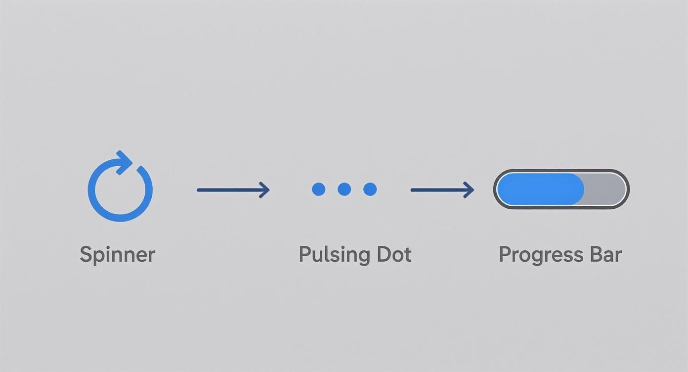
First up, the most iconic loading animation of them all: the simple spinner.
This classic is the perfect starting point for anyone new to CSS animations. It’s a fantastic example of how a few fundamental properties can work together to create something elegant. You only need a single HTML element and a handful of CSS rules to bring it to life, which is why it's such a lightweight and powerful solution for any project.
The Classic Spinner Animation
So, how does it work? The secret is to create a circle with a transparent background but give it a colored border. Then, you just hide parts of that border to create the illusion of a spinning arc. We'll use border-radius: 50% on a div to shape it into a perfect circle, then set one of its borders to a transparent color to create the "gap."
The real magic, though, is in the @keyframes. We define an animation that rotates the element a full 360 degrees. By setting the animation to loop infinite-ly, the element spins forever, giving us that classic loader effect.
Here’s what that looks like in a CodePen.
This shows just how much you can do with a simple HTML div. Some targeted CSS for the border and animation properties is all it takes to produce a clean, effective spinner. The key is keeping the effect isolated to a single, lightweight element.
Let's break down the code. It’s surprisingly simple.
<div className="spinner"></div>.spinner {
width: 48px;
height: 48px;
border: 5px solid #fff;
border-bottom-color: #ff3d00;
border-radius: 50%;
display: inline-block;
box-sizing: border-box;
animation: rotation 1s linear infinite;
}
@keyframes rotation {
0% {
transform: rotate(0deg);
}
100% {
transform: rotate(360deg);
}
}Creating Pulsating Dots
Next, let’s build a pulsating dot loader. This one feels a bit more active and is perfect for signaling that a process is chugging away in the background. The core technique here is using animation-delay to offset the animation for each dot, which creates a slick, wave-like effect.
We’ll start with three simple div elements for our dots. The animation itself will just scale each dot up and down using transform: scale(). The trick is applying a slightly different animation-delay to the second and third dots. This creates a staggered, pulsating rhythm that’s way more engaging than a single, repetitive animation.
This staggered timing is such a simple but powerful technique. It turns a basic animation into a more complex and visually interesting sequence without adding any real performance overhead.
Simulating Progress with a Linear Bar
A linear progress bar is another foundational loader. You'll often see these for tasks that have a more predictable duration, like file uploads. While a real progress bar needs JavaScript to track actual progress, we can create a very convincing "indeterminate" version with pure CSS that smoothly fills from left to right.
To pull this off, we'll use a container div with a child div inside it that acts as the "fill." The animation will use transform: scaleX() to expand the fill element horizontally from 0% to 100% of the container's width. This creates a clean, modern loading effect that clearly communicates forward momentum. When you start combining this with other effects, you can create some truly cool CSS animations that will seriously elevate your UI.
These three examples—the spinner, pulsating dots, and progress bar—are the building blocks for just about any css loader animation you'll ever need. Once you get a good handle on how @keyframes, transform, and animation-delay work together, you'll be ready to start customizing these patterns or even cooking up your own unique loaders.
Making Your Loaders Dynamic and Reusable
A static loader gets the job done, but modern development demands components that are flexible and reusable. If you hardcode values like colors and sizes directly in your CSS, you're setting yourself up for a maintenance headache. The moment a designer asks for a theme change, you'll be stuck hunting down hex codes across a dozen files.
A much smarter approach is to build your CSS loader animation to be dynamic from the very beginning. This doesn't just simplify future updates; it lets you adapt a single loader for different contexts—a tiny one for a button, a larger one for a full-page overlay—all without writing redundant code.
The types of loaders we've been building each serve a different perceptual purpose, from simple spinners to more deterministic progress bars.
Ultimately, whether it's a rotational spinner or a linear bar, the goal is always the same: manage the user's perception of waiting and keep them engaged.
Powering Loaders With CSS Custom Properties
CSS Custom Properties (you probably know them as CSS variables) are the key to unlocking this kind of flexibility. They let you define a value once and reuse it all over your stylesheet. Let's refactor our earlier examples to use variables for things like color, size, and animation speed. This will make them instantly configurable.
Think about our spinner. Instead of hardcoding width: 48px, we can define a variable like --loader-size: 48px and then use var(--loader-size) in our CSS rule. It's a small change, but it means you can now override that size directly from a parent element or even with inline styles, making the component far more modular.
Here are a few properties you should definitely turn into variables:
--loader-color-primary: This will control the main, active color of the loader.--loader-color-secondary: Perfect for background or track colors, like in a progress bar.--loader-size: Sets the overall width and height of the component.--loader-speed: Adjusts theanimation-durationto create faster or slower effects.
By abstracting these core properties, you create a robust and themeable component. A single loader can now easily adapt to light mode, dark mode, or different brand palettes with just a few variable overrides.
To give you a clearer picture, here’s a quick breakdown of the core CSS animation properties we've been using to bring these loaders to life.
CSS Animation Property Comparison
This table is a handy reference for the CSS properties that are the backbone of any loader animation.
| Property | Purpose | Example Usage |
|---|---|---|
@keyframes | Defines the animation's sequence, specifying styles at various points (e.g., from/to or 0%/100%). | @keyframes spin { from { transform: rotate(0deg); } to { transform: rotate(360deg); } } |
animation-name | Binds the @keyframes rule to the element you want to animate. | animation-name: spin; |
animation-duration | Sets the total time it takes for one animation cycle to complete. | animation-duration: 1s; |
animation-iteration-count | Specifies how many times the animation should repeat. infinite is common for loaders. | animation-iteration-count: infinite; |
animation-timing-function | Controls the speed curve of the animation, like linear, ease-in, or ease-out. | animation-timing-function: linear; |
animation | A shorthand property to combine all the animation properties into a single declaration. | animation: spin 1s linear infinite; |
Understanding these properties is crucial for both creating animations from scratch and for customizing existing ones effectively.
Integrating With Tailwind CSS
If you're working in a project that uses Tailwind CSS, this variable-driven approach fits in perfectly. You can use Tailwind's utility classes to set the CSS variables on your loader's container, which means you can style the component without writing a single line of custom CSS.
Imagine you have a loader component. You could modify its color and size on the fly with simple utility classes like text-blue-500 (if you map your variables to currentColor) or by setting the variables directly.
For more complex or illustrative animations, you might want to look beyond pure CSS. Libraries offering Lottie animations for dynamic loaders can provide incredibly rich, JSON-based animations that integrate smoothly into modern frameworks.
Creating a Reusable React Component
Taking this a step further, we can wrap our loader in a reusable React component. This component can accept props like color, size, and speed, and then use those props to set our CSS variables via inline styles. This pattern gives you a clean, predictable, and even type-safe API for using loaders anywhere in your React application.
This approach truly gives you the best of both worlds: the raw performance of pure CSS animations combined with the dynamic, prop-driven nature of React components. Your loaders become true "plug-and-play" elements in your design system, completely decoupled from the specific context they're used in. That kind of modularity is a cornerstone of building efficient and scalable front-end applications.
Implementing Modern Skeleton Screens

While spinners and bars are classic choices for showing background activity, they don't really tell the user what's coming next. This is where skeleton screens completely change the game. Instead of an abstract animation, you present a low-fidelity placeholder of the UI, which massively improves the perceived load time. The experience feels more progressive and less jarring.
A good skeleton screen essentially mimics the final layout using simple, grayed-out shapes. Imagine a user profile card: you might show a gray circle for the avatar, a couple of gray rectangles for the name and bio, and another for a button. This approach just feels faster because it eases the user into the interface, rather than making them stare at a spinner before the content suddenly pops into existence.
It’s a powerful technique for managing user expectations and providing a clear visual outline of the page long before the actual content has rendered.
Crafting the Shimmering Effect
The signature detail of any modern skeleton screen is that subtle, shimmering animation that sweeps across the placeholders. It’s a small touch, but it’s crucial—it visually confirms that the application is actively loading data in the background.
Believe it or not, creating this effect is surprisingly simple using a CSS linear-gradient paired with a @keyframes animation.
The core idea is to create a wide gradient on a pseudo-element (like ::before) that sits on top of your skeleton layout. This gradient usually goes from a transparent color, to a slightly lighter "shimmer" color, and back to transparent. We then just animate its position, sliding it from left to right across the element.
To get this working, you'll need a few key pieces:
- A container with
position: relativeandoverflow: hidden. - A
::beforepseudo-element set toposition: absolutethat covers the entire container. - A
linear-gradientdefined with your shimmering color stop. - A
@keyframesrule that animates thetransform: translateX()property of the pseudo-element.
By sticking to the
transformproperty for animation, you're tapping into hardware acceleration. This guarantees a buttery-smooth effect that won't cause jank or bog down the browser's main thread—a performance-first approach that's essential for any great CSS loader.
Building a Skeleton Card Layout
Let's put this into practice with a real-world example: a user profile card. We’ll start with some basic HTML that maps out the shapes of our final UI. Each element gets a base background color to serve as the placeholder content.
<div className="card">
<div className="skeleton-avatar"></div>
<div className="skeleton-text-container">
<div className="skeleton-text"></div>
<div className="skeleton-text short"></div>
</div>
</div>Next, the CSS will define the shapes and, most importantly, apply the shimmering animation to the parent .card element. The animation will then gracefully sweep across all the child placeholder elements nested inside. You can see a similar effect in our guide on creating a shimmer button component, which can be adapted for all sorts of UI elements.
This pattern is incredibly flexible. You can apply it to just about any component in your app, from simple cards to complex dashboards, delivering a loading experience that feels far more sophisticated and user-friendly than a traditional spinner ever could.
Fine-Tuning for Performance and Accessibility
Creating a slick CSS loader animation is only half the job. A truly professional loader has to be fast, fluid, and work for everyone—including people who use assistive technologies. If you ignore performance and accessibility, even the most beautiful animation can end up degrading the very user experience it was meant to improve.
The secret to a smooth, jank-free animation lies in understanding how browsers render changes on the screen. Some CSS properties are just "cheaper" for a browser to animate than others. When you animate properties like width, height, or margin, you force the browser to recalculate the layout of the page, a process called reflow. This can be incredibly slow and resource-intensive, often leading to choppy, stuttering animations, especially on less powerful devices.
Keeping Animations on the GPU
For silky-smooth performance, you should almost exclusively stick to animating two properties: transform and opacity. The browser can hand these off directly to the computer's Graphics Processing Unit (GPU), a technique called hardware acceleration. This simple move offloads the heavy lifting from the browser's main thread, which is already busy handling things like JavaScript and user input.
Animating on the GPU stops your loader from fighting for resources, giving you consistently fluid motion that won’t bog down the rest of your app. It’s a simple trick, but it's absolutely critical for building high-performance animations.
Making Loaders Work for Everyone
An animation visually tells a user that something is loading. But what about users who can't see it? That same state needs to be communicated audibly for screen reader users. Without the right accessibility attributes, a person using a screen reader might have no idea that content is being fetched, leaving them confused and frustrated.
To fix this, we can use a couple of specific ARIA (Accessible Rich Internet Applications) attributes:
role="status": This tells assistive tech that the element contains status information that’s important, but not urgent enough to interrupt the user.aria-live="polite": This attribute instructs a screen reader to announce changes to the element's content when the user is idle, so it doesn't break their focus.
Just by adding these two attributes to your loader's container, you ensure that screen readers will announce that content is loading, providing that crucial piece of context.
A truly inclusive design considers all users from the very beginning. Implementing ARIA roles isn't just a box to check at the end; it's a fundamental part of building a user-friendly interface that works for everyone.
Finally, we need to respect our users' motion preferences. Many people enable a "reduce motion" setting in their operating system to avoid dizziness or distractions caused by animations. The prefers-reduced-motion media query lets us detect this setting and adjust our loaders. For these users, a simple, subtle fade is almost always a better choice than a fast-spinning or pulsating animation.
Using Loader Libraries in a React Project
Building your own CSS loader from scratch offers total creative freedom, but let's be honest—it’s not always the most practical route. When you're deep in a fast-moving project, leaning on a dedicated library can be a massive time-saver. You get instant access to dozens of battle-tested animations right out of the box.
Knowing when to build and when to borrow is a key skill for any developer. If your project demands a highly specific or brand-aligned animation, rolling your own is the way to go. But for most standard use cases? A library is usually the smarter, more efficient path. These packages offer a huge variety of loaders that are already optimized for performance and accessibility, letting you drop in a solution and get back to the bigger picture.
Picking Your Way Through the Loader Ecosystem
The world of CSS loader libraries has absolutely exploded. We've seen collections grow to offer hundreds of options, with some creators building around 580 different loaders using just a single HTML element.
This boom led to specialized libraries for every need, from Animista for quick prototyping to LDRS for data-heavy React apps. For a deeper look at the options out there, you can check out some of the best React animation libraries available today.
With a massive selection of over 600 unique designs available, it's clear the CSS loader has evolved from a minor detail into a core part of professional web development. If you're curious, you can learn more about this vast collection of loading animations on dev.to.
How to Use a Library in a React and TypeScript Project
Let's walk through a real-world scenario. Say you've picked a library like react-spinners for its simplicity and variety. The first thing you'll do is add it to your project.
With that installed, you can import the specific loader component you want to use. For this example, we’ll grab the ClipLoader.
import { ClipLoader } from "react-spinners"The most common way to use this is to show the loader conditionally based on your application's state. You’ll typically have a boolean state variable, maybe called isLoading, that tracks whether you're fetching data. When isLoading is true, you render the loader. When it's false, you show your content.
Here’s what a basic implementation looks like inside a React component:
import React, { useEffect, useState } from "react"
import { ClipLoader } from "react-spinners"
const DataComponent = () => {
const [loading, setLoading] = useState(true)
const [data, setData] = useState(null)
useEffect(() => {
// Simulating a network request to fetch data
setTimeout(() => {
setData("Your fetched data is here!")
setLoading(false)
}, 2000)
}, [])
if (loading) {
return <ClipLoader color={"#36D7B7"} loading={loading} size={50} />
}
return <div>{data}</div>
}This pattern—conditionally rendering based on a loading state—is a fundamental practice in modern React development. It keeps your logic clean and gives users a clear, predictable experience during any asynchronous operation.
This simple approach gives you a production-ready blueprint for integrating just about any third-party loader library into your projects quickly and efficiently.
Ready to build stunning, animated user interfaces with minimal effort? Magic UI offers a massive collection of 150+ free, open-source animated components built with React, TypeScript, and Tailwind CSS. Browse components and start building today.