
Before you even think about colors or fonts, the most important step is to build a solid HTML foundation for your navigation bar. This is the skeleton of your component, and getting it right ensures everything else—styling, responsiveness, and accessibility—falls into place smoothly.
Building Your Nav Bar with Semantic HTML
Forget the old days of stringing together a bunch of <div> tags. Modern, professional web development is all about using semantic HTML. This just means using tags for their intended purpose. Not only does this make your code cleaner and easier for other developers to read, but it also gives a huge boost to accessibility and SEO.
A well-structured navigation bar is one of the most critical parts of your website's user experience. It tells search engines how your site is organized and helps users with screen readers understand how to get around.
The Essential HTML Tags
You only need a handful of tags working together to create a perfectly structured navigation menu. Each one has a specific job.
The <nav> element is your main wrapper. It’s a clear signal to browsers and assistive technologies that "Hey, this block of links is the main site navigation." Inside that, you'll use an unordered list (<ul>) to group all your menu items together.
Each individual menu item gets its own list item (<li>) tag. Finally, the actual clickable link is the anchor tag (<a>), which sits inside the <li>.
Let's break down the core HTML elements you'll be using.
Core HTML Elements for a Navigation Bar
A quick look at the essential HTML tags for building a semantic navigation bar and their specific roles.
| HTML Tag | Purpose | Best Practice Tip |
|---|---|---|
<nav> | The main container for your primary navigation links. | Use it for major navigation blocks like the main site header, but not for every group of links (e.g., footer links). |
<ul> | Groups the collection of navigation items into a list. | <ul> is standard for navigation because the order of links usually doesn't imply a sequence, unlike an ordered list (<ol>). |
<li> | Represents a single list item, holding one navigation link. | This tag acts as a wrapper, allowing you to style the area around the link, like adding padding or a background color on hover. |
<a> | The anchor tag, which creates the actual hyperlink. | Always include an href attribute. For placeholder links during development, use href="#". |
This structure might seem simple, but it's incredibly powerful and is the industry standard for a reason.
The introduction of HTML5 back in 2014 was a game-changer because it gave us the <nav> tag. Before that, developers had to rely on generic <div id="nav"> containers, which offered no real semantic meaning. Using <nav> properly helps search engines map out your site's architecture, which can have a positive impact on your rankings.
A great navigation bar is intuitive and almost invisible; it guides users without making them think. The foundation for that experience starts with clean, semantic HTML. It’s the difference between a flimsy shack and a solid foundation.
By focusing on this structure first, you make the styling process so much easier down the line. If you're looking for some inspiration on how different structures can lead to incredible designs, check out these amazing website header examples.
Styling Your HTML Nav Bar with CSS
An unstyled list of links is a starting point, but let's be honest, it's a long way from the polished, professional navigation you see on real-world websites. This is where CSS (Cascading Style Sheets) steps in. It's the magic wand that transforms that basic HTML structure into something both beautiful and intuitive. The styling is what truly gives your nav bar its personality.
First things first, we need to deal with the default browser styles. Unordered lists (<ul>) come with their own opinions—they've got built-in padding, margins, and those classic bullet points. Our first job is to wipe the slate clean.
ul {
list-style-type: none; /* Say goodbye to bullet points */
margin: 0;
padding: 0;
}With that boilerplate out of the way, we can get to the fun part. Most desktop nav bars lay their links out side-by-side, not stacked vertically. The modern and, frankly, easiest way to handle this is with CSS Flexbox.
Creating a Horizontal Layout with Flexbox
Flexbox is a lifesaver for layout challenges. It just makes aligning items simple. By adding display: flex to our <ul> container, we're essentially telling all of its direct children—the <li> elements—to fall in line, literally.
ul {
list-style-type: none;
margin: 0;
padding: 0;
display: flex; /* Lines up the list items in a row */
gap: 1rem; /* Adds some breathing room between them */
}That one display: flex property does a ton of heavy lifting. Your vertical list is now a clean, horizontal menu. While we're writing custom CSS from scratch here, it's worth knowing you can also integrate frameworks like Tailwind via CDN to make this kind of styling happen even faster.
Next up, let's style the links themselves. The anchor (<a>) tags need some attention to get rid of that default blue, underlined look and to make them easier to click. We can do this by adding some padding to increase their target size and changing the text color.

To really dial in the user experience, you absolutely need a hover effect. This is a small detail that provides huge visual feedback, letting the user know that an item is interactive. A simple color change on hover is effective and super easy to set up using the :hover pseudo-class.
Good design is about communication. A hover effect is a small but vital conversation with your user, telling them, "Yes, you can click this." It builds confidence and makes the interface feel responsive to their actions.
By pulling together just these few foundational CSS properties, you can quickly turn a bare-bones HTML list into a nav bar that not only looks professional but is also a pleasure to use.
Adding Interactive Dropdown Menus
As your website gets bigger, a simple, single-level navigation bar just doesn't cut it anymore. Things start to feel cluttered. This is the perfect time to bring in dropdown menus, letting you neatly tuck away related sub-pages under a main category. The best part? We can build this slick functionality using only HTML and CSS—no JavaScript required.
The whole trick is to nest another unordered list (<ul>) inside a parent list item (<li>). This nested list is what becomes our dropdown menu. From a code perspective, it's just a list within a list, which creates a logical hierarchy that's easy for search engines and screen readers to follow.

Right now, if you add that nested list, it will show up on the page and probably mess up your layout. Our job is to hide it by default and only make it appear when someone hovers over its parent menu item.
Structuring the HTML for a Submenu
Let's say you want to create a dropdown under a "Services" link. The structure is pretty intuitive: you'll add a new <ul> right inside the "Services" <li>, just after the link tag.
Here’s exactly what that looks like in practice:
<nav>
<ul>
<li><a href="#">Home</a></li>
<li><a href="#">About</a></li>
<li className="dropdown">
<a href="#">Services</a>
<ul className="submenu">
<li><a href="#">Web Design</a></li>
<li><a href="#">SEO</a></li>
<li><a href="#">Hosting</a></li>
</ul>
</li>
<li><a href="#">Contact</a></li>
</ul>
</nav>With the HTML skeleton in place, we can jump over to the fun part—using CSS to control the submenu's visibility and positioning. This is where we bring the interactive "dropdown" behavior to life.
Hiding and Showing the Dropdown with CSS
The game plan is simple: use CSS to hide the submenu initially and then display it whenever a user hovers over its parent <li>. We can handle all of this with the :hover pseudo-class and a descendant selector.
We also need to give the submenu position: absolute. This pulls it out of the normal flow of the page, so it floats over your content instead of pushing everything down when it appears. To make sure it appears in the right spot, we give its parent <li> position: relative, which turns it into a positioning anchor for the submenu.
The parent element with
position: relativebecomes the coordinate system for its absolutely positioned children. This is a fundamental concept in CSS that ensures your dropdown appears exactly where you want it—right below its parent link.
Here’s the core CSS that makes the magic happen:
- Hide the submenu: Set
display: none;on your.submenuclass. - Position the parent: Apply
position: relative;to the.dropdownlist item. - Position the submenu: Use
position: absolute;on.submenu. - Show on hover: Use
.dropdown:hover .submenu { display: block; }to reveal it.
This pure CSS method is lightweight and completely reliable, giving your users a smooth experience as they navigate through more complex parts of your site.
Making Your Navigation Bar Responsive
A nav bar that looks sharp on a desktop but completely breaks on a phone is more than just an inconvenience; it’s a user experience dead end. In a world where most of your traffic is likely coming from mobile devices, making your navigation adapt to different screen sizes isn't optional. It’s a core skill.
This whole process boils down to CSS media queries. Think of them as simple "if-then" rules for your stylesheet. A media query tells the browser, "If the screen is 768px wide or smaller, then apply these specific styles." It’s how you can completely transform your navigation for smaller viewports without messing up the desktop version.
By far, the most common solution you'll see in the wild is the "hamburger" menu. The idea is to tuck away the full list of navigation links on small screens and show a simple, clickable icon that toggles the menu open and closed.
Implementing Media Queries
First thing's first, we need to pick a breakpoint. This is the specific screen width where our mobile styles will kick in. A popular and effective choice is 768 pixels, which generally covers tablets and smartphones held upright.
Inside that media query, we'll write the CSS to hide the standard navigation links and, in their place, display our hamburger icon.
Good navigation isn't just about looks; it directly impacts how people use your site. By 2025, it's predicted that 91% of consumers will gravitate toward sites offering personalized and easy-to-use navigation. A clean, responsive menu is the first step—it helps people find what they need without getting frustrated.
Toggling Visibility With JavaScript
While CSS handles the heavy lifting of hiding and showing elements, we need a little sprinkle of JavaScript to bring the hamburger icon to life.
The logic is straightforward: when someone clicks the icon, we’ll use JavaScript to add a CSS class (like .is-visible) to our navigation menu. That class will contain the styles to make the menu appear, usually by changing its display property from none to flex or block. Clicking the icon a second time removes the class, hiding the menu again.
This diagram lays out the foundational CSS steps you'd take even before thinking about responsiveness.
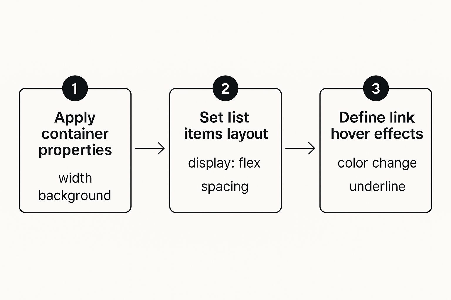
This workflow—styling the container, arranging the items, and adding interactive states—is the base layer. Responsive styles are then built right on top of this foundation.
A responsive navigation bar is a sign of respect for your users. It acknowledges that they access your site from a variety of devices and ensures they have a seamless experience, no matter the screen size.
If you’re looking for some real-world inspiration, it helps to explore various responsive web design examples to see how others have solved this problem. The combination of HTML, CSS media queries, and a touch of JavaScript remains the industry-standard approach. Of course, if you're working within a framework, you can find more tailored solutions, like our guide to building a responsive React header.
Pushing Your Nav Bar to the Next Level
Once you have a solid, responsive navigation bar, it's time for the professional touches that take it from functional to fantastic. These finer points are all about boosting usability, accessibility, and even your SEO. It's the small refinements at this stage that really make a difference.
A huge win for user experience is adding a sticky navigation bar. This simple trick keeps your menu locked to the top of the screen as someone scrolls down the page. Think about it—on longer pages, nobody wants to scroll all the way back up just to find the menu.

Putting this into practice is surprisingly simple with CSS. All it really takes is a single property: position: sticky;, along with top: 0; to tell it where to stick.
.main-nav {
position: sticky;
top: 0;
background-color: white; /* Ensures content doesn't show through */
z-index: 1000; /* Keeps it above other page elements */
}This tiny snippet of code keeps your main navigation within easy reach at all times, dramatically cutting down on user frustration.
Don’t Forget ARIA for Accessibility
Making your navigation usable for everyone, including people who rely on screen readers, isn't just a nice-to-have; it's essential. This is where Accessible Rich Internet Applications (ARIA) attributes come in. They don’t change how your nav bar looks, but they add critical context for assistive technologies.
You can easily weave a few key ARIA attributes into your HTML to clarify what each part of your navigation does:
- Add
role="navigation"to your<nav>tag to explicitly define its purpose. - Use
aria-label="Main Navigation"to give the whole block a clear, descriptive name. - Apply
aria-current="page"to the link for the page the user is currently on, which tells screen readers which link is active.
These attributes might seem small, but they are a cornerstone of building an inclusive web.
Great design isn’t just about visual appeal; it’s about clarity and ease of use for every single visitor. ARIA attributes are a fundamental part of building an interface that works for everyone, not just most people.
Finally, take a hard look at the text inside your links. Clear, descriptive labels like "Our Services" or "Case Studies" are always better than vague terms like "More" or "Click Here." A well-thought-out navigation bar is a powerful tool for both your users and search engines. To make sure your site structure is solid, optimizing internal linking is a must-read. All these details add up to create a truly professional, effective, and accessible navigation system.
A Few Common Questions About HTML Nav Bars
Even with a good roadmap, you're bound to hit a few specific bumps when you're deep in the code. It happens to everyone. Let's tackle some of the most common hurdles developers run into when building nav bars—the kind of stuff that often falls outside a standard tutorial.
How Do I Center My Navigation Links?
The cleanest, most modern way to handle this is with CSS Flexbox. It's practically made for this kind of layout challenge.
Just target your <ul> element—which is the container for all your <li> navigation links—and add two simple properties to its CSS rule:
display: flex;justify-content: center;
That's it. Flexbox automatically figures out the spacing and perfectly centers your links horizontally inside the container. It doesn't matter if you have three links or ten; it just works.
Can I Use an Icon Library for My Hamburger Menu?
Absolutely. In fact, for most projects, I'd recommend it. Instead of fussing with styling a bunch of <div> elements to look like a hamburger icon, pulling in a library like Font Awesome is way more efficient. Plus, you get icons that are consistently crisp and professional.
You’d just link the library's stylesheet in your HTML's <head>. Then, you can drop their icon element right into your HTML, something like <i className="fas fa-bars"></i>. From there, your JavaScript click listener simply targets that <i> element to toggle your mobile menu.
The real difference between using
<nav>and a<div>for your navigation bar comes down to one word: semantics. While you can make them look identical with CSS, the<nav>tag gives crucial context to browsers, search engines, and assistive technologies, telling them, "Hey, this is the main way to get around the site." This is a huge win for both accessibility and SEO.
Getting the HTML element right from the very beginning makes every other step more effective. It’s a core principle of professional web development and ensures your site is built for everyone (and everything) that visits it.
Ready to build stunning web interfaces in minutes? Magic UI offers over 150 free and open-source animated components built with React, Typescript, and Tailwind CSS. Explore our components and start creating today.