
Picking the right React UI framework is one of those big, upfront decisions that ripples through your entire project. It's not just about aesthetics; it shapes how your team builds, how fast they can move, and how the final app actually performs. Your choice here defines the developer experience just as much as the user experience.
This guide is designed to cut through the noise. We'll compare the heavy hitters—Magic UI Pro, Material-UI (MUI), Ant Design, and Chakra UI—so you can make a call that fits your project, not just what's popular this week.
Why a React UI Framework Is a Critical Choice
Thinking of a UI framework as just a "theme" is a huge mistake. It's a foundational layer that deeply influences your project's architecture and your team's day-to-day workflow. This becomes crystal clear when you place it in the context of modern web application architecture, where the frontend is everything.
React’s dominance has created a massive ecosystem of these frameworks. The numbers speak for themselves: React is behind roughly 4.8% of all websites, which adds up to over 11 million live sites. Even more telling, it’s used by 6.2% of the top 10,000 websites, proving its mettle in high-stakes, high-traffic environments.
The official React site sums it up perfectly—it's all about building interfaces from small, self-contained pieces of code called components.

This component model is React's superpower. Every UI framework we're looking at simply offers a different opinion—a different philosophy—on the best way to build and combine those components.
Key Differentiators to Consider
It's tempting to just compare feature lists, but that's a trap. The real differences are in the core philosophies of each framework. These philosophies dictate how you'll approach styling, customization, and even the structure of your application. A framework is more than just a box of buttons and inputs; it’s an opinionated system for building UIs.
The best React UI framework isn't the one with the most components. It's the one whose design philosophy clicks with your project goals and your team's way of working.
To make this tangible, here's a quick breakdown of the frameworks we'll be digging into.
| Framework | Core Philosophy | Ideal Use Case |
|---|---|---|
| Magic UI Pro | Animated, modern aesthetics out-of-the-box | Visually rich marketing & landing pages |
| MUI | Adherence to Google's Material Design | Internal tools & Google-ecosystem apps |
| Ant Design | Comprehensive, enterprise-grade design system | Data-intensive dashboards & complex apps |
| Chakra UI | Utility-first, highly composable & accessible | Highly customized and accessible applications |
Getting a handle on these core distinctions is your first step. Each one offers a unique balance of speed, flexibility, and design consistency, and we’re about to dive into exactly what that means for you.
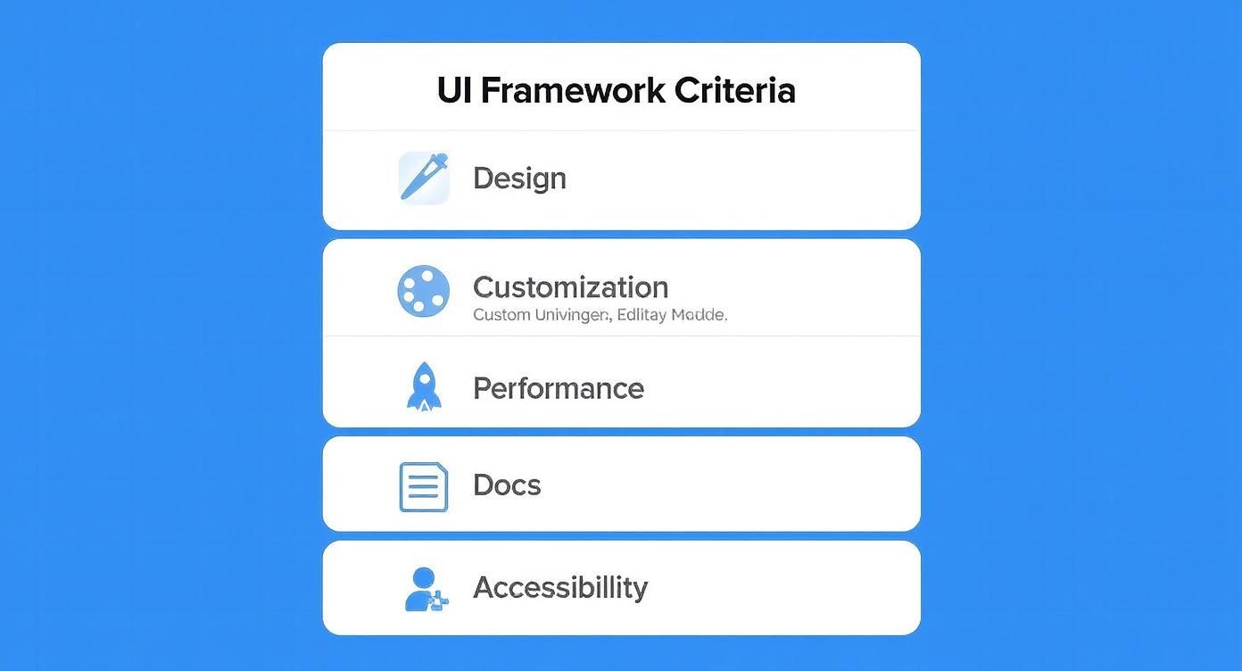
The Core Criteria for Framework Evaluation
Choosing the right React UI framework is about more than just a quick glance at a feature list. To make a decision you won't regret down the line, you need a solid set of criteria to measure each option against. This is how you can fairly compare libraries like Magic UI Pro, MUI, and Ant Design on the things that actually make or break a project.
We're going to look at each framework through five critical lenses:
- Component Philosophy and Design: What's the core idea behind how they build components and what do they look like out of the box?
- Customization and Theming: How easy is it to make the framework look like your brand, not theirs?
- Performance and Bundle Size: What’s the performance hit? How much extra weight will this library add to your app?
- Documentation and Community: How good are the learning resources, and is there an active community to help you when you get stuck?
- Accessibility (a11y) Standards: How well does the framework support building experiences that work for everyone?
Using these pillars gives us a structured way to dig into the real trade-offs you'll be making.
Component Philosophy and Design
A framework's philosophy is its DNA. It shapes everything about the developer experience, from the first component you build to the headaches of long-term maintenance. For instance, a library with a utility-first approach—like Tailwind CSS, which is the engine behind Magic UI Pro—hands you the keys by letting you compose styles from tiny, low-level classes. Total control.
On the flip side, you have pre-styled component libraries like Ant Design, which give you polished, enterprise-grade components ready to go. This can seriously speed up development for standard interfaces, but bending those components to a truly unique design can feel like a fight. When you're weighing your options, thinking about how each approach aligns with essential user interface design best practices is a great starting point.
Customization and Performance
Customization and performance are locked in a delicate dance. A framework that gives you endless theming power often does so with CSS-in-JS, a technique that lets you write your styles right inside your JavaScript. Libraries like Chakra UI and MUI lean into this, offering incredibly dynamic, component-level styling.
But that flexibility doesn't come for free; it can add a small performance cost at runtime. The alternative is static CSS extraction, where styles are compiled into plain old CSS files when you build your app. This usually means faster initial page loads, but it can make on-the-fly theming a bit more cumbersome.
Understanding the trade-off between styling flexibility (CSS-in-JS) and raw performance (static CSS) is fundamental. Your choice depends on whether your project prioritizes dynamic, real-time style changes or the absolute fastest load time.
Ultimately, you have to look at the bundle size—the amount of code the framework adds to your final application. A bloated bundle can tank the user experience, especially for people on slower connections. We'll get into the specifics for each framework, giving you the hard data you need to pick a tool that fits both your performance budget and your team's workflow.
A Detailed Comparison of Leading Frameworks
Now that we have our criteria laid out, it's time to put the top frameworks under the microscope. This isn't about crowning a single "winner." Instead, we're diving into the unique philosophies and trade-offs of Magic UI Pro, MUI, Ant Design, and Chakra UI. Each react ui framework offers a different way to build interfaces, and the right choice is all about what your project demands.
We'll go beyond basic feature lists to really get into the developer experience, how far you can push customization, and the core design ideas behind each one. By looking at how they handle everyday tasks like theming and building out components, you’ll get a real feel for what it’s like to work with them.
To keep things focused, we'll size up each framework based on five key areas: design, customization, performance, documentation, and accessibility.
This breakdown makes it clear that picking a framework is a balancing act. You have to weigh multiple important factors, not just chase a single feature.
React UI Framework Feature Comparison
Here's a quick side-by-side look at how these popular frameworks stack up. Think of this as a cheat sheet to quickly grasp their core differences before we dive deeper into each one.
| Framework | Core Philosophy | Customization Level | Built-in Components | Best For |
|---|---|---|---|---|
| Magic UI Pro | Aesthetics & Motion First | High (Tailwind CSS) | 50+ animated blocks | Visually stunning marketing sites, portfolios, and landing pages. |
| MUI | Material Design Implementation | High (CSS-in-JS) | Extensive library | Admin dashboards, internal tools, and apps needing a consistent, familiar UI. |
| Ant Design | Enterprise-Grade Design System | Medium (Less variables) | Massive, complex library | Data-heavy enterprise applications, complex forms, and dashboards. |
| Chakra UI | Composability & Accessibility | Very High (Style Props) | Accessible UI primitives | Custom designs, rapid prototyping, and accessibility-focused projects. |
This table gives you the high-level view, but the real story is in the details of building with each framework. Let's get into the specifics.
MUI: The Material Design Powerhouse
Material-UI, now just MUI, has been a giant in the React world for a long time. Its biggest draw is its rock-solid, comprehensive implementation of Google's Material Design system. This makes it a go-to for projects that want to align with Google's look and feel or for teams who just want a mature, well-defined design language right out of the gate.
MUI comes loaded with a huge library of components, from basic buttons to seriously complex data grids. This approach can massively speed up development, especially for internal tools, admin panels, and apps where a clean, predictable UI is the top priority.
But that dedication to Material Design can also feel restrictive. While MUI is very customizable, trying to break too far from its core design can feel like you're swimming upstream. Customization is handled through a powerful theming API that uses CSS-in-JS (usually Emotion), giving you deep control over colors, fonts, and component styles.
Let's see what basic theming looks like. To change a button's default style, you create a theme object and wrap your app in a ThemeProvider.
import { Button, createTheme, ThemeProvider } from "@mui/material"
const theme = createTheme({
palette: {
primary: {
main: "#556cd6",
},
},
components: {
MuiButton: {
styleOverrides: {
root: {
borderRadius: 8,
textTransform: "none",
},
},
},
},
})
function App() {
return (
<ThemeProvider theme={theme}>
<Button variant="contained">Custom Button</Button>
</ThemeProvider>
)
}This structured system is great for consistency, but it means you'll spend some time in the docs figuring out the specific APIs for each component you want to tweak.
Ant Design: The Enterprise-Grade Toolkit
Ant Design (AntD) markets itself as a design system for enterprise-level products, and it delivers. It has an even bigger component library than MUI, with sophisticated tools like statistical charts, intricate form layouts, and powerful data visualization widgets. Its look is professional, clean, and perfectly suited for data-heavy applications.
Coming from Ant Group, AntD has been battle-tested in some seriously complex financial apps, which gives developers a lot of confidence in its stability. The documentation is top-notch, with exhaustive API references and practical examples for its massive component set.
AntD handles customization by modifying Less variables, which is a different beast compared to the CSS-in-JS approach of its rivals. This can lead to better runtime performance since styles are compiled into static CSS, but it can feel a bit rigid if you're used to styling components directly. For a deeper comparison, check out our guide on Ant Design vs Material UI.
Ant Design’s greatest strength is its “batteries-included” philosophy. It gives you a complete UI solution right out of the box, letting teams build complex, feature-packed interfaces incredibly fast—as long as its design system fits their vision.
Chakra UI: The Composer's Toolkit
Chakra UI flips the script entirely. Instead of giving you fully-styled components, it provides a set of highly composable and accessible building blocks. Its whole philosophy is built around style props, letting you style components right in your JSX using a shorthand syntax that maps directly to CSS.
This utility-first method gives you incredible flexibility and makes building custom, on-brand designs feel intuitive and quick. Accessibility is baked into every component from the ground up, adhering to WAI-ARIA standards. This is a huge differentiator and saves developers a ton of time making their apps usable for everyone.
Chakra UI also uses Emotion for its CSS-in-JS engine but exposes it through a slick style prop API. Here’s how you might style a button—it feels much more direct than MUI’s theme overrides for one-off adjustments.
import { Button, ChakraProvider, extendTheme } from "@chakra-ui/react"
// You can still extend the theme for global styles
const theme = extendTheme({
colors: {
brand: {
500: "#ff6347",
},
},
})
function App() {
return (
<ChakraProvider theme={theme}>
{/* Or just apply styles directly when you need to */}
<Button
bg="brand.500"
color="white"
_hover={{ bg: "brand.600" }}
borderRadius="md"
px={6}
>
Styled Button
</Button>
</ChakraProvider>
)
}That mix of composability, great developer experience, and built-in accessibility makes Chakra UI a fan favorite for teams that need custom designs and want to prototype fast.
Magic UI Pro: The Aesthetic Innovator
Magic UI Pro carves out its own niche by putting modern aesthetics and slick motion design first. Built on top of Tailwind CSS and Framer Motion, it’s made for creating jaw-dropping, animated web experiences without the headache. While other frameworks give you the parts to build anything, Magic UI Pro is your go-to for building marketing sites, landing pages, and portfolios where visual punch is everything.
The library offers over 50 pre-built blocks and templates that are not only gorgeous but also fully customizable thanks to Tailwind CSS. This means you can build things incredibly fast without ever compromising on design quality. The experience is as simple as copying production-ready JSX from the website and pasting it right into your project.
The broader React ecosystem is as strong as ever, which is great news for tools like this. Over 40% of professional developers are actively using React.js, and its weekly NPM downloads frequently top 20 million—leaving alternatives in the dust. This massive community ensures a solid foundation and a big audience. You can dig into these numbers in a recent analysis of React.js trends.
Here's a peek at how straightforward it is to use a Magic UI Pro component. The styling is all handled by Tailwind's utility classes, which keeps the code clean and the styling logic right where you need it.
// Example assumes Tailwind CSS is configured in your project.
// You would typically copy this component's code from magicui.design.
export default function AnimatedShinyButton() {
return (
<button className="relative inline-flex h-12 overflow-hidden rounded-full p-[1px] focus:ring-2 focus:ring-slate-400 focus:ring-offset-2 focus:ring-offset-slate-50 focus:outline-none">
<span className="absolute inset-[-1000%] animate-[spin_2s_linear_infinite] bg-[conic-gradient(from_90deg_at_50%_50%,#E2CBFF_0%,#393BB2_50%,#E2CBFF_100%)]" />
<span className="inline-flex h-full w-full cursor-pointer items-center justify-center rounded-full bg-slate-950 px-3 py-1 text-sm font-medium text-white backdrop-blur-3xl">
Get Started
</span>
</button>
)
}Magic UI Pro's unique value is its focus on high-end, animated, ready-to-go components. It closes the gap between design and code, letting you build interfaces that feel alive and modern without needing to be an animation wizard.
Matching a Framework to Your Project Type
Picking the right React UI framework isn't some abstract thought exercise; it's a practical choice that directly impacts your project's timeline, budget, and ultimate success. That killer feature that looks amazing on a demo site might be total overkill for a simple landing page, or completely inadequate for a complex enterprise system.
The secret is to stop looking at frameworks in a vacuum and start matching their core strengths to what you’re actually building. Context is everything. Let's dig into some real-world scenarios to see how these tools stack up.

Enterprise Dashboards and Data-Heavy Applications
When you're wrestling with complexity—think dense data grids, intricate forms, and convoluted workflows—you need a framework that brings heavy-duty solutions to the table. This is where Ant Design truly comes into its own.
- Ideal Project: A financial analytics platform, an internal CRM, or a logistics management dashboard.
- Why it Fits: Ant Design is unapologetically "batteries-included." Its library is packed with enterprise-grade components like complex tables with built-in sorting and filtering, robust form validation, and sophisticated data visualization tools. This means you spend less time building foundational UI from scratch and more time on the business logic that actually matters. The whole system is cohesive and professional, ensuring a consistent look and feel across hundreds of different screens.
Visually Rich Marketing and Landing Pages
For projects designed to grab attention, tell a story, and drive conversions, aesthetics and fluid motion are paramount. This is the sweet spot for Magic UI Pro, a toolkit purpose-built for visual impact.
- Ideal Project: A product launch website, a digital agency's portfolio, or a high-converting marketing landing page.
- Why it Fits: Built on Tailwind CSS and Framer Motion, Magic UI Pro gives you over 50 animated components and templates right out of the box. Its entire focus is on delivering a slick, modern feel with minimal fuss. Instead of spending days coding animations, you can implement stunning, production-ready experiences by just copying and pasting code. It’s a massive accelerator for any visually-driven project.
The real power of a specialized framework like Magic UI Pro is its opinionated approach. It doesn’t try to be a jack-of-all-trades. It aims to be the absolute best tool for building beautiful, animated web interfaces that get results.
Internal Tools and Corporate Applications
For internal-facing apps, consistency, reliability, and speed often trump the need for a completely novel design. This is the bread and butter of MUI (formerly Material-UI).
- Ideal Project: A company wiki, an HR management portal, or an internal bug-tracking system.
- Why it Fits: MUI’s faithful implementation of Google's Material Design offers a familiar, intuitive UI that most users already understand, cutting down on training time. Its massive component library has a solution for almost any challenge, while its powerful theming system lets you customize it just enough to feel on-brand. Teams can build functional, great-looking internal apps at an incredible pace. For a deeper look, check out our detailed guide on the best React component library choices.
Highly Customized and Accessible Web Apps
When your design is totally unique and can't be shoehorned into an existing system, you need one thing above all else: flexibility. Chakra UI was built from the ground up for this kind of freedom, without ever compromising on accessibility.
- Ideal Project: A bespoke consumer-facing application, a design-forward startup website, or any project with strict accessibility requirements.
- Why it Fits: Chakra UI provides a set of highly composable and accessible building blocks. Its utility-first style props let you build virtually any design imaginable right in your JSX, which is fantastic for rapid prototyping and iteration. Better yet, every component is built with WAI-ARIA standards in mind, so you get best-in-class accessibility baked in from the start—a massive advantage for any public-facing app.
How to Make Your Final Decision
Picking a React UI framework is a big deal. It's a commitment that will define how you build and maintain your project for a long time to come. We've walked through the strengths of the big players, but the goal isn't just to crown a "winner"—it's about finding the perfect fit for you.
That means it's time to stop looking at feature lists and start looking inward at your team, your project goals, and your long-term vision. The best way forward becomes much clearer once you start asking the right questions.
Clarifying Your Project Requirements
First thing's first: you need a practical assessment of what your project absolutely must have. Is this a public-facing website where accessibility is a legal requirement? Or is it an internal dashboard where shipping fast is the only thing that matters? Your answers here will immediately start to narrow the field.
Think about these critical questions:
- What is your accessibility baseline? If you need to hit WCAG compliance from day one, a framework built with accessibility at its core, like Chakra UI, gives you a massive head start.
- How much creative freedom do you need? For a completely bespoke design, the utility-first approach of Magic UI Pro (via Tailwind) or the style props in Chakra UI offer total control. But if you need a pre-built, consistent design system, MUI or Ant Design are much stronger contenders.
- What's your performance budget? Every kilobyte counts, especially for a slick marketing site. A framework that relies on static CSS extraction will often have a performance edge over one that leans heavily on runtime CSS-in-JS.
Getting these answers gives you a solid technical foundation. But that's only half the story.
The most powerful framework is useless if your team can't use it effectively. The final decision must weigh your team's existing skills and workflow preferences just as heavily as any technical feature.
Evaluating Your Team and Long-Term Vision
Your team’s collective experience is a huge part of the equation. If your developers live and breathe CSS-in-JS libraries like Emotion, they'll be right at home with Chakra UI or MUI. On the flip side, forcing them into a utility-class workflow could seriously slow them down.
Now, you need to zoom out and look at the bigger picture.
- Team Experience: Does your team have a strong preference for a certain styling method? Forcing a new paradigm can create a steep learning curve and kill productivity.
- Maintenance Horizon: Is this a quick project or a platform you'll be supporting for years? For long-term apps, things like robust documentation, a big community, and solid corporate backing (like Ant Design's) become critical for stability.
In the end, this decision is a key part of your entire development strategy. Choosing a framework is just one piece of the puzzle. For a broader look at making these kinds of foundational choices, we've got a ton of insights in our guide on how to choose your tech stack.
There is no single "best" React UI framework. There's only the best one for your project, your team, and your goals. By carefully balancing the technical needs with your team's expertise, you can make a confident choice that sets you up for success.
Frequently Asked Questions
Jumping into the world of React UI frameworks always brings up a few questions, especially when you start thinking about the day-to-day grind of building and maintaining a real project. It's not just about flashy features; it's about the long-term health of your codebase and your team's sanity.
Let's tackle some of the most common questions developers ask when they're on the hunt for the right UI framework. Getting these answers straight can help you sidestep some common traps and make a choice you won't regret later.
Can I Mix Components From Different React UI Frameworks?
Technically, yes, you can. But should you? Almost certainly not. While it's possible to pull in components from multiple UI libraries, it’s a recipe for disaster. You'll almost immediately run into a bloated bundle size because you're shipping the runtime and styling engines from two (or more) completely different ecosystems.
Beyond the performance hit, this approach is a maintenance nightmare. You’ll be fighting with conflicting global styles, clashing design languages, and juggling multiple theming providers. If you just need one specific component, a much better strategy is to either build it yourself to match your existing framework or find a lightweight, single-purpose library that does just that one thing well.
How Much Does Performance Really Differ Between Frameworks?
The performance gap usually comes down to three things: the initial bundle size, the overhead from the styling solution, and how complex the components are out of the box. A library like Ant Design, for instance, has a larger initial footprint because its component library is massive. But it uses Less for styling, which can be faster at runtime than some CSS-in-JS solutions.
The real performance story isn't just about the framework itself but how you use it. Techniques like code-splitting, tree-shaking, and proper memoization are critical for optimizing any React application, regardless of the UI library you choose.
On the other hand, frameworks like Chakra UI and MUI give you incredible styling flexibility with their CSS-in-JS approach, but that comes with a small runtime cost. The best way to know for sure is to analyze your production build with a tool like Webpack Bundle Analyzer to see exactly what's impacting your app's load time.
How Difficult Is Migrating From One UI Framework to Another?
Let's be blunt: migrating from one React UI framework to another is a massive, expensive undertaking. It's so much more than a simple find-and-replace job. You're looking at a complete rewrite of every single component instance across your entire application.
You’ll have to learn a new theming system, get used to a completely different component API, and untangle fundamental differences in props and behavior. For example, swapping MUI’s <Grid> component for Chakra UI’s <SimpleGrid> isn't a one-to-one change; it would require you to refactor every single page that uses a grid layout. This is exactly why that initial framework choice is so critical. You should only even consider a migration if your current framework is causing severe development bottlenecks or just fundamentally can't meet your project's new requirements.
Ready to build stunning, animated interfaces without all the complexity? Magic UI gives you a library of over 50 production-ready components and templates built with React, Tailwind CSS, and Framer Motion. You can start building beautiful landing pages in minutes.