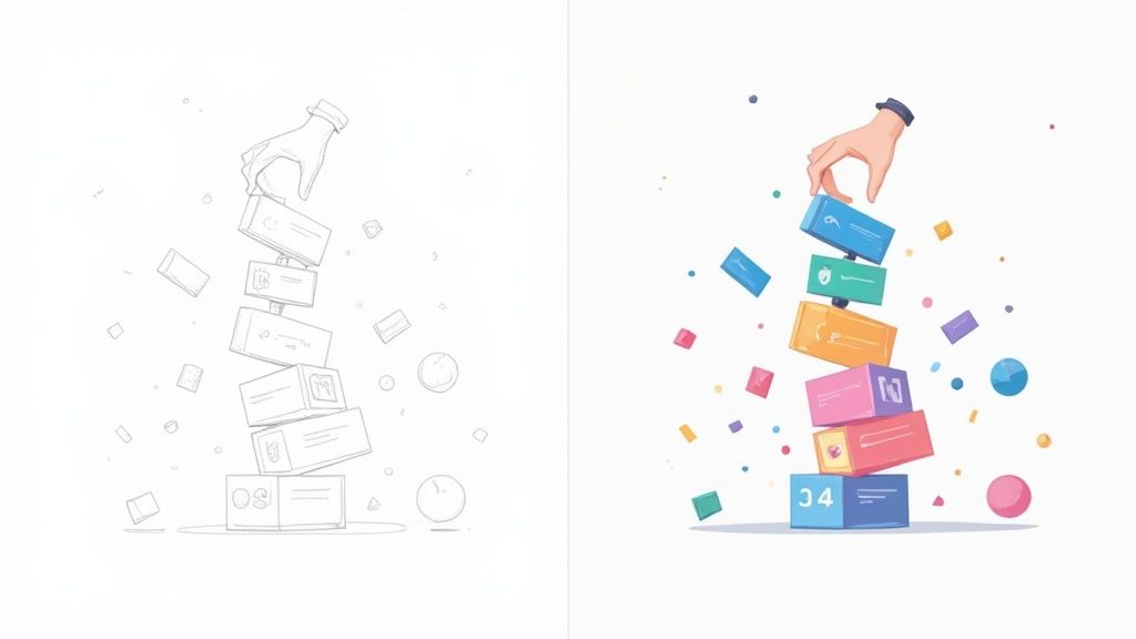
Think of card UI design as a way to tidy up a messy room. Instead of having information scattered everywhere, you group related items into neat, rectangular boxes. Each of these "cards" is a self-contained unit, holding just enough information—like a picture, a title, and maybe a button—to be useful on its own. It's a simple concept that makes websites and apps feel instantly more organized and scannable.
Why Cards Are Essential in Modern UI Design
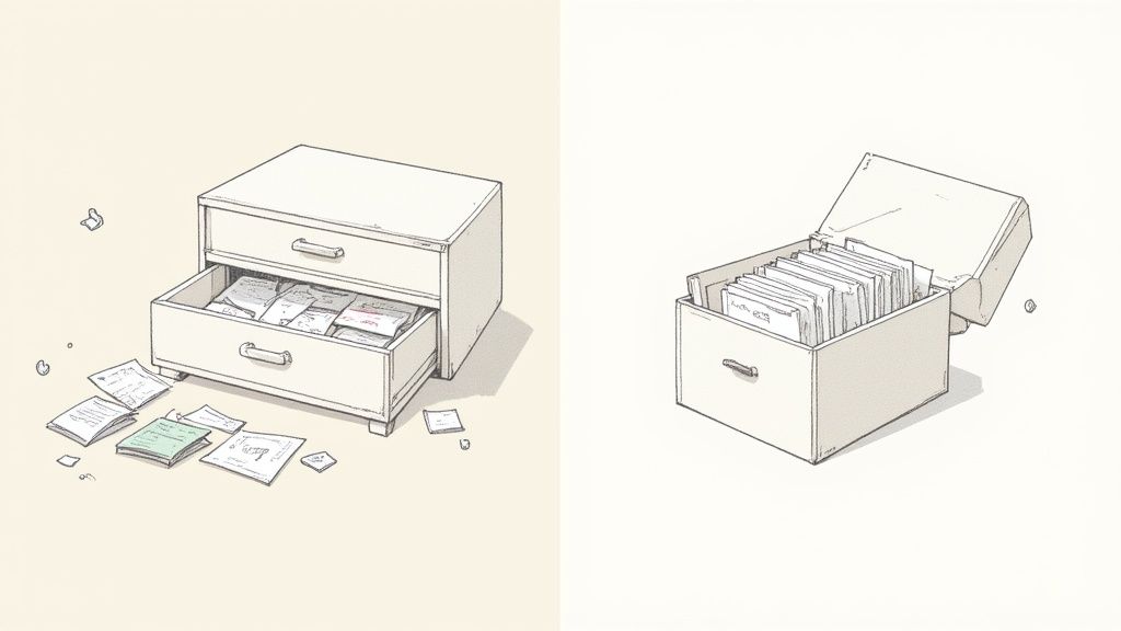
Imagine trying to find a specific recipe in a disorganized pile of papers versus flipping through a well-organized recipe box. That’s the exact difference cards UI design makes. It takes what could be a chaotic jumble of information and packages it into clean, bite-sized modules that people can understand at a glance.
Each card serves as a compact preview for something bigger. Take a look at any e-commerce site: the product card gives you a quick hit of the essentials—an image, name, and price—just enough to get you interested without hitting you with a wall of text. This modular, summary-first approach is the secret to its success.
Creating a Consistent User Experience
One of the biggest wins for card-based design is how gracefully it adapts to different screens. We all jump between our phones, tablets, and desktops, and cards ensure the experience feels familiar no matter the device.
A grid of cards that looks great on a big desktop monitor can neatly stack into a single, scrollable feed on a phone. Because the content inside each card is already grouped together contextually, that visual relationship stays intact. This natural responsiveness makes cards a go-to for building flexible, modern interfaces.
This consistency pays off in a few key ways:
- Reduces Cognitive Load: People don't have to relearn your interface when they switch devices. The pattern is predictable.
- Improves Scannability: The defined edges of each card guide the eye, letting users quickly hop from one item to the next.
- Enhances Usability: Each card is its own interactive world. Tapping it leads to one place, making navigation feel simple and direct.
A well-designed card is more than just a box for content; it's a doorway. It offers a quick summary and a clear next step for anyone who wants to dive deeper, making it one of the most powerful patterns in any designer's toolkit.
The Power of Modularity and Flexibility
The modular nature of cards is a game-changer for designers and developers. Think of them like LEGO bricks. You can rearrange them, stack them, and reuse them to build all sorts of layouts without having to start from scratch every time.
This makes them incredibly efficient, especially for sites with tons of content, like news feeds, social media platforms, or even project management tools like Trello. Once you establish that simple, repeatable card pattern, you have a foundation for an interface that’s not just visually clean but also easy to scale and maintain. It's an intuitive system that sets users up for success from the moment they land on the page.
The Anatomy of an Effective UI Card
To build a really great card, you have to know what it’s made of. Think of it like a chef understanding their ingredients—each component, from the container down to the call-to-action button, has a role to play. When you know how they work together, you can create designs that aren't just pretty but are genuinely useful.
Every piece has a job. When combined thoughtfully, they create an experience that feels intuitive and guides the user effortlessly. Let's break down the strategic purpose of each element in a successful cards ui design.
The Foundational Components
The most fundamental piece of any UI card is the container. This is the card's outer shell, the defined space that holds everything else together. It’s what tells the user, "Hey, all this stuff belongs together." Usually, a subtle shadow, a clean border, or a simple block of color is enough to lift it from the background and signal that the whole package is a single, clickable unit.
Inside that container, the media element is almost always the first thing that catches the eye. This could be a photo, a short video, or an illustration that gives you the gist of the content in a split second. Quality visuals are non-negotiable here; they communicate information way faster than text and make the whole card more inviting.
A well-structured UI card is a masterclass in information hierarchy. It tells a story at a glance, guiding the user’s eye from the most important visual cue to the final action, all within a few square inches of screen space.
Next up is typography. This is more than just throwing text on the card; it’s about styling it to create a clear visual path for the user's eye.
- Headline or Title: This is your bold, attention-grabbing statement. It tells the user what the card is about in just a few words.
- Supporting Text: This is the wingman to the headline. A short description or snippet that gives a little more context, like a product summary or the first line of an article.
- Metadata: These are the finer details—a date, an author's name, or category tags. They provide useful, secondary information without cluttering the main message.
By playing with font size, weight, and color, you create a natural flow, leading the user from the most critical info down to the nice-to-haves.
Driving Engagement with Interactive Elements
While the container and its content provide the what, interactive elements provide the what's next. These are the parts of the card that users can actually do something with—click, tap, or hover to make something happen. The most classic example is the call-to-action (CTA) button.
A good CTA is impossible to miss. It should pop with a contrasting color and use clear, direct language like "View Details" or "Add to Cart." There's no room for ambiguity; the user needs to know exactly what happens when they click. In some designs, the entire card is clickable, taking the user straight to a detail page. For more dynamic interactions, you can even explore animated components like those in the Magic UI's card components documentation.
Icons also play a huge part. They act as universal shortcuts for actions like "favorite," "share," or "comment," saving precious space and making the card easier to scan. Every interactive element needs a crystal-clear purpose to keep the user’s journey smooth and frustration-free.
To put it all together, here's a quick rundown of each component's role and how to get it right.
Anatomy of a UI Card Component
| Component | Primary Function | Design Best Practice |
|---|---|---|
| Container | To group related content and define a clickable area | Use subtle shadows or borders for depth and separation. |
| Media (Image) | To provide instant visual context and capture attention | Optimize images for fast loading without sacrificing quality. |
| Headline | To deliver the most critical information quickly | Keep it short, descriptive, and visually dominant. |
| Supporting Text | To offer additional details and context | Use a smaller font size and keep it to 1-2 concise lines. |
| CTA Button | To prompt a specific user action | Make it visually distinct with clear, action-oriented text. |
| Icons | To provide shortcuts for secondary actions | Use universally recognized symbols to ensure clarity. |
Mastering these individual elements is the first step toward designing cards that not only look fantastic but also perform brilliantly.
Core Principles of Great Card Design
What really separates a so-so card from a great one? It’s not about flashy animations or cramming in a ton of features. The magic is in how you apply a few simple, powerful principles.
Think of it this way: great card design is about turning a simple rectangle into a smart, intuitive tool that feels good to use. Get these fundamentals right, and your cards won’t just hold information—they’ll create a genuinely seamless experience for your users.
Embrace Modularity Like Building Blocks
The first and most important principle is modularity. Treat each card like a LEGO brick. It’s a self-contained unit with everything it needs to make sense on its own: an image, a title, a quick description, maybe a button.
This independence is what makes card UIs so incredibly flexible. Because every card is its own self-sufficient module, you can shuffle them around into different layouts without confusing the user. A three-column grid on a desktop can elegantly reflow into a single, scrollable column on a phone. That’s the kind of responsive design that feels completely natural, no matter the screen size.
Design for Effortless Scannability
Let's be real: nobody reads web pages word-for-word. We scan. A well-designed card leans into this behavior by creating a rock-solid visual hierarchy. The goal is simple: let users grab the most critical info in the blink of an eye.
You do this by giving different elements different "weights."
- Lead with an image: A strong visual is almost always the first thing the eye catches. It sets the scene instantly.
- Make the headline pop: The title should be the biggest, boldest piece of text. It tells the user exactly what the card is about.
- Quiet down the details: Things like dates, categories, or author names should be smaller and lighter. They’re there if you need them, but they don’t fight for attention.
This clear path guides the user's eye naturally from the big picture to the finer details.
Good scannability isn't just about making things look tidy. It's a sign of respect for your user's time. You’re acknowledging they’re busy and need to find what they're looking for, fast.
Maintain Unbreakable Consistency
Consistency is the unsung hero of user experience. When every card in your UI plays by the same rules, users only have to learn how to use them once. This predictability drastically reduces their cognitive load, which is just a fancy way of saying they don't have to waste brainpower figuring out your interface.
If a user understands one card, they should intuitively understand them all. This applies to everything—from where the title sits to what the buttons look like. This consistent design language builds trust and makes the whole app feel more polished and professional.
Master the Subtle Details
Beyond the big ideas, it's the little things that push a good design into the "great" category. These small touches often work on a subconscious level, shaping how users perceive the quality and polish of your interface.
One of the most powerful—and most often ignored—details is whitespace. Giving your content room to breathe is crucial. Good spacing prevents a card from feeling cluttered and overwhelming, and it quietly reinforces the visual hierarchy by separating different bits of information.
Another key detail is the use of shadows. A soft, subtle shadow can lift a card off the background, giving it a sense of depth and making it feel like a real object. This isn't just decoration; it clearly defines the card's edges and signals that it’s a distinct, interactive element. It makes the whole thing feel more tangible and clickable, practically begging to be tapped.
Common Cards UI Layout Patterns
Once you've nailed the design of a single card, the next big question is: how do you arrange a whole bunch of them? The layout pattern you pick for your cards UI design is a huge deal. It fundamentally shapes how people browse and interact with your content.
Think of it like this: you can have a neatly organized bookshelf or a chaotic pile of books. Both hold the same information, but one is a whole lot easier to navigate.
Choosing the right layout isn't just about making things look pretty—it's a strategic move. Each pattern serves a different purpose, whether it's for rapid scanning, reading in order, or just visual discovery. Getting a handle on these common arrangements is the key to building an interface that just feels right.
This concept map breaks down the core principles that hold up any good card layout: Modularity, Scannability, and Consistency.
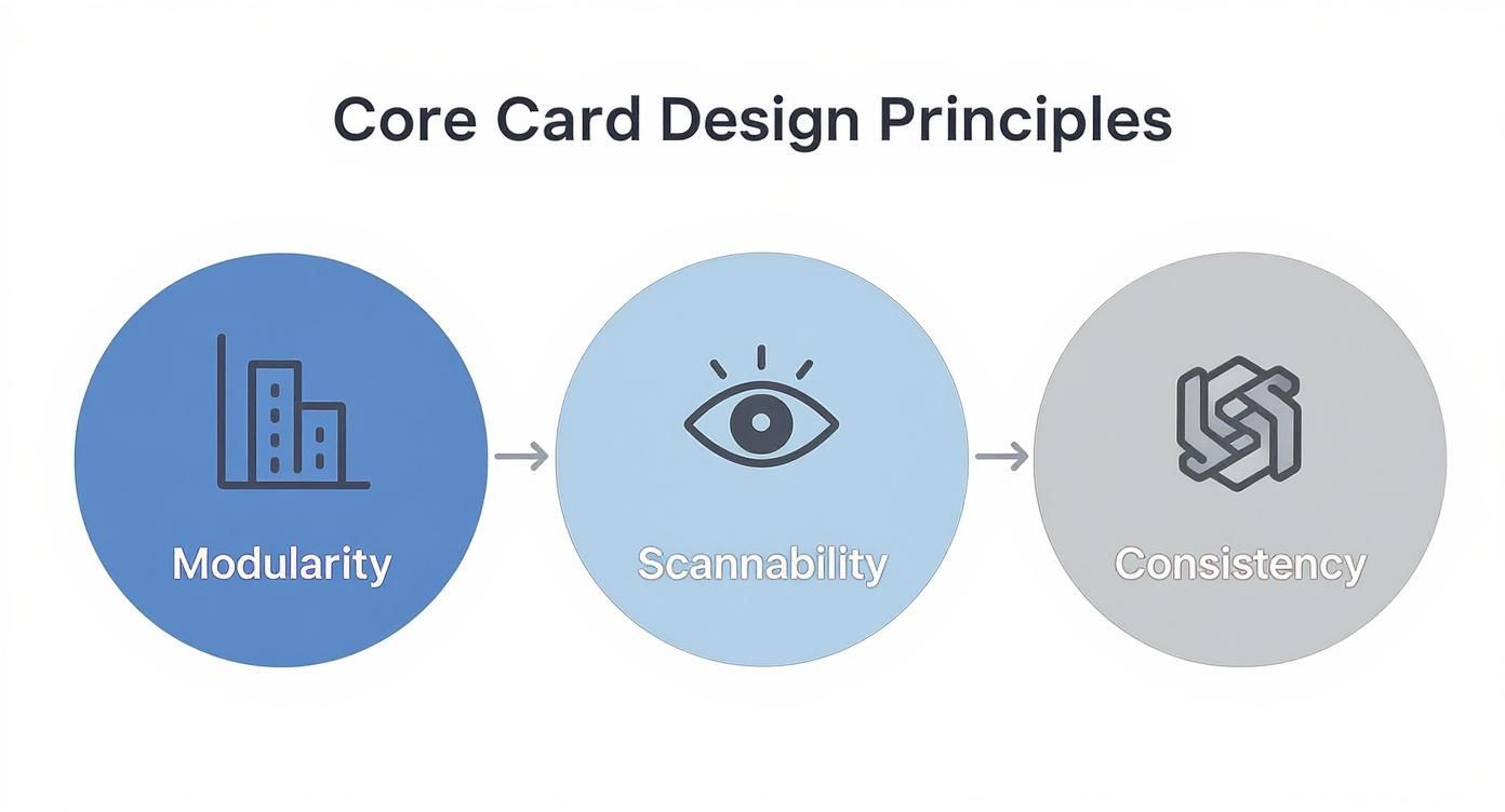
It’s a good reminder that no matter which pattern you choose, these three pillars are non-negotiable for a clear and effective user experience.
The Classic Grid Layout
The grid is probably the layout you see the most. It arranges cards in a clean, symmetrical pattern of rows and columns, a lot like a photo gallery. This structure is perfect when the visuals are the star of the show.
You see it on e-commerce sites, portfolio pages, and video streaming services all the time. A grid lets users scan a ton of items quickly, comparing them visually at a glance. Because every card is the same size, the layout feels predictable and orderly, which cuts down on cognitive load and makes browsing feel effortless. The grid is the undisputed champ when discoverability and visual comparison are top priorities.
The Sequential List Layout
Where the grid is all about visual browsing, the list layout is built for sequential consumption. This pattern stacks cards vertically, one after another, creating a clear top-to-bottom reading path. It’s the go-to choice for content that has a chronological or narrative flow.
This pattern is everywhere—from news feeds and email inboxes to your favorite task manager. A list layout naturally encourages users to process one item at a time before moving on to the next. For content that’s mostly text-based or needs to be understood in a specific order, the list provides a focused, linear experience that a grid just can't deliver. If you want to dive deeper into how this works in practice, our guide on the MUI Card component has some great examples.
The layout isn't just a container for your cards; it tells a story about how your content should be consumed. A grid invites exploration, while a list provides a clear path.
The Dynamic Masonry Layout
So, what happens when your cards aren't all the same height? Enter the masonry layout, made famous by Pinterest. It arranges cards in a multi-column grid but staggers them vertically, killing all that awkward empty space and creating a tightly packed, "brick-like" wall of content.
This pattern is fantastic for showcasing a diverse collection of items with different dimensions, without having to crop images or force everything into a uniform box. The result is a dynamic, visually engaging experience that just begs you to keep scrolling and discovering what's next.
- When to Use Grid: Perfect for uniform, visually-driven content like product listings or photo galleries.
- When to Use List: Best for sequential content that needs to be read in order, such as articles or notifications.
- When to Use Masonry: Ideal for visually eclectic content of varying heights, promoting discovery and exploration.
By carefully picking the layout that actually fits your content and what your users are trying to do, you can dramatically improve the usability and overall feel of your interface.
How to Design Accessible and Inclusive Cards
Great design is more than just good looks; it's about making sure everyone can actually use what you've built. When it comes to cards ui design, accessibility isn't some extra feature you tack on at the end. It's baked into the very foundation of a solid, user-friendly experience.
Thinking about inclusivity from the get-go doesn't just check a box for users with disabilities—it almost always leads to a better, more intuitive design for every single person. It’s about making your cards functional for someone using a screen reader, navigating with a keyboard, or dealing with visual impairments. If we nail a few key areas, we can build cards that are truly effective for everyone.
The Foundation: Semantic HTML
Long before a user ever lays eyes on your card, their browser and assistive tech need to understand what they're looking at. This is where semantic HTML becomes your best friend. Using the right tags for the right content gives tools like screen readers a clear map to follow.
Don't just wrap everything in a generic <div>. Instead, use meaningful elements like <article> for the card container, an <h2> for its title, and <p> for the description. Think of it as labeling the rooms in a house. Without labels, a screen reader is completely lost. With them, it can confidently announce, "Here's a heading," or "This is a paragraph," giving users the context they need to get around efficiently.
Visual Clarity and Color Contrast
One of the quickest ways to lose a user is to make your content hard to read. That's why the Web Content Accessibility Guidelines (WCAG) set crystal-clear standards for color contrast, especially for users with low vision.
According to WCAG 2.1, the contrast ratio between your text and its background needs to be at least 4.5:1 for normal text and 3:1 for large text. This isn't just a friendly suggestion; it's the baseline for creating a legible interface.
You can easily use an online contrast checker to test your color pairings. Pay close attention to text layered over images and the colors you use for buttons. Getting this right is a simple step that makes a world of difference in usability.
Making Images Meaningful
Images on your cards often carry important information, but for someone using a screen reader, they might as well be invisible—unless you provide alternative text (alt text). Good alt text describes the content and purpose of an image, making sure nobody misses out on crucial context.
Just follow these simple rules:
- Be descriptive, but brief: Say what's in the image without writing a novel. For a product card, "White running shoe with blue accents" is way better than just "shoe."
- Explain the function: If an image is also a link, the alt text should tell the user where it goes. Something like, "Read more about our summer sale."
- Mark decorative images correctly: If an image is purely for looks and adds zero new information, use an empty alt attribute (
alt=""). This tells screen readers they can safely skip it.
Keyboard-Friendly Navigation
Remember, not everyone uses a mouse. Plenty of people rely on a keyboard or other input devices to get around. This means your cards have to be fully usable without a pointer, and every interactive element needs to be reachable with the Tab key.
Make sure the focus order is logical. As a user hits Tab, the focus should move through the card’s interactive bits—buttons, links, icons—in a way that makes sense. It's also vital to have a clear and visible focus indicator (like a distinct outline) so users always know exactly where they are on the page.
Learning from the Best in the Business
Theory is great, but seeing how the pros put it into practice is where the real learning happens. When you start dissecting how top-tier companies use card UI, you can see the principles of scannability, modularity, and consistency come alive to create experiences that just feel right.
Let's take a look under the hood at how giants like Airbnb, Spotify, and Trello have absolutely mastered the art of the card. These platforms couldn't be more different, yet they all lean heavily on cards to make complex information simple and inviting. Each one offers a masterclass in tailoring design to fit specific user goals.
Airbnb: The Art of the Tease to Drive Bookings
Airbnb's entire business model hinges on getting you to click that "Book" button. Their listing cards are precision-engineered for exactly that purpose. They are a brilliant exercise in information hierarchy, boiling down an entire property into a bite-sized, scannable preview.
Your eyes are immediately drawn to a carousel of gorgeous images—the quickest way to communicate the vibe of a place. All the essential info is right there: location, rating, dates, and price, presented with clean typography and just enough breathing room to make comparing listings a breeze. Notice the only secondary action is a simple "heart" icon. That's intentional. It keeps the focus squarely on the main prize: clicking through to see more.
Airbnb’s cards don't overwhelm you with details. They give you just enough to pique your curiosity and earn the click. It’s a powerful lesson that great card design is as much about what you leave out as what you put in.
Spotify: A Visual Feast for Music Discovery
Spotify wants you to get lost in a world of new music, and their cards are built to be as browsable as a vintage record store. Whether you're looking at an album, a playlist, or a podcast, each card uses striking cover art as the main hook.
This visual-first approach transforms music discovery from a chore into an engaging, almost tangible experience. The text is kept to a minimum—just a title and artist—because the artwork is doing all the heavy lifting. Spotify's cards are a perfect reminder that when your content is inherently visual, you need to let it be the star of the show.
This same principle of concise, visual-first content applies to social media cards, too. A well-designed Tweet card, for example, makes content instantly digestible and shareable. You can see how we build one in our guide for the Tweet Card component.
Trello: Pure Function for Peak Productivity
Over at Trello, cards are the very heart of their project management tool. Here, design choices prioritize function over flair, and for good reason. Each card is a task, stripped down to its functional core—a title, labels, and small icons indicating attachments or comments.
There’s no aspirational imagery like on Airbnb or Spotify. These cards are workhorses. Their genius is in their dead-simple flexibility. You can drag and drop them between lists, giving you a satisfying, tactile way to update a project's status. It makes managing even the most complex workflows feel surprisingly intuitive.
Being able to design functional, elegant solutions like these is a key skill. If you want to show off your UI design chops, think about creating a compelling UX portfolio that showcases how you solve these kinds of real-world problems.
Frequently Asked Questions
When you're deep in the weeds of card UI design, the same practical questions tend to surface again and again. Getting these right can be the difference between a clunky interface and a smooth, intuitive one.
How Many Actions Should a Card Have?
The golden rule here is simple: less is more.
Ideally, a card should feature one clear, primary action. At most, you might add one or two secondary actions, but tread carefully. Piling on too many buttons or clickable areas creates decision paralysis for the user, making your interface feel cluttered and confusing.
A great example is a product card. It might have a bold "View Details" button as the main call-to-action, with a much smaller "Save to Wishlist" icon tucked away. This creates a natural hierarchy, guiding the user to the most important next step without overwhelming them.
Remember, a card's main job is to be a concise summary—a gateway to more detailed content. Overloading it with interactive elements completely undermines its purpose.
What Is the Difference Between a Card and a Tile?
It's easy to mix these up since they're both container-based elements, but their complexity and purpose are quite different.
- Tiles are the simpler of the two. Think of them as just an image with maybe a bit of text on top. They're straightforward navigation links, like the movie posters you see on a streaming service's home screen.
- Cards, on the other hand, pack more of a punch. They contain a mix of content like a title, descriptive text, metadata, and often multiple actions. They give you a much richer summary of what's inside.
Here's an easy way to think about it: a tile is a signpost, while a card is a detailed brochure. Both point you somewhere, but a card gives you way more information upfront to help you decide if you even want to go.
Why Are Cards So Popular in Mobile Design?
The explosion of card-based layouts goes hand-in-hand with the rise of mobile. There's a good reason for that.
Cards are incredibly effective on smaller screens because they break down complex information into digestible, self-contained chunks. This modular approach is a lifesaver for usability, simplifying navigation and perfectly supporting the quick-scan behavior we all adopt on our phones. Extensive UX research backs this up, showing it's one of the most effective patterns out there. If you want to dive deeper, check out these key mobile app design trends.
Their sheer adaptability and clarity have made them an essential part of any modern designer's toolkit for crafting efficient, user-friendly mobile experiences.
Ready to build beautiful, animated interfaces without the usual grind? Magic UI offers a library of 150+ free, open-source components, plus powerful Pro templates to create stunning landing pages in minutes.