
When you see a CSS animation on scroll, you're watching an element come to life right as it enters your screen. The secret sauce behind this magic is usually the browser's Intersection Observer API. It’s a clean, efficient way to watch for an element becoming visible and then slap on a CSS class to kick off the animation. This modern method blows older, script-heavy techniques out of the water in terms of performance.
Why Scroll Animations Matter
Let's be honest, most web pages are static and, frankly, a bit boring. Dynamic elements aren't just a nice-to-have anymore; they're essential for grabbing and holding a visitor's attention. A flat wall of text just doesn't cut it. This is where you can really make an impact with scroll-triggered animations, turning a simple browse into a more engaging experience.
By animating elements as someone scrolls, you’re essentially telling a story. You guide their eyes, reveal information piece by piece, and highlight the most important parts of your message. It's about creating a narrative flow that pulls them deeper into your content instead of overwhelming them with everything at once.
The Modern Approach to Scroll Effects
Not too long ago, the only way to do this was with JavaScript event listeners that were constantly checking where everything was on the page. This was a nightmare for performance, often leading to choppy scrolling and a sluggish feel. Thankfully, things have changed for the better. We now have the Intersection Observer API.
This native browser tool is a game-changer. It's built specifically to trigger events when an element enters or leaves the screen, and it does so with incredible precision and minimal performance cost. When you combine this with a library like Magic UI Pro, which gives you ready-to-go animated components, you can build these experiences in a fraction of the time.
The real win is combining the performance of the Intersection Observer with the elegance of pure CSS transitions and animations. This pairing creates stunning visual effects without compromising on speed—a critical factor for both user retention and modern SEO standards.
The numbers back this up, too. Recent data from 2024-2025 shows that sites with smart scroll animations see a 37% boost in user engagement and 23% longer average session durations compared to their static counterparts. You can dive deeper into the data and explore modern scroll animation solutions to get the full picture.
This infographic gives you a great visual of how different elements can animate into view as a user scrolls down a page.
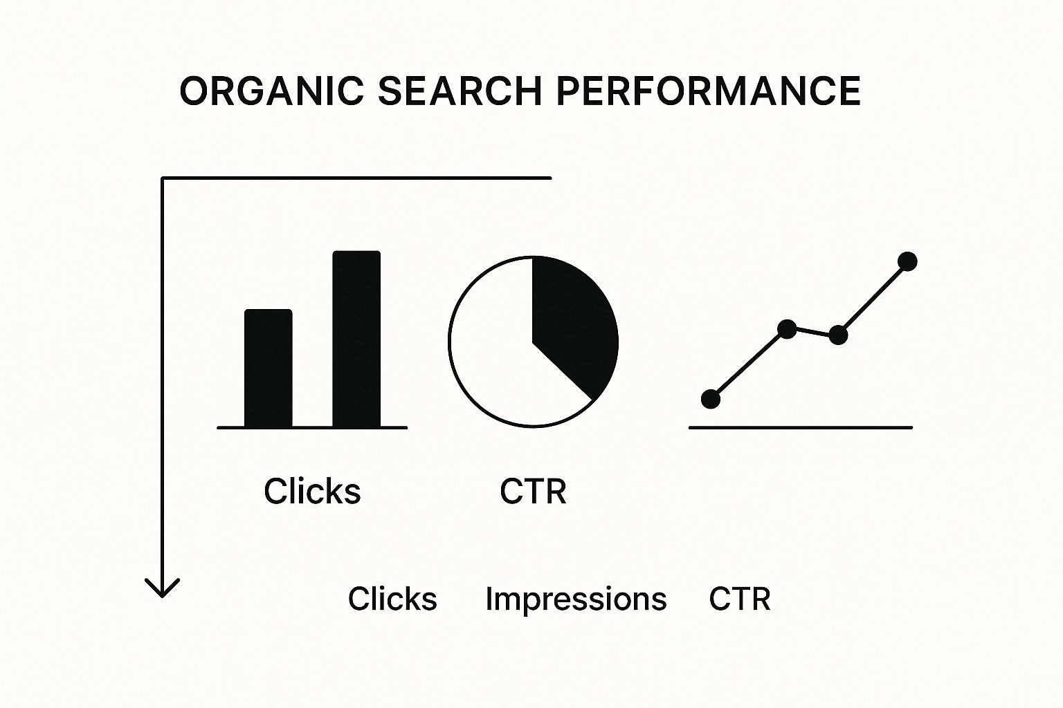
You can see how staggering animations for text, images, and cards creates a much more dynamic and guided experience for the user. It just feels more intentional.
Animation Trigger Method Comparison
Here’s a quick look at how the modern Intersection Observer API stacks up against older methods for triggering animations on scroll.
| Method | Performance Impact | Ease of Use | Best For |
|---|---|---|---|
| Intersection Observer API | Low. The browser handles all the heavy lifting, firing events only when needed. | Moderate. Requires some JavaScript setup, but the logic is straightforward. | Modern, performant websites where a smooth user experience is critical. |
onscroll Event Listener | High. Fires constantly as the user scrolls, leading to jank and performance issues. | Easy. Simple to implement but comes with major performance drawbacks. | Simple prototypes or very limited-use cases where performance isn't a concern. |
getBoundingClientRect() | High. When used with a scroll listener, it forces frequent reflows, hurting performance. | Complex. Requires manual calculations to track element positions. | Legacy projects or specific scenarios where you need precise element coordinates. |
As you can see, the Intersection Observer is the clear winner for any modern web project. It delivers the smooth, high-quality experience users expect without bogging down the browser.
Building Your React Animation Environment
Before we dive into making elements fly across the screen, we need to lay a solid foundation. Getting your development environment set up correctly from the start is a non-negotiable step. It not only gets you coding faster but also saves you from major headaches down the road.
We’ll be using Vite to get our React app off the ground. If you haven't used it before, you're in for a treat. Its dev server is ridiculously fast because it serves native ES modules, meaning your changes show up in the browser almost instantly. No more waiting for a slow bundler.
Pop open your terminal and run this command to scaffold a new project:
This command creates a fresh React project in a new folder called my-animation-app. Once that’s finished, jump into the new directory (cd my-animation-app) and run npm install to get all the initial packages sorted.
Installing the Right Tools for the Job
With the basic React boilerplate ready, it's time to bring in the libraries that will handle the animation magic.
We'll need two key packages:
- Framer Motion: This is a fantastic, production-ready library for React. It makes crafting complex animations and gestures feel almost effortless with a clean, declarative API.
- Magic UI Pro: This is our secret weapon. It’s a library packed with beautifully designed, pre-animated components that let us build incredible UIs without having to design every little detail from scratch.
Let's install them both with a single command in your project's terminal:
Selecting the right tools is a critical decision. This combination of Framer Motion and Magic UI Pro gives us the best of both worlds—fine-grained control when we need it and high-level, ready-to-use components to speed things up. If you're curious about other options, we've broken down the pros and cons in our guide to the best React animation libraries.
Structuring Your Project for Success
A little organization now pays off big time later. Inside your src directory, go ahead and create a components folder. This is where we’ll keep all our reusable UI pieces. I also like to create a hooks folder for custom React hooks—we'll actually build one for scroll detection later in this guide.
A well-structured project isn't just about being neat; it's a practical necessity for maintainability. Knowing exactly where to find components, styles, and logic makes building, debugging, and scaling so much smoother.
To wrap up our setup, let's create a simple Layout.jsx file inside src/components. This component will act as the main container for our pages, giving us a consistent and predictable structure. Think of it as the canvas where we’ll start painting our animated experiences.
Implementing Your First Scroll-Triggered Animation
Alright, let's move from theory to practice. The best way to really get a feel for how a CSS animation on scroll works is to build one from scratch. We’re going to create our own custom React hook that neatly bundles all the logic for figuring out when an element has scrolled into view.
This hook is going to use the browser's native Intersection Observer API, which is a game-changer for performance. The result? A super-efficient, reusable tool for triggering animations anywhere in our app.
Crafting a Reusable Visibility Hook
The idea here is simple: write the logic once, use it everywhere. A custom hook is the perfect pattern for this in React. We’ll call our hook useOnScreen, and it will take a ref pointing to a DOM element and tell us whether that element is currently visible.
To pull this off, we'll lean on two of React's most fundamental hooks:
useState: This will hold our simple boolean state,isVisible.useEffect: This is where we'll set up and tear down the Intersection Observer. It’s the perfect place for side effects like this.
Inside the useEffect hook, we'll create a new observer and tell it to watch our target element. As soon as the element enters the viewport, the observer's callback fires, and we'll flip our isVisible state to true. That’s it.
// src/hooks/useOnScreen.js
import { useEffect, useRef, useState } from "react"
export const useOnScreen = (options) => {
const ref = useRef(null)
const [isVisible, setIsVisible] = useState(false)
useEffect(() => {
const observer = new IntersectionObserver(([entry]) => {
// Update our state when the element is intersecting
if (entry.isIntersecting) {
setIsVisible(true)
// We can unobserve after it's visible to prevent re-triggering
observer.unobserve(entry.target)
}
}, options)
const currentElement = ref.current
if (currentElement) {
observer.observe(currentElement)
}
// Cleanup function to unobserve the element
return () => {
if (currentElement) {
observer.unobserve(currentElement)
}
}
}, [ref, options])
return [ref, isVisible]
}This little hook is now the powerhouse for every scroll-triggered animation we want to build. It's clean, efficient, and keeps all the tricky observer logic tucked away.
Defining the Animation with CSS
Now that we have the JavaScript to detect when to animate, we need some CSS to define how it animates. A simple fade-in and slide-up effect is a classic for a reason—it’s subtle but makes a huge difference.
Jump into your main CSS file and define the two states for the element: its starting (hidden) state and its final (visible) state.
.fade-in-section {
opacity: 0;
transform: translateY(20px);
transition:
opacity 0.6s ease-out,
transform 0.6s ease-out;
}
.fade-in-section.is-visible {
opacity: 1;
transform: translateY(0);
}The fade-in-section class sets our element to be completely transparent and shifted down by 20 pixels. When we add the is-visible class, the transition property kicks in, smoothly animating the element to full opacity and back to its original position.
If you're looking to create more dynamic effects that respond directly to the speed and direction of the scroll, you might want to explore scroll-based velocity animations for more advanced techniques.
Putting It All Together
Okay, time to connect the dots. We’ll apply our useOnScreen hook and our new CSS classes to a React component. The best way to do this is to create a wrapper component, let's call it AnimatedSection, that can house any content we want to animate.
// src/components/AnimatedSection.jsx
import React from "react"
import { useOnScreen } from "../hooks/useOnScreen"
const AnimatedSection = ({ children }) => {
const [ref, isVisible] = useOnScreen({ threshold: 0.1 })
return (
<section
ref={ref}
className={`fade-in-section ${isVisible ? "is-visible" : ""}`}
>
{children}
</section>
)
}
export default AnimatedSectionWith this reusable component, animating any part of your page becomes incredibly simple. You just wrap it. This approach keeps your code clean by separating the animation logic from a component's main job, which makes your project much easier to work on down the road.
Now, you can take any text, image, or custom component and wrap it in <AnimatedSection> to bring it to life as the user scrolls down the page. You’ve just successfully built a performant and reusable CSS animation on scroll.
Speed Up Your Workflow with Magic UI Pro
Rolling your own custom animation hook is a great learning experience. You really get under the hood of how CSS animation on scroll works. But let's be realistic—on a real-world project, time is money. This is exactly where a good component library like Magic UI Pro becomes an absolute game-changer.
Instead of reinventing the wheel and writing animation logic from scratch for every single element, you can pull in pre-built, production-ready components. They already have the animations baked right in, which means you can get back to what matters: building out the actual features of your app.

Dropping in Pre-Animated Components
Magic UI Pro has a ton of components that you can integrate in minutes. Let's look at a couple of my favorites to see how easy it is to add some visual flair to your project. The best part is that they’re designed to be customized through props, so you get all the control without the headache.
- AnimatedGridPattern: This is a killer component for creating dynamic backgrounds that catch the eye. You can tweak the number of squares, how fast they animate, and their size with a few simple props. It’s an instant way to add a layer of polish.
- ShimmerButton: A plain old button is boring. The
ShimmerButtonadds this slick, subtle shimmer effect on hover that naturally draws the user’s eye to your most important calls-to-action without being obnoxious.
When you use components like these, you're shifting to a more declarative way of thinking. You just tell the app what you want the UI to do, and the library handles all the messy implementation details, including the Intersection Observer logic.
Let's Build a Feature Section in Minutes
Alright, let's put this into practice. We're going to pull together a few Magic UI Pro components to create a complex and visually interesting feature section. This little exercise will show you just how fast you can build something that would normally take hours to code and animate by hand.
Picture a typical "features" section on a landing page, highlighting three key benefits of a product. Here's how we can structure it:
- First, we'll lay down an
AnimatedGridPatternfor the background to give it some subtle, engaging movement. - Next, we'll grab a
BlurIncomponent for the main headline. This will make the text elegantly fade and sharpen into view as it scrolls onto the screen. - Finally, we'll wrap each of the three feature descriptions in its own
ShinyCardcomponent. We can even use the built-in delay props to stagger their entrance, creating a slick, choreographed reveal.
Here’s a quick look at what the code might look like. Notice how readable and straightforward it is:
import AnimatedGridPattern from "@/components/magicui/animated-grid-pattern"
import BlurIn from "@/components/magicui/blur-in"
import ShinyCard from "@/components/magicui/shiny-card"
const FeatureSection = () => {
return (
<div className="bg-background relative flex h-full w-full items-center justify-center overflow-hidden rounded-lg border p-20 md:shadow-xl">
<BlurIn
word="Stunning Features, Effortlessly"
className="text-4xl font-bold text-black dark:text-white"
/>
<div className="mt-8 flex gap-4">
<ShinyCard>Feature One</ShinyCard>
<ShinyCard>Feature Two</ShinyCard>
<ShinyCard>Feature Three</ShinyCard>
</div>
<AnimatedGridPattern
numSquares={30}
maxOpacity={0.5}
duration={3}
repeatDelay={1}
className="[mask-image:radial-gradient(ellipse_at_center,white,transparent_70%)]"
/>
</div>
)
}The real magic of a component library is its composability. You're not just using individual components; you're combining simple, pre-animated building blocks to construct complex and polished interfaces with a fraction of the effort.
This approach doesn't just make you a faster developer. It also helps you maintain a consistent, high-quality user experience across your entire application.
Avoiding Common Performance Pitfalls
A great CSS animation on scroll should feel completely fluid, not clunky or slow. Getting that smooth, jank-free experience really comes down to being deliberate about performance from the very start. The single biggest impact you can have is choosing which CSS properties you decide to animate.
I always tell developers to stick to animating transform and opacity. Why? Because these properties are handled by the browser's compositor thread. In simple terms, this means they don't force the browser to do a bunch of heavy lifting by recalculating the page layout. Try to animate things like width, height, or margin, and you'll see the difference—the browser has to repaint and reflow the whole document, which is what causes that stuttering and poor user experience.
Fine-Tuning Animation Triggers
The Intersection Observer is incredibly efficient right out of the box, but its default settings aren't always a one-size-fits-all solution. You can really dial in the timing of your animations by tweaking its configuration options.
-
threshold: This is your go-to for controlling when the animation fires. It takes a number between 0 and 1. A value of 0.1 will kick things off when just 10% of the element is visible. If you want to wait until it's fully in view, you’d use 1.0. I find that playing with this value is where you find the magic timing for your design. -
rootMargin: Think of this as an invisible buffer around your viewport. It uses a CSS-like string (e.g.,"100px 0px -50px 0px") to grow or shrink the area where intersections are detected. For example, a negative bottom margin can trigger an animation just before an element actually scrolls into view, creating a really nice, proactive effect.
As you're building these experiences, remember that overall site performance is key. It's a huge factor for user experience and search rankings, so it's worth learning how to improve website speed and boost SEO.
Balancing Aesthetics with User Experience
It’s tempting to animate everything that moves. I've been there. But over-animating a page often does more harm than good, creating "animation clutter" that just overwhelms people. It can also tank performance, especially on less powerful devices.
One of the most common mistakes I see is developers forgetting to unobserve elements after they've animated. If an element only needs to animate in once, keeping the observer attached is a needless drain on resources. Always build cleanup logic into your Intersection Observer to unobserve the target once its job is done.
Accessibility is another huge piece of the puzzle. Some people have vestibular disorders or sensitivity to motion, making excessive animations disorienting or even nauseating. You should always respect the prefers-reduced-motion media query in your CSS to tone down or disable animations for those users.
When you get this right, the payoff is huge. Industry data actually shows that well-implemented animations can cut bounce rates by up to 20% by making complex information easier to digest and keeping users engaged. For a deeper dive into optimization, check out our guide on how to improve website performance.
Answering Your CSS Animation on Scroll Questions
Even when you have a solid guide, questions are bound to come up. Let's dive into some of the most common things people ask about creating scroll-triggered animations. I'll walk you through the practical answers to help clear up any confusion.
How Does Intersection Observer Actually Help Performance?
You might have heard of older methods that used JavaScript's scroll event listener. The problem with that approach is that it fires constantly while the user scrolls, triggering your animation logic over and over again. This can really clog up the browser's main thread and lead to that frustrating, choppy scrolling effect we all hate, often called "jank."
Think of it this way: the scroll event is like an alarm that blares non-stop, while the Intersection Observer API is a silent, motion-activated sensor. It's a built-in browser feature that only wakes up and runs your code at the exact moment an element enters or leaves the screen. This asynchronous approach means no more constant, expensive calculations, which keeps your site feeling smooth and responsive.
Are CSS Scroll Animations Bad For SEO?
This is a big one, and the short answer is no—as long as you do it right. In fact, they can actually help by improving user engagement, which is a signal search engines pay attention to.
The golden rule here is to make sure all your content exists in the HTML from the very beginning. Even if an element is visually hidden with opacity: 0 or moved off-screen with a transform, search engine crawlers can still read it because they primarily parse the Document Object Model (DOM), not what's visually rendered on the screen.
SEO issues only crop up when animations are poorly implemented. For example, if they significantly slow down your page load time (hurting Core Web Vitals like Largest Contentful Paint) or if you're loading important content with JavaScript after the initial page render.
Stick to performant CSS properties and ensure your content is in the initial markup. You'll get the best of both worlds: a dynamic user experience and a website that search engines can easily understand.
Can I Use These Animation Techniques Without React?
Absolutely. The magic behind all of this is the Intersection Observer API, which is a native browser feature. That means it works flawlessly with vanilla JavaScript or any other framework you prefer, whether it's Vue, Svelte, or Angular.
The core logic is the same no matter what tools you're using:
- First, you select the element you want to animate.
- Then, you create an observer to watch it.
- Finally, you write a callback function that adds a CSS class when the element scrolls into view.
The custom React hook we built earlier is just a clean way to package this logic for reuse within the React ecosystem. You can easily adapt the same concept to manipulate the DOM directly or build it into the lifecycle hooks of another framework. The fundamental technique is universal.
Ready to build stunning, high-performance web experiences without the hassle? Magic UI offers over 150 free and premium components to help you create beautiful landing pages in minutes. Explore our components today and see how easy it can be.