
A CSS loading animation is a simple visual cue that lets your users know that content is on its way. It stops them from thinking the page is broken or frozen, turning a potential moment of frustration into a smooth part of the user experience. Best of all, they're built with pure CSS, which means they are incredibly lightweight and fast.
Why CSS Loading Animations Are Not Just Decoration
Let's be honest, nobody likes waiting. When a page needs a moment to load, that blank white screen can feel like an eternity. A simple CSS loading animation, however, transforms that wait from a frustrating pause into a seamless, professional experience. These small visual cues are a game-changer for user experience.
They work by tapping into the psychology of perceived performance. By providing immediate visual feedback, you reassure the user that the system is working. This simple act of communication keeps them engaged and dramatically reduces the chance they'll get impatient and bounce.
The Impact Of Visual Feedback
User expectations for website speed have skyrocketed. We all know it from our own experience, but the data backs it up: 53% of mobile users will abandon a site if it takes longer than three seconds to load. This makes visual feedback during those unavoidable delays absolutely critical.
In fact, websites that use CSS loaders can see a 20-30% reduction in bounce rates compared to those that just show a blank screen.
This bar chart visualizes the stark reality of user patience during loading times.
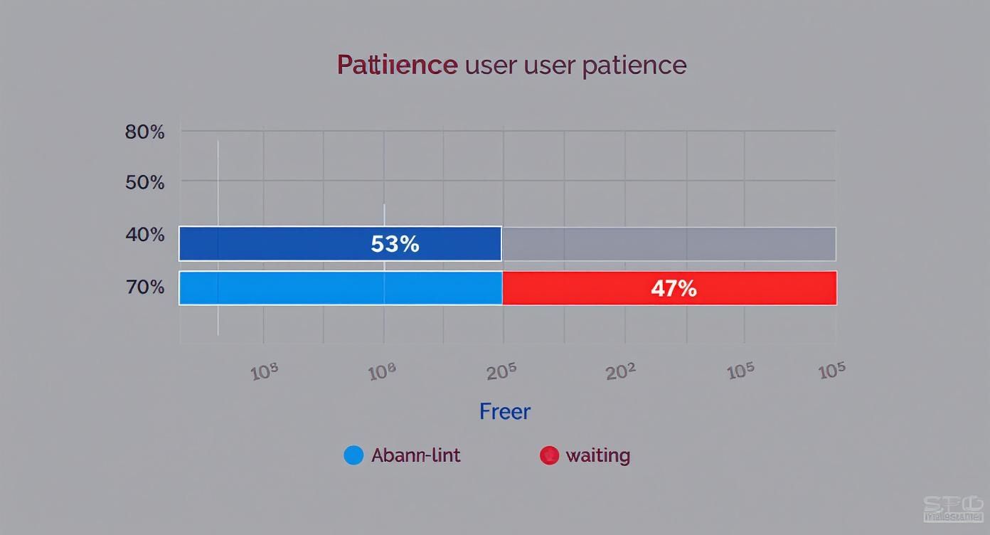
The data is pretty clear. Over half your potential audience might leave before your content even appears if you don't give them a reason to stick around. A simple spinner can be that reason.
How Loading Animations Impact User Behavior
Here's a quick look at key metrics showing how CSS loading animations positively affect user behavior and website performance.
| Metric | Without Animation | With CSS Animation |
|---|---|---|
| User Patience | Low; users often assume the site is broken | High; users understand content is loading |
| Bounce Rate | Significantly higher (up to 53% on mobile) | Reduced by an average of 20-30% |
| Perceived Speed | Site feels slow and unresponsive | Site feels faster and more professional |
| Engagement | Low; high abandonment rate | Higher; users are more likely to wait |
As you can see, the simple addition of a CSS loader does more than just fill dead air—it actively improves core website metrics and user perception.
Why Pure CSS Is The Smart Choice
So, why not just use a JavaScript library or a GIF? The answer comes down to one thing: performance. You don't want your loading solution to become a performance problem itself, and pure CSS is the most lightweight option available.
Here’s why it stands out:
- No External Dependencies: Pure CSS animations are completely self-contained. You don’t need to fetch heavy JavaScript libraries that can slow down the initial page render.
- Hardware Acceleration: Modern browsers are smart. They can offload animation calculations for properties like
transformandopacitydirectly to the GPU. This gives you incredibly smooth, jank-free motion that doesn’t tax the main CPU thread. - Easy Customization: Need to tweak colors, speed, or size? It’s as simple as changing a few CSS variables. This makes them ridiculously easy to adapt to any brand aesthetic.
Think of a CSS animation as the first handshake your website offers. It sets the tone, communicates competence, and assures the user they’re in the right place. A blank screen, in contrast, is like an unanswered doorbell.
To truly grasp the value beyond mere aesthetics, considering the essential role of motion graphics in business can provide a wider perspective on how dynamic visuals drive engagement. Ultimately, implementing a CSS loader is the first practical step toward building a user-centric and performant site.
Alright, let's roll up our sleeves and build the most classic CSS loading animation out there: the spinner. This is a foundational skill you'll come back to time and time again, and the best part is it only takes a single <div> and a bit of clever CSS.
We're going to break down the entire process, piece by piece. The goal isn't just to hand you some code to copy. It's to help you really understand why each line works—from turning a square div into a perfect circle to making it spin with a smooth, infinite loop. Once you nail these concepts, you'll be able to cook up all sorts of variations on your own.

Setting the Stage with HTML
The beauty of this spinner is its simplicity. Seriously, all you need is one div element in your component. We'll pop a className on it so we can hook into it with our styles.
That's it. This is all the markup you need:
Keeping the HTML this lean is great practice. It keeps your DOM clean and lets the CSS do all the heavy lifting.
Crafting the Spinner with CSS
Now for the fun part—let's make this thing look like a spinner. First up, we need to create the basic shape. We’ll give it a fixed width and height, then use border-radius to curve it into a perfect circle.
The real trick, though, lies in how we use the border properties. We'll set a thick, light-gray border around the entire circle, but then override the color of just the top border. This creates that iconic "gap" that actually makes the spinning motion visible.
.spinner {
width: 50px;
height: 50px;
border: 8px solid #f3f3f3; /* Light grey */
border-top: 8px solid #3498db; /* Blue */
border-radius: 50%;
animation: spin 1s linear infinite;
}Pro Tip: Want to get creative? Try using
transparentfor theborder-top-colorto get a cool "pac-man" effect. You can even color multiple border sides for a multi-toned spinner. The core technique is exactly the same.
With this CSS in place, you should see a static circle with a blue chunk at the top. Next, we'll make it move.
Animating the Rotation with Keyframes
The final piece of the puzzle is the @keyframes rule. This is where we define the animation itself. We'll create a simple animation named spin that rotates our element from 0 degrees to a full 360 degrees.
- At
0%(orfrom), the animation starts with the element at its original position. - At
100%(orto), the animation ends after the element has completed a full 360-degree turn.
@keyframes spin {
0% {
transform: rotate(0deg);
}
100% {
transform: rotate(360deg);
}
}To bring it all together, we apply this animation to our .spinner class with the animation shorthand property: animation: spin 1s linear infinite;.
This one line tells the browser everything it needs to know:
spin: Use the@keyframesanimation we just defined.1s: The animation should take one second to complete a full rotation.linear: The animation should have a constant, steady speed with no acceleration or deceleration.infinite: Lather, rinse, repeat. The animation should loop forever.
This spinner is a fantastic starting point for any project. But if you find yourself needing something more advanced for visualizing data, you might want to explore pre-built components like a fully animated circular progress bar.
Once you've nailed the basic spinner, a whole world of creative possibilities opens up. Let's be honest, a simple CSS loading animation doesn't have to be a spinning circle. With a few clever tricks, you can create loaders that are more engaging, feel on-brand, and just give your users a more polished experience.
We're going to dive in and build three distinct and practical examples together: the classic bouncing dots, a smooth pulsating circle, and a clean linear progress bar. Each one introduces a new animation technique, giving you a versatile toolkit of patterns you can adapt for pretty much any project that comes your way.
Classic Bouncing Dots
Bouncing dots are a playful and super common alternative to the standard spinner. The real magic here isn't some complex animation; it's the strategic use of animation-delay that creates that staggered, wave-like motion. We'll set up three simple dot elements and apply the exact same animation to each, but we'll kick them off at slightly different times.
First up, the HTML is about as simple as it gets. We just need a container and three div elements to act as our dots.
Next, the CSS handles the styling for the dots and the core bouncing keyframe animation. This animation uses transform: translateY() to move the dots up and down. The real workhorse here is the :nth-child selector, which lets us target each dot individually and give it a unique animation-delay.
.bouncing-loader {
display: flex;
justify-content: center;
}
.bouncing-loader > div {
width: 1rem;
height: 1rem;
margin: 3rem 0.2rem;
background: #8385aa;
border-radius: 50%;
animation: bouncing 0.6s infinite alternate;
}
.bouncing-loader > div:nth-child(2) {
animation-delay: 0.2s;
}
.bouncing-loader > div:nth-child(3) {
animation-delay: 0.4s;
}
@keyframes bouncing {
to {
opacity: 0.1;
transform: translateY(-1rem);
}
}This staggered effect creates a much more dynamic and fluid visual than if all three dots were just bouncing in perfect sync. It's a small detail that makes a big difference.
Smooth Pulsating Circle
If you're going for a more subtle and modern feel, a pulsating circle is an excellent choice. This effect is all about animating the transform: scale() property, which smoothly grows and shrinks the element. It’s incredibly lightweight and gives a calm, almost "breathing" feel to the loading state.
The HTML couldn't be simpler—just a single div.
The CSS defines the circle's appearance and the pulsate animation. We'll animate its scale and opacity at the same time to create a soft, fading pulse effect.
.pulsating-circle {
width: 40px;
height: 40px;
background-color: #007bff;
border-radius: 50%;
animation: pulsate 1.5s ease-in-out infinite;
}
@keyframes pulsate {
0% {
transform: scale(0.8);
opacity: 0.5;
}
50% {
transform: scale(1.2);
opacity: 1;
}
100% {
transform: scale(0.8);
opacity: 0.5;
}
}This technique of animating
transformandopacityis fantastic for performance. Both properties can be offloaded to the browser's GPU, which results in buttery-smooth animations that won't cause your page to stutter or lag.
Clean Linear Progress Bar
Sometimes, you need to show loading progress more directly. A linear progress bar that fills up from left to right is the perfect tool for the job. This effect works by animating the width of a child element inside a container.
Here’s the HTML structure: a container and an inner bar that will do the actual growing.
Now for the CSS. We'll style the container and then set up the fill-progress animation for the inner bar. This keyframe simply transitions the bar's width from 0% to 100%, simulating a loading process.
.progress-bar-container {
width: 100%;
height: 10px;
background-color: #e0e0e0;
border-radius: 5px;
overflow: hidden;
}
.progress-bar {
width: 0%;
height: 100%;
background-color: #76c7c0;
animation: fill-progress 2s linear infinite;
}
@keyframes fill-progress {
from {
width: 0%;
}
to {
width: 100%;
}
}Of course, these examples are just scratching the surface. Once you start combining techniques like animation-delay, transform, and animating properties like width, you can create an endless variety of unique loaders. If you're looking for more inspiration on what's possible, check out this great collection of cool CSS animations to spark some new ideas for your own projects.
Advanced Animation and Performance Tuning
Once you get past the basics, the real fun begins. This is where you level up your animations, making them both more powerful and way more performant. It's the difference between a decent CSS loading animation and a truly great one, and it all comes down to maintainability, smoothness, and accessibility.
One of the slickest pro-level tricks I've learned is using CSS variables (or custom properties) to make animations super themeable. Instead of hardcoding colors, sizes, or speeds directly in your keyframes, you define them as variables. This is a game-changer. It means you can completely change the look and feel of your loader on the fly—say, for a dark mode or different brand themes—without having to touch a single keyframe.
Optimizing for Buttery Smooth Performance
Here's a secret that will change how you approach CSS animation: not all properties are created equal. If you want buttery-smooth motion, your secret weapons are transform and opacity. Animate these two properties almost exclusively.
Why? Because modern browsers can offload the heavy lifting for transform and opacity changes to the Graphics Processing Unit (GPU). This is a process called hardware acceleration, and it's your best friend for performance.
When you try to animate properties like width, height, or margin, you're asking the browser to recalculate the entire page layout and repaint pixels on every single frame. This is incredibly expensive and leads to that janky, stuttering motion we all hate. It's often called "layout thrashing" for a reason.
By sticking to
transformandopacity, you're working with the browser's rendering engine, not against it. You keep the animation off the main thread, which is how you hit that silky smooth 60 frames per second (FPS) that just feels right to the user.
For really complex animations, you can give the browser an extra heads-up with the will-change property. Something like will-change: transform; tells the browser, "Hey, get ready, I'm about to animate the transform property," allowing it to make optimizations ahead of time. Just be careful with this one—use it sparingly, because overdoing it can hog memory and actually hurt performance.
Designing for Accessibility
A truly great animation is one that everyone can appreciate, even users who are sensitive to motion. This is where the prefers-reduced-motion media query comes in. It's an essential tool that lets you respect a user's system-level preference for less movement.
You can wrap your more intense animations in this media query to offer a simpler, more subtle alternative.
- For motion-sensitive users: Instead of a fast-spinning loader, you could swap it for a gentle fade-in/fade-out effect.
- Implementation: The code is refreshingly simple and shows a real commitment to an inclusive user experience.
/* Default animation */
.loader {
animation: spin 1s linear infinite;
}
/* Reduced motion alternative */
@media (prefers-reduced-motion: reduce) {
.loader {
/* Replace spin with a gentle fade */
animation: fade 1.5s linear infinite;
}
}
@keyframes fade {
0%,
100% {
opacity: 1;
}
50% {
opacity: 0.5;
}
}This approach doesn't get rid of the loading feedback; it just makes the experience more comfortable for everyone.
Of course, the best experience is a site that loads fast in the first place. Optimizing your animations is just one piece of that puzzle. To really dig in, check out our complete guide on how to improve website loading speed.
Putting Your CSS Animation to Work
Okay, so you’ve built a slick-looking animation. Now what? An animation is just a pretty snippet of code until it’s actually doing something in your project. Let's bridge that gap and bring your CSS loading animation to life when your app is fetching data or crunching numbers.
The most common way to handle this is by simply toggling a CSS class with a bit of JavaScript. Imagine you have a class called .is-loading. When your app is busy, you add that class to a container element to show the loader. Once the work is done, you remove it. Simple and effective.
Integrating with a React Component
This class-toggling approach fits beautifully into the modern component lifecycle. If you’re working in a React application, for instance, you can manage this with a basic useState hook.
Picture a component that needs to fetch some data. You’d kick things off with the loading state set to true.
const [isLoading, setIsLoading] = useState(true);
As soon as your data comes back, you just flip the state to false with setIsLoading(false). From there, your JSX can conditionally apply the .is-loading class or even render the entire loader component based on that isLoading flag.
It’s this dynamic control that transforms your CSS animation from a static decoration into a genuinely useful piece of your UI.
Custom Build vs. Pre-Built Libraries
Sooner or later, you'll hit that classic developer crossroads: do I build this from scratch or grab a library? There’s no single right answer here—it really boils down to what your project needs.
- When to Build Custom: A custom CSS animation is your best bet when you need something simple, lightweight, and perfectly on-brand. If you're creating a unique spinner or a basic progress bar, writing the CSS yourself gives you total control without bloating your project with dependencies.
- When to Use a Library: On the flip side, if you need complex animations or you’re up against a tight deadline, a pre-built library can be an absolute lifesaver. These packages offer a huge variety of tested, optimized animations right out of the box, saving you a ton of development time.
The focus on user experience has made CSS loading animations more popular than ever. Consider this: Animate.css—a framework often used for these kinds of effects—is used by 42.5% of all websites that declare a CSS framework. That accounts for 8.8% of all websites globally, which just goes to show how critical these little animations are for keeping users engaged during wait times. You can read more about these CSS framework statistics here.
Choosing wisely between a custom build and a library ensures your loading state isn't just a pretty face—it's a practical and efficient part of your application.
Of course, even with the best instructions, you're bound to hit a few snags. It’s all part of the process. Let’s walk through some of the most common questions and roadblocks that pop up when you're wrestling with a CSS loading animation.
Why Is My Animation Jerky or Laggy?
This one almost always comes down to performance. If your animation is stuttering, you're probably animating properties that force the browser to do a ton of heavy lifting—think expensive repaints triggered by changes to width, height, margin, or top.
The fix? Rework your animation to lean on transform and opacity. These properties are special because the browser can hand them off to the GPU for hardware acceleration. The result is buttery-smooth motion that doesn't bog down the main browser thread.
A quick audit of your
@keyframesis the best place to start. See anything other thantransformoropacity? That’s your prime suspect. Something as simple as swappingmargin-leftfortransform: translateX()can make a night-and-day difference.
How Can I Get My Loader Centered on the Screen?
Ah, the classic centering conundrum. Thankfully, modern CSS has made this a lot less painful than it used to be. The most reliable tool for the job is Flexbox.
Just apply display: flex, justify-content: center, and align-items: center to the parent container holding your loader. That's it. This combo will perfectly center your loader both horizontally and vertically inside its container, no matter how big or small the loader is.
Are There Any Pre-Made CSS Loaders I Can Use?
Absolutely, and you've got more options now than ever before. The world of pre-built CSS loading animations has really exploded. For instance, sites like css-loaders.com have a massive library of over 580 unique CSS-only loading animations, and each one is built with just a single HTML element.
Using a library like this means you can find and plug in a slick, engaging effect in minutes without having to build it from the ground up. If you're curious, you can discover more about this extensive collection of CSS loaders and see what’s possible.
Ready to build stunning, animated web interfaces without the hassle? Magic UI offers a massive library of 150+ free, open-source animated components built with React, Typescript, and Tailwind CSS. Get started for free at https://magicui.design.