
Building an effective landing page isn't just about flashy design or clever code; it all comes down to a focused strategy. You need to define a single goal, get inside your audience's head, and then build a clear, friction-free path to conversion. This initial planning is what separates a page that just looks good from one that actually turns visitors into customers.
Laying the Groundwork for a High-Converting Landing Page
Before you even think about picking a color palette or writing a line of code, you need to lay the groundwork. Honestly, the most beautiful page in the world will fall flat if it’s not built on a solid strategic foundation. This is where you ask the tough questions to make sure every single element—from the headline to the button—serves one unified purpose.
Your first job? Settle on one single, solitary objective. A landing page that tries to do everything will accomplish nothing. Are you trying to get email signups? Drive direct sales? Fill webinar seats? Pick one. That goal becomes your North Star, guiding every single decision from here on out.
Defining Your Core Strategy
With a clear objective in place, it’s time to get to know the people you’re trying to reach. And I mean really know them. Who are they? What keeps them up at night? Good audience research goes way beyond basic demographics to uncover the real motivations and pain points that drive their decisions. This is the secret to crafting a message that truly connects.
This foundational process is all about three things: defining your goal, understanding your audience, and seeing what the competition is up to.
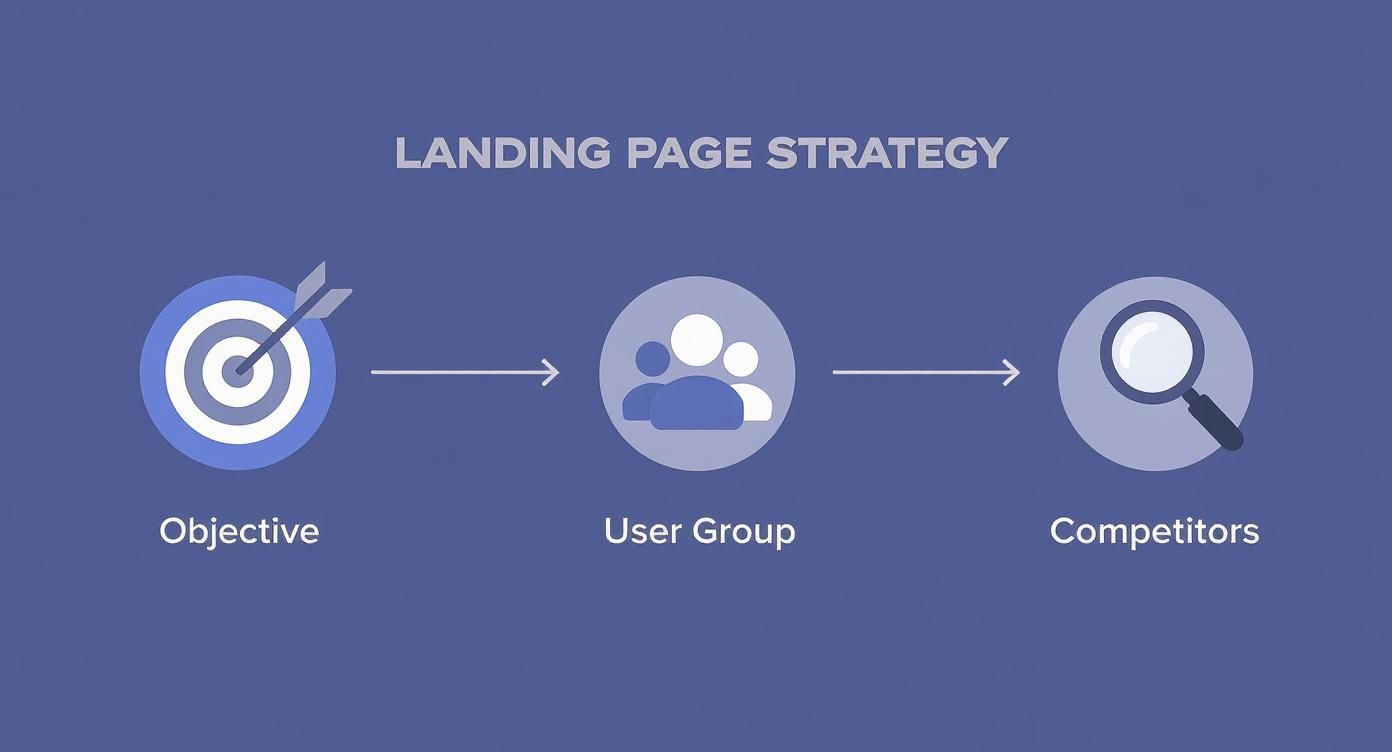
This flow shows that the real work on a great landing page starts long before you open a design tool. It begins with a clear goal and a deep understanding of your market. Without that, you’re just guessing.
A crucial part of your strategy is a little competitive recon. Check out your competitors' landing pages and ask yourself:
- What's their main value proposition?
- What kind of social proof are they using (testimonials, case studies, etc.)?
- Where did they place their calls-to-action, and how are they worded?
The point here isn't to copy them. It's about understanding the lay of the land and finding gaps where your offer can truly stand out. If you're looking for more guidance on this, there are great resources available that show you how to build high-converting landing pages by mastering these fundamentals.
Understanding Key Conversion Metrics
Knowing the industry benchmarks gives you a realistic target to aim for. As of 2025, the average landing page conversion rate sits around 6.6% globally. That means for every 15 visitors, you might get one conversion.
But that number swings wildly depending on the industry. B2B pages often see higher rates around 13.3%, while SaaS might be closer to 3.8%. These numbers give you a much-needed reality check for setting your own goals.
Before we dive into the nitty-gritty of building, let's break down the core components you'll be working with. Think of these as the essential building blocks for any landing page that's designed to persuade and convert.
Key Landing Page Components and Their Purpose
This table is a quick cheat sheet for the essential elements of an effective landing page and the specific job each one has.
| Component | Primary Goal | Best Practice Example |
|---|---|---|
| Headline & Sub-headline | Grab attention and clearly state the value proposition. | "The All-In-One Toolkit for Remote Teams." |
| Hero Image/Video | Create an emotional connection and show the product in action. | A short video of a happy customer using the software. |
| Social Proof | Build trust and credibility with potential customers. | Customer testimonials with photos, logos of well-known clients. |
| Benefits & Features | Explain what the offer does and how it solves the user's problem. | Bullet points focusing on outcomes, not just technical specs. |
| Call-to-Action (CTA) | Guide the user to take the single desired action. | A clear, action-oriented button like "Start Your Free Trial." |
Getting these core elements right is more than half the battle. Each one plays a distinct role in moving your visitor from curiosity to commitment.
A landing page is a focused conversation with a potential customer. If you try to talk about too many things at once, your message gets lost, and so does the conversion.
Ultimately, you can't skip this planning phase. It determines the entire structure, copy, and design of your page. Nailing your strategy ensures your message is sharp, persuasive, and effective. For a deeper look into writing words that sell, check out our complete guide on effective landing page copywriting. After all, powerful copy built on a solid strategy is the true engine of a high-converting page.
Designing and Prototyping Your User Experience
Alright, with your strategy locked in, it’s time to bring those ideas to life. This is where we shift from abstract goals to a tangible user experience (UX) that actually guides people toward your call-to-action. Design isn't just about making things look pretty—it's about building a frictionless journey for every visitor.
A great landing page always starts with a clear visual hierarchy. This is just a fancy way of saying you arrange things so people naturally look at the most important stuff first. Your headline should scream for attention. Your sub-headline should back it up. And your call-to-action button should be impossible to ignore. Everything needs to flow.
Think of it like telling a story. You wouldn't jump straight to the ending, right? Your hero section is the opening chapter—it has to grab attention and instantly tell visitors what's in it for them. A solid hero combines a killer headline, a helpful sub-headline, and an engaging visual to answer that one crucial question on every visitor's mind: "What do I get out of this?"
Crafting a Clean and Trustworthy Aesthetic
Your design choices have a direct line to a visitor's trust. A cluttered, chaotic page will send people running for the "back" button because it makes your offer feel unprofessional. One of the most powerful tools you have here is whitespace. Seriously. Giving your content room to breathe helps users focus on what actually matters.
Color psychology is another huge piece of the puzzle. The right colors can spark specific emotions and pull the eye toward key elements, especially your CTA buttons. A bright, contrasting color for your main CTA makes it pop off the page. Pair that with clean typography and high-quality images, and you've got an aesthetic that feels both modern and reliable. For anyone just starting out, designing stunning visuals with accessible tools can be a total game-changer for producing professional-looking assets without a massive budget.
Your landing page design should be invisible. A good user experience feels so natural and intuitive that the visitor doesn't even notice the design—they just effortlessly follow the path you've laid out for them.
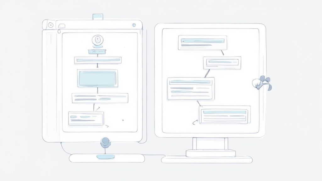
Mapping the User Journey with Wireframes
Before you even think about opening a high-fidelity design tool, start with a simple wireframe. A wireframe is basically a low-fi, black-and-white sketch of your page layout. It forces you to focus purely on structure and flow without getting sidetracked by fonts and colors.
This is the step where you map out every interaction and make sure the user's journey is logical from the second they land on the page.

- Hero Section: Where does the eye go first? Is the CTA immediately visible?
- Features/Benefits: How are you going to present this info? Icons? Bullet points? Short paragraphs?
- Social Proof: Where will you place testimonials or logos for maximum impact and trust?
- Final CTA: Is there a clear, final call-to-action right before the footer?
This process is all about organizing the essential landing page sections into a story that makes sense. By prototyping the flow first, you can spot potential friction points early on. This ensures every element works together to drive conversions and makes the final coding process so much smoother.
Bringing Your Design to Life with Magic UI Pro
Alright, you’ve got your design and UX mapped out. Now for the fun part: turning those static blueprints into a living, breathing webpage. This is where we move from theory to reality, and tools like Magic UI Pro can seriously accelerate the process without cutting corners on quality or performance.
Magic UI Pro is a component library built on some of my favorite tech: React, TypeScript, and Tailwind CSS. Instead of hand-coding every single button, card, and animation, you get to pull from a massive collection of pre-built, beautifully designed components. For developers and startups needing to ship fast, this is an absolute game-changer.
The whole idea is to assemble your page using these tested, responsive blocks. You’re still getting the flexibility and control of custom code, but you skip the tedious part of building everything from the ground up. It lets you focus your energy on the big picture—the user experience—instead of getting bogged down in CSS nuances.
Getting Started with Components
First things first, you'll install Magic UI into your project. From there, you can start digging through its library of components to find ones that match up with your wireframe. It’s packed with everything you'd need for a landing page, like hero sections, feature grids, social proof carousels, and pricing tables—many with slick animations already baked in.
This screenshot from the Magic UI website gives you a feel for the clean, modern aesthetic you can expect.
As you can see, animated, interactive elements aren't an afterthought; they're a core part of the library. This helps you build a dynamic, engaging experience right out of the box.
Let's walk through a quick example. Say you're building the hero section. You find a component that looks right, copy the code snippet, and paste it into your React app. The code itself is refreshingly clean and easy to follow, even if you’re still getting your sea legs with React.
import { Dock, DockIcon } from "@/components/magicui/dock"
export function HeroSection() {
return (
<div className="bg-background relative flex h-[500px] w-full flex-col items-center justify-center overflow-hidden rounded-lg border md:shadow-xl">
<h1 className="text-4xl font-bold">Your Awesome Product</h1>
<p className="mt-2 text-lg">A tagline that grabs attention instantly.</p>
<Dock direction="middle">
<DockIcon>
<span>Home</span>
</DockIcon>
<DockIcon>
<span>About</span>
</DockIcon>
</Dock>
</div>
)
}Just like that, this snippet gives you a fully responsive hero area complete with an animated dock navigation. All that’s left is to swap out the placeholder text and maybe tweak a few styles to fit your brand. It’s honestly that straightforward.
Customizing and Composing Your Page
Here’s where the real power of a component library comes into play: customization. The pre-built blocks are a fantastic starting point, but you're never locked into their default look. Since Magic UI is built on Tailwind CSS, changing things like colors, spacing, and fonts is as easy as adding a few utility classes directly in your markup.
For instance, changing the background color of that hero section is a one-line edit to the className prop:
- Original:
className="... bg-background ..." - Customized:
className="... bg-slate-900 text-white ..."
That tiny change completely transforms the vibe. You can apply this same logic to any component—swapping images, updating copy, and fine-tuning animations until everything lines up perfectly with your prototype.
Think of components as high-quality building blocks. You can use them as-is, or you can paint them, resize them, and combine them in unique ways to construct something that is entirely your own.
You just repeat this process for each section of your landing page:
- Features Section: Grab a grid or list component to show off your product’s benefits.
- Social Proof: Drop in a testimonial carousel or a logo grid to build instant trust.
- Pricing Table: Choose a pre-styled pricing component and fill it in with your plan details.
- CTA: Use a button component and customize its color and text to make it impossible to miss.
By building your page piece-by-piece with these battle-tested components, you guarantee a consistent design and a responsive layout that looks great on any device. This approach massively shortens the path from a design file to a live page, letting you launch and start getting feedback that much faster.
Optimizing Your Page for Performance and Conversions
Alright, you've built your landing page. The design is locked in, the code is clean, but the job isn't quite finished. A stunning page that takes forever to load or fails to convince visitors is like a sports car with no engine—it looks great but won't get you anywhere.
Now, we shift gears from building to tuning. It’s time to focus on the two things that really matter: making your page lightning-fast and turning visitors into customers.
Boosting Your Page Load Speed
Page speed isn't just some techy vanity metric; it directly impacts your wallet. In a world of fleeting attention spans, a single second of delay can send potential customers packing. Slow pages are frustrating, and frustrated users don't stick around to hear what you have to say.
So, where do you start? Images. They're almost always the biggest performance hog. Before you even think about uploading, make sure every single image is compressed. Tools like TinyPNG or Squoosh are your best friends here. Serving images in modern formats like WebP can also slash file sizes without any noticeable quality loss.
Next up, take a look at your code itself. If you're building with a framework like React or Next.js, your bundler (like Vite or Webpack) is doing a lot of heavy lifting. Double-check that it's set up for code-splitting and tree-shaking. This ensures that users only download the code they need for the initial view, not the entire app. It's a game-changer for that initial load time.
Want proof? The data doesn't lie. A 2025 study found that websites loading in one second have conversion rates three to five times higher than those that take five to ten seconds. For e-commerce specifically, that one-second load time translates to 2.5 times more sales than a page that takes five seconds.
If you want to dive deeper, our guide on how to improve website loading speed is packed with more actionable tips.
Mastering Conversion Rate Optimization
Once your page is flying, it's time to focus on persuasion. This is where Conversion Rate Optimization (CRO) comes in—the art and science of guiding visitors to take action.
It all starts with your Call-to-Action (CTA). Your CTA button needs to be the most obvious thing on the page. Use a color that stands out from everything else and write copy that inspires action. "Get Your Free Template" is worlds better than a boring "Submit."
Placement matters, too. Make sure your CTA is clearly visible without scrolling and then repeat it further down the page after you've laid out your key benefits.
Finally, you need to build trust, and nothing does that better than social proof. People are naturally inclined to follow the lead of others. Seeing that other people have already gotten value from what you're offering makes the decision to convert so much easier.
Here are a few proven ways to sprinkle in social proof:
- Customer Testimonials: Real quotes from happy customers are gold. Add a name, title, and photo to make them feel genuine.
- Case Studies: Go deep and show the tangible results a customer achieved. This is perfect for more complex B2B offers.
- Client Logos: If you've worked with recognizable companies, show them off! Their credibility instantly rubs off on you.
- Simple Metrics: Numbers like "Trusted by 10,000+ designers" or a 5-star rating are simple but incredibly powerful.
By pairing blistering performance with smart conversion tactics, your landing page will do exactly what it was designed for: drive real business results.
Alright, your landing page is live. Pop the champagne? Not quite. Hitting "publish" isn't the finish line; it’s the starting block.
Now the real fun begins. We're moving from building to optimizing, and that means swapping our assumptions for cold, hard data. Without it, you're just making educated guesses, and that's no way to build a page that actually converts.
Think of it this way: your launch is the hypothesis. The data you're about to collect is the proof.
What Numbers Actually Matter?
Before you dive headfirst into your analytics, you need to know what to look for. It's easy to get distracted by vanity metrics, but only a few key performance indicators (KPIs) truly tell the story of how people are interacting with your page.
These are the vital signs for your landing page's health:
- Conversion Rate: This is your North Star. It's the percentage of people who do the one thing you want them to do. If this number is low, something is fundamentally broken in your pitch or design.
- Bounce Rate: This tells you how many visitors hit your page and leave without clicking anything. A high bounce rate is a huge red flag. It often means there's a disconnect between your ad and your page, or maybe your site is just too slow.
- Time on Page: How long are people sticking around? If they're bailing in a few seconds, your headline and hero section aren't doing their job to hook them.
- Traffic Sources: Where are your visitors coming from? Knowing whether your best traffic comes from social media, organic search, or paid ads tells you where to double down on your efforts.
Your analytics dashboard isn't just a spreadsheet; it's a story about human behavior. Learning to read that story is the single most important skill for turning a good landing page into a great one.
The Art of A/B Testing
So, your data points to a problem. What now? You test.
A/B testing is your new best friend. It's a straightforward method: create two versions of your page (an 'A' and a 'B'), change just one thing, and see which one performs better.
Let's say you think your headline is weak. You could run a test where half your visitors see the original, and the other half see a new, more benefit-focused version. After a week, you check the conversion rates. It’s a simple, scientific way to stop guessing and start knowing.
You can test almost anything, but don't get lost in the weeds. Start with the big stuff that has the most impact:
- The main headline
- The call-to-action (CTA) button copy and color
- The hero image or video
- The length and fields of your form
This constant cycle of measuring, learning, and refining is what separates a page that dies on the vine from one that becomes a consistent lead-generating machine. Every test is a lesson, getting you one step closer to a perfectly tuned landing page.
Frequently Asked Questions About Landing Pages
Even with the best guide in hand, you’re bound to have some questions as you start building. It happens to everyone. Let's tackle some of the most common ones that pop up.
What Is the Difference Between a Landing Page and a Homepage?
Think of your homepage as the lobby of your digital office—it’s built for general exploration. It has a navigation menu, various links, and multiple paths designed to let visitors wander and discover different parts of your site.
A landing page, on the other hand, is a direct, one-way street. Its entire existence is dedicated to a single, hyper-focused goal, like getting a demo request or a newsletter signup. To achieve this, it strips away all distractions, especially navigation menus. This laser focus is what makes it such a powerful tool for marketing campaigns.
How Many Form Fields Should My Landing Page Have?
Here’s a simple rule I stick to: only ask for what you absolutely need right now.
For a low-commitment action like signing up for a newsletter, just an email address is perfect. Every single extra field you add introduces friction and gives people a reason to bail. You'll see your conversion rates drop.
Now, if you're offering something of high value, like a one-on-one strategy call, it's fair to ask for more info (name, company, etc.). Just be ruthless. If a field isn't essential for the very next step in your sales process, cut it.
"A landing page has one job. Any element that doesn't support that single job—whether it's an extra navigation link or an unnecessary form field—is actively working against you."
How Long Should a Landing Page Be?
There’s no magic word count. The right length is dictated entirely by how complex your offer is.
- Short Pages: These are your best bet for simple, low-commitment offers. Think free e-book downloads or webinar registrations. The value proposition is easy to grasp, so you don't need a wall of text to convince someone.
- Long Pages: You’ll need more runway for higher-ticket items or complex B2B services. A longer page gives you the space to tackle objections head-on, build trust with testimonials and social proof, and lay out all the details a person needs to make a confident, informed decision.
Always prioritize clarity over length. Get to the point, deliver value, and don't waste your visitor's time.
What Are the Most Important Metrics to Track?
You could drown in data, but honestly, you only need to obsess over a few key metrics to understand what's really going on.
- Conversion Rate: This is the big one. What percentage of visitors actually took the action you wanted them to take? Everything else is secondary to this number.
- Bounce Rate: This tells you how many people landed on your page and left immediately without interacting. A high bounce rate is a clear sign that your message isn't connecting.
- Traffic Sources: Where are your best visitors coming from? Knowing which channels (Google, social media, email) send you high-converting traffic tells you where to double down on your marketing efforts.
- Page Load Time: Speed kills… conversions. A slow-loading page will sabotage all your other metrics before a visitor even sees your headline.
Nail these four, and you’ll have a crystal-clear picture of your page’s performance and know exactly where to start optimizing.
Ready to build stunning, high-performance landing pages in minutes, not months? With over 50 customizable blocks and 150+ animated components, Magic UI gives you the tools to bring your vision to life effortlessly. Explore Magic UI Pro and start building today.