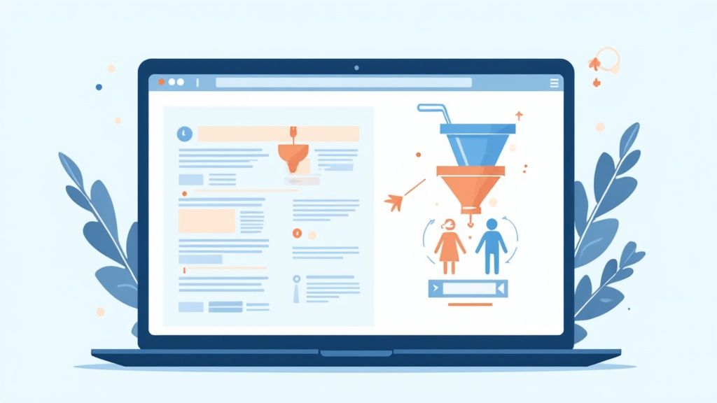
If you want to boost your website's conversion rates, you need to zero in on a few critical things: the overall user experience, your most important pages (like landing pages and checkout), and using real data to back up your decisions. It’s all about turning the traffic you already have into paying customers by smoothing out the bumps in the road and building some serious trust.
Why Conversion Rates Are Your Most Valuable Metric

Getting traffic to your website is hard work. It's expensive and takes time. But what actually happens once people show up? Just getting more eyeballs on your site is only half the battle. The real win is turning those visitors into customers, subscribers, or leads—and that's where your conversion rate tells the true story.
A conversion rate is simply the percentage of visitors who do the thing you want them to do. That could be anything from buying a product to signing up for your newsletter. When you focus on improving this number, you get a much higher return on your marketing dollars than just pouring more money into ads.
Think of it this way: doubling your conversion rate from 1% to 2% has the exact same impact on your bottom line as doubling your traffic. The big difference? Optimizing for conversions makes the money you're already spending work twice as hard.
Understanding the Benchmarks
It always helps to know where you stand in the grand scheme of things. Recent data shows that the average global ecommerce conversion rate hovers between 2.5% and 3.0%. More established brands often hit the 3-4% mark. If your numbers are falling short, that's not bad news—it's a massive opportunity.
This guide is your roadmap to finding and fixing the "leaks" in your conversion funnel. We're going to tackle three core areas head-on:
- Mastering User Experience: How to create a seamless, trustworthy environment that makes people want to stick around.
- Optimizing Key Pages: Refining your highest-impact pages—the ones that do the heavy lifting—to drive action.
- Leveraging Data: Using analytics to get inside your users' heads and make changes that actually move the needle.
The core idea is simple: a great user experience is what drives great conversion rates. When you get rid of the friction and make your value crystal clear, you empower visitors to take that next step.
And since more people are browsing on their phones than ever before, a smooth mobile experience isn't just a nice-to-have; it's a must. A lot of what we'll cover ties directly into responsive design. If you're new to the concept, our guide on what is mobile-first design is a great place to get your bearings.
Building a Foundation of Trust with User Experience
Before anyone even considers clicking "buy" or filling out your form, they're asking a subconscious question: "Can I trust this place?" The answer lies in your website's user experience (UX). A clunky, confusing, or unprofessional site immediately plants a seed of doubt. A seamless one, on the other hand, builds the confidence you need to earn that conversion.
Think about it: 38% of people will ditch a website if the layout is unattractive. This isn't just about pretty visuals; it's a direct signal of professionalism and reliability. You only get milliseconds to make a first impression, and in that flash, your design does all the talking.
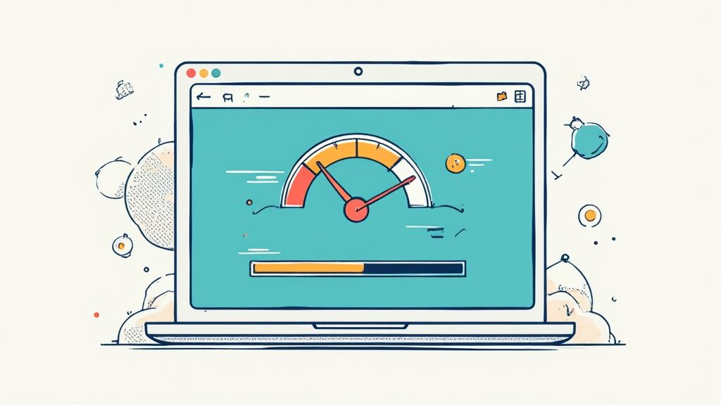
Speed is another huge piece of the trust puzzle. A delay of just a few seconds can send your conversion rates into a nosedive, especially on mobile where patience is thin. If your site feels sluggish, visitors assume the entire process—from browsing to checkout—will be just as frustrating.
Craft a Clear and Compelling Value Proposition
The second a visitor lands on your page, the clock starts ticking. You have to tell them why they should stick around, and you have to do it fast. A strong value proposition isn't some fluffy slogan; it's a crystal-clear statement explaining the benefit you offer, who you offer it to, and what makes you the best choice.
It must instantly answer the user's "What's in it for me?" question. Don't make them hunt for it—place it front and center, right above the fold. A muddled message is a one-way ticket to a bounced visitor.
Your value proposition is the promise you make to your visitor. A great user experience is how you prove you can deliver on that promise, building credibility with every single click.
This need for clarity extends to your navigation, too. If people can't easily find what they’re looking for, they won't stick around to play detective. An intuitive menu structure guides them effortlessly through your site, cutting down on frustration and keeping them on the path to conversion.
Harness the Power of Visuals and Social Proof
Let's be blunt: high-quality images, a clean design, and consistent branding are non-negotiable. Grainy photos or a cluttered layout scream amateur, completely eroding credibility. These visual cues reinforce the quality of your brand before a user reads a single word of your copy.
But it’s not just about what you say. It's about what others say about you. This is where social proof becomes your secret weapon. Weaving in testimonials, reviews, or detailed case studies validates your claims and builds an incredible amount of trust. If you're looking for inspiration, exploring different ways to display social proof on your website can give you some powerful ideas.
Finally, making your site usable for everyone is a fundamental part of building trust. A commitment to accessibility signals that you care about every user's experience, not just a select few. Diving into how accessibility boosts your website's UX and sales reveals just how big of an impact this can have. An inclusive environment is a trustworthy one.
Optimizing Your Most Critical Pages for Conversion
While a solid overall user experience is the foundation, your conversion rate really comes down to a few high-stakes pages. If you want to see a real impact, you have to pour your energy into optimizing your landing pages, product pages, and especially the checkout process. These are the make-or-break moments.
Every single element on these pages has one job: guide the user toward a single, obvious action. There’s simply no room for confusion or distractions. It's all about creating the smoothest possible path from interest to purchase.
Anatomy of a High-Converting Landing Page
Think of your landing page as your digital sales pitch. It all starts with a headline that grabs attention and immediately screams value. Critically, it needs to echo the language from the ad or link that brought the visitor there, which creates a sense of continuity and trust right off the bat.
Then there's your call-to-action (CTA) button. It needs to be impossible to miss and ridiculously compelling to click. Drop the passive "Submit" and go for action-packed words like "Get," "Reserve," or "Try." The color, size, and placement all play a huge part in drawing the user's eye. For a much deeper look into creating buttons that people actually click, our guide on https://magicui.design/blog/cta-design has some fantastic, actionable tips.
A landing page isn’t a brochure; it’s a conversation with a single goal. Every word, image, and button should contribute to that one desired outcome, eliminating anything that pulls focus away from the main call to action.
When you're dialing in these critical pages, the focus has to be on crystal-clear calls to action and content that truly connects. For a wider view on turning those clicks into cash, exploring proven strategies to boost online sales can give you some valuable perspective. This big-picture approach ensures every little tweak you make is pushing your main business goals forward.
Streamlining the Checkout Flow to Reduce Abandonment
The checkout process is where so many potential sales just vanish. The tiniest bit of friction is all it takes to send a motivated buyer packing.
One of the easiest wins? Offer a guest checkout option. Forcing people to create an account before they can hand over their money is a massive, unnecessary barrier.
Another huge conversion killer is surprise costs. It’s no shock that the shopping cart abandonment rate has shot past 70%. And in many places, the number one reason is unexpected shipping and tax fees popping up at the last second. You have to be transparent with all costs upfront—ideally, right on the product page. For more on this, check out the global conversion rate analysis on Statista.
To make the whole thing even simpler, use a progress bar so people know where they stand, and keep your forms as short as humanly possible. Only ask for what you absolutely need to complete the sale.
Here’s a quick checklist to slash that checkout friction:
- Offer Guest Checkout: Never force someone to create an account.
- Show All Costs Upfront: No one likes surprise shipping fees or taxes.
- Minimize Form Fields: If you don't need it, don't ask for it.
- Provide Multiple Payment Options: Include digital wallets like Apple Pay or Google Pay for that sweet one-click convenience.
- Ensure Mobile Friendliness: The checkout has to be absolutely flawless on a small screen.
Using Data to Understand What Your Visitors Want
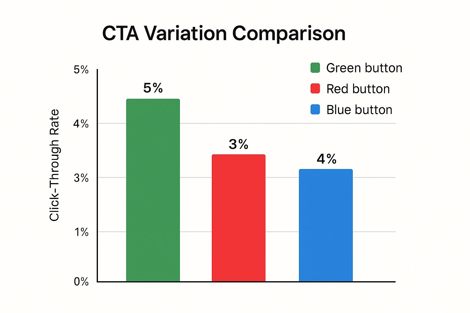
This chart is a perfect example of data in action. It shows the click-through rates for three different button colors, and the results are crystal clear. The green button, with its 5% CTR, is the obvious winner, giving us a solid, data-backed reason to make a change. No guesswork needed.
Making assumptions about your website visitors is one of the fastest ways to tank your conversion rates. The real magic happens when you stop guessing and start listening to what their actions are telling you. Data gives you a direct line into their needs, wants, and frustrations, forming the bedrock of any successful optimization strategy.
Going beyond simple page views, qualitative analytics tools are like getting a window into your user's mind. They don’t just tell you what happened; they help you uncover the why. And that's where the biggest opportunities for boosting your website's conversion rates are hiding.
Uncovering User Behavior with Visual Tools
Two of the most powerful tools in this arena are heatmaps and session recordings. They take abstract numbers and turn them into visual stories of how real people are actually using your website.
- Heatmaps give you a big-picture view, showing you where people are clicking, where their mouse hovers, and how far they bother to scroll down a page. You can instantly see which parts of your page are hot and which are getting the cold shoulder.
- Session Recordings are literal videos of individual user visits. Watching these is like looking over someone's shoulder as they navigate your site. You see every confused click, every moment of hesitation, and every ounce of frustration in real-time.
Think of analytics as a conversation with your users where they communicate through their clicks and scrolls. When you learn to interpret this language, you stop making blind changes and start solving real problems.
I once saw this play out perfectly on a client's site. A heatmap revealed that dozens of people were furiously clicking on a gorgeous, high-res image that wasn't actually a link. This "rage clicking" was a massive red flag. Users clearly expected that image to take them somewhere—probably a product gallery—and when it didn't, they hit a dead end. We made one simple change: we made the image clickable. Engagement on the product pages shot up almost immediately.
Translating Insights into Actionable Changes
The goal here isn't just to hoard data; it's to pull out actionable insights that lead to specific, tangible improvements. This is how you turn simple observation into powerful optimization.
It's also essential to know where your best traffic is coming from, because not all visitors are created equal.
Average Conversion Rates by Traffic Source
This table compares the typical conversion rates from different marketing channels, helping you prioritize optimization efforts based on traffic source performance.
| Traffic Source | Average Conversion Rate | Primary User Intent |
|---|---|---|
| Direct Traffic | 3.3% | High intent; users already know the brand. |
| Email Marketing | 2.8% | Engaged audience; responding to a specific offer or message. |
| Organic Search | 2.5% | Problem/solution-focused; actively searching for answers. |
| Paid Search | 2.1% | High commercial intent; ready to buy or take action. |
| Social Media | 1.1% | Low intent; browsing or discovery phase, not actively buying. |
| Referral | 0.9% | Varies; depends heavily on the context of the referring site. |
As you can see, someone typing your URL directly into their browser (direct traffic converts at 3.3%) is a much warmer lead than someone casually scrolling through social media. Similarly, a well-targeted email campaign can drive impressive results (2.8% conversion rate) by reaching people who already want to hear from you. For a deeper dive, it's worth reading the latest research on website visitor conversion rates to see how you stack up.
Armed with this user behavior data, you can start creating a backlog of smart, data-informed hypotheses to test. Here’s a simple process to get started:
- Hunt for Drop-Off Points: Start in your analytics. Find the pages with the highest exit rates, then pull up session recordings for those pages. Watch what people are doing right before they bail.
- Dissect Your Forms: Are people abandoning your signup or checkout forms? Watch recordings to see which fields are causing them to pause or give up. Maybe the form is too long, or a question is just plain confusing.
- Find Your Invisible CTAs: If your main call-to-action isn't getting the clicks it deserves, a heatmap will tell you if it's being ignored. Sometimes another, less important element on the page is stealing all the attention.
Running A/B Tests That Actually Drive Improvements
Alright, you’ve done the hard work of digging through the data and pinpointing where your users are getting stuck. Now for the fun part: turning those insights into real, measurable wins. This is exactly what A/B testing (or split testing) was made for.
Think of it as a methodical way to let your users vote on what works best. Instead of making changes based on a gut feeling or what you think will work, you test your ideas in a controlled way. This is how you build a culture of continuous improvement, one that systematically lifts your conversion rates over time.
The concept is simple. You show one version of your page (the original, or "control") to one chunk of your visitors, and a slightly modified version (the "variation") to another. Then, you sit back and see which one drives more conversions.
It All Starts With a Solid Hypothesis
Every great A/B test is built on the foundation of a strong hypothesis. This isn't just a random idea—it's a specific, testable statement about what you expect to happen, and it should be directly informed by your user data. Without a clear hypothesis, you’re just throwing spaghetti at the wall.
A good hypothesis usually follows this simple formula: "If I change [X], then [Y] will happen, because [Z]."
Let’s use a real-world example. Imagine you noticed in your session recordings that a lot of users pause and hover over your "Sign Up" button, but never click.
- The Change (X): I’ll change the CTA button text from "Sign Up" to "Get My Free Guide."
- The Predicted Outcome (Y): I expect the number of lead form submissions to increase.
- The Reason (Z): The new text is focused on immediate value (getting something free) instead of a commitment (signing up for something).
See how that connects the dots? Your observation leads directly to a proposed solution with a clear purpose.
The golden rule of A/B testing is to test only one variable at a time. Seriously. If you change the headline, the button color, and the main image all at once, you’ll have no clue which change actually moved the needle. Keep your tests clean by isolating one variable at a time.
Practical A/B Tests You Can Run Today
You don't need a massive team of developers to get started. Most modern testing tools, like VWO or Optimizely, make it surprisingly easy to set up experiments. The trick is to start with changes that have the potential for a big impact.
Here are a few high-impact ideas you can start testing right away:
- Headlines: Pit your current headline against one that's more benefit-driven. For example, instead of "Powerful UI Components," try "Build Stunning Landing Pages in Minutes."
- Call-to-Action (CTA) Button: This is a classic. Test the text, the color, the size, even the placement. You'd be shocked how often a simple switch from a muted grey to a vibrant green can lift conversions.
- Page Layout: Try moving a key element, like your testimonials or social proof, higher up on the page. Does building trust earlier in the user's journey make a difference?
- Form Fields: If you're running a lead gen form, test a version with fewer required fields. Every field you remove reduces friction, which can often lead to a direct increase in submissions.
Making Sense of the Results
Once your test has run long enough to achieve statistical significance (meaning the results aren't just a random fluke), it's time to see what you've learned. Your A/B testing tool will declare a winner, but your job isn't done.
The real gold is in understanding the why. Why did the benefit-focused headline win? Did the brighter button color simply grab more attention, or did the text resonate more?
Every test, win or lose, teaches you something invaluable about your audience. That insight is what you’ll use to build your next, even smarter, hypothesis.
Common Questions on Improving Conversion Rates
Whenever I talk to marketers and business owners about conversion rate optimization, the same few questions always pop up. If you're just starting to dig into how to improve your website's performance, chances are you've wondered about these things too. Let's clear them up.
What Is a Good Website Conversion Rate
Everyone wants a magic number, but the truth is, there isn't one. A "good" conversion rate is completely relative to your industry, your business model, and even where your traffic is coming from.
You might hear that an e-commerce average is around 2-3%, but honestly, the only benchmark that matters is your own. The real goal isn't to hit some universal average; it's to consistently beat your own last record.
The best metric for success is progress, not perfection. Aim to consistently beat your own previous conversion records. This internal benchmark is far more valuable than comparing yourself to broad industry statistics that might not apply to your unique audience.
Getting a 1% lift this month compared to last month? That's a huge win. That's the kind of sustainable, incremental improvement that leads to massive long-term growth.
How Long Should I Run an A/B Test
The right length for an A/B test comes down to one thing: traffic volume. You have to let a test run long enough to collect enough data to be confident in the results—something statisticians call statistical significance. It just means the outcome wasn't a fluke.
For most sites, you'll want to run a test for at least one to two full weeks. Why? Because user behavior on a Tuesday morning is often wildly different from behavior on a Saturday night. Running it for a full business cycle helps you capture those natural fluctuations.
Don't cut it short. Your testing tool will tell you when you have a statistically significant result. Trust the process, because ending a test too early is a classic mistake that can send you chasing the wrong conclusion.
Should I Focus on Traffic or Conversions First
Conversions first. Always. It’s so much cheaper and more effective to get more out of the traffic you already have than it is to just go out and buy more.
I always use the leaky bucket analogy. Your website is the bucket, and traffic is the water you're pouring into it. If your bucket is full of holes—like a confusing checkout process, slow-loading pages, or a broken form—pouring more water in is a complete waste.
Plug the leaks first. Once your website is a well-oiled machine that converts visitors effectively, every dollar you spend on ads or SEO will work that much harder for you. It's the only way to get a real return on your marketing spend.
Ready to build stunning, high-converting landing pages without the headache? Magic UI gives you over 50 customizable blocks and templates to create beautiful web interfaces in minutes. Explore our components and start building today.