
Mobile-first design isn't just a buzzword; it's a fundamental shift in how we build for the web. The strategy is simple: design for the smallest screen first, then scale up. Think of it like building a house. You pour a solid, simple foundation—the mobile version—before you start adding the ornate bay windows and extra wings for the desktop mansion. This ensures the core experience is rock-solid for the vast majority of people browsing on their phones.
The Smartphone Revolution And The Need For Mobile-First

Before everyone had a supercomputer in their pocket, the internet was a desktop-only affair. Websites were sprawling digital estates built for big monitors, complete with complex layouts and navigation menus that had more options than a diner menu. Trying to view these sites on an early mobile phone was an exercise in pure frustration—a chaotic mess of pinching, zooming, and scrolling sideways just to read a sentence.
Then, everything changed. While the idea of designing for mobile had been floating around since the mid-2000s, it was Apple's iPhone in 2007 that truly lit the fuse. Suddenly, a powerful, full-featured browser was in everyone's hands, and user expectations were transformed overnight. The explosion in mobile traffic threw a harsh spotlight on the fatal flaw in the old desktop-centric design philosophy.
A Necessary Shift In Thinking
The old way of doing things was called "graceful degradation." Designers would build a massive, feature-rich desktop site and then try to chop bits and pieces off to make it sort of work on a phone. The result was almost always a slow, broken, and barely usable mess. It became painfully clear that this subtractive approach just wasn't going to cut it.
This reality forced a massive shift towards minimalism and ruthless prioritization. By starting with the constraints of a small screen, design teams were forced to ask the most important question of all: What does our user absolutely need to accomplish? This discipline naturally led to cleaner, more focused, and ultimately better user experiences for everyone. As smartphones took over, user patience for slow sites evaporated, making website speed performance a make-or-break factor for keeping people engaged.
By starting with the mobile experience, you inherently focus on speed, clarity, and the core user journey. This isn't just about making things smaller; it's about making them smarter from the very beginning.
This new strategy, known as progressive enhancement, flipped the old model on its head. Instead of subtracting features from a bloated desktop site, you begin with the essential mobile experience and then progressively enhance it. As more screen real estate becomes available, you can add richer layouts, more complex features, and secondary content. This ensures a solid, functional baseline for every single user, no matter their device. Getting hands-on with different mobile templates is a great way to see this principle in action. This user-first philosophy quickly became the undisputed standard for modern web development.
Understanding The Core Principles Of Mobile First
So, what’s really going on with mobile-first design? Let's try a simple analogy.
Imagine you're packing for a trip. You have two choices. You could pack a giant suitcase with everything you could possibly need and then try to cram it into a tiny backpack for a weekend hike. It’s a mess, right? Things get lost, crushed, and it's impossible to find what you actually need.
Or, you could start with the backpack. You pack only the absolute essentials: a water bottle, a map, a first-aid kit. Once that’s perfectly organized, you can think about adding luxuries to a bigger bag for a longer stay. This second approach is the heart of mobile-first design.
It’s a philosophy called progressive enhancement. You begin with the most constrained environment—the small screen—and perfect the core experience. This forces you to be ruthless about what's truly important.
This shift in thinking isn't just a trend; it's a direct response to how we all use the internet now. The data is pretty clear on this.
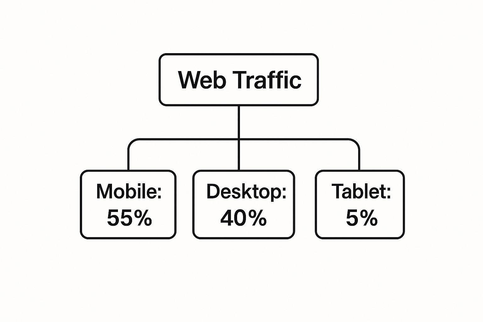
With mobile devices driving more than half of all web traffic, starting with them isn't just smart—it's essential. You’re building the best possible experience for the biggest chunk of your audience, right from the get-go.
Key Pillars Of The Mobile First Philosophy
This design strategy is built on a few foundational ideas that shape every decision.
First up is a strict content hierarchy. On a tiny screen, there's zero room for clutter. You have to figure out what information and actions are most critical and put them front and center. Everything else can be gracefully added in for larger screens.
Next is a relentless focus on touch-friendly interfaces. We're not using precise mouse pointers here; we're using our thumbs.
Key interactive elements like buttons and links must be large enough to be easily tapped, with enough surrounding space to prevent frustrating accidental clicks. This focus on usability is central to the mobile-first mindset.
Finally, simplicity is king. This means embracing lean, clean navigation—often using familiar patterns like a hamburger menu to tuck secondary options away neatly. To really get a handle on mobile-first, it's also helpful to understand the bigger picture of responsive web design principles, which set the stage for making layouts work across any screen.
Mobile First vs Desktop First A Comparison
To make the difference crystal clear, let's look at a side-by-side comparison of the two dominant web design philosophies. This table really highlights why starting small often leads to a better, more focused end product.
| Aspect | Mobile First (Progressive Enhancement) | Desktop First (Graceful Degradation) |
|---|---|---|
| Starting Point | Designs for the smallest screen (mobile) first. | Designs for the largest screen (desktop) first. |
| Core Philosophy | Start with a solid foundation of essential features and add more for larger screens. | Start with a full-featured site and remove or hide elements for smaller screens. |
| Content Focus | Forces prioritization of content and features from the beginning. | Can lead to "feature bloat," making it hard to cut down for mobile. |
| Performance | Tends to be faster and more lightweight on mobile, as assets are added, not removed. | Can be slower on mobile due to loading hidden desktop assets. |
| User Experience | Naturally creates a focused, clean, and uncluttered mobile experience. | Mobile experience can feel like a stripped-down, compromised version of the desktop site. |
| Development | Often leads to cleaner, more efficient code. | Can result in complex CSS and JavaScript to hide or alter elements. |
Ultimately, the table shows that progressive enhancement builds a robust, lean foundation, while graceful degradation often involves chipping away at a larger structure, which can sometimes feel like an afterthought for mobile users.
Why Mobile First Design Is A Game Changer For SEO

Thinking about mobile-first as just a design trend is a huge mistake. It’s a core strategic decision that directly feeds into your website's visibility and, ultimately, its success. The real magic happens when you deliver a superior user experience. By forcing you to focus on the absolute essentials first, this approach naturally leads to a cleaner, more intuitive interface for mobile users.
This isn't just about making things look nice on a small screen. Search engines are obsessed with user experience, and since most people are searching on their phones, Google has completely rewired its ranking system to reflect that reality.
The Power Of Mobile-First Indexing
Here’s the part you can’t ignore: Google now primarily uses the mobile version of your site for indexing and ranking. Let that sink in. Your desktop site could be a masterpiece, but if the mobile version is a slow, clunky mess, your search rankings are going to take a serious hit. A mobile-first design makes your site inherently optimized for the way Google actually sees and judges it.
This isn’t new, either. Google made it official back in 2019, announcing that mobile-first indexing would be the default for all new websites. That was the moment the industry officially shifted, making a top-notch mobile experience a non-negotiable for anyone serious about SEO. You can get more details about the mobile-first paradigm on appsflyer.com.
By aligning your design strategy with Google's indexing priorities, you're not just improving user experience—you're fundamentally boosting your site's potential to rank higher and attract more organic traffic.
Faster Performance And Higher Engagement
Another massive win is speed. Mobile-first sites are just naturally leaner. You start with the bare necessities—optimized images, essential scripts—and only add the heavier stuff for larger screens. This simple shift results in dramatically faster load times, which is absolutely critical for keeping impatient mobile users from bouncing.
Faster loading isn't just a technical metric; it directly influences user behavior, sending powerful positive signals to search engines. Here’s how it all connects:
- Lower Bounce Rates: People are far less likely to abandon a site that loads in a snap.
- Longer Session Durations: A smooth, fast experience encourages users to stick around, click through more pages, and actually engage with your content.
- Improved Conversion Rates: A frictionless mobile journey—whether you want a newsletter signup or a sale—removes the barriers that make people give up.
It all creates a powerful feedback loop. A better user experience leads to stronger engagement signals, which tells Google your site is a high-quality result worth showing to more people. That powerful synergy is what makes mobile-first design a true game-changer for modern SEO.
Your Blueprint For Implementing Mobile-First Design
Alright, let's move from theory to action. This is where the real work of mobile-first design happens, and it’s about more than just shrinking things down. It's a disciplined approach that starts not with fancy design tools, but with your content.
The first step is a content inventory. You need to take stock of absolutely everything: every piece of information, every feature, every call-to-action on your site. Once you have a complete list, the tough part begins—ruthless prioritization.
Ask yourself one critical question: what is the single most important thing a user needs to do or see on this page? For an e-commerce site, it’s the product image, price, and the "Add to Cart" button. For a blog post, it's the headline and the article itself. Everything else is secondary.
Laying The Foundation With Wireframes
With your prioritized content list in hand, you can start building the structural skeleton of your mobile site. This is where wireframing comes in. We’re talking simple, low-fidelity layouts that focus purely on structure and hierarchy, not on flashy colors or fonts.
Your mobile wireframe should be a single-column layout, presenting your prioritized content in a logical, top-to-bottom flow. This forces you to think about the user journey in its most essential form. For instance, a clean, intuitive navigation system is crucial on mobile. Our guide on building a great navbar in React JS dives into practical tips for creating exactly that, a key component of any mobile-first project.
By perfecting the single-column mobile layout first, you ensure the core experience is solid. This foundational work makes expanding to larger screens a much more straightforward and logical process.
Once that mobile wireframe feels right, you can create versions for tablets and desktops. This is where you start adding back secondary elements into the newly available space. For example, a sidebar with related articles might appear next to a blog post on a desktop, but it stays tucked away at the bottom on mobile.
Building Up With CSS Media Queries
With a solid visual blueprint, it’s time to bring your design to life with code. The key technology that powers this whole implementation is CSS media queries. These are simple rules that apply different styles based on the characteristics of a device, most commonly its screen width.
The mobile-first approach means you write your default CSS for the smallest screen size first. These are your base styles—simple, clean, and universal. Then, you use min-width media queries to add more complex styles and layouts as the screen gets larger.
Here’s what that looks like in practice:
/* Default styles for mobile */
.container {
width: 100%;
padding: 10px;
}
.sidebar {
display: none; /* Hide the sidebar on mobile */
}
/* Styles for tablets and up (768px and wider) */
@media (min-width: 768px) {
.container {
display: flex;
}
.main-content {
flex: 3;
}
.sidebar {
display: block; /* Show the sidebar */
flex: 1;
margin-left: 20px;
}
}
/* Styles for desktops and up (1024px and wider) */
@media (min-width: 1024px) {
.container {
max-width: 1200px;
margin: 0 auto;
}
}This code starts with a basic, single-column layout for mobile devices. As the screen width increases past 768px, it introduces a two-column layout by displaying the sidebar. This method, known as progressive enhancement, ensures a fast, functional experience on all devices by gracefully adding complexity instead of trying to subtract it.
How To Accelerate Development With Magic UI
Starting a mobile-first project from the ground up is a serious commitment. It’s a disciplined process that involves tons of careful planning, painstaking media query coding, and then testing it all across a sea of devices. But what if you could skip most of that foundational grunt work and still get a pixel-perfect, mobile-optimized design?
That’s where a component library like Magic UI gives you a massive leg up. Instead of building every responsive button, grid, and card from scratch, you get a toolkit where mobile-first thinking is already baked into the DNA of every component.
Think of it as building a house with high-quality, prefabricated modules instead of laying every single brick by hand. You get the speed and reliability of a proven system, but you don't lose the power to customize and make it your own.
Built-In Responsiveness For Faster Workflows
A well-crafted UI library handles the tricky responsive logic for you. Its components are engineered from day one to adapt fluidly to any screen size, saving you countless hours of writing, testing, and debugging CSS. This frees you up to focus on what makes your app unique, not on reinventing the wheel for basic layouts.
For instance, a common headache is creating a grid that’s simple and clean on a phone but expands into something more sophisticated on a desktop. With Magic UI, you can drop in a component like <BentoGrid> with just a few lines of code.
import { BentoGrid, BentoGridItem } from "@/components/magicui/bento-grid"
export function BentoGridDemo() {
return (
<BentoGrid className="mx-auto max-w-4xl">
{items.map((item, i) => (
<BentoGridItem
key={i}
title={item.title}
description={item.description}
header={item.header}
icon={item.icon}
/>
))}
</BentoGrid>
)
}That’s it. On mobile, this code automatically renders a neat, single-column stack. As the screen gets wider, it elegantly transforms into a dynamic multi-column grid—all without you writing a single media query.
Ensuring A Polished User Experience
Moving fast is great, but the quality of the user experience is what really matters. The real power of a good component library is its ability to deliver a polished, consistent, and accessible experience right out of the box. Elements like animated cards, navigation menus, and interactive grids are not only responsive but also designed with great usability in mind.
By using pre-built components, you're not just saving development time; you're leveraging a system that has been refined to meet modern user expectations for performance and interactivity on any device.
This approach dramatically cuts down on common responsive design mistakes, like elements wrapping awkwardly or touch targets being too tiny on a phone. Each component is a reliable building block for your mobile-first design, helping you get a high-quality result every time. For anyone wanting to see just how much is possible, the Magic UI documentation is packed with examples.
This kind of acceleration is a game-changer. It frees up your resources so you can focus on the important stuff: crafting a killer user journey and delivering real value, all while knowing your UI is robust, scalable, and perfectly tuned for a mobile-first world.
Got Questions About Mobile-First Design? Let's Clear Things Up.
Even when you get the big picture, a few practical questions always pop up when you're trying a new approach. I hear the same ones all the time from designers and developers just starting out.
Let's tackle some of the most common mix-ups and worries about mobile-first design, so you can move forward with confidence.
Is Mobile-First the Same as Responsive Design?
This is easily the most common point of confusion. The short answer is no—they're related, but definitely not the same thing.
Think of it like this: responsive design is your set of tools—the flexible grids and media queries that let a site physically adapt to different screens. Mobile-first design, on the other hand, is the strategy or the blueprint. It’s the philosophy that says you start with the smallest screen and build your way up.
A site built with a mobile-first approach will always be responsive. But not all responsive sites are mobile-first. Many are built using "graceful degradation," where you design for a big desktop screen and then start stripping things away for smaller devices. That often leads to a clunky, compromised mobile experience.
Mobile-first is the strategy: start small and expand. Responsive design is the technique that makes the strategy work.
Will This Make My Desktop Site Look Too Simple?
That’s a big fear I hear, but it’s completely off the mark. Mobile-first isn't about permanent simplification; it's about progressive enhancement.
You start by building a lean, powerful, and focused core experience for mobile users. Then, as you get more screen space to play with, you strategically add more features, richer visuals, and more complex interactions.
Your desktop site can be as complex and feature-rich as you want. The mobile-first method just ensures that all those bells and whistles don't break the experience or tank the performance for someone on their phone. You're not stuck with the basic version; you're just adding layers of awesome on top of a rock-solid foundation.
How Does Mobile-First Design Affect SEO?
The impact is massive—and overwhelmingly positive. Ever since Google switched to mobile-first indexing, it primarily looks at the mobile version of your site to figure out where to rank you.
By its very nature, a mobile-first website is perfectly aligned with how Google sees and judges the web today.
This alignment brings real, tangible SEO wins. Mobile-first sites tend to load faster, have lower bounce rates, and deliver a far better user experience on phones. Google sees all of these as strong positive ranking signals, telling them your site is a quality result for users on the go.
Can I Apply Mobile-First to an Existing Website?
Technically, yes, but it’s rarely a quick fix. It usually demands a significant redesign, not just a few tweaks.
The process involves a deep content audit to figure out what's absolutely essential for that core mobile experience. From there, you'd need to completely rethink your CSS, writing mobile styles as the default and then using media queries to layer on the desktop enhancements.
For most large, complex sites, a full redesign is often the cleanest and most effective way to do it right. The alternative is to tackle it piece by piece, refactoring key pages or sections over time to slowly shift your site toward a mobile-first approach without a massive, one-time overhaul.
Ready to build stunning, responsive websites with a toolkit that has mobile-first principles baked in? Magic UI offers over 150 free and open-source animated components to accelerate your development. Check out the full library and see for yourself.