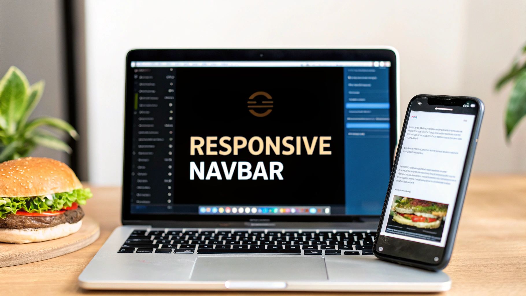
A solid navbar in React JS is more than just a collection of links. It’s a dynamic user interface built with JSX for structure, CSS for looks, and a sprinkle of JavaScript magic with React Hooks like useState to make it interactive. This combo is the secret to creating a navigation system that’s both reusable and incredibly efficient for modern web apps.
Why a Great Navbar Is More Than Just Links
Before we jump into the code, let's talk about why the navbar deserves our full attention. Think of it as the front door to your application. It’s often the very first thing a user clicks, acting as the main roadmap for their entire journey.
A clunky, confusing navbar is a recipe for disaster—it frustrates users and can send your bounce rate through the roof. On the other hand, an intuitive and clean navigation bar makes finding content a breeze. It encourages people to stick around and explore, which is a huge win for user retention and how long they spend on your site.
The Power of React for Navigation
This is where React's component-based architecture really shines. We can break down our navbar into smaller, self-contained pieces. Imagine having separate components like <Logo />, <NavLinks />, and <MobileMenu />. This approach makes your code incredibly easy to manage and scale. Need to update the logo? You just touch one file without worrying about breaking the rest of the navigation.
It's no surprise that this modular style is how the pros build their interfaces. React is a dominant force on the web, powering over 11 million websites, including giants like Netflix and Airbnb. Its massive adoption is a testament to its power in building complex, high-performance UIs, making it the perfect tool for a robust navbar in React JS.
Core Concepts for Our Navbar Build
To get this right, we'll lean on a few core React concepts. These aren't just buzzwords; they're the foundational pillars that will make our navbar functional, interactive, and genuinely user-friendly.
- State Management: We’ll use the
useStatehook to keep track of the mobile menu's state—is it open or closed? This simple hook is the key to our toggle functionality. - Conditional Rendering: This is how we’ll show or hide elements based on the situation. For example, we'll display a hamburger icon on smaller screens or apply a special style to the currently active link.
- Component Composition: We’re not going to build one giant, monolithic navbar component. Instead, we'll compose it by fitting smaller, specialized components together, which is the heart of building modern React applications.
A well-crafted navbar is the silent ambassador of your brand. It communicates professionalism, thoughtful design, and a clear path for your users, shaping their entire experience from the very first click.
Before you start coding, it’s always a good idea to gather some inspiration. Checking out some effective website header examples can spark creative ideas for layouts, color schemes, and cool interactive elements.
Setting Up Your Project and Core Navbar Component

Alright, enough theory. Let’s get our hands dirty and start building this thing. A clean project setup is the bedrock of any maintainable app, so we'll start there. We’re going to use Vite, a fantastic build tool that gets you from zero to a running dev server in seconds. Seriously, it's fast.
Pop open your terminal and fire off this command. It'll scaffold a brand new React project for you.
npm create vite@latest my-react-navbar -- --template react
Once that’s done, just cd into your new my-react-navbar directory and run npm install. This pulls in all the packages React needs to do its magic.
Structuring Your Navbar Component
Good organization is a lifesaver on any project. Instead of just dumping everything into the main src folder, we'll create a dedicated components directory. This is standard practice and keeps all your reusable UI pieces in one predictable place.
Go ahead and create a components folder inside src. Then, inside that, make another folder called Navbar. This keeps our component's logic and styling bundled together, which makes finding and editing things much easier down the road.
Your file structure should now look like this:
src/components/Navbar/Navbar.jsxNavbar.module.css
I’m a big fan of this co-location approach. The component’s logic (Navbar.jsx) lives right next to its dedicated styles (Navbar.module.css). By using CSS Modules, we ensure the styles in Navbar.module.css only apply to this component. No more worrying about accidentally overwriting button styles somewhere else in your app.
Creating the Initial JSX Structure
Let's lay down the basic skeleton for our navbar in React JS. Open up that Navbar.jsx file you just created and paste in this initial JSX. This gives us a solid blueprint with placeholders for our logo, navigation links, and a couple of call-to-action buttons.
import React from "react"
import styles from "./Navbar.module.css"
const Navbar = () => {
return (
<nav className={styles.navbar}>
<a href="/" className={styles.logo}>
Logo
</a>
<ul className={styles.navLinks}>
<li>
<a href="/features">Features</a>
</li>
<li>
<a href="/pricing">Pricing</a>
</li>
<li>
<a href="/about">About</a>
</li>
</ul>
<div className={styles.navButtons}>
<button className={styles.loginBtn}>Log In</button>
<button className={styles.signupBtn}>Sign Up</button>
</div>
</nav>
)
}
export default NavbarThis initial JSX provides a clear and semantic structure using a
<nav>element for accessibility. By separating the logo, links, and buttons into distinct containers, we've set a strong foundation for the responsive styling and state management we'll add next.
With this barebones component in place, we have a functional (if a little plain) starting point. Now for the fun part: bringing it to life and making it responsive.
Making Your Navbar Responsive with CSS and Hooks
A static navbar is only half the battle. For a truly professional user experience, our component needs to look great and function perfectly on any screen, from a sprawling desktop monitor to the smallest smartphone. This is where we get to blend the power of CSS with the dynamic capabilities of React Hooks.
The best way to tackle this is with a mobile-first CSS strategy. This simply means we'll write our base styles for the smallest screens first, then use media queries to layer on changes for larger screens. I've found this approach almost always leads to cleaner CSS and better performance on mobile devices, which is critical when a huge chunk of your users are on their phones.
This workflow diagram shows exactly what I mean—start with mobile and progressively enhance the layout as the screen size increases.
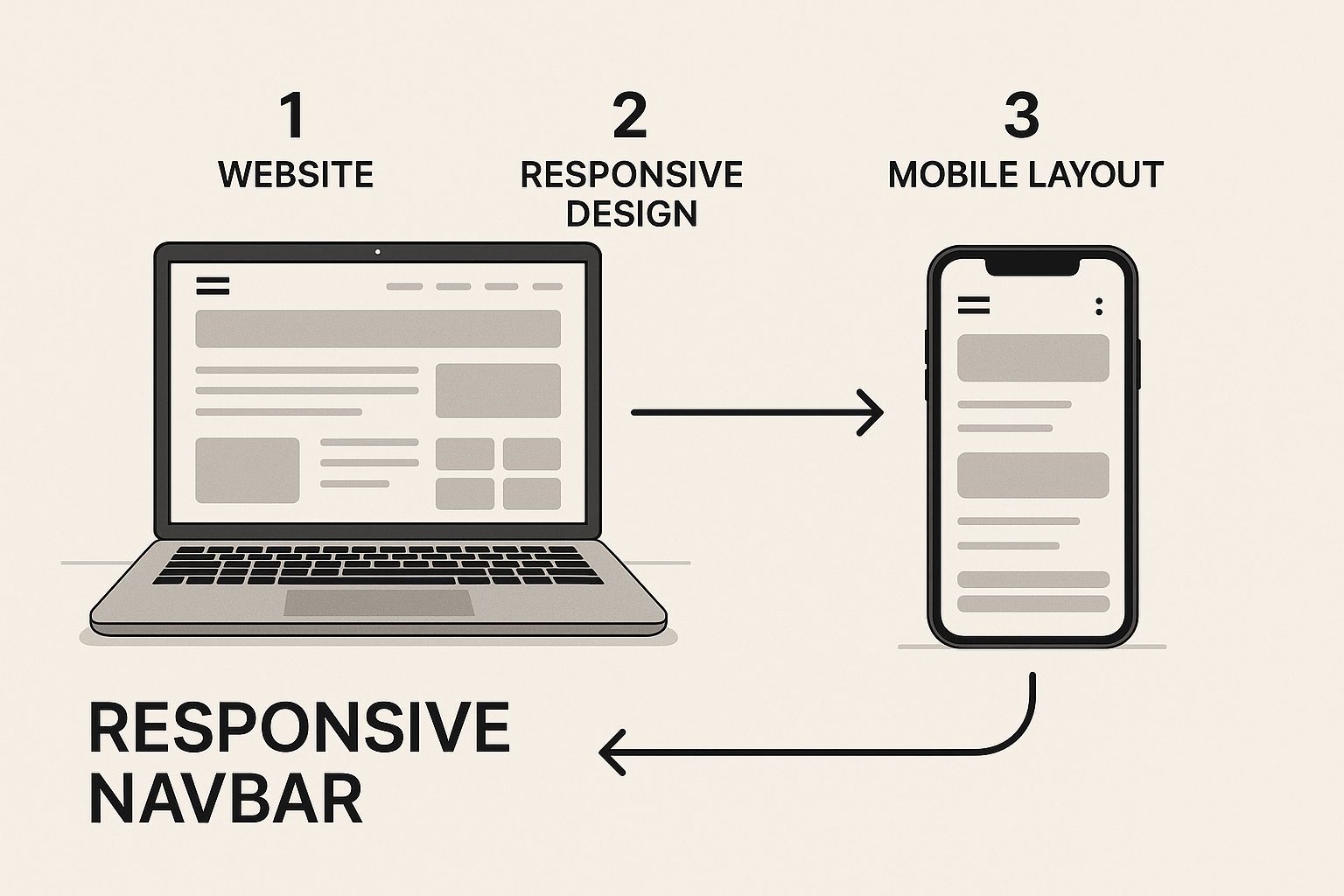
Thinking mobile-first simplifies the whole process. Instead of trying to cram a complex desktop design into a tiny space, you build up from a solid, simple foundation.
Introducing State with the useState Hook
On smaller screens, there's just not enough room to lay out all our navigation links horizontally. The go-to solution is the classic "hamburger" menu icon that users can tap to reveal the navigation. To manage whether this menu is open or closed, we need to introduce state into our Navbar component.
This is a perfect job for the useState hook. It's React's built-in way to add state to functional components. Let's pop it into our Navbar.jsx file.
import React, { useState } from "react"
import styles from "./Navbar.module.css"
const Navbar = () => {
const [menuOpen, setMenuOpen] = useState(false)
return (
<nav className={styles.navbar}>
<a href="/" className={styles.logo}>
Logo
</a>
<div className={styles.menuIcon} onClick={() => setMenuOpen(!menuOpen)}>
{/* Hamburger Icon SVG or an element */}
</div>
<ul className={`${styles.navLinks} ${menuOpen ? styles.active : ""}`}>
{/* ... our li elements */}
</ul>
{/* ... navButtons div */}
</nav>
)
}
export default NavbarWhen we call useState(false), we're creating a new piece of state called menuOpen and setting its initial value to false. The setMenuOpen function is what we'll use to change that value. The real magic is the onClick event, which simply flips the menuOpen state from true to false and back again with every tap.
To really get a handle on the interactive parts of a navbar, it helps to know which hooks do what. Here’s a quick rundown of the most common ones you’ll encounter.
React Hooks for Navbar Interactivity
This table is a quick reference for the essential React hooks used to build an interactive and stateful navbar.
| Hook | Primary Use Case in Navbar | Example |
|---|---|---|
| useState | Manages the open/closed state of a mobile menu or dropdowns. | const [isOpen, setIsOpen] = useState(false); |
| useEffect | Handles side effects, like closing the menu when the user clicks outside of it or when the window is resized. | useEffect(() => { document.addEventListener(...) }, []); |
| useRef | Gets a direct reference to a DOM element, like the navbar itself, to measure its height or position. | const navbarRef = useRef(null); |
| useContext | Shares global state (like theme or user authentication) across the navbar and other components without prop drilling. | const { theme, setTheme } = useContext(ThemeContext); |
These hooks are the fundamental building blocks for creating dynamic, modern navigation that responds to user input and browser events.
Implementing CSS Media Queries
Now we need the CSS to bring this all to life. In our Navbar.module.css file, we'll start by hiding the navigation links on mobile and only showing the hamburger icon. When our menuOpen state is true, our JavaScript adds the active class to the ul, and our CSS will use that class to make the links visible.
This component-based architecture is a big reason why, as of 2025, over 40% of professional developers are actively using React. Being able to encapsulate logic and styling like this can result in up to 60% faster build times compared to older methods. It’s all about creating reusable, high-performance components like the navbar we’re building right now.
If you want to brush up on the HTML fundamentals behind navigation, our guide on how to create a navigation bar in HTML is a great place to start.
As you build out your responsive navbar, I highly recommend keeping these responsive design best practices in mind. They’ll help you ensure the final product is polished, user-friendly, and works flawlessly everywhere.
Highlighting Active Links with React Router
A great navbar doesn't just look good—it tells you where you are. That small visual cue of highlighting the current page's link is a massive boost for user experience. For single-page apps built with React, the best tool for the job is hands-down React Router.
Instead of plain old <a> tags, React Router gives us a much smarter component: NavLink. This component is route-aware, meaning it automatically knows when its link matches the current URL. When it does, it can apply a specific CSS class, which is exactly what we need to style our active link.
Putting NavLink to Work
First things first, if you don't have React Router in your project, you'll need to add it. A quick npm install react-router-dom in your terminal will do the trick.
With that installed, we can pop open our Navbar.jsx file, import NavLink, and replace our anchor tags.
The magic happens with the className prop. We can pass it a function that receives an isActive boolean. This is a clean, modern way to conditionally apply our active link style.
import { NavLink } from "react-router-dom"
import styles from "./Navbar.module.css"
const Navbar = () => {
// ... existing useState logic
return (
<nav className={styles.navbar}>
{/* ... logo and menu icon */}
<ul className={`${styles.navLinks} ${menuOpen ? styles.active : ""}`}>
<li>
<NavLink
to="/"
className={({ isActive }) => (isActive ? styles.activeLink : "")}
>
Home
</NavLink>
</li>
<li>
<NavLink
to="/features"
className={({ isActive }) => (isActive ? styles.activeLink : "")}
>
Features
</NavLink>
</li>
<li>
<NavLink
to="/pricing"
className={({ isActive }) => (isActive ? styles.activeLink : "")}
>
Pricing
</NavLink>
</li>
</ul>
{/* ... buttons */}
</nav>
)
}When a link is active, this code applies the styles.activeLink class from our CSS module. It’s a simple but incredibly effective way to give users instant feedback on their location.
Providing immediate visual feedback, like an active link style, isn't just a design choice—it's a core usability principle. It reduces cognitive load by instantly confirming the user's location within your application's hierarchy.
When You Need More Control: The useLocation Hook
NavLink handles most cases beautifully, but what about more complex routing? Maybe you have nested routes, like a "Dashboard" section with its own sub-pages, and you want the "Dashboard" link to stay highlighted.
For those trickier scenarios, React Router gives us another powerful tool: the useLocation hook.
This hook provides access to the location object, which contains all the details about the current URL, including its pathname. With the pathname in hand, you can write custom logic to define what "active" means for your specific navbar in React JS.
For instance, you could check if the current pathname starts with /dashboard. This would keep the main "Dashboard" link highlighted whether the user is on /dashboard/settings or /dashboard/profile. This kind of fine-grained control is what allows you to build truly intuitive navigation, no matter how sophisticated your app becomes.
Okay, our responsive navbar works. It does the job. But let's be real—functionality is just the baseline. A truly great user experience comes from the little details, the polish that makes an interface feel alive.
To take our navbar in React JS from functional to fantastic, we're going to add some subtle but impactful animations. This is the perfect job for a library like Magic UI.
I'm a big fan of Magic UI because it gives you a whole suite of beautifully designed, copy-and-paste components that play nicely with React and Tailwind CSS. It’s designed to give you that professional-grade animation flair without needing a degree in motion design.
You can get a feel for the kind of slick, modern components they offer just by looking at their site. They're built to be eye-catching but also incredibly simple to drop into your project.

This is what I mean by polish. A library like this can instantly elevate a standard component into something that not only grabs a user's attention but also makes your brand feel more premium.
Integrating a Magic UI Component
Let's start by swapping out one of our plain, static nav links with something more dynamic. The AnimatedShinyText component is a great choice. It adds a really elegant shimmer effect when a user hovers over it—a tiny detail that makes the UI feel much more interactive.
First things first, we need to get the right dependencies installed. Magic UI's components often lean on Framer Motion for the heavy lifting on animations, and they use handy utilities like clsx and tailwind-merge to intelligently handle CSS classes.
Pop open your terminal and run this command in your project directory:
npm install framer-motion clsx tailwind-merge
Think of these packages as the engine under the hood. They power the smooth animations and give us the tools to manage dynamic styling without headaches.
Putting AnimatedShinyText to Work
With the dependencies installed, we can now bring the AnimatedShinyText component into our Navbar.jsx. The best way to do this is to head over to the Magic UI component documentation, find the component, and copy its code into a new file in your project. Once you have that file, you can import and use it just like any other React component.
Here’s a quick example of how you could replace the "Features" link in your navbar:
import React, { useState } from "react"
import { NavLink } from "react-router-dom"
import { AnimatedShinyText } from "../components/magicui/AnimatedShinyText" // Make sure this path is correct!
import styles from "./Navbar.module.css"
const Navbar = () => {
const [menuOpen, setMenuOpen] = useState(false)
return (
<nav className={styles.navbar}>
{/* ... your logo and menu icon ... */}
<ul className={`${styles.navLinks} ${menuOpen ? styles.active : ""}`}>
<li>
<NavLink to="/">Home</NavLink>
</li>
<li>
<NavLink to="/features">
<AnimatedShinyText className="inline-flex items-center justify-center ...">
<span>✨ Features</span>
</AnimatedShinyText>
</NavLink>
</li>
<li>
<NavLink to="/pricing">Pricing</NavLink>
</li>
</ul>
{/* ... your buttons ... */}
</nav>
)
}By simply wrapping a standard navigation link with a pre-built animated component, you add a layer of sophistication in minutes. This is a massive time-saver compared to trying to build complex CSS or JavaScript animations from the ground up.
This small tweak is a perfect illustration of a broader trend in development: efficiency through component libraries. It's no surprise the React Native market is projected to grow at a CAGR of 16.7% through 2033, largely because developers are hungry for reusable components. In fact, using a framework like React can cut development costs by up to 40%, which is a powerful argument for leaning on pre-built, optimized solutions whenever you can.
Answering Common Questions About React Navbars
Once you've got the basics of your responsive, animated navbar down in React, you'll inevitably run into a few real-world challenges. Moving past the tutorial stage means grappling with these common issues, and it's what really sharpens your skills as a developer. Let's dig into some of the most frequent questions that pop up.
Think of this section as the next level—a way to head off common problems and really solidify your understanding of building robust components.
How Do I Make My React Navbar Accessible?
Accessibility isn't just a nice-to-have feature; it's a fundamental part of building professional, usable web apps. For a navbar, this means making sure everyone, including people who rely on assistive technologies, can easily get around your site.
It all starts with using the right HTML. The <nav> element is non-negotiable—it's a signpost for screen readers, telling them, "Hey, this is the main navigation." From there, you have to make sure every interactive part works with a keyboard.
- Buttons vs. Links: Use a
<button>for actions, like opening and closing the mobile menu. For actual navigation, stick with<a>or, even better,<NavLink>from React Router. - Label Everything: That hamburger menu icon is just a visual cue. For screen readers, it's invisible without an
aria-label. Something like<button aria-label="Open navigation menu">is perfect. - Smart Focus Management: When a mobile menu slides open, the user's focus should jump right into it. When it closes, focus should return to the button that opened it. This prevents keyboard users from getting lost.
Building for accessibility is really about empathy. A properly built, accessible navbar ensures that 100% of your audience can find their way around your site, which is the whole point of a UI in the first place.
How Should I Handle Dropdown Menus for Nested Links?
Okay, so what about when you have nested navigation? Think of a "Products" link that needs to reveal a list of product categories. This is where dropdowns come in, and the trick is to manage their state correctly.
For each dropdown, you'll need its own piece of state, probably managed with useState, to track whether it's open or closed. The user experience also needs to adapt to the device. On a desktop, hovering feels natural, so you can use onMouseEnter and onMouseLeave to show and hide the menu. On mobile, that's not an option, so a clean onClick toggle is the way to go.
How Can I Stop My Navbar From Re-rendering All the Time?
Performance is always on our minds, especially as an app grows. The last thing you want is your entire navbar re-rendering every time a piece of state changes somewhere else on the page.
A quick and effective fix for this is to wrap your navbar component in React.memo. This is a higher-order component that tells React to only re-render the component if its props have actually changed. It performs a quick shallow comparison, and if nothing's different, React just skips the render cycle for that component. It’s a simple optimization that can make a big difference for components that don't change often.
Ready to build interfaces that feel alive? Magic UI gives you a massive library of 150+ free, open-source animated components built with React and Tailwind CSS. Stop building from scratch and start creating beautiful, professional UIs in minutes. Check out the components at https://magicui.design.