
A React JS navbar isn't just another item on the UI checklist; it's the navigational heart of your application. Built with React's component-based architecture, it offers a level of state management, reusability, and responsiveness that older, static methods just can't match. This modern approach allows for dynamic interfaces that adapt beautifully across any device, creating a far superior user experience.
Why Your Navbar Needs a Modern Approach

Think about it: the navigation bar is often the very first thing a user interacts with. It’s not just a list of links—it’s the roadmap that guides visitors through your digital space. Despite this, I still see so many developers clinging to outdated HTML and CSS methods that result in clunky, hard-to-maintain navigation systems.
Those traditional approaches often make a mess of managing state, like figuring out which page is "active" or simply toggling a mobile menu. This is where a modern, component-driven library like React completely changes the game.
The Power of Component-Based Architecture
React’s true strength is its ability to break down complex UIs into small, self-contained, and reusable pieces called components. Instead of wrestling with a giant block of HTML, you build individual parts—a logo, a nav link, a dropdown menu—that each manage their own logic and style.
For building a React JS navbar, this offers some serious wins:
- Reusability: Build a
<NavItem>component once, and you can drop it in anywhere you need it. No more copy-pasting code. - State Management: React’s
useStatehook makes handling dynamic states—like showing or hiding a mobile menu—incredibly straightforward. - Maintainability: Need to update a link or change its style? You only have to edit the component in one place, and the change ripples through your entire application instantly.
The real magic of building a navbar in React isn’t just about writing cleaner code. It’s about creating a navigation experience that feels intuitive, fluid, and perfectly integrated into your app's flow.
The massive adoption of React really speaks for itself. As of 2025, React is the engine behind 4.8% of websites globally. We're talking about high-traffic giants like Netflix and Airbnb, who rely on its component architecture to scale. With over 11 million websites built on the library, its knack for handling complex state changes makes it the perfect choice for dynamic navigation.
Accelerating Development with Magic UI
While React gives us the ideal foundation, building every single component from scratch is a huge time sink. This is where a UI library like Magic UI becomes your secret weapon. It provides a whole collection of beautiful, production-ready components that plug right into your React project.
Instead of spending hours coding custom animations and wrestling with CSS, you can drop in pre-built elements to create a premium feel in minutes. Of course, a great UI is more than just slick components; understanding core user experience design principles is key to making it all work.
In this guide, we're going to combine the raw power of React with the elegance of Magic UI to build a stunning and fully functional React JS navbar from the ground up.
Alright, let's get our hands dirty and set up the development environment. Before we can even think about building that slick React JS navbar, we need a solid foundation. Getting this part right from the start saves a ton of headaches later on. Trust me.
We’re going to kick things off with Vite. If you haven't used it, you're in for a treat. It gives us a ridiculously fast development server and a build process that’s already optimized right out of the box.
To get started, just pop open your terminal. We’ll run one command to scaffold a complete project structure, saving us from all that initial boilerplate setup.
npm create vite@latest my-navbar-app -- --template react-ts
Once that finishes, jump into your new project directory (cd my-navbar-app) and run npm install. This pulls in the core React library and all the scripts you need to get the application running. Simple as that—your base project is good to go.
Layering in the Styling Tools
Now for the fun part: styling. We'll be using Tailwind CSS. Its utility-first approach is an absolute game-changer for building custom, responsive components without ever leaving your JSX. It keeps everything clean and self-contained.
Let's get it installed along with its dependencies and generate the necessary config files.
npm install -D tailwindcss postcss autoprefixer npx tailwindcss init -p
After running those, you’ll see new tailwind.config.js and postcss.config.js files in your project. The next crucial step is to open up tailwind.config.js and configure your template paths. This tells Tailwind which files to watch for utility classes, ensuring they actually make it into the final CSS build.
Finally, we'll bring in the magic—literally. Magic UI provides a collection of beautifully designed, pre-animated components that will seriously speed up our development. It’s designed to slot perfectly into the setup we've just created.
This combination is what makes modern frontend development so powerful. Vite gives us speed, Tailwind provides the styling muscle, and Magic UI delivers the aesthetic flair. Together, they create an incredibly efficient stack for building a top-tier React JS navbar.
Adding Magic UI is done through its own CLI, which handles all the dependencies and configuration for you. If you ever need a refresher, the official docs have everything you need. You can learn more about the Magic UI installation process right from the source.
With all these tools locked in, our development environment is officially ready for action. We've got a fast build tool, a powerhouse styling framework, and a library of stunning components at our fingertips. Now, we can confidently move on to building out the navbar itself.
With our project set up and ready to go, it's time to dive into the fun part: building the actual Navbar component. Right now, we're not worried about making it look perfect. The focus is on creating a solid, logical foundation. Getting the JSX structure right from the start will make styling and adding features down the road a whole lot smoother.
Our main goal here is to scaffold the essential pieces every good react js navbar needs. This means carving out a dedicated spot for a brand logo, a container for the main navigation links, and a clear call-to-action button. Think of it like framing a house—you have to get the core structure in place before you can even think about paint colors and furniture.
This infographic gives you a quick visual recap of the setup process we just finished, showing the journey from an empty folder to a React project that's ready for components.
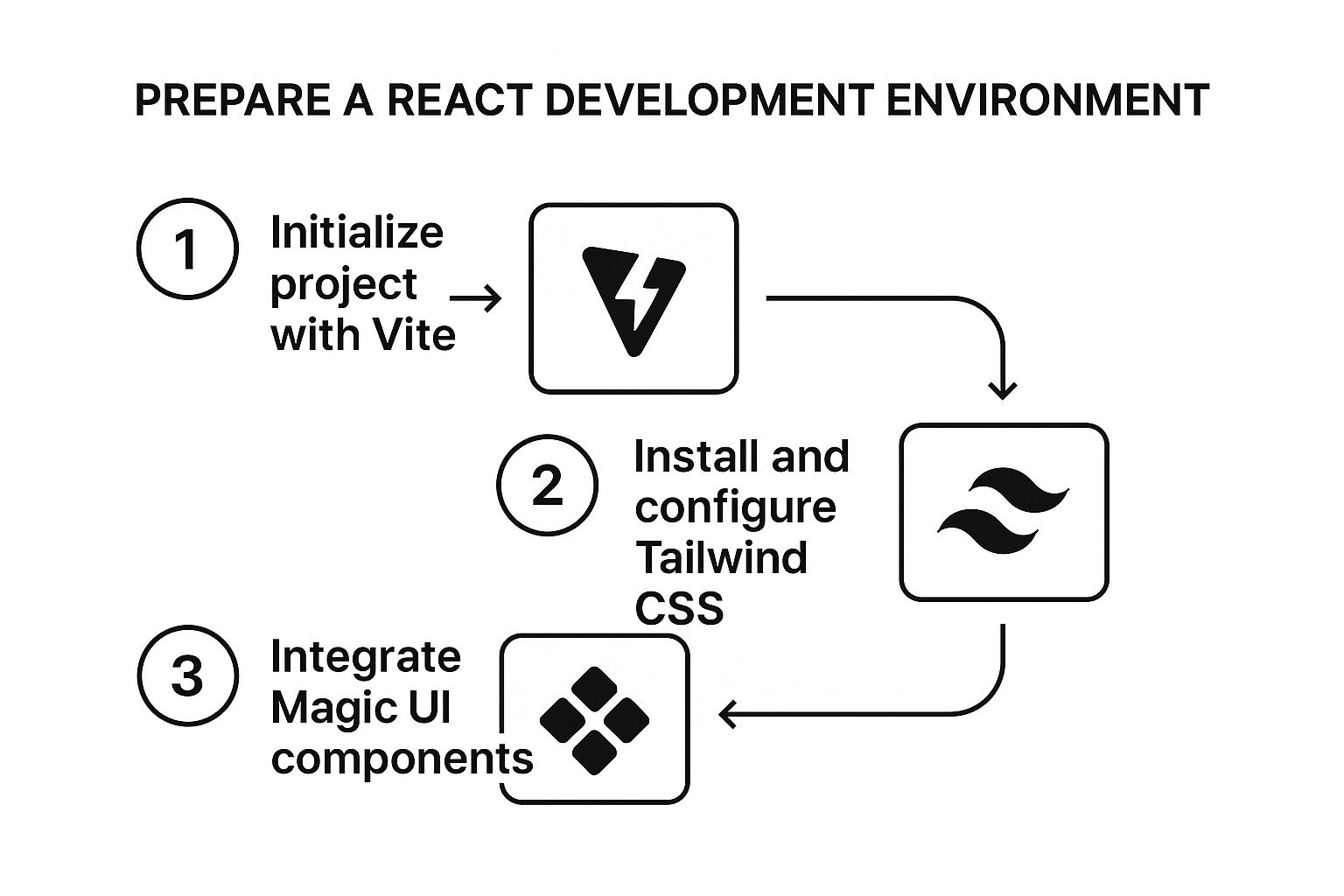
This workflow is a great reminder of how Vite, Tailwind CSS, and Magic UI work in tandem to create a powerful and efficient development stack, setting the stage for what we're about to build.
Laying Out the JSX Structure
First things first, let's create a new file. Inside your src folder, make a components directory and add a Navbar.jsx file to it. This is where we'll define our functional component. We'll start with a semantic <nav> element as the main container, which is great for accessibility and organization.
Here’s the basic JSX skeleton:
import React from "react"
const Navbar = () => {
return (
<nav className="p-4">
<div className="container mx-auto flex items-center justify-between">
{/* Logo Section */}
<div className="text-xl font-bold">
<a href="/">MagicNav</a>
</div>
{/* Desktop Navigation Links */}
<div className="hidden space-x-6 md:flex">
<a href="/features">Features</a>
<a href="/pricing">Pricing</a>
<a href="/about">About Us</a>
</div>
{/* Call to Action Button */}
<div className="hidden md:block">
<button className="rounded px-4 py-2">Get Started</button>
</div>
</div>
</nav>
)
}
export default NavbarThis initial code gives us a clean, desktop-first layout. See those hidden md:flex classes from Tailwind? We’re already building with responsiveness in mind by hiding the nav links on smaller screens. We'll come back to that shortly.
Managing State for Mobile Menus
A static desktop navigation is a good start, but it's not enough. We need to handle the state of our mobile menu—specifically, whether it's open or closed. This is the perfect job for one of React's most fundamental tools: the useState hook.
We'll introduce a state variable, isMenuOpen, and a function to update it, setIsMenuOpen. This simple piece of state management is the key to turning a static element into a fully interactive and responsive navigation experience for mobile users.
Before we implement it, here's a quick look at the React hook we'll be using.
Essential React Hooks for Navbar State
This table provides a quick reference for the primary React hook we'll use to manage the navbar's dynamic behavior.
| Hook | Purpose in Navbar | Example Usage |
|---|---|---|
useState | Manages the open/closed state of the mobile menu. | const [isMenuOpen, setIsMenuOpen] = useState(false); |
This hook is all we need for now to control the visibility of our mobile menu.
So, how do we put this into practice? It's a straightforward process:
- Import
useState: First, make sure you importuseStatefrom React at the top of your file. - Initialize the state: Inside the
Navbarcomponent, calluseState(false)to create ourisMenuOpenvariable. - Add a toggle button: We'll need a "hamburger" button that's only visible on mobile screens.
- Create an
onClickhandler: This handler will callsetIsMenuOpento flip the boolean value whenever the button is clicked.
This approach ensures our component's UI is directly tied to its state, which is a core principle of building with React. With this logic in place, we're ready to build out the mobile view and connect it to our new state variable.
Adding Style and Animation with Magic UI
Alright, we've got a functional navbar. It works, but let's be honest—it’s a bit bland. This is where the magic happens, where we take our basic component and turn it into something polished and professional that actually grabs a user's attention.
We’ll do this by pulling in some of Magic UI's pre-built, beautifully animated components. Instead of getting bogged down writing complex CSS animations from scratch, we can just import and wrap our existing elements. It's a massive time-saver and a smarter way to build.
Upgrading Links with AnimatedShinyText
Our standard navigation links are fine, but they're missing that something. We can easily fix this by wrapping them with AnimatedShinyText from the Magic UI library. It adds an eye-catching shimmer effect on hover—a perfect micro-interaction to make the navbar feel more responsive and alive.
Getting it integrated is super straightforward. First, import the component at the top of your Navbar.jsx file. Then, just wrap the text inside each navigation link.
import { AnimatedShinyText } from "@/components/ui/animated-shiny-text"
// ... inside your Navbar component's return statement
;<div className="hidden items-center space-x-6 md:flex">
<a href="/features" className="group">
<AnimatedShinyText>
<span>Features</span>
</AnimatedShinyText>
</a>
{/* Repeat for other links */}
</div>Did you notice the group className on the anchor tag? That's a slick little Tailwind CSS trick. It allows the AnimatedShinyText component to react when you hover over its parent link, making the entire link area interactive, not just the text.
This component-based approach is exactly why so many developers love React. It lets us package complex animations and logic into neat, reusable pieces, which dramatically speeds up the whole development process.
This efficiency is a big reason why over 43.5% of JavaScript developers choose React for building their UIs. The ecosystem is huge, with the core package getting over 20 million weekly downloads on NPM alone. When you pair React with a library like Magic UI, building a sophisticated React JS navbar becomes so much faster.
Giving the CTA a Professional Polish
Next up: that plain "Get Started" button. A call-to-action needs to pop, and Magic UI's ShimmerButton is the perfect tool for the job. It adds a subtle, continuous shimmer that naturally draws the eye without being obnoxious.
The process is exactly the same as before. We'll import the ShimmerButton and swap out our standard <button> element.
Here’s the game plan:
- Import it: Add
import ShimmerButton from "@/components/ui/shimmer-button";to the top of your file. - Swap it: Find your
<button>and replace it with<ShimmerButton>. - Style it: Use the
classNameprop to pass in your Tailwind utilities for padding, background colors, and text styles.
The result is a button that feels premium and practically begs to be clicked, adding a ton of value for very little effort. The best part is that this is just one option. The official documentation has a fantastic overview of all available Magic UI components you can play around with.
Mastering a Fully Responsive Navbar Design

A great-looking desktop navbar is a solid start, but let's be honest, that's only half the battle. If we want a truly professional react js navbar, it has to deliver a flawless, intuitive experience on every single screen, from a sprawling monitor all the way down to a tiny smartphone. This is where the real design engineering begins.
Given that most web traffic is mobile these days, a "mobile-first" or at least "mobile-equal" mindset isn't just a trendy best practice—it's an absolute must. We'll lean on the power of Tailwind CSS's responsive prefixes to make this process incredibly clean, skipping the headache of juggling messy media queries.
Implementing Conditional Rendering with Tailwind CSS
Tailwind’s responsive modifiers, like md: and lg:, are the secret sauce here. These little prefixes let us apply styles conditionally, right in our JSX, based on the viewport's width. This approach is fantastic because it keeps all the responsive logic bundled with the component, making our code self-contained and way easier to understand at a glance.
For our navbar, this means we can elegantly swap between the full desktop navigation and a tidy hamburger menu.
Here’s a look at the logic in action:
- Desktop Links: The container holding our main navigation links gets
hidden md:flex. This tells the browser to hide it by default (hidden) but show it as a flex container (md:flex) once the screen is medium-sized or larger. - Hamburger Icon: Inversely, our mobile menu button gets the className
md:hidden. It's visible on small screens but disappears as soon as the desktop links have enough room to show up.
This simple, declarative syntax is so much more maintainable than writing separate CSS files and trying to keep class names in sync. It just works.
By building responsiveness directly into the component's structure with Tailwind's prefixes, we create a single source of truth for our navbar's appearance across all devices. This prevents style drift and makes future updates much simpler.
Managing the Mobile Menu Overlay
Now that the hamburger icon is toggling correctly, we need to hook it up to our component's state to manage the mobile navigation overlay. This is where the isMenuOpen state variable we set up earlier comes into play. When isMenuOpen is true, we'll conditionally render a full-screen overlay that contains our navigation links.
A common tripwire here is "content shift"—that annoying jump in the page layout when an overlay suddenly appears. We can sidestep this completely by applying position: fixed or position: absolute to the overlay. This pulls it out of the normal document flow, making it float on top of the existing content without disrupting anything underneath.
Another crucial point for mobile design is the size of your touch targets. People are using their thumbs, not a mouse pointer. Every interactive element—links, buttons, you name it—needs to be big enough to tap easily without hitting something else by mistake. A good rule of thumb is to aim for a minimum touch target size of 44x44 pixels.
By weaving together state management, thoughtful CSS, and good accessibility practices, you can build a navigation system that’s truly robust and a pleasure to use. For a deeper dive, our complete guide to building a navbar in React JS breaks down even more examples and techniques.
When you're deep in the code building a React JS navbar, you'll inevitably run into a few classic head-scratchers. I've seen these same questions pop up time and again with developers I've worked with, especially when they're building their first complex navigation.
Let's break down a couple of the most common challenges and solve them with some clean, practical approaches.
How Do I Show the Active Link?
One of the first things you'll ask is, "How do I show which link is currently active?" It's a small detail, but it's huge for user experience. People need to know where they are. While a CSS pseudo-class like :active works for the moment you click, it vanishes as soon as you let go. That’s not what we want.
The real solution lies in managing this with component state, and thankfully, most routing libraries have our back.
Handling Active Link States with React Router
If you're using a modern library like React Router, this problem is practically solved for you. They offer a component called NavLink that is an absolute game-changer. It’s smart enough to know which route is currently active and will automatically add a CSS class (usually active) to the link that matches the current URL.
From there, it's just a bit of CSS. You can target that .active class to make the link bold, change its color, or add a neat underline. It’s a beautifully declarative way to keep your UI in sync with the URL, and it's far more reliable than trying to juggle this with manual state management.
import { NavLink } from "react-router-dom"
// A snippet from a Navbar component
;<NavLink
to="/features"
className={({ isActive }) =>
isActive ? "active-link-class" : "inactive-link-class"
}
>
Features
</NavLink>Creating a Sticky Navbar That Stays Put
Another feature that always comes up is the "sticky" navbar. You know the one—it stays glued to the top of the screen even as you scroll down the page. This is a fantastic usability win, especially on longer pages, because it keeps navigation just a click away.
You might think this involves some complex JavaScript or scroll listeners, but it's often much simpler.
With a utility-first framework like Tailwind CSS, this is ridiculously easy. All you need to do is add a few classes to your main <nav> element: sticky top-0 z-50.
sticky: This tells the browser to treat the element as a sticky element.top-0: This pins the navbar to the very top of the viewport once you scroll past its original position.z-50: This is crucial. It sets the stack order, ensuring your navbar stays on top of all the other content on the page.
The real magic happens when you combine React's powerful component model with the simplicity of utility-first CSS. Common UI puzzles like active link states and sticky headers become trivial to solve with just a few lines of clean, readable code. This synergy is what makes building interfaces today so efficient.
Nailing your React JS navbar is really about mastering these smaller details. They're what separate a decent user experience from a truly great one.
Ready to build stunning, production-ready interfaces in minutes? With Magic UI, you get access to over 50 customizable blocks and 150+ free animated components built with React, Typescript, and Tailwind CSS. Start building for free.