
Ever tried to build a piece of complex furniture without instructions or pre-cut parts? You'd spend ages measuring, cutting, and hoping every piece fits together perfectly. That’s a lot like building a web application's user interface from scratch.
A UI framework for React is like getting a professional, flat-pack furniture kit. Instead of starting with raw lumber, you get a box full of perfectly crafted, ready-to-use components like buttons, forms, and navigation bars that are guaranteed to fit together. This simple shift saves a massive amount of time and headache.
What Is a UI Framework for React

Without a framework, you're on the hook for designing every single button, styling every input field, and manually ensuring that everything looks and acts the same across your entire app. It’s not just tedious; it's a recipe for inconsistency, which can seriously degrade the user experience.
This is where a UI framework for React steps in. It’s a comprehensive toolkit of reusable components designed to solve these exact problems. These aren't just basic HTML elements; they're fully functional, beautifully designed pieces of your front end, all built to play nicely with React.
Core Components of a React Framework
At its heart, a good framework is a collection of dependable building blocks that handle all the common UI chores. This frees you and your team up to focus your energy on what makes your app unique, rather than reinventing the wheel for the hundredth time.
Here's what you typically get right out of the box:
- Pre-designed Components: A huge library of elements like modals, cards, alerts, and menus that are ready to drop into your project.
- Design System: A built-in set of rules, patterns, and principles that keeps your app's look and feel cohesive from one page to the next.
- Built-in Accessibility: Many frameworks are designed with accessibility standards (like ARIA attributes) from the ground up, making your app usable for everyone.
- Responsiveness: Components are almost always designed to adapt beautifully to different screen sizes, from a tiny phone to a huge desktop monitor.
The core idea is simple: develop faster, maintain better consistency, and ship a more polished product. You're standing on the shoulders of countless developers who have already solved the everyday challenges of UI design.
The React ecosystem is absolutely massive. It now powers over 11 million websites worldwide, which is nearly 4.8% of the entire internet. This incredible adoption rate shows just how powerful and flexible it is for building modern web apps.
By choosing a UI framework, you’re plugging directly into this powerful ecosystem and getting a huge head start. To get a better feel for the options out there, check out our guide on the fundamental differences in UI frameworks. It’s the perfect primer for making a smart decision for your next project.
Why Use a React UI Framework
Let's be honest, picking a UI framework for your React project isn't just a technical detail—it's a strategic call that ripples across your timeline, budget, and the final quality of your product.
Think about it this way: you could try to build a car engine by hand, forging every single piston and screw yourself. While that’s technically possible, it’s a whole lot smarter (and faster) to start with professionally engineered parts. A UI framework is exactly that: a toolbox full of high-quality, pre-built parts for your user interface.
This approach gives you some serious advantages right out of the gate. Let’s break down the four big reasons why using a React UI framework is a complete game-changer for development teams.
Accelerate Your Development Timeline
The most immediate win? A massive boost in speed. Instead of grinding away writing CSS for a dropdown menu or wrangling the state for a modal window from scratch, you just import a component that’s already built, tested, and ready to roll. That alone saves countless hours of repetitive, mind-numbing work.
This efficiency isn't just a small-scale win; it compounds across the entire project. React is all about reusable components, and a framework supercharges this by giving your team a shared library to pull from. In fact, studies show that adopting React can slash development costs by up to 40% compared to old-school methods, mostly because you're not constantly reinventing the wheel. You can see more on developer trends in the 2025 Stack Overflow developer survey.
By leaning on pre-made components, your team can finally stop rebuilding the same basic elements and start focusing on the unique features that actually deliver value to your users. It’s a fundamental shift that helps you stay competitive and ship products faster.
Ensure Universal Design Consistency
A great app speaks a single, consistent visual language. A UI framework is your secret weapon for making that happen, providing a unified design system from the start. Every button, every card, and every form field follows the same stylistic rules.
This helps you sidestep a classic problem: different parts of an app, built by different developers, slowly starting to look and feel like they belong to separate products. The framework is the guardian of your aesthetic, ensuring a professional, polished, and trustworthy user experience on every single screen. And it's not just about looking good—this consistency makes your app more predictable and intuitive for people to use.
Bake In Accessibility from the Start
Building an inclusive app that everyone can use—including people with disabilities—is non-negotiable in modern web development. But let’s face it, correctly implementing accessibility standards like ARIA (Accessible Rich Internet Applications) can be a real headache. It's complex, tedious, and easy to get wrong.
This is where a good UI framework for React becomes invaluable. It handles most of the heavy lifting for you by building accessibility right into the components themselves. This typically includes:
- Proper ARIA Roles: Components come tagged with the correct roles and attributes, making them easy for screen readers to understand.
- Keyboard Navigation: Users can navigate interactive elements like menus and modals using just their keyboard—no mouse required.
- Focus Management: The framework intelligently manages focus, guiding users through complex interactions without leaving them lost or confused.
Tap Into Community and Support
Finally, when you adopt a popular framework, you’re not just getting code—you’re joining a community. You're never coding in a vacuum. You get instant access to a massive group of developers who have almost certainly tackled the same challenges you're facing right now.
This support system is a huge safety net. It comes with extensive documentation, tons of tutorials, and a network of peers who are ready to help you out. On top of that, active frameworks get regular updates that add new features, patch security holes, and keep everything compatible with the latest versions of React.
How to Evaluate a UI Framework
Picking the right UI framework for React feels a lot like choosing a foundational partner for a big project. The choice you make upfront will echo through the entire development lifecycle, so it’s worth getting right. But how do you cut through the noise and move from a sea of options to a confident decision?
The trick is to look past the flashy landing pages and focus on what will actually impact your day-to-day work and the final quality of your app.
This simple decision tree helps frame the initial choice. If you need to move fast, a framework is almost always the answer.
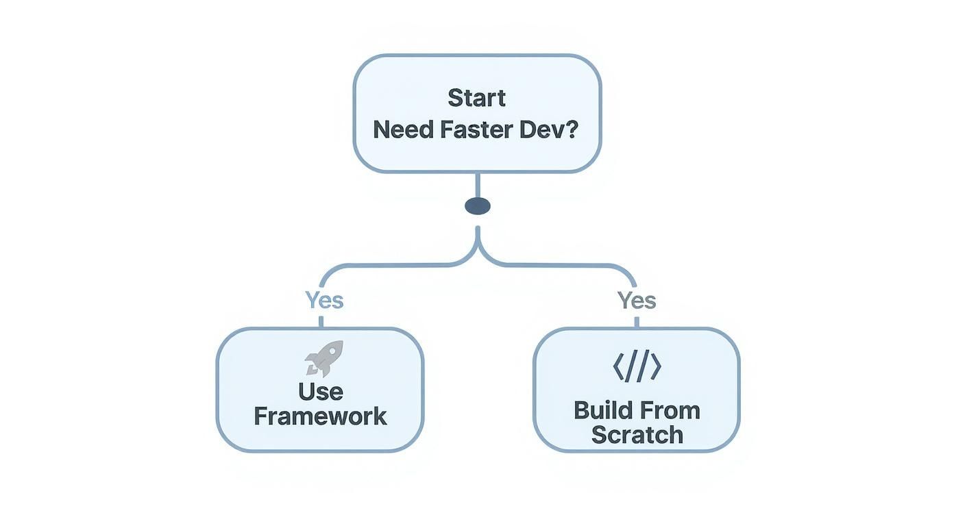
As the graphic shows, when speed is the priority, leveraging a framework beats building everything from the ground up, hands down.
Assess the Component Library
First things first, dive into the heart of the framework: its components. A great library isn't just a numbers game; it's about having the right building blocks. Does it cover the essentials your project needs, like complex data tables, versatile date pickers, or solid form elements?
Then, look closer at the quality. Are the components well-designed, accessible out of the box, and battle-tested? Honestly, a framework with fewer, more polished components is often way more valuable than one boasting hundreds of half-baked options.
Evaluate Customization and Theming
Your app needs to look like your app, not a clone of the framework's documentation site. That’s why customization is non-negotiable. See how easy it is to change colors, fonts, spacing, and component styles. Does it play nicely with modern tools like Tailwind CSS for intuitive theming, or are you going to be stuck fighting a tangled mess of CSS overrides?
A framework should serve your design system, not force you into its own. The best options provide a solid, unopinionated foundation that you can easily mold to fit your unique visual identity without writing mountains of override styles.
Analyze the Developer Experience
A fantastic developer experience (DX) is a huge productivity booster. It’s what makes working with a tool a joy instead of a chore. For me, it boils down to a few key things:
- Documentation Quality: Is the documentation clear, thorough, and packed with real-world examples? Bad docs can turn a five-minute task into a frustrating hour-long scavenger hunt.
- API Design: Are the component props logical and easy to remember? A clean, predictable API means you spend less time referencing docs and more time building.
- Community and Support: Is there an active community on GitHub or Discord? A buzzing community is a great sign that the project is alive and that you’ll be able to find help when you hit a wall.
To see a direct comparison of how popular frameworks perform on these points, check out our detailed guide to the best React UI frameworks.
To give you a clearer picture, here’s a quick rundown of how some well-known frameworks compare on these crucial features.
React UI Framework Feature Comparison
This table offers a snapshot of popular React UI frameworks, highlighting their strengths and ideal use cases to help guide your decision.
| Framework | Component Variety | Customization | Performance Focus | Best For |
|---|---|---|---|---|
| MUI | Extensive; covers everything from basic inputs to complex data grids. | High, with a robust theming system. Can be complex. | Good, but can be heavy if not optimized. | Enterprise applications and projects needing a vast component library out of the box. |
| Chakra UI | Strong, with a focus on accessibility and composition. | Excellent; built with style props for easy, inline customization. | Very good; components are designed to be composable and lightweight. | Developers who prioritize accessibility, customization, and a great developer experience. |
| shadcn/ui | A curated collection of high-quality, unstyled components. | Maximum; you copy-paste components into your project to own and style them. | Excellent; you only add the components you use. | Teams that want full control over styling and prefer a non-library approach. |
| Ant Design | Massive library with an enterprise-grade design language. | Moderate; designed for consistency but can be hard to override. | Good, though the bundle size can be large due to its scope. | Data-intensive back-office systems and internal tools. |
Each framework strikes a different balance. Your job is to find the one whose trade-offs best align with your project's goals.
Check Performance and Bundle Size
Last but certainly not least, think about performance. Every kilobyte counts, especially for users on slower mobile networks. A bloated framework can kill your app's initial load time and create a sluggish user experience.
Look for frameworks built with performance in mind. Key things to check for are support for tree-shaking (which automatically removes unused code) and a minimal core footprint. Some frameworks even publish performance benchmarks, giving you a transparent look at the impact they’ll have on your app's speed.
Spotlight on Magic UI
Most UI frameworks are all about function—giving you a massive box of practical, workhorse components. But what if you want your interface to do more than just work? What if you want it to feel alive and create a little bit of delight for your users?
That's exactly where a new breed of toolkits comes in, and Magic UI is leading the charge. It's less of a traditional component library and more of an animation and design system built for developers who want to craft truly memorable experiences.
The whole idea behind Magic UI is that modern web apps shouldn't feel static. It's built on the powerhouse combo of Framer Motion and Tailwind CSS, delivering a collection of beautifully crafted components designed to move with purpose. This sharp focus on fluid, meaningful animation is what makes it stand out in the crowded ui framework for react space.
Just take a look at their homepage. You can immediately feel the difference.

The animated grid, the interactive glows—it all speaks to a library that’s built from the ground up to help you create something dynamic and engaging right out of the box.
Animation Made Simple
Let's be honest, implementing slick animations is often a huge pain. You see something amazing on Dribbble, but turning that vision into reality can mean days of wrestling with complex CSS or clunky JavaScript libraries. Magic UI cuts right through that frustration.
The goal here is to make high-quality animation accessible to everyone. Forget spending hours fighting with keyframes and transition logic.
With Magic UI, you can drop a stunning, interactive component into your project with a simple copy-paste. It frees you up to think about the bigger picture instead of getting bogged down in the weeds of implementation.
This couldn't be more relevant today. React's dominance just keeps growing. The latest Stack Overflow Developer Survey shows it's now used by 49% of developers, making it the undisputed king of the frontend. As more of us build with React, the demand for tools that simplify tough jobs—like animation—is only going to get louder. You can dig deeper into current React trends on Netguru.
From animated grids and buttons to slick text effects, every component is designed to be both visually impressive and ridiculously easy to use. You can check out the full collection and get started over at the Magic UI documentation.
How It Works: A Practical Example
Getting a Magic UI component into your project is refreshingly simple. Since it's a collection of individual components, not some giant, monolithic library, you just grab the code for the element you need. That's it. This keeps your app lean and free of code you're not even using.
Want to add a dynamic, animated grid? You just install the dependencies and paste the component's code right into your file.
Here’s a quick peek at what that looks like:
import { cn } from "@/lib/utils"
import { AnimatedGrid } from "./components/magicui/animated-grid"
const MyAwesomePage = () => {
return (
<div className="bg-background relative flex h-full w-full items-center justify-center overflow-hidden rounded-lg border p-20">
<AnimatedGrid
className={cn(
"[min-height:300px] [min-width:500px] [--duration:20s] [--gap:1rem]"
)}
/>
</div>
)
}
export default MyAwesomePageThis straightforward, declarative approach means you can build incredibly rich, animated interfaces with surprisingly little effort.
Integrating a UI Framework into Your Project
Theory is great, but seeing a React UI framework come to life in your own project is where the real fun begins. Let's walk through the actual, hands-on steps of adding a modern framework, using Magic UI as our example. The whole point is to get you from a blank slate to a beautiful, working component in just a few minutes.
One of the best things about Magic UI is that it isn’t some massive, all-or-nothing library. You’re not bloating your project by installing a giant dependency. Instead, you just pull in the individual, self-contained components you actually need. This approach keeps your project lean and free of dead code.
Initial Project Setup
Before you can add any slick animations, you need a basic React project up and running with its core dependencies—especially Tailwind CSS. Most modern React frameworks like Next.js make this ridiculously easy with simple command-line prompts that get you a new project with Tailwind already configured.
If you’re starting a new project with Next.js, this one command is all you need:
That single line scaffolds a brand-new project and handles the TypeScript and Tailwind CSS setup for you. Honestly, it’s the fastest way to lay down a production-ready foundation.
Installing Your First Component
Once your project is ready to go, you can start cherry-picking Magic UI components. Let's grab the eye-catching AnimatedGrid component as our first victim. The process uses the Magic UI command-line interface (CLI) to pull the component directly into your project.
First, you need to initialize the CLI inside your project's main folder:
This little command takes care of setting up the necessary utilities and configurations. From there, you can add any component you want.
Now, this command does something pretty cool. It doesn't just add another line to your package.json. It physically copies the AnimatedGrid component's source code right into your project, usually creating a components/magicui folder for it.
This "copy-paste" method is a core part of the philosophy. It gives you full ownership of the code. You can tweak it, restyle it, and bend it to your will without fighting against library defaults or writing a mountain of CSS overrides.
Using the Component in Your App
With the component now living in your local codebase, using it is as simple as importing it like you would any other React component.
Let's crack open a page file (for Next.js, that’s probably app/page.tsx) and drop in the AnimatedGrid. From there, you can customize how it looks and behaves using standard props and familiar Tailwind CSS classes.
Here’s a practical, copy-paste-ready example to get you started:
import { cn } from "@/lib/utils"
import { AnimatedGrid } from "@/components/magicui/animated-grid"
export default function Home() {
return (
<div className="bg-background relative flex min-h-screen w-full flex-col items-center justify-center overflow-hidden rounded-lg border md:shadow-xl">
<h1 className="z-10 text-center text-5xl font-medium tracking-tighter whitespace-pre-wrap text-black dark:text-white">
Welcome to Your New Site
</h1>
<AnimatedGrid
className={cn(
"[min-height:500px] [--duration:30s] [--gap:1rem]",
"absolute inset-0 h-full w-full"
)}
/>
</div>
)
}And just like that, you’ve woven a sophisticated, animated background into your page. This simple workflow—initialize, add, and import—is how you’ll work with every component in the Magic UI ecosystem. It makes building visually rich interfaces incredibly fast.
Making the Right Choice for Your Project
Picking a UI framework for React isn't about finding some mythical "best" option. It's about finding the best fit for your project. The right answer always comes down to a careful balance between your project’s scope, your team's skills, and what you’re ultimately trying to build.
What works perfectly for a data-heavy enterprise dashboard would be total overkill for a sleek, animation-focused marketing site. It’s all about context.
Think of this as your final mental checklist before you commit. You need a strategic mindset that sees past the initial setup. Don't just consider how fast you can build something today; think about the long-term reality of maintaining it, scaling it, and getting new developers up to speed down the line.
Your Final Evaluation Checklist
To pull it all together, run through these critical questions when you're comparing frameworks:
- Project Scope: Does this framework’s component library actually match the features you need? Not just for the MVP, but for where the product is headed?
- Team Skills: Is your team more comfortable getting their hands dirty with deep customization (like shadcn/ui)? Or would they be more productive with a library that offers more ready-to-go solutions (like MUI)?
- Design Goals: Are you just trying to build a standard, functional interface, or is a highly polished, beautifully animated user experience a top priority?
- Performance Needs: How much does bundle size and initial load time really matter for your app? Will the framework’s footprint fit within your performance budget?
Ultimately, the right framework should feel like an accelerator, not an obstacle. It should empower your team to build better and faster, aligning perfectly with both your technical requirements and your creative vision.
Of course, the UI framework is just one piece of the puzzle. It's smart to zoom out and look at your entire development ecosystem. Getting familiar with the broader landscape of essential product management tools and technology stacks can give you the context needed to make holistic tech decisions that support your product from start to finish.
For projects where that aesthetic polish, modern animations, and a top-notch developer experience are non-negotiable, a toolkit like Magic UI really starts to shine. It was built specifically for teams that want to create interfaces that don't just work flawlessly but actually delight users with fluid, meaningful interactions. It gives you a clear path to crafting memorable digital experiences without the usual friction that comes with complex animation work.
Ready to build interfaces that feel alive? Explore the components and templates from Magic UI and see how easy it is to add a touch of magic to your next React project. Get started for free.