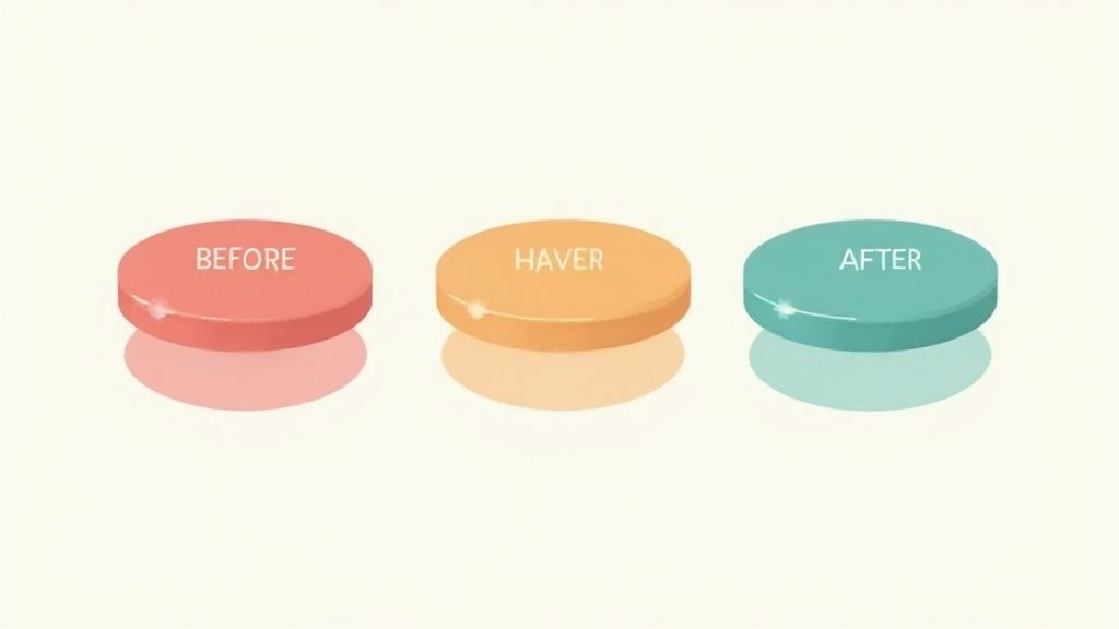
Don't mistake CSS button hover effects for simple decoration. They're a core piece of UI design, acting as a crucial signal of interactivity. When a user's cursor glides over an element and it responds, that immediate visual feedback confirms the button is alive and clickable.
Why Interactive Buttons Matter
First impressions count, and in web design, your interactive buttons are the digital handshake. The subtle animations and style changes from CSS button hover effects are so much more than eye candy. They are the communication channel that turns a static page into a dynamic, interactive experience.

These tiny interactions perform a few key jobs that directly shape how people see and use your website. At their heart, hover effects are all about giving clear, instant feedback.
- Signaling Interactivity: A quick change in appearance tells the user, "Hey, you can click this." This is vital, especially for custom-styled buttons that might not scream "I'm a button!" at first glance.
- Guiding User Flow: By drawing the eye to key actions, hover effects can gently nudge a visitor along a path, encouraging them to hit that sign-up or purchase button you want them to.
- Improving User Confidence: When a button reacts to a user's mouse, it builds trust and kills uncertainty. That tiny bit of confirmation makes the whole interface feel more responsive and dependable.
The Psychology Behind Hover States
Beyond just feedback, a well-designed hover state taps into a bit of user psychology. The immediate response creates a satisfying micro-interaction that makes the entire experience feel more engaging. A thoughtful hover effect can turn a boring click into a surprisingly pleasant moment, subtly boosting a user's opinion of your brand.
This isn't just fluffy theory; it has a real, measurable impact on performance. A well-designed hover state can make a call-to-action (CTA) button far more compelling and encourage more clicks.
The data actually backs this up. Polished button hover animations can bump up click-through rates by around 10-30%, depending on the specific design and context. These gains are most obvious on big CTA buttons, where something as simple as a smooth color fade over 200-300 milliseconds can boost user engagement and, ultimately, conversions. You can dig into more insights on the connection between button design and user experience on sliderrevolution.com. This link between technical CSS and tangible business results is exactly why mastering these effects is worth your time.
Creating Smooth Effects with CSS Transitions
If you want to create polished CSS buttons hover effects, the transition property is your best friend. Without it, property changes on hover are instant and jarring. With it, you can animate those changes over a specific time, giving your buttons a smooth, professional feel. It's the secret sauce that makes a button feel responsive and alive, not clunky.

Think of the transition property as the bridge between a button's default style and its :hover state. It gives you precise control over the user experience, turning abrupt shifts into graceful fades, slick movements, and satisfying reveals.
Mastering the Core Transition Properties
The transition property is really just shorthand for four individual properties that work in tandem. Getting a handle on each one gives you much more granular control over your animations.
transition-property: This specifies which CSS property (or properties) you want to animate. You can target justbackground-color, or you can list multiple liketransform, color. While you can useall, it’s better for performance to be explicit about what you're animating.transition-duration: This sets how long the animation takes. From my experience, a duration somewhere between 0.2s and 0.4s (that's 200 to 400 milliseconds) feels the most natural and responsive to the user.transition-timing-function: This controls the speed curve of the animation. Instead of a boringlinearspeed, options likeease-in(starts slow),ease-out(ends slow), orease-in-out(starts and ends slow) create much more realistic and organic motion.transition-delay: This one’s pretty straightforward—it adds a waiting period before the animation kicks off. It's less common for a simple hover, but it’s incredibly useful when you want to create more complex, sequenced animations.
Here’s a pro tip: always apply the
transitionproperty to the base selector of your element (e.g.,.btn), not the:hoverpseudo-class. This is a common mistake, but doing it right ensures the animation is smooth both when the user hovers on and when they hover off the button.
Common CSS Transition Properties for Hover Effects
When you're building out these effects, you'll find yourself returning to a handful of animatable properties. Here’s a quick rundown of the most useful ones for button hovers.
| Property | Effect Description | Common Use Case |
|---|---|---|
background-color | Changes the button's background color. | A simple, classic fade from one color to another. |
color | Changes the color of the text inside the button. | Often paired with background-color for contrast. |
transform | Scales, rotates, or moves the button. | Growing the button slightly or lifting it up on hover. |
box-shadow | Animates the shadow around the button. | Creating a "glow" effect or giving the button depth. |
opacity | Fades an element in or out. | Revealing an icon or text that's hidden by default. |
border-color | Changes the color of the button's border. | Swapping border colors for a subtle, clean effect. |
letter-spacing | Increases or decreases the space between characters. | Adding a stylistic touch by expanding text on hover. |
These properties are the foundational building blocks for the vast majority of hover animations you'll see on the web.
Practical Examples of CSS Transitions
Let's put this all together with a classic color fade effect. We'll make the button's background and text color change smoothly when the user hovers over it. This kind of simple, elegant effect is a workhorse in modern UI design for a reason.
In this code, we're telling the browser to animate both the background-color and color properties over 0.3 seconds using an ease timing function. It's clean, simple, and effective.
For more advanced interactions, you don't always have to build from scratch. Pre-built solutions like Magic UI’s interactive hover button are a great starting point for integrating sophisticated animations into your projects without the headache. Mastering these foundational CSS techniques is the first step to creating truly dynamic and memorable user interactions.
Building Dynamic Animations with Transforms
While smooth transitions are the bedrock of any good UI, the transform property is where you can really start having fun and injecting personality into your CSS buttons hover effects.
This is the property that lets you scale, rotate, skew, and move elements around. Think of it as opening up a whole new dimension of interactivity that goes way beyond simple color fades. It's how you make buttons feel physically responsive, almost like they're reacting directly to the user's cursor.

When you combine transform with transition, you get animations that are both dynamic and fluid. A button that slightly grows or "lifts" on hover, for instance, provides a really satisfying, tactile feedback loop. It's a subtle touch, but it’s a powerful way to make your interface feel more engaging and intuitive.
Leveraging Pseudo-Elements for Creative Effects
To take your animations to the next level, you have to get comfortable with pseudo-elements like ::before and ::after. These are essentially "ghost" elements you can style and animate completely independently of the button itself, all without cluttering your HTML. They are the secret weapon behind many of the most impressive hover effects you see out there.
With pseudo-elements, you can build all sorts of cool stuff:
- A colorful background that wipes across the button when you hover.
- An animated border that looks like it's drawing itself around the button.
- An icon or shape that fades in or slides into view.
Because ::before and ::after are treated like children of the button element, you can position them absolutely inside it and then trigger changes to their properties based on the parent's hover state.
Creating a Swipe Effect with ::before
Let's walk through a classic: the swipe effect. The idea is to have a new background color slide in from the left on hover. It's a fantastic way to add a splash of color and motion to your CTAs. We’ll use the ::before pseudo-element as our colored layer and reveal it using transform: scaleX().
So what's happening here? The ::before element starts with transform: scaleX(0), which basically squashes it down to zero width, making it invisible. On hover, we scale it back up to scaleX(1). The key is transform-origin: left, which tells the browser to start the scaling animation from the left edge, creating that smooth swipe from left to right.
It’s a simple, elegant animation that adds a premium feel. For more complex interactions like animated ripples, you might want to check out pre-built solutions like the Magic UI Ripple Button component to save some time.
The variety of CSS button hover effects has exploded recently. The 'Transform Button Size' effect, which just subtly enlarges a button on hover, is a super popular pattern because it mimics a physical, real-world response. In fact, some industry data suggests that using engaging hover effects like these can reduce bounce rates by up to 15% on landing pages.
Using Hover Effects in Modern Frameworks
Translating raw CSS into a real-world project usually means working within a modern JavaScript framework. If you’re building with React or Next.js, implementing css buttons hover effects is a daily task, but the approach is a little different than with a static HTML file. The core principles are identical, but the syntax and structure adapt to fit the component-based world we live in.
This shift is actually a huge win. When you encapsulate styles within components, you create UI elements that are self-contained, reusable, and far easier to manage as an application grows. Whether you're a fan of traditional CSS Modules, inline style objects, or a utility-first library like Tailwind CSS, the end goal is always predictable and maintainable styles.
Implementing Hover Effects in React
Let's walk through a classic transform effect—making a button grow slightly on hover—and see how to build it in React. You generally have two paths: using a dedicated stylesheet with className, or going directly with inline style objects.
The className approach is often preferred because it keeps a clean separation between your styling and your component logic. It feels familiar and organized.
// MyButton.js
import React from "react"
import "./MyButton.css"
const MyButton = ({ children }) => {
return <button className="btn-grow">{children}</button>
}
export default MyButtonAnd here's the corresponding CSS that brings it to life.
/* MyButton.css */
.btn-grow {
background-color: #5e35b1;
color: white;
padding: 12px 24px;
border: none;
border-radius: 8px;
cursor: pointer;
transition: transform 0.2s ease-out;
}
.btn-grow:hover {
transform: scale(1.05);
}This method is straightforward. The React component is minimal, and all the styling—including the hover state—lives in its own CSS file.
Refactoring with Tailwind CSS
Now, let's get the exact same result using Tailwind CSS. This utility-first workflow lets you build completely custom designs right inside your JSX, often without writing a single line of your own CSS. It's incredibly fast for prototyping and maintaining a consistent UI.
Here’s how that same button looks with Tailwind's utility classes.
import React from "react"
const MyButtonTailwind = ({ children }) => {
return (
<button className="cursor-pointer rounded-lg bg-purple-700 px-6 py-3 text-white transition-transform duration-200 ease-out hover:scale-105">
{children}
</button>
)
}
export default MyButtonTailwindSee that hover:scale-105 class? That’s the magic of Tailwind. Its state variants, like hover:, make it trivial to apply styles for different interactions directly in your markup. This approach co-locates everything related to the button into a single file, which many developers find incredibly efficient.
As you think about applying these effects in a larger application, it can be helpful to see how they fit into the bigger picture. Reading a guide on Next.js development services can offer that broader context.
A major advantage of using frameworks is the ability to adapt these patterns into component libraries. For example, you can use these exact techniques to customize open-source components, like those from Magic UI, to fit your project's unique brand and interactive feel.
In the end, choosing between CSS Modules and Tailwind often comes down to your team's workflow and the project's needs. Both are fantastic, powerful ways to create dynamic css buttons hover effects in any modern web app.
Designing for Accessibility and Performance
A slick button animation is useless if it tanks the user experience. This is where we need to step back from the cool visuals of css buttons hover effects and consider what's happening under the hood. An effect isn't really great unless it's accessible to everyone and runs smoothly on every device.

This means your interactions can't leave people out. Color contrast, for example, is huge. If your button text fades into a background color that’s too similar, users with visual impairments simply won't be able to read it. Always run your hover state colors through a contrast checker to make sure they meet accessibility guidelines.
Also, remember not everyone uses a mouse. Keyboard navigation is a must, which means your hover effects should also kick in on focus. It's a surprisingly simple fix: just chain the :focus pseudo-class right alongside :hover.
.btn:hover,
.btn:focus {
/* Your hover and focus styles go here */
transform: translateY(-2px);
box-shadow: 0 4px 8px rgba(0, 0, 0, 0.2);
}That one tiny addition makes your interactive elements work for a much bigger audience.
Keeping Animations Fast and Smooth
Performance is the other side of the coin. A choppy, lagging animation can make an otherwise polished site feel cheap and broken. The secret to buttery-smooth effects is knowing which CSS properties the browser can animate without breaking a sweat.
You should always prioritize animating two properties above all others: transform and opacity. Why? Because they can be handed off directly to the GPU in a process called hardware acceleration. This lets them skip the browser’s expensive layout and repaint calculations, which are the main culprits behind janky animations.
I see this all the time: developers animating properties like
width,height,margin, ortop. This is a classic performance trap. Changing these forces the browser to reflow the entire page, which can cause significant lag, especially on complex pages or less powerful devices. For any movement or scaling, stick totransform.
The arrival of CSS3 back around 2011 was a game-changer for web interactivity, giving us native browser support for these high-performance animations. In fact, some analytics show that websites using modern CSS hover effects saw an average session duration increase of 12.8% and about 40 seconds more interaction time per user.
If you want to be sure your effects are fast, pop open your browser's developer tools and audit the rendering performance. This will help you spot any costly animations and confirm that your css buttons hover effects are as performant as they are beautiful. For a much deeper dive into optimization, check out our guide on how to improve website performance.
Common Questions About CSS Hover Effects
When you're deep in the weeds creating css buttons hover effects, the same questions and headaches tend to pop up again and again. Nailing the answers to these common issues is the key to taking your animations from just okay to truly polished and professional.
Let's walk through some of the most frequent challenges I see developers run into.
How Do I Make My Hover Effect Work on Mobile Devices?
This is a classic "gotcha" that trips up a lot of people. The short answer? You don't. The :hover pseudo-class is tied directly to a mouse cursor, which simply doesn't exist on touch devices like phones and tablets. Forcing a hover effect on mobile usually just creates a weird, sticky state that feels broken to the user.
A much better approach is to use the :active pseudo-class for mobile. This state fires the moment a user taps down on an element. By making your :active styles match your :hover styles, you create a consistent experience across all devices. Think of hover as a nice little bonus for desktop users, not a core interaction for everyone.
Why Is My Hover Animation Laggy or Choppy?
Nine times out of ten, a choppy animation comes down to a performance issue. If your button hover feels jerky, you're probably animating CSS properties that force the browser to do a ton of heavy lifting—recalculating layouts (reflow) and redrawing the screen (repaint). The usual suspects are properties like width, height, margin, padding, top, or left.
Want to guarantee a silky-smooth 60fps animation? Stick to animating just two properties: transform and opacity. These are special because the browser can hand them off to the GPU for hardware acceleration. This simple trick bypasses the main browser thread, resulting in buttery-smooth animations that never slow your page down.
Can I Trigger an Effect on One Element by Hovering Another?
Absolutely, but there's a catch: the elements need to have a direct relationship in your HTML. CSS gives us a few selectors to work with here.
- Adjacent Sibling (
+): Use.trigger:hover + .targetto style an element that comes immediately after the trigger. - General Sibling (
~): Use.trigger:hover ~ .targetto style any sibling element that comes after the trigger. - Child (
.parent:hover .childto style a child element when its parent is hovered. This is probably the most common one you'll use.
If the two elements are completely unrelated in the DOM—say, in different sections of your page—then CSS can't connect them. In that case, you'll need to reach for a little bit of JavaScript to add and remove a class on the target element.
For most standard button hover effects,
transitionis the simpler and more appropriate choice. It's designed for straightforward state changes. Useanimationwith@keyframesonly when you need complex, multi-step sequences like pulsing or shaking.
What Is the Difference Between Transition and Animation?
This is a great question. While both transition and animation create movement over time, they're built for different jobs.
The transition property is your go-to for simple state changes. It’s perfect for defining that smooth shift from a button's default style to its :hover style and then back again. It's clean, efficient, and does exactly what you need for most UI interactions.
On the other hand, the animation property (used with @keyframes) is a much more powerful tool. It's designed for creating complex, multi-step sequences. You'd pull this out if you wanted a button to pulse repeatedly, shake on hover, or follow some other intricate sequence. For the vast majority of css buttons hover effects, transition is the right tool for the job.
Ready to stop building from scratch and start creating stunning UIs faster? Magic UI offers a massive library of over 150 free, open-source animated components and premium templates built with React, Typescript, and Tailwind CSS. Explore our components and build beautiful landing pages in minutes at https://magicui.design.
