
A dashboard UI is all about taking a mountain of complex data and making it understandable, scannable, and—most importantly—actionable. A great design cuts through the noise, turning raw numbers into meaningful insights that help people make smart decisions, fast.
Building the Foundation of Your Dashboard
Before you even think about picking a chart type or a color scheme, you need to lay the groundwork. This is where the real work happens. A beautiful dashboard that doesn't answer the right questions is just a pretty picture; it's a failure. The planning stage isn't just a box to tick—it's the most critical phase of the entire project.
This is where you stop talking in hypotheticals and start defining concrete goals. You have to get into the heads of the people who will actually be using this thing every day. What do they really need to accomplish?
A dashboard for a CEO should offer a high-level, at-a-glance summary of the company's health. But a marketing analyst needs to get their hands dirty with granular data they can slice and dice. Miss that distinction, and you're on the fast track to a cluttered, useless interface. It’s a classic mistake.
Know Your Audience and What They Need
The first, and most important, question you have to ask is: "Who is this for?" The answer to that single question will shape every decision that follows. To get to the bottom of it, you'll want to create user personas—basically, fictional profiles of your key users.
Let's imagine a couple of scenarios. A sales manager is probably focused on:
- How their team is tracking against monthly quotas.
- Which reps have the best lead conversion rates.
- The total value of the current sales pipeline.
Now, contrast that with an operations manager. Their world revolves around:
- System uptime and performance metrics.
- Average time to resolve support tickets.
- How resources are being allocated and used.
By mapping out these distinct needs, you make sure the dashboard surfaces only the most relevant information. This is how you avoid the data overload that makes so many dashboards feel overwhelming. The whole point is to give each user a view that speaks directly to their role and goals. For instance, the specific data visualizations required for something like stock market analysis software are completely different from those for a social media dashboard.
A user-centric approach isn't just a nice-to-have; it's the only way to build a dashboard that actually gets used. If people have to hunt for the information they need, they'll just go back to their trusty old spreadsheets.
To ensure your planning phase is rock-solid, focus on these foundational principles.
Key Principles for User-Centric Dashboard Planning
This table outlines the core ideas that should guide your strategy from the very beginning.
| Principle | Key Action | Impact on Dashboard UI |
|---|---|---|
| Audience First | Create detailed user personas and conduct interviews to understand their daily tasks and pain points. | The UI will feature data and visualizations directly relevant to each user group, eliminating clutter. |
| Goal-Oriented | Define the primary business question the dashboard must answer for each user persona. | Every element on the dashboard has a clear purpose, guiding the user toward a specific action or decision. |
| Context is King | Understand the environment where the dashboard will be used (e.g., on a large screen in an office vs. a tablet on the go). | The layout, font sizes, and interactivity will be optimized for the user's actual viewing context. |
| Prioritize Ruthlessly | Work with stakeholders to identify the top 3-5 most critical metrics (KPIs) and relegate others to secondary views. | The main view of the dashboard will be clean and focused, highlighting the most important information "above the fold." |
Following these principles sets you up for a design that is not only functional but also intuitive and valuable to its users.
Identify and Prioritize Key Metrics
Once you know exactly who you're building for, it's time to figure out which Key Performance Indicators (KPIs) actually matter to them. This isn't about throwing every available metric onto the screen. It's about being ruthless with your choices. A dashboard that tries to show everything ultimately communicates nothing.
Here’s a great exercise: ask your stakeholders, "If you could only see five metrics to understand the health of your department, what would they be?" This question forces everyone to get laser-focused. It helps you separate the "nice-to-know" data from the "must-know" information that drives real action. For a deeper look at building user-focused digital tools, check out our guide on web application design.
This simple visualization shows how these foundational steps connect.
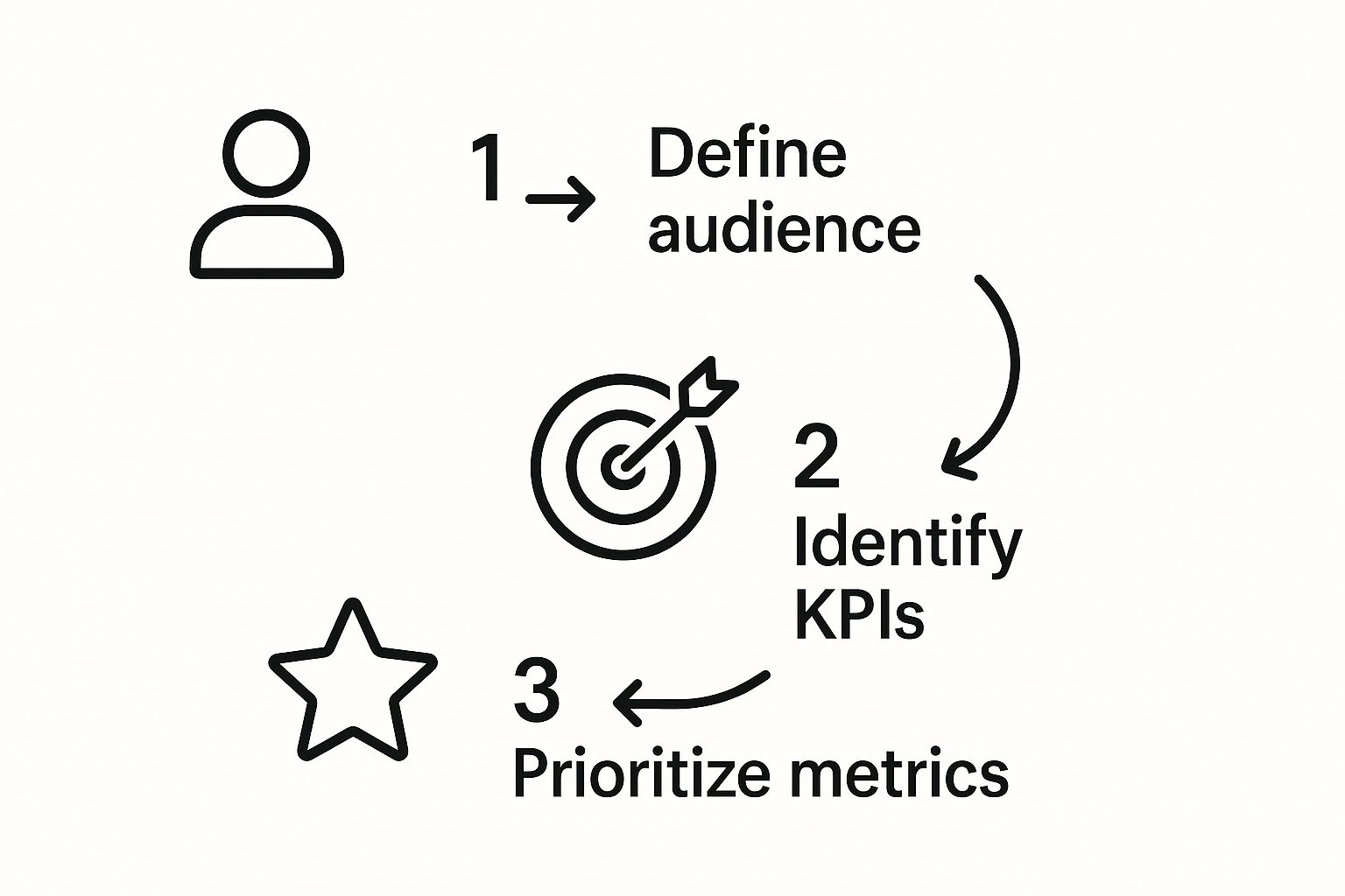
Starting with the user, then defining their needs, and finally prioritizing the metrics ensures your dashboard UI is built on a solid, strategic footing. If you skip this structured approach, you're just guessing. You might end up with a dashboard that's rich in data but completely poor in insights.
Mastering Visual Hierarchy and Layout
A great dashboard doesn’t make you hunt for insights. It guides your eye directly to the most critical information, turning complex data into something you can understand at a glance. It's less of a puzzle and more of an intuitive path.
This isn't about just making things look pretty; it's a strategic use of visual cues—like size, color, and placement—to create a clear hierarchy. The most important metrics should literally be the biggest and boldest things on the screen. It's a functional choice that puts the focus exactly where it needs to be.
Guiding the User’s Eye with Layout Patterns
Let's be honest, people don't read dashboards; they scan them. If you understand how people scan, you can build a much more effective layout. For most users in Western cultures, the eyes naturally follow a Z-pattern: top-left to top-right, down to the bottom-left, and then across to the bottom-right.
You can use this natural behavior to your advantage.
- Top-Left (Point 1): This is prime real estate. Put your most critical, high-level KPI right here, as it's the very first place a user will look.
- Top-Right (Point 2): Perfect for secondary information or key actions like date range filters. It's important, but not the absolute first thing they need to see.
- Bottom-Left (Point 3): A great spot for supporting charts or breakdowns that add context to your main KPI.
- Bottom-Right (Point 4): This is the end of the line. Reserve this space for less critical data or "nice-to-have" details that users can dig into if they want.
When you align your layout with this pattern, the whole experience feels more natural. You reduce the user's cognitive load, which means they can absorb information much, much faster. It's a subtle trick, but it's incredibly powerful.
Whitespace Is an Active Design Element
Whitespace is probably the most underrated tool in a designer’s toolkit. It’s not just “empty” space—it’s an active element that defines relationships, kills clutter, and makes everything easier to read. A crowded dashboard is an overwhelming one.
Think of whitespace as breathing room for your data. When you put plenty of space between charts and metrics, you’re helping the user’s brain group related information together. It’s a visual cue that says, "Hey, these things belong together and tell a specific part of the story."
A common mistake is trying to cram something into every last pixel. The goal isn't to show everything at once, but to show the right things clearly. Strategic whitespace is what separates a clean, professional dashboard from a cluttered, amateurish one.
Using whitespace effectively makes your entire design feel more organized and far less intimidating. If you're looking for inspiration on creating clean interfaces, exploring different user interface themes can give you some great ideas for managing space and color.
Building a Responsive Grid System
In a world full of different devices, your dashboard isn't just going to live on a big desktop monitor. It has to look just as good and be just as functional on a tablet or a laptop. A responsive grid system isn't a nice-to-have; it's non-negotiable.
A grid gives your layout a solid foundation, ensuring everything stays consistent and aligned. Using something like a 12-column grid lets you define exactly how your components should reflow and resize on different screens.
Here’s why that’s so helpful in the real world:
- Consistency: It locks in your margins, padding, and alignment, giving your dashboard that polished, professional feel.
- Responsiveness: You can set rules, like telling a four-column row of KPIs on a desktop to stack into a two-by-two grid on a tablet and a single column on a phone.
- Efficiency: It just makes the design process faster. You have a clear structure to work with instead of just placing elements randomly.
Without a solid grid, your layout can completely fall apart on different devices. That would make your carefully designed dashboard unusable for a huge chunk of your audience. Getting these layout principles right is the first step to creating a dashboard that not only looks fantastic but works brilliantly.
Telling a Story with the Right Data Charts
A dashboard isn't just a jumble of metrics; it's a storytelling tool. The charts you pick are the main characters in that story, and choosing the wrong one can send your users down a completely wrong path, leading to bad conclusions. A truly powerful dashboard design UI hinges on picking visualizations that tell the truth with absolute clarity.
The real goal here is to move beyond just knowing what a line chart is. You have to understand the why behind each choice. What specific question is a user trying to answer, and which visual is best equipped to give them that answer instantly? When does a line chart reveal a trend better than a bar chart? And why are pie charts, so often requested, usually a terrible choice for detailed comparisons?
Get these answers right, and users can digest complex information in seconds, not minutes. That efficiency is the hallmark of a dashboard that actually works.
Matching Chart Types to Data Stories
Every chart type has a job. Your role as a designer is to be a matchmaker, pairing the right data story with its perfect visualization. Trying to cram a dataset into the wrong chart is like trying to hammer a screw—it’s messy, and it just doesn't work.
Think about these common scenarios I see all the time:
- Showing Change Over Time: If you want to show a trend—like website traffic over the last quarter or monthly recurring revenue—the line chart is your best friend. Its continuous line naturally draws the eye along the timeline, making peaks, valleys, and patterns immediately obvious.
- Comparing Categories: Need to stack up distinct categories against each other? Think sales performance across different regions or user counts in various subscription tiers. A bar chart is the undisputed champ here. The length of each bar provides an instant, easy-to-process visual comparison.
- Illustrating Parts of a Whole: The often-abused pie chart (and its cousin, the donut chart) really only has one job: showing composition. It’s only effective when you have a tiny number of categories (ideally fewer than five) that neatly add up to 100%. Any more than that, and the slices become impossible to compare, making the chart worse than useless.
Building a Visual Narrative
Once you’ve picked your charts, you need to arrange them to tell a compelling story. A well-designed dashboard doesn't just throw data at the user; it guides them logically from a high-level overview right down to the nitty-gritty details.
Always start with the most critical, summary-level KPIs at the very top. These are your "headline" numbers that give an instant pulse check on what's happening. From there, you can place charts that add context and break down those headline figures. For instance, a big KPI showing "Total Sales" could be followed by a bar chart breaking down sales by region and a line chart showing the sales trend over the past six months.
This top-down structure creates a natural flow. Users get the big picture in a glance, and if something sparks their curiosity, they can seamlessly scroll down to investigate further. This guided exploration stops them from feeling lost in a sea of data.
The best dashboard UIs don't just present data; they curate it. They build a story that starts with a powerful summary, offers supporting details, and allows the user to explore the 'why' behind the numbers without getting overwhelmed.
This user-first approach has become non-negotiable. The whole field of dashboard design has shifted in recent years, with a huge new emphasis on user experience and ethical UX. Users don't just expect data to be clear; they demand transparency about where it comes from and what it means. This is driven partly by the need to reduce churn—a confusing chart or a widget that doesn't work will now directly lead to user dissatisfaction. Good design means making data sources obvious, often through tooltips that add context and build trust. You can dig deeper into these evolving standards and see how top dashboard design trends are shaping user experience on uitop.design.
The Details That Make a Difference
The final layer of polish comes from the small details that turn a good chart into a great one. These are the things that often get overlooked but are absolutely critical for clarity.
- Clear Labeling: Every single chart and axis needs a clear, concise title. Don't make people guess what "Metric A" or "Dataset 2" means. Use plain English to describe exactly what they're looking at, like "Monthly New Subscribers" instead of just "MNS."
- Strategic Color Use: Color is a tool, not decoration. Use a neutral palette for the base of your charts and save your bright, attention-grabbing colors to highlight key data points, outliers, or important alerts. And please, make sure your color choices are accessible and have enough contrast for everyone.
- Minimalist Interactivity: A little interactivity goes a long way. The key is to add just enough to empower users without overwhelming them. Hover-over tooltips that show precise data points are fantastic. Drill-downs can be powerful, but use them sparingly and make it obvious that an element is clickable.
By focusing on these principles, you can elevate your charts from simple data displays into powerful storytelling tools that actually drive understanding and action.
Improving UX with Smart Interactivity
A dashboard that just throws data at you is only doing half its job. The really great ones invite you to touch, explore, and question what you’re seeing. This is where smart interactivity comes in—it transforms a static report into a dynamic, hands-on tool that makes the whole user experience so much better.
When you give users interactive elements, you empower them. They go from being passive observers to active participants, and that engagement is crucial for uncovering deeper insights. The moment a user can instantly filter a massive dataset or click on a chart segment to see the details behind it, they start building a more intuitive feel for the information.
Making Data Exploration Intuitive
The whole point of interactivity is to make digging into data feel natural, not like a chore. I've seen dashboards with poorly designed filters or confusing navigation that just frustrate people until they give up. This is where thoughtful, intuitive choices for your dashboard design ui are absolutely essential.
Think about something as simple as a date picker. A clean, calendar-based selector is almost always a better experience than forcing someone to manually type YYYY-MM-DD. Same goes for dropdowns—they should be clearly labeled and ordered in a way that makes sense, whether that’s alphabetical or by importance.
But the real game-changer is implementing drill-downs. Imagine a user sees a huge sales spike on a summary chart. With a drill-down, they can click that spike and instantly see a breakdown by region, product, or sales rep. This immediate access to the "why" behind the numbers is what turns a good dashboard into an indispensable business tool.
Providing Clear User Feedback
Every single action a user takes needs an immediate and obvious reaction from the interface. It's this feedback loop that makes a dashboard feel responsive and trustworthy. Without it, users are left clicking and wondering, "Did that work? Is this thing broken?"
Here are a few small but powerful ways to give feedback:
- Hover States: When a user's mouse passes over a chart element, it should subtly change color or grow slightly. A tooltip should pop up with the precise data point. Simple. Effective.
- Loading Animations: If fetching new data takes a second, show a spinner or a pulsing animation. That little visual cue tells the user, "Hang on, I'm working on it," which is infinitely better than a frozen screen.
- Confirmation Messages: After a user saves a new setting or applies a complex filter, a quick "Settings saved" message provides that crucial confirmation and peace of mind.
A dashboard without feedback is like having a conversation where the other person just stares back silently. It creates uncertainty and kills trust. Clear, immediate feedback makes the entire experience feel polished and professional.
And when you're dealing with huge amounts of data, you'll want to ensure everything stays snappy. A great way to do that is with flawless data pagination.
The core idea is to make the dashboard work for the user, not the other way around. You want to anticipate their questions and make the path to the answers as short and painless as possible. As you build out your dashboard design ui, think through every click, hover, and filter.
For more on this, check out our guide on how to make an interactive website. By putting smart interactivity at the top of your priority list, you're not just creating a tool people use—you're building something they genuinely rely on to make better decisions.
Exploring Advanced UI Techniques
Once you’ve got a solid foundation built, it’s time to start pushing the creative boundaries of your dashboard design ui. This is the fun part, where you move from a merely functional interface to something exceptional. We're talking about exploring techniques that add polish, intelligence, and a little bit of magic to elevate the user experience from useful to genuinely memorable.
You’ve probably noticed emerging trends constantly reshaping what's possible in dashboard design. One of the biggest shifts I’m seeing is the integration of AI to surface personalized insights. Imagine a dashboard that learns a user's habits and proactively highlights the data it knows they'll care about, even before they start clicking around. That changes the game from reactive data exploration to a more proactive, guided discovery.
Weaving in Subtle Animations
Let's be clear: when I say animation, I don't mean flashy, distracting effects. Thoughtful, subtle animation can transform a static dashboard into a fluid and responsive experience. The goal is to use motion to guide the user's eye and provide context.
Even the simplest, most purposeful animations make a huge difference. Think about when a user applies a filter. Instead of the charts abruptly reloading, what if they smoothly transitioned to their new state? This visual continuity helps the user instantly understand what just changed. A gentle fade-in for newly loaded data can also give the whole interface a much more polished and professional feel.
Here are a few practical ways to apply this:
- Loading Indicators: Instead of a generic spinner, use subtle pulsing animations during data refreshes. It assures users the system is working without being obnoxious.
- Hover Effects: Have chart segments slightly grow or brighten on hover. It’s a simple cue that makes it obvious which element is being interacted with.
- Bar Chart Transitions: When data updates, make the bars animate their growth from the baseline. This small detail makes trends and changes feel more dynamic and alive.
Drawing Inspiration from Unconventional Design
While usability will always be my top priority, there's tremendous value in looking outside the box. I always encourage designers to check out unconventional layouts and bold typography for inspiration. These avant-garde designs are often where new ideas are born, ideas that can be toned down and adapted for more practical use. They force you to think beyond the standard grid.
The evolution of dashboard design is heavily influenced by this kind of creative exploration. Designers are finally being encouraged to break away from traditional UIs by using unique color palettes, layouts, and interactive elements.
Realistically, many of these forward-thinking designs aren't practical for direct implementation—in fact, around 90% might not fit a real-world business scenario. But they are absolutely essential for sparking new ideas. If you want to see what I mean, you can explore top dashboard design examples for 2025 on muz.li.
The goal isn't to copy these unconventional designs directly. Instead, use them as creative fuel. Ask yourself: "What's the core idea here, and how could I adapt a small piece of it to make my functional dashboard more engaging?"
Maybe it means using a bolder, more expressive font for a single, critical KPI to give it more visual weight. Or perhaps it involves breaking your grid slightly for one specific module to draw special attention to it.
It’s all about finding that perfect balance where innovative design choices support and enhance usability, rather than compete with it. By carefully integrating these advanced techniques, you can create a dashboard that's not only effective but is also a genuine pleasure to use.
Common Dashboard Design UI Questions
Even the best plan hits a few bumps. That's just part of the creative process. When you're deep in a dashboard UI design, certain questions and challenges seem to pop up for everyone. Getting a straight answer on these can save you a ton of rework and help you build something better from the get-go.
Let's walk through some of the most common hurdles I see designers face and break down how to clear them with confidence.
How Do I Make My Dashboard UI Design Mobile-Friendly?
First thing's first: making a dashboard mobile-friendly isn't about shrinking it down. You have to completely rethink the experience. It’s an exercise in ruthless prioritization because mobile screen real estate is incredibly precious.
You'll want to start with a responsive grid system—that's non-negotiable. It’s the skeleton that lets your layout adapt gracefully. From there, your main job is to identify the one or two most critical KPIs. I mean the numbers a user absolutely needs to see while they're on the move. Make those the heroes of the mobile view. Everything else is secondary.
So what do you do with the rest of the information? You tuck it away neatly using space-saving patterns.
- Collapsible Menus: The classic hamburger menu is your friend. Use it for navigation and filters that aren't mission-critical.
- Accordions: Got a few related charts or data sets? Group them under expandable accordion sections so they don't create a wall of scroll.
- Tap-Friendly Targets: Make sure every single button, link, and interactive element is big enough for a thumb to hit easily. It sounds obvious, but it’s a classic rookie mistake.
Your goal here is a focused, glanceable experience, not a miniature clone of the desktop version.
What Is the Biggest Mistake to Avoid in Dashboard Design?
This one's easy: information overload. It’s the single most destructive mistake you can make. It's that "kitchen sink" approach where stakeholders—usually with the best intentions—ask you to cram every possible metric onto one screen. This is the fastest way to make a dashboard completely useless.
When every chart and number is screaming for attention, nothing actually gets heard. The user is left staring at a visual puzzle box that takes real mental effort to piece together. This completely defeats the whole point of a dashboard, which is to deliver clear, quick insights.
If everything is presented as important, then nothing is important. A great dashboard is curated. It’s an opinionated view of what matters most, designed to answer specific questions in seconds.
Your job is to create clarity, not a data dump. You have to prioritize. When someone asks you to add "just one more chart," gently push back and ask, "What specific decision will this chart help someone make?" That question alone can work wonders.
How Can I Choose the Right Color Palette for My Dashboard?
Color is an incredibly powerful tool in your dashboard design UI kit, but it’s got to have a purpose beyond just looking nice. A smart color strategy should make data easier to understand and guide the user's eye to what matters.
Your organization's brand guidelines are a good starting point, but don't be afraid to adapt them for data viz. That vibrant brand orange might be perfect for a button, but it's probably way too overpowering for a background. I almost always start with a neutral palette—think light grays, off-whites, or even muted dark tones—for the main UI containers and backgrounds.
This lets you reserve your bright, saturated colors for the important stuff:
- Drawing the eye to your most critical KPIs.
- Signaling alerts or negative trends (red is the universal go-to for a reason).
- Emphasizing a specific data series in a busy line chart.
For the charts themselves, don't reinvent the wheel. Stick to established best practices. Use sequential palettes (light to dark of one hue) for ordered data, and diverging palettes (like a blue-to-red scale) when you need to show a range with a clear midpoint. And please, always run your final palette through an accessibility checker. You need to ensure there's enough contrast for everyone to read it clearly.
Should I Include Data Tables in My Dashboard UI?
Absolutely, but they should play a supporting role, not the lead. Think of it this way: charts are fantastic for showing trends, patterns, and high-level comparisons at a glance. But they are terrible when you need precision. When a user needs to find an exact value or compare a few specific line items, nothing beats a good old-fashioned table.
The trick is integrating them without cluttering the main visual overview. You never want to drop a massive, sprawling table front and center. That just brings back the information overload problem. Instead, use tables as a tool for deeper exploration.
A great way to do this is by making tables accessible through a drill-down action. For example, a user clicks on a big slice of a pie chart, and a modal window pops up with a clean table showing the raw data for just that segment. Another solid option is to put detailed tables in a separate tab or section labeled "Detailed View" or "Raw Data." This keeps your primary dashboard clean and focused on insights while still giving your power users the granular detail they crave.
Ready to build dashboards that are not just functional but also visually stunning? Magic UI provides a library of over 150 free and open-source animated components built with React, Typescript, and Tailwind CSS. Stop building from scratch and start creating beautiful, responsive interfaces in minutes. Explore the components and accelerate your design process today at https://magicui.design.