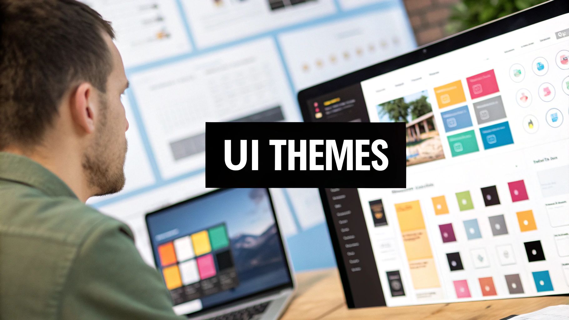
A user interface theme is the complete visual and interactive system that gives a website or app its distinct look and feel. It’s way more than just a color palette. Think of it as a comprehensive design language that makes sure every button, font, and layout works together to create a smooth, intuitive experience.
What Are User Interface Themes Anyway?
Imagine a UI theme as the architectural style of a house. The architect doesn't just pick a paint color and call it a day. They design a whole system where the windows, doors, roofline, and materials all follow a single, unified vision—whether it's modern, classical, or industrial. In the same way, a UI theme sets the rules for every single element on the screen.
This design language makes the user’s journey feel predictable and seamless. When you tap a button, you have a certain expectation for how it will look and behave, just like the other buttons in the app. That consistency is no accident; it’s the direct result of a solid, well-executed theme.
From Static Skins to Dynamic Experiences
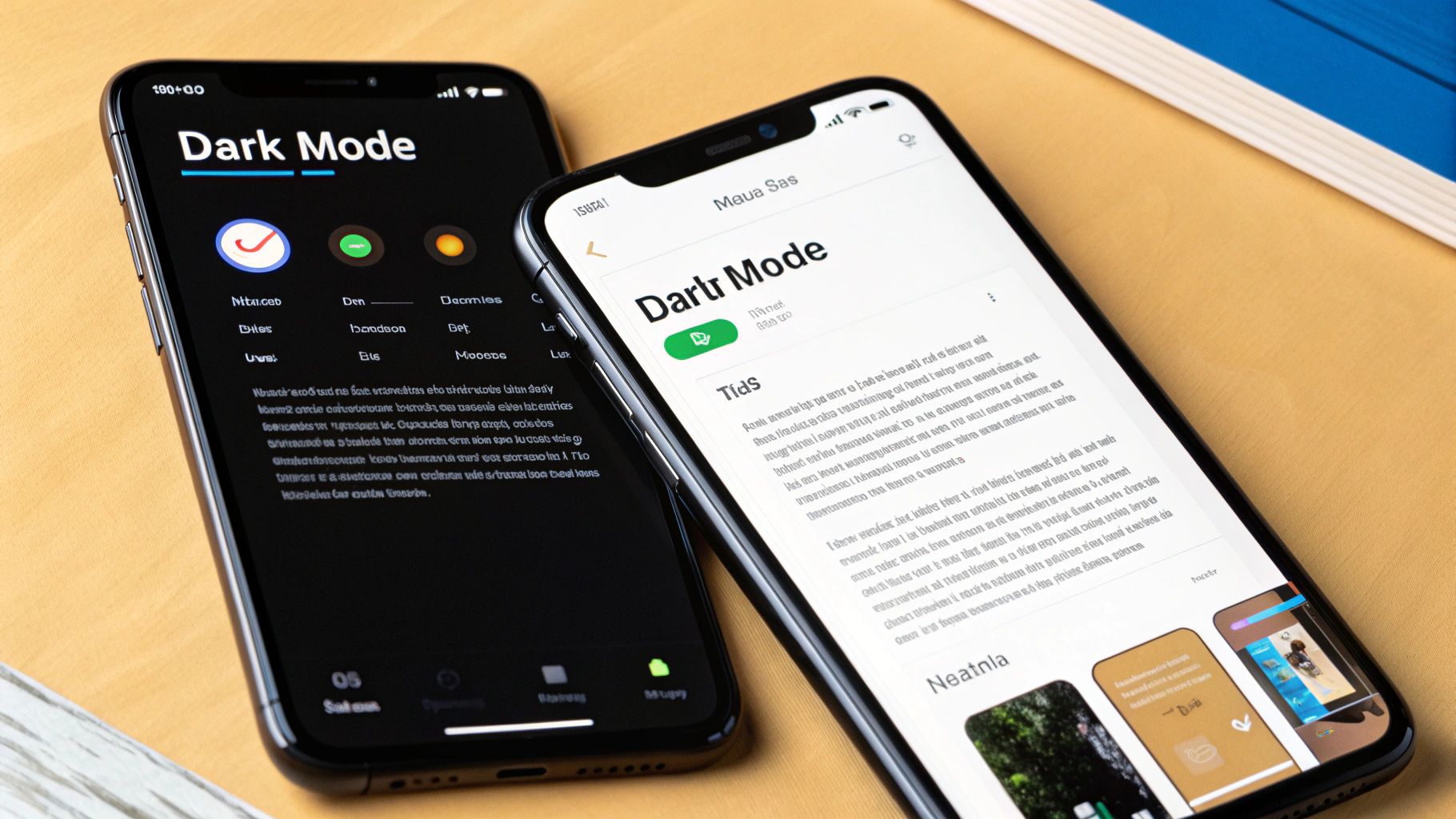
Back in the early days of the web, themes were basically just static "skins" that swapped out colors and fonts. Fast forward to today, and they've become dynamic systems that can adapt to user preferences and different environments. The most common example is the now-ubiquitous light and dark mode, which lets people choose the experience that’s easiest on their eyes.
This evolution points to a huge shift in design thinking. Modern user interface themes are all about flexibility and personalization, giving users more say in how they interact with their digital world. A great theme nails several key goals:
- Strengthens Brand Identity: A unique theme makes a product instantly recognizable, reinforcing brand colors, typography, and personality.
- Improves Usability: Consistency reduces the mental effort for users, since they don't have to relearn how things work from one screen to the next.
- Increases User Engagement: An interface that’s both beautiful and intuitive encourages people to stick around, building loyalty over time.
The Power of Themes in Modern Web Development
Nowhere is the impact of themes more obvious than in the world's most popular content management system. As of 2025, WordPress powers over 43% of all websites, making its theme ecosystem a massive force in web design. Over 25% of these themes are built specifically for e-commerce, while around 30% focus on minimalist designs that put clean, user-friendly interfaces first. You can dive deeper into these stats over at WPExperts' post on WordPress statistics.
A great UI theme doesn't just make a product look good; it makes the product feel right. It builds an unspoken trust between the user and the interface by creating a world with consistent rules and predictable outcomes.
Ultimately, a thoughtfully designed theme is the soul of a digital product. It's what turns a random collection of components into a cohesive, intuitive, and memorable experience that keeps people coming back for more.
Exploring Popular Types of UI Themes
Just as architectural styles give a city its character, different types of user interface themes define the feel of our digital spaces. Each style delivers a unique user experience, shaped by specific goals and user preferences. While the options are nearly endless, a few dominant styles have become the bedrock for millions of websites and apps.
The most fundamental choice any designer makes is between a light and a dark theme. A Light Theme, with its dark text on a bright background, is the digital equivalent of ink on paper. It’s no wonder it’s often the default for content-heavy sites where readability is king.
On the flip side, a Dark Theme inverts this, placing light text on a dark background. This style has exploded in popularity, and for good reason—it can reduce eye strain in low light and even save battery life on modern OLED screens where black pixels are simply turned off.
Material, Minimal, and Flat Designs
Beyond the simple light/dark split, several key design philosophies guide how themes are built. Each one has a distinct take on visual hierarchy, depth, and how users should interact with the elements on screen.
- Material Design: This is Google's brainchild, inspired by the physical world. It uses subtle shadows, layers, and motion to make interface elements feel tangible and responsive, almost like you could reach out and touch them.
- Minimalist Design: This approach is all about subtraction. It strips away every non-essential element, putting the focus squarely on the content and core functions. Think generous white space, a tight color palette, and clean typography for a calm, uncluttered vibe.
- Flat Design: A forerunner to modern minimalism, flat design threw out skeuomorphism (designs that mimic real-world objects) in favor of simple, two-dimensional elements and bright, bold colors. Its main goal is clarity and a straightforward user experience.
If you want to see how these philosophies are put into practice, our detailed guide on the most popular UI frameworks is a great next step. It can also be helpful to see these concepts in action. Exploring popular free website templates is a fantastic way to understand how these different styles come together to serve various business needs.
Specialized and Branded Themes
While the styles above are great starting points, many companies need something more specific. This is where specialized or fully custom user interface themes come into play, creating everything from playful, gamified interfaces to serious, data-heavy dashboards.
A High-Contrast Theme, for example, is built with accessibility as its top priority. Designed for users with low vision, it uses a limited palette with starkly different tones to ensure everything is as readable as possible, often going above and beyond standard accessibility guidelines.
Then you have the Brand-Centric Theme, which is custom-built from the ground up to reflect a company's unique identity. It weaves in brand colors, bespoke typography, and custom icons to forge a digital presence that’s instantly recognizable and memorable.
This chart shows just how popular different color palette strategies are within these themes, with monochromatic—using shades of a single color—being the clear favorite.
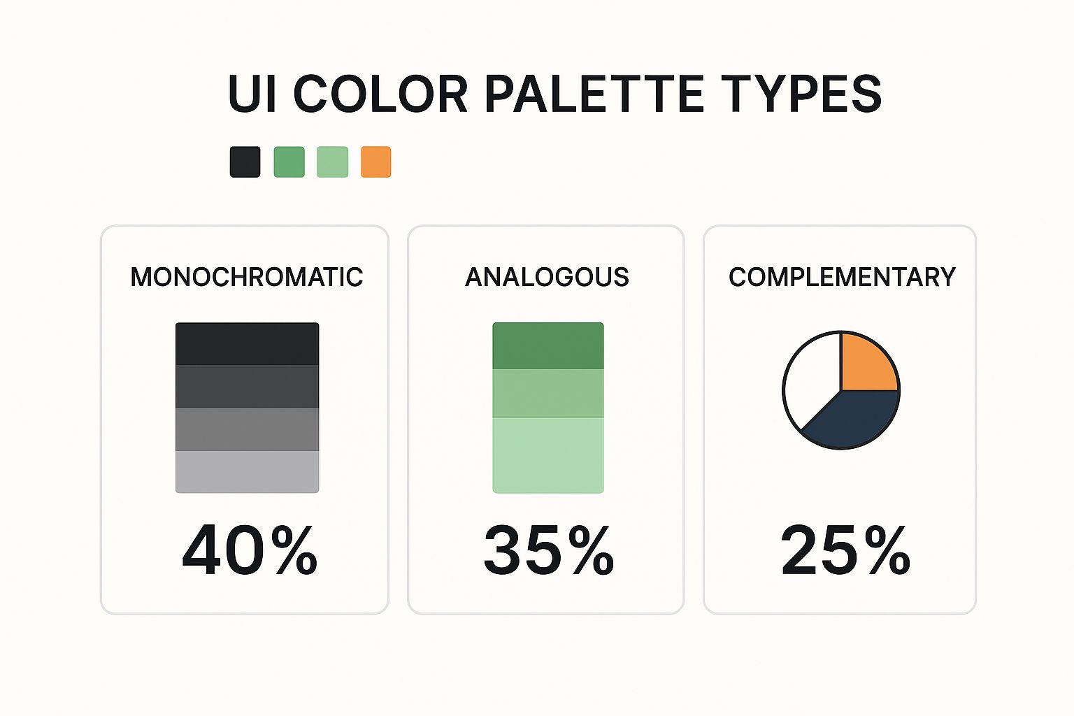
What this tells us is that a massive 40% of designers lean on monochromatic palettes. Their inherent simplicity and cohesiveness make them a safe but incredibly effective foundation for almost any UI theme.
To help you visualize the differences between the most common styles, we've put together a simple comparison table.
Comparison of Common UI Theme Types
| Theme Type | Key Characteristics | Pros | Cons | Best For |
|---|---|---|---|---|
| Light | Dark text on a light background. High contrast, clean, and open feel. | Excellent readability in bright light, feels familiar, great for text-heavy sites. | Can cause eye strain in low-light environments, higher energy use on OLED. | Blogs, news sites, e-commerce, productivity apps. |
| Dark | Light text on a dark background. Reduced glare and modern aesthetic. | Reduces eye strain at night, saves battery on OLED, highlights content like photos/videos. | Can reduce readability for long text passages, potential for "halation" effect. | Media streaming, code editors, creative portfolios, trading dashboards. |
| Minimalist | Abundant white space, limited color palette, focus on typography and core content. | Uncluttered, calming, fast-loading, puts focus entirely on the user's task. | Can feel generic if not executed well, may lack strong visual personality. | Portfolios, agency websites, SaaS products with a focus on usability. |
This table should give you a clear, at-a-glance understanding of where each theme shines and what its potential drawbacks are. Choosing the right one is all about balancing your brand's personality with your users' needs and context.
The Building Blocks of Every UI Theme
A great UI theme isn't just a splash of color. It's a disciplined system of interconnected design decisions, all working in harmony.
Think of it like a recipe. You can't just toss ingredients in a bowl and hope for the best. You need the right elements, in the right amounts, to create something cohesive and satisfying. In the same way, a polished theme is built from several core ingredients that transform a basic interface into a seamless design system.
Color Palettes and Typography
The first thing anyone notices is the color palette. This is way more than just picking a few colors you like; it’s about creating a visual hierarchy that tells users what to look at.
- Primary Colors: This is your brand's signature. It's the color you'll see the most.
- Secondary Colors: These play a supporting role, highlighting less critical information without stealing the show.
- Accent Colors: These are your showstoppers. You save them for the important stuff—call-to-action buttons, links, and notifications—to grab attention instantly.
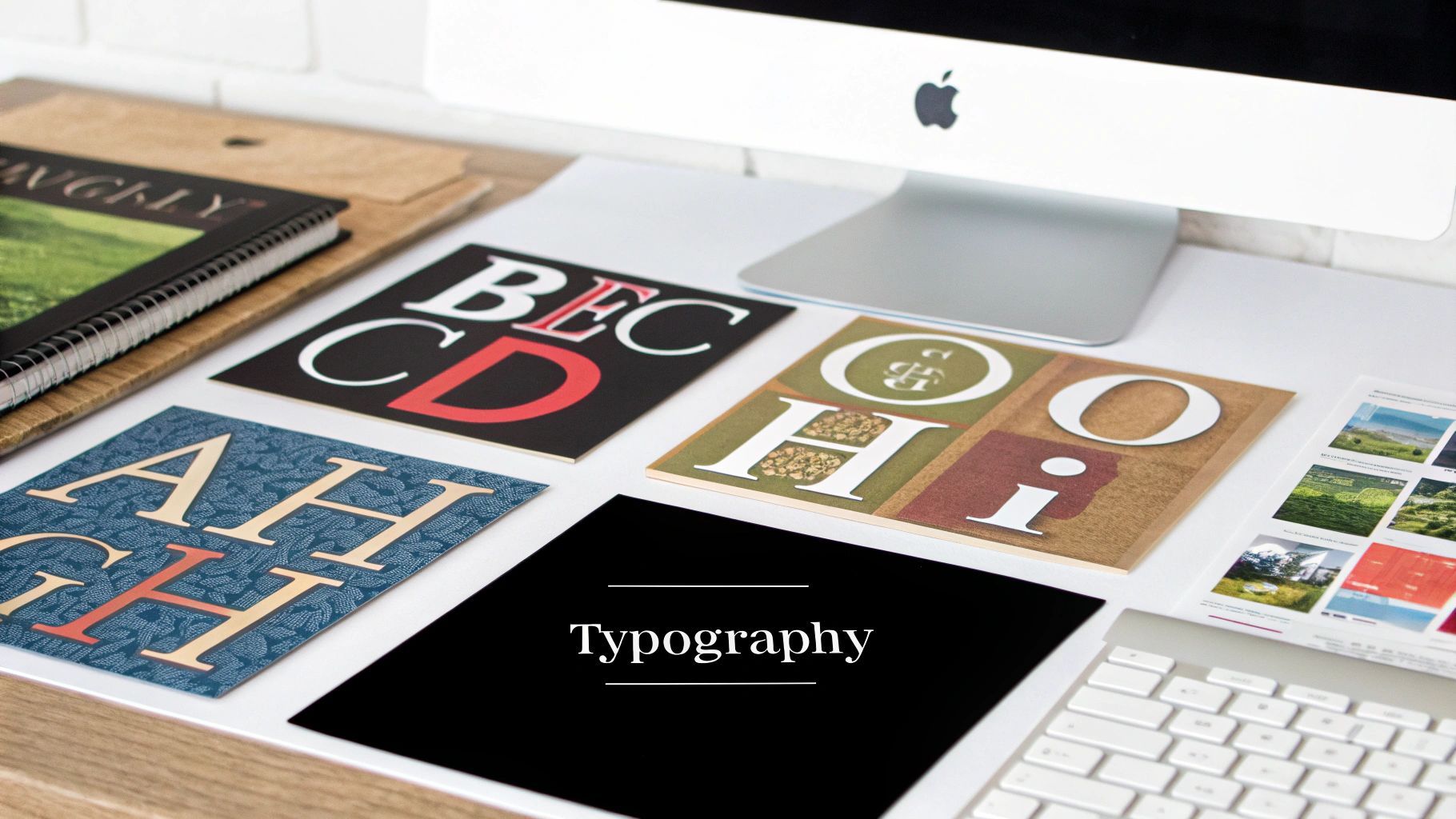
Just as critical is typography, the system of fonts that gives your content personality and structure. A solid typographic system uses defined sizes, weights, and styles to distinguish headings from body text and captions, making everything on the page easier to scan and read.
A well-crafted theme creates a predictable visual rhythm. Users shouldn't have to think about where to look or what to click; the design should guide them there naturally.
Iconography, Spacing, and Component States
Beyond colors and fonts, a few other elements really define a theme's character. Iconography, for instance, acts as a universal visual shorthand. Whether you choose filled, outlined, or two-tone icons, the key is consistency. Stick with one style.
Then there's spacing. This is the unsung hero of good design. The margins, padding, and negative space between elements create breathing room and define relationships on the page. Without proper spacing, even the best-looking interface feels cluttered and chaotic.
Finally, every interactive element needs to account for its various component states. A button isn’t just a static rectangle; it has a life of its own. It needs distinct styles for its default, hover, active, and disabled states. These visual cues are crucial for letting users know the interface is responding to their actions. These components are so foundational, we dedicated a whole guide to explaining what UI components are.
The market for well-structured themes shows just how valuable this is. In 2025, the average premium theme costs around $59, with some bestsellers like Avada selling over a million copies. This demand proves that people are more than willing to pay for sophisticated, feature-rich interfaces built on these solid design principles.
Best Practices for Designing Effective UI Themes
Knowing the building blocks of a great UI theme is one thing. Actually piecing them together into a system that’s both beautiful and functional? That’s a whole different ball game. Crafting an effective user interface theme is less about picking pretty colors and more about a thoughtful approach that balances aesthetics with raw usability. Every single design choice needs to have a purpose.
And that process always, always starts with one non-negotiable: accessibility. An interface that isn't usable by everyone isn't just flawed—it's broken. This means baking in established guidelines from the very beginning to create an experience that works for every single user.
Prioritize Accessibility from Day One
Accessibility isn't a checkbox you tick off at the end of a project. It's the concrete foundation you build everything on top of. Your theme's color palette, for instance, has to meet the Web Content Accessibility Guidelines (WCAG) contrast standards. This is crucial for making sure text is legible for users with visual impairments.
A light gray text on a white background might look minimalist and clean to you, but for some users, it’s practically invisible. This is where a contrast checker tool becomes your best friend. Use one to validate that all your text and interactive elements meet at least the AA standard, which calls for a contrast ratio of 4.5:1 for normal text.
A theme that is beautiful but inaccessible has failed at its most fundamental job. The goal is to create interfaces that empower every user, regardless of their abilities.
But it doesn't stop at color. A truly accessible theme has to support keyboard navigation and play nicely with screen readers. The visual hierarchy you create with colors and spacing needs to translate into a logical, navigable structure for anyone using assistive technologies.
Plan for Scalability and Consistency
A great theme isn't a one-and-done project; it’s built to grow and adapt. If you plan for scalability right from the start, you’ll save yourself countless hours of soul-crushing rework down the line. The secret? Design tokens (or CSS custom properties).
Instead of hardcoding a hex value like #007bff every time you need your primary blue, you define a token like --color-primary. Now you have a single source of truth. Need to update the entire theme's primary color? You change one line of code. This simple system is the backbone of any scalable and maintainable UI.
Consistency is the other side of that coin. To create a seamless user journey, you have to apply your theme's rules uniformly across every single component and screen.
- Define All Component States: A button isn't just a button. It has
hover,active,focus, anddisabledstates. Each one needs a distinct design so users get clear, immediate visual feedback for every interaction. - Use Motion Thoughtfully: Animation can be a powerful tool for guiding a user's attention and making an interface feel alive and responsive. But it must have a purpose—think a subtle fade-in on a modal—not just be for decoration, which can quickly become distracting.
Thinking about these details is also crucial for the bigger picture, like how your theme supports a user's entire journey. For more on that, it’s worth learning about user onboarding best practices. By sticking to these principles, you'll build themes that aren't just visually appealing, but are also robust, inclusive, and genuinely a joy to use.
How to Implement User Interface Themes
Alright, let’s get our hands dirty. Moving from a polished design concept to a real, live application is where the magic truly happens. Implementing a user interface theme isn't just about flipping a switch; it's a methodical process that turns your abstract ideas into something your users can actually see, touch, and feel.
The modern way to do this revolves around a single, central system that acts as the command center for your entire app's look. It all starts with defining your theme’s core ingredients—colors, fonts, spacing—as design tokens.
Think of these tokens as variables for your design system. Instead of hardcoding a hex value like #FFFFFF everywhere you need a white background, you create a token like colors.background. This one small shift is the secret sauce to building themes that can be switched on the fly with almost zero effort.
Setting Up Your Theming Foundation
First things first: you need a central theme file. This file is your configuration hub, the place where you’ll define all your design tokens for every theme you want to support, like light and dark modes.
For example, your colors.background token might be #FFFFFF in your light theme, but it flips to #121212 in your dark theme.
Once those tokens are defined, you start referencing them throughout your entire component library. Every button, every navigation bar, every single element becomes "theme-aware" because it’s not using a static, hardcoded value. It's pulling its style from that centralized source. The result? When a user toggles the theme, the whole app updates instantly and perfectly, because everything is listening to the same set of instructions.
The sheer size of the theme market shows just how powerful this is. As of September 2025, the WordPress ecosystem alone boasts over 30,000 themes. With nearly 13,000 free options on WordPress.org and another 12,000 on ThemeForest, it’s clear there’s a massive global demand for adaptable designs. WPZOOM offers some great insights into the scale of this ecosystem.
A Practical Theme Toggler Example
Let's see what this looks like in practice with a simple React MDX example. The code below shows a basic Card component and a ThemeToggler button. The key here is how the Card's styling isn’t fixed—it’s determined by a theme prop that can be either 'light' or 'dark'.
// A simple themed Card component
const Card = ({ theme, children }) => {
const styles = {
light: {
backgroundColor: "#ffffff",
color: "#111827",
border: "1px solid #e5e7eb",
},
dark: {
backgroundColor: "#1f2937",
color: "#f9fafb",
border: "1px solid #4b5563",
},
}
const currentStyle = styles[theme]
return (
<div className="rounded-lg p-6 shadow-md" style={currentStyle}>
{children}
</div>
)
}
// Example usage with a toggler state (managed by React's useState)
// const [theme, setTheme] = useState('light');
// <Card theme={theme}>This is a themed card!</Card>This example gets right to the heart of theming: component styles are not static. They are dynamic variables that react to a global state, allowing the entire UI to transform with a single click.
Of course, building a full-fledged theme switcher means managing this state across your entire application. Thankfully, libraries like Magic UI offer pre-built solutions that take care of all the tricky logic and animations for you.
You can check out the documentation for an animated theme toggler component to see how you can add this feature with just a few lines of code. By taking this component-based, token-driven approach, you can build dynamic, visually impressive interfaces without breaking a sweat.
Common Questions About UI Themes
As you start working more with user interface themes, you’ll probably run into the same questions that trip up most designers and developers. Things like telling the difference between a UI kit and a theme, or figuring out the right way to build a dark mode that doesn’t hurt your eyes.
Let's clear up some of that confusion. Here are straightforward answers to the most common questions we hear.
UI Kit Versus UI Theme
This one comes up all the time. Are UI kits and UI themes the same? Not exactly, but they are partners in crime.
A UI kit is your box of LEGOs. It’s a complete set of pre-built, reusable components—the buttons, form fields, navigation bars, and cards that you’ll use to construct your app. The kit itself is usually unstyled, focusing purely on function and structure. It's the raw material.
A UI theme is the style guide you apply to those LEGOs. It dictates the colors, typography, spacing, and shadows that give your interface a consistent, branded look and feel. It’s the paint, the finish, and the overall aesthetic.
Simply put: a UI kit is the what (the components), and a UI theme is the how it looks (the styling). You apply a theme to a kit to make it yours.
The Role of Design Tokens in Theming
So how do you actually manage all this styling across a big application? That's where design tokens come in. They are the secret sauce for any modern, scalable user interface theme.
Think of design tokens as variables for your design decisions. Instead of hardcoding a hex code like color: #007bff;, you create a token and use that instead, like color: var(--color-primary);. This might seem like a small change, but it's incredibly powerful.
When you want to switch your entire app from light to dark mode, you don't have to hunt down every single color value. You just update your core tokens.
- Light Theme:
--color-background: #FFFFFF; - Dark Theme:
--color-background: #121212;
Suddenly, every component that uses that token updates automatically. This is how you keep your interface perfectly consistent and make theme management something you can handle in minutes, not days.
Key Accessibility Rules for Dark Mode
Building a great dark mode isn't as simple as just flipping a switch and inverting your colors. To make it comfortable and usable for everyone, you have to nail the accessibility.
Here are the non-negotiables:
- Ditch Pure Black: Never use a pure black background (
#000000) with pure white text. That extreme contrast causes an effect called "halation," where the text seems to glow and blur into the background, causing serious eye strain. A dark gray (like#121212) is much easier on the eyes. - Mind Your Contrast: Every piece of text and every button still needs to pass WCAG AA contrast standards against the new dark background. This is a must for readability, especially for users with visual impairments.
- Desaturate Your Colors: Bright, punchy accent colors can look almost painfully vibrant on a dark screen. Pulling back the saturation a bit helps them sit more naturally in the design while still grabbing attention when they need to.
Applying a Theme to an Existing App
What if you have an app that’s already built? Can you just drop a new UI theme on top of it? Well, yes... but how painful it will be depends entirely on how the app was built in the first place.
If the app was made with a component library that supports theming or was styled using CSS custom properties (design tokens), you're in luck. The process can be pretty straightforward, sometimes as simple as changing a few lines in a config file.
But if the styles are hardcoded all over the place—inline styles, messy stylesheets—then you’re looking at a much bigger job. It often means a major refactor of all the CSS to get things organized. This is exactly why thinking about your theming strategy from day one saves so much time and frustration down the road.
Ready to stop wrestling with code and start building beautiful interfaces in minutes? With Magic UI, you get access to over 50 customizable blocks and templates built with React, Typescript, and Tailwind CSS. Explore our library of 150+ free animated components and see how easy it can be to create stunning landing pages. Get started with Magic UI today!