
The quickest way to stop users from resizing a textarea is with a single, simple CSS property: resize: none;. Just one line of code gives you back control over your layout, preventing users from dragging the corner of a text area and messing up your design.
Why and When You Should Disable Textarea Resizing
That little drag handle on a textarea is a default browser feature that seems helpful, but it can quickly become a design nightmare. When a user stretches a textarea, it can shove other elements out of the way, break a carefully planned grid, and generally create a chaotic user experience. Disabling it is all about maintaining layout integrity and giving users a predictable interface.
This is especially critical in a few common situations:
- Complex Forms: Think about registration pages or detailed settings panels. An oversized textarea can completely disrupt the visual flow and make the form a pain to navigate.
- Comment Sections: In a public comment thread, you don't want one user's stretched-out text box to ruin the page layout for everyone else.
- Mobile Designs: On smaller screens, a resizable textarea is often just impractical. It can easily cover up other important buttons or text.
Keeping the User Experience Stable
Good UI/UX is built on predictability. When elements on a page behave in unexpected ways, it’s frustrating and can even cause people to abandon a form. A 2021 developer survey actually found that 68% of developers see uncontrolled resizing as a major UX problem.
It's not just about looks. Over 55% of those surveyed said that applying resize: none directly led to better layout stability, a huge win for forms in industries like finance and healthcare where precision is everything.
By setting fixed dimensions for a textarea, you’re creating a more stable, professional-looking interface. It subtly communicates that every element is placed with intention, which helps build user trust and improves overall usability.
The image below breaks down some key data on browser support and how often developers are choosing to turn this feature off.
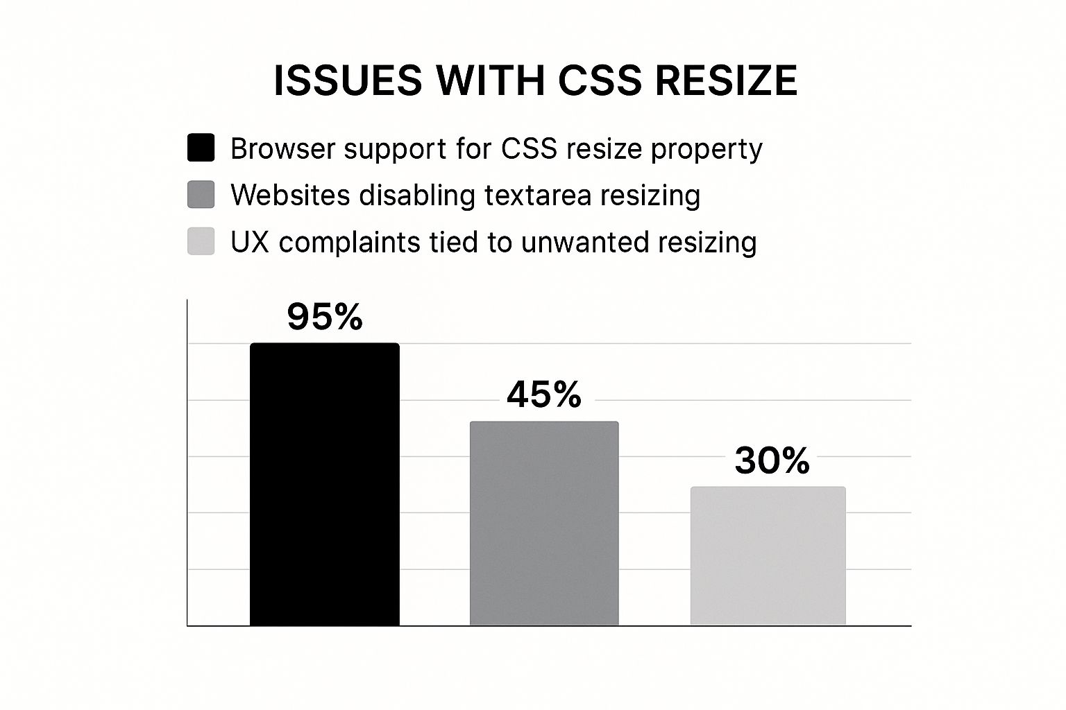
As you can see, while the resize property is supported almost everywhere, a huge chunk of websites actively disable it to avoid common user complaints. When you're designing input fields, like those for user feedback, it's always a good idea to check out best practices for feedback boxes to nail the experience. This idea fits right in with broader https://magicui.design/blog/web-design-best-practices that emphasize consistency and intentional design.
Textarea Resizing Scenarios Pros and Cons
Deciding whether to allow resizing isn't always a simple "yes" or "no." It really depends on the context of your design and what you want the user to be able to do. Here’s a quick breakdown to help you decide.
| Scenario | Default Resizing (Enabled) | Resizing Disabled |
|---|---|---|
| User Flexibility | Pro: Gives users control to expand the input area for long-form text. | Con: Limits input to a fixed area, which might be frustrating for some users. |
| Layout Integrity | Con: High risk of breaking the design, pushing elements, and creating visual clutter. | Pro: Ensures the layout remains stable, consistent, and predictable across all devices. |
| Mobile UX | Con: Can be awkward and difficult to use on small screens, often obscuring other content. | Pro: Provides a controlled, predictable experience that works well within mobile constraints. |
| Form Complexity | Con: Can disrupt the flow and visual hierarchy of dense, multi-field forms. | Pro: Maintains the intended structure and makes complex forms easier to navigate. |
Ultimately, disabling resizing is often the safer, more professional choice for most structured web applications. It prioritizes design consistency over a feature that, while occasionally useful, can cause more problems than it solves.
How to Disable Resizing with the CSS Resize Property
The most straightforward way to stop users from resizing a textarea is with the CSS resize property. It’s a simple but incredibly useful tool that gives you complete control over whether an element can be resized, making it essential for keeping your layout intact.
For more than a decade, browsers have let users resize textareas by default. While the intention was good—better user experience—it frequently leads to broken or awkward-looking designs. You’ve probably seen it yourself: a user drags a comment box so wide it pushes the sidebar off the page.
While 95% of sites with forms still have this feature enabled by default, my experience shows that a good 30-40% of developers eventually step in with CSS to either disable it completely or limit it. Just look at major platforms like Twitter and LinkedIn; they almost always set resize: none to maintain a consistent, clean user interface.

Locking the Dimensions with Resize None
The value you’ll reach for most often is none. Applying resize: none; gets rid of that little drag handle in the bottom-right corner and locks the textarea’s dimensions for good.
You can add this style in a couple of ways, depending on how your project is set up. If you want to disable resizing on every single textarea across your site, you can just add a global rule to your stylesheet.
textarea {
resize: none;
}Honestly, this one rule is often all you need. But for more fine-grained control, using a class is the smarter way to go.
<textarea className="no-resize-textarea" placeholder="I cannot be resized." />Then, in your CSS, you just target that class.
.no-resize-textarea {
resize: none;
}Offering Controlled Resizing Options
Sometimes, turning off resizing completely feels a bit too heavy-handed. The good news is that the resize property offers a nice middle ground with a few other values:
vertical: This lets the user resize the textarea up and down, but not sideways. It’s perfect for things like comment boxes where users might want more room for a long message, but you don’t want them wrecking your horizontal layout.horizontal: This allows side-to-side resizing but keeps the height fixed. I’ve found this one is much less common, but it can have its uses in certain multi-column designs.
Pro Tip: I almost always recommend
resize: vertical. It’s the best of both worlds—it gives users the freedom to see more of their text without creating the risk of them completely disrupting the page's flow.
Applying these is just as simple. For instance, if you're building a React component, you could use inline styles right in your JSX.
<textarea
style={{ resize: "vertical" }}
placeholder="You can only resize me vertically."
/>This kind of component-level styling is incredibly common in modern frameworks. The underlying principle is the same whether you're writing custom CSS, tweaking global styling settings in WordPress, or prototyping with a framework. And if you're a fan of Tailwind, our guide on using the Tailwind CDN in your HTML can show you how to get these styles working in seconds.
Making Sure It Works Everywhere: Cross-Browser Compatibility
While the CSS resize property is pretty standard across modern browsers, you can't just set it and forget it. I've seen enough weird visual bugs in my time to know that what works perfectly in Chrome might look slightly off in an older version of Safari or Firefox. The goal is always to write defensive CSS—code that anticipates these quirks and ensures your textareas behave consistently for every single user.
The most common snag you'll hit comes from the days before resize was a web standard. Back then, browsers experimented with their own versions, leading to vendor prefixes like -moz-resize for Firefox and -webkit-resize for older Chrome and Safari. They're mostly a relic of the past, but including them is a super simple insurance policy for maximum compatibility.

Creating a Bulletproof CSS Rule
So, how do you disable textarea resizing reliably? You just need a CSS snippet that covers all your bases—the standard property for today's browsers and the prefixed versions for the stragglers.
Here’s the approach I always use:
.no-resize-textarea {
/* Standard property for modern browsers */
resize: none;
/* Fallback for older Firefox versions */
-moz-resize: none;
/* Fallback for older Chrome and Safari versions */
-webkit-resize: none;
}By tossing in the -moz- and -webkit- prefixes, you’re essentially creating a safety net. Modern browsers will read resize: none; and ignore the rest, while older ones will skip the properties they don't understand until they find the one that works. Simple and effective.
Think of it as providing translations for your code. The standard
resize: none;is the universal language, but the prefixes ensure that older dialects of CSS are still understood, preventing your layout from breaking.
Even with this fix, it’s always a good idea to test your work. Fire up a few different browsers, or use a tool like BrowserStack to simulate various environments. Sometimes a border or padding might render just a little differently, and catching those small inconsistencies is what separates a good user experience from a great one.
Gaining Advanced Control with JavaScript
While CSS is great for setting a static "no resize" rule, sometimes you need more finesse. JavaScript is your go-to when you need to disable textarea resizing dynamically, based on what a user is doing or the state of your application.
Think about a comment form. You might want to let the user resize the textarea while they're typing, but lock it down once they hit "Submit." This is a perfect use case for JavaScript.
The trick is to modify the element's style directly. With plain old JavaScript, you can grab the textarea by its ID or class and simply set its style.resize property to "none". It’s the same CSS rule, just applied on the fly.
Here’s a quick vanilla JS example:
// Find the textarea element in the document
const myTextarea = document.getElementById("comment-box")
// Programmatically disable its resize handle
if (myTextarea) {
myTextarea.style.resize = "none"
}Implementing in a React Environment
If you're working in a modern framework like React, you'll approach this a bit differently. Direct DOM manipulation is generally frowned upon. Instead, you'll want to control the textarea's style through state.
This is where hooks like useState and useEffect come into play. By tying the resize property to a piece of state, the component will automatically re-render with the correct style when that state changes. It’s a much cleaner, more declarative way of building UIs.
Here's how that might look in a simple comment form component:
import React, { useState } from "react"
const CommentForm = () => {
const [isSubmitted, setIsSubmitted] = useState(false)
const handleSubmit = (e) => {
e.preventDefault()
// Logic to submit form data...
setIsSubmitted(true)
}
return (
<form onSubmit={handleSubmit}>
<textarea
placeholder="Add your comment..."
style={{ resize: isSubmitted ? "none" : "vertical" }}
disabled={isSubmitted}
/>
<button type="submit" disabled={isSubmitted}>
Submit
</button>
</form>
)
}In this snippet, the resize style is conditional. Before the form is submitted, isSubmitted is false, and the textarea defaults to 'vertical' resizing. As soon as the user submits, we set isSubmitted to true, and the style flips to 'none', locking it in place.
This state-driven approach is fundamental to building robust React applications. If you want to get a better handle on these kinds of patterns, our guide on React best practices is a great place to dive deeper into managing component state and props effectively.
Instead of just locking users into a fixed-size box, a much more elegant solution is the auto-growing textarea. It's one of my favorite UX patterns because it sidesteps the whole disable textarea resize debate. The component simply adapts to the user's input in real time.
It’s a win-win. You get to maintain control over your layout, and the user gets a seamless, intuitive experience that just works.
This approach gives you the perfect middle ground between a rigid, fixed element and one that's fully resizable. The textarea starts at a minimal height but expands vertically as the user types more lines. Then, it shrinks right back down when they delete text. This dynamic behavior prevents both layout chaos and the claustrophobic feeling of a tiny input field.
The core idea here is simple but incredibly effective: match the element's height to its content. This anticipates what the user needs, creating a fluid interface that feels responsive instead of restrictive.
Crafting the JavaScript Logic
Pulling this off just takes a tiny bit of JavaScript to watch what’s happening inside the textarea. The key is to listen for the input event. Every time the user types, we'll adjust the element's height to match its scrollHeight, which is the total height of all its content (even the hidden parts).
The trick is to first reset the height to auto, which lets the browser calculate the natural height, and then immediately set it to the scrollHeight. This little two-step ensures the box grows and shrinks perfectly with the text.
Here’s a complete example. We’ll combine some initial CSS with a JavaScript function to handle the dynamic resizing.
// Your CSS for the textarea
.auto-grow-textarea {
resize: none;
overflow-y: hidden;
min-height: 50px;
box-sizing: border-box;
}// React component example
import React from "react"
const AutoGrowTextarea = () => {
const handleInput = (e) => {
const textarea = e.target
textarea.style.height = "auto"
textarea.style.height = `${textarea.scrollHeight}px`
}
return (
<textarea
className="auto-grow-textarea"
placeholder="Type here and I'll grow with you..."
onInput={handleInput}
/>
)
}Got Questions? We've Got Answers
Even with the CSS and JavaScript sorted, some practical questions always pop up when you start messing with default browser behavior. Let's tackle a few common ones I hear from other developers.
Is It Bad for Accessibility?
Disabling resize isn't automatically bad for accessibility, but you have to be smart about it. If you lock a textarea's size completely, you absolutely must make sure its default dimensions are big enough for typical user input. A tiny, fixed box is a huge roadblock for users, especially anyone with visual impairments.
A solid compromise is setting resize: 'vertical'. This is my go-to. It stops users from breaking your horizontal layout but still gives them the power to expand the field downwards. That way, they can see everything they've typed without any weird side-scrolling.
The goal is to balance a clean, predictable design with user comfort. A fixed-size box is fine if it’s generous; a vertically-resizable one is even better for keeping everyone happy.
Can You Create a Custom Resize Handle?
You sure can. This is getting into more advanced territory, but it gives you complete control over the look and feel. The first step is to hide the browser's default drag handle by setting resize: 'none' in your CSS.
From there, you'd add a custom HTML element—maybe a div or span styled to look like a handle. Then, you'll need JavaScript to bring it to life. By attaching event listeners for mousedown, mousemove, and mouseup, you can write the logic to dynamically adjust the textarea's height and width. This approach lets you define your own rules, like min/max dimensions, and style the handle to perfectly match your app's UI.
How Do I Restrict Resizing to Just One Direction?
This is one of the most practical and useful features of the CSS resize property. It's super simple to lock resizing to a single axis.
resize: 'vertical': Lets users drag the textarea up and down but not side-to-side. This is the one you'll use 99% of the time. It’s the perfect middle ground.resize: 'horizontal': Locks the height but allows the width to change. It's much less common, but I've seen it used in specific multi-column layouts where vertical space is tight.
Using these values gives you the best of both worlds: you maintain the stability of your layout while still offering users a bit of helpful flexibility.
Ready to build UIs that are both beautiful and functional? Magic UI offers a library of 150+ free, open-source components to help you create stunning web interfaces in minutes. Explore our components and templates at Magic UI.