
Imagine this: you’ve built your website and are ready to go. But then, you notice something’s off. Your site isn’t performing as well as you expected. Pages are loading slowly, and you’re unsure if your audience can find what they want. You look under the hood to figure out what’s wrong, but it’s overwhelming. There are too many design elements to untangle, and you don’t know where to start. If this scenario sounds all too familiar, you’re not alone. Many website owners face challenges like this, even after launching their sites. The good news is that there’s a solution. By studying web design best practices, you can improve your site’s performance and create a better visitor experience. This blog will explore 10 web design practices and how they can help your site.
MagicUI's startup landing page template is a valuable tool for helping you implement these practices and improve your site performance. This solution can help you create a well-designed website quickly and easily so you can get back to running your business.
Best 10 Web Design Practices for Improving Site Performance

1. Optimize Images
Images often represent the most extensive files on a webpage. Optimizing them can reduce page load times by up to 80%. Use formats like WebP for better compression without sacrificing quality. Tools like ImageOptim or TinyPNG can help compress images effectively.
2. Minimize HTTP Requests
Each element on a webpage (images, scripts, stylesheets) requires an HTTP request. Reducing the number of requests can significantly speed up loading times by:
- Combining files
- Using CSS sprites
- Eliminating unnecessary elements
3. Leverage Browser Caching
Implement caching strategies to store frequently accessed resources locally on users' devices. This reduces load times for returning visitors. Setting appropriate cache-control headers can help manage how long resources are stored.
4. Use a Content Delivery Network (CDN)
A CDN distributes your website's content across multiple servers worldwide, ensuring faster delivery to users based on their geographic location. This can dramatically improve load times, especially for global audiences.
5. Minify CSS, JavaScript, and HTML
Minifying code involves removing unnecessary characters, comments, and whitespace from files. This reduces file sizes and speeds up load times. Tools like:
- UglifyJS for JavaScript
- CSSNano for CSS can automate this process
6. Implement Lazy Loading
Lazy loading defers the loading of images and videos until needed (i.e. when they enter the viewport). This reduces initial load times and improves perceived performance, especially on pages with many media elements.
7. Optimize Server Response Time
A slow server response can hinder performance. Use performance monitoring tools to identify bottlenecks, and consider upgrading your hosting plan or optimizing your server configuration to enhance speed.
8. Reduce Redirects
Each redirect creates additional HTTP requests and increases load time. Minimize redirects by ensuring that links point directly to the final destination, reducing unnecessary steps for users.
9. Utilize Asynchronous Loading for CSS and JavaScript
Loading CSS and JavaScript files asynchronously allows the browser to continue rendering the page while these resources are downloaded. This can significantly improve:
- Perceived load times
- User experience
10. Regularly Test and Monitor Performance
Use tools like Google PageSpeed Insights, GTmetrix, or Lighthouse to test your website's performance regularly. Monitoring helps identify areas for improvement and ensures that optimizations are effective.
Integrating MagicUI for Enhanced Performance
MagicUI offers lightweight components that can be seamlessly integrated into your web design to help you achieve these best practices. By utilizing MagicUI’s pre-built components, developers can reduce the need for custom coding, often leading to bloated files and slower load times. The components are designed with performance in mind, ensuring they are optimized for speed without compromising functionality or aesthetics.
React Tailwind
MagicUI components are built using React and Tailwind CSS, known for their efficiency and speed. This allows developers to create visually appealing interfaces that load quickly. MagicUI's focus on minimalism and clean design aligns perfectly with the best practices mentioned above, promoting clarity and simplicity in web design.
By leveraging MagicUI, developers can implement responsive designs that enhance user experience across all devices. The fully responsive components make it easier to create mobile-friendly designs without sacrificing performance. This is crucial, as responsive design has increased mobile traffic retention by over 50%, ensuring users stay engaged with your content.
Related Reading
- Web Application Design
- How To Make An Interactive Website
- Best Web Design Tools
- Website Animation Examples
- Web Design Trends
- Text Animation CSS
- UI Libraries
- UI Animation
Key Principles of Web Design Best Practices

Keep It Simple
Simplicity reigns supreme in web design. A straightforward design reduces cognitive load, allowing users to navigate and interact with the site effortlessly. This principle advocates for a clean layout with minimal distractions.
By employing straightforward navigation and clear calls to action, designers can enhance usability and ensure visitors find what they need quickly.
Consistency is Key
Consistency in design elements such as:
- Color schemes
- Typography
- Layout
Consistent Design
Such consistency fosters familiarity and trust among users. When users encounter consistent design across pages, they can navigate more intuitively.
- Reducing confusion
- Enhancing their overall experience
This principle is vital for building a cohesive brand identity and ensuring users feel comfortable interacting with the site.
Put the User First
User-centric design focuses on understanding the target audience's needs, preferences, and behaviors. This principle emphasizes gathering user feedback throughout the design process to create interfaces that resonate with users.
By prioritizing user needs, designers can enhance satisfaction and engagement, leading to higher conversion rates.
Visual Hierarchy: What Is It and Why Is It Important
Visual hierarchy is the arrangement of elements to signify importance and guide user attention. This can be achieved through:
- Size
- Color
- Contrast
- Spacing
Effective use of visual hierarchy helps users navigate content more efficiently, ensuring that they notice:
- Key information
- Call to action
Accessibility: Inclusive Design for Everyone
Designing with accessibility in mind ensures that websites are usable by individuals with diverse abilities, including those with disabilities. This principle broadens the audience reach and enhances overall usability for all users.
Implementing alt text for images and keyboard navigation options is crucial for creating an inclusive web experience.
Performance Optimization: Speed Matters
Performance optimization involves techniques like image compression, caching, and minimizing HTTP requests to enhance site speed. Fast-loading websites improve user satisfaction and retention, as users are less likely to abandon sites that load slowly.
Statistics show that a delay of just a few seconds can significantly impact user engagement and conversion rates.
How MagicUI Embodies These Principles
MagicUI exemplifies these web design principles through its thoughtfully crafted components. The library is designed to focus on simplicity and user-centricity, allowing developers to create intuitive interfaces without unnecessary complexity.
- Simplicity: MagicUI offers a clean and minimalistic design aesthetic, ensuring users can navigate applications easily.
- Consistency: The components maintain consistent styling and behavior, which helps users familiarize themselves with the interface quickly.
- Responsive Design: MagicUI components are built to be fully responsive, adapting seamlessly across devices. This ensures users have a consistent experience on a desktop or mobile device.
- Performance: The lightweight nature of MagicUI components contributes to faster load times, enhancing overall site performance and user satisfaction.
The Role of Responsive Design in Web Design Best Practices

Responsive design enhances usability by providing a consistent experience across devices, making it easier for users to navigate and interact with the site. For example, users may visit your website on their smartphone and later return on their laptop. If your site is responsive, the user will see the same content and a similar layout on both devices.
This allows for a smoother transition between devices and reduces user frustration. If your site weren’t responsive, the user would encounter a very different version of your site on each device. Not only would this create confusion, but it could also lead to the user abandoning your site altogether.
Capturing the Mobile Audience
With more users accessing websites via mobile devices, responsive design helps capture this audience, leading to higher traffic retention rates, which can increase by over 50%. This is crucial because Google uses mobile-first indexing, meaning the version of your indexed site is mobile. If your site isn’t responsive, it could hurt your SEO rankings and drive your site’s traffic down.
Reduced Costs with Responsive Design
Maintaining a single responsive site is more cost-effective than developing separate sites for different devices. This reduces development and maintenance costs. While the initial investment in a responsive site may be higher, the costs will decrease over time.
SEO Benefits of Responsive Web Design
Search engines favor responsive websites, leading to better rankings and increased visibility. Responsive design allows for a single URL for a site's mobile and desktop versions, whereas a separate mobile site would have an entirely different URL.
Faster Load Times
Responsive design often results in faster load times due to optimized images and layouts, improving user satisfaction. When users open a website, they want the page to load quickly. If it doesn’t, they’ll likely leave before the site opens.
This is especially true for mobile users, who tend to have less patience than desktop users. A responsive site helps improve:
- Load times
- Create a smoother experience for users
Future-Proofing Your Website
Responsive design prepares websites for future devices and screen sizes, ensuring longevity in a rapidly evolving tech landscape. New devices are released regularly, and each has a unique screen size.
A responsive site will adapt to these new sizes, whereas a mobile site will quickly become obsolete as technology changes.
Enhanced Engagement
Users are likelier to engage with a site that provides a seamless experience across devices, leading to higher conversion rates. If users encounter a website that looks completely different on their mobile device than their desktop, they may lose interest and leave the site before completing any tasks.
Users can transition between devices without noticeable changes if the site is responsive. This encourages engagement and builds trust between:
- The user
- The business
Easier Analytics Tracking
A single responsive site simplifies analytics tracking, allowing better insights into user behavior across devices.
If you have separate sites for mobile and desktop users, you’ll need to track them individually. This makes it difficult to get a clear picture of how users interact with your site.
Simplified Maintenance
Managing one site is more accessible than managing multiple versions, streamlining updates and changes. Every time you change or update a site, you must do it for both versions if they aren’t responsive. This takes extra time and can lead to inconsistencies between the two sites.
Improved Accessibility
Responsive design enhances accessibility for users with disabilities as it adapts to various assistive technologies. A screen reader will read a responsive site the same way on both:
- Mobile
- Desktop devices
This isn’t the case for separate mobile sites that often have different content and layouts.
MagicUI's Components: Fully Responsive for Optimal User Experience
MagicUI’s components are designed to be fully responsive, allowing developers to implement mobile-friendly designs effortlessly without sacrificing performance. This adaptability contributes significantly to user retention and engagement across platforms.
Use our startup landing page template today to create a beautiful, responsive landing page to capture your target audience and convert visitors into customers.
Usability and Accessibility in Web Design Best Practices
Ease of Use: Make Your Website Intuitive
Websites must be intuitive, allowing users to achieve their goals with minimal effort. When a website is easy to use, visitors can quickly find the information they need without feeling lost or confused. Improving ease of use can also boost SEO. Search engine spiders look for websites that:
- Perform well
- Load quickly
If your site is complicated, it may have a lot of code or excessive features that hinder performance. Simplifying your site’s design for better usability will help both:
- Human visitors
- Search engine bots
Clear Navigation: Your Website’s Roadmap
Effective navigation systems help users find information quickly, reducing frustration. If your website needs better navigation, visitors may become disoriented and leave. 94% of the time, someone will leave a website after experiencing issues with its navigation. Clear navigation also helps search engine bots index your website, improving your SEO.
Accessible Content: Open Your Doors to Everyone
Content should be available to all users, including those with disabilities, ensuring inclusivity. For instance, about 15% of the world’s population lives with some form of disability. Many of these individuals use the internet regularly.
They often encounter barriers that prevent them from accessing information. By designing accessible websites, you can help eliminate these barriers and make your content available to everyone.
Responsive Design: Functionality Across Devices
Websites must be functional across devices, accommodating various screen sizes and resolutions. In 2021, over 58% of all online traffic came from mobile devices.
If your site isn’t mobile-friendly, smartphone or tablet visitors may struggle to find information. This can lead to high bounce rates and hurt your SEO.
Feedback Mechanisms: Let Users Know They’re on the Right Track
Providing users with immediate feedback enhances their understanding of interactions and actions taken on the site. If a user fills out a form on your site, they should receive a confirmation notification as soon as they submit it. This lets them know their action has been recorded and improves usability.
Error Prevention and Recovery: Designing for the Inevitable
Designing for error prevention and offering clear recovery options improves usability. For instance, if a user encounters an error on your website, they should be able to:
- Quickly recover
- Resume their task
This can be done by providing an intuitive way to fix the error, such as listing the steps to take or allowing the user to automatically return to where they started.
Consistent Layouts: The Predictability Factor
Consistent layouts help users predict where to find information, enhancing their navigation experience. If you run an eCommerce site, your product pages should have a similar structure.
This will allow users to quickly locate the information they want, such as product descriptions, customer reviews, and shipping details.
Readable Content: Don’t Make Your Visitors Work to Understand Your Message
The text should be legible, with appropriate font sizes and colors that contrast nicely with the background. If content is difficult to read, visitors may get frustrated and leave your site without seeing what you offer. Use clear fonts, and ensure any custom fonts used are:
- Web-friendly
- Easy to read
Multimedia Accessibility: Don’t Exclude Anyone from Your Content
Incorporating captions and transcripts for multimedia content ensures that all users can access information. If you have a video on your site, not all users can hear the audio.
This could be due to a hearing impairment, or they may simply be in a location where playing audio isn’t practical. Providing captions will allow these users to access the information contained in your video.
User Testing: Don’t Guess What Your Users Want
Regular user testing helps identify usability issues and areas for improvement, ensuring the site effectively meets user needs. You can conduct user testing at any point in your website’s lifecycle, from pre-launch to several months after it goes live.
Visual Hierarchy and Color Theory in Web Design Best Practices

Visual hierarchy helps prioritize content based on importance. This can be achieved through:
- Size: Larger elements draw more attention.
- Color: Bright or contrasting colors can highlight key information.
- Spacing: Adequate whitespace improves readability and focus.
Explore MagicUI
MagicUI components utilize visual hierarchy principles to create interfaces that naturally guide user behavior and ensure that critical information is easily identifiable.
Color Theory: Evoking Emotion and Enhancing User Engagement
Color theory involves understanding how colors interact and the emotions they evoke. Effective use of color can enhance user engagement and convey brand identity.
- Complementary Colors: Using colors that complement each other can create a visually appealing design.
- Limited Palette: A restricted color palette helps maintain consistency and focus.
MagicUI incorporates color theory into its components, allowing designers to create visually stunning interfaces that resonate with users.
Performance Optimization in Web Design Best Practices
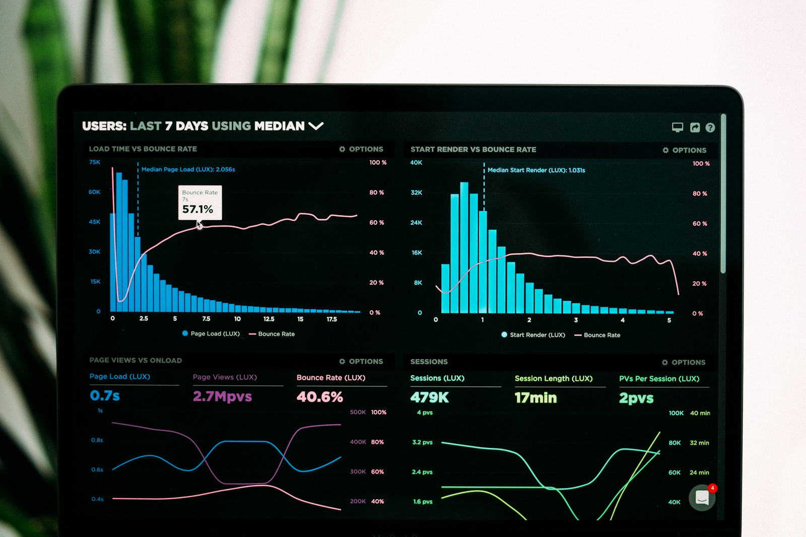
Performance optimization is crucial for:
- Improving site speed
- Enhancing user satisfaction
- Improving search engine rankings
Image Compression: Reduce File Size for Faster Loading Times
High-resolution images can significantly slow down website performance. Compressing images reduces their file size without compromising quality, leading to:
- Faster loading times
- Better user experiences
Caching: Speed Up Repeat Visits to Your Website
We are implementing browser caching, which stores specific resources on the user’s device. This reduces the need for repeat downloads and speeds up subsequent visits to the website.
Minimize HTTP Requests: Fewer Requests Mean Faster Load Times
Every file, script, or image on a webpage requires an HTTP request. Reducing these requests by combining files or using CSS sprites helps the page load faster.
Performance Optimization Improves User Experience
Fast-loading websites keep users engaged, reducing bounce rates and increasing time spent. Studies show that a delay of even one second in page response can result in a 7% reduction in conversions.
Performance Optimization Leads to Higher Conversion Rates
Faster websites directly contribute to higher conversion rates, as users are more likely to complete actions like purchases when pages load swiftly.
SEO Benefits of Performance Optimization
Search engines prioritize fast-loading websites, meaning performance optimization can lead to higher rankings and increased visibility.
MagicUI’s Lightweight Components Boost Site Speed
MagicUI’s lightweight components are optimized for performance, helping designers create fast-loading, highly responsive websites. These components significantly enhance site speed, critical for user satisfaction and SEO. Use our startup landing page template today.
Related Reading
- Cool CSS Animations
- Web Animation Tools
- Animation Libraries
- React Animation Examples
- MUI Transitions
- Framer Motion React
- React Animations
- React Text Animation
- React Scroll
- React Spring
Common Mistakes and Current Trends in Web Design Best Practices

Ditch Confusing Navigation for Good
Overcomplicated navigation frustrates users and leads to high bounce rates. Aim for a clear, intuitive hierarchy with no more than 5-7 main categories.
Don’t Ignore Mobile Users
With over 50% of web traffic coming from mobile devices, it’s crucial to prioritize responsive design. Ensure your website looks and functions seamlessly across all screen sizes.
Speed Up Slow Loading Times
Users expect fast-loading pages.
- Optimize images
- Minimize HTTP requests
- Leverage caching to improve performance
- Aim for a load time under 3 seconds
Make Clear CTAs a Priority
Prominent, compelling calls to action guide users to the desired action. Use action-oriented text and contrasting colors to make CTA stand out.
Maintain Consistent Branding
Maintain a cohesive brand identity across all pages with:
- Consistent colors
- Typography
- Imagery
Inconsistencies can appear unprofessional.
Avoid Cluttered Designs
White space is essential for readability and focus. Avoid cramming too many elements onto a page, which can:
- Overwhelm users
- Dilute key messages
Ensure Content is Accessible
Ensure your website is accessible to users with disabilities by:
- Providing alt text for images
- Captions for videos
- Keyboard navigation
This broadens your audience and improves SEO.
Regularly Check for Broken Links
Regularly test your website for broken links, which can:
- Frustrate users
- Damage credibility
Set up redirects for moved pages and monitor for 404 errors.
Keep Content Fresh
Stale content makes your website appear neglected. Establish a content maintenance schedule and keep information current to retain user trust.
Optimize for Mobile Users, Not Just Desktop Users
More than simply simply shrinking a desktop site for mobile is required. Optimize layouts, navigation, and content for smaller screens to provide the best possible mobile experience.
The Significance of Typography and Information Architecture in Web Design Best Practices

Typography creates a solid foundation for both usability and aesthetic appeal. When users land on a website, they want to absorb information quickly to find answers to their questions. Effective typography promotes this goal by optimizing readability, which:
- Enhances user experience
- Bolsters brand perception
Key aspects of typography include:
- Font selection
- Hierarchy
- Contrast
- Spacing
- Mobile Optimization
Typography Made Easy with MagicUI
MagicUI allows developers to integrate well-crafted typography into their designs easily. The library offers pre-styled text components that adhere to best practices, ensuring readability and aesthetic appeal.
Information Architecture: The Key to Intuitive User Experience
Information architecture is essential for enhancing user navigation and overall site functionality. Effective IA involves:
- User research
- Clear hierarchy
- Labeling
- Multiple pathways
- Testing and iteration
Intuitive Navigation
MagicUI supports effective information architecture by providing components that can be easily arranged and customized to fit the desired structure. The library simplifies the creation of intuitive navigation systems that enhance user experience.
The Role of User Testing, Feedback, and Essential Tools in Web Design Best Practices

User testing uncovers usability issues that can drastically affect a visitor's experience on your site. By watching real users navigate your site, you can identify areas where they struggle to complete tasks or find information.
This allows you to target the right improvements to enhance usability and create a more enjoyable experience for your visitors.
Validating Design Decisions with User Feedback
Designing a website often involves making assumptions about what users want and need. User feedback helps validate (or challenge) these design decisions to ensure the final product aligns with actual user expectations.
This leads to better outcomes, as you can optimize the site for its real users rather than your biases.
Gathering Insights from Real Users
Quantitative data from analytics tools can reveal how users interact with your site, but it doesn’t give you the full picture. User testing and feedback provide valuable context to help you understand why users are behaving a certain way. This qualitative feedback can uncover issues that data alone may miss.
Improving Conversion Rates
Optimizing your site with user testing and feedback aims to improve the user experience. A better UX can lead to higher engagement and conversion rates, whether you're trying to get users to fill out a form, make a purchase, or subscribe to your blog.
Iterative Design: Testing Early and Often
UX design has transitioned from a linear approach to a more iterative process involving regular testing and feedback. By incorporating user testing and feedback into your design process, you can continuously improve your website's user experience.
Essential Tools for Testing and Feedback
Several tools can help you implement these web design best practices. They include:
- Usability Testing Platforms: Tools like UserTesting.com and Hotjar facilitate user testing sessions.
- Analytics Tools: Google Analytics and similar platforms help track user behavior and identify trends.
- Feedback Tools: SurveyMonkey and Typeform allow for direct user feedback collection.
- Prototyping Tools: Figma and Adobe XD enable rapid prototyping and testing of design concepts.
- A/B Testing Tools: Optimizely and VWO help compare design variations to find the most effective solutions.
MagicUI: A Tool for Feedback and Iteration
MagicUI can be an integral part of this toolset, providing a collection of customizable components that can be easily tested and iterated upon. The library's focus on design efficiency and user-centric components empowers developers to create and refine their designs based on honest user feedback.
Check Out Our React Component Library for Design Engineers
MagicUI is a free and open-source UI library that we specifically designed for design engineers. It offers a collection of over 20 animated components built with:
- React
- TypeScript
- Tailwind CSS
- Framer Motion
We provide a range of visually appealing and interactive elements that can be easily integrated into web applications. This allows us to create stunning user interfaces with minimal effort. MagicUI components are highly customizable, enabling seamless adaptation to match our desired branding and design requirements.
With our focus on animation and a design-centric approach, MagicUI aims to bridge the gap between design and development, empowering us to craft captivating digital experiences. With our free component library, MagicUI Pro can save thousands of hours creating a beautiful landing page and converting visitors into customers with our website templates.
Use our startup landing page template today.
Related Reading
- GSAP Examples
- React Transition Animation
- GSAP Vs Framer Motion
- React Motion
- React Spring Examples
- Framer Motion Vs React Spring
- React Transition