
Creating a drop down menu in js is simpler than you might think. At its core, you're using HTML for the structure, CSS for the looks, and a bit of JavaScript to toggle a class that shows or hides the menu when someone clicks a button. This simple event listener is the magic that handles the menu's visibility.
Building Your First Drop Down Menu in JS
Getting a custom dropdown menu off the ground starts with a solid foundation in HTML, CSS, and, of course, JavaScript. We'll kick things off by creating the basic structure first, then layer on the interactivity that actually brings it to life. This approach keeps your component clean, reusable, and built with best practices from the get-go.
The first real step is writing semantic HTML. This isn't just about throwing elements on a page; it’s about building a logical structure that browsers and assistive technologies can actually understand. A standard dropdown usually has a button to trigger the action and a container that holds all the menu links.
The Core Structural Components
To get our menu working, we need three key pieces working in harmony. I've found that truly understanding their individual roles makes a huge difference when it comes to troubleshooting and customizing things down the road.
Before we dive into the code, let's break down the essential elements you'll be working with. Each language plays a distinct, critical role in making the dropdown functional and visually appealing.
| Component | Language | Purpose |
|---|---|---|
| Trigger Element | HTML | Usually a <button>, this is what the user clicks to open or close the menu. |
| Menu Container | HTML | A <div> or <ul> that holds the list of links or options. |
| Visibility Control | CSS | Manages the menu's appearance, including its initial hidden state and styling when visible. |
| Event Listener | JavaScript | The "brains" of the operation; it waits for a user's click and then executes the logic. |
| Class Toggle | JavaScript | The action itself—adding or removing a CSS class (e.g., .is-open) to show or hide the menu. |
This table illustrates the separation of concerns—a principle that makes your code much easier to manage and scale. It's the standard for modern web development for a reason.
This foundational logic is powered by the language that drives the interactive web. In fact, JavaScript is used by approximately 98.9% of all websites, making it absolutely essential for creating dynamic features like a responsive drop down menu in js. You can explore the data on JavaScript's dominance to see why it remains the undisputed king for client-side functionality.
Making Your Dropdown Interactive
Alright, with the HTML structure in place, it's time for the fun part: bringing it to life with JavaScript. This is where we go from a static layout to a component that actually does something. The magic here is all about listening for a user's click and then smartly toggling the menu's visibility.
We'll start by attaching an event listener to the dropdown button. Think of this listener as a guard, constantly waiting for one specific event: a click. When that click happens, it triggers a function. This function's only job is to add or remove a CSS class—something simple like .is-active—from the menu itself. That little class toggle is the secret sauce for showing and hiding the menu using clean CSS transitions.
But what happens if the user clicks away from the menu? A dropdown that stubbornly stays open until you click the button again feels awkward and unprofessional. To fix this, we'll add another event listener to the entire document. This lets us check if a click happened outside our dropdown, and if it did, we simply close the menu.
This small addition makes a huge difference in usability. An intuitive UI anticipates what the user wants to do, and closing a dropdown on an outside click is a perfect example of that. It's one of those subtle touches that makes your work feel polished.
Managing States and User Intent
Effectively managing the open and closed states of your drop down menu in js is what separates a decent script from a really solid one. It's about more than just flipping a class on and off; it's about making the interaction feel predictable and smooth.
Here’s a quick rundown of what the JavaScript needs to do:
- Select the DOM Elements: First, you need to grab the button and the menu container from the HTML. A quick
document.querySelector()for each is all it takes. - Create the Toggle: Attach a
clickevent listener to the button. When clicked, it should toggle an "active" class on the menu container. - Detect Outside Clicks: Add a
clickevent listener to thewindow. This one checks if the click's target is outside the menu. If it is, it removes the "active" class to close it.
This approach keeps your JavaScript clean and easy to follow. If you're looking for more tips on creating these kinds of engaging user interfaces, check out our guide on how to make an interactive website.
Making Your Dropdown Accessible to Everyone
Getting a dropdown to work is one thing. Making it accessible is what separates the good from the great. When you focus on accessibility (often called a11y), you’re not just ticking a compliance box—you're building a better, more intuitive experience for every single person who visits your site.
It's easy to overlook these details in the rush to ship, but they're absolutely essential for a professional, solid final product. We'll walk through adding the key attributes and keyboard functionality that ensure your drop down menu in js is usable by all.
Adding ARIA Attributes for Screen Readers
So, how do you make your dropdown understandable to assistive technologies like screen readers? That's where Accessible Rich Internet Applications (ARIA) attributes come in. Think of them as signposts for screen readers, giving context that standard HTML can't on its own. They explain what an element does and what its current state is.
Here are the must-haves for your dropdown:
aria-haspopup="true": Pop this on your dropdown button. It tells screen readers, "Hey, this button opens up an interactive menu."aria-expanded="false": This also goes on the button. You'll need to toggle its value with JavaScript—it should be"false"when the menu is closed and flip to"true"when it's open.aria-controls="menu-id": This attribute connects the button to the menu it controls. Just make sure its value matches theidof your menu container.
These simple additions make a world of difference. It's this kind of dynamic attribute manipulation that helps explain why 63.61% of developers stick with JavaScript for their front-end work. If you're curious about the numbers, you can dig into more developer language preferences yourself.
An accessible component is a usable component. When you build with screen readers and keyboard navigation in mind, you inherently create a more predictable and intuitive interface for all users.
Implementing Keyboard Navigation
Beyond ARIA, full keyboard support is non-negotiable. Many users rely on their keyboard to navigate, so they should be able to operate your menu without ever touching a mouse. This just means listening for a few specific key presses.
You'll want to set up JavaScript event listeners to handle this. The Enter or Space keys should open and close the menu, while the Escape key should always close it. To move between menu items, the up and down arrow keys should shift the focus. Nail this, and your dropdown won't just be visible—it'll be fully functional for everyone.
Adding Polished CSS Styles and Animations
A working dropdown is one thing, but a polished one is what truly elevates the user experience. Now that you have the JavaScript logic locked in, it's time for the fun part: making it look good. We'll use CSS to style the menu and add some subtle animations that make every click feel responsive and intentional.
Let's start with the basics: the open and closed states. A clean way to handle this is by using opacity: 0 and visibility: hidden to hide the menu by default. When your JavaScript adds an "active" class, we can switch those to opacity: 1 and visibility: visible. This alone creates a simple but effective fade-in effect.
Crafting Smooth Transitions
But we can do better than a simple fade. This is where CSS transitions come into play. By transitioning properties like transform and opacity together, you can create some really slick animations.
For example, combining a translateY transform with an opacity transition gives you a subtle slide-down effect as the menu fades in. This little touch does a great job of guiding the user's eye right where it needs to go.
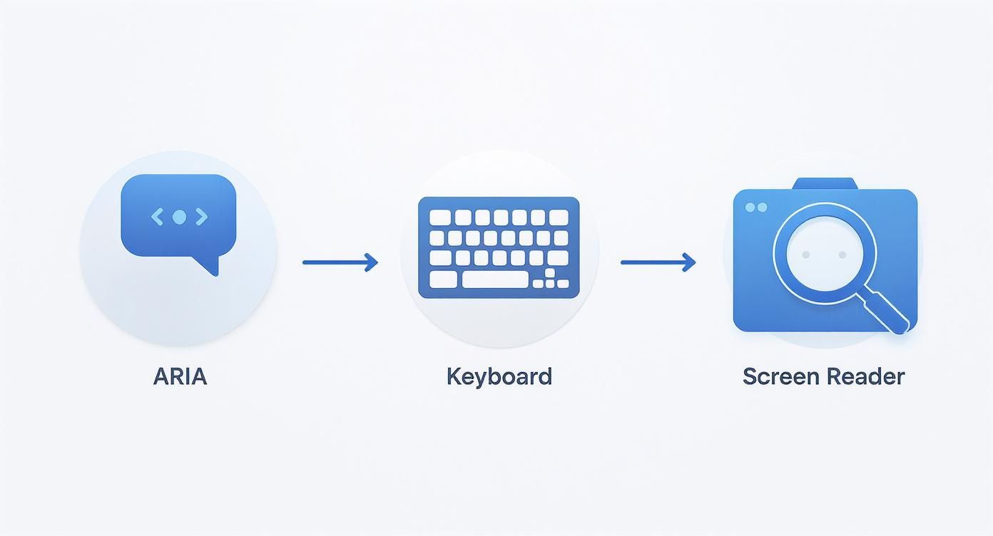
This infographic walks through the key stages of building a truly user-centric component, starting with foundational ARIA roles and moving all the way to full interactive support.
It’s a great reminder that a polished design is nothing without accessibility. If you're looking for more ideas to bring your components to life, check out this collection of cool CSS animations you can adapt for your own projects.
A well-crafted animation isn't just decoration; it's a form of communication. It provides feedback, guides focus, and makes the interface feel more responsive and alive.
Finally, don't forget about responsive design. You have to make sure your dropdown looks and works perfectly on any screen. Use media queries to adjust its behavior. Maybe on mobile, it should span the full width of the screen, while on a desktop, it’s a more compact box. This kind of attention to detail is what separates a good component from a great one.
So you’ve got your dropdown working in vanilla JavaScript, but what happens when you need to bring it into a modern framework like React? This is where things get really interesting. Moving your dropdown logic into a React component isn't just a syntax swap; it’s a complete mindset shift away from direct DOM manipulation.
With React, you stop telling the browser how to change the UI step-by-step. Instead, you declare what the UI should look like based on its current state. React takes care of the rest, making complex interfaces way easier to manage and debug.
This component-based approach is why millions of websites have been built with React.js. It’s perfect for creating a reusable, stateful dropdown menu that can respond to user actions on the fly. You can see just how popular React has become on citrusbug.com.
From DOM Manipulation to State Management
The biggest difference you'll notice is how you handle the dropdown's visibility. Forget about manually adding or removing CSS classes. In React, we'll use the useState hook to create a simple boolean variable, like isOpen. This single piece of state will be the one and only thing that determines if the menu is visible.
Handling clicks changes, too. Instead of an addEventListener, you'll use JSX's built-in onClick prop directly on your button. This prop will call a function that does one thing: it toggles our isOpen state. It's clean, declarative, and works seamlessly across browsers thanks to React's synthetic event system.
In React, state is the single source of truth. When the
isOpenstate changes fromfalsetotrue, React automatically re-renders the component to show the menu. This removes the need for manual DOM queries and updates.
This method of encapsulating logic and presentation makes it incredibly simple to build out more complex UIs, like a full navigation bar. If you want to go deeper, check out our guide on building a navbar in React JS. By building your dropdown as a self-contained component, you create a reusable block you can drop into any project—a far more scalable approach than the vanilla JS equivalent, especially as your application grows.
Navigating Common JS Dropdown Hurdles
As you get your hands dirty building JavaScript dropdowns, you'll inevitably run into a few classic "gotchas." I've seen them trip up developers time and time again. Getting ahead of these common issues will save you hours of head-scratching and help you build much more solid components from the get-go.
One of the first walls people hit is dealing with nested menus. You know, a dropdown within a dropdown. The trick here is all about managing event propagation. You have to make sure that clicking a parent item to open a submenu doesn't also fire that "click outside" listener that's supposed to close everything. It’s a delicate dance, but getting it right is key for complex navigation.
Performance and Sneaky Pitfalls
Performance is another big one, especially if your page is already loaded with interactive bits and pieces. A single dropdown? No big deal. But start scattering dozens of them across your UI without thinking, and you can really bog things down. You've got to be smart about how many event listeners you're attaching to the document.
A rookie mistake I see all the time is adding a new "click outside" listener every single time a dropdown opens, but never removing the old one. This is a fast track to memory leaks and all sorts of bizarre, unpredictable behavior.
Always clean up your event listeners. When a component is no longer needed or gets destroyed, unbind its events. This is just good housekeeping and it’s critical for keeping your UI snappy and responsive.
Finally, let's run through a few quick-fire problems that pop up constantly:
- The Z-Index Battle: Your menu is hiding behind another element? Nine times out of ten, the culprit is the
z-indexCSS property. Just give your dropdown container a higherz-indexvalue than whatever is overlapping it. - Mobile Mishaps: Remember, there's no "hover" on a touch screen. Your dropdown has to work flawlessly with taps and clicks. While you're at it, make sure the menu items are big enough for fingers, not just mouse cursors.
- Forgetting Accessibility: It's so easy to skip ARIA attributes or proper keyboard navigation, but it's a huge mistake. An inaccessible dropdown doesn't just exclude users; it creates a clunky, frustrating experience for everyone.
Keep these pointers in your back pocket. They'll help you sidestep the most common frustrations and build dropdowns that are not just functional, but truly reliable and user-friendly.
Ready to build stunning, production-ready UIs without the headache? Explore Magic UI and access over 50 customizable components to create beautiful landing pages in minutes. Start building for free at magicui.design.