
When you need to add a dropdown in react js, you’re really facing two choices: stick with the native <select> element or build a completely custom component from the ground up. The native element gets the job done quickly, but a custom dropdown unlocks total control over styling, behavior, and user experience—something that’s non-negotiable for modern web apps.
Why Building a Custom React Dropdown Matters

Dropdowns are everywhere. They guide users through forms, power navigation menus, and make data filtering possible. While just dropping in a browser's default <select> tag is tempting for its simplicity, it almost always falls short. Its look and feel are jarringly inconsistent across different browsers and operating systems, and trying to wrestle it into shape with CSS is a notoriously frustrating experience.
This is exactly why learning to build a custom dropdown in React is such a powerful skill. React’s component-based architecture is the perfect tool for creating UI elements that are reusable, predictable, and entirely under your command.
The Power of Full Control
When you build your own dropdown, you're in the driver's seat for every single detail. This opens the door to features that are simply impossible with a native element. Think about adding icons next to options, creating searchable inputs, or even fetching data from an API as the user types. That level of control lets you craft an experience that truly fits your application's design and functional needs.
Plus, building from scratch forces you to get your hands dirty with core concepts like state management (useState), event handling, and accessibility (ARIA attributes), which sharpens your overall React skills in the process.
By mastering a single, versatile component like a dropdown, you establish a pattern for building other complex UI elements. The principles of state management, event propagation, and accessibility are transferable to modals, tooltips, and more.
React's Dominance in UI Development
The demand for this kind of custom work is fueled by React's incredible adoption across the industry. What started as a Facebook project in 2013 now powers over 10.8 million websites. Its component model has become the de facto standard for building interactive user interfaces for a reason: it enables developers to create the exact sophisticated, bespoke components your users expect—like the dropdown we're about to build.
Of course, starting from a blank slate isn't always necessary. For larger projects, looking into the best react component library can save a ton of development time by providing pre-built, accessible components ready for customization. This guide, however, is all about giving you the foundational knowledge to build one yourself.
Native <select> vs Custom React Dropdown
Here's a quick look at the pros and cons of using the browser's default select element compared to a custom React component for your dropdowns.
| Aspect | Native <select> Element | Custom React Component |
|---|---|---|
| Styling & Branding | Extremely limited. Styling is inconsistent across browsers and OS. | Complete control. Can be styled to match any brand or design system perfectly. |
| User Experience (UX) | Basic functionality. No advanced features like search, icons, or multi-select. | Highly customizable. Can include search, icons, custom animations, and more. |
| Accessibility | Accessible by default with built-in keyboard navigation and screen reader support. | Requires manual implementation of ARIA attributes and keyboard navigation. |
| Implementation Speed | Very fast. Just a few lines of HTML. | Slower to build from scratch. Requires managing state, events, and styling. |
| Dependencies | None. It's a standard HTML element. | May require additional libraries for styling (e.g., Tailwind CSS) or animation. |
While the native <select> element is great for rapid prototyping or simple internal tools, a custom component is almost always the right choice for a polished, production-ready application where user experience and brand consistency are key.
Alright, let's roll up our sleeves and build the core of our custom dropdown. The idea here is to create a smart, reusable component that handles its own state. This makes it a self-contained, predictable piece of your UI that you can drop in anywhere.
We'll start with the basics: some JSX for the structure and the useState hook to bring it to life.
In React, state is everything. For our dropdown, we really only need to keep track of two things: is the menu open right now, and what option (if any) has the user picked? This is the perfect job for the useState hook.
By keeping this logic inside the component, we're building what's known as a controlled component. This is a core React pattern. It just means our UI will always be a perfect mirror of our state, which saves us from a whole class of bugs and makes the component's behavior much easier to predict.
Setting Up State with useState
First things first, let's get our state variables on the board. We need one to manage the open/closed status (we'll call it isOpen) and another to hold the currently selected option (selectedOption).
import React, { useState } from "react"
const Dropdown = ({ options, placeholder = "Select an option" }) => {
const [isOpen, setIsOpen] = useState(false)
const [selectedOption, setSelectedOption] = useState(null)
// We'll add our event handlers here in a bit.
// And the JSX will go right here.
}We'll initialize isOpen to false because, naturally, the dropdown should start off closed. And selectedOption begins as null since nothing has been selected yet. Simple enough.
Building the JSX Structure
With state ready to go, we can sketch out the visual parts. A typical dropdown has two main pieces: a trigger button that the user clicks and the list of options that pops up.
We can lean on conditional rendering to show the option list only when isOpen is true. It's a clean, declarative way to handle UIs that change.
// ... inside the Dropdown component
return (
<div className="dropdown-container">
<button className="dropdown-trigger" onClick={() => setIsOpen(!isOpen)}>
{selectedOption ? selectedOption.label : placeholder}
</button>
{isOpen && (
<ul className="dropdown-menu">
{options.map((option) => (
<li key={option.value} className="dropdown-item">
{option.label}
</li>
))}
</ul>
)}
</div>
)This gives us a button that shows either the selected option's label or the placeholder text. A click on it simply flips the isOpen state.
Making It Interactive
The final piece of this initial puzzle is making the options actually do something when you click them. Each list item (<li>) needs an onClick handler. When a user clicks an item, a couple of things need to happen:
- The
selectedOptionstate has to update to the one they just chose. - The menu should close, so we'll set
isOpenback tofalse.
Here’s how that looks in code:
// ... inside the Dropdown component
const handleOptionClick = (option) => {
setSelectedOption(option)
setIsOpen(false)
}
// ... and here's the updated list item in the JSX
;<li
key={option.value}
className="dropdown-item"
onClick={() => handleOptionClick(option)}
>
{option.label}
</li>And just like that, we have a functional core for our dropdown in React JS. It's a solid foundation that manages its state and responds to clicks.
For a deeper dive into menu components, you might want to check out our guide on how to create a drop-down menu, which gets into some other patterns. Up next, we'll make this even better by adding a way to close the menu when the user clicks outside of it.
A dropdown that stays open when you click away from it is a classic sign of a rushed implementation. It's a small detail, but it quickly becomes a huge annoyance, cluttering the screen and creating a messy, frustrating experience for anyone trying to use your app.
This is where we need to think beyond a simple isOpen state. Our component needs to be aware of the world outside itself. The most elegant way to solve this in React is by creating a custom hook. We'll build a neat little hook called useOnClickOutside that listens for clicks anywhere on the page and checks if they happened outside our dropdown.
The beauty of this pattern is its reusability. Once you have this hook, you can drop it into modals, popovers, sidebars—basically any UI element that should gracefully disappear when the user's focus shifts.
Building a Custom useOnClickOutside Hook
So, how does this work? The core idea is to leverage useEffect to attach a global event listener to the browser's document when our component mounts. Critically, we'll also remove that listener when the component unmounts to prevent any nasty memory leaks.
Inside our event handler, we need a way to know what the user clicked. Was it inside our dropdown or somewhere else? This is the perfect job for the useRef hook. We'll attach a ref to our dropdown's main container element, giving us a direct line to that specific piece of the DOM.
Here’s what a practical useOnClickOutside hook looks like:
import { useEffect } from "react"
function useOnClickOutside(ref, handler) {
useEffect(() => {
const listener = (event) => {
// If the click is inside the ref's element, do nothing
if (!ref.current || ref.current.contains(event.target)) {
return
}
// Otherwise, call the handler function
handler(event)
}
document.addEventListener("mousedown", listener)
document.addEventListener("touchstart", listener)
return () => {
// Clean up the event listeners on unmount
document.removeEventListener("mousedown", listener)
document.removeEventListener("touchstart", listener)
}
}, [ref, handler]) // Re-run if ref or handler changes
}The hook is simple: it accepts a ref pointing to the element we're watching and a handler function to execute when an outside click happens. That cleanup function returned by useEffect is absolutely essential for keeping your app performant and bug-free.
Integrating the Hook into Our Dropdown
Now for the fun part: wiring it all up. Back in our Dropdown component, we'll create a ref using useRef and attach it directly to the dropdown's container div. Then, we just call our new hook, passing it the ref and a simple function to close the menu.
import React, { useRef, useState } from "react"
// Assuming useOnClickOutside is in a separate hooks file
import { useOnClickOutside } from "./hooks/useOnClickOutside"
const Dropdown = ({ options, placeholder }) => {
const [isOpen, setIsOpen] = useState(false)
const [selectedOption, setSelectedOption] = useState(null)
// 1. Create a ref for the dropdown container
const dropdownRef = useRef(null)
// 2. Call the hook, passing the ref and the closing function
useOnClickOutside(dropdownRef, () => setIsOpen(false))
// ... (rest of the component logic)
return (
// 3. Attach the ref to the main div
<div className="dropdown-container" ref={dropdownRef}>
{/* ... trigger button and menu ... */}
</div>
)
}And that's it! With just a few lines, our dropdown in React JS is now way more intuitive and behaves exactly how a user would expect.
This pattern of combining
useState,useEffect, anduseRefto build self-contained, intelligent components is a cornerstone of modern frontend development. It lets us encapsulate complex behaviors like outside-click detection into clean, reusable hooks—a huge leap forward from older, more tangled approaches. If you're curious about the history, you can read about the evolution of dynamic React components.
Making It Accessible and Styling It Up
Getting a dropdown to work is one thing, but making it production-ready is another beast entirely. A truly solid component needs to be accessible for all users and look like it belongs in a modern app. This is where we go from a functional prototype to something you'd be proud to ship.
First, let's talk accessibility. This isn't just a "nice-to-have" feature; it's a core requirement for professional development. We're talking about making your component usable for people who rely on screen readers or can only use a keyboard to navigate. With over 1 billion people worldwide living with some form of disability, building accessible UI isn't an edge case—it's essential.
The basic open/close logic of a dropdown is pretty simple, but it's helpful to visualize the flow.
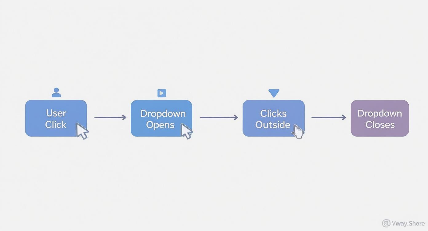
Mapping this out helps clarify the state changes our component needs to handle as a user interacts with it.
WAI-ARIA for Screen Reader Support
Our custom dropdown is built with generic div and button elements, which don't mean much to a screen reader on their own. We need to give them semantic context using WAI-ARIA (Web Accessibility Initiative – Accessible Rich Internet Applications) attributes.
These attributes are simple props you add to your JSX, but they make a massive difference:
aria-haspopup="listbox": Put this on the trigger button. It tells assistive tech, "Hey, this button opens a list of options."aria-expanded={isOpen}: Also on the button. This one dynamically announces whether the menu is currently visible (true) or hidden (false).role="listbox": Add this to the<ul>that wraps your options. It clearly defines the container's purpose.role="option": Each<li>item gets this role, identifying it as a selectable choice within the listbox.
Just a few lines of code, but they completely change the experience for users navigating with assistive tools.
Getting Keyboard Navigation Right
Next up: keyboard support. A user should be able to do everything with their keyboard that they can with a mouse. This means adding an onKeyDown event handler to manage the interactions.
Here’s the standard behavior you’ll want to implement:
- Enter or Space on the button should toggle the dropdown.
- ArrowDown and ArrowUp should cycle focus through the list items.
- Escape should immediately close the menu, no questions asked.
To pull this off, you'll likely need another piece of state to keep track of the currently highlighted option index. This lets you apply a specific "active" style and manage focus as the user presses the arrow keys.
By combining proper ARIA attributes with full keyboard support, you're not just ticking a box. You're building a component that meets WCAG (Web Content Accessibility Guidelines) standards and creates a better, more inclusive experience for everyone.
Modern Styling with Tailwind CSS
With the accessibility foundation in place, we can make it look great. Tailwind CSS is perfect for this, letting you build clean, modern designs right inside your component's JSX without writing a separate CSS file. If you're new to it or need a setup guide, we have a post on how to install Tailwind CSS that will get you going fast.
The real power here comes from applying Tailwind's utility classes based on your component's state. For example, you can easily change the trigger's border color when isOpen is true, or add a subtle background hover effect to the currently highlighted list item.
Little details like these add up. In fact, developer communities have shown that well-designed dropdowns can speed up data selection by up to 40% in complex apps like dashboards. A clean, responsive UI isn't just about looks—it's about making the user's job easier.
Once you've nailed down the basics of a solid dropdown, it's time to layer in the more advanced features you'll find in production-level applications. These are the patterns that take a simple selector and turn it into a genuinely useful, dynamic tool that actually improves the user experience.
Let's dig into a few techniques I've used to push my own dropdown components to the next level.
Building an Asynchronous Search Dropdown
Picture a dropdown for picking a user from a database with thousands—or even millions—of entries. Loading all of them upfront would be a performance nightmare, plain and simple.
A much smarter approach is an asynchronous dropdown that fetches data on the fly as the user types. This usually involves placing an input field right inside your dropdown. As the user types, a useEffect hook kicks off an API call with their search term.
The real key here is to debounce that API call. You don't want to hammer your server with a new request for every single keystroke. By debouncing, you wait until the user has paused typing for a brief moment—say, 300ms—before firing the request. This keeps your app feeling snappy and your backend from falling over.
Implementing Multi-Select Functionality
So many real-world scenarios require users to select more than one option. Turning your single-select component into a multi-select one fundamentally changes how you handle state. Instead of storing a single selected object, you’ll be managing an array of selected items.
This means your handleOptionClick logic needs a rewrite. When a user clicks an option, your function will need to:
- Check if the item is already in the selected items array.
- If it is, you remove it from the array (deselecting it).
- If it isn't, you add it to the array.
The UI then needs to reflect this state, often by showing the selected items as little "tags" in the trigger area or by displaying persistent checkmarks next to the selected options in the list.
Adding Polished Animations
Good UI is felt as much as it is seen. Subtle animations can make your components feel incredibly polished and intuitive, and dropdowns are a perfect place for them.
Integrating a library like Framer Motion is my go-to for adding smooth open and close transitions. Just wrap your dropdown menu in a motion component and define a few states for initial, animate, and exit.
A simple fade-in paired with a subtle vertical expansion on open gives the user instant, clear feedback. It makes the whole interaction feel less jarring and more connected to the application's flow.
Optimizing for Performance
Finally, let's talk about performance, especially when your dropdown is packed with options. Every time a parent component re-renders, your dropdown might re-render too, even if its own props haven't changed. This is a classic performance drain.
The fix? React.memo.
By wrapping your Dropdown component export with React.memo, you're telling React to do a quick props check. If the props (options, placeholder, value, etc.) haven't changed since the last render, React will just skip re-rendering the entire component and its children. This simple one-liner is a huge performance win, ensuring your dropdown in React JS stays lightning-fast.
Common Questions About React Dropdowns
As you get deeper into building dropdowns, you’ll inevitably run into the same handful of tricky situations that trip up most developers. It’s just part of the process. Getting a handle on these common problems early will save you a ton of debugging headaches down the road and really solidify your understanding.
Here are some of the most frequent questions I see, along with practical, no-nonsense solutions.
How Do I Close a Dropdown When Clicking Outside?
This is probably the number one question. You’ve got your beautiful dropdown open, but clicking anywhere else on the page does nothing, and it just hangs there. Annoying, right?
The cleanest, most reusable way to solve this is with a custom hook—let’s call it useOnClickOutside. The idea is pretty simple: inside a useEffect, you attach a global mousedown event listener to the document itself.
Then, you give your dropdown component a ref using useRef. In the event handler, you just check if the element that was clicked is outside of your dropdown's container (the one with the ref). If it is, you trigger the function to close your dropdown. The last crucial piece is to remember the cleanup function in your useEffect to remove that event listener when the component unmounts. This prevents memory leaks, which are never fun to track down.
What's the Best Way to Handle Accessibility?
If you’re building a custom dropdown from divs and spans, you are now responsible for making it accessible. This isn't just a "nice-to-have"—it's a requirement for any real-world application. The good news is that the strategy boils down to two main things: ARIA attributes and keyboard support.
- ARIA Attributes: Think of these as signposts for screen readers. Add
aria-haspopup="listbox"to the button that opens the dropdown. Usearia-expandedto tell assistive tech whether the menu is open (true) or closed (false). The list container (your<ul>) gets arole="listbox", and every single item inside (<li>) needs arole="option". - Keyboard Navigation: Start with a native
<button>element for your trigger. This gives you focus and basic keyboard events for free. From there, you'll need to handle key presses:EnterandSpaceshould toggle the menu,Escapeshould close it, and theArrowUp/ArrowDownkeys should let users move between options.
By taking the time to implement these features, you’re making sure that users with screen readers or those who can't use a mouse can use your dropdown just as easily as anyone else. It makes a world of difference.
Should I Use a Library or Build My Own?
Ah, the classic build vs. buy dilemma. The answer here really depends on your project's needs and how much time you have.
Building your own dropdown in react js is an amazing learning exercise. You get total control over the markup, styling, and behavior, which is perfect if you need something simple and highly specific to your design system.
But let's be realistic. If your dropdown needs advanced features like async search, virtualization to handle thousands of options, or a complex multi-select UI, reaching for a library is often the smarter move. Headless UI libraries like Radix UI are a fantastic middle ground—they give you all the tricky logic and accessibility hooks, but you still get to own the styling completely. On the other end, full-featured libraries like React Select provide a complete, out-of-the-box solution that can get you up and running in minutes.
Ready to build stunning, high-performance web interfaces without starting from scratch? Magic UI offers over 150 free, open-source animated components and premium templates built with React, TypeScript, and Tailwind CSS. Create beautiful landing pages in minutes and accelerate your development workflow.
Explore the components at https://magicui.design.