
At its core, creating a drop down menu is a three-part dance between HTML for structure, CSS for looks, and JavaScript for the interactive magic. The basic idea is simple: you start with a navigation list that's hidden from view. When a user clicks or hovers over a specific trigger—like a button or a link—that hidden list pops into view.
Building Your First Drop Down Menu with Core Web Tech

Before you get tempted by shiny frameworks and libraries, it's a rite of passage to build one of these from scratch. Getting your hands dirty with just HTML, CSS, and vanilla JavaScript gives you a real feel for the mechanics. Trust me, this fundamental knowledge is a lifesaver when you need to debug a stubborn menu or customize a component down the line, no matter what tools you end up using.
Everything starts with a solid, logical structure. A menu built on a shaky foundation is a nightmare to style and, more importantly, a dead-end for accessibility.
The HTML Foundation
Semantic HTML isn't just a suggestion; it's the bedrock of any good navigation component. Using the right tags gives browsers and assistive technologies the context they need to understand what they're looking at. For a navigation menu, the playbook is pretty clear.
You'll want to kick things off with a <nav> element to signal that this is a navigation block. Inside that, an unordered list <ul> holds your menu items, with each link wrapped in a <li>. This isn't just arbitrary—it’s the standard that ensures your menu is accessible and machine-readable. If you want to zoom out and see how this fits into the bigger picture, check out our guide on how to create a navigation bar in HTML.
Here’s what that basic structure looks like in practice:
A Quick Pro-Tip: See that
<button>inside the dropdown<li>? That's deliberate. Buttons are for actions (like opening a menu), while<a>tags are for navigating to a new page. This small detail makes a world of difference for keyboard users and screen readers.
Styling with CSS
Once the HTML skeleton is in place, it's time for CSS to give it some flesh and personality. Your first job is to make sure the dropdown submenu is hidden by default. The simplest, most reliable way to do this is with display: none;.
From there, you'll style the main navigation bar and the button that triggers the dropdown. The real trick happens when the menu needs to appear. We'll use JavaScript to add a class (let's call it .show), which will flip the submenu's display property to display: block;, making it visible.
Here's the styling game plan:
- Initial State: Your
.dropdown-menustarts withdisplay: none;. - Positioning: Give the dropdown container (
.dropdown)position: relative;and the submenu (.dropdown-menu)position: absolute;. This lets you position the submenu precisely below its parent without messing up the rest of your layout. - Visibility Toggle: A simple class like
.showwill be our on/off switch for the menu's visibility.
Adding Interactivity with JavaScript
Finally, JavaScript steps in to handle the logic. All we need to do is listen for a click event on our dropdown button. When that click happens, we'll simply toggle the .show class on the submenu.
This approach keeps things clean and efficient. The JavaScript is only responsible for toggling a state, while the CSS handles all the visual changes. This separation of concerns makes your code way easier to read, maintain, and debug later.
Making Your Menu Work for Mobile Users

We’ve all been there: a navigation menu that looks perfect on a desktop but turns into a jumbled mess on a phone. It’s an instant user experience fail. Since most people browse the web on their phones, responsive design isn’t just a nice-to-have anymore—it’s an absolute must.
The numbers don't lie. The modern web is overwhelmingly mobile. The latest data shows an estimated 62.54% of global website traffic now comes from mobile devices. This trend has been climbing for years and solidifies why components like dropdown menus need to adapt seamlessly.
Taming the Layout with CSS Media Queries
So, how do you transform your desktop menu for smaller screens? The real magic happens with CSS media queries. Think of them as simple rules that apply specific styles only when certain conditions are met, like when a screen’s width drops below a particular size. This lets you create a completely different layout for mobile without messing up your desktop design.
A common breakpoint is 768 pixels. Once the screen is narrower than that, you’ll typically want to:
- Hide the standard horizontal navigation list.
- Show a "hamburger" icon that users can tap to open the menu.
- Make the menu items appear in a vertical stack when the icon is tapped.
This is the core of an adaptive interface. To make sure your menu adjusts gracefully on any device, it’s worth brushing up on the foundational responsive web design principles. It's about more than just hiding and showing elements; it's about creating a fluid experience.
A great responsive menu feels intentional, not like a compromised version of the desktop site. It’s a chance to rethink navigation for a different context, often leading to a cleaner, more focused user journey.
Designing for Fingers, Not Cursors
Simply resizing your menu isn’t enough. You also have to design for touch. Fingers are far less precise than a mouse cursor, which makes tiny, tightly packed links a recipe for pure frustration.
This is where having a generous tap target size becomes critical. Your buttons and links need to be large enough—and have enough space around them—to prevent users from accidentally tapping the wrong thing. Try increasing the padding and spacing on your mobile menu items to create a much more forgiving interface.
This all feeds into a broader strategy called mobile-first design. If you want to dig deeper, you can explore what is mobile-first design in our detailed guide. It’s a powerful approach that forces you to prioritize the mobile experience from the very beginning.
Making Your Dropdown Accessible to Everyone
Building a dropdown menu that looks good is only half the battle. If a user navigating with a keyboard or a screen reader can't use it, then it’s broken. That's why making your dropdown accessible isn't just a "nice-to-have"—it's a core part of building for the modern web.
Getting this right doesn't just help users with disabilities; it actually improves the overall experience for everyone and can even give your technical SEO a little boost. It’s a true win-win. With 5.56 billion people online as of early 2025 and 70.5% of the world's population on mobile, creating components that work for a global audience is absolutely essential. You can dig into more of these stats in the latest global state of digital report from WeAreSocial.
This infographic really nails down the techniques that connect the technical bits of accessibility to real-world user benefits.
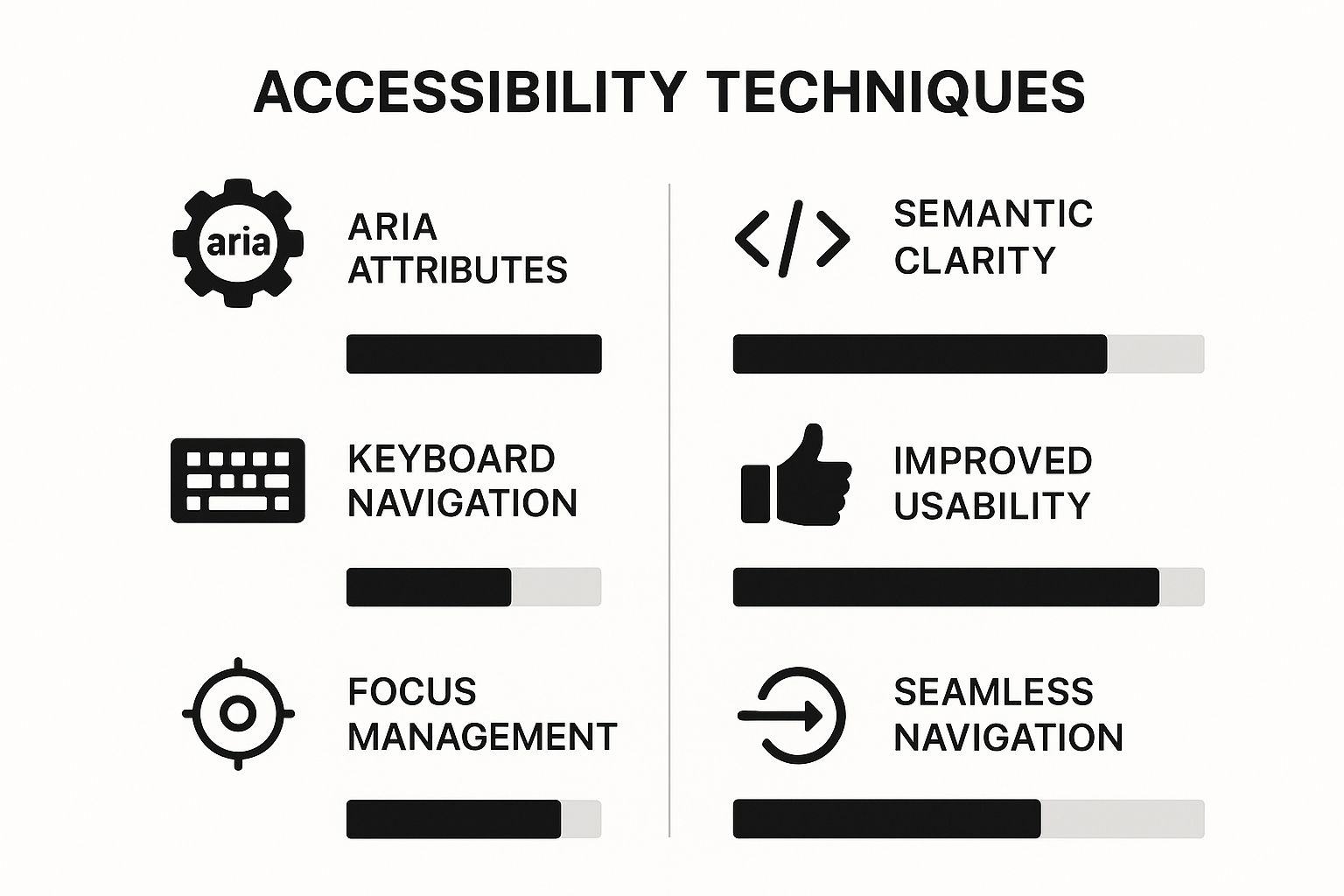
As you can see, what might seem like small code attributes translates directly into a more intuitive and seamless experience for your users.
Using ARIA for Clear Communication
So, how do we make our dropdown "talk" to assistive technologies? We use WAI-ARIA (Web Accessibility Initiative – Accessible Rich Internet Applications). These attributes are like adding helpful labels and context for screen readers. For any dropdown, you'll want to focus on a few key players:
aria-haspopup="true": This tells the screen reader, "Hey, this button opens something up." It sets the expectation that a menu will appear.aria-expanded="false": This signals that the menu is currently hidden. When a user clicks the button, your JavaScript needs to flip this totrue.aria-labelledby: This attribute creates a clear link between the dropdown menu and the button that controls it, removing any ambiguity.
Think of ARIA attributes as sign language for your website. They translate the visual cues sighted users see into concrete information that a screen reader can announce. Without them, a user might not even realize a hidden menu is there.
But ARIA is just one piece of the puzzle. The next critical step is ensuring proper keyboard focus. Someone should be able to navigate your entire menu using only their keyboard. This means they can Tab through the items and use Enter or Spacebar to open and close it. If your menu isn't usable without a mouse, it's not truly accessible.
Modern Approaches with React and Tailwind CSS
While getting your hands dirty with vanilla HTML, CSS, and JavaScript is a rite of passage for understanding how the web works, modern development workflows often demand something more robust. When you're building a large-scale application, you can't afford to reinvent the wheel every time you need a dropdown.
This is where tools like React and Tailwind CSS really shine. They let you build complex UIs efficiently and, more importantly, maintainably.
The big shift in thinking here is moving towards reusable components. Instead of writing markup and styles for each individual menu, you create a single, self-contained <Dropdown /> component. This little package contains all the necessary logic and styling, ready to be dropped anywhere you need it. It’s a game-changer for consistency and speed.
Managing State with React Hooks
In the React world, we don't manually toggle CSS classes to show or hide elements. That's considered a bit old-school. Instead, we control visibility through state.
The useState hook is your best friend for this. You can declare a piece of state, let's call it isOpen, and a function to update it, setIsOpen. It's a clean, declarative way to manage the dropdown's visibility.
import React, { useState } from "react"
function Dropdown() {
const [isOpen, setIsOpen] = useState(false)
return (
<div className="relative">
<button onClick={() => setIsOpen(!isOpen)}>Options</button>
{isOpen && (
<ul className="absolute right-0 z-10 mt-2 w-48 rounded-md bg-white py-1 shadow-lg">
<li>
<a
href="#"
className="block px-4 py-2 text-sm text-gray-700 hover:bg-gray-100"
>
Profile
</a>
</li>
<li>
<a
href="#"
className="block px-4 py-2 text-sm text-gray-700 hover:bg-gray-100"
>
Settings
</a>
</li>
<li>
<a
href="#"
className="block px-4 py-2 text-sm text-gray-700 hover:bg-gray-100"
>
Logout
</a>
</li>
</ul>
)}
</div>
)
}Notice how the <ul> element is only rendered if isOpen is true. Clicking the button simply flips that boolean value. Simple, right? If you're building out more complex navigation, this component-based approach is key. You can see more examples in our guide to building a React JS navbar.
Pro Tip: A crucial bit of UX is making the menu disappear when a user clicks anywhere else on the page. You can handle this gracefully by creating a custom hook that listens for click events on the
documentand checks if the target is outside your dropdown component.
Rapid Styling with Tailwind CSS
This is where the magic really happens for styling. Tailwind CSS lets you ditch separate CSS files and style elements directly in your JSX using utility classes. You can see it in action in the snippet above with classes like relative, absolute, shadow-lg, and hover:bg-gray-100.
This approach is incredibly fast. It keeps your markup, logic, and styles all in one place, making components truly self-contained. You can knock out a fully styled, responsive, and interactive component without ever leaving your .jsx file.
To help you decide which path is right for your project, let's break down the differences between these two methods.
Comparing Menu Creation Approaches
| Aspect | HTML, CSS, JavaScript | React & Tailwind CSS |
|---|---|---|
| Development Speed | Slower; requires writing custom CSS and JS logic from scratch for each instance. | Faster; reusable components and utility classes speed up development significantly. |
| Maintainability | Can become difficult to manage as the project grows; styles and scripts are often global. | Highly maintainable; encapsulated components are easy to update and debug. |
| State Management | Manual DOM manipulation (e.g., classList.toggle()) which can get messy. | Declarative state management with hooks like useState makes logic cleaner and more predictable. |
| Styling | Requires writing custom CSS, managing class names, and handling specificity. | Utility-first styling is fast, consistent, and co-located with the component markup. |
| Best For | Smaller projects, learning foundational web technologies, or when a framework is overkill. | Large-scale applications, projects requiring a design system, and team-based development. |
Ultimately, both approaches have their place. The "vanilla" way is perfect for learning the fundamentals, while the React and Tailwind stack offers the power and scalability needed for modern, professional web development.
Going Beyond the Basics: Pro Tips and Common Pitfalls
You’ve got the basics down. But let’s be honest, the difference between an amateur component and a professional one lies in the details. Getting a dropdown to just work is the first step; making it feel polished and intuitive is where the real craft comes in.
One of the quickest ways to level up your menu is to add subtle CSS transitions. Instead of submenus just blinking into existence, a gentle fade-in with opacity or a smooth slide-down with transform makes the whole experience feel much more refined. It’s a tiny touch, but it’s the kind of thing that tells a user the interface was built with care.
Another challenge you'll run into is nested submenus—menus popping out from other menus. These can get messy fast and easily turn into a user experience nightmare. The trick is to give users clear visual cues and enough breathing room so they don't accidentally mouse out and close the parent menu when they're aiming for a child item.
Common Mistakes I See All the Time
After building and debugging countless navigation components, I’ve seen developers get tripped up by the same issues over and over. Sidestep these common traps, and you'll save yourself a world of headache.
- Forgetting Keyboard Warriors: A menu that only works with a mouse isn't just inconvenient; it's inaccessible. Users need to be able to
Tabthrough every single link and useEnteror theSpacebarto open submenus and follow links. No exceptions. - Poor Focus Management: This one's huge. When a dropdown opens, the keyboard focus must shift into that new submenu. When it closes, focus has to return to the button that triggered it in the first place. If you lose that focus state, keyboard and screen reader users are left completely lost.
- The "Div Soup" Problem: It’s so tempting to just use
divelements for everything, but don't do it. Sticking with semantic HTML like<nav>,<ul>,<li>, and<button>is non-negotiable for building a structured, accessible component that machines (and other developers) can understand.
Getting these details right is what transforms a functional menu into a genuinely user-friendly one. To dig deeper into creating truly great navigation, check out these top website navigation best practices.
Frequently Asked Questions
Building a dropdown menu from scratch is a great learning experience, but it's not without its quirks. A few common issues tend to trip developers up. Let's walk through some of the questions I see pop up all the time.
How Do I Trigger a Menu on Hover Instead of Click?
You could just use the CSS :hover pseudo-class to toggle a submenu from display: none to display: block. Technically, it works. But this approach is a trap for two big reasons: it completely breaks on touch devices and is a nightmare for anyone navigating with a keyboard.
A much smarter, more inclusive solution involves a bit of JavaScript. By setting up event listeners for mouseenter and mouseleave, you get full control over the menu's visibility. This lets you properly manage the necessary ARIA attributes, guaranteeing the dropdown works for everyone, no matter how they're browsing.
What Is the Best Way to Handle a Dropdown That Goes Off-Screen?
Ah, the classic UI bug: a dropdown menu spilling right off the edge of the viewport. The fix here is to get dynamic with JavaScript.
The moment the menu opens, you can grab its exact size and position on the screen with element.getBoundingClientRect(). Then, you just need to compare its coordinates against the browser window's dimensions, which are easy to find with window.innerWidth and window.innerHeight.
If the menu’s right edge goes past the viewport’s edge, you can just add a CSS class that tells it to align differently. While most component libraries take care of this for you, understanding this logic is key to building your own robust components.
The core idea is simple: measure, compare, and adjust. When the menu's calculated right boundary is greater than the window's width, a class like
.align-rightcan flip its positioning fromleft: 0toright: 0.
Should I Use a Library or Build from Scratch?
Honestly, it really depends on the project.
If you're working on a personal portfolio, a simple website, or you're just trying to level up your skills, building it from scratch is an incredible way to truly understand the nuts and bolts of HTML, CSS, and JavaScript.
But if you're in a production environment or working on a large-scale application, grabbing a pre-built component from a battle-tested library like Material-UI or Headless UI is almost always the better call. They’ve already solved all the tricky problems—accessibility, keyboard navigation, responsive behavior—saving you a massive amount of time and potential headaches.
Ready to build stunning, production-ready interfaces without the headache? Magic UI offers a massive library of over 150 free, open-source animated components built with React, Typescript, and Tailwind CSS. Create beautiful landing pages in minutes and accelerate your development workflow. Explore the components at Magic UI.