
If you've spent any time building with React, you know that a static interface just doesn't cut it anymore. Users expect fluid, responsive feedback—interactions that feel alive. This is where Framer Motion comes in, and frankly, it's a game-changer for bringing those dynamic experiences to life without pulling your hair out.
Framer Motion is a production-ready animation library that gives you a simple, declarative way to create incredibly fluid and complex animations. It’s designed by developers, for developers, turning static UI elements into something truly interactive with surprisingly little code. The beauty of it is that it handles the complex animation logic for you, letting you build gorgeous UIs fast.
So, Why Framer Motion for React Animation?

In modern web development, user experience is everything. A great animation library isn't just a nice-to-have; it's a core part of your toolkit. For anyone working on framer motion react projects, this library is a standout because of its unique blend of simplicity and raw power.
Its declarative API means you describe what you want to animate, not get tangled up in the how. Forget manually wrestling with animation states using useEffect hooks and messy CSS classes. With Framer Motion, you just define the target state, and it smoothly handles the transition. This approach keeps your code incredibly clean, readable, and much easier to manage as your app scales.
Built for a Great Developer Experience and Peak Performance
What really makes Framer Motion feel different is its dedication to animations that feel natural. It's not just about simple CSS transitions. The library incorporates physics-based animations, like springs, that mimic how things move in the real world. This results in interactions that feel more responsive, intuitive, and just plain better.
Performance is also front and center. Framer Motion is heavily optimized to use hardware acceleration, ensuring your animations stay buttery smooth and jank-free, even on less powerful devices. This combination of robust features and stellar performance is exactly why it has become the go-to animation library in the React world, boasting over 10 million monthly npm downloads.
Framer Motion’s real magic is how it simplifies complex UI animations into clean, reusable code. It gives you the fundamental building blocks for everything from a simple button hover to sophisticated, orchestrated page transitions.
This mix of a dead-simple API and powerful capabilities makes it a top contender. If you're curious how it stacks up against the competition, take a look at our breakdown of the best React animation libraries available today.
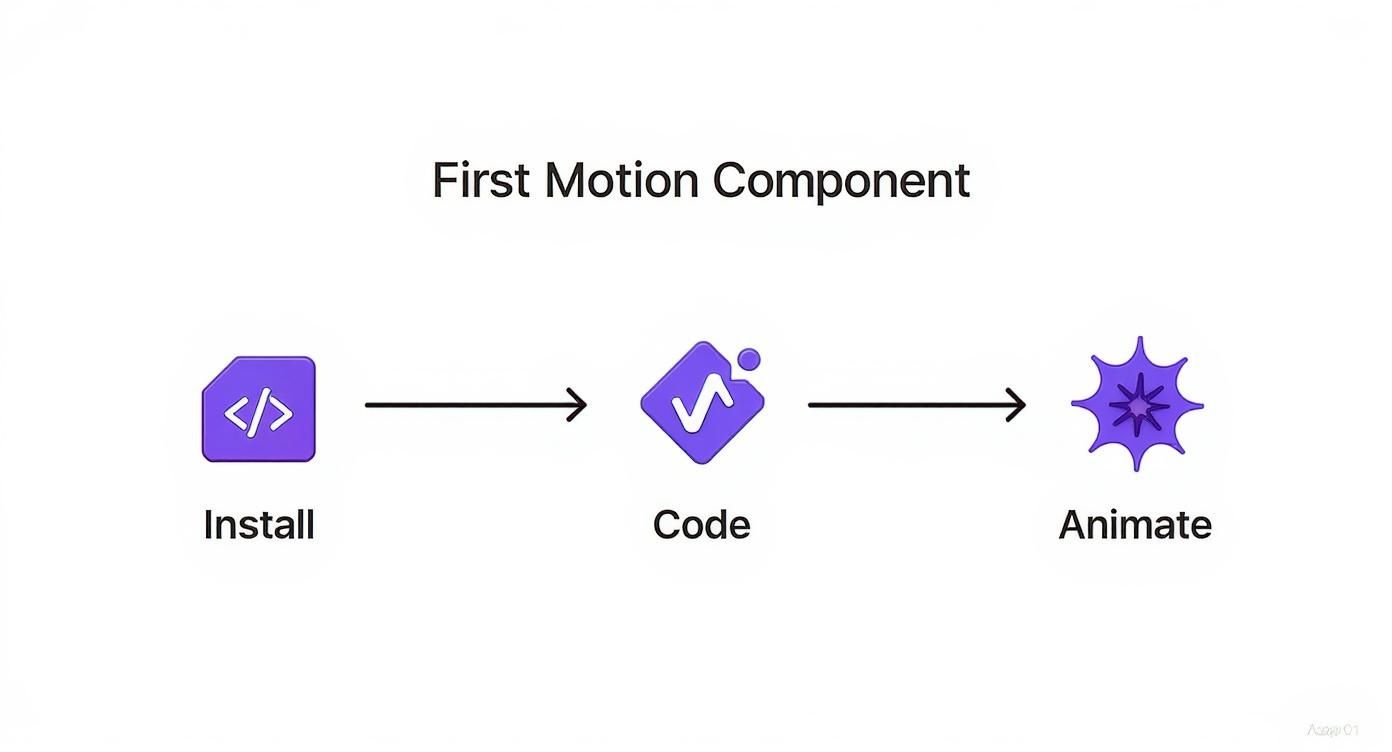
Getting Your Hands Dirty: Your First Motion Component
Diving into Framer Motion within a React project is surprisingly painless. The library is built to feel like a natural extension of React, letting you turn any regular HTML or SVG element into an animatable powerhouse with a single prefix: motion. This simple concept is your ticket to everything else the library can do.
Think of the motion factory as a superpower for your JSX. Just by swapping <div /> for <motion.div />, you've instantly unlocked a whole new set of animation props for that element. This tiny change is huge—it lets you define states, transitions, and gesture-based interactions right on the component itself. Your animation logic lives exactly where it should: with the element it affects.
The Core Animation Props
To make an element move, you'll mostly be working with a handful of key props that describe its different animated states. You simply declare what the animation should look like at various points, and Framer Motion handles all the complex math to create a smooth animation between those states. It feels almost like magic.
Here are the main players you'll use constantly:
initial: This defines the component's state the moment it first renders. It's your starting line. For example, an element could start with an opacity of 0 or be positioned just off-screen.animate: This is where you want the component to animate to after it mounts. It's the end state of your initial animation.whileHover: A super handy prop that specifies an animation state active only when the user's cursor is over the element. It automatically animates to this state on hover and then gracefully returns to theanimatestate when the cursor leaves.transition: This prop gives you deep control over the how of the animation. Want to change the duration? The easing? Want to use a physics-based spring instead of a timer? This is the prop for you.
Let's Build an Interactive Button
Okay, let's put this theory into practice with a classic example: an interactive button that scales up when you hover over it. It's a small detail, but this kind of user feedback makes an interface feel alive and responsive.
First things first, make sure Framer Motion is added to your project. If you haven't already, run this in your terminal:
npm install framer-motion
Now, let's create the component. Peep how we import motion and then immediately use motion.button to create our special, animatable button. The props we add describe the exact behavior we want, no messy setup required.
import { motion } from "framer-motion"
const AnimatedButton = () => {
return (
<motion.button
className="rounded-lg bg-blue-600 px-6 py-3 font-semibold text-white shadow-lg"
whileHover={{ scale: 1.1 }}
transition={{ type: "spring", stiffness: 400, damping: 10 }}
>
Click Me
</motion.button>
)
}
export default AnimatedButtonJust look at that. With only two props,
whileHoverandtransition, we've created a physically-based, interactive animation. This is the absolute beauty of Framer Motion: achieving seriously impressive results with minimal, easy-to-read code.
In this example, the button will smoothly scale to 110% of its original size on hover. Better yet, it's driven by a spring animation that feels bouncy and natural, not robotic. And just like that, you've built your first motion component. This fundamental pattern is the same one you'll use to build much, much more complex animations down the road.
Orchestrating Animations With Variants
While plugging props like initial and animate directly onto a component works great for simple effects, things can get out of hand quickly. Imagine trying to manage an element with five different animation states. Shoving all that logic directly into your JSX would be an absolute nightmare to read and maintain.
This is exactly where Framer Motion's variants API comes in and saves the day.
Variants let you define your animation states ahead of time in a clean, reusable object. You just give each state a name—like visible, hidden, or expanded—and then tell your motion component which one to use by name. This pulls all the messy animation logic out of your component tree, making your code infinitely cleaner and easier to scale.
The basic idea is simple: install, code, animate. Variants just make that "code" step much more organized.
This workflow is straightforward for a single component, but variants truly shine when you need to coordinate these states across multiple elements, keeping everything consistent and manageable.
Refactoring to Variants
Let's revisit our earlier button example and refactor it to use variants. Instead of defining the animation states with inline objects, we'll create a dedicated buttonVariants object. This small change immediately makes our component's intent clearer and sets us up for adding more complex states down the road without making a mess.
import { motion } from "framer-motion"
// Define our animation states in a variants object
const buttonVariants = {
initial: {
scale: 1,
boxShadow: "0px 0px 0px rgba(0, 0, 0, 0.2)",
},
hover: {
scale: 1.1,
boxShadow: "0px 8px 15px rgba(0, 0, 0, 0.3)",
transition: {
type: "spring",
stiffness: 400,
damping: 10,
},
},
}
const AnimatedButton = () => {
return (
<motion.button
className="rounded-lg bg-blue-600 px-6 py-3 font-semibold text-white"
variants={buttonVariants}
initial="initial"
whileHover="hover"
>
Hover Me
</motion.button>
)
}
export default AnimatedButtonLook how much cleaner that motion.button component is now! We just pass our buttonVariants object to the variants prop, and then reference the state names (initial, hover) as simple strings. This approach scales beautifully.
By decoupling animation definitions from the component’s JSX, variants make your code more declarative and easier to debug. You can export, import, and reuse these variant objects across your entire application.
Sometimes, seeing the difference laid out helps clarify why one approach is better than the other.
Animation Props vs Variants
| Feature | Direct Props (e.g., animate={{...}}}) | Variants (e.g., variants={{...}}) |
|---|---|---|
| Readability | Poor for complex states. JSX gets cluttered. | Excellent. Separates logic from markup. |
| Reusability | Low. Logic is tied directly to the component. | High. Can be imported and used anywhere. |
| Scalability | Difficult. Adding new states is cumbersome. | Simple. Just add another key to the object. |
| Orchestration | Manual and complex. | Built-in via parent-child propagation. |
Ultimately, while direct props are fine for one-off animations, variants provide a far more robust and maintainable system for any real-world application.
Creating Cascading Effects With StaggerChildren
The real magic of variants happens when you start orchestrating animations between parent and child components. A classic UI pattern is a list where each item animates in one after another, creating a slick cascading or "stagger" effect. Framer Motion makes this incredibly simple with the staggerChildren property.
Here’s how it works: you define variants for both a container element and its children. The parent's transition prop can then include staggerChildren, which is just a number that specifies the delay (in seconds) between each child's animation starting.
Imagine a list of items you want to animate in:
- The Container (
motion.ul): This will have avisiblevariant that includes atransitionwith thestaggerChildrenproperty. - The Items (
motion.li): Each list item will have its ownhiddenandvisiblevariants.
When the parent's animate prop switches to "visible", it automatically triggers the same animation on all its motion children. But thanks to staggerChildren, it applies the specified delay between each one. This creates a sophisticated, sequential animation without you having to write any complex timers or manual state-juggling logic.
This one feature unlocks some of the most professional-feeling UI animations you can build, and it's a perfect example of why variants are so powerful.
Fine-Tuning Motion With Custom Transitions
The true character of an animation isn’t just about where it starts and ends. It’s in the feel—that subtle timing, bounce, and flow that makes it come alive. While the initial and animate props in framer motion react set the stage, the transition prop is where you get to play the director and inject some real personality.
Think of it as the bridge between states. Mastering the transition prop is what separates a generic, robotic movement from one that feels intentional and unique to your app.
By default, Framer Motion often uses a gentle spring animation, which is great for many situations. But sticking to the defaults can make your UI feel like a template. The transition prop opens up the animation engine, giving you the controls to craft motion that perfectly matches your brand's style, whether that's quick and energetic or smooth and sophisticated.
Choosing the Right Transition Type
Framer Motion comes with several animation types out of the box, and each one is suited for different kinds of interactions. Once you get a feel for their distinct characteristics, you can pick the perfect tool for any job.
spring: This is the default, physics-based animator. Instead of setting a rigid duration, you control its behavior with properties likestiffnessanddamping. It's perfect for creating lively, natural-feeling movements that respond realistically to what the user is doing.tween: This is your classic, duration-based animation. You define a specificdurationand aneasecurve, which gives you predictable and consistent timing. Tweens are ideal for UI elements that need to get from point A to point B in a set amount of time, like a sidebar sliding into view.inertia: This one is specially designed for animations that need to gradually slow down after a user gesture, like when you "flick" a draggable element. It cleverly calculates the velocity of the gesture and continues the motion, decelerating smoothly until it comes to a stop.
The choice between
springandtweenreally comes down to purpose. I usespringfor interactive, user-driven animations that need to feel responsive. For programmatic, state-driven animations where precise timing is non-negotiable, I always reach fortween.
Crafting Custom Animation Curves
Let's walk through a practical example. Imagine we have a modal backdrop that needs to fade in smoothly when the modal appears. A tween is the perfect fit here because we want a controlled, predictable fade over a specific timeframe.
Here’s how you’d set that up:
import { motion } from "framer-motion"
const backdropVariants = {
hidden: { opacity: 0 },
visible: {
opacity: 1,
transition: {
type: "tween",
duration: 0.3,
ease: "easeInOut",
},
},
}
const ModalBackdrop = () => (
<motion.div
className="bg-opacity-50 fixed top-0 left-0 h-full w-full bg-black"
variants={backdropVariants}
initial="hidden"
animate="visible"
/>
)In this snippet, we’ve specified a tween with a duration of 0.3 seconds and an easeInOut curve. This ensures the fade feels gradual and polished, not abrupt. Even tiny tweaks to these values can dramatically change how the interaction feels to the user.
As you get deeper into animation, the ability to be defining custom actions becomes critical for creating truly unique and responsive transitions. This same level of control over timing and easing can be applied to animations triggered by scrolling, a technique you can dive into with our guide on CSS animation on scroll. Fine-tuning these little details is ultimately what separates a good UI from a great one.
Advanced Animation With Gestures and Layouts
Once you’ve nailed down states and transitions, it’s time to level up by making your UI respond directly to user input. This is where the real magic of Framer Motion in React comes into play. We're moving beyond animations that just look nice and into experiences that feel genuinely interactive.
Gesture animations are your ticket to building interfaces that feel tactile and alive. While helpers like whileTap and whileHover are great for quick feedback, the real fun begins when you let users physically manipulate elements on the screen.
Making Elements Interactive With Gestures
The drag prop is easily one of the coolest features in the library. Just add drag to any motion component, and it's instantly draggable. You can even lock it to an axis by setting it to drag="x" or drag="y". It's that simple.
Let's put this into practice with a draggable card that can only be moved within a specific area. This is a super common pattern you see in customizable dashboards or interactive onboarding flows.
import { useRef } from "react"
import { motion, useMotionValue, useTransform } from "framer-motion"
const DraggableCard = () => {
const constraintsRef = useRef(null)
return (
<motion.div
ref={constraintsRef}
className="flex h-64 w-64 items-center justify-center rounded-lg bg-gray-200"
>
<motion.div
className="h-32 w-32 cursor-grab rounded-xl bg-purple-600"
drag
dragConstraints={constraintsRef}
whileTap={{ cursor: "grabbing", scale: 1.1 }}
/>
</motion.div>
)
}
export default DraggableCardIn this snippet, the purple div is draggable, but the dragConstraints prop keeps it from leaving its gray parent container. We also tossed in a whileTap prop to give the user some instant feedback—the cursor changes and the card scales up the moment you click down.
Creating Seamless Layout Animations
One of the most impressive effects in modern UI is the "magic move," where an element smoothly animates between different positions and sizes as the layout shifts. Framer Motion makes this incredibly complex task feel almost trivial with its layout animations.
All you have to do is add the layout prop to a motion component. That’s it. You're telling Framer Motion to automatically handle the animation whenever its position in the DOM changes. This is a game-changer for things like reordering lists, expanding accordions, or switching between tabs.
When you have a bunch of components that need to animate their layouts together, wrap them in a
<LayoutGroup>component. This tells Framer Motion they're all part of the same choreographed move, resulting in perfectly synchronized and seamless transitions.
Graceful Exits With AnimatePresence
So what happens when you remove a component from the DOM? React just yanks it out, which can feel abrupt and jarring to the user. AnimatePresence is Framer Motion's elegant answer to this problem, allowing components to animate out before they're unmounted.
It works like this:
- Wrap your dynamic components in
<AnimatePresence>. - Make sure every child has a unique
keyprop so Framer Motion can track it properly. - Add an
exitanimation to the child component that defines how it should disappear.
This little touch is what separates a good UI from a great one. Think about a to-do list where items fade out gently when you delete them, or a modal that gracefully slides off-screen when closed. It makes your app feel polished and complete. For more ideas on this front, check out some of these other powerful React animation examples that use similar principles.
Common Questions About Framer Motion
As you start weaving framer motion react into your projects, you'll probably bump into a few common questions. Let's tackle them head-on, because figuring this stuff out early will save you a ton of headaches later and help you build much slicker, faster apps.
Is Framer Motion Bad for Performance?
This is usually the first thing on everyone's mind. Does all this slick animation come with a performance penalty? The short answer is: not really. Framer Motion is seriously optimized. It's smart enough to offload animations to the GPU whenever possible by sticking to hardware-accelerated properties like transform and opacity.
But, you can still shoot yourself in the foot. If you start animating layout properties like width, height, or backgroundColor, the browser has to do a lot more work—recalculating layouts and repainting the screen. That’s what leads to that dreaded janky, stuttering feeling. For the smoothest ride, stick to transforms and opacity.
How Does It Work with SSR and Production Builds?
The next big question is usually about Server-Side Rendering (SSR). Can you use Framer Motion in a framework like Next.js? Absolutely, but there's a tiny catch. Animations are a client-side thing, so sometimes they don't play perfectly with the initial server-generated HTML.
Luckily, there are a few solid strategies to get around this:
- Lazy Loading: Use
next/dynamicto pull in your animation-heavy components only after the page has loaded on the client's browser. - The
LazyMotionComponent: This is a gem. Wrap parts of your app with<LazyMotion>to code-split Framer Motion itself. This keeps your initial bundle tiny by only loading animation features when they're actually needed. - The
initialProp: A simple fix is to setinitial={false}on a motion component. This tells it to skip the very first animation on page load, completely avoiding any mismatch between the server and client render.
Code-splitting the library is a huge win. It shrinks the initial payload your user has to download, which directly impacts load times. In fact, on complex pages, this can improve First Contentful Paint by up to 30%.
Should I Stop Using CSS Animations Altogether?
Finally, people often wonder if Framer Motion makes CSS animations and transitions obsolete. While it's incredibly powerful, it's not a complete replacement. CSS is still king for simple, non-interactive animations. Think of a button's background color changing on hover—CSS handles that perfectly and efficiently.
The real pro move is to use both tools for what they do best. Lean on CSS for your simple, static transitions. When you need complex, state-driven, or interactive animations that demand the full power of JavaScript, that's when you bring in Framer Motion.
This hybrid approach gives you the best of both worlds. You get the raw performance of CSS for the simple stuff and the dynamic, physics-based magic of Framer Motion for crafting truly memorable user experiences in React.
Ready to build stunning, animated landing pages in minutes? Check out Magic UI for a library of over 50 customizable blocks and 150+ free animated components built with the best of React and Framer Motion. Start creating at https://magicui.design.