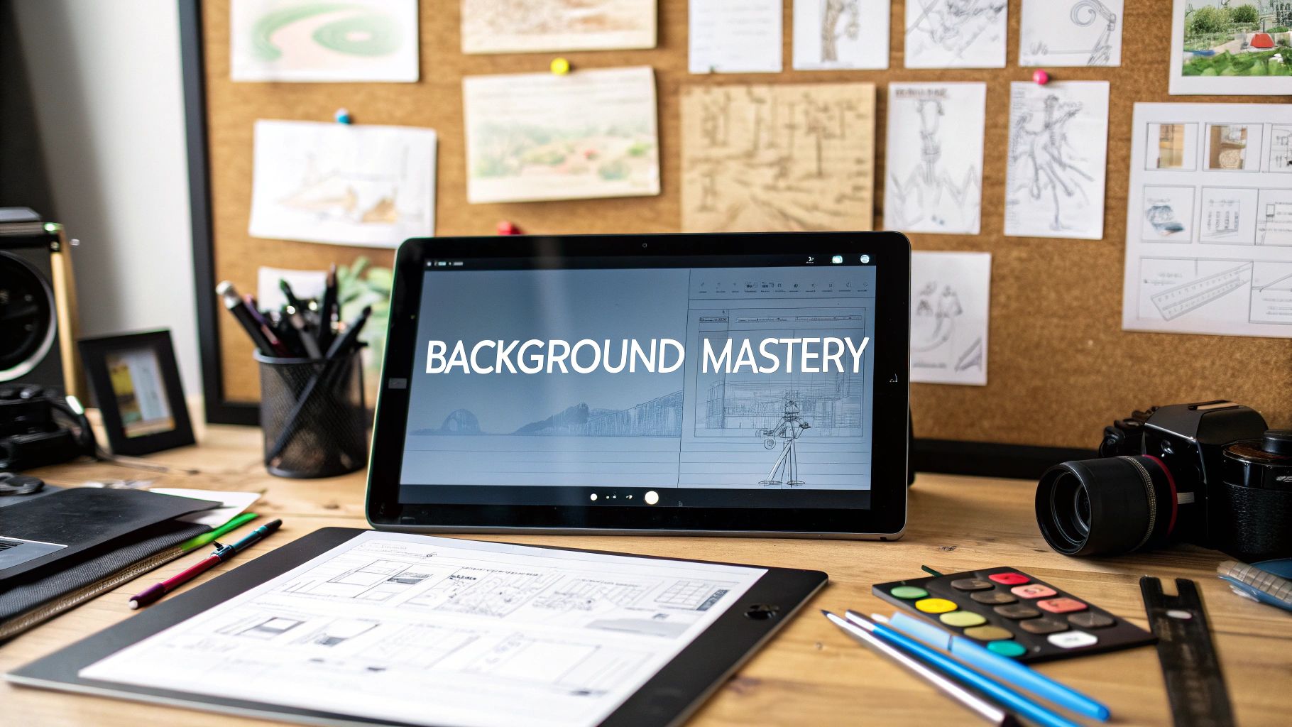
Learning how to create backgrounds for animation is so much more than just filling in the space behind your characters; it's about building an entire world from scratch. The real craft is in mixing classic art principles like composition and color theory with the technical know-how of digital software to create environments that genuinely tell a story.
The Unsung Hero: An Animation Background's True Role
Think of a great background as the unsung hero of any animated scene. It sets the mood, gives the audience context for what’s happening, and subtly tells them where to look—all without stealing the spotlight. It's what turns a simple character movement into a real moment inside a living, breathing world.
This foundational piece of visual storytelling has come a long way. The leap from hand-painted cells to fully digital creation has completely changed how we work. In fact, digital workflows shortened animation production cycles by a massive 30-50% between the late 90s and the 2010s.
Today, you'll find that over 75% of big-budget animations rely on digitally created backgrounds. It's a clear sign that the industry has embraced the efficiency and complexity digital tools offer. You can get a better sense of this shift by checking out the latest animation industry statistics and seeing how technology continues to shape production.
Building a Visual World Straight from the Script
Your very first clues for designing a background are waiting for you in the script. A solid script or storyboard is usually packed with little details that will guide your artistic choices. Your job is to be a detective and translate those words and rough sketches into a believable place.
To get it right, you need to pull out the key info:
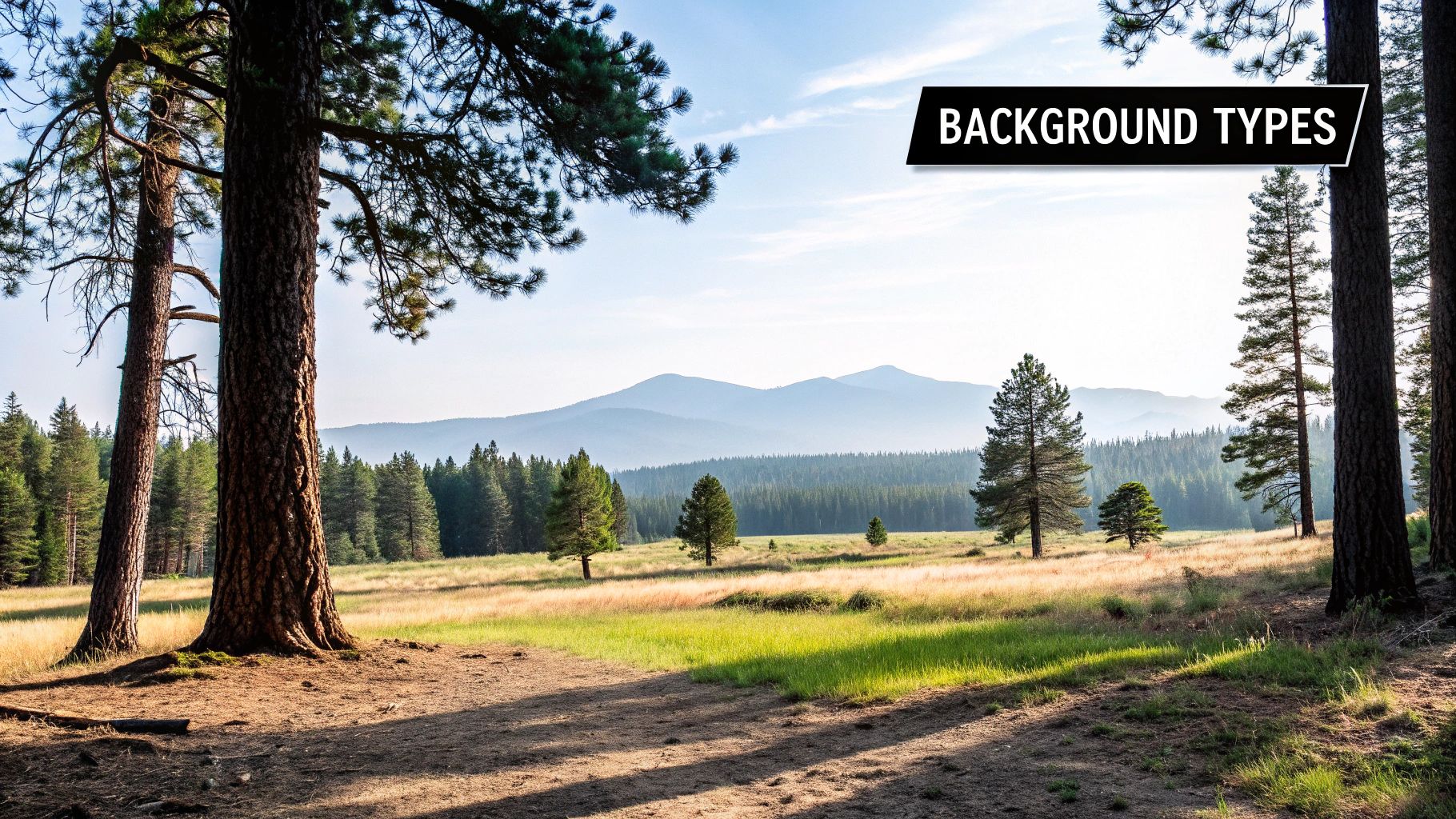
- Time and Place: Is this a futuristic city at midnight or a sleepy countryside at dawn? The answer dictates your lighting, architecture, and the entire color palette.
- Emotional Tone: A tense, dramatic scene might need sharp angles, stark contrast, and a cool color scheme. A goofy, lighthearted moment, on the other hand, would feel right at home with soft, rounded shapes and warm, bright colors.
- Character Interaction: Pay close attention to where the characters will move and what objects they'll interact with. Those "hero props" have to be clearly defined and perfectly placed to support the action.
Guiding the Viewer's Eye Without Them Noticing
Composition is easily your most powerful tool for controlling what the audience focuses on. By using some fundamental principles, you can create backgrounds that are both gorgeous and functional. For instance, using leading lines—like a winding road, a fence, or a row of trees—can physically draw the viewer's gaze right to a character or a key action.
A background should support the narrative, not compete with it. The best environments feel authentic and immersive, allowing the viewer to get lost in the story without being distracted by unnecessary visual noise.
This is a principle I come back to on every project. A background that's too cluttered or overly detailed will pull focus away from the characters and muddy the story you're trying to tell. A great technique to avoid this is using atmospheric perspective—making things in the distance lighter and less detailed. It creates a natural sense of depth and, more importantly, keeps the focus right where you want it. Once you nail these fundamentals, you’re not just painting a picture; you’re setting the stage for a truly compelling animation.
Choosing Your Digital Art Toolkit
Alright, let's talk tools. Picking the right software is the very first fork in the road when you're figuring out how to make backgrounds for animation. This decision will ripple through your entire process, shaping your workflow, the styles you can pull off, and how quickly you can get from a blank canvas to a finished scene. It's less about which program has the longest feature list and more about finding one that just clicks for you.
For years, the undisputed king of the castle in many professional studios has been Adobe Photoshop. Its painting engine is incredibly powerful and versatile. If you're aiming for a highly detailed, painterly look, the brush customization is simply on another level. For complex textures and photorealistic effects, Photoshop's massive library of tools and filters gives you ultimate control.
But it's not the only game in town. For artists who live and breathe line art and perspective, Clip Studio Paint is an absolute gem. Its perspective rulers are a game-changer, and the ability to integrate 3D models can shave hours off creating complex architectural scenes. Honestly, a lot of illustrators just prefer the feel of drawing in Clip Studio—it feels a bit closer to traditional media.
Key Software Considerations
The "best" software really comes down to your personal needs, style, and budget. Before you commit, think about what truly matters for the kind of work you want to do.
- Workflow Integration: Can it easily export layered files (like PSDs) that the animators downstream can actually use without a headache?
- Artistic Style: Does the brush engine feel right for the painterly, cel-shaded, or line-art style you're going for?
- Hardware: Are you chained to a desktop with a graphics tablet, or do you need the freedom of an iPad?
Speaking of portability, Procreate has become a titan for artists on the go. Its touch-based interface is so intuitive you can just pick it up and start painting, but don't let that fool you—it’s more than powerful enough for professional-quality work. It might not have every single bell and whistle of its desktop cousins, but its speed and sheer ease of use are huge wins for concepting and painting.
As you weigh these options, you might also find our guide on other web animation tools useful for getting a wider look at the modern digital toolkit.
Comparing Popular Background Creation Software
To help you decide, let's break down the main players. Each has its own strengths, so the best choice depends on what you value most in your workflow.
| Software | Best For | Key Features | Price Model |
|---|---|---|---|
| Adobe Photoshop | Painterly styles, photo-bashing, and complex texturing | Unmatched brush engine, extensive filters, industry-standard PSD format | Subscription |
| Clip Studio Paint | Line art, perspective-heavy scenes, and comic/manga styles | Advanced perspective rulers, 3D model integration, vector layers | One-time Purchase |
| Procreate | Portability, intuitive painting, and rapid concepting on iPad | Touch-optimized interface, powerful brush engine, simple and fast workflow | One-time Purchase |
Ultimately, you're looking for a partner in creativity. The best tool is the one that empowers you to create stunning backgrounds without getting in your way.
The Rise of AI in Background Creation
Beyond the traditional software, a completely new class of tools is shaking things up. Artificial Intelligence (AI) isn't just a buzzword anymore; it's becoming a practical assistant for background artists.
Think of AI tools as a creative partner that can handle the grunt work. They can generate endless texture variations, block out initial color palettes, or even suggest different compositions. This frees you up to focus on the truly artistic decisions that make a piece unique.
The impact is real. The AI animation market is projected to hit $1.4 billion and is growing fast. This tech can slash the manual effort for tasks like texture generation by up to 50%, which means much faster prototyping and iteration. You can find more on how AI is revolutionizing the animation industry if you want to dive deeper.
From Sketch to Final Render
Alright, this is where the magic happens. We're about to take that first spark of an idea and shape it into a living, breathing environment for your animation. This whole process is a journey, moving from a blank canvas to a polished, action-ready background. It's less about a rigid set of rules and more about a creative workflow that gets you from a rough concept to a final asset without losing your mind.
The key to this entire process is starting broad and then slowly, deliberately, narrowing your focus. If you jump into the tiny details too early, you'll get bogged down. Trust me, I've been there. The goal is to build a reliable framework you can lean on for any project, ensuring your work is both stunning and functional every single time.
This first step, the initial sketching phase, is where the foundational ideas really start to take shape.
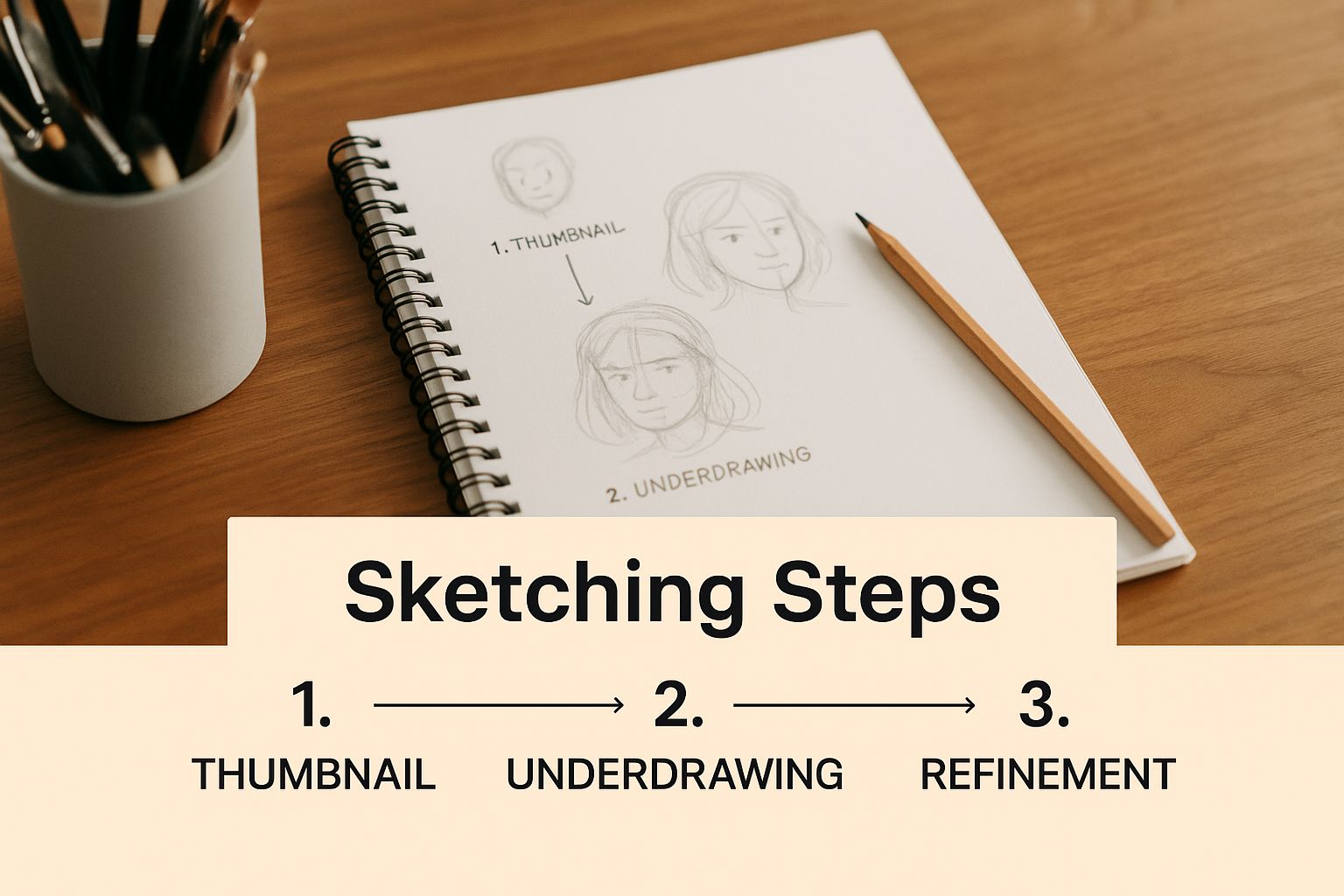
As you can see, even the most detailed, complex backgrounds start with nothing more than simple, exploratory drawings to lock in a strong visual foundation.
Start with Thumbnail Sketches
Before you even think about picking a color or rendering a single pixel, you need to start with thumbnail sketches. These are tiny, lightning-fast, and unapologetically messy drawings. Seriously, think business-card size or smaller. Their only job is to help you explore composition.
Don't aim for perfection. The entire point is to churn out a bunch of ideas fast. Working small forces you to ignore the details and focus on what really matters at this stage: the big shapes, the visual flow, and the overall balance of the scene.
As you sketch, ask yourself some basic questions. Where's the horizon line? What's the main point of interest, and how can I frame it to draw the viewer's eye? You're hunting for the most dynamic composition. I always aim for at least five to ten different thumbnails before I even consider moving on. It gives you options, and options are everything.
Gather Your Visual References
Once you've locked in a composition you feel good about, it's time to gather references. And no, this isn't cheating—it's what every single professional artist does to build worlds that feel authentic.
If your scene is a moody, rain-slicked city street at night, go find photos of wet asphalt. Look for pictures of neon signs reflecting in puddles, or the specific architectural style you're imagining. These references are your secret weapon; they'll inform every decision you make, from lighting and color to the texture of a brick wall.
I like to pull everything into a single mood board. It becomes my visual anchor, a single source of truth I can refer back to, ensuring the final piece stays consistent with my initial vision.
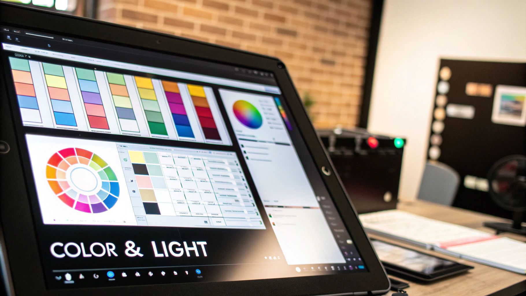
Block In Your Colors and Values
With a refined sketch and a solid bank of references, you can finally start laying down some color. This stage is all about color blocking. Grab a big, simple brush and just paint in the main areas of color. No detail, no texture—just big, bold shapes.
The goal here is to establish the scene's overall lighting and atmosphere. Focus on the relationship between your lights and shadows. Is it a high-contrast, sunny day with sharp, dark shadows? Or is it a soft, overcast day with more subtle, diffused light? Defining these broad value groups early on is what will give your background a real sense of depth and form.
A classic rookie mistake is jumping straight into rendering tiny details before the core lighting is figured out. If your underlying value structure is weak, your background will always feel flat, no matter how much detail you throw at it. Get the big shapes right first.
Render Details and Textures
Now that your foundation is rock-solid, you can finally dive into the fun stuff: rendering the details and textures that make the scene feel real. This is where you can bring in specific elements that sell the world you're building.
For instance, adding realistic surfaces for things like brick walls, wood grain, or grassy fields can make a huge difference. Knowing how to create seamless textures is an invaluable skill for this, as it allows you to cover large areas without obvious repetition.
But be strategic with your detail. Don't render everything to the same level of polish. The areas where your characters will be, or where you want the audience to look, should get the most love—more detail, higher contrast.
As things recede into the distance, they should get simpler and less contrasty. This classic technique is called atmospheric perspective, and it's absolutely essential for creating a believable sense of space. By carefully managing where you put your detail, you're not just painting a picture; you're guiding the viewer's eye and telling a story.
Mastering Layers for Dynamic Scenes
In animation, a background is never just a single, flat picture. It’s a carefully built set of pieces working in concert to create depth, dimension, and movement. If you want to master how to make backgrounds for animation, you have to master the art of layering—it’s the secret ingredient that makes your scenes breathe.
This technique means strategically splitting your artwork into distinct planes: the foreground, midground, and background. This isn't just an artistic flourish; it's a technical necessity. When you put different elements on their own layers, you open the door for camera movements like pans and zooms without forcing the animation team to redraw entire scenes frame by painful frame.
Think about a character walking through a forest. If you pop a big tree on a foreground layer, the character can move behind it seamlessly, creating an instant and totally believable sense of depth. The rest of the woods might live on a midground layer, with the distant mountains and sky chilling way back on the background layer.
The Power of Parallax
This separation is what gives us the magical parallax effect. As the camera "moves" across the scene, the foreground elements zip by faster than the background elements, mimicking how our eyes perceive depth in the real world. It's a simple trick, but it's one of the most powerful ways to add dynamic motion and immersion to a 2D scene.
Without good layering, a camera pan just looks like you're dragging a flat poster across the screen. With it, you’ve created a window into a world that feels real. You can see some cool, code-based examples of this principle in action with animated effects like the warp background component to get a feel for how layers generate motion.
Organizing Your Layers for Production
A clean, organized layer file is a gift to your animation team. I can't tell you how many times a messy file has caused massive production headaches down the line. To avoid being that person, get into the habit of using a clear and consistent naming convention from the start.
Think of your layered file as a blueprint for the animators. The more logical and clearly labeled it is, the smoother the entire production pipeline will run. A simple change like naming layers "FG_Tree_01" and "BG_Mountains" instead of "Layer 3 copy" can save hours of confusion.
Here’s a practical structure I always follow:
- Foreground (FG): This layer is for anything sitting closest to the camera. This could be the tree the character walks behind, a windowsill in an interior shot, or even falling rain.
- Midground (MG): This is your main stage. It's where most of the character action will unfold. It includes the ground they walk on and the primary set pieces they'll interact with.
- Background (BG): This layer holds everything furthest from view—the sky, distant mountains, or a far-off city skyline.
This logical separation isn't just about creating depth; it's about maintaining control. It allows different artists and animators to work on elements independently and makes the entire process ridiculously more efficient.
Getting Your Backgrounds Ready for Production
A gorgeous background is only half the job done. If it’s not built for the production pipeline, it can become a massive bottleneck for the entire team. This is where the technical side of the art comes in—prepping your work so it’s seamless for animators to use. Frankly, getting this right separates the amateurs from the pros.
This handoff process is more critical than you might think. The global animation industry was valued at a staggering $371.85 billion in 2024 and is still climbing fast. That kind of growth means workflows have to be incredibly efficient. Perfectly prepped backgrounds are a huge part of hitting those tight deadlines. You can dig into the growth of the animation market on kasradesign.com if you're curious.
Nail Down Your Resolution and File Formats
Let's get into the specifics. You should always, always work at a higher resolution than the final animation output. A great rule of thumb is to double it. If the project is for Full HD (1920x1080), create your background at 3840x2160 pixels. This extra real estate is a lifesaver, giving animators the room they need for camera moves like zooms and pans without the image turning into a pixelated mess.
When you're ready to export, the file format you choose is everything. The whole point is to keep the layers and transparency intact for the animation team.
- PSD (Photoshop Document): This is the king for a reason. It perfectly preserves every layer, folder, and effect you’ve created. It's the go-to format for handing off work to animators, especially those working in software like Adobe After Effects, which can import PSDs flawlessly.
- PNG (Portable Network Graphics): Need to export a single element with a transparent background, like a tree that sits in the foreground? PNG is your best friend. It uses lossless compression, so you don't lose a speck of quality.
Yes, these formats can lead to bigger files, but their flexibility in production is non-negotiable. If you're looking for ways to keep file sizes in check, many of the same ideas in our guide on how to optimize images for web can be applied here.
Master Your Naming and Color Profiles
A clean file is a happy animator. One of the best habits you can ever develop is a logical layer naming system. It might seem tedious, but naming your layers with simple, descriptive titles like FG_Tree_01 or BG_Sky is so much better than handing over a file with a hundred layers all named "Layer 1 copy."
A well-organized file is an act of consideration for your team. It removes guesswork, speeds up the animation process, and prevents costly misunderstandings. Clear communication starts with how you label your layers.
Finally, double-check that your color profile matches the project's standards. Most animation workflows are built around the sRGB color space. If you work and export in the right profile, you can be confident that the colors you spent hours perfecting are the same ones everyone else sees—from your monitor to the final render.
Common Questions About Background Art
Diving into background creation for the first time always brings up the same handful of questions. It doesn't matter if you're a seasoned pro or just getting your feet wet; figuring out the answers to these common hurdles is part of the process.
Let's break down some of the questions we see pop up again and again, with some clear, practical answers to get you started on the right foot.
What Is the Best Resolution for Animation Backgrounds?
Here's a solid rule of thumb that will save you a lot of headaches: work at double the final output resolution. If the project is going to be in standard Full HD (1920x1080), you should be creating your background files at a crisp 3840x2160 pixels.
Why so big? It’s all about flexibility. This extra real estate gives the animators room to play. They can add camera movements—zooms, pans, even slight rotations—without the image turning into a blurry mess.
Of course, you should always double-check the project's specific technical requirements, but starting bigger is a simple way to make your work much more useful down the line.
Consistency is the cornerstone of a believable animated world. When the style of the backgrounds and characters align perfectly, the audience is free to become fully immersed in the story without any visual distractions.
How Do I Match the Background Style to the Characters?
Getting that visual harmony right is everything. You want your characters and backgrounds to feel like they belong together, not like they were dropped in from two different universes. The best way to nail this is to establish a shared visual language right from the beginning.
Start with a unified color palette that gets used for both characters and environments. Then, look closely at the line quality.
- Are the characters drawn with sharp, clean lines? The background should echo that, maybe with slightly thinner lines to push it back and create depth.
- Is the style more painterly and textural? Carry those same brush techniques and textures into the background elements.
The single best way to keep everyone on the same page is to create a detailed style guide before production really kicks into gear.
How Much Detail Should I Add to My Backgrounds?
Detail should always serve the story, not fight it for attention. The trick is to use it strategically, guiding the viewer's eye exactly where you want it to go.
Think about where the action is happening. Any area where characters will interact or a key story point unfolds should get the most detail and the highest contrast. On the flip side, things in the distance or on the edges of the frame should be simplified, with softer edges and less contrast.
This isn't just an artistic choice; it creates a natural focal point and a believable sense of depth. Before you add another tree or rock, just ask yourself: "Does this help tell the story, or is it just visual noise?"
Is It Okay to Use Photos in My Animation Backgrounds?
Absolutely. Using photos, a technique often called "photobashing," can be a seriously powerful and efficient way to build out realistic textures and complex environments. But, and this is a big but, it takes a skillful hand to pull it off.
The secret isn't just dropping a photo in. You have to manipulate it—a lot. Adjust the colors, values, and lighting so it blends seamlessly with your scene's established art style. You'll almost always need to paint over parts of the photo to fully integrate it into the artwork.
And the most critical part: make sure you have the proper rights and licenses to use any photos in a commercial project. Don't skip this step.
Ready to build interfaces as stunning as your animations? Magic UI offers a library of 150+ free, open-source animated components and premium templates to bring your landing pages to life. Check out our components and start building today.