
When we talk about optimizing images for the web, we're really talking about a balancing act. The goal is to shrink file sizes as much as possible without sacrificing visual quality, all to make your website load faster. This isn't just a technical tweak; it's absolutely fundamental for good SEO and a positive user experience. It directly shapes how both visitors and search engines see your site.
Why Image Optimization Is a Game Changer
Have you ever bailed on a website because it was taking forever to load? We all have. More often than not, the culprit is a bunch of large, unoptimized images clogging up the works. This isn't a minor hiccup—it's a critical performance bottleneck that can seriously hamstring your site's success.
Even a single poorly sized image can tack on several extra seconds to your load time. That delay is a killer, especially on mobile. One study found that about 53% of visitors will abandon a site if it takes longer than three seconds to load. You can read more about how performance shapes user behavior and steer clear of common mistakes in our guide on web design best practices.
The SEO and User Experience Impact
Google has been beating the drum about site speed for years, and it's a huge ranking factor. Their Core Web Vitals are now at the heart of how they measure user experience, and images are front and center in these metrics:
- Largest Contentful Paint (LCP): This measures how quickly the biggest element on the screen—usually a hero image or a block of text—becomes visible. A slow-loading hero image is a one-way ticket to a poor LCP score, and that will hurt your rankings.
- Cumulative Layout Shift (CLS): This tracks the visual stability of your page. You know when you try to click a button, but an image loads late and shoves everything down? That's layout shift. Images without properly defined dimensions are a common cause, creating a jarring experience and a high CLS score.
By learning how to optimize images for the web, you are directly improving these vital metrics. The result is a better user experience, lower bounce rates, and a significant boost in search engine visibility.
For anyone running an online store, the stakes are even higher. Site speed is directly tied to conversion rates. For a fantastic deep dive into how optimization can completely transform an e-commerce site, check out this complete guide to image optimization for Shopify.
Choosing the Right Image Format
Before you even think about compression or lazy loading, your first big decision is picking the right image format. This is the bedrock of web image optimization, and honestly, it’s no longer a simple choice between JPEG and PNG.
Modern formats have completely changed the game, offering much better performance without any noticeable hit to quality. These new formats were developed specifically to make pages load faster. For instance, a next-gen format like WebP can slash file sizes by 25-30% compared to an old-school JPEG, and that difference is huge. It's a direct boost to your page speed and, by extension, your user experience. If you want to go deeper, we cover this and more in our deep dive into image optimization techniques.
Modern Formats vs Traditional Staples
Don't get me wrong, the classic JPEG vs. PNG debate isn't over. JPEGs are still my go-to for photographs and any complex images with lots of color gradients. And PNGs? They're unbeatable when you need that crystal-clear transparency for things like logos or icons.
But for most everyday images on the web, WebP is the clear winner. It strikes an incredible balance between tiny file sizes and high visual quality. Then there's AVIF, which takes compression to another level. It's perfect for those high-impact visuals, like a massive hero image, where every single kilobyte you can save makes a difference.
When it comes to logos, icons, or any graphic that needs to look sharp at any size, there’s only one answer: SVG (Scalable Vector Graphics). Because they're just code, they're incredibly lightweight and resolution-independent, meaning they stay crisp on a tiny phone screen or a massive 4K display.
Image Format Comparison WebP vs AVIF vs JPEG vs PNG
To help you decide at a glance, I've put together a quick cheat sheet. This table breaks down the most common formats you'll be working with.
| Format | Best For | Compression | Browser Support |
|---|---|---|---|
| JPEG | Photographs, complex gradients | Lossy | Universal |
| PNG | Images requiring transparency, simple graphics | Lossless | Universal |
| WebP | A modern replacement for JPEG and PNG | Both | Excellent |
| AVIF | Maximum compression for critical visuals | Both | Good & Growing |
| SVG | Logos, icons, and scalable vector graphics | N/A | Excellent |
Think of this as your starting point. Choosing the right format upfront saves you a ton of headaches later and sets the stage for a genuinely fast website.
A Practical Workflow for Resizing and Compressing Images
Turning a high-resolution photo into a fast-loading web asset really comes down to two things: resizing and compressing. Nailing this workflow is the difference between a snappy site and one that has users tapping their fingers waiting for images to load.
First up is resizing. Before you even think about uploading, you have to know the actual dimensions the image will have on your site. One of the most common performance killers I see is a massive 4000-pixel wide image being crammed into an 800-pixel container. This forces the user's browser to download all that extra data and then shrink the image down, wasting bandwidth and processing power.
Resizing to Fit Your Layout
Take a good look at your website's layout. If your main content area is 900 pixels wide, there's absolutely no reason for an image inside it to be any wider. For those big, full-width hero images, check your site on a large monitor to find the maximum container width and use that as your guide. The goal is to resize your image to match those final display dimensions before it ever touches your website.
This single step can slash file sizes on its own. You can use pretty much any image editor for this, from Photoshop to free online tools. Many of the best web design tools even have these features built-in, which can really smooth out your process.
Understanding Image Compression
Once the image is the right size, it's time to compress it. This is where you shrink the file size (the kilobytes or megabytes) even further. You'll run into two main types of compression:
- Lossless Compression: This method cleverly removes non-essential metadata from the file without touching a single pixel. The image quality stays identical to the original.
- Lossy Compression: This is where the magic happens for web performance. It achieves much smaller file sizes by intelligently removing some visual data that the human eye isn't likely to notice.
For almost everything on the web, a smart lossy compression is the way to go. The file size savings are huge—often reducing an image's weight by 70% or more—with a trivial impact on how it actually looks to your visitors.
This infographic breaks down how you can define breakpoints and generate different image versions for a responsive design.
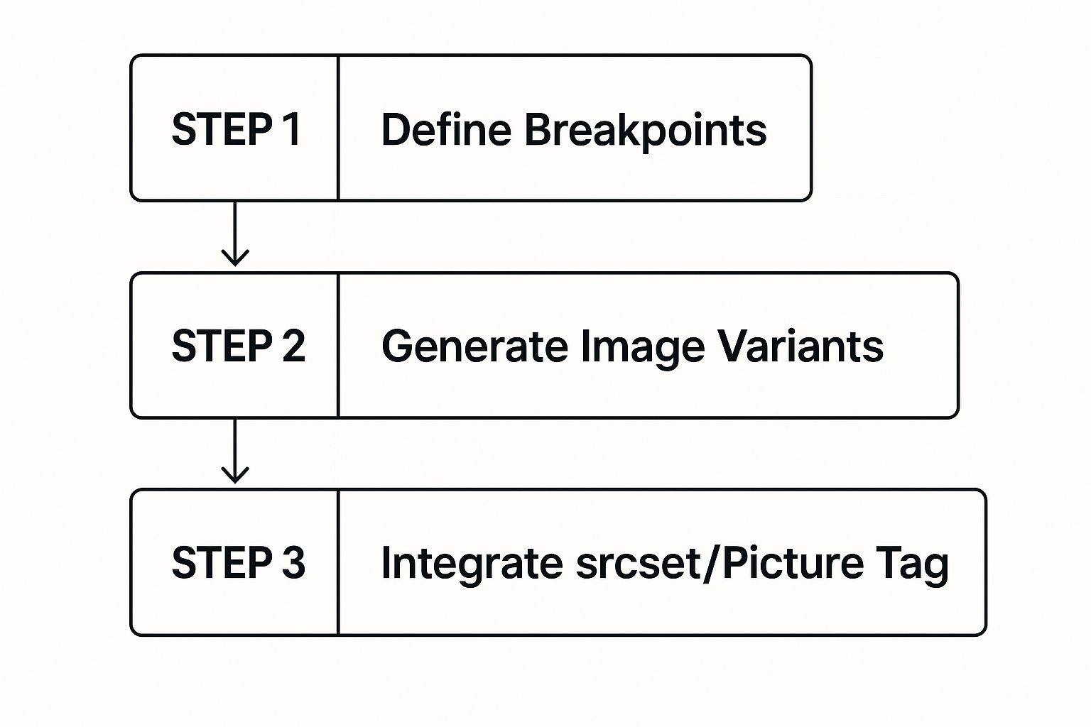
As you can see, creating multiple image versions for different screen sizes is a core part of any modern optimization strategy. On a day-to-day basis, I find myself using free online tools like TinyPNG for quick and effective lossy compression. You just drag, drop, and download the optimized file—it couldn't be simpler.
Nail Responsive Images with Srcset

Resizing and compressing your images is a solid start, but it's really only half the battle. If you want to truly master image optimization, you have to serve the right-sized image to the right device.
Think about it: sending a massive, high-resolution image meant for a desktop monitor to a tiny mobile screen is a complete waste. It burns through the user's data and slows your site to a crawl for zero benefit.
This is exactly the problem the HTML srcset attribute was designed to solve.
It's a surprisingly powerful tool that lets you hand the browser a menu of different-sized image sources. The browser then gets to be the smart one, picking the perfect option based on the user's screen size and resolution. The result? A fast, tailored experience for everyone.
This screenshot from MDN gives you a peek at a basic srcset implementation. The code offers up multiple image files, each tagged with its width, giving the browser all the options it needs to make the right call.
Putting Srcset and Sizes into Practice
Getting srcset working is more straightforward than it looks. The basic idea is to create a few versions of your image—maybe a small, medium, and large—and then list them in the attribute. You'll use a width descriptor (w) to tell the browser the actual pixel width of each image file you're providing.
Here’s a real-world example you can adapt:

The sizes attribute is the trusty sidekick to srcset. It gives the browser a heads-up about how much space the image will actually take up on the screen at different viewport sizes, helping it make an even smarter choice.
Don't forget the fallback
srcattribute. It's your safety net, ensuring that older browsers that don't getsrcsetwill still show an image. It’s a simple line that guarantees backward compatibility.
To get the most out of srcset, it helps to understand responsive web design in detail to ensure your images adapt flawlessly.
The good news for developers working with modern frameworks is that much of this can be automated. Framework-specific image components often handle srcset generation for you, a topic we dive into in our guides for frameworks like Next.js. This automation is a massive time-saver and cuts down on the chance of human error.
Don't Forget Alt Text and File Names for SEO

Crushing your image file sizes is a huge win, but it's only half the battle. If you're not thinking about SEO and accessibility, you're leaving traffic on the table. Every image you upload is a chance to tell Google what your page is about, turning a simple visual into a genuine SEO asset.
This process starts before you even upload the file.
Stop using default camera names like IMG_8472.jpg. That tells a search engine absolutely nothing. Instead, get descriptive and think about what a real person would type into a search bar. A file named blue-suede-running-shoes.jpg gives Google immediate, valuable context about the image, helping it show up in relevant image searches.
It's a small change that makes a big difference.
Writing Alt Text That Actually Works
Once your image is on the site, the alt attribute—or alt text—is your most powerful tool. Its main job is accessibility; it describes the image for screen readers used by visually impaired visitors. But it's also a critical signal for search engines.
Good alt text is both concise and descriptive, and it should feel natural, not stuffed with keywords.
- Bad Alt Text:
alt="shoes" - Good Alt Text:
alt="A pair of blue suede running shoes with white laces on a wooden floor."
See the difference? The second example is infinitely more helpful for both people and search crawlers.
Alt text is the bridge between your visual content and the text-based world of search engines. By describing exactly what's in the picture, you help Google understand the context of your page, which can give your overall rankings a nice little boost.
Great images don't just help with SEO; they keep people on your site. Content with relevant visuals gets around 94% more views on average. Combine that with speed, and you've got a winning formula. A site's bounce rate can jump by 32% when the load time creeps from just one to three seconds.
If you want to dive deeper into how images impact SEO and user retention, check out these 2025 optimization insights.
Even after you've got a solid image workflow down, some practical questions always seem to pop up. Let's run through a few of the most common ones I hear, just to clear the air.
"What's the 'Perfect' File Size?"
This is probably the number one question, and the honest answer is... there isn't one. It's all about context.
A great rule of thumb is to keep most standard images under 150KB. For more complex, high-impact visuals like a full-width hero image, I try to stay under 500KB. The real goal is always finding that sweet spot between visual quality and file weight.
Don't obsess over a single number. Instead, focus on the trade-off. Does shaving off another 20KB noticeably degrade the image? If so, it's probably not worth it.
"Should I Use WebP or AVIF for Everything?"
People often wonder if they should go all-in on modern formats. While WebP and AVIF offer incredible compression, you can't just forget about older browsers. Providing fallbacks is still smart.
Here’s my take:
- WebP: This format has fantastic browser support now. It's a safe, high-performance choice for replacing both your JPEGs and PNGs. It's my go-to for most things.
- AVIF: This one offers even better compression, but browser compatibility isn't quite universal yet. I save it for critical, high-traffic images where every single kilobyte counts.
Thankfully, you don't always have to manage this manually. Many modern frameworks and build tools can serve the best format to each browser automatically. If you're rolling your own solution, the <picture> element is your best friend for specifying multiple sources and letting the browser choose.
"How Does a CDN Fit Into All This?"
So, where does a Content Delivery Network (CDN) come in? A CDN is a massive performance booster for your images. It’s not just about caching; a modern image CDN can automatically optimize your images in real-time.
Think of it this way: a CDN can detect a user's browser and device on the fly. It can take the large JPEG you uploaded and serve a perfectly sized, compressed WebP image to someone on a modern browser, all without you lifting a finger.
Plus, by caching your images on servers all around the world, CDNs dramatically cut down load times by delivering them from a location physically closer to your visitor. It's a total game-changer.
Ready to build stunning, high-performance websites without the hassle? Magic UI offers a library of over 50 customizable blocks and templates built with React and Tailwind CSS, so you can create beautiful interfaces in minutes. Explore Magic UI