Landing page design templates are essentially pre-built layouts laser-focused on a single goal, like grabbing a lead or closing a sale. They give you a proven framework right out of the box, saving you a ton of time while baking in conversion best practices from the very beginning. For marketers, they're an absolute game-changer.
What Are Landing Page Templates and Why Do They Work?
Think of a landing page template less like a shortcut and more like a professional blueprint. It’s like getting the chassis of a high-performance race car—you get the proven, aerodynamic structure you need to win the race. With that solid foundation handled, you can pour all your energy into the engine (your offer) and the paint job (your branding). It's a smarter way to build powerful, effective pages without reinventing the wheel every single time.
But these templates are so much more than just pretty designs. They are strategic tools, built on a deep understanding of conversion rate optimization. The placement of a headline, the color of a call-to-action button, the flow of information—none of it is accidental. It's all based on piles of data and testing on real user behavior. When you use a template, you're tapping into a massive well of knowledge about what actually gets people to click.
The Strategic Value of a Proven Blueprint
One of the biggest wins you get from using landing page design templates is the sheer amount of development time they save. Instead of your team being bogged down for weeks designing, coding, and testing a page from scratch, you can get a new campaign live in a tiny fraction of the time. In fast-moving markets, that speed is a serious competitive edge.
Templates also bring a welcome dose of brand consistency across all your campaigns. When every landing page shares a similar structure and visual feel, it strengthens your brand identity and builds a subtle layer of trust with your audience. This isn't just about looking good; it's about creating a predictable and reliable experience for your users.
A well-designed landing page template acts as a silent salesperson. It expertly guides visitors from initial curiosity to decisive action by stripping away friction and focusing their attention on one clear objective.
Driving Conversions with Intentional Design
At the end of the day, a landing page exists for one reason: to turn visitors into leads or customers. When you understand the fundamentals of lead generation marketing, you see why these focused pages are such powerful tools. They are purpose-built conversion machines, plain and simple.
And the data backs this up in a big way. According to industry benchmarks for 2024–2025, it's common for well-optimized templates to hit conversion rates between 21% and 50%, depending on the industry. That completely blows away the average e-commerce website conversion rate, which hovers around a meager 2.5% to 3%. In fact, strategic redesigns using optimized templates have been shown to boost conversions by up to a staggering 300% compared to generic pages. You can read more about these web design statistics and their impact to see just how powerful this is.
To wrap it up, using a pre-built template offers a potent mix of benefits.
| Core Benefits of Using Landing Page Templates | | :-------------------------------------------- | :--------------------------------------------------------------------- | :--------------------------------------------------------------------------------------------- | | Benefit | Impact on Your Project | Why It Matters | | Speed and Efficiency | Drastically reduces the time from idea to launch. | Enables you to capitalize on market opportunities faster and outpace competitors. | | Proven Layouts | You start with a design that's already optimized for user behavior. | Eliminates guesswork and costly A/B testing on basic layouts, improving your odds of success. | | Brand Cohesion | Ensures a consistent look and feel across all marketing touchpoints. | Builds brand recognition and trust, creating a more professional and reliable user experience. | | Cost-Effectiveness | Lowers the need for extensive custom design and development resources. | Frees up budget and team capacity to focus on strategy, content, and promotion. |
By starting your projects with such a solid foundation, you empower your team to stop worrying about the nuts and bolts and instead focus on what truly moves the needle—crafting a compelling offer and making a real connection with your audience.
The Anatomy of a High-Converting Landing Page
Breaking down a high-converting landing page is a bit like studying the blueprint for a finely tuned engine. Every single component has a specific job, and they all have to work together perfectly to hit one, focused goal. It’s not just about slapping some pretty elements on a page; it’s a masterclass in persuasion, psychology, and strategic design.
Understanding this anatomy is the first step, even before you start browsing landing page design templates. A great template isn't just about looking good—it's a pre-built structure that already nails these essential, high-impact components, giving you a massive head start.
This infographic shows you the core benefits of using a template that already has these critical elements baked right in.
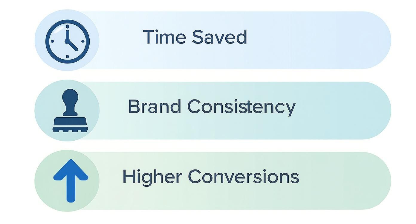
As you can see, the advantages stack up to make your marketing process way more efficient and effective, ultimately leading to higher conversions.
The Irresistible Headline
Let's be real: your headline is the first—and sometimes only—thing a visitor reads. You’ve got about three seconds to stop their scroll and convince them to stick around. A powerful headline doesn’t just describe your offer; it shouts a clear benefit and sparks immediate curiosity.
It needs to speak directly to your audience's pain point or biggest desire. For instance, "Our New CRM Software" is flat. But "Stop Juggling Tabs and Close More Deals"? Now that promises a solution, making it infinitely more compelling.
The Persuasive Value Proposition and Copy
Once the headline hooks them, the body copy reels them in. This is where you make your case with a crystal-clear value proposition. Your copy must answer the visitor’s biggest unspoken question: "What's in it for me?"
Ditch the technical jargon and focus on benefits, not just features. A feature is what your product does; a benefit is how it makes the customer's life better. Good copy guides the reader on a journey, building trust and desire with every sentence.
A high-converting landing page makes the decision to act feel like the most natural and obvious choice. It achieves this by aligning every word, image, and element with a single, compelling purpose.
If you want to go deeper on how individual pieces fit into the puzzle, you can learn more about the different types of landing page sections and the specific roles they play in getting people to act.
The Compelling Visuals
We’re visual creatures. A strong hero image or video can communicate value much faster than text ever could. A great visual doesn't just decorate the page; it creates an instant emotional connection and helps the visitor imagine themselves benefiting from your offer.
The best landing page visuals are:
- Relevant: They have to directly relate to what you're offering.
- High-Quality: Grainy, unprofessional images will kill trust in a heartbeat.
- Emotionally Resonant: They should stir the feeling you want your brand to be associated with, whether that’s relief, excitement, or security.
The Trust-Building Social Proof
People are far more likely to do something if they see that others have already done it and had a good experience. Social proof is the element that dissolves doubt and builds credibility. Think of it as the digital version of a trusted friend’s recommendation.
This can show up in a bunch of different ways:
- Testimonials: Direct quotes from happy, real customers.
- Case Studies: In-depth stories of customer success.
- Logos: Showing off logos of well-known companies you've worked with.
- Reviews and Ratings: Star ratings from third-party sites.
By showing off real-world validation, you lower the perceived risk for new visitors and make them feel much more confident in their decision to convert. This is an absolutely critical component that the best landing page design templates always make room for.
How to Choose the Right Landing Page Template
Staring at thousands of landing page design templates can feel like trying to find a needle in a haystack. It’s overwhelming. But picking the right one doesn’t have to be a guessing game. A little strategy goes a long way, ensuring you choose a template that doesn’t just look sharp, but is actually built to deliver results.
Think of it like choosing the right tool for a job. You wouldn't use a hammer to tighten a screw, right? The same logic applies here. A template designed for e-commerce won’t be the best fit for getting webinar sign-ups. The absolute first step is matching the template’s core purpose with your specific campaign goal.
This single decision influences the entire structure of the page. A lead generation page needs a big, obvious form. A sales page needs plenty of room for product shots and glowing reviews. An event sign-up page has to put the date, time, and speakers front and center. If you start with a goal-aligned template, you won’t have to fight a design that’s working against you.
Define Your Campaign Goal
Before you even glance at a single template, get laser-focused on what you want to achieve. What is the one action you need a visitor to take? This clarity is your north star.
Your primary goal will likely fall into one of these buckets:
- Lead Generation: Your main aim is to capture contact info, like names and emails. You’re usually offering something valuable in return, like an ebook or a newsletter subscription.
- Direct Sales: You’re guiding visitors straight to a purchase. This requires space for features, pricing tables, and social proof to seal the deal.
- Webinar or Event Registration: The goal is getting sign-ups. The design needs to build excitement by highlighting the event’s value, the speakers, and what attendees will learn.
- Appointment Booking: You’re trying to get people on your calendar for a demo, consultation, or service. The flow should be seamless and direct.
Once you know your goal, you can instantly filter out all the noise and focus only on templates built for that exact purpose.
Prioritize Critical Technical Features
A gorgeous design is completely worthless if the page doesn't work. A few technical features are non-negotiable in today's world, forming the bedrock of a good user experience and directly impacting whether people convert or bounce.
The sheer volume of templates is staggering—a major marketplace like Envato lists over 3,200 landing page templates alone. But here's the good news: creators are getting the message about modern standards. An incredible 94.22% of these templates are fully responsive, meaning they look great on any screen. This reflects the reality that most of your traffic is probably coming from a phone. You can dig into more of this data on current website template statistics if you're curious.
Your template’s technical performance is just as important as its visual appeal. A slow, clunky, or broken experience will send potential customers running, no matter how great your offer is.
When you’re vetting templates, keep an eye out for these three technical must-haves:
- Mobile Responsiveness: The page has to look and function perfectly on smartphones, tablets, and desktops. No exceptions.
- Fast Load Speed: Slow pages kill conversions. Look for templates advertised as lightweight or optimized for speed.
- Customization Potential: A good template is a starting point, not a straitjacket. It should be easy to change colors, fonts, and layouts to match your brand without having to wrestle with the code.
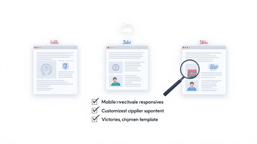
Use a Checklist for Objective Evaluation
To avoid getting swayed by flashy designs that don't actually serve your goals, it helps to use a simple checklist. This pulls you out of the subjective "I like how this looks" mindset and forces you to evaluate each option against a consistent, strategic set of criteria.
This quick sanity check ensures you're picking a template that is not only visually appealing but also strategically sound.
Template Selection Checklist
| Evaluation Criteria | Why It's Critical | What to Look For |
|---|---|---|
| Goal Alignment | Ensures the page structure supports your specific conversion action. | Does it have a layout built for lead gen, sales, or event sign-ups? |
| Visual Hierarchy | Guides the user's eye naturally toward the call-to-action. | Clear headlines, subheadings, and a CTA button that stands out. |
| Brand Fit | The design's aesthetic should feel like a natural extension of your brand. | Check if the typography, color scheme, and overall vibe match your style. |
| Social Proof Sections | Builds trust and credibility, which is essential for conversions. | Are there pre-designed sections for testimonials, logos, or case studies? |
Using this framework, you can move past the initial paralysis of too many choices and confidently select a template that’s engineered to help you win.
Customizing Your Template for Maximum Impact
Picking the right landing page design template is a huge head start, but the real magic happens when you start customizing. This is where you take a solid, proven blueprint and shape it into a unique conversion machine—one that speaks directly to your audience and feels like your brand. It’s less about reinventing the wheel and more about adding your own signature style.
Think of it like this: the template is a beautifully designed, functional house. Customization is you painting the walls in your brand colors, hanging your art, and arranging the furniture to create a welcoming experience that feels unmistakably yours. It’s the essential step to turn a generic layout into a high-impact experience that actually drives people to act.
This screenshot of the Magic UI homepage, for example, shows a clean, modern design that perfectly balances beautiful aesthetics with clear information. It's a great look at how customized components can come together.
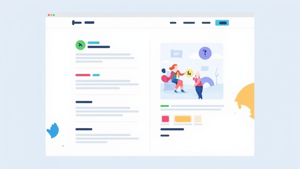
The smart use of whitespace, consistent typography, and subtle animations all work together to create a professional and engaging user experience. That’s the end goal of any good customization effort.
Aligning Visuals with Your Brand Identity
Your first and most important job is to make sure the template perfectly matches your brand's visual identity. This is about so much more than just slapping your logo at the top of the page. You’re aiming to create a cohesive and instantly recognizable experience for every visitor.
Start with the core pieces from your brand’s style guide:
- Color Palette: Swap the template’s default colors for your primary and secondary brand colors. Use your main color on key elements like headlines and call-to-action buttons to grab attention.
- Typography: Change the fonts to match your brand's typography. Consistent fonts build brand identity and make your content easier to read.
- Imagery: Get rid of all placeholder images. Replace them with high-quality photos, videos, or graphics that are actually relevant to your offer and connect with your target audience.
These changes make sure that when someone clicks over from an ad or a social media post, the visual experience feels seamless. That consistency builds trust from the very first second.
Implementing Your Changes with Code
For developers working in modern frameworks, tools like Magic UI make this whole process incredibly simple. You can easily tweak components using props and Tailwind CSS classes.
Let's say you want to customize a call-to-action button. Instead of fighting with complex CSS files, you can just make the changes directly in your React component. Here’s a quick React MDX snippet showing how you might change a button's color and add a hover effect.
import React from "react"
import { Button } from "@/components/ui/button" // Assuming a Magic UI button component
const CustomCTAButton = () => {
return (
<Button
className="bg-blue-600 text-white hover:bg-blue-700"
style={{ padding: "1rem 2rem", fontSize: "1.1rem" }}
>
Sign Up Now
</Button>
)
}
export default CustomCTAButtonThis snippet creates a branded button with a specific background color (bg-blue-600), white text, and a slightly darker shade when you hover over it. This level of fine-tuned control lets developers quickly turn a brand's style guide into functional, beautiful components.
Elevating Engagement with Advanced Components
Once your core branding is dialed in, you can take your page to the next level by weaving in advanced components and subtle animations. These aren't just for show; they can seriously boost user engagement and guide visitors toward your conversion goal.
Thoughtful customization isn't about adding flashy distractions. It’s about enhancing the user experience and reinforcing your core message to make taking action feel effortless and intuitive.
Modern UI libraries are packed with components designed to capture and hold attention. You might want to add things like:
- Animated Text: Use subtle animations to reveal your headline or key value props, drawing the user's eye exactly where you want it.
- Interactive Features: Bring in elements like sliders or interactive testimonials that encourage people to actually engage with the page.
- Micro-interactions: Add small animations to buttons or form fields. This provides visual feedback when a user interacts with them, making the whole experience feel more responsive and polished.
Of course, the most important part of your page is the words. Strong visuals and slick components fall flat without compelling copy to back them up. To make sure your message is just as powerful as your design, check out our in-depth guide to mastering landing page copywriting.
Ultimately, customizing your landing page design template is a balancing act. You want to keep the proven, conversion-focused structure of the template while breathing your own unique brand personality and message into it. By thoughtfully tweaking colors, typography, and imagery—and by strategically adding advanced components—you create a powerful and persuasive experience that doesn't just look great, but also gets incredible results.
Optimizing Your Landing Page for Peak Performance
Getting your landing page live is a huge milestone, but it's just the starting line. The real work—and the real results—come from what you do next. Think of your new page like a race car fresh off the assembly line. It looks great, but you won't know how fast it can really go until you get it on the test track and start fine-tuning the engine.
Peak performance isn't about guesswork; it’s about listening to your audience through their actions. You need a system to test, measure, and tweak every crucial element to find out what truly gets visitors to click that button. This is how you turn a static page into a dynamic conversion machine that gets better over time.
Unlocking Insights with A/B Testing
Your most powerful tool for this is A/B testing, also known as split testing. The idea is wonderfully simple: you create two versions of your page (an 'A' and a 'B'), change just one thing between them, and show each version to different groups of visitors. Then you see which one gets better results.
This approach takes all the assumptions out of the equation and lets actual user behavior be your guide. You'd be amazed at how tiny changes can lead to massive wins.
Here are the essential elements you should start testing right away:
- Headlines: Try a benefit-focused headline against one that piques curiosity. Does "Save 50% on Your First Order" outperform "The Secret to Effortless Mornings"? Only one way to find out.
- Hero Images: Test a clean product shot against a lifestyle photo of someone enjoying your product. Visuals trigger immediate emotional responses, making them a goldmine for testing.
- Call-to-Action (CTA) Button: Play around with the button's color, size, and especially the words on it. Swapping a generic "Submit" for an action-oriented "Get Your Free Guide" can boost clicks significantly.
- Form Length: How much is too much? Test a form that only asks for an email against another that also asks for a name. Often, the less friction you create, the higher your conversion rate.
The point of A/B testing isn't just about finding a one-time winner. It's about building a deep, continuous understanding of what makes your audience tick. Every test is a lesson.
Fine-Tuning Technical Performance
Beyond the pretty pictures and clever copy, the technical guts of your landing page are a huge deal. Nothing kills conversions faster than a slow, clunky page. In fact, just a one-second delay in page load time can slash conversions by up to 7%.
To keep things running smoothly, focus on these two technical pillars:
- Page Speed Optimization: Compress your images, minify your code (CSS, JavaScript), and use quality hosting. Even if your landing page template is built on lean code, the content you add can weigh it down if you're not careful.
- On-Page SEO: Many landing pages are tied to paid ads, but why not capture some free organic traffic too? Make sure your page has a clear title tag, a compelling meta description, and uses your main keyword naturally in the headline and body copy.
Nailing these technical details ensures your page is not only persuasive but also fast and easy for everyone to access.
Making Data-Driven Decisions
Optimization is a loop, not a one-and-done task. Get comfortable with your analytics tools and keep a close eye on key metrics like conversion rate, bounce rate, and time on page. This data tells the story of how people are actually using your page and points you directly to what needs fixing.
This constant feedback loop of testing, measuring, and refining is the secret to turning a good landing page into a truly great one. To build on these fundamentals, learning how to improve website conversion rates in a broader sense will give you a powerful framework for success.
If you want to dive deeper into specific tactics, check out our complete guide on how to improve website conversion rates for more actionable tips. By embracing this mindset of constant improvement, you'll ensure your landing page keeps working harder for you over the long haul.
Common Questions About Landing Page Templates
Even with a solid plan, jumping into the world of landing page design templates can kick up a few questions. It doesn't matter if you're a seasoned marketer or a developer who's new to the game; it’s totally normal to wonder about the finer details. This section is here to tackle the most common questions we get, with clear, direct answers to help you move forward with confidence.
Think of this as your quick-reference guide. It’s designed to clear up any lingering confusion and hammer home the core ideas that make templates such a powerful part of your marketing toolkit.
What Is the Difference Between a Landing Page Template and a Website Theme?
This is a classic point of confusion, but the difference is night and day. Imagine a website theme as the master blueprint for an entire house. It sets the style for every single room—the living room, kitchen, bedrooms—to make sure everything feels consistent and connected. It’s built for exploration, with navigation menus, footers, and sidebars.
A landing page template, on the other hand, is the blueprint for a single, high-stakes room, like a home theater built for one thing and one thing only: watching movies. It intentionally strips away all the usual distractions like site-wide navigation to laser-focus a visitor's attention on a single action. The whole design is engineered for one specific conversion goal, making it a specialized tool for focused campaigns.
Can I Use a Landing Page Template Without Knowing How to Code?
Absolutely, you can. The great news is the market is flooded with options for every skill level. Many templates are built specifically for no-code or low-code platforms like Webflow, Framer, or WordPress page builders. These tools give you a visual, drag-and-drop interface so you can build and tweak pages without ever looking at a line of code.
And for developers, templates built for frameworks like React—like the ones we offer at Magic UI—give you a solid, pre-built foundation. You get to skip all the boring setup and jump right into the fun part: customization and logic. The trick is just to pick a template that’s built for the platform or tech you’re most comfortable with.
The best template for you is one that lines up with both your campaign goal and your technical comfort level. The modern template ecosystem ensures there's a perfect fit for everyone, from visual builders to expert coders.
How Much Customization Does a Template Really Need?
The sweet spot is finding the right balance. You need to customize it just enough to make the page feel unmistakably yours, but not so much that you accidentally break the strategic layout that made the template effective in the first place.
Here’s a simple checklist to get the essentials right:
- Brand Identity: This is non-negotiable. Always swap in your logo, color palette, and fonts to match your brand guidelines. This creates a smooth, trustworthy experience for people coming from your ads or emails.
- Content and Imagery: Rip out all the placeholder text and stock photos. Replace them with your own compelling copy and visuals that speak directly to your audience and your offer.
- Call-to-Action: Double-check that the CTA button text is clear and the link goes exactly where it needs to.
Be careful about making huge structural changes, though. The core layout of a premium template—the visual hierarchy, the spacing, the section flow—is usually based on design principles proven to convert. Your job is to pour your brand into that proven container, not rebuild the container itself.
Should I Choose a Free or a Premium Template?
This decision really boils down to how high the stakes are for your campaign. Free templates are great for quick experiments, personal projects, or campaigns on a shoestring budget. They let you get something live fast to test an idea without spending a dime.
For most business-critical campaigns, however, a premium template is a smart investment. Here’s why:
- Higher Quality: Premium templates almost always have more polished design, cleaner code, and better attention to the little UX details that make a big difference.
- Better Support: They often come with dedicated customer support, which can be an absolute lifesaver when you hit a technical snag.
- Advanced Features: You’re far more likely to get advanced components, better documentation, and more robust customization options.
While it costs a little something upfront, the investment in a premium landing page design template usually pays for itself many times over through higher conversion rates, a more professional brand image, and hours of saved development time. It just sets a stronger foundation for success.
Ready to stop building from scratch and start launching beautiful, high-converting pages in minutes? With Magic UI, you get access to a massive library of over 50 professionally designed, fully customizable templates and components. Built with React, Typescript, and Tailwind CSS, our tools empower you to create stunning user interfaces that drive results.
Explore Magic UI Templates and Build Your Next Landing Page Today