
Here’s the simple truth about Shadcn UI: it is not a component library in the way you’re probably used to. Think of it less as a package you install and more as a collection of well-crafted, reusable components that you copy and paste directly into your project. This gives you complete ownership and control over every line of code.
What Is Shadcn UI and Why Does It Matter?
Imagine you’re given a professional chef's recipe book. It lays out the exact ingredients and steps for a perfect dish, but you have total freedom to adjust the seasoning, swap out an ingredient, or plate it however you like. That's the whole idea behind Shadcn UI. You get beautiful, accessible components that live right inside your own codebase.
Traditional UI libraries, on the other hand, are more like a pre-packaged meal. You install them via npm, import what you need, and then find yourself limited by the library's built-in styling and functionality. It’s convenient at first, but it often leads to fighting with CSS overrides and bloating your app with code you don't even use.
Shadcn UI completely sidesteps these problems with its unique 'copy-and-paste' philosophy.
The Power of Owning Your Code
This ownership model is the real game-changer and the core reason Shadcn UI is getting so much attention in modern web development. Because the components are just files in your own project, you can:
- Modify them freely: Need to change styles, add new features, or strip out something you don’t need? Go for it. No complex workarounds required.
- Avoid dependency headaches: There is no "shadcn-ui" package in your
package.json. That means no breaking changes from library updates wrecking your project overnight. - Ensure perfect consistency: The components become a true part of your internal design system, perfectly aligned with your project's architecture from day one.
This approach isn't just a niche idea; it's catching on fast. Recent developer surveys show its adoption is climbing, with one Stack Overflow report noting it's already used by nearly 8.7% of developers in its category. This reflects a bigger shift in the community toward tools that give developers more control and lead to better-performing applications. You can dig into the full survey details at Stack Overflow's 2025 Developer Survey.
Shadcn UI gives you the building blocks, not a finished building. You are the architect, with full control over the final design and structure of your user interface.
As you get familiar with Shadcn UI, you'll see how its modular design naturally supports key website design best practices for modern web development, making it easier to build high-quality, user-friendly interfaces. To get a better handle on this, it helps to understand what a component library is and how Shadcn UI is completely redefining the category.
To make this crystal clear, here’s a quick breakdown of its core principles.
Shadcn UI Core Principles at a Glance
This table sums up the fundamental ideas that make Shadcn UI so different from the libraries you might be used to.
| Principle | What It Means for Developers |
|---|---|
| Not a Library | You get source code, not a dependency. This means no versioning conflicts or unexpected updates breaking your build. |
| Code Ownership | You have 100% control to edit, restyle, and refactor components to fit your exact needs. |
| Composition | Components are built on unstyled, accessible primitives, giving you a solid, flexible foundation to build upon. |
| CLI-Driven | A simple command-line tool lets you add the components you need, one at a time, without any manual setup fuss. |
Ultimately, these principles put the power back in your hands, letting you build what you want, how you want.
To really get Shadcn UI, you have to look past the components themselves and understand the philosophy behind it all. It’s a deliberate break from how we’ve traditionally used UI libraries, and it’s all built around one powerful idea: you should own your code, not just rent it from a package. This principle of code ownership is the secret sauce to building more flexible, maintainable, and future-proof projects.
Most UI libraries get installed as a single, monolithic package from npm. When you do that, you're essentially plugging a black box into your application. Sure, you can use its components, but they aren't truly yours. This creates a dependency that can, and often does, cause major headaches down the road.
This is where the dreaded "dependency hell" rears its ugly head. We've all been there—wrestling with a library update that breaks everything, or hitting a wall because a component just doesn't quite match the design spec. The typical fix involves messy CSS overrides or convoluted workarounds that make your codebase brittle and a pain to manage.
From Consumer to Creator
Shadcn UI flips this entire model on its head. Instead of an install, you use a simple CLI command to copy a component's source code directly into your project's components folder. This simple act transforms you from a library consumer into a code owner. The components become a first-class part of your application, no different from any other file you’ve written yourself.
That might sound like a small change, but the ripple effects on your workflow are huge:
- No More Fighting Abstractions: You're not stuck working within the confines of a library's API or theming system. You have direct access to the component's JSX and Tailwind CSS classes, so you can make any change you need without fighting the framework.
- Zero External Dependencies: Because there’s no
shadcn-uipackage in yourpackage.json, your project is completely insulated from outside versioning conflicts. You decide when and if a component ever gets updated. - True Customization: The components are intentionally unopinionated. They give you a beautifully crafted and accessible starting point, but the final look, feel, and function are completely in your hands.
This philosophy gives you the power to build durable, adaptable user interfaces that are perfectly suited to your project. You’re not just borrowing components; you’re using high-quality blueprints to build your own design system.
The Power of Composition
The other pillar of Shadcn UI's philosophy is its focus on composition. Rather than giving you overly complex, feature-packed components, it provides simple, composable building blocks. This whole approach is built on top of Radix UI, an incredible library of unstyled, accessible primitives for things like dropdowns, dialogs, and tooltips.
Shadcn UI takes these rock-solid primitives and layers on a clean, thoughtful design using Tailwind CSS. It’s the best of both worlds: you get world-class accessibility and functionality from Radix, plus the full styling power of Tailwind right at your fingertips. You can easily combine and extend these simple pieces to create more complex UI without inheriting a mountain of code you don't need.
"The moment I switched to Shadcn UI, my entire mindset changed. I stopped thinking about how to 'work around' a library's limitations and started focusing on how to build the exact experience I wanted. It's liberating to know you have complete control over every pixel."
This shift from a rigid, top-down structure to a flexible, bottom-up approach is what makes Shadcn UI so powerful. It respects your expertise as a developer and gives you the tools to build with confidence, knowing your codebase will stay clean, scalable, and easy to manage for years. At the end of the day, it’s about making you the true owner of your front end.
Exploring Key Features and Technical Advantages
The real magic behind Shadcn UI isn't just one thing; it's the smart combination of three core technologies that fit together perfectly. This isn't your typical component library. It's a finely-tuned system built on a foundation of bulletproof accessibility, utility-first styling, and a clever command-line interface.
This trio is what lets developers build beautiful, functional, and easy-to-maintain UIs with incredible speed and complete control.
At its heart, Shadcn UI stands on the shoulders of giants. It uses Radix UI for its component primitives—the unstyled, accessible building blocks for things like dialogs, dropdowns, and accordions. This is a huge win. It means every component you grab is accessible right out of the box, handling all the tricky details like ARIA attributes, focus management, and keyboard navigation for you.
Layered on top of that solid foundation is Tailwind CSS. This is where the styling comes in. Since you literally own the component code, you change how it looks by editing Tailwind’s utility classes directly in your JSX. This approach cuts out the need for complicated CSS-in-JS solutions or wrestling with style overrides. Customization feels direct and natural.
Want a deeper dive on this approach? Check out our guide on creating a Tailwind CSS component library.
The Command-Line Interface Is Your Assistant
The last piece of the puzzle is the Shadcn UI CLI. It's a simple but powerful tool that orchestrates the whole process. Instead of installing and managing a package, you run a command like npx shadcn-ui@latest add button, and the actual source code for that component lands right in your project.
The CLI is smart. It handles dependencies, figures out your project paths, and drops the file exactly where it needs to go. Think of it as a personal assistant who takes care of all the tedious boilerplate, giving you a clean, ready-to-use component file every single time. It's an incredibly efficient workflow that lets you focus on building features, not on manual setup.
How It All Comes Together: A Practical Example
Let's see this in action. Say you need a dialog box for your app.
- Add the Component: You pop open your terminal and run a single command:
npx shadcn-ui@latest add dialog. - Import and Use: Just like that, the CLI adds a
dialog.tsxfile to yourcomponents/uifolder. Now you can import it and use it like any other React component.
The code you get is clean, readable, and built with familiar React patterns.
import {
Dialog,
DialogContent,
DialogDescription,
DialogHeader,
DialogTitle,
DialogTrigger,
} from "@/components/ui/dialog"
function MyComponent() {
return (
<Dialog>
<DialogTrigger>Open Dialog</DialogTrigger>
<DialogContent>
<DialogHeader>
<DialogTitle>Are you absolutely sure?</DialogTitle>
<DialogDescription>
This action cannot be undone. This will permanently delete your
account and remove your data from our servers.
</DialogDescription>
</DialogHeader>
</DialogContent>
</Dialog>
)
}Notice how composable it is? You get individual pieces like DialogTitle and DialogDescription that you can arrange however you need. Want to change the styling? Just open dialog.tsx and tweak the Tailwind CSS classes. There are no barriers between you and the code.
By giving you full source code access and using Tailwind CSS for styling, Shadcn UI gets rid of external package updates and drastically reduces migration risks—a common headache with traditional UI libraries.
This unique architecture has made Shadcn UI a go-to for projects where flexibility and performance are non-negotiable. It stands apart from libraries like Material-UI by giving developers the keys to the kingdom, freeing them from the shackles of external package updates.
The Technical Edge Summarized
The synergy between Radix, Tailwind, and the CLI offers some clear advantages over the old way of doing things.
- Maximum Control: With the source code living in your project, you have the final say over every pixel and every interaction.
- Minimal Bundle Size: You only add the components you actually need. This means no shipping unused code to the client, which leads to better tree-shaking and a leaner final bundle.
- Future-Proof Architecture: Your UI isn't tied to an external library's release schedule. This insulates your project from breaking changes and ensures things stay stable for the long haul.
Ultimately, these technical perks translate into a better developer experience and a faster end product. You get all the benefits of a well-designed component system without giving up the freedom to build things your way.
How Shadcn UI Stacks Up Against Traditional Libraries
Picking a UI toolkit is a pivotal moment for any web project. It’s a decision that echoes through your entire development process, influencing everything from workflow and developer happiness to the final performance of your app. While established libraries like Material UI (MUI) or Chakra UI offer a robust, all-in-one package, Shadcn UI comes at the problem from a completely different angle.
This isn't about crowning a "winner." It's about understanding two fundamentally different philosophies. Traditional libraries are like a high-end meal kit subscription. You get a box with perfectly portioned ingredients and a set of strict recipes. It's convenient, consistent, and fast, but you’re pretty much locked into what they sent you.
Shadcn UI, on the other hand, is like being handed the keys to a professional-grade kitchen. You get the best tools and top-shelf ingredients, but you have complete creative control over the final dish.
The Core Philosophical Divide
The biggest difference boils down to a single, powerful concept: ownership.
Traditional libraries are installed as third-party dependencies in your package.json. You import their components, tweak them through a specific API and theming system, and cross your fingers that the next version update doesn't blow up your app. This model is great for projects that need to get off the ground quickly and are happy to stick to a pre-defined design system.
Shadcn UI operates on the principle that you should own your code. When you add a component, its actual source code is copied directly into your project. It stops being an external dependency and becomes just another file in your codebase—one you can edit, refactor, or even delete at will. This rips away a layer of abstraction, giving you raw, direct control over the markup and styling.
This approach of having direct access to the code is a game-changer for theming and styling, massively simplifying the design process.
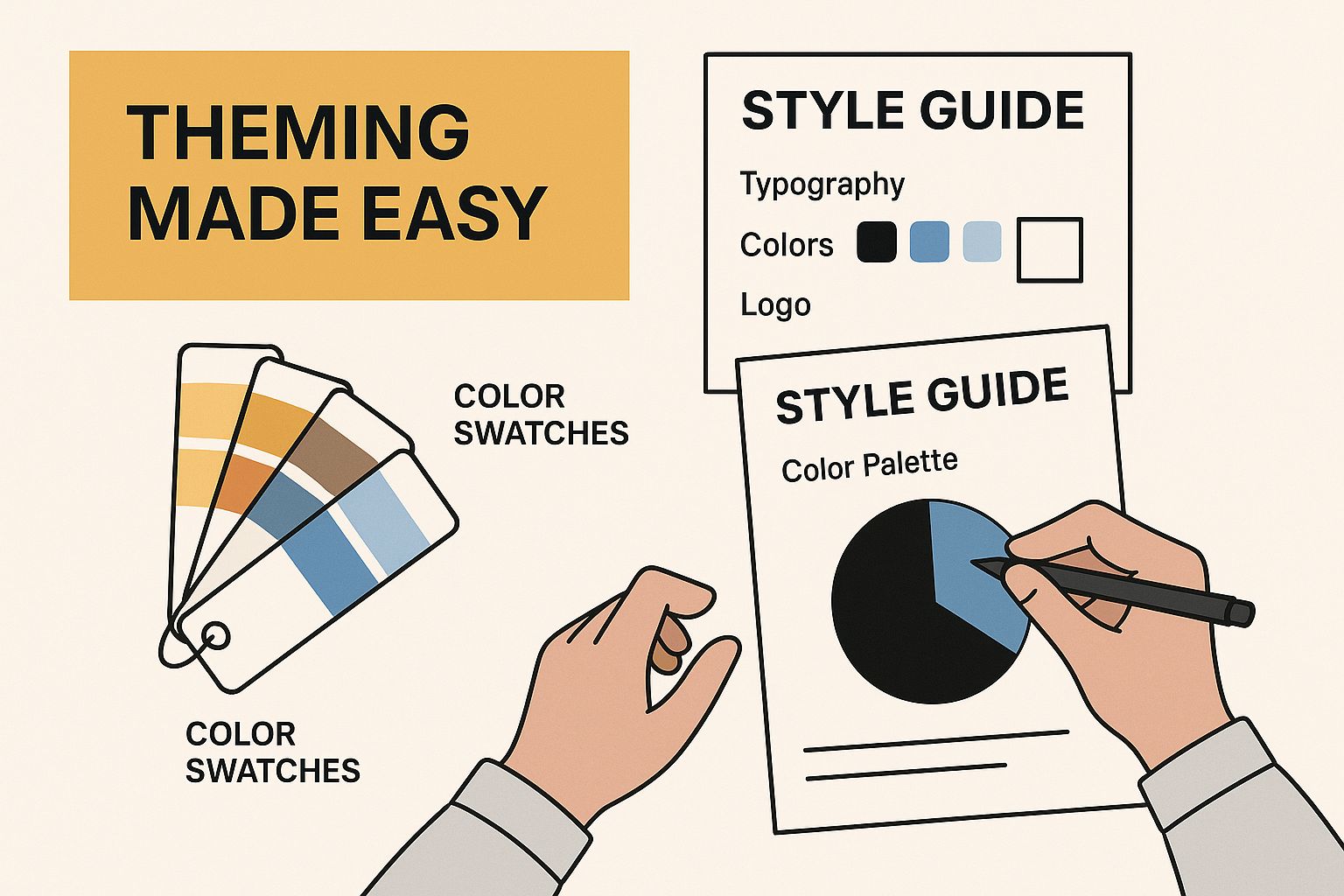
As the image shows, when developers can just open a file and directly change styling elements, they get unparalleled flexibility to perfectly match any design spec.
Customization and Flexibility
If you've ever used a library like MUI, you've probably done the customization dance with a theming provider and sx props. It's a powerful system, but sometimes it feels like you're wrestling with the library's built-in styles, writing complex overrides just to achieve a unique look.
With Shadcn UI, customization is as simple as editing a file. Because every component is styled with Tailwind CSS, you just change the utility classes right there in the JSX. For anyone comfortable with Tailwind, this direct approach is often way faster and more intuitive.
The decision between Shadcn UI and a traditional library is a strategic one. It's a trade-off between the out-of-the-box convenience of a managed system and the long-term control of an owned codebase.
A Head-to-Head Comparison
To really nail down the differences, let's look at the key criteria that development teams care about most. This table breaks down the practical implications of each library's architecture, helping you decide which tool fits your project best.
Shadcn UI vs Traditional UI Libraries
| Feature | Shadcn UI | Material UI / Chakra UI |
|---|---|---|
| Dependency Model | Code is copied into your project; no external dependency in package.json. | Installed as a versioned npm package, creating a direct dependency. |
| Customization | Direct manipulation of JSX and Tailwind CSS classes within the component file. | Primarily through a theme provider, component props, and style override APIs. |
| Bundle Size Impact | Minimal. You only add the components you use, leading to excellent tree-shaking. | Can be larger, as the entire library is a dependency, though tree-shaking helps. |
| Updating Components | Manual process. You use a CLI to diff changes and decide whether to apply them. | Managed via npm update. Can introduce breaking changes between major versions. |
| Developer Experience | High control and transparency. Feels like writing your own components from a template. | Structured and guided. Easier for teams who prefer a consistent, documented API. |
In the end, there's no single right answer. If your team needs to spin up a standard dashboard fast and values a huge, pre-styled set of components, a traditional library is probably a great fit. But for projects that demand a completely unique design system, maximum performance, and long-term maintainability, the ownership model of Shadcn UI offers a seriously compelling advantage.
Getting Started with Shadcn UI in Your Project
Jumping into a new tool can feel like a big commitment, but getting Shadcn UI into your project is surprisingly fast. It’s built to take you from a blank canvas to a fully working, styled component in just a couple of minutes. Let’s walk through the whole process, from the first setup command to adding and tweaking your very first component.
The whole thing kicks off with a single command in your terminal. This isn't your typical npm install—it doesn't add a bulky library to your node_modules. Instead, it runs a clever initialization script that wires up your project to work with Shadcn UI, creating a perfect home for all your future components.
Before you start, just make sure you have a React project ready to go. Whether you're using Next.js, Vite, or Remix, you're in good shape. Shadcn UI plays nicely with the entire modern React ecosystem.
Initializing Your Project
To get the ball rolling, pop open your terminal, navigate to your project's root folder, and run the initialization command. This is the one and only setup step you'll ever need to do.
Running this command starts a short, interactive Q&A session to get everything configured just right for your project. It’ll ask you about things like:
- Your language of choice: TypeScript or JavaScript.
- The visual style you're going for:
DefaultorNew York. - Your base color preference:
Slate,Gray,Zinc, you name it. - Where your
globals.cssfile lives, so it knows where to drop in the necessary Tailwind variables. - If you want to use CSS variables for theming.
- Path aliases for your components (it usually defaults to
@/components).
Once you’ve answered the prompts, the script does all the heavy lifting. It creates a components.json file to keep track of your setup, tweaks your tailwind.config.js, and adds the right styles to your global CSS file. This completely sidesteps all the tedious manual configuration. If you're new to this styling approach, our guide on how to install Tailwind CSS in a React project is a great place to get up to speed.
Adding Your First Component
With the setup out of the way, your project is primed and ready for components. This is where you really see the core idea of Shadcn UI in action. You don't import components from a package; you use the CLI to pull their actual source code right into your project.
Let's start with a classic UI element: a button.
Run that, and you'll see a new file, button.tsx (or .jsx), appear in your components/ui directory. That's it. The button component is now a first-class citizen in your codebase. You can open it up, see exactly how it's built with Tailwind CSS, and get ready to use it.
By adding components one by one, you keep your project incredibly lean. This approach completely avoids the bundle bloat that plagues traditional, all-in-one UI libraries. You only ship the code you're actually using.
Now, you can import and use this button just like any other component you'd write from scratch.
import { Button } from "@/components/ui/button"
function MyFirstComponent() {
return (
<div className="p-4">
<Button>Click me</Button>
</div>
)
}
export default MyFirstComponentThis simple workflow—initialize once, then add components as you need them—is the heart and soul of working with Shadcn UI.
Customizing the Component
The real magic happens the moment you need to change something. Since button.tsx is just another file in your project, customizing it is as direct as it gets.
- Open the file: Head over to
components/ui/button.tsx. - Read the code: You’ll find a clean React component defined with Tailwind CSS utility classes for styling.
- Make your changes: Want bigger buttons by default? Just adjust the padding classes. Need a new variant with a slick gradient background? You can add it directly to the component’s variants right there in the code.
There's no wrestling with complex theming APIs or fighting specificity with style overrides. You're just editing the source. This gives you 100% control over how every component looks and behaves. This transparent process lets you go from an idea to a fully functional, custom UI element in minutes, closing the gap between your design vision and the final product.
Why Shadcn UI Is a Game-Changer for Teams and Design Systems
When you're building software with a team, consistency isn't just a nice-to-have; it's everything. This is where Shadcn UI's unique approach really starts to pay off, especially in collaborative settings. It acts as the ultimate bridge between designers and developers by establishing a single source of truth.
How? By placing component source code directly inside your project repository. This simple idea completely gets rid of the guesswork that so often slows down team workflows. Every developer on the team pulls from the exact same set of component files, guaranteeing that UI elements look and behave the same across the entire application.
This direct ownership also makes version control a breeze. Forget about the headache of managing updates from an external UI library. With Shadcn UI, any change to a component is tracked through Git, just like the rest of your project's code. This creates a transparent history, making it dead simple to see who changed what and why.
That shared codebase quickly becomes the foundation of a living, breathing design system.
Building a Cohesive Design Language
A design system is so much more than a folder of components—it's the shared language your team uses to build products. Because your team owns the Shadcn UI components, you can adapt them perfectly to your evolving brand guidelines without battling the constraints of an external library.
Imagine this workflow: a designer requests a tweak to a button's hover state. A developer can jump right into that button's file, make the change, and the update is instantly available for everyone on the team. No silos, no friction.
This tight loop between design and development fosters incredible alignment. Designers and developers are no longer tossing ideas over a wall; they're both contributing to the same transparent codebase that defines the product's visual identity. Iteration becomes faster, and the endless back-and-forth that kills project momentum is drastically reduced. By making component development and reuse so straightforward, Shadcn UI directly supports various strategies to increase team productivity in a very tangible way.
The real power of Shadcn UI in a team setting is its ability to turn the codebase into the ultimate design documentation. The code itself becomes the single, undisputed source of truth for every UI element.
This direct-to-repository model isn't just about making developers' lives easier; it delivers real business benefits. It cuts down on maintenance overhead, speeds up the delivery of new features, and builds a more harmonious relationship between your design and engineering teams.
These aren't just abstract gains. A recent industry report found that companies with over 100 employees using design systems similar to what Shadcn UI enables saw a 46% reduction in design and development costs and a 22% faster time to market. You can dig into these findings on design system efficiency yourself. The numbers show how this modern approach to UI can supercharge product cycles and lock in consistency, even as you scale. The end result is a more agile team that can ship higher-quality products, faster.
Common Questions About Shadcn UI
As you start digging into Shadcn UI, you'll probably run into a few questions. Its whole philosophy is a bit different from what you might be used to, so let's clear up some of the common sticking points right now.
Is It Just Another Component Library?
Nope, and this is the most important thing to get your head around. Shadcn UI isn't a package you install from npm and import. It's not a dependency.
Instead, you use its CLI to literally copy the source code for beautifully designed, unstyled components right into your project. That means you own the code. You have 100% control over its logic, styling, and everything in between, without bloating your package.json.
How Do I Handle Component Updates?
Since the code is yours, you're in charge of updates. When the official components get a new feature or a bug fix, it won’t automatically break your app.
Shadcn UI gives you a handy diff command in its CLI. You can run it to see a side-by-side comparison of your local component file and the latest version. This shows you exactly what changed, so you can decide if—and how—you want to merge those updates yourself.
With Shadcn UI, you're never at the mercy of a library's release cycle. Updates are intentional and transparent, putting you in the driver's seat of your project's evolution.
Can I Use It with Vite or Remix?
Absolutely. While it's a massive hit in the Next.js community, Shadcn UI is totally framework-agnostic as long as you're in the React world.
When you run the init command, it will ask what you're building with. It has presets for Vite, Remix, Create React App, and others, and it sets up all the right paths for you automatically.
How Hard Is It to Customize Components?
This is where it truly shines. Customizing a component is as direct as it gets. Every component is styled with Tailwind CSS utility classes, so all you have to do is open the file and edit the JSX.
There are no complicated theming APIs, style overrides, or layers of abstraction to fight with. If you know Tailwind, you already know how to customize every single part of a shadcn ui component.
Ready to build beautiful, high-performance web interfaces in minutes? Magic UI offers a massive library of over 50+ customizable blocks, templates, and 150+ free animated components built with React, TypeScript, and Tailwind CSS. Check out our collection and start building your next stunning landing page at https://magicui.design.