
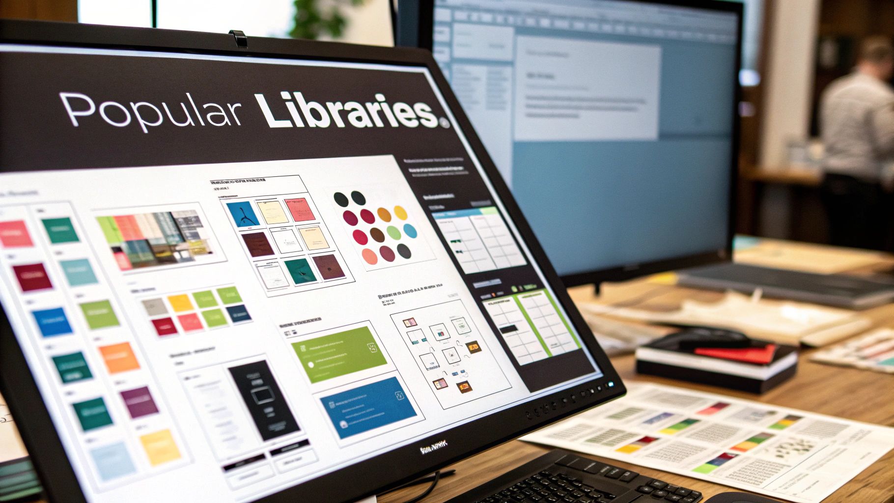
So, what exactly is a Tailwind CSS component library? At its core, it’s a ready-made collection of UI elements like buttons, cards, and navigation bars, all built with Tailwind's utility classes. This lets you build custom interfaces much faster by skipping the tedious process of coding common elements from scratch. You get the speed of pre-built components combined with the unmatched flexibility of a utility-first framework.
How Tailwind Component Libraries Put Your Development on the Fast Track
Every developer knows the feeling: you’re staring at a blank screen with a deadline breathing down your neck. While raw Tailwind CSS is incredibly powerful, it's like being handed a giant box of individual Lego bricks. You have the freedom to build absolutely anything, but you have to assemble every single piece from the ground up. It’s flexible, sure, but it can be a real time-sink, especially for standard UI patterns you've built a hundred times before.
This is where a Tailwind CSS component library completely changes the game. Think of it less like loose bricks and more like a collection of expertly designed, pre-assembled Lego kits. Instead of building a car one tiny piece at a time, you get a pre-built chassis, wheels, and a steering mechanism. You can snap them together instantly and then customize everything to your heart's content.
The Best of Both Worlds
These libraries give you fully-functional modules like navigation bars, forms, and modals that you can drop straight into your project. This alone saves countless hours. But here's the magic: unlike traditional UI kits that lock you into their specific design, every component is made from Tailwind's utility classes. That means you keep total creative control. You can tweak every color, adjust every pixel of spacing, and modify any detail right in your HTML.
A component library isn't a shortcut that sacrifices quality. It's a strategic accelerator that empowers you to build beautiful, consistent, and maintainable user interfaces way faster than you could on your own.
A Smarter Way to Build UIs
The utility-first approach has taken the web development world by storm, and for good reason. Tailwind CSS has seen massive growth, quickly establishing itself as a powerhouse alongside giants like Bootstrap. Its appeal is simple: incredible design flexibility and top-tier performance. It’s no surprise that major companies like Netflix and GitHub now use Tailwind, citing huge boosts in developer productivity and faster load times from smaller CSS files. You can learn more about Tailwind's growing influence on aynsoft.com.
When you use a tailwind css component library, you’re plugging into this efficiency multiplier. You aren't just building faster; you're building smarter. You're using a system that encourages consistency and scales effortlessly across your entire application. This frees you up to focus on what really matters: solving unique business problems and creating an amazing experience for your users.
Understanding What a Component Library Really Is

To really get why a Tailwind CSS component library is such a big deal, you have to understand how it breaks from the old way of doing things, like with traditional UI kits such as Bootstrap. In the past, grabbing a UI kit meant you were adopting its entire pre-styled world. You’d get a decent-looking button, sure, but it came with its own opinionated CSS file that you constantly had to fight just to make small changes.
A Tailwind component library throws that whole model out the window. Instead of shipping components with their own external stylesheets, it gives you building blocks made entirely with Tailwind's utility classes. Every button, modal, or card is just a self-contained chunk of HTML, styled directly with classes like bg-blue-500, p-4, and rounded-lg.
This small change has massive implications. Customization becomes completely native. You aren't wrestling with overrides in a separate CSS file; you're just changing the utility classes right in your HTML. Want a green button instead of a blue one? You just swap bg-blue-500 for bg-green-500. It’s a direct, intuitive workflow that puts you back in control.
Unstyled Components: The Secret Sauce
Many modern Tailwind libraries take this a step further with "headless" or "unstyled" components. The idea might sound a little strange at first—why would anyone want a component with no style? The magic lies in separating a component's behavior from its appearance.
Think about a dropdown menu. The logic behind it is pretty complex. It needs to:
- Manage its own open and close state.
- Handle keyboard navigation for accessibility.
- Close itself when you click somewhere else on the page.
An unstyled component handles all of that tricky logic for you but leaves the visual styling completely blank. It provides a functional skeleton, and you get to decide exactly how it looks using your own Tailwind classes.
This approach gives you the best of both worlds: you get the convenience of pre-built functionality and the complete design freedom that made you love Tailwind in the first place. It's a huge head start without ever forcing your project into a generic mold.
This separation is a game-changer for building truly unique interfaces. It saves you from reinventing the wheel for common UI patterns while making sure your final product looks nothing like a template. You can dive deeper by reading our detailed guide on what a component library is and how it fits into a modern developer's workflow.
The True Meaning of Customization
With traditional UI kits, "customization" often meant tweaking a handful of predefined variables. The core design language was already baked in. If you tried to stray too far, you risked breaking the whole system, which usually led to a frustrating game of CSS overrides and !important tags.
In the Tailwind ecosystem, every component is inherently yours to shape. The library gives you a well-structured starting point, but the final design is a direct result of the utility classes you choose to apply. This makes building a unique and consistent design system not just possible, but surprisingly straightforward. It empowers you to translate a designer’s vision into pixel-perfect reality without wrestling with someone else's CSS.
What Makes a Great Tailwind CSS Component Library?
Diving into the world of Tailwind CSS component libraries can feel like a lot. There are so many options out there, but they are definitely not all created equal. Picking the right one is a big deal—it affects your project's health and your sanity down the line.
Think of it like choosing a set of high-quality power tools versus a cheap, generic toolkit. One set is built to last, with every tool feeling right in your hand and doing its job perfectly. The other might look the part, but you'll spend more time fighting with it than building with it.
To make the right call, we need to look past the flashy demos. We’ll break down the three pillars that separate an average tailwind css component library from a truly exceptional one: rock-solid accessibility, deep customizability, and documentation that actually helps. This is your checklist for finding a library that's powerful, easy to maintain, and a genuine joy to use.
When you're shopping around, it's easy to get lost in the details. This quick-reference table breaks down the non-negotiable features every top-tier library should have, why they're so important, and what you should be looking for.
Essential Features of Top-Tier Tailwind Component Libraries
| Feature | Why It Matters | What to Look For |
|---|---|---|
| Built-in Accessibility | It's not just a feature; it's a requirement for modern web development. It expands your user base and ensures legal compliance. | Explicit mention of WAI-ARIA standards, full keyboard navigation support, semantic HTML, and logical focus management. |
| Deep Customization | The whole point of Tailwind is control. Your library should enhance this, not restrict it. It prevents "fighting the framework." | Components that are styled with utility classes, not complex custom CSS. Easy theming via tailwind.config.js. |
| Clear Documentation | A library is useless if you can't figure out how to use it. Good docs save you time, frustration, and headaches. | Live interactive previews, copy-paste code snippets for different component states, and a complete API reference for all props. |
Ultimately, a library built on these principles isn't just a collection of UI elements; it's a solid foundation for your entire project, setting you up for success from day one.
Built-In Accessibility Compliance
Let's get one thing straight: accessibility isn't a "nice-to-have." It’s a core requirement for building professional websites. A high-quality library has accessibility baked in from the very beginning, not sprinkled on top as an afterthought. This means every component is built to be used by everyone, including people who rely on screen readers or other assistive tech.
Look for libraries that make a point of mentioning their compliance with WAI-ARIA standards. This is a clear signal that complex components like modals, dropdowns, and tabs are built correctly with the right roles and properties, so they actually work for all users.
A library with strong accessibility doesn't just help you meet legal requirements; it directly expands your potential user base. An accessible product is an inclusive product, and that's good for both people and business.
At a minimum, this includes:
- Keyboard Navigation: Can you tab through and interact with every single button, link, and form field without touching a mouse? You should be able to.
- Semantic HTML: Using the right tags for the job (
<button>,<nav>,<main>) gives your site structure and meaning that assistive tech can understand. - Proper Focus Management: When a modal pops up, the keyboard focus should move into it—and return to where it was when the modal closes. This is a small detail that makes a huge difference.
Effortless Customization and Theming
The biggest reason developers flock to Tailwind CSS is for its incredible control over styling. A good component library gets this. It should never box you into a rigid design system you can't escape. It's supposed to be a starting point, not a creative straitjacket.
The best libraries make customization feel completely natural within the Tailwind ecosystem. You shouldn't have to write messy CSS overrides or fight with opinionated styles. Changing a button's color or a card's padding should be as simple as swapping a few utility classes in your markup.
This level of control has become the standard for professional development. By 2025, Tailwind CSS has become a top choice for huge projects at companies like Shopify, GitHub Next, NASA, and Loom. They use its utility-first approach to build custom, high-performance UIs that scale, often relying on libraries that give them total styling freedom. You can dive deeper into some top UI library picks for modern frameworks on varbintech.com.
Comprehensive and Clear Documentation
Finally, a component library is only as good as its documentation. A powerful tool is worthless if the instructions are confusing or incomplete. Top-tier docs are your trusted guide, making the development process smooth instead of a struggle.
Good documentation goes way beyond just listing components. For every single element, you should be able to find:
- Live Previews: Interactive examples that let you play with the component and see how it behaves.
- Code Snippets: Clean, ready-to-go code for different variations and states that you can copy and paste right into your project.
- Props and API Reference: A detailed breakdown of every available option and property for customization.
- Best Practices: Helpful tips on how and when to use a component to create the best possible user experience.
Excellent documentation is a massive time-saver and a clear sign that the library's creators care about the developer experience. It’s what empowers you to build amazing things without pulling your hair out.
Picking the right Tailwind CSS component library is a huge decision. It basically sets the tone for your entire development workflow. This isn't about finding the one "best" library out there, but about finding the one that clicks with your project's specific goals, timeline, and even your team's vibe.
Nailing this choice upfront saves you from a world of headaches down the line. You're building a foundation, so you want to be sure it can support your vision, not hold it back.
The whole thing boils down to a few key questions. Are you throwing together a quick prototype where speed is everything? Or are you building a massive, enterprise-level app that needs to last for years? Even your team's comfort level with frameworks like React or Vue matters, since many libraries are built for specific ecosystems. A little honesty here goes a long way in pointing you to the right tool.
This decision tree gives you a simple mental model for how to approach this based on what you're building.
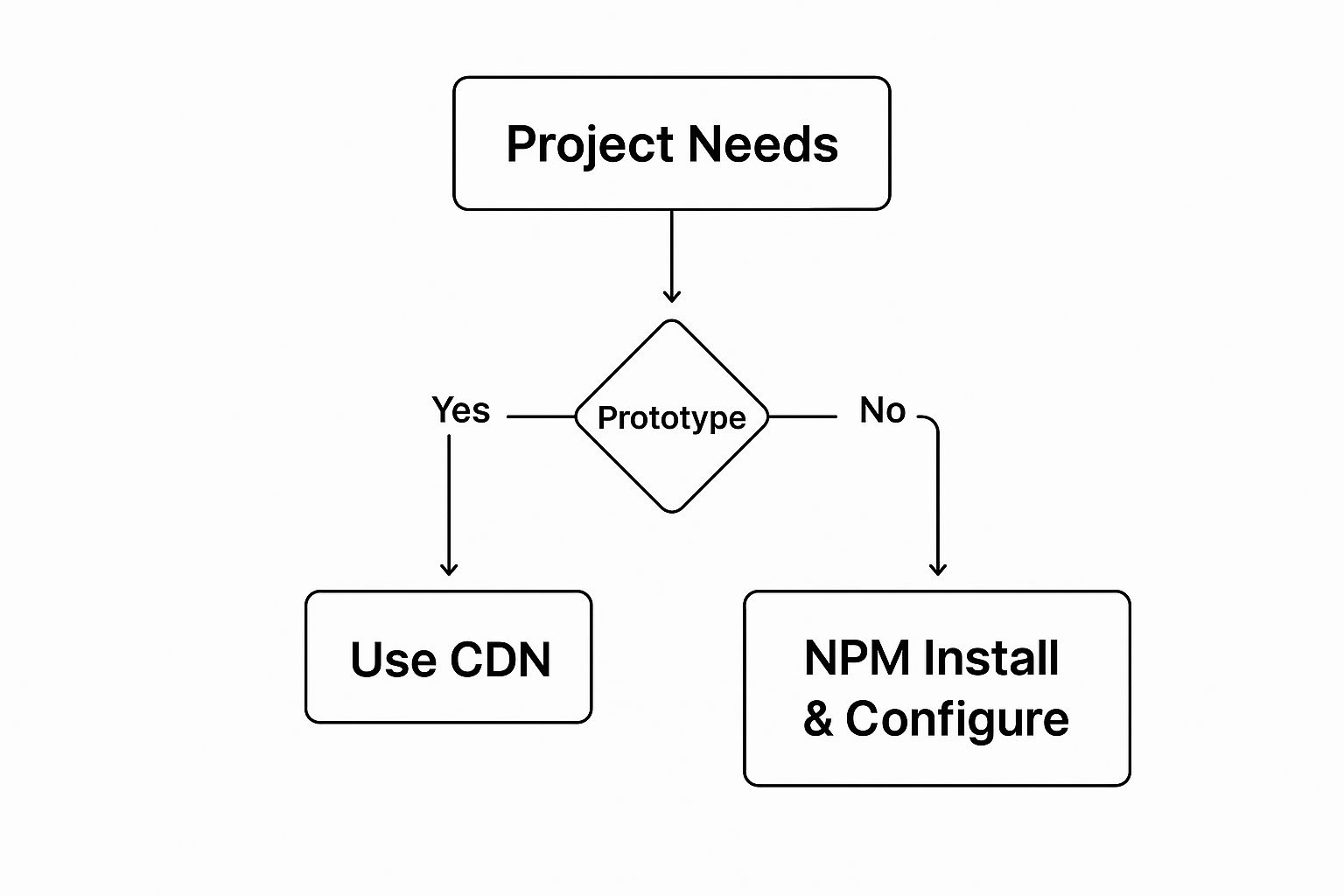
As you can see, quick-and-dirty prototypes can get away with a fast CDN setup. But for a real production app, you’ll want a proper NPM installation to fine-tune and optimize everything.
Styled vs. Headless Libraries
At the heart of this decision is a fundamental choice between two main philosophies: fully-styled libraries and headless (or unstyled) ones. Each has its own set of trade-offs, and your pick will massively shape how you build.
A fully-styled library, like DaisyUI, is like buying a professionally decorated model home. You get components that look great right out of the box. You can move in immediately. It’s perfect for projects where a totally unique design isn't the top priority and you just need to get moving. You can still tweak things with Tailwind utilities, but you're starting from a polished, opinionated base.
On the flip side, a headless library like Headless UI is more like getting the keys to a house with just the framework and wiring done. It handles all the tricky, behind-the-scenes functionality—accessibility, state management, keyboard navigation—but leaves every single design choice to you. This gives you total creative freedom to build something 100% unique. The catch? It takes more work upfront to style every little detail.
If you want to dig deeper into the pros and cons, our guide on choosing between different types of component libraries breaks it all down.
To help you visualize the differences, here's a quick comparison of the two main approaches.
Component Library Styles Head-to-Head Comparison
Choosing between styled and headless libraries is really about weighing speed against control. This table breaks down the key differences to help you figure out which style is the best fit for your next project.
| Feature | Styled Component Libraries (e.g., DaisyUI) | Headless/Unstyled Libraries (e.g., Headless UI) |
|---|---|---|
| Speed & Setup | Incredibly fast. Components are pre-designed, allowing for rapid prototyping. | Slower initial setup. Requires styling every component from scratch. |
| Design Freedom | Limited. You start with an opinionated design and customize from there. | Maximum freedom. Every visual aspect is controlled by you. |
| Learning Curve | Low. Easy to get started, as most design decisions are already made. | Steeper. Requires a solid understanding of both design and Tailwind CSS. |
| Brand Consistency | Easy to maintain consistency, but can look generic if not customized enough. | Perfect for implementing a unique, pixel-perfect design system. |
| Best For | Internal tools, admin panels, MVPs, and projects on a tight deadline. | Flagship products, bespoke marketing sites, and apps with a strong brand identity. |
Ultimately, styled libraries get you to a finished product faster, while headless libraries give you the raw materials to build something truly one-of-a-kind.
Making the Right Choice for Your Goals
Let your project's needs be your guide. Building a quick internal tool or a proof-of-concept? A styled library will get you across the finish line much faster. Building a flagship product with a very specific brand identity? A headless library will give you the creative control you need to nail that vision.
Here are the key things to weigh in your decision:
- Project Timeline: If you’re on a tight deadline, a styled library gives you a massive head start. No question about it.
- Design Specificity: For projects with a detailed, bespoke design system, a headless library is almost always the right call.
- Team Experience: If your team is newer to building design systems, a styled library can provide helpful guardrails and keep things consistent.
By thinking through these factors, you can pick a Tailwind CSS component library that not only speeds up your work but also truly aligns with your project’s long-term vision. It's the best way to avoid that painful moment when you realize you've built on the wrong foundation and need to refactor everything.
Spotlight on a Professional Component Solution
Let's move from theory to practice. To really get a feel for what a professional-grade Tailwind CSS component library can do, it helps to see one up close. We'll put Magic UI under the microscope.
Magic UI is built for developers and teams who don't want to choose between beautiful design, rock-solid performance, and an efficient workflow. It’s more than just a box of UI parts; it's a complete system designed for building slick, modern web applications.
The whole idea behind it is to give you production-ready components that look amazing right out of the box. They're not just static—they're meticulously animated and optimized for the modern web. This saves you from the tedious work of perfecting the tiny animations and micro-interactions that separate a "good enough" user experience from a truly great one.
Since it's built specifically for Next.js and React, it drops right into the stack that powers so many of today's best web apps.
Elevating Design with Animated Components
What really makes Magic UI stand out is its deep focus on motion design. Plenty of libraries give you static building blocks, but Magic UI comes packed with components that have polished, built-in animations. We’re talking about everything from subtle hover effects to complex, multi-stage animated grids and text reveals.
These animations aren't just for show. They're crafted using high-performance libraries like Framer Motion to ensure they run smoothly and never bog down the user experience. By including these right out of the gate, Magic UI lets you add a layer of professional polish to your projects with almost zero extra effort.
A great UI is more than just static elements on a page. It's about creating an engaging, responsive experience that guides the user. Thoughtful animation is a critical part of that, turning a functional interface into a memorable one.
Think about it. Coding something like an animated, shimmering button or a dynamic grid that reacts to the user's cursor could easily burn hours of your time. With a library like Magic UI, that complex feature becomes a simple copy-and-paste job. That frees you up to concentrate on the core logic that makes your app tick.
This shot of the Magic UI homepage gives you a taste of the visually rich, animated components you get.
You can immediately see the commitment to a modern aesthetic. It’s a clean design brought to life with dynamic elements that grab a user's attention.
Built for a Modern Development Workflow
Magic UI was clearly engineered to fit right into how developers work today. The components are fully typed with TypeScript and built with clean, readable code. That makes them a breeze to understand, customize, and extend when you need to.
This focus on developer experience is a huge deal, especially for business-critical applications where you can't afford messy code or a painful learning curve. With clear documentation and a dead-simple implementation process, teams can get moving fast, dramatically shortening their development timelines.
Ultimately, a professional Tailwind CSS component library like Magic UI is a powerful case study. It demonstrates how the right toolkit can do much more than just speed up your work. It elevates the final product, enforces design consistency, and delivers a superior user experience that makes an application stand out. For any project where quality and speed are non-negotiable, investing in a premium library is a clear strategic win.
Integrating and Customizing Your First Component

Theory is great, but the real magic happens when you get your hands dirty and drop a Tailwind CSS component library into a live project. This is that "aha!" moment where abstract ideas become a tangible, working part of your application. The good news? Most libraries are designed to get you from zero to a functioning component in just a few minutes.
Let's walk through the process with a classic example: the humble 'Button' component. It's a staple in every project, and the steps to get it working are pretty universal across any component library you pick up.
Initial Setup and Configuration
First, you'll pull the library into your project, usually with a quick npm or yarn command. The next—and most critical—step is tweaking your tailwind.config.js file. You'll almost always need to add the library's component paths to your content array.
Don't skip this part! This is how you tell Tailwind's Just-In-Time (JIT) compiler where to look for utility classes. If you forget, Tailwind won't "see" the classes inside the library's components, leaving you with plain, unstyled HTML. For a detailed guide on getting this right in a React project, check out our tutorial on how to install Tailwind with React.
Once that's configured, you just copy the code snippet for the button and paste it into your app. Instantly, you have a styled, functional button without writing a single line of your own CSS.
Customizing the Component
This is where the true power of a Tailwind CSS component library really shines. You’re never locked into the default look. Since every component is just a collection of utility classes, you can easily override or extend its styles directly in your markup.
For example, if the default button has a bg-blue-500 class, you can switch it to bg-emerald-600 or any other Tailwind color utility. It’s this direct, intuitive manipulation that makes the development workflow so incredibly fast.
Customization isn't about fighting the library's styles; it's about composing new ones. You use the library's structure as a foundation and apply your own utility classes to tailor the appearance to your exact needs.
This utility-first approach has exploded in popularity, and for good reason. Recent developer surveys show that frameworks like Tailwind CSS have seen a 30% jump in adoption. A big driver for this shift is performance; projects using Tailwind often see their CSS bundle sizes shrink by up to 50%, which means significantly faster load times for your users.
Creating Component Variants with Props
For more organized and reusable customizations, most modern libraries (especially for React or Vue) let you pass props to components to toggle between predefined styles. It's a much cleaner way to manage different button types without repeating yourself.
You might have a variant prop that accepts values like 'primary', 'secondary', or 'destructive'.
- Primary Variant: Could apply classes for your main brand color, like
bg-indigo-600 text-white. - Destructive Variant: Might use classes like
bg-red-500 text-whitefor delete actions.
By just changing a single word in your code (<Button variant="destructive">), you can completely change how the component looks and feels. This keeps your code tidy, your design system consistent, and gives you the freedom to adapt any component to fit your project’s unique identity.
Got Questions? Let's Get Them Answered
Diving into the world of component libraries can definitely bring up a few questions. That's perfectly normal. Getting those questions cleared up is the best way to move forward and pick the right tools for your project with total confidence.
Here are a few of the most common things developers ask when they start exploring Tailwind CSS component libraries.
Can I Mix and Match Library Components with My Own Custom Styles?
You bet. In fact, this is one of the biggest reasons to use a library built on Tailwind in the first place.
Because every component is just a smart combination of utility classes, you can easily tweak or completely override its appearance right in your HTML. Want to adjust a button's padding or change a card's shadow? Just add or modify the utility classes on the element itself. No more wrestling with external stylesheets to make simple changes.
Aren't Tailwind Component Libraries Bad for Performance?
It’s a common misconception, but the reality is the complete opposite—they're fantastic for performance.
Since everything is built with Tailwind utilities, your entire project benefits from the Just-In-Time (JIT) compiler. This thing is a game-changer. It scans all your files and surgically removes every single unused style from your final CSS file.
The result is a ridiculously small, highly optimized CSS bundle. It’s often much smaller than what you'd get from older frameworks like Bootstrap, which means faster load times and a much snappier experience for your users.
What's the Real Difference Between a UI Kit and a Headless Library?
This is a really important distinction to understand, as it will guide you to the right tool for the job.
-
A traditional UI kit (think of older versions of Bootstrap) is opinionated. It gives you components that are already styled and often come with their own JavaScript. This is great for whipping up a quick prototype, but it can be a real pain when you need to match a unique brand identity. You end up fighting the default styles more often than not.
-
A headless library, on the other hand, is all about function over form. It gives you the logic, state management, and accessibility features right out of the box but leaves the styling 100% up to you. You get the functional skeleton, and you get to dress it up with your own Tailwind classes. It’s the ultimate in design freedom.
Ready to build stunning, production-ready interfaces without losing weeks to custom styling? Check out the animated, fully customizable components over at Magic UI and see just how fast you can bring your ideas to life. https://magicui.design
Article created using Outrank