
In UI Frameworks, the concept of a component library can often be a lifesaver. Imagine having to create a user interface from scratch each time! Thankfully, component libraries exist to save you from this dreadful scenario. Today, we're diving into the world of component libraries to help you better understand them, know when and why to use them, and even discover some examples that might just end up being game-changers for your projects.
Magic UI's React component library is a fantastic resource we'll explore together. It's just the tool you need to understand component libraries, know when and why to use them, and discover a variety of examples that can help you on your way. Let's dive in and unlock the potential of component libraries together!
What Is A Component Library?

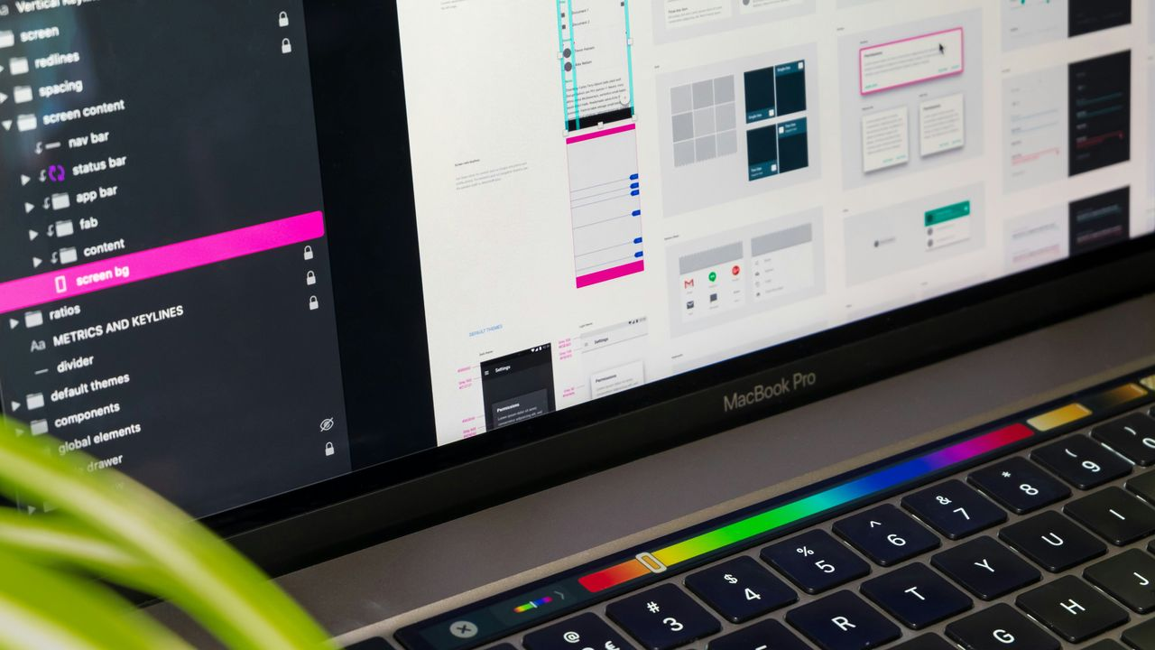
A UI component library is a collection of pre-designed and pre-built user interface elements used to create user interfaces for digital products, such as websites and applications with a unified look. These libraries include various pre-made UI elements, such as buttons, forms, navigation menus, icons, and more, each designed with a consistent look and feel. UI component libraries are particularly useful in collaborative design and development environments, as they help ensure that all team members are using the same source of truth and that the end product maintains a professional and polished appearance.
Component libraries can reduce the risk of product variations or different components in different places. They handle the source code for UI elements and usually leverage CSS and JavaScript. React is a prime example of a popular open-source framework. Facebook developed it as a component library, which has since grown into a large ecosystem for creating apps, static sites, and desktop applications.
Related Reading
- What Are UI Components
- What Are UI Components
- React Libraries
- React CSS Framework
- React Design Patterns
- Component Libraries
- React Best Practices
Why use A Component Library?
A component library is a toolbox filled with versatile library components for designers and developers. Like how a carpenter would reach into their toolbox for the right tool, digital product teams access design components for their projects. What are the advantages that come with utilizing a component library?
Time-saving
The first major benefit is time-saving. Atlassian’s design system, which includes an extensive component library, has been instrumental in helping their team build products faster by reusing code snippets rather than starting from scratch every time.
Consistency
But it’s not just about speed – consistency plays a huge role too. Using familiar elements across different projects ensures a consistent user experience. Imagine being able to familiarize your users as they navigate through various parts of your app or website because you’ve reused components – pretty neat, huh?
Team Collaboration
In addition to saving time and promoting consistency, component libraries can foster better team collaboration. Using the same building blocks (components) makes communication more effective and less prone to misunderstanding.
Scalability
With well-defined UI components, scaling up becomes much easier as new features can be built using existing elements without reinventing the wheel each time.
Creating Stunning User Interfaces with MagicUI
MagicUI is a free and open-source UI library that we designed specifically for design engineers. It offers a collection of over 20 animated components built with React, TypeScript, Tailwind CSS, and Framer Motion. We provide a range of visually appealing and interactive elements that can be easily integrated into web applications, allowing us to create stunning user interfaces with minimal effort. MagicUI components are highly customizable, enabling seamless adaptation to match our desired branding and design requirements.
With a focus on animation and a design-centric approach, MagicUI aims to bridge the gap between design and development, empowering us to craft captivating digital experiences. Along with our free component library, with MagicUI Pro, you can save thousands of hours and create a beautiful landing page, and convert your visitors into customers with our website templates.
Use our React component library for free today at https://magicui.design/docs.
Difference Between A Component Library And A Design System

Imagine you're working on designing an app. You have a lot of buttons, forms, icons, and other UI elements to put together. Here's where a component library and a design system come into play, and while they sound similar, they serve slightly different purposes.
Component Library
A component library is like a well-organized toolbox filled with pre-built, reusable pieces. Think of it as a collection of LEGO bricks, where each brick is a UI component like a button, a card, a modal, etc. These components are standardized, following the same design guidelines and codebase, ensuring consistency across your app. When you need a button, just grab one from the component library and drop it into your design. This saves you time because you don’t have to build these elements from scratch every time.
For example, let’s say you’re designing a login page. Instead of designing and coding each button and input field from scratch, you pull these components from the library, knowing they’ll look and behave consistently with the rest of your app.
Design System
On the other hand, a design system is more like the entire blueprint of your project, complete with guidelines, principles, and best practices. It includes a component library but goes way beyond that. It’s the comprehensive documentation of how every aspect of your product should look and feel. This provides color palettes, typography, spacing, iconography, and even how specific user interactions should behave.
The Design System: A Detailed Recipe Book for Consistency
The design system is like a detailed recipe book that gives you the ingredients (the components) and instructions on how to use them (the guidelines). It provides the reasoning behind design decisions, ensuring everyone on the team, from designers to developers, is on the same page. This ensures that your app has a cohesive look and feel, no matter how many people are working on it.
Ensuring Cohesive Look and Feel with Design Guidelines
For instance, if you’re designing a new feature, the design system will guide you on which colors to use, how much spacing to apply between elements and the overall user experience. It’s the overarching strategy that maintains the integrity of your brand and user experience.
Check out Audi's design system, which covers various use cases, from phones to smartwatches and car displays.
Component Library vs. Design System: Building Blocks and Vision
A component library is a collection of reusable UI elements. It’s super handy for quickly assembling interfaces with consistent, pre-built pieces. A design system is a comprehensive framework that includes the component library and also provides the guidelines, principles, and best practices to ensure a cohesive and consistent design across the entire product.
Both are crucial for efficient and consistent design work. Still, while the component library is more about the practical building blocks, the design system is about the overall vision and rules governing how those blocks should be used.
Related Reading
- Best React Native UI Library
- React Component Best Practices
- Tailwind Vs Bootstrap
- Material UI Alternatives
- Best React Component Library
- React Tips
- Create React Component Library
- Cool React Components
- Component Library Examples
- Bootstrap Vs React
- React Native Libraries
- Best React UI Framework
- NextJS
- Next.JS
- Next JS
- React Bootstrap
- MUI Table
- MUI Card
- MUI Box
- What Is NextJS
How Does Using A Component Library Improve The UX/UI Design Quality Assurance?

Component libraries can be used for visual QA by visual designers once functionality is in development and before it is deployed into the application. Component libraries also enable UX quality assurance on how components function; this workflow can be collaborative. Edge cases typically can arise once real data is used in an application environment; by using a component library, your team can catch more of those edge cases before they appear in your production application and more effectively address the UX required for modern stateful interfaces.
Documentation in Component Libraries
Component libraries typically include documentation that describes each component’s purpose, usage, and behavior. This helps developers and quality assurance teams better understand the expected behavior of the components, making it easier to spot and address issues.
Accessibility Testing with Component Libraries
Using a component library can also help when testing for accessibility. Many component libraries prioritize accessibility by providing pre-built components that follow best practices. This means the quality assurance team can be more confident in the application’s accessibility and spend less time testing these aspects.
How Atomic Design Fits With Component Libraries

In atomic design, design concepts comprise modular and reusable components created from individual atomic pieces.
Brad Frost describes atomic design:
Atomic design is a methodology composed of five distinct stages working together to create more deliberate and hierarchically interface design systems. The five stages of atomic design are:
- Atoms
- Molecules
- Organisms
- Templates
- Pages
Atomic design is not a linear process but rather a mental model that helps us think of our user interfaces as both a cohesive whole and a collection of parts. Each of the five stages plays a key role in the hierarchy of our interface design systems.
The Power of Atoms in Atomic Design
Atomic design helps design systems scale more effectively by breaking down the UI into small, reusable pieces. This approach allows us to build well-organized, modular systems that can be easily maintained and updated over time. Each component is built on top of the previous one, creating a well-thought-out system of components.
Combining Elements for Functionality
The Atoms stage is where the process starts, with the smallest and simplest elements of an interface. These elements are the building blocks of everything that comes next. They include things like labels, buttons, and input fields. The Molecules stage combines atoms into more complex organisms. Molecules include dropdowns, labels combined with input fields, and more complex interface elements.
The Cornerstones of User Interfaces
The Organisms stage combines molecules into complex structures. Organisms are the smallest standalone elements of an interface that can be used on our templates. In the Templates stage, we combine organisms to build layouts, wireframes, and mockups. The Pages stage is the final product, where templates are fully fleshed out and ready for implementation.
Bringing it All Together
In component libraries, these concepts are borrowed from atomic design and applied to a library of components. Component libraries are well-documented sets of reusable components that can be used to build products. They speed up the design and development process, making it easier for designers and developers to work together.
The Final Destination
Components are built from smaller, reusable pieces called atoms. These atoms can be combined into molecules, which can then be combined into organisms. Organisms are the smallest standalone elements of a user interface that can be used in templates.
How To Choose The Best UI Component Libraries

Community
A dynamic community suggests that the UI components library has a lot of support and will probably change along with the sector's trends. Search for libraries with a committed community that regularly releases updates, bug fixes, and feature additions.
Easy To Use
The initial setup procedure may differ, even though most libraries function similarly once installed. Look for libraries with easy-to-understand documentation, thorough examples, and a gradual learning curve.
Extensibility + Licensing
Extensibility enables the addition of new components to satisfy evolving requirements, allowing for future flexibility and growth. On the other hand, licensing is extremely important in ensuring that the selected library complies with the licensing specifications for your project and allows for the intended usage.
Popularity
You can get insights regarding the library's reputation, user adoption, and satisfaction by looking at the number of stars on GitHub, perusing live issue pages, and conducting web research. A well-liked library with a sizable user base and ongoing development suggests dependability, support from the community, and satisfying user experiences.
5 Examples Of UI Component Libraries
1. Magic UI
Magic UI is a free and open-source UI library designed specifically for design engineers. It offers a collection of over 20 animated components built with React, TypeScript, Tailwind CSS, and Framer Motion. MagicUI components are highly customizable, enabling seamless adaptation to match desired branding and design requirements. MagicUI aims to bridge the gap between design and development with a focus on animation and a design-centric approach. MagicUI Pro also offers website templates to help create beautiful landing pages.
Use our React component library for free today at MagicUI.
2. Material UI
Material UI is a React component library that implements Google's Material Design. It provides a comprehensive collection of pre-built components that are ready for use in production right out of the box.
3. Storybook
Storybook is an open-source tool for building UI components in isolation for React and other platforms. It enables developers to work on a single component simultaneously, making the development process faster.
4. React Bootstrap
React Bootstrap is one of the oldest React UI libraries, switching Bootstrap’s JavaScript with React. This change gives users more control over the function and form of every component, making every component accessible and important for building front-end frameworks.
5. Blueprint
Blueprint is a React-based UI toolkit focusing on simplicity, functionality, and a united design language. It includes meticulously designed components for building elegant and responsive web applications. Blueprint's components cover many UI elements, making it a valuable resource for developers aiming to create polished and professional web applications.
Check Out Our React Component Library for Design Engineers
MagicUI is a free and open-source UI library that we designed specifically for design engineers. It offers a collection of over 20 animated components built with React, TypeScript, Tailwind CSS, and Framer Motion. We provide a range of visually appealing and interactive elements that can be easily integrated into web applications, allowing us to create stunning user interfaces with minimal effort. MagicUI components are highly customizable, enabling seamless adaptation to match our desired branding and design requirements.
With a focus on animation and a design-centric approach, MagicUI aims to bridge the gap between design and development, empowering us to craft captivating digital experiences. Along with our free component library, with MagicUI Pro, you can save thousands of hours and create a beautiful landing page, and convert your visitors into customers with our website templates.
Use our React component library for free today at https://magicui.design/docs.