
Building a Tailwind CSS button is one of those "aha!" moments where the power of a utility-first workflow really clicks. Instead of jumping back and forth between your HTML and a separate CSS file, you're building, styling, and polishing elements right in your markup. This keeps everything in one place, making the whole process faster and way more intuitive.
Crafting Your First Tailwind CSS Button
The best way to get a feel for this is to just dive in and build one. We'll start with a completely naked <button> element and layer on Tailwind's utility classes one by one to see how it comes to life.
First things first, make sure your project is set up with Tailwind. If you're starting from scratch or just need a quick refresher, our guide on how to install Tailwind CSS will get you up and running in no time.
From Plain HTML to a Styled Button
Alright, let's say this is what you're starting with in your component. It works, but it's not exactly inspiring.
Our mission is to turn that into a professional-looking primary button. We'll do it by stringing together a few utility classes directly inside the <button> tag. Each class has a single, clear job.
Here’s a quick look at the core utilities that will get us started.
Core Utilities for Your First Button
This table breaks down the essential classes we'll be using to style our button from the ground up. Think of it as your cheat sheet for the basics.
| Utility Class | Purpose | Example Usage |
|---|---|---|
py-2 / px-4 | Sets vertical and horizontal padding, respectively | <button className="py-2 px-4">... |
bg-indigo-600 | Applies a specific background color from the palette | <button className="bg-indigo-600">... |
text-white | Sets the text color | <button className="text-white">... |
font-semibold | Increases the font weight for better emphasis | <button className="font-semibold">... |
rounded-lg | Adds rounded corners for a softer, modern look | <button className="rounded-lg">... |
shadow-md | Applies a medium box-shadow for a subtle lift | <button className="shadow-md">... |
By combining these simple, single-purpose classes, you can build complex styles without ever leaving your HTML file. That's the magic of the utility-first approach.
The Final Code in Action
Once we apply all those classes, our button's code will look like this. Yes, the className is longer, but it's also incredibly descriptive. Anyone—including your future self—can look at this markup and know exactly how the button is styled without needing to hunt down a separate stylesheet.
And just like that, you've created your first real Tailwind CSS button. This simple exercise covers the fundamental workflow and gives you a solid foundation for the fun stuff we'll get into next, like handling hover states and creating reusable button components.
Bringing Buttons to Life with States and Variants
A static button is a missed opportunity. It leaves users wondering, "Is this thing clickable?" To build an interface that feels responsive and alive, your buttons need to give immediate visual feedback. This is where Tailwind's state modifiers absolutely shine, letting you style interactions like hover, focus, and clicks right in your HTML.
These modifiers are just simple prefixes you add to any utility class. For instance, hover:bg-indigo-700 applies a darker background, but only when the user’s cursor hovers over the button. It's a tiny tweak, but it makes a world of difference in the user experience, signaling that the element is interactive and ready to go.
Styling Common Button States
Let's take the button we just built and give it some personality by styling the most common user interactions. The name of the game is clear, consistent feedback for every state.
- Hover State (
hover:): This is the one you'll see most often. A simple, effective approach is to slightly darken the background color, which acknowledges the user's intent to click. - Active State (
active:): This fires the moment the button is clicked. A subtle transform, like a one-pixel downward shift (active:translate-y-px), gives that satisfying "pressed" feeling and confirms the action. - Focus State (
focus:): Absolutely critical for accessibility. This state lets keyboard navigators know exactly which element is selected. We'll add a visible ring around the button to make it crystal clear. - Disabled State (
disabled:): When a button isn't usable, it should look the part. We can make it appear faded and, importantly, disable pointer events to stop any clicks.
Here’s an updated React MDX snippet that puts these modifiers into practice.
Pro Tip: Never, ever skip the
focusstate. It's not just a "nice-to-have" for accessibility; it's a fundamental part of building a keyboard-friendly website. Forgetting it can lock out a huge number of your users.
Creating Practical Button Variants
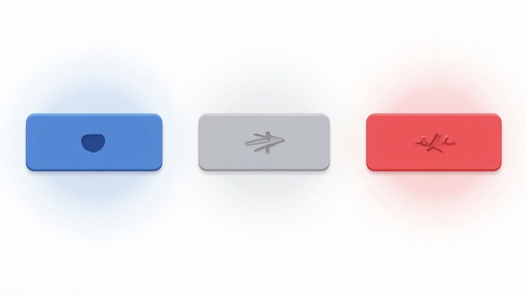
Most apps need more than one button style. You need a clear visual hierarchy to guide users toward the most important actions. This usually means creating a set of variants, like primary, secondary, and destructive buttons.
You can define these styles by simply mixing and matching Tailwind's utility classes.
- Primary Button: This is your main call-to-action. Think bold, high-contrast, and attention-grabbing.
- Secondary Button: For less critical actions. It's often styled with a lighter background or just an outline to take a backseat to the primary button.
- Destructive Button: Save this one for actions like "Delete" or "Cancel." A red color scheme is the universal signal for caution.
For example, a secondary button might use bg-gray-200 text-gray-800, while a destructive one could be bg-red-600 text-white. A great next step is to build out a complete set of interactive states for each variant. If you want to get really creative, you can find some great ideas for an interactive hover button.
By combining state modifiers with a thoughtful set of variants, your tailwind css button components become a powerful and intuitive part of your application's design system.
Building Advanced and Accessible Buttons

Once you’ve nailed the basics, you can start getting creative. Moving beyond standard colors and states opens up a world of possibilities for your Tailwind CSS buttons. Adding things like SVG icons or subtle gradients can really level up your design, making the UI feel more intuitive and look more polished.
These aren't just cosmetic tweaks, either. They serve a real purpose.
For instance, sticking a small "arrow right" icon inside a "Learn More" button clearly signals forward movement. A trash can icon on a delete button? It instantly reinforces the action. This pairing of text and imagery actually reduces cognitive load for your users, letting them process what to do next much faster.
Integrating SVG Icons
Icons are everywhere in modern UIs, and for good reason. Libraries like Heroicons make dropping them into your buttons dead simple. You just embed the SVG markup right inside your button element and use Tailwind's utilities to handle the size, color, and spacing.
Here’s what that looks like in practice—a simple "Submit" button with a leading icon:
The magic happens with inline-flex, items-center, and gap-2. These three classes perfectly align the icon with the text and add just the right amount of breathing room between them.
Prioritizing Accessibility for All Users
A beautiful button is only half the battle. If it’s not usable by everyone, including people who rely on assistive tech, it’s a failure. Accessibility isn’t a feature you tack on at the end; it’s a fundamental part of professional web development.
Making your web components accessible from the start saves significant time and effort down the line. It ensures your product serves the widest possible audience and complies with critical web standards.
Here are a few essential practices you should build into every single button you create with Tailwind:
- Use
focus-visible: The defaultfocus:outline is helpful for keyboard users but can be a visual distraction for mouse users. Thefocus-visible:variant is the perfect solution—it only applies focus styles during keyboard navigation, which creates a much cleaner experience for everyone. - Check Color Contrast: Your text has to be readable against its background. Aim for a contrast ratio of at least 4.5:1 for normal-sized text. Tools like the WebAIM Contrast Checker are great for quickly verifying your color palette.
- Add ARIA Attributes for Icon-Only Buttons: If a button has no text, a screen reader won't know what it’s for. Use the
aria-labelattribute to give it a descriptive name, like<button aria-label="Close">...</button>.
Thinking about the user experience doesn't stop with a single button, of course. It's always a good idea to explore broader user experience design best practices to see how these small interactions fit into the bigger picture of creating intuitive and inclusive products.
Getting Your Buttons to Perform at Their Peak
A visually stunning Tailwind CSS button is only half the battle. If you've been in web development for any length of time, you know that performance is a feature, not an afterthought. It directly impacts everything from user experience to conversion rates.
Slow-loading styles can cause frustrating layout shifts and make an otherwise great site feel sluggish. This is exactly where Tailwind’s performance-first approach really shines.
The secret sauce is its Just-In-Time (JIT) compiler. This engine is a game-changer. It scans your HTML, JavaScript components, and any other template files on the fly, looking for every single utility class you use. When it's time to build for production, it generates a CSS file with only the styles you actually need. No bloat.
Smart Configuration for Maximum Performance
To get the most out of the JIT engine, you have to point it in the right direction. This all happens in your tailwind.config.js file, specifically inside the content array.
By giving it precise paths to your template files, you make sure the compiler scans every class you've used without wasting time on directories it doesn't need to see.
A typical setup for a Next.js project, for example, might look like this:
/** @type {import('tailwindcss').Config} \*/
module.exports = {
content: [
"./src/pages/**/_.{js,ts,jsx,tsx,mdx}",
"./src/components/\*\*/_.{js,ts,jsx,tsx,mdx}",
"./src/app/\*_/_.{js,ts,jsx,tsx,mdx}",
],
theme: {
extend: {},
},
plugins: [],
}Keeping these paths clean and accurate is a simple but incredibly powerful way to guarantee a lean, optimized build every time.
The HTML vs. CSS Performance Question
I get this question a lot: don't all those utility classes in the HTML hurt performance? While it’s true that your HTML file size increases slightly, the tradeoff is a massive win for performance.
Because Tailwind purges every unused style, the final CSS file is tiny—often under 10 kB for most sites. That’s a huge reduction compared to traditional CSS frameworks. If you want to dive deeper, you can find a great in-depth performance analysis that breaks down how this approach leads to smaller CSS payloads.
In the world of modern web performance, a tiny, highly-cacheable CSS file is far more valuable than a slightly smaller HTML document. Faster CSS parsing means your page becomes interactive sooner, which is a metric that directly impacts user satisfaction.
At the end of the day, true performance is about more than just file size. It’s about how your design choices influence user behavior. To really get the most out of your buttons, you should combine Tailwind's technical efficiency with broader conversion rate optimization tips. That’s how you build buttons that aren’t just fast, but also incredibly effective.
Creating Reusable Button Components

If you find yourself manually copying and pasting long strings of utility classes for every button, it's time to rethink your strategy. That approach is a recipe for disaster—it’s tedious, prone to typos, and makes updating your site’s design an absolute nightmare.
The real power of Tailwind CSS isn't just in styling individual elements; it’s in abstracting those styles into reusable components. This is the leap from a hobby project to a professional, scalable application.
You see this component-first mindset everywhere. Big players like Netflix and GitHub use Tailwind's utilities to build and maintain their design systems. It's no surprise that community surveys show over 60% of new React projects now see Tailwind as a go-to styling solution, signaling a major industry shift toward component-driven architecture.
Building a Flexible Button Component
Let's walk through creating a foundational <Button> component using React and JSX. The goal is simple: build one component that can handle multiple styles and sizes through props, instead of hardcoding classes for every single variation. This is how you keep your code DRY (Don't Repeat Yourself) and your design consistent.
We'll set up our component to accept props for variant (like primary or secondary), size (sm, md, or lg), and pass along any other standard button attributes with the ...props spread operator. This structure gives us a component that is both powerful and incredibly easy to use.
Here’s the basic skeleton:
// A basic structure for a reusable Button component
function Button({ children, variant = 'primary', size = 'md', ...props }) {
// We'll add class logic here
const baseClasses = 'font-semibold rounded-lg shadow-md focus:outline-none focus:ring-2 focus:ring-offset-2';
// The final className will be built conditionally
return (
<button className={...} {...props}>
{children}
</button>
);
}This is our starting point. We've got a set of base styles that apply to every button. Now, we just need a clean way to manage the classes that change based on the variant and size props we pass in.
Managing Classes with clsx
Once you start dealing with conditional classes, string concatenation can get messy—fast. This is where a tiny utility library like clsx (or its cousin, classnames) becomes a lifesaver. It gives you a clean, declarative way to combine class names, especially when some of them are conditional.
Another fantastic tool to have in your arsenal is tailwind-merge. This utility intelligently merges your Tailwind classes, so you don't have to worry about style conflicts. For instance, it understands that you can't have both px-2 and px-4 active at the same time and will correctly apply the last one in the sequence. It's a small detail that prevents a lot of headaches.
Let’s bring these tools together to flesh out our component's logic.
By abstracting your styling logic into components, you create a "single source of truth." Need to change your primary button color? You only have to update it in one place, and that change will instantly ripple across your entire application.
Here’s the finished Button component, fully equipped to handle variants and sizes gracefully. If you're looking for more real-world examples, exploring a high-quality Tailwind CSS component library can show you just how powerful this pattern is.
import { clsx } from "clsx"
import { twMerge } from "tailwind-merge"
function Button({
children,
variant = "primary",
size = "md",
className,
...props
}) {
const baseClasses =
"font-semibold rounded-lg shadow-md focus:outline-none focus:ring-2 focus:ring-offset-2 transition-colors"
const variantClasses = {
primary:
"bg-indigo-600 text-white hover:bg-indigo-700 focus:ring-indigo-500",
secondary:
"bg-gray-200 text-gray-800 hover:bg-gray-300 focus:ring-gray-500",
}
const sizeClasses = {
sm: "py-1 px-3 text-sm",
md: "py-2 px-4 text-base",
lg: "py-3 px-6 text-lg",
}
const finalClasses = twMerge(
clsx(baseClasses, variantClasses[variant], sizeClasses[size], className)
)
return (
<button className={finalClasses} {...props}>
{children}
</button>
)
}And there you have it. This reusable Button component is now the foundation for a scalable, maintainable UI system. You can call it anywhere in your app, pass a few props, and get a perfectly styled, consistent button every time.
Common Questions About Tailwind Buttons
As you get your hands dirty with Tailwind, you'll inevitably run into a few common questions, especially when it comes to customization and performance. Nailing down the answers to these will really solidify your understanding and just make you a better, more efficient developer. Let's walk through some of the things people often ask when building a Tailwind CSS button.
Most of these questions circle around how to extend the framework, keep larger projects from becoming a mess, and what the real-world performance impact of the utility-first approach actually is.
How Do I Apply Custom Styles or Animations?
This is usually one of the first walls developers hit. What do you do when the default theme doesn't have that exact brand color or the specific animation you need for a button? Luckily, Tailwind gives you a few great ways to tackle this.
For a quick, one-off custom value, you can lean on arbitrary value syntax right in your HTML. This is perfect for a unique color that isn't a core part of your design system.
But for more systematic changes, like adding a new hover animation you'll use everywhere, the best practice is to extend your theme. You can define custom keyframes and animation utilities directly in your tailwind.config.js file. This is powerful because it makes your custom styles available as utility classes, just like any of Tailwind's built-in options.
The cleanest, most maintainable way to handle complex custom styles is by using the
@applydirective in your main CSS file. It lets you bundle a bunch of utilities under one custom class name, keeping your HTML tidy while still using Tailwind's design system.
What Is the Best Way to Manage Button Variants?
In any real project, you're going to need more than one button style. Think primary, secondary, destructive, and so on. Keeping these consistent is the secret to a professional-looking app.
The single best strategy here is to create a reusable button component.
- Centralize Your Logic: A single component becomes the "source of truth" for what a button looks and feels like.
- Use Props for Variants: You can pass props like
variant="primary"orsize="lg"to conditionally swap out the right classes. - Guarantee Consistency: Need to change the primary button color? You only have to edit one file, and that change ripples through your entire application instantly.
To take this a step further, I highly recommend using a couple of small utility libraries: clsx for conditionally applying classes and tailwind-merge to intelligently handle class conflicts. This combination is pretty much the industry standard for building robust, scalable component systems that don't break.
Does Using So Many Utility Classes Hurt Performance?
It’s a fair question. Seeing that long string of classes in your HTML can make you wonder if you're bloating the final file size. The reality, though, is that the performance impact is usually tiny—and in many cases, it's actually a net positive.
The magic here is Tailwind's JIT (Just-In-Time) compiler. It scans all your files—HTML, JS, JSX, you name it—and generates a CSS file containing only the classes you've actually used. This process results in a shockingly small production CSS file, which is a huge win for performance.
Browsers can parse and apply a tiny CSS file way faster, leading to a quicker first contentful paint. The slight increase in HTML size is a tiny trade-off for a site that renders significantly faster for the end user.
Ready to build stunning, high-performance UIs without the headache? Explore the component library at Magic UI and discover over 150 free and open-source animated components to bring your projects to life. Find your next component at https://magicui.design.