Have you ever spent hours figuring out how to use CSS Grid correctly? Me too. As a developer, I’ve been lost in documentation, experimenting with code, and still not getting the envisioned layout. It’s frustrating, isn't it?
Now that I've figured it out (reasonably well!) let me save you that time.
This blog post is your shortcut to mastering grid layouts in Tailwind CSS, specifically within a React project. No more endless searches. No more trial and error. Just straight answers.
We’ll dive into:
- The differences between CSS Grid and Flexbox
- Setting up Tailwind CSS in your React project
- Creating basic and advanced grid layouts
Let’s get started!
What is Grid vs. Flex in Tailwind CSS?
CSS Grid is useful when you create a 2-dimensional grid of elements - rows and columns. It allows you to create complex, responsive layouts with ease. Grid is particularly useful for creating page layouts where you need precise control over horizontal and vertical alignment.
Flexbox, on the other hand, is a one-dimensional layout system. It excels at aligning items along a single axis, either horizontally or vertically. Flexbox is ideal for distributing space within an item or aligning items in a container.
This makes Grid more suitable for complex layouts. You can use it to create entire page layouts or complex card designs.
Flexbox is better for simpler, linear arrangements, such as navigation bars, single rows of items, or aligning items within a container.
Tailwind Grid Syntax cheat sheet
You need to understand some basics to start with Tailwind CSS Grid in React and TypeScript. Here’s a simple cheat sheet to help you with the syntax:
Grid
grid: This class turns an element into a grid container. It has to always be present, along with the other properties mentioned below. This tells Tailwind to treat the children of this element like grid items.
To specify your layout, you can either specify the number of columns you want or the number of rows you want. You only need one or the other.
Columns
grid-cols-3: This class divides the grid into three equal columns. You can change the number to create more or fewer columns, likegrid-cols-2for two columns orgrid-cols-4for four columns. The elements are ordered horizontally. A column layout is best for a collection of cards or images.
Rows
grid-rows-3: This class sets the grid to have three equal rows. You can adjust the number for different row counts, such asgrid-rows-2for two rows orgrid-rows-4for four rows. The ordering of the elements is done vertically. A row layout is best for lists.- When you use the row layout, remember to set
grid-flow-colto make sure that the items are auto-placed correctly.
Gap
gap: You don't want all the items in the grid to be super close to each other. It just doesn't look good. THis is where you can use the `gap` class to set the spacing between items in the grid. You can specify different sizes, such asgap-1for a small gap,gap-4for a medium gap, orgap-8for a large gap.
Here's what a sample grid might look like:
<div>
<div className="grid grid-cols-3 gap-2"></div>
<div className="grid grid-rows-3 gap-2"></div>
</div>Combining these classes allows you to create flexible and responsive grid layouts in your React and TypeScript projects.
Setting Up Tailwind CSS in a React Project
First, make sure that your React project has Tailwind CSS properly configured. Need help? We've written a full step-by-step guide on how to install all the necessary packages for React here.
Creating a Basic Grid Layout in React with Tailwind CSS
Let's start by creating a simple Card component that we will use as the items in our grid.
Create a new file called src/components/Card.tsx :
import { FC } from "react"
const Card: FC<any> = () => {
return (
<div className="max-w-sm overflow-hidden rounded bg-white shadow-md">
<div className="px-6 py-4">
<div className="mb-2 text-xl font-bold">Mountain Sunset</div>
<p className="text-base text-gray-700">
Lorem ipsum dolor sit amet, consectetur adipisicing elit. Voluptatibus
quia, nulla! Maiores et perferendis eaque, exercitationem praesentium
nihil.
</p>
</div>
<div className="px-6 pt-4 pb-2">
<span className="mr-2 mb-2 inline-block rounded-full bg-gray-200 px-3 py-1 text-sm font-semibold text-gray-700">
#photography
</span>
<span className="mr-2 mb-2 inline-block rounded-full bg-gray-200 px-3 py-1 text-sm font-semibold text-gray-700">
#travel
</span>
<span className="mb-2 inline-block rounded-full bg-gray-200 px-3 py-1 text-sm font-semibold text-gray-700">
#winter
</span>
</div>
</div>
)
}
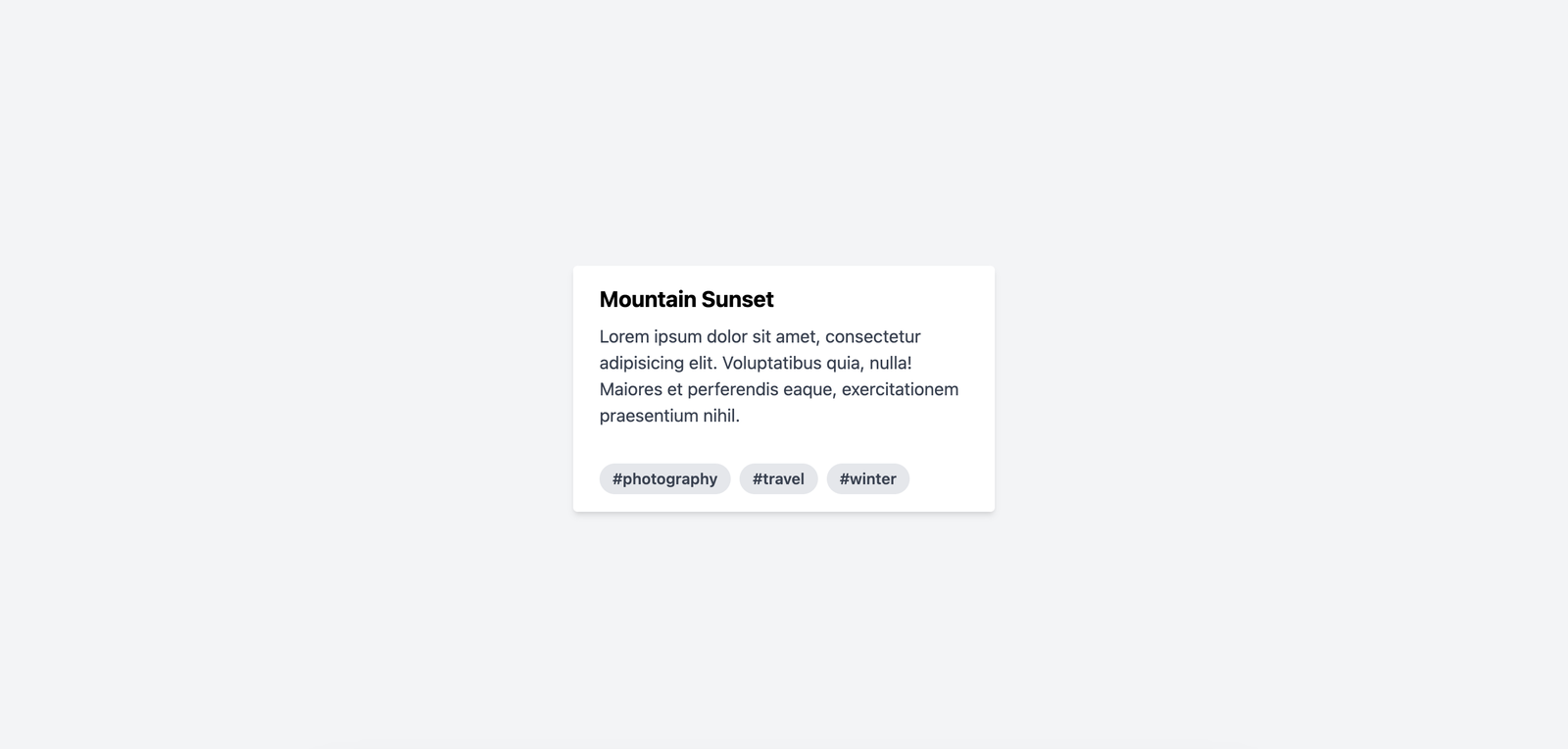
export default CardAdd it to your App.tsx to see what it looks like when it's rendered. It should be something like this.

Now is the fun part - setting up a grid component to hold all the cards.
Create a column-based grid
Create a new file called src/components/CardGallery.tsx
import { FC } from "react"
import Card from "./Card"
const CardGallery: FC<any> = () => {
return (
<div className="grid-col-3 grid">
<Card />
<Card />
<Card />
<Card />
</div>
)
}
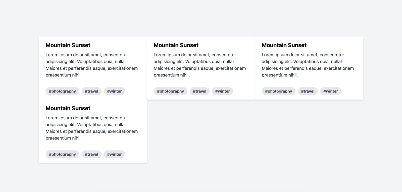
export default CardGalleryNotice how we added the grid class to the parent div; this tells Tailwind to treat the children as grid items. With grid-cols-3 , they get stacked horizontally one after another.
I added a 4th Card to show how they they are ordered.

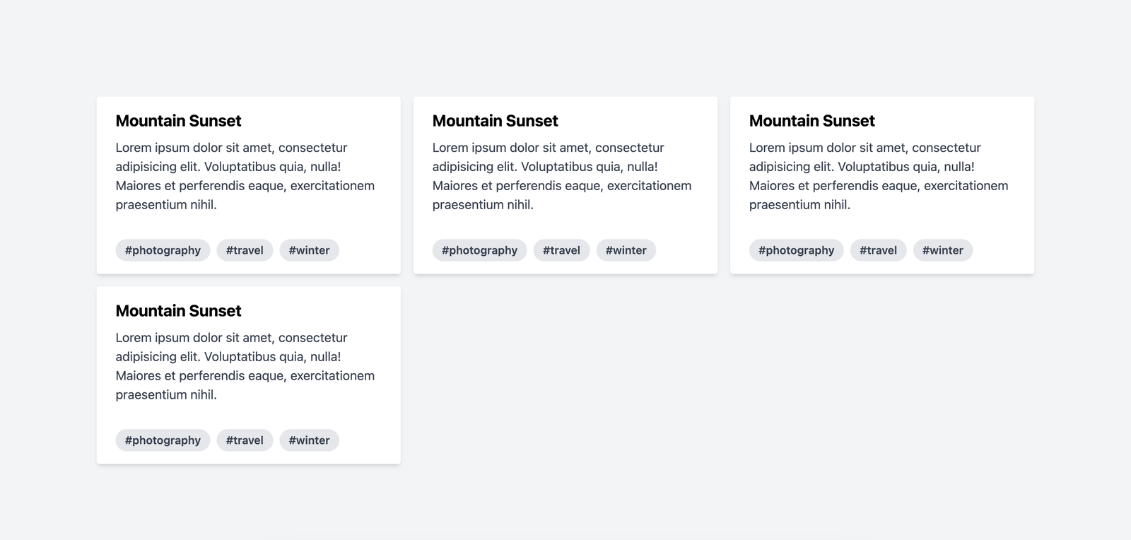
They are a little too close, right? Let's add a gap.
import { FC } from "react"
import Card from "./Card"
const CardGallery: FC<any> = () => {
return (
<div className="grid-col-3 grid gap-4">
<Card />
<Card />
<Card />
<Card />
</div>
)
}
export default CardGalleryMuch better, no?

Create a row-based grid
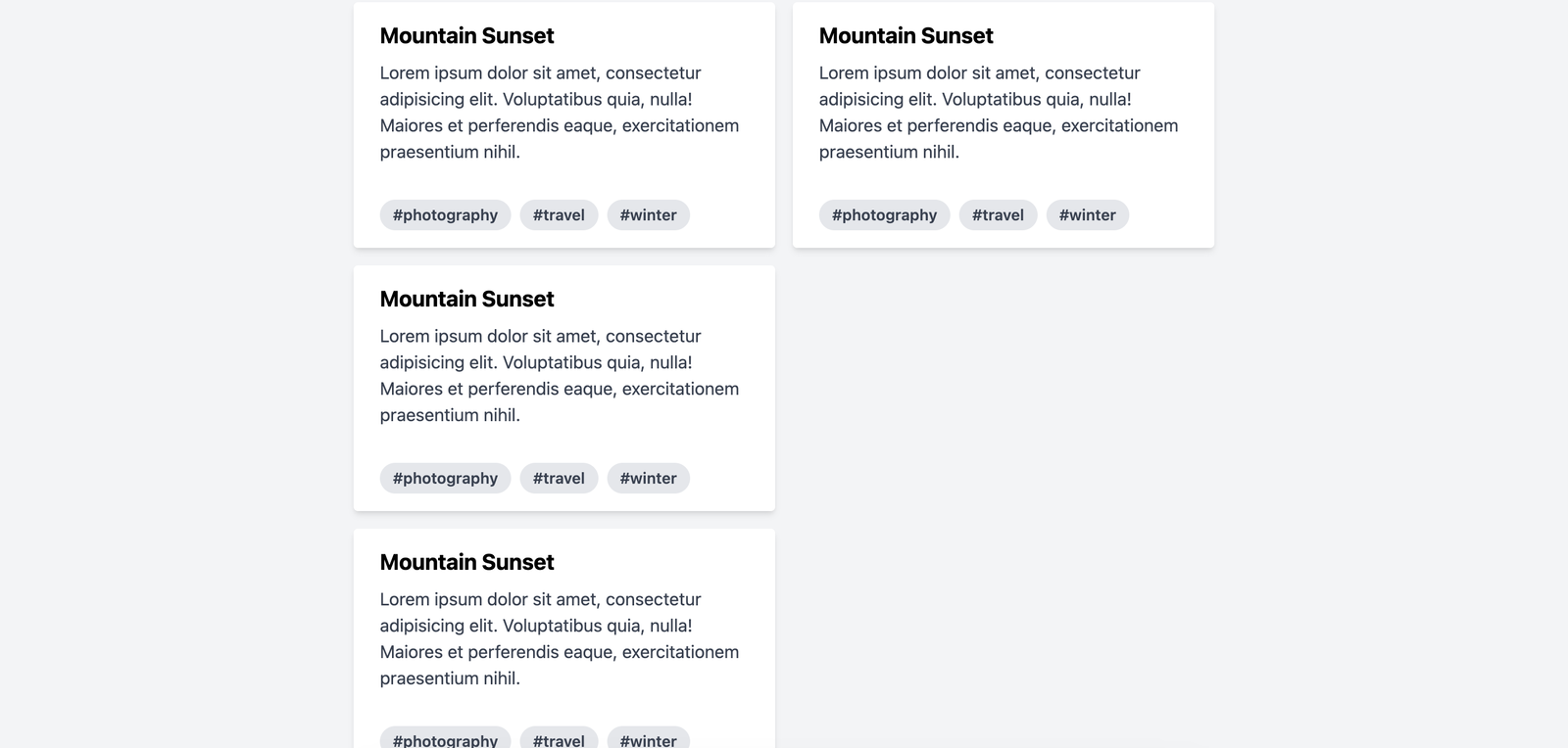
We can switch the layout to row-first like so. This will stack 3 cards vertically and then move to the next row.
import { FC } from "react"
import Card from "./Card"
const CardGallery: FC<any> = () => {
return (
<div className="grid grid-flow-col grid-rows-3 gap-4">
<Card />
<Card />
<Card />
<Card />
</div>
)
}
export default CardGalleryHere's what that looks like.

Next Steps
Now that you know how to create great looking grids, try creating an image gallery to test your skills. If you're feeling particularly fancy, see if you can recreate this Bento Grid using Tailwind.
