Do you want to avoid your landing pages falling flat and not converting as you hoped? Adding animation could be the secret sauce to revitalize user engagement and boost conversion rates. In this blog, you will learn how to create animated landing pages and their vital role in enhancing user experience, increasing conversions, and creating a lasting impression. This blog also highlights landing page examples to inspire your creative journey and offers insights to help you easily create animated landing pages.
Magic UI's solution, the startup landing page template, provides an excellent foundation to start your animated landing page creation journey. With this user-friendly tool, you can quickly learn about creating animated landing pages and find inspiration from many examples available.
What Is An Animated Landing Page
Landing page animations are dynamic elements integrated into a webpage to boost user engagement and enhance the overall experience.
Animation Effects
These animations can include effects such as:
- Sliding images
- Fading text
- Interactive buttons
Purpose of Animation
Their primary purpose is to highlight critical features, guide user behavior, and make the page visually appealing, which can ultimately drive higher conversion rates.
Storytelling with Animation
Beyond aesthetics, animations play a significant role in storytelling by smoothly directing visitors through the content.
They create a more immersive and engaging experience when used effectively, drawing attention to important information and calls to action.
Animation and Performance
Using animations judiciously to balance visual appeal and page performance is essential, ensuring the page remains functional and fast-loading.
Animation Benefits
Today, landing page animation is an excellent opportunity to stand out and a long-term investment in your brand. It can bring a truly memorable experience to your website visitors, who will become your customers.
How Does Animation Impact Your Landing Pages And UX
Animation can significantly impact landing pages and user experience (UX). Here’s how incorporating animation can enhance your landing page's effectiveness and improve user engagement:
Capturing Attention
Animation can draw users' attention to specific elements on your landing page, such as calls to action (CTAs) or key messages.
By using subtle animations, like a button that changes color or a text block that fades in, you can guide users to important information without overwhelming them. This helps keep visitors focused on what matters most, increasing the likelihood of conversions.
Enhancing User Engagement
Interactive animations can make your landing page more engaging. Animated infographics or interactive sliders can encourage users to explore content more thoroughly.
When users interact with animated elements, they are more likely to stay on the page longer, which can:
- Reduce bounce rates
- Improve overall engagement metrics
Improving Information Retention
Animations can aid storytelling and convey complex information more effectively. For instance, using animations to illustrate a process or demonstrate a product can help users understand the benefits of what you’re offering.
This can lead to:
- Better information retention
- Stronger connection with your brand
Creating a Professional Look
Well-executed animations can enhance the aesthetic appeal of your landing page, giving it a polished and professional look.
This can help build trust with your audience, as a visually appealing page is often associated with credibility and quality. Users are more likely to engage with a brand that presents itself well.
Encouraging Action
Animations can be used strategically to encourage users to take action. For example, a subtle bounce effect on a CTA button can create a sense of urgency, prompting users to click.
You can increase conversion rates by making your CTAs more visually appealing and dynamic.
Try MagicUI Now
MagicUI is a free and open-source UI library that we designed specifically for design engineers. It offers a collection of over 20 animated components built with:
- React
- TypeScript
- Tailwind CSS
- Motion
MagicUI Features
We provide a range of visually appealing and interactive elements that can be easily integrated into web applications, allowing us to create stunning user interfaces with minimal effort. MagicUI components are highly customizable, enabling seamless adaptation to match our desired branding and design requirements.
Design Meets Development
With our focus on animation and a design-centric approach, MagicUI aims to bridge the gap between design and development, empowering us to craft captivating digital experiences.
Along with our free component library, MagicUI Pro can:
- Save you thousands of hours
- Create a beautiful landing page
- Convert your visitors into customers with our website templates
Use our startup landing page template today.
Related Reading
- FAQ Template
- How To Create A Landing Page
- Website Footer
- Website Header Examples
- How To Design A Landing Page
- Creative Landing Page Design
- Pricing Page Examples
- Tailwind Landing Page
- Landing Page UI
- Landing Page Copywriting
- App Landing Page
9 Types Of Design Components Of Creating Animated Landing Pages
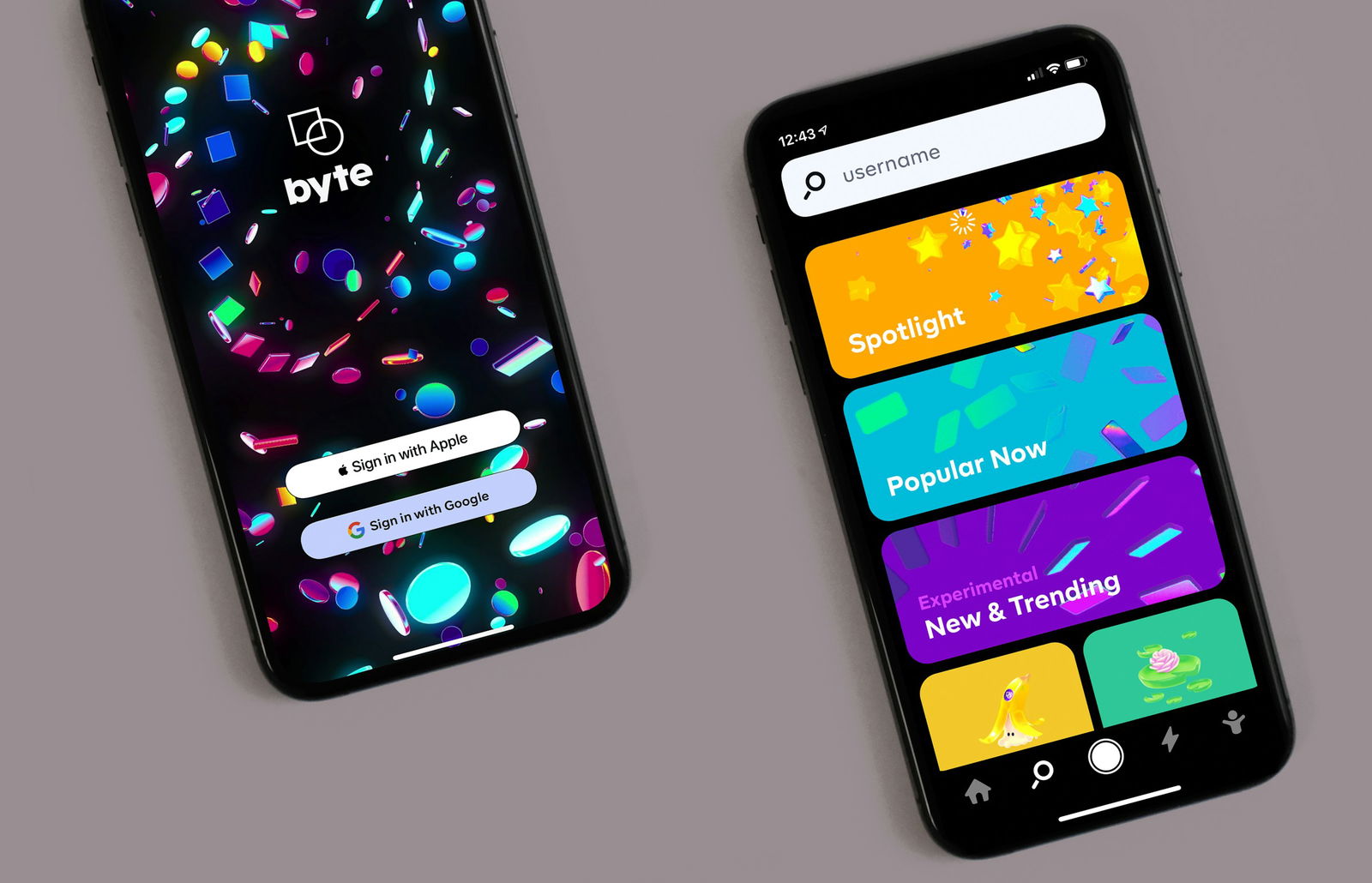
1. Animated text
Animated text allows you to apply motion effects to text elements on a landing page, such as:
- Fade-ins
- Slides
- Zooms
These animations draw attention to crucial messages, making them more noticeable and memorable. Using animated text, you’ll guide visitors' focus to essential areas of your page, including headlines or calls to action.
2. Button effects
Animated CTA buttons might shimmer, pulse, change color, or grow in size when hovered over, creating a visually appealing invitation for users to click.
Utilizing animated CTA buttons can enhance user engagement by making the desired action stand out, which increases the likelihood of conversions. Magic UI's shimmer button shimmers around the edges, drawing attention to your CTA.
3. Videos
Adding videos to landing pages, whether as embedded content or dynamic backgrounds, can significantly boost engagement.
Informative Video Embeds
Embedded videos allow you to share detailed information or showcase products, making complex ideas easy to understand.
Immersive Video Backgrounds
Using videos as backgrounds adds a visual element that captures attention and sets the mood, creating an immersive experience. Both methods can increase visitor interaction and drive conversions.
4. Parallax scroll effects
Parallax scrolling is a design technique where background elements move slower than foreground content as you scroll, creating a sense of depth and immersion.
Engaging Parallax Scrolling
Including parallax scrolling on your landing page enhances the user experience by making the page more engaging and visually appealing. This effect draws users in, encouraging them to explore your content more thoroughly.
5. Scrolling animation
Scrolling animations are another form of interactive landing page animation—and they’re one of the most commonly used.
User-Paced Scrolling
They are triggered when the user scrolls up or down, allowing the visitor to consume your content at their own pace.
Scroll Animation Types
Simple scrolling animations can take the form of animated text, but they can also bring motion to graphics or images. Other forms of scrolling animation include:
- Parallax scrolling
- Animated transitions
- Fade-ins and fade-outs
6. Animated graphics and illustrations
Animated graphics and illustrations are good ways to bring your landing page to life. These can range from subtle, user-triggered graphics to eye-catching animations encouraging visitors to explore your website.
Modern Animation Stars
While GIFs were once the most popular form of landing page animation, today, Lottie animations are more popular because they’re smaller, faster, and much higher quality. Animated charts are another popular animated landing page graphic.
7. Animated backgrounds
If you’re looking to create an impressive cinematic effect on your landing page, you may want to consider an animated background.
Immersive Background Layers
These place animated grids, videos, photos, or graphics behind the content in the foreground, creating a profoundly immersive experience that feels like you’re moving through a page rather than simply scrolling through it.
Storytelling with Animation
If your landing page focuses on a specific story, then this form of landing page animation, which pairs text with visual aids, can be very effective.
8. Carousels and slideshows
Most landing pages aren’t long, so it’s important to conserve screen space whenever possible. Slideshows, image galleries, and horizontal-scrolling sections are great ways to maximize screen space while still injecting movement and life into your landing page.
Bandwidth-Friendly Showcase
You can show readers more visual examples of your work without using precious bandwidth. Animated carousels like our Marquee component are a great way to show testimonials on your landing page without cluttering the page.
Creative Carousel Display
You can present it horizontally or vertically or use #D to add more dramatic effects to your page.
9. Hover animations
Hover animations are triggered in response to user interactions. They occur when visitors move their cursor over selected elements, causing them to move, change size or color, switch up the background images, and more.
Hover animations are one of the more subtle forms of animation and are often used to highlight specific text and visuals through micro-interactions.
3 Easy & Efficient Ways To Add Animation To Your Landing Page
1. MagicUI
MagicUI is a versatile UI library designed to simplify the integration of animations into landing pages. It offers over 20 pre-built animated components, such as interactive buttons and sliders, built with:
- React
- TypeScript
- Tailwind CSS
- Motion
Endless Customization
These highly customizable components allow seamless adaptation to your branding and design needs.
Design and Dev Harmony
By bridging the gap between design and development, MagicUI helps create captivating digital experiences with minimal effort. Its focus on design-centric animations and its efficiency in saving time makes it an invaluable tool for enhancing user engagement.
Pro-Level Power-up
MagicUI Pro provides advanced features and website templates to further streamline the creation of beautiful, high-converting landing pages.
2. CSS Animations
CSS animations are a powerful way to add movement and visual interest without relying on JavaScript.
CSS Animation Basics
Using CSS properties, you can create animations by defining keyframes and applying them to HTML elements. You can animate elements to fade, slide, or bounce as users interact with the page.
3. Webflow Interactions
If you're using Webflow, you can leverage its built-in interactions and animations feature. Webflow provides a visual interface to design animations and interactions without writing code.
Interactive Animation Triggers
You can create animations triggered by user actions, such as scrolling or clicking, and apply them to various elements on your landing page.
Examples Of Great Animated Landing Page
Langfuse
Langfuse is a tech startup designed to enhance observability for AI applications, particularly those using large language models (LLMs).
AI Performance Insights
It integrates seamlessly with existing AI models to provide detailed insights into their performance, helping developers understand and improve their AI systems.
AI Performance Insights
Langfuse uses Magic UI to build its landing page and components, such as an animated video to show its products and an animated beam to display how its products integrate with other tools. It also uses the shimmer button, which shines bright around the edges when hovered over.
Cognosys
Cognosys is a productivity tool that lets you do more in less time. Like Langfuse, It was built with Magic UI.
Gradual Content Reveal
They use scrolling animation effects, where the content gradually appears when the user scrolls down. Scroll animations are triggered when the user scrolls up or down, allowing the visitor to consume the content at their own pace.
Animated Explainer
They also use other components like the animated beam to explain better how their product works and integrates with others.
Road 13 Vineyards - The John Oliver Collection
Canadian wine company Road 13 Vineyards used Vev to create their animated landing page to promote their new range of products, The John Oliver Collection.
Animated Storytelling
The first element to note is animated text. As the reader scrolls, paragraphs slide horizontally across the screen, telling the story of John Oliver and why Road 13 has created a collection dedicated to him.
Dynamic Scroll Design
The flipping from vertical to horizontal scroll instantly engages the reader and shows them that this isn’t a standard e-commerce site but an engaging digital story.
Contra
Contra utilizes decorative rather than functional hover effects. Hovering over the floating images gently shifts them, which complements the airiness of this design.
Dissolution
Dissolution is a science fiction-inspired video game that uses three-dimensional background images of a spacecraft for a deeply immersive experience.
Scrolling down the page feels akin to moving through it, like being dropped straight into the video game.
DN - The Craftsmen
Dagens Næringsliv—or DN—is a Norwegian newspaper. Their Vev-created advertising feature for Lexus, The Craftsmen, contains some excellent examples of landing page animation.
Cinematic Welcome
Arriving on the page takes you to a sleek animated background, immediately creating a cinematic effect.
Immersive Vehicle Reveal
As you land on a futuristic photo of a Lexus vehicle, the camera slowly pans in, pulling you into the narrative.
Origami Metaphor
Scrolling down further takes you to an animated graphic of an origami bird being formed. Accompanied by the text ‘precision to the fingertips,’ the delicate and systematic construction of the origami bird conveys the care that went into creating the new Lexuses far better than a block of text could.
Related Reading
- Portfolio Landing Page
- React Portfolio Template
- NextJS Portfolio Template
- React Landing Page
- Startup Landing Page
- Tailwind Portfolio Template
- Best Saas Landing Pages
- React Header
- CTA Design
- App Landing Page
- Social Proof On Website
- Hero Section Design
- Waitlist Landing Page
- Best Web Developer Portfolios
- Nextjs Landing Page
Animated Landing Page Best Principles To Keep In Mind
When designing an animated landing page, it's crucial to follow certain principles to ensure the animations enhance user experience rather than detract from it. Here’s a breakdown of the fundamental tenets to keep in mind:
Make Objects Move Naturally
For animations to look convincing, they need to adhere to the rules of physics. This means avoiding linear movements that appear mechanical and artificial.
Natural Object Motion
Instead, use easing—where objects start slowly and speed up or start quickly and slow down—to create a more natural effect.
Realistic Movement Paths
Additionally, objects should follow arcs in their movement, mimicking real-world motion. Avoid making multiple elements move simultaneously to prevent cognitive overload.
Focused Animation Flow
Instead, animate elements one at a time to make the content more accessible to follow and understand.
Reveal Elements in the Right Order
The sequence of elements on the page should guide the user’s attention. For horizontally or vertically aligned elements, ensure they appear one by one at a consistent pace.
Diagonal Focus Flow
If dealing with a complex arrangement of objects, like a grid, animate them from the top left to the bottom right to direct the user’s focus diagonally.
Logical Animation Path
This method helps maintain a logical flow and ensures users can easily follow the narrative of the animation.
Timing is Everything
The duration of animations is critical. They should be long enough for users to notice but not so long that they become impatient.
Optimal Animation Speed
Research suggests that the optimal timing for animations is between 100 and 500 milliseconds. Animations for mobile devices with smaller screens can be quicker, while those for desktops can be slower.
Responsive Animation Timing
Adjust the timing based on the size of the object and the distance it travels to keep the experience engaging and appropriate for the device.
Animate With Style
Consistency in animation style is key to maintaining a cohesive brand identity. Avoid using a variety of animation effects across different pages, as this can create a disjointed user experience.
Consistent Brand Animation
Select an animation style that aligns with your brand and apply it uniformly across the website. While a bounce effect might work for a playful brand, it may not be suitable for a more serious brand like an insurance company.
Use Animation with Purpose
Too many animated effects can be overwhelming and make it hard for visitors to know what to pay attention to.
Related Reading
- Landing Page Sections
- Interactive Landing Page
- How To Display Testimonials On Website
- Saas Landing Page Best Practices
- How To Make An Animated Website
- Landing Page Call To Action
- Website Logo Examples
- How To Add Animation To Website
- React Hero Component
Check Out Our React Component Library for Design Engineers
MagicUI is a free and open-source UI library designed specifically for design engineers. This library provides over 20 animated components, allowing users to create visually appealing and interactive web applications effortlessly.
Design-Development Harmony
With a focus on animation and a design-centric approach, MagicUI bridges the gap between design and development, empowering users to craft captivating digital experiences. The highly customizable components seamlessly adapt to match desired branding and design requirements, making them ideal for creating stunning user interfaces with minimal effort.
Saving Time and Creating Beautiful Landing Pages with MagicUI Pro
In addition to the free component library, MagicUI Pro offers a valuable resource for users looking to save time and create beautiful landing pages.
Conversion Optimization
With MagicUI Pro, users can effectively leverage website templates to convert visitors into customers. By incorporating MagicUI Pro into their projects, design engineers can enhance the user experience and increase engagement with animated landing pages that stand out from the competition.
Start Your Journey
Ready to get started? Use the startup landing page template today and discover the power of MagicUI Pro for yourself.
