
Implementing dark mode in Tailwind boils down to two clear paths: the automatic media route that follows the user’s system setting, or the manual class route that hands control over to your UI. Picking the right one here shapes everything that follows in your theme setup.
Choosing Your Tailwind Dark Mode Strategy
Dark mode isn’t a fringe add-on anymore—it’s become essential for readability, eye comfort, and even battery savings on OLED screens. Tailwind CSS cuts right to the chase by offering two built-in strategies that cover both ends of the control spectrum.
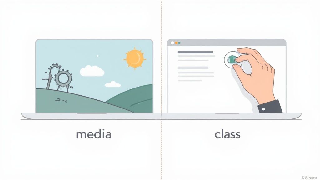
The Two Core Strategies
Your theme logic lives in tailwind.config.js. There, you choose how dark styles kick in:
-
Media Strategy (Default) Tailwind leans on the
prefers-color-schemeCSS media query. If a user’s OS is in dark mode, anydark:variants fire automatically—no JavaScript needed. -
Class Strategy (Manual Control) Switch on
darkMode: 'class'in your config. From there, your UI only appliesdark:styles when you’ve added a.darkclass on a parent (usually<html>). It means a tiny bit of scripting, but full theme-toggle flexibility.
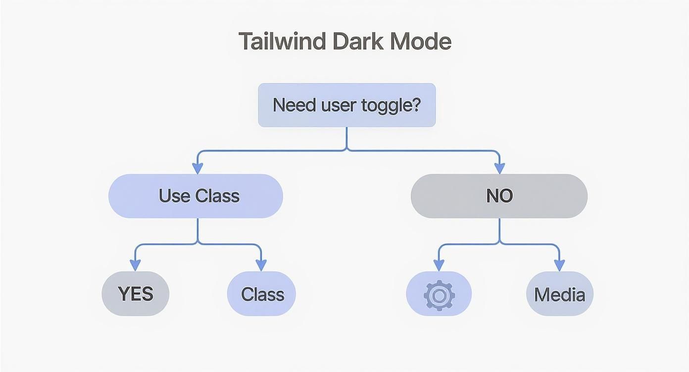
When To Use Each Approach
The media route is perfect for simple blogs, docs, or landing pages. You set it up once, and it just respects whatever the user already prefers.
On full-blown apps and dashboards, though, the class approach usually wins. It lets people pick a theme on your site—handy for accessibility and personal choice. If you want to dig into different user interface themes, you’ll see why explicit toggles often feel more polished.
User agency beats passive defaults. Letting people pick dark or light on your site makes your interface more inclusive and satisfying.
Tailwind Dark Mode Strategies Compared
Here’s a quick rundown of how the two strategies stack up side by side.
| Feature | Media Strategy | Class Strategy |
|---|---|---|
| Trigger Mechanism | OS setting via prefers-color-scheme | Manual toggle via .dark class |
| Setup | Zero config—works out of the box | Set darkMode: 'class' and add toggle logic |
| JavaScript Needed | No | Yes |
| User Control | Follows system preference | Full on-site choice |
| Ideal Use Cases | Simple sites, blogs, docs | Complex apps, dashboards, highly interactive UIs |
Deciding between these often comes down to how much theme-switching control you need in your interface.
In my projects, I’ve seen a smart dark mode pay dividends. According to a 2023 study, sites that rolled out dark themes enjoyed a 15% average increase in user session duration. Even better, user complaints about eye strain fell by 40% on major platforms. You can dive deeper into these dark mode case studies. Clearly, implementing thoughtful tailwind dark mode isn’t just a design trend—it’s a real, measurable enhancement to your product.
If you want to give users control over your site's theme, the class strategy is the way to go. This approach is fantastic because it decouples the theme from the operating system, letting users pick light or dark mode themselves. It’s a small code change that unlocks a much more interactive and user-centric experience.
The first step is a simple one-liner in your project's configuration. Before you start, make sure you have a working project setup. If you're starting from scratch, you can follow this guide on how to install Tailwind CSS to get up and running in no time.
Configuring Tailwind for Class-Based Mode
To enable manual control, pop open your tailwind.config.js file and add the darkMode key with the value 'class'. This one line tells Tailwind to stop paying attention to the system’s prefers-color-scheme media query. Instead, it will only apply dark: variant styles when it sees a .dark class on a parent element.
Here’s what that looks like in practice:
// tailwind.config.js
/** @type {import('tailwindcss').Config} */
module.exports = {
darkMode: "class", // This is the magic line!
content: [
"./pages/**/*.{js,ts,jsx,tsx,mdx}",
"./components/**/*.{js,ts,jsx,tsx,mdx}",
"./app/**/*.{js,ts,jsx,tsx,mdx}",
],
theme: {
extend: {},
},
plugins: [],
}Just like that, your entire tailwind dark mode setup is ready for a manual toggle. All of the framework's dark: variant utilities, like dark:bg-slate-900, will now lie dormant until you programmatically add the dark class to the HTML tree.
Building the JavaScript Toggle Logic
Next, you'll need a way to add and remove that .dark class. A small JavaScript snippet is all it takes. The goal is to create a function that targets the <html> element and flips the class on or off whenever a user clicks a button.
The release of Tailwind CSS v2.0 back in November 2020, which introduced this dedicated dark variant, was a huge moment for the framework. Its popularity exploded afterward, with weekly npm downloads jumping from around 2 million to over 10 million by early 2025. You can read more about Tailwind's relevance and growth if you're curious. This one feature made building theme toggles remarkably straightforward.
Here’s a practical, copy-and-paste example for a simple theme toggle button you can drop into any vanilla JavaScript project:
<button id="theme-toggle" className="px-4 py-2 bg-slate-200 dark:bg-slate-700 rounded">
Toggle Theme
</button>
<script>
const themeToggle = document.getElementById('theme-toggle');
themeToggle.addEventListener('click', () => {
// toggle the 'dark' class on the html element
document.documentElement.classList.toggle('dark');
});
</script>Pro Tip: By targeting
document.documentElement(which is just the<html>tag), you ensure the.darkclass gets applied globally. This makes all nested elements withdark:variants respond instantly, creating a consistent theme switch across your entire site. It's a simple yet incredibly effective foundation for any user-controlled dark mode.
Integrating Dark Mode In React And Next.js Apps
A plain JavaScript toggle is fine for a handful of elements, but once your UI grows in React or Next.js, you need something more scalable. Passing theme and setTheme through every layer quickly becomes a headache—this is where prop drilling trips you up.
Instead, we’ll lean on React’s Context API to keep things tidy. With a central ThemeContext, any component can read or change the theme without passing props through the entire tree.
Building A Reusable Theme Provider
We’ll create a ThemeProvider that:
- Centralizes theme state (light or dark)
- Uses
useEffectto toggle thedarkclass on<html> - Exposes a simple API for switching themes
This pattern cleans up your components and keeps the dark-mode logic in one place. If you’re new to Tailwind in React, check out our guide on how to install Tailwind with React before you dive in.
// components/ThemeProvider.js
import React, { createContext, useContext, useEffect, useState } from "react"
const ThemeContext = createContext()
export const ThemeProvider = ({ children }) => {
const [theme, setTheme] = useState("light")
useEffect(() => {
const root = window.document.documentElement
root.classList.remove(theme === "light" ? "dark" : "light")
root.classList.add(theme)
}, [theme])
return (
<ThemeContext.Provider value={{ theme, setTheme }}>
{children}
</ThemeContext.Provider>
)
}
export const useTheme = () => useContext(ThemeContext)Creating The Theme Toggle Component
With useTheme, building a toggle button is almost trivial. Here’s how you let users switch modes with one click:
When you need a user-facing switch, the class strategy is the only way forward.
// components/ThemeToggleButton.js
import React from "react"
import { useTheme } from "./ThemeProvider"
const ThemeToggleButton = () => {
const { theme, setTheme } = useTheme()
const toggleTheme = () => {
setTheme(theme === "light" ? "dark" : "light")
}
return (
<button
onClick={toggleTheme}
className="rounded-lg bg-slate-200 px-4 py-2 dark:bg-slate-700"
>
Switch to {theme === "light" ? "Dark" : "Light"} Mode
</button>
)
}
export default ThemeToggleButtonA common hiccup in Next.js is the flash of unstyled content (FOUC), where the page briefly shows the default theme before your script applies the correct one. In the next section, we’ll tackle persistence using
localStorageor cookies to eliminate that flash and honor user preferences on load.
Persisting User Theme Preferences with LocalStorage
A theme toggle is a great starting point, but a truly polished experience remembers a user's choice. Nobody wants to re-select their preferred theme every single time they visit your site. We can easily fix this with the browser's localStorage API, a simple key-value store that sticks around between sessions.
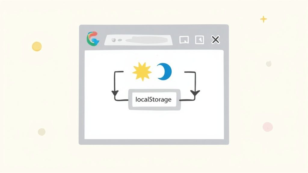
The idea is pretty straightforward. When a user clicks the toggle, we'll write their choice—'light' or 'dark'—to localStorage. Then, on their next visit, we read that value before the page even renders to apply the correct theme. This is the secret to preventing that jarring "flash of unstyled content" (FOUC).
Saving The Theme Choice
Let's upgrade our toggle logic. Right inside the event listener, after we flip the .dark class, we'll add one more line to save the current theme. This makes sure that every time the user makes a choice, it’s immediately saved for next time.
Here’s how you can tweak a simple JavaScript toggle to include localStorage:
const toggleButton = document.getElementById("theme-toggle")
toggleButton.addEventListener("click", () => {
// 1. First, toggle the class on the HTML element
document.documentElement.classList.toggle("dark")
// 2. Now, check the current theme and save it to localStorage
if (document.documentElement.classList.contains("dark")) {
localStorage.theme = "dark"
} else {
localStorage.theme = "light"
}
})Applying The Saved Theme On Page Load
Saving the theme is only half the battle. To keep the default theme from flashing on screen first, you have to apply the saved preference as early as humanly possible. The best place for this is a tiny, inline <script> tag tucked away inside the <head> of your HTML, before any of your CSS files are loaded.
This script checks localStorage and slaps the dark class on if needed, ensuring the correct tailwind dark mode is rendered from the very first paint.
<script>
// On page load, apply the theme from localStorage right away
if (localStorage.theme === "dark") {
document.documentElement.classList.add("dark")
}
</script>By placing this script in the
<head>, you're running it before the browser even starts to render the<body>. This is the single most effective trick for killing that annoying theme flash on page loads.
Creating A Hybrid Approach
For the ultimate user experience, you can combine a few strategies. On a user's very first visit, localStorage will be empty. In that case, we can fall back to their system preference as a sensible default. But as soon as they make a manual choice with the toggle, we honor that choice from then on.
This hybrid model respects both the user's implicit settings and their explicit actions, leading to an intelligent and seamless theme experience. It’s actually the same approach Tailwind's own documentation recommends for building a really robust dark mode.
Polishing Your Dark Mode: Advanced Techniques and Best Practices
Once you have a working theme toggle, it's time to add some polish. Moving beyond a basic class switch is what separates a functional feature from a truly delightful user experience. Let's dig into a few techniques that will make your tailwind dark mode implementation feel professional and clean.

One of the best things you can do for your theme is to abstract your colors using CSS variables. This approach keeps your component markup incredibly tidy and centralizes all your theme logic in one place. You define your colors once and reuse them everywhere—no more hunting down hex codes.
Theming with CSS Variables
Instead of peppering your components with classes like dark:bg-slate-800 dark:text-gray-200, you can create semantic color variables. Trust me, your future self will thank you when it's time to update your color palette.
Here’s how you can set it up in your global CSS file:
/* styles/globals.css */
:root {
--background: #ffffff;
--foreground: #020817;
}
.dark {
--background: #020817;
--foreground: #ffffff;
}Next, just tell Tailwind to use these new variables inside your tailwind.config.js.
// tailwind.config.js
module.exports = {
// ...
theme: {
extend: {
colors: {
background: "hsl(var(--background))",
foreground: "hsl(var(--foreground))",
},
},
},
// ...
}With that in place, your component markup becomes beautifully simple: <div className="bg-background text-foreground">...</div>. Tailwind handles the rest.
Adding Smooth Transitions
An instant, jarring flash when switching themes is a dead giveaway of an unrefined implementation. You can create a much smoother, more professional effect with a subtle transition on your background and text colors.
It's surprisingly easy to do. Just apply a transition utility to your <body> or root layout element.
Adding transition-colors and duration-300 (or whatever timing feels right to you) to your main layout component tells the browser to animate changes to background-color and color. The result is a fluid and pleasing switch between themes.
Prioritizing Accessibility
Look, a slick dark mode is pointless if your users can't read the text. Accessibility must always be a priority, and color contrast is a huge piece of that puzzle. A color combination that looks fantastic in light mode might become completely illegible in dark mode.
As developers, it’s our job to make sure what we build is usable for everyone. Low-contrast text can completely exclude users with visual impairments, which is a massive portion of the web's audience.
Always test your color pairings against the Web Content Accessibility Guidelines (WCAG) standards. The baseline you should be aiming for is a AA rating, which requires a contrast ratio of at least 4.5:1 for normal text.
Here are a few things to double-check:
- Text vs. Background: Is your body text easy to read against the background in both themes?
- UI Elements: Are buttons, links, and form fields still distinct and readable?
- Focus States: Don't forget about focus rings and other interactive states. They need to have good contrast, too.
Running your site through a website accessibility checklist is a great habit to get into. You can also use browser developer tools and online contrast checkers to validate your palette and ensure your design works for everyone.
Common Questions About Tailwind Dark Mode
Even with a solid plan, you'll likely run into a few tricky spots when you're in the trenches building a dark theme. Let's walk through some of the most common questions and roadblocks I see developers hit when implementing Tailwind dark mode and get you unstuck with some direct, practical solutions.
Nailing these little details is often what separates a decent theme from a genuinely great one. Get them right, and you’ll deliver a smooth, professional user experience.
How Do I Fix the Wrong Theme Flashing on Page Load?
You know the one—that jarring flash of a light theme right before the dark one loads. It’s a classic issue known as a flash of unstyled content, or FOUC. This happens because the browser paints the default HTML before your JavaScript has a chance to execute and apply the user's saved theme preference from localStorage.
The fix is surprisingly simple: a small, inline <script> tag placed directly in the <head> of your document. It has to go before any CSS files or other scripts are loaded. The sole purpose of this script is to check localStorage for a theme setting and immediately slap the dark class on the <html> element if it finds one. This ensures the correct theme is locked in before the browser’s first render, completely eliminating that annoying flash.
Key Takeaway: Placing this critical script in the document head is non-negotiable for a flicker-free experience. It’s an old-school trick that perfectly solves the race condition between the browser rendering and your main scripts running.
Can I Use Custom Color Palettes for Dark Mode?
Not only can you, but you absolutely should. Simply inverting your colors is a rookie mistake that often leads to a harsh, inaccessible design. A dedicated dark theme palette gives you granular control over the entire aesthetic and, more importantly, ensures everything remains perfectly readable.
You can define a whole new set of colors right inside your tailwind.config.js file.
- Start by extending the
colorsobject with your dark theme palette. For example:dark: { background: '#1a202c', text: '#e2e8f0' }. - Then, apply these new colors in your components using Tailwind's
dark:variant. - Your markup stays clean and semantic, looking something like this:
<div className="bg-white text-gray-800 dark:bg-dark-background dark:text-dark-text">.
This approach keeps your theme rock-solid and consistent. Plus, when it's time to tweak your color scheme down the road, it's a breeze to manage.
What Is the Best Way to Organize Dark Mode Classes?
The most maintainable and straightforward way to handle your styles is to keep them co-located. This is a core tenet of Tailwind’s utility-first philosophy: all the styling logic for a single element should live in one place. The dark: variant makes this incredibly intuitive.
For instance, a button's classes should look something like this:
<button className="bg-slate-100 text-slate-900 dark:bg-slate-800 dark:text-slate-200">Click Me</button>
Everything you need to know about that button's appearance—in both light and dark mode—is right there. Steer clear of creating separate stylesheets just for dark mode. That completely defeats the purpose of Tailwind's component-centric approach and will quickly become a maintenance nightmare.
Ready to build stunning UIs without the headache? Magic UI offers a massive library of over 50 customizable blocks and 150+ free animated components built with React, Typescript, and Tailwind CSS. Create beautiful, high-performance landing pages in minutes at https://magicui.design.