Have you ever found yourself squinting at your screen, trying to read tiny text in a web app? There's nothing more infuriating.
When creating a Design System, Typography is the most crucial piece. It's the one that takes the most thinking and planning. Creating this manually for every project is a nightmare.
But here’s the good news: Tailwind solves this.
In this blog post, I'll walk you through customizing font sizes in Tailwind CSS within a React project. Whether you’re a beginner or an experienced developer, you’ll find that using Tailwind's out-of-the-box Typography styles is just a better option.
In this post, you will learn how to customize the font size in Tailwind CSS within a React application. We'll cover everything from setting up your React project to advanced customization techniques. Let's dive in!
What is Font Size in Tailwind CSS?
Font size utility classes in Tailwind denote how big or small the text will look on the screen. Typically, in vanilla CSS, you can do font-size: 12px . In Tailwind, instead of specifying a pixel size for the fonts and risking inconsistent styles all over the place, you use a predefined set of font sizes that rank
you use the prefix text- to apply a predefined set of font sizes like:
- text-xs
- text-sm
- text-md
- text-lg
- text-xl
- text-2xl...text-9xl
Sticking to a set of font sizes like above forces your UI to look a lot more cohesive.
Let's see how we can set this up for our React project.
Setting Up Tailwind CSS in your React Project
First, make sure that your React project has Tailwind CSS properly configured. Need help? We've written a full step-by-step guide on how to install all the necessary packages for React here.
Testing the Initial Setup
Run your application to ensure everything is set up correctly:
npm startOpen http://localhost:3000 in your browser to see your React app styled with Tailwind CSS.
Create your React Component
Let's start by adding some text and applying the pre-defined font sizes to them. Edit your App.tsx with:
import "./App.css"
import "./index.css"
function App() {
return (
<div className="flex h-screen w-full flex-col items-center justify-center gap-4 bg-gray-100">
<p className="text-xs">Text size xs</p>
<p className="text-sm">Text size sm</p>
<p className="text-base">Text size base</p>
<p className="text-lg">Text size lg</p>
<p className="text-xl">Text size xl</p>
<p className="text-2xl">Text size 2xl</p>
<p className="text-3xl">Text size 3xl</p>
<p className="text-4xl">Text size 4xl</p>
<p className="text-5xl">Text size 5xl</p>
<p className="text-6xl">Text size 6xl</p>
<p className="text-7xl">Text size 7xl</p>
<p className="text-8xl">Text size 8xl</p>
<p className="text-9xl">Text size 9xl</p>
</div>
)
}
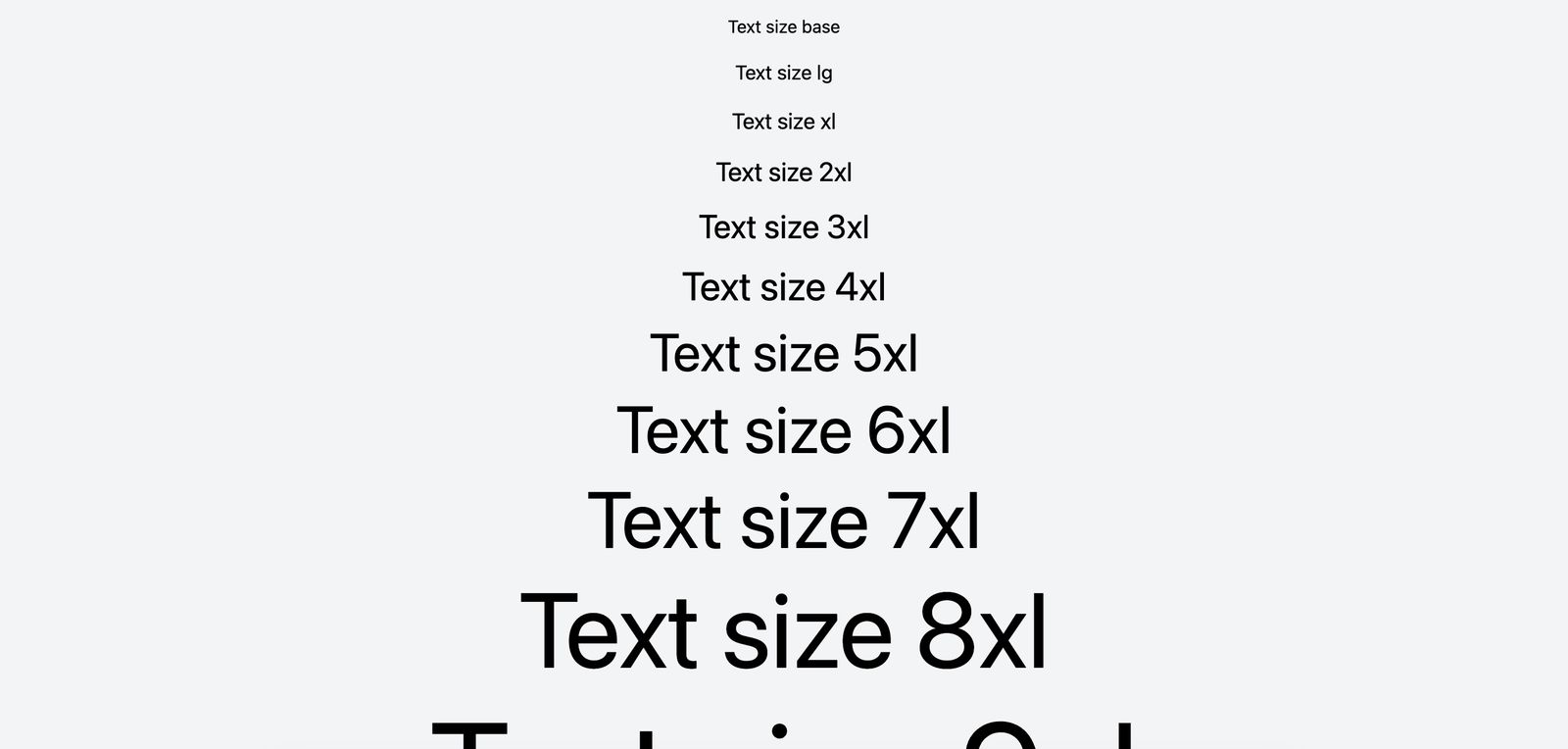
export default AppThis is how the sizes look like when previewed.

By combining font sizes with other text styles, you can start creating more complex layouts like so:
import "./App.css"
import "./index.css"
function App() {
return (
<div className="flex h-screen w-full flex-col items-center justify-center gap-4 bg-gray-100">
<div className="max-w-xl text-center">
<h1 className="mb-4 text-center text-5xl font-bold underline">
Welcome to Tailwind CSS
</h1>
<p className="text-xl text-gray-600">
This is a sample text layout using Tailwind CSS, an utility-first CSS
framework for rapidly building custom designs.
</p>
<div className="mt-2">
<button className="rounded bg-blue-500 px-4 py-2 font-bold text-white hover:bg-blue-700">
Get Started
</button>
</div>
</div>
</div>
)
}
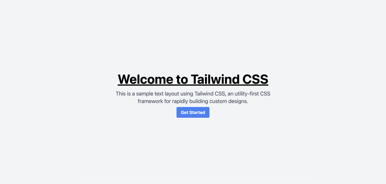
export default AppThis is what it looks like with a heading text up top, then a description followed by a button.

Make your layouts responsive
Tailwind lets you easily change font sizes to ensure that your text is readable across all screen sizes.
Tailwind styles are default mobile-first. This means that they will apply to the smallest screen sizes first. When you add new styles with a breakpoint like md:, they will be applied starting from that breakpoint and up (in this case 768px and up).
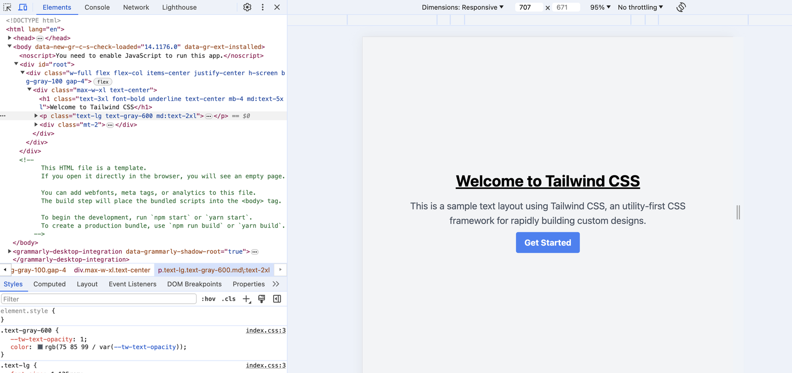
We can make the above text layout responsive by adding in the md: utility class with bigger font sizes so that on mobile, the font size would be 3xl but on a bigger screen, it will scale to 5xl.
import "./App.css"
import "./index.css"
function App() {
return (
<div className="flex h-screen w-full flex-col items-center justify-center gap-4 bg-gray-100">
<div className="max-w-xl text-center">
<h1 className="mb-4 text-center text-3xl font-bold underline md:text-5xl">
Welcome to Tailwind CSS
</h1>
<p className="text-lg text-gray-600 md:text-2xl">
This is a sample text layout using Tailwind CSS, an utility-first CSS
framework for rapidly building custom designs.
</p>
<div className="mt-2">
<button className="rounded bg-blue-500 px-4 py-2 font-bold text-white hover:bg-blue-700">
Get Started
</button>
</div>
</div>
</div>
)
}
export default AppTest this out by opening DevTools (Cmd + Shift + C on Mac) and varying the screen size. You will see that the 2 text lines will change their respective sizes.

Customize Font Sizes to fit your project
The list of sizes that come with Tailwind should generally be enough for a good UI, but if you're looking to either customize existing ones or add new ones, you can do so by editing the tailwind.config.js and extending the fontSize property.
For example:
module.exports = {
theme: {
extend: {
fontSize: {
xxs: "0.625rem",
xxl: "1.75rem",
},
},
},
}The new sizes will then be available for use like this.
function CustomFontSizeComponent() {
return (
<div className="text-center">
<p className="text-xxs">This is extra extra small text.</p>
<p className="text-xxl">This is extra extra large text.</p>
</div>
)
}
export default CustomFontSizeComponentNext Steps
Now that you know how font sizes in Tailwind work, try creating text heavy landing pages with Tailwind to practice your skills.
