
A text loading bar isn't just a visual progress indicator; it's a UI element that gives users real-time updates with descriptive text, like "Processing file 2 of 10...". This kind of specific feedback is way better at managing expectations than a generic spinner, making it a surprisingly powerful tool in your UI toolkit.
Why a Text Loading Bar Still Matters in Modern UI
In a world full of ambiguous spinners and pulsating dots, the humble text loading bar offers something invaluable: clarity. While a spinning icon just signals that something is happening, a text indicator tells the user what is happening. This small distinction has a huge psychological impact.
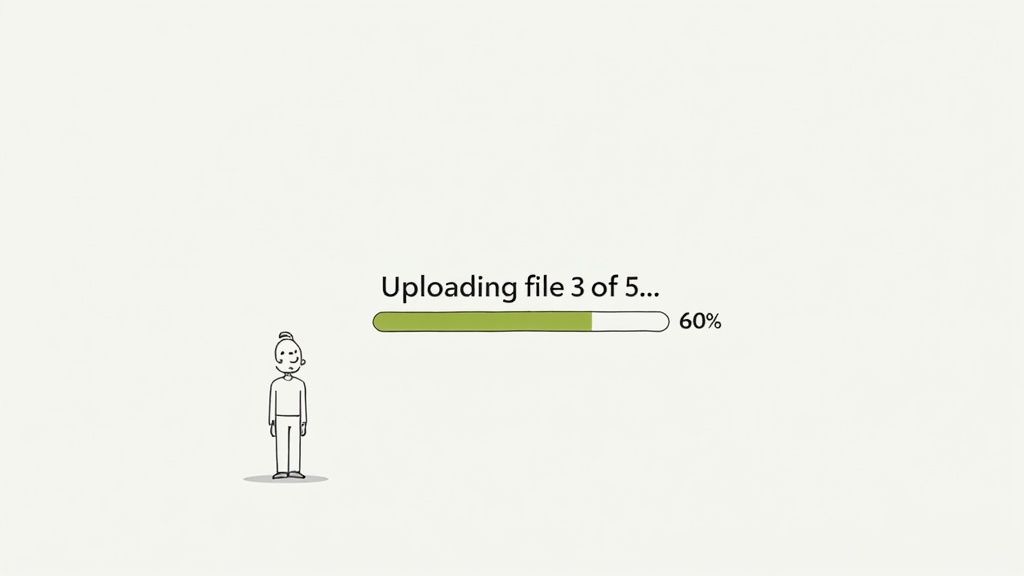
When someone sees "Uploading file 3 of 5...", they immediately get a sense of control and understanding. The process is no longer an abstract wait but a tangible, finite task. This transparency cuts down on user anxiety and makes the wait feel shorter, which in turn makes your application feel more responsive and trustworthy.
Managing Expectations and Building Trust
At its core, any loading indicator's job is to manage the user's perception of time. A generic animation can get frustrating fast if it drags on, leaving people wondering if the app has frozen. A text loading bar neatly sidesteps this entire problem.
It provides a clear frame of reference. Users see progress, understand the current step, and can anticipate when it will finish. This is especially crucial for multi-step processes where ambiguity leads to high abandonment rates. This concept has a long history for a reason; it popped up with early graphical interfaces, and even back then, studies showed that providing real-time text updates cut user abandonment during long waits by an estimated 35%.
By communicating clearly, you turn a moment of potential frustration into an opportunity to build user trust. The message is simple: "We know you're waiting, and here's exactly what we're doing for you."
Key Scenarios for Text Indicators
You don't need a text loader for every micro-interaction, but it really shines in situations where clarity is paramount. Getting the foundations of good user experience right is key, and you can always go deeper by mastering user experience design principles for better UI outcomes.
Think about using one for:
- Multi-file uploads or downloads: Let users know which file is currently being processed (e.g., "Downloading report_final.pdf...").
- Sequential data processing: Clearly state the current stage of a complex backend task (e.g., "Step 2: Analyzing data...").
- Software installations or updates: Provide specific feedback on which component is being installed or configured.
Building a Foundational Bar with Pure CSS
Before we get into fancy frameworks and libraries, let's roll up our sleeves and build this thing from scratch with pure CSS and HTML. This approach is not just lightweight and universally compatible; it gives you a gut-level understanding of how a text loading bar actually works.
The core idea is pretty simple: we're just layering elements. We'll have a container, a "fill" element that shows the progress, and a text label sitting on top.
While you could use a <progress> tag, I find a simple <div> structure offers way more flexibility for custom styling, especially when you need a clean text overlay. By using a parent container to hold both the progress fill and the text, we get fine-grained control over positioning everything just right.
Structuring the HTML
First things first, let's get the markup sorted. It's surprisingly straightforward. All we need is a main wrapper for the bar and two children inside it: one for the colored fill and another for the text itself. This separation is the key to managing their styles independently.
Here’s the basic structure I usually start with:
This simple setup gives us all the hooks we need for our CSS. The container defines the boundaries, the fill element handles the visual progress, and the span holds our dynamic text.
Styling with CSS
Now for the fun part—bringing the structure to life with CSS. The container needs a defined position and a bit of styling, while the fill element gets its color and initial width. The real trick is using CSS positioning to slap the text label directly on top of the bar.
Let's break down the styles:
.progress-bar-container: I always set this toposition: relativeso we can absolutely position its children inside. We’ll also give it a background color, a niceborder-radius, and—crucially—overflow: hiddento keep the fill contained..progress-bar-fill: This gets a vibrant background color and aheightof100%. Thewidthis what we'll be updating dynamically with JavaScript..progress-bar-text: Here, we useposition: absolute, stretch it to the full width and height, and then use flexbox ortext-alignto center the text perfectly. A contrastingcoloris a must for readability.
This layering technique is a classic web design pattern that's been proven effective long before modern frameworks were even a thing. When CSS3 came along and introduced smooth animations, these bars exploded in popularity. In fact, they became so critical for user retention that by 2010, jQuery plugins for text overlays had seen over 2.5 million downloads on GitHub. It's fascinating to explore the history of CSS progress bars and see just how much they’ve evolved.
Simulating Progress with JavaScript
A static bar doesn't do much, so we need a little JavaScript to simulate a loading process. This snippet will incrementally update the width of our fill element and change the text content to match, creating a fully functional text loading bar.
const fill = document.querySelector(".progress-bar-fill")
const text = document.querySelector(".progress-bar-text")
let progress = 0
const interval = setInterval(() => {
progress += 10
if (progress <= 100) {
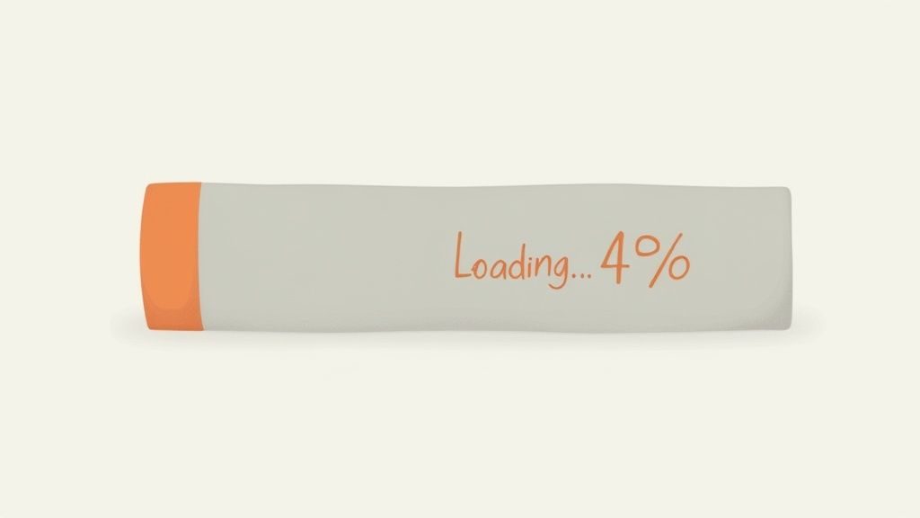
fill.style.width = progress + "%"
text.textContent = "Loading... " + progress + "%"
} else {
clearInterval(interval)
text.textContent = "Complete!"
}
}, 500)This simple update loop gives you a complete, working example. You now have a solid, framework-agnostic component that’s easy to drop into any project and adapt as needed.
Crafting an Animated Bar with Tailwind CSS
While plain CSS gives you total control from the ground up, a utility-first framework like Tailwind CSS can seriously speed things up. It lets you build a sleek, animated text loading bar right in your HTML using pre-built utility classes, which means you can often skip writing a separate stylesheet altogether.
This approach is a lifesaver for projects where you need to move fast. Instead of jumping between HTML and CSS files, you can style your component entirely with classes like bg-blue-500, flex, and items-center. What you get is a clean, modern component built in a fraction of the time.
Setting Up the HTML Structure for Tailwind
Good news—the HTML structure is almost identical to the plain CSS version. We still need a container, a fill element, and a text label. The big difference is that all the styling now lives in the className attributes.
This makes your markup way more descriptive and self-contained. You can tell an element's background color, positioning, and size just by reading the class names. It’s a really powerful way to see the UI take shape directly in your code.
Processing... 75%
Applying Utility Classes for Style and Animation
Let's break down how Tailwind's utility classes bring this component to life. This is where you see the real magic of a utility-first workflow. If you're new to the framework, our guide on how to install and set up Tailwind CSS will get you up and running in no time.
-
The Container (
<div>):relative w-full bg-gray-200 rounded-full h-8 overflow-hidden: This sets the stage. We make it a full-width, gray, rounded container with a fixed height and clip any overflow from the fill element.
-
The Fill Element (
<div>):bg-indigo-600 h-full rounded-full: This styles the progress bar itself with a rich indigo color, making sure it fills the container's height and keeps the rounded shape.transition-all duration-500 ease-in-out: Here’s the secret sauce for our animation. These classes apply a smooth, 500ms transition to any property that changes—in this case, thewidth.
-
The Text Label (
<span>):absolute inset-0 flex items-center justify-center: We layer the text over the entire container usingabsoluteandinset-0. Then, we use flexbox utilities (flex,items-center,justify-center) to nail the perfect horizontal and vertical centering.text-sm font-medium text-white: Finally, we style the text itself with a small size, medium font weight, and white color so it pops against the indigo fill.
This utility-driven method doesn't just speed up development; it also enforces a consistent design system. By pulling from the predefined spacing, colors, and transitions in your Tailwind config, you ensure your loading bar feels right at home with the rest of your application's look and feel.
With this setup, any JavaScript function that updates the inline style for the width will now trigger a fluid, polished animation automatically. This simple mix of structured HTML and descriptive utility classes gives you a production-ready, animated text loading bar without writing a single line of custom CSS.
Developing a Reusable React and TypeScript Component
When you're ready to move beyond one-off styles and utility classes, a component-based framework like React is the logical next step. Building a reusable text loading bar with React and TypeScript is a game-changer for scalability, giving you consistency, type safety, and much easier maintenance across your entire application.
Instead of copying and pasting markup and styles, you create a single, robust component that can be imported and configured anywhere you need it. Think about it: if you have loading states all over a complex app, this approach is a lifesaver. Need to tweak the animation or styling? You change it in one place, and the update propagates everywhere instantly.
This decision tree helps visualize where a reusable React component fits into the bigger picture of UI development.
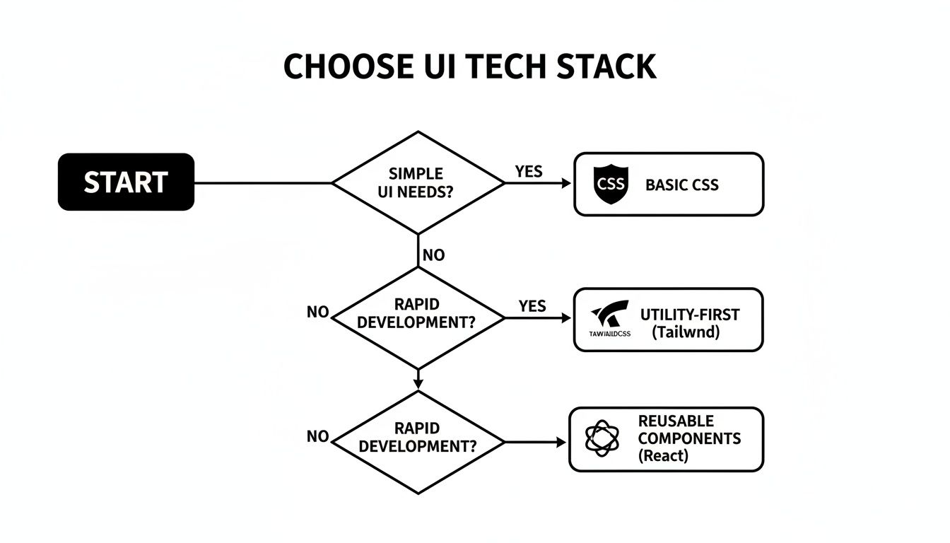
As you can see, while plain CSS is perfect for simple needs and Tailwind is king for rapid development, React is the clear winner when you're building a design system or a scalable component library.
To give you a clearer picture, here’s how the three methods we've covered stack up against each other.
Comparison of Text Loading Bar Implementations
This table breaks down how our three approaches—Pure CSS, Tailwind CSS, and React with TypeScript—compare across key development aspects. It should help you pick the right tool for your specific project needs.
| Feature | Pure CSS & JS | Tailwind CSS | React & TypeScript |
|---|---|---|---|
| Setup Complexity | Low. Just HTML, CSS, and a bit of JS. | Medium. Requires a build step and config file. | High. Needs a full React environment. |
| Scalability | Poor. Prone to code duplication. | Good. Utility classes promote consistency. | Excellent. Encapsulated and reusable by nature. |
| Maintainability | Difficult. Changes require finding all instances. | Moderate. Utility strings can be hard to refactor. | Excellent. Update one component, it updates everywhere. |
| Dynamic Data | Manual DOM manipulation required. | Can be combined with JS, but not its core strength. | Seamless. Built for handling dynamic state via props. |
| Best For | Simple websites, quick demos, or learning. | Rapid prototyping and utility-first projects. | Complex applications and design systems. |
Each approach has its place. The key is knowing which one fits the scale and complexity of what you're building.
Defining Props With a TypeScript Interface
The first step to crafting a solid React component is defining its API with TypeScript. By creating an interface for our component's props, we enforce type safety right from the start. This means anyone using our TextLoadingBar will get clear instructions—and helpful compile-time errors—if they pass in the wrong type of data.
Here’s what that looks like:
progress: The current progress value (0-100). This will be a required number.labelText: Optional text to display over the bar.color: An optional Tailwind CSS class for the bar's color.
This simple interface makes our component flexible yet completely predictable, preventing a ton of potential bugs down the road.
Building the Component Structure
With our props defined, we can build out the functional component itself. We'll use the incoming props to dynamically set the bar's width, the text it displays, and its color. You'll notice we're using React's className attribute for the Tailwind classes and a style object for the dynamic width.
The component is pretty straightforward: a container div, a progress div whose width is tied to the progress prop, and a span to overlay the text.
This self-contained component is now ready to be dropped into any part of your application. Want to learn more about structuring components effectively? Check out our deep dive on how to create a React component library.
Managing State and Dynamic Rendering
In a real-world app, the progress value isn't going to be static. It will come from your application's state, likely managed by a hook like useState or a global state manager like Redux or Zustand. As that state updates—say, during a file upload or a multi-step form completion—the component will automatically re-render to show the new progress.
This component-based model is incredibly effective. A Baymard Institute study found that e-commerce sites using text-enhanced progress bars saw a 19% higher checkout completion rate. Similarly, Microsoft's Fluent Design system incorporates text bars in 85% of its apps, which reduced perceived wait times by 27% in large-scale user tests.
The beauty of this approach is that our TextLoadingBar component is completely "dumb." It doesn't need to know how the progress is calculated or where it comes from; it just needs to receive the progress prop and render what it's told. This separation of concerns is a fundamental principle of clean React development, and it's what makes your codebase so much easier to understand and maintain as it grows.
Optimizing for Accessibility and Performance

A great text loading bar isn't just about looking slick; it needs to be inclusive and snappy. A sluggish, inaccessible component can tank the user experience, especially for anyone relying on assistive technologies. The real goal is to build a loader that clearly communicates what’s happening to everyone, without bogging down your app.
This boils down to two critical areas: making sure screen readers can understand it and ensuring the animations are buttery smooth. These aren't just "nice-to-haves"—they're hallmarks of a professional, user-friendly interface that respects every visitor.
Making Your Text Loading Bar Accessible
To make your loading bar truly accessible, you have to give screen readers the semantic context they need to interpret and announce its status. This is exactly what ARIA (Accessible Rich Internet Applications) attributes were designed for. They bridge the gap by adding meaning that standard HTML tags can't convey on their own.
When you implement these attributes correctly, you transform a purely visual element into a meaningful announcement for assistive tech users. To really nail this, it's worth getting familiar with the best practices in web accessibility audits and improvements.
Here are the essential ARIA roles and properties you'll need:
role="progressbar": This is the big one. It tells screen readers, "Hey, this thing is a progress bar," setting the right expectation immediately.aria-valuenow: This announces the current progress. You'll update this attribute dynamically with JavaScript as the value changes (e.g., "60").aria-valuemin="0": Defines the starting point, which is almost always zero for a progress bar.aria-valuemax="100": Sets the goal post, typically 100 for a percentage-based loader.
Without these attributes, a screen reader might just ignore the element or read out a jumble of meaningless style info. With them, it delivers a clear, actionable announcement like, "Progress bar, 60 percent." Big difference.
Boosting Animation Performance
Performance is the other side of the coin. A choppy, stuttering animation can make your entire site feel slow and broken, which completely defeats the purpose of having a loading indicator in the first place. The secret to smooth animations is steering clear of CSS properties that trigger expensive browser repaints and reflows.
Instead of animating the width property—a common mistake that can cause janky layout shifts—it's far more efficient to use CSS transform. Specifically, transform: scaleX() on the fill element is your best friend here. Transforms are offloaded to the browser's GPU, which results in silky-smooth animations that don't bog down the main thread.
If you want to dive deeper into creating efficient animations, our guide on how to trigger https://magicui.design/blog/css-animation-on-scroll is packed with performance-friendly techniques that apply here, too.
Common Questions About Text Loading Bars
When you start dropping a text loading bar into your projects, you'll inevitably run into a few tricky scenarios. It's how you handle these little details that really separates a good component from a great one. Let's walk through some of the most common challenges I see developers face.
How Can I Make the Text Always Readable?
This is probably the biggest headache. When the progress is low, the loading bar's background color often matches the text color, making your label completely disappear. A popular trick is the dual-text method, where you layer two text elements with contrasting colors. It works, but it can feel a bit heavy.
A more elegant solution I've come to prefer is using a bit of CSS magic with mix-blend-mode: difference;. This clever property inverts the text color based on whatever background is behind it, guaranteeing high contrast at every single point in the animation. If you want something even simpler, a subtle text-shadow or a thin stroke can often be just enough to lift the text off the background and keep it legible.
Determinate vs Indeterminate Loading Bars
Knowing when to use each type is absolutely crucial for creating a good user experience. They serve very different purposes.
- Determinate Bar: You’ll want to use this anytime you can actually calculate the progress of an operation, like a file upload. It shows a real value (e.g., "75% complete") and gives the user a solid idea of how much time is left. A text loading bar is almost always determinate.
- Indeterminate Bar: This is your go-to when the wait time is a total unknown. It just shows a continuous, non-specific animation to signal that the system is working, but can't promise when it'll be done.
The key takeaway here is to always use a determinate bar when you can show real, tangible progress. Faking it with a bar that mysteriously hangs at 90% is a quick way to erode user trust once they catch on to the pattern.
Will a Text Loading Bar Hurt Performance?
If you build it poorly, then yes, absolutely. A common pitfall is using JavaScript to frequently update an element's width. This triggers expensive browser repaints and can make your whole UI feel jerky and unresponsive.
To sidestep this performance trap, lean on CSS transforms for the visual animation. Instead of animating width, animate transform: scaleX(). This offloads the heavy lifting to the GPU, resulting in buttery-smooth performance. You should still update the aria-valuenow attribute with JavaScript for accessibility, but throttling those updates with requestAnimationFrame will ensure you aren't flooding the main thread with too many changes at once. This keeps your entire app feeling snappy.
Ready to stop building from scratch and start shipping beautiful UIs faster? Magic UI offers a massive library of over 150 free, open-source animated components and premium templates built with React, TypeScript, and Tailwind CSS.
Explore the components at https://magicui.design.