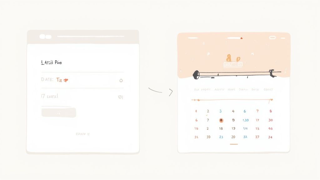
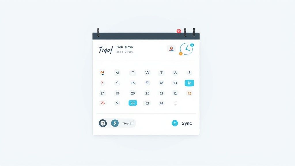
A time and date picker is exactly what it sounds like: a single UI component that lets someone pick both a calendar date and a specific time. You see them everywhere in booking, scheduling, and event management apps. Their whole purpose is to make scheduling foolproof and stop users from fumbling with manual inputs.
Why a Custom Time and Date Picker Matters
Ever tried to book a flight and felt like you were wrestling with the calendar? It’s a classic developer trap: falling back on the default browser pickers. The problem is, they often create a clunky, frustrating experience for the user.
These native components look and behave differently across browsers, their mobile UIs can be a nightmare, and they almost never have the specific features a business needs. This is where a custom component completely changes the game.
Building your own isn't just about making it look pretty. It's about creating a tool that feels intuitive, matches your brand, and respects your user's time. A well-designed time and date picker can genuinely streamline a user's workflow, slash input errors, and give your conversion rates a healthy bump.
The Problem with Default Pickers
The biggest headache with default browser pickers is the total lack of control. A native date input might look sharp in Chrome on a desktop, but then on Safari for iOS, it looks completely different and is way less usable.
This kind of inconsistency throws users off and shatters the cohesive feel of your app. On top of that, they give you almost zero room to customize business logic, like blocking out certain days or specific time slots.
For anything more complex than a basic form—think flight booking systems or service schedulers—you need more. You need a component that can handle your business rules, slot perfectly into your UI, and work seamlessly on any device.
A custom picker transforms date selection from a potential roadblock into a smooth, integrated part of the user journey. It’s an investment in user experience that pays off through higher engagement and fewer abandoned forms.
Boosting UX and Business Metrics
The move to graphical date pickers was a massive win for user interaction. In the old days, people had to type out dates by hand, which led to a constant stream of formatting errors. Was it day/month/year or month/day/year? It was a mess.
Once interactive calendars became the norm, enterprise UX teams saw date entry error rates drop by as much as 40%. The improvement was immediate and significant.
The infographic below shows just how big the business impact can be when you switch to a custom solution.

As you can see, a custom component doesn't just reduce errors; it helps people get things done faster and directly lifts conversions. This data makes it crystal clear: a better UI leads directly to better business outcomes.
When you're thinking through why a custom time and date picker matters for your project, tools like Framer can be a lifesaver if you want to prototype custom designs with Framer before writing a single line of code. Picking the right building blocks is also crucial; check out our guide to the best React component library to see how pre-built systems can give you a major head start.
Crafting the Perfect Development Setup
A smooth build always starts with a solid foundation. Before we can get our hands dirty building the custom time and date picker, we need to get our development environment set up and dialed in. Trust me, a poorly configured setup is a recipe for slow builds, cryptic errors, and a lot of wasted time.
We're going with a modern stack that's all about speed and reliability. This approach ensures all the pieces—our bundler, language, and styling library—play nicely together. It frees you up to focus on the actual component logic instead of wrestling with config files.

Bootstrapping with Vite and TypeScript
First things first, let's get our React project off the ground. We’re skipping create-react-app and going straight for Vite. Why? Its build server gives you near-instant hot module replacement (HMR), meaning your app updates in the browser almost immediately as you code. For component development, this speed is a total game-changer.
Next up is TypeScript. This isn't just about jumping on a trend; it's a practical move that helps you squash bugs before they even happen. By enforcing type safety, your component props and state become predictable and far easier to debug, especially as the application scales.
Kicking off your project with Vite and TypeScript from the get-go builds a really robust foundation. This combo doesn't just speed up your development cycle—it also cuts down on runtime errors, leading to more stable, maintainable code down the road.
Integrating Tailwind CSS for Styling
With the project structure in place, it’s time to talk styling. We'll be using Tailwind CSS, a utility-first framework that lets you build custom designs right inside your JSX. I find this approach is perfect for a component like a time and date picker because it keeps your styles co-located with the markup, making them incredibly easy to manage and tweak.
To get Tailwind working with Vite, you'll need to install it and then create two config files: tailwind.config.js and postcss.config.js. These files are what tell Tailwind how to process your styles and which files it needs to scan for utility classes.
Getting this part right is key. For a detailed walkthrough, our post on how to install Tailwind CSS with Vite is an excellent resource. A proper configuration ensures all your utility classes compile correctly, so you can start styling without a hitch.
Once this is all done, you’ll have a clean, powerful, and organized project—the perfect canvas for building our custom component.
Alright, with our development environment set up and ready to go, it's time to dive into the fun part: building the actual calendar grid for our custom time and date picker. This is the heart of the whole component. The plan is to create something truly modular and reusable from scratch, focusing on clean code that behaves exactly as you'd expect.
We'll be using TypeScript to define super clear interfaces for our component's props and state. This isn't just for show—it creates a contract. Anyone using our component will know precisely what data it needs, like a selectedDate and an onDateChange callback function. This level of predictability is what really separates a professional, production-ready component from a quick hack.
Taming Date Logic with date-fns
Let's be honest: handling date logic by hand is a nightmare. It’s a classic source of bugs. You've got time zones, leap years, and months with different numbers of days, creating a minefield of weird edge cases.
To avoid all that pain, we'll bring in a lightweight and powerful library called date-fns.
Unlike some of the heavier date libraries out there, date-fns is tree-shakable. That means only the specific functions we actually use get bundled into our final application, keeping our component lean and fast.
For our calendar, we’ll lean on date-fns for a few critical jobs:
- Generating the Days: It will help us create the grid of all the days for whatever month is currently showing.
- Handling Empty Cells: A calendar month rarely starts perfectly on the first day of the week. We need a way to calculate and show those empty slots at the beginning.
- Month Navigation: We need simple functions to jump to the previous or next month when a user clicks the navigation arrows.
Using this library lets us focus on the UI and state management instead of getting bogged down reinventing date calculations from scratch.
Defining Component Props and State
Before we even think about writing JSX, we need to establish a clear contract for how our component will work. This is where TypeScript really proves its worth. We'll start by defining an interface for the component's props, making its API completely explicit.
// src/components/DatePicker.tsx
interface DatePickerProps {
selectedDate: Date | null
onDateChange: (date: Date) => void
}This small interface tells us everything we need to know. The component expects a selectedDate (which can be null when nothing is selected yet) and a function to call when a new date is picked. Simple and clear. Inside the component itself, we'll use local state to manage which month is currently being displayed.
Understanding the key differences between state and props is crucial for building reusable React components. This table breaks down their roles within our date picker.
State vs Props for the Date Picker Component
| Concept | Role in Date Picker | Example Usage |
|---|---|---|
| Props | Data passed into the component from its parent. This is how the parent controls the component. | selectedDate is a prop because the parent component needs to know and control the final selected date. |
| State | Data managed inside the component. It's used for internal UI logic that the parent doesn't need to know about. | The currentMonth being viewed is state. The user can navigate months without affecting the final selectedDate value. |
This distinction allows us to build a more flexible and predictable component.
By separating the controlled value (
selectedDate) from the internal display state (like the current month view), we build a more flexible component. The parent component controls the final value, while the date picker manages its own internal UI logic.
Now, for the visuals. Styling our calendar grid is where Tailwind CSS shines. We’ll use its utility classes to build a clean, responsive layout directly in our JSX. For instance, creating the seven-column layout for the days of the week is as easy as adding grid and grid-cols-7 to a container.
We'll apply classes directly to the header elements, the navigation buttons, and each individual day cell in the grid. This utility-first approach is fantastic because it keeps our component completely self-contained and super easy to customize later without ever touching a separate CSS file.
Integrating an Intuitive Time Selector
Okay, so we've got a working calendar. Now, let's bring in the other half of the equation: the time selector. A great time and date picker shouldn't feel like two separate things glued together. It needs to be a single, smooth experience. This is where we'll build a clean time input that feels right at home next to our calendar.
There are a few ways to tackle this. You could go with the classic hour and minute dropdowns everyone knows, or maybe a slick scrolling interface that’s perfect for mobile. For this guide, we'll stick to a straightforward but highly effective selector using React and Tailwind CSS.

Unifying Date and Time State
Honestly, building the UI is the easy part. The real trick is managing the state so the date and time selections play nicely together. When someone picks a date and then a time, it should trigger one clear, predictable update. The best way I've found to do this is to manage a single JavaScript Date object for both.
Think of it this way: when a user clicks a day, we update our state. When they tweak the hours or minutes, we modify that exact same Date object. This simple approach completely sidesteps any state synchronization headaches and keeps the component logic lean.
The key is to treat the date and time as two parts of one whole. By consolidating them into a single
Dateobject, you ensure data integrity and avoid complex state synchronization issues, which also helps prevent unnecessary component re-renders.
Building the Time Input Component
Let’s get our hands dirty and create a new component, TimeInput. Its only job will be to render the hour and minute selectors. It will take in the currently selected Date as a prop and have a handler function to pass any changes back up to the parent.
We can use simple <select> dropdowns for this. We’ll just generate an array for the hours (0-23) and another for the minutes—let's use 15-minute intervals (0, 15, 30, 45) for now—and then map over them to create the <option> elements.
This is where you see the real-world value of a combined picker. In appointment scheduling systems, for example, implementing a solid date picker alone can slash booking errors by around 35% and boost user speed by up to 25%. Adding precise time selection on top of that is non-negotiable for any business that runs on a tight schedule. You can discover more about these UX improvements from recent research by digital form providers.
Refactoring for a Combined State
Time to bring it all together in our main DateTimePicker component. We just need to make a small tweak to our state management. Instead of only tracking the date, we'll manage a full Date object that includes the time.
Our onDateChange handler from the calendar now needs to be smart enough to preserve the existing time when updating the date. Likewise, the new onTimeChange handler from our TimeInput will update the hours and minutes while leaving the date untouched.
Here's a quick rundown of the logic:
- Initialize State: Kick things off with
useState(new Date())to hold the complete date and time. - Handle Date Selection: When a new date is picked, create a new
Dateobject. Set the year, month, and day from the calendar selection, but pull the hours and minutes from the current state. - Handle Time Selection: When the time changes, do the opposite. Create another new
Dateobject, this time setting the hours and minutes from the time input but keeping the year, month, and day from the current state.
This approach keeps every update clean and correct, giving you a robust and reliable time and date picker that just works.
Making Your Picker Accessible and Global
We've built a functional time and date picker, which is great. But to take it from good to truly professional, we need to make sure it's usable by everyone, everywhere. This last leg of development is all about accessibility (a11y) and localization (i18n)—the details that create a truly inclusive component.
Making something accessible means anyone can use it, including people who rely on assistive technologies like screen readers or navigate exclusively with a keyboard. This isn't just a "nice-to-have" feature you tack on at the end; it’s a fundamental part of building a quality UI, especially for a complex component like our calendar.

Implementing ARIA for Screen Readers
Accessible Rich Internet Applications (ARIA) attributes are your best friend for adding context that screen readers need to make sense of your UI. Since our calendar is built from <div> elements instead of a standard <table>, we have to explicitly tell assistive tech how to interpret its structure.
Here’s how to do it:
role="grid": Slap this onto the main calendar container. It tells screen readers, "Hey, this is a grid of interactive cells, kind of like a spreadsheet."role="row": Use this for each week's container inside the grid.role="gridcell": Apply this to every individual day element.aria-label: This one is crucial. Use it on your navigation buttons ("Previous month") and each date cell ("January 1, 2024") to give clear, human-readable descriptions.
These attributes won't change how your component looks one bit, but they make a world of difference for screen reader users, making it fully navigable and understandable. This kind of attention to detail is a hallmark of robust user interface design patterns.
Enabling Full Keyboard Navigation
Next up, let's make sure someone can use the entire time and date picker without ever touching a mouse. This is all about managing focus and handling keyboard events. The goal is an intuitive experience: arrow keys move through the calendar, and the Enter key makes a selection. Simple.
A truly accessible component allows users to perform all key actions with a keyboard. For our picker, this means navigating between days, switching months, and selecting a final date and time, all without ever touching a mouse.
You can pull this off by adding a tabIndex="0" to the currently focused day, which makes it a focusable element. From there, attach an onKeyDown event listener to the grid container to handle arrow key presses, moving focus logically from one day to the next.
Adapting for a Global Audience
Now for the final touch: localization (i18n). This is the process of adapting your component for different languages and regions. For a time and date picker, this mostly boils down to date formats and language. A user in the United States expects MM/DD/YYYY, while someone in Germany expects DD.MM.YYYY.
Using a library like date-fns makes this almost trivial. It has fantastic built-in support for different locales, letting you format dates and display month or day names in just about any language. You simply pass a locale object to its formatting functions, and it handles the rest. This last step ensures your component feels native to users, no matter where they are.
Don't underestimate the impact of getting this right. Poor date and time inputs are a major reason for form abandonment rates that can exceed 20%. On the flip side, analytics consistently show that a well-designed, intuitive picker can boost form completion rates by up to 30%, especially in industries that lean heavily on scheduling and reservations.
Common Questions About React Date Pickers
When you're deep in the code, building or plugging in a time and date picker, you'll inevitably run into the same handful of questions that pop up for every developer. Getting these right is the difference between a component that just works and one that's genuinely robust and ready for the real world.
Let's walk through some of the most common hurdles I've seen and how to clear them.
How Can I Disable Specific Dates?
Pretty much any scheduling tool needs this. You'll want to block out holidays, past dates, or any day that's already booked solid. This is a non-negotiable feature for booking systems.
The simplest way is to pass a function or an array of dates to your component as a prop.
Then, as you’re rendering the calendar grid, you just run a quick check for each day. Is this date in the disabled array? Or does it fail a condition, like being earlier than today?
If the answer is yes, you slap on a few Tailwind CSS classes like opacity-50 and pointer-events-none. This visually grays out the date and, more importantly, makes it unclickable. It’s a clean way to signal to the user that a date is off-limits while keeping your component flexible for different use cases.
What Is the Best Way to Handle Time Zones?
Time zones can feel like a minefield, but the industry standard approach is surprisingly simple. The golden rule is to always store date and time in Coordinated Universal Time (UTC) on your server. This gives you a single, unambiguous source of truth.
On the front end, you can let the browser do the heavy lifting. The native JavaScript Date object is smart enough to use the user's local time zone by default when displaying dates.
So, your workflow looks something like this:
- A user picks a date and time in their own time zone.
- Before you send that data to your backend, you convert it to a UTC string using a method like
date.toISOString(). - When you fetch that data back from the server, you just pass the UTC string to the client. The browser will automatically handle converting it back into the user's local time for display.
Sticking to a UTC-first approach on the backend simplifies everything. It eliminates ambiguity and ensures that time data is consistent across all users, regardless of their geographical location. For more complex needs, a library like
date-fns-tzcan be invaluable.
Can I Customize the Picker Beyond Tailwind CSS?
Of course. Tailwind’s utility classes are incredible for getting things built fast, but sometimes you need a time and date picker with a more bespoke, branded feel.
Your first stop should be your tailwind.config.js file. This is where you can extend the default theme with your brand's specific colors, fonts, and spacing. This keeps your design system consistent across the entire application, not just the picker.
For component-specific styles that are more complex, you can use Tailwind’s @apply directive in a separate CSS file to bundle utilities into custom classes. And if you need truly dynamic, prop-based styling, you can always reach for a CSS-in-JS library like Styled Components or Emotion. This lets you write highly adaptable styles while still pulling from Tailwind’s powerful design tokens.
Ready to build stunning, high-performance web interfaces with less effort? Magic UI offers over 50 customizable blocks and 150+ free animated components built with React, TypeScript, and Tailwind CSS. Start building beautiful landing pages in minutes at magicui.design.
