User interface design patterns are the reusable solutions to the design problems we all face time and time again. Think of them as a shared language between a person and a piece of technology. They're the reason so many different apps and websites feel intuitive, almost familiar, from the first time you use them.
These are time-tested blueprints that help us create interfaces people just get without a second thought.
Why UI Design Patterns Matter
Here's an analogy. Imagine trying to build a house without any architectural plans. You'd have to figure everything out from scratch—how a door should swing open, the right height for a kitchen counter, where the windows should go. The whole process would be slow, costly, and you'd probably end up with a house that's confusing and awkward to live in.
UI design patterns are those architectural plans, but for digital products. They give us proven, reliable solutions for common interaction challenges, so we don't have to constantly reinvent the wheel. When you see a shopping cart icon or a standard login form, you know exactly what to do. No instructions needed.
That instant familiarity is the real power of using established patterns.
Reducing Cognitive Load
The human brain can only juggle so much information at once. When a user has to learn a completely new interface, they’re forced to burn mental energy just figuring out how things work. Designers call this cognitive load.
By using established UI design patterns, we dramatically lower that mental effort. Users can stay focused on what they actually want to do—like find a piece of information or buy something—instead of getting bogged down by the mechanics of the interface itself.
This makes for a much smoother and more satisfying experience. A well-designed interface feels effortless, almost like an extension of your own thoughts. For a closer look at the building blocks that make up these patterns, check out our guide on https://magicui.design/blog/what-are-ui-components.
Building Trust and Consistency
Consistency is the bedrock of good design. When similar elements look and behave in predictable ways across an app, users start to build confidence and trust in the product. Design patterns are what make this consistency possible, from one page to the next.
This is especially critical in complex creative software, like the best music production software, where a fluid and intuitive interface is everything. Following these established conventions helps you create a dependable product that feels natural from the very first click.
The Evolution of Digital Interfaces
To really get why modern user interface design patterns are such a big deal, you have to rewind the clock. For the earliest computer users, getting anything done was a cryptic, frustrating exercise. They were stuck with the command-line interface (CLI)—a blank screen and a blinking cursor where you had to type exact, unforgiving commands to make anything happen.
Forget icons or windows. There wasn’t even a mouse. This was a world built for engineers, and it completely shut out the average person. The digital world was locked behind a wall of code, and something had to give. Computing needed to become a tool for everyone, not just a handful of experts.
The breakthrough started cooking in the 1970s at Xerox's Palo Alto Research Center (PARC). Researchers there invented the first graphical user interface (GUI), swapping out typed commands for visual, real-world metaphors. Their work showed that regular users could finish tasks up to 60% faster with a GUI. This was a massive leap, and it set the stage for a revolution. You can really see how these foundational ideas took root by diving deeper into the early history of UX design.
The WIMP Revolution
The GUI didn't just change the screen; it introduced a whole new language of interaction. This language, known by the acronym WIMP, gave us a set of patterns so intuitive that they still power most desktops today. It made the digital world feel like a physical space you could actually interact with.
- Windows: These were containers for programs and files, letting you juggle multiple tasks at once.
- Icons: Simple pictures representing files and apps made everything instantly recognizable.
- Menus: Instead of memorizing commands, you could just browse a list of options.
- Pointers: The mouse-controlled arrow gave us a way to directly point at and manipulate things on the screen.
The WIMP model, made famous by the Apple Macintosh in 1984, made computing visual, direct, and approachable. It created a consistent set of rules that, once learned, could be applied everywhere, blowing the doors wide open for millions of new users.
The Mobile-First Era
Just when we thought we had it all figured out, another massive shift happened. The smartphone explosion of the late 2000s completely rewrote the rules. Tiny touchscreens and the absence of a mouse and keyboard demanded a whole new vocabulary of user interface design patterns. Our fingers became the primary input.
Patterns like 'swipe,' 'pinch-to-zoom,' and 'tap' became second nature. These gestures allowed for fluid, direct manipulation of content, making interfaces feel more tangible and responsive.
This mobile-first world forced designers to solve new problems, especially how to navigate on such small screens. The "hamburger menu," that little three-line icon, became the standard way to tuck away navigation without hogging precious screen real estate. Card-based layouts also took off, giving us a clean, scrollable way to organize bite-sized chunks of information.
It just goes to show you—UI patterns aren't set in stone. They're constantly evolving right alongside our technology and our expectations.
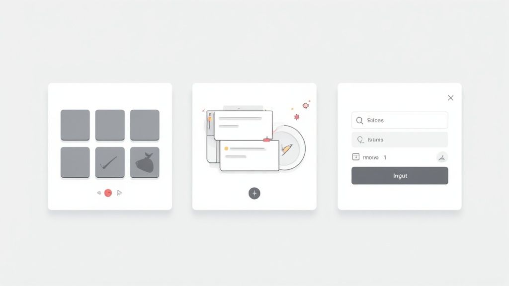
A Practical Guide to Common UI Patterns
To really get a handle on the huge world of user interface design patterns, it helps to organize them into a sort of toolkit. The best way to do that is to group them by what they do. Thinking about patterns based on their function gives you a clear mental framework, so you can quickly grab the right solution for whatever design challenge you’re facing.
Most patterns slot neatly into one of four main groups. Each group tackles a different part of the user's journey, from how they enter information to how they make sense of what's on the screen. Getting these categories down is the first step toward building an experience that just flows.
This diagram maps out how interfaces have evolved, starting from the early text-based systems and moving toward the visual, touch-friendly interfaces we all use today.
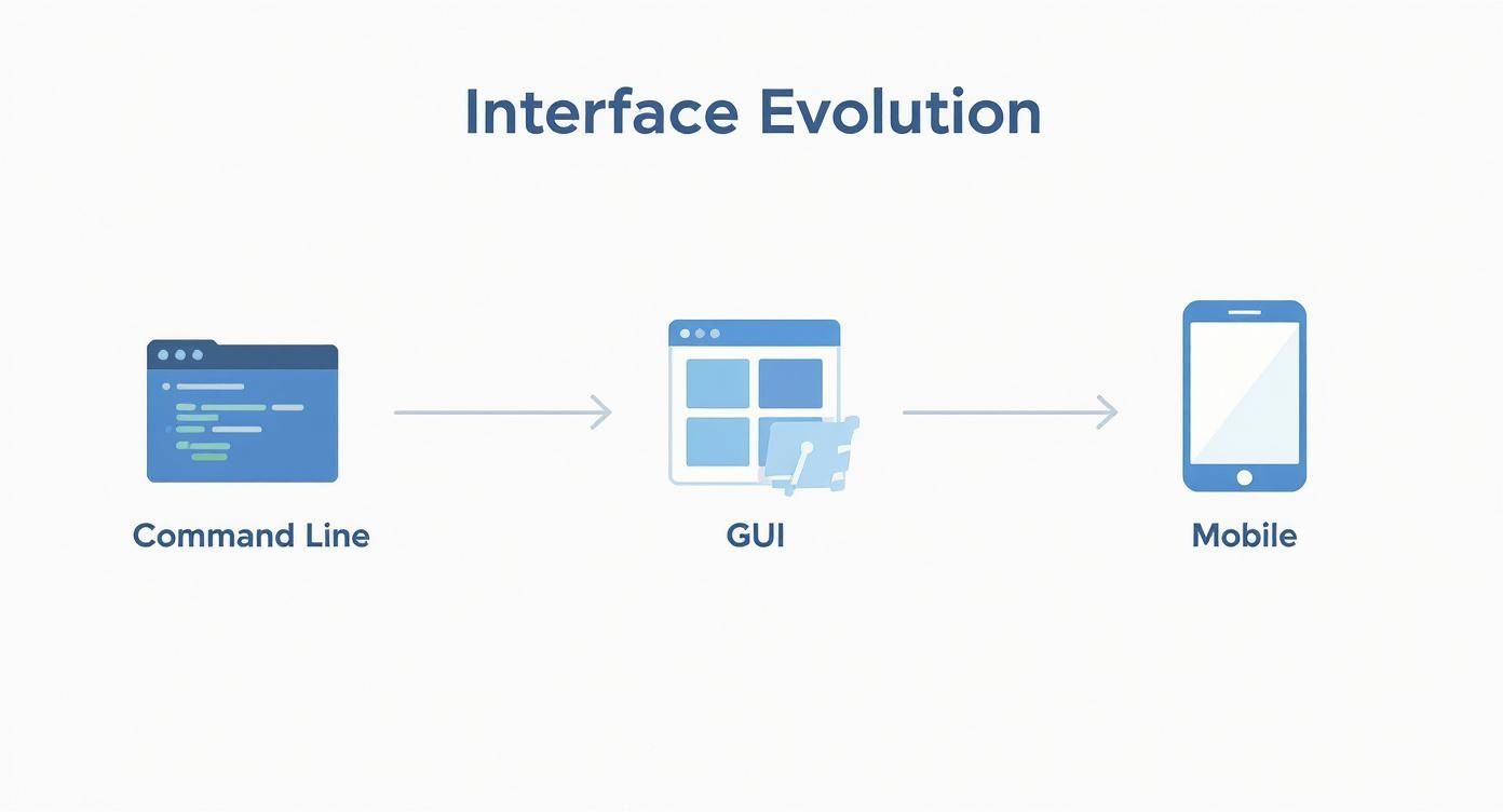
You can see a clear trend toward more direct and intuitive interactions, which shows just how much technology has shaped what users expect from a digital product.
Input And Output Patterns
Think of this category as the ongoing dialogue between the user and the system. Input patterns are how users talk to the interface, and output patterns are how the system talks back. They are the absolute bedrock of any interaction.
- Input Patterns: These are all the familiar elements like forms, buttons, dropdowns, and toggles. They're the tools users grab to make choices, type in data, and tell the interface what to do next.
- Output Patterns: This is how the system responds. We're talking about notifications, status messages, confirmation pop-ups, and progress bars. They confirm actions have been received and keep the user in the loop.
A well-designed input/output loop feels like a clear, responsive conversation. When a user clicks a "Submit" button (input), a success message (output) should pop up right away, confirming the action was completed. This simple feedback loop prevents confusion and builds trust.
Navigation Patterns
So, how do people get from point A to point B in your product? That’s where navigation patterns come in. They provide the map and the signposts, making sure users can move around without ever feeling lost or confused.
Common navigation patterns include things like top-level menus, tab bars, breadcrumbs showing a user’s trail, and search bars for when someone knows exactly what they want. The explosion of mobile devices also gave us patterns like the navigation drawer (the "hamburger menu") to save precious screen real estate.
The shift to touchscreens was a huge driver for these changes. By 2020, smartphones made up over 80% of global mobile phone sales, which made touch-based gestures like swipe and tap universally understood. In fact, the average person now taps their screen more than 2,600 times a day—that’s a stat that shows just how central these interactions have become. You can read more about the evolution of UI/UX design and its impact on modern patterns.
Content Structuring Patterns
Once a user lands on a screen, they have to figure out what they're looking at. Content structuring patterns are all about organizing information so it’s easy to digest and scan.
These patterns are crucial for taming complexity and keeping users from getting overwhelmed. A few of the most common ones are:
- Cards: These are self-contained boxes of content that neatly group related information together. To see how to use them well, you can explore our detailed guide on UI card design.
- Grids: A layout system that arranges content into clean rows and columns, giving the whole screen a sense of order.
- Carousels: A rotating slideshow of content, perfect for showing off multiple items without taking up too much space.
Patterns like these help create a clear visual hierarchy, guiding the user's eye to the most important information first.
Bringing UI Patterns to Life with Magic UI
Knowing the theory behind user interface design patterns is one thing. Actually building them with a bit of flair and efficiency? That’s a whole different ball game. This is exactly where a solid component library becomes your best friend.
Instead of reinventing the wheel by coding every button, grid, and form from scratch, you can grab pre-built, production-ready components that bring these patterns to life instantly.
That's the idea behind Magic UI. It's a collection of animated, interactive React components that are perfect for this job. They don't just copy standard patterns; they give them a modern spin with fluid motion, creating experiences that feel both intuitive and surprisingly fresh. Let’s look at how you can use them to solve some common design challenges.
Structuring Content with Animated Grids
One of the most basic tasks in UI design is just showing a bunch of stuff—blog posts, products, portfolio pieces—in a way that’s clean and easy to scan. A simple, static grid works, but let's be honest, it can feel a little dull.
This is where animated grid patterns can add a much-needed layer of polish. Magic UI's animated grid components use subtle motion to guide the user's eye, making content feel more alive as it loads onto the screen.
A well-implemented animation isn't just decoration; it’s a form of feedback. It guides the user's attention and makes the interface feel responsive and alive, which can significantly improve the perception of performance.
Rather than content just popping into existence, it can gracefully fade, slide, or scale into place. This small detail can turn a basic content layout into a genuinely delightful interaction, making your site feel more professional and thoughtfully designed.
Creating Engaging Navigation with Bento Boxes
The bento box is a super popular pattern right now for organizing different kinds of information into a compact, tile-based layout. It’s a great-looking way to present features, links, or key selling points on a landing page.
Magic UI pushes this concept a step further by making these bento boxes interactive. You can easily build a grid where hovering over a box triggers an animation, pops up more information, or creates a subtle glow effect. This solves a big design problem: how do you show a lot of information without totally overwhelming the user?
- Before: A static list of features is easy for users to scan past and ignore.
- After: An interactive bento grid naturally encourages people to explore. Users are invited to mouse over different sections, which turns a passive look into an active discovery.
With this approach, navigation starts to feel less like a chore and more like a fun, interactive experience.
Improving Usability with Dynamic Input Forms
Let's face it: forms are essential, but they're often the biggest source of user frustration. A clunky, confusing form is the fastest way to lose someone. This is where dynamic components can make the entire process feel a lot smoother.
For instance, Magic UI has interactive input fields that give you instant visual feedback. Think of a field that gently animates when you click into it, or a submit button that shows a loading spinner after it's been pressed. These tiny touches provide immediate confirmation that the system is listening to the user's actions.
This is really just scratching the surface. By combining these powerful building blocks, you can implement almost any user interface design pattern quickly and with real style. To see everything that's possible, take a look at the full library of Magic UI components and their documentation. It’s packed with live demos and code snippets you can drop right into your projects to start building more engaging interfaces today.
How to Choose the Right UI Pattern
Picking the right user interface design pattern feels a bit like an art and a science, a mix of gut feeling and hard data. It’s not just about what looks cool. A pattern has to actually work—it needs to line up perfectly with what the user is trying to do, what the business needs to achieve, and what’s technically possible.
Get it wrong, and you’ll frustrate people. Fast.
Think of it like picking a tool from a toolbox. You wouldn't grab a sledgehammer to hang a picture frame. In the same way, forcing a complex carousel onto a page where a simple grid would do the job just overcomplicates things and hurts the experience. The first step is always to get a crystal-clear understanding of the problem you're trying to solve.
A User-Centered Decision Framework
The best way to choose a pattern is to ground every decision in a user-centered framework. That just means you’re constantly asking questions about your users, their environment, and the information they need. A pattern that’s a dream to use on a huge desktop monitor could easily become a nightmare on a tiny phone screen.
To make a smart choice, you have to weigh these key factors:
- User Needs: What is the user actually trying to get done here? The pattern you choose has to make that task feel effortless.
- Business Goals: Does this pattern help the business? Whether that’s boosting sign-ups or keeping users engaged, it has to serve a purpose.
- Information Architecture: How is all your content organized? The pattern’s job is to present that information logically so people aren’t left scratching their heads.
- Technical Feasibility: Can your team actually build and support this thing? A flashy, bug-ridden component is a thousand times worse than a simple one that just works.
The most effective UI patterns are often the most invisible. When a design works seamlessly, users don't notice the individual patterns; they only notice how easy it is to get things done.
Validating Your Choices
Never just assume your first idea is the best one. Great design is all about iterating and validating—in other words, testing your assumptions with real people. It's so easy to fall into the trap of chasing trends, which is how we end up with interfaces that are stylish but completely unusable.
Luckily, we have a whole toolkit for validating patterns. Methods like heuristic evaluation, first laid out by the legendary Jakob Nielsen, give us a solid set of principles to measure usability. His "10 Usability Heuristics" are still a bible for many designers today.
The rise of massive pattern libraries like Google's Material Design, which is used in an estimated 70% of top Android apps, has also helped standardize best practices and cut down development time for countless teams. You can see how these principles and libraries have shaped the field in this deep dive into user interface design.
Testing and Iteration
At the end of the day, nothing beats feedback from actual users. It’s the ultimate reality check. Two of the most powerful methods for getting that feedback are:
- Usability Testing: This is where you watch a handful of people try to use your design. It's the quickest way to find out what's broken. Famous research showed that testing with just five users can reveal about 85% of the usability problems.
- A/B Testing: This is more scientific. You pit two different patterns against each other to see which one performs better on specific metrics, like getting more clicks or helping users finish a task faster.
By grounding your choices in a solid framework and then testing them with real-world data, you can move beyond guesswork. You’ll be able to pick UI design patterns that don’t just look good, but deliver real, measurable results.
A Few Common Questions About UI Design Patterns
As you start working more with UI patterns, a few questions always seem to pop up. Let's clear the air on some of the most common ones.
UI Patterns vs. Design Systems: What's the Difference?
This is a big one. Think of a UI pattern as a single, battle-tested solution to a common problem—like a modal for confirmations or a tooltip for extra info. A design system, on the other hand, is the entire toolbox. It bundles all those individual patterns together into a shared library, complete with rules, guidelines, colors, and typography.
For example, a specific button style is a pattern. When that button is standardized as part of Google's Material Design, with rules for spacing, color, and usage, it becomes part of a design system. This is why teams often use a library like Magic UI—it gives you ready-made patterns that work together consistently right out of the box.
- Scope: Patterns solve one problem at a time. Systems create a cohesive design language for an entire product.
- Components: A pattern might be a single element. A system includes everything from colors and fonts to page templates.
- Governance: Design systems are the source of truth, managing updates and versioning for all the patterns they contain.
Understanding this helps you decide whether you just need a quick, effective pattern for a specific feature or if it's time to invest in a full-blown design system to keep a complex product consistent.
With Magic UI Pro, you get the best of both worlds: powerful standalone patterns and a cohesive component library that helps you build faster.
How Do I Keep Up With All the New Trends?
The world of UI design moves fast. New devices, new interactions, new trends—it can feel like a lot to keep up with. The trick is to stay informed without getting overwhelmed.
Here’s a simple strategy that works for me:
- Find a few quality design newsletters and actually read them. They do the hard work of curating what's new and interesting.
- Spend a little time each week browsing communities like Dribbble and CodePen. It’s a great way to see what others are building and get a dose of inspiration.
- The best way to learn is by doing. Grab a few Magic UI components and spin up a small sandbox project to see how they feel in a real interface.
This keeps you in the loop, balancing passive learning with hands-on practice so you can confidently bring fresh, proven user interface design patterns into your work.
When Should I Innovate vs. Stick to Convention?
This is the classic tug-of-war in design. Pushing the boundaries can lead to incredible, fresh user experiences, but straying too far from what people already know can just leave them confused and frustrated. The key is finding a healthy balance.
Before you introduce something totally new, make sure you have a good reason.
- Set a Goal: What are you actually trying to improve with this new pattern? Is it faster? Clearer? More engaging?
- Test Everything: Don't just assume your cool new idea is better. Use A/B tests and look at the metrics to prove it actually improves usability.
- Respect the Rules (Before You Break Them): Start with familiar layouts and interactions. You can then introduce innovative elements within that comfortable structure, rather than throwing users into the deep end.
| Practice | The Upside | The Downside |
|---|---|---|
| Innovation | Makes your product stand out | Can have a steep learning curve |
| Convention | Instantly usable and familiar | Can feel a bit bland or generic |
Following these ideas will help you apply user interface design patterns with purpose. For more practical examples, dive into the Magic UI documentation and community forums—you'll find tons of real-world use cases and code snippets.
The bottom line? Focus on patterns that solve a real user need while also hitting your business goals.
Once you have clear answers to these questions, you'll be able to build interfaces that feel both intuitive and delightful.
And if you want to speed things up, try building your next project with the Magic UI component library. The live demos and copy-paste blocks let you get patterns up and running in minutes, giving you more time to focus on what really matters: creating a great design.
Ready to build stunning interfaces with patterns that just work?
Head over to Magic UI to explore over 150 animated components and templates designed to make your job easier and more fun. Join the thousands of developers and designers who are cutting their iteration time in half.