
Are you starting a new project and feeling overwhelmed by the various UI Frameworks and components available? Understanding the basics of UI Components is crucial in navigating the plethora of options and making informed choices. In this article, you will discover what UI Components are, explore their types, benefits, limitations, and identify practical use cases, enabling you to streamline your development process effectively.
Magic UI presents an innovative React component library that will help you grasp the fundamentals of UI Components, their benefits, and limitations. It will guide you toward making well-informed decisions that align with your project goals. Whether you are a seasoned developer or new to the field, Magic UI provides a practical solution to discover UI Components and integrate them seamlessly into your projects.
What Are UI Components?
A UI component is a standardized container used for quick and easy design. UI components usually fall into one of three categories (informational, navigational, or input controls) and can be composed of multiple or single elements representing specific functions.
Essential UI Design Components
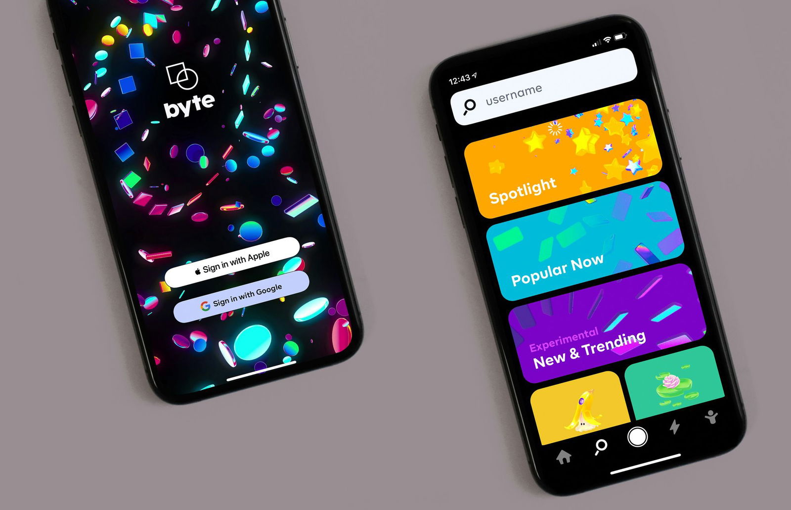
A navigation bar is an example of a UI design component. It uses various elements like icons, buttons, and text to demonstrate the structure and core pages of an app or website in a user-friendly way. A card is another example of a UI component that displays important content and can contain images, buttons, text, and more.
Using Pre-built and Customizable UI Components
UI components are often pre-built and customizable, making it easier for designers and developers to create consistent and cohesive user interfaces, reducing development time and costs. They also facilitate easier maintenance, updates, and keeping the design consistent across different pages of an application or website.
Related Reading
- React Frameworks
- What Is A Component Library
- React Libraries
- React CSS Framework
- React Design Patterns
- Component Libraries
- React Best Practices
What Is The Difference Between UI Elements And UI Components
It is essential to differentiate between UI components and UI elements in any design project. UI components are composite blocks, cards, or containers comprising one or more specific UI elements. These blocks are standardized for quick and easy design and represent particular actions. In contrast, UI elements are the basic building blocks of UI design and can be adapted for many different purposes. For example, an input field can be used in various applications apart from its use as part of a search box component in an app design.
UI elements represent the smaller visual building blocks in a design project. UI components are larger, self-contained, reusable entities that frequently incorporate multiple UI elements to provide specific functionality or perform particular tasks. This distinction is crucial as it allows designers to structure their projects effectively and facilitates better communication and collaboration among team members.
UI Component Libraries

A UI component library is a collection of pre-built, reusable UI components that can be easily added to a web or mobile application. These components are typically designed to be flexible, customizable, easy to use, and consistent in look and feel. A UI component library typically includes various components such as a navigation bar, a gallery, etc., and UI elements like buttons, forms, icons, typography, navigation, and other common UI elements.
Let’s learn a bit more about the structure and importance of a UI component library!
UI component libraries are essential for developers and designers. They allow for high consistency throughout a web application or website. Maintaining consistency makes users feel more comfortable and competent as they navigate through the user interface. This consistency also helps to establish a visual hierarchy within a web application or website. Users can quickly identify the most important elements on a webpage, such as menus, buttons, and call to action.
UI component libraries can save developers and designers a lot of time. Instead of building all UI components from scratch, developers and designers can use pre-built components from a UI component library. This allows developers and designers to focus on a web application or website's more complex and unique parts. It also helps to ensure that these components are accessible and responsive. Components in a UI library are tested on various screen sizes, browsers, and operating systems, ensuring that they work well for all users.
A React Component Library for Design Engineers
Are you looking for a React component library to include in your web development projects? Look no further. MagicUI is a free and open-source UI library designed specifically for design engineers. It offers a collection of over 20 animated components built with React, TypeScript, Tailwind CSS, and Framer Motion.
Seamless Integration and Customization with MagicUI Components
Our visually appealing and interactive elements can be easily integrated into web applications, allowing you to create stunning user interfaces with minimal effort. MagicUI components are highly customizable, enabling seamless adaptation to match your desired branding and design requirements.
Empowering Digital Experiences with MagicUI Pro: Animation and Design Focus
With our focus on animation and a design-centric approach, MagicUI aims to bridge the gap between design and development, empowering you to craft captivating digital experiences. Along with our free component library, MagicUI Pro can save you thousands of hours, create a beautiful landing page, and convert your visitors into customers with our website templates.
Use our React component library for free today at https://magicui.design/docs.
Related Reading
- Best React Native UI Library
- React Component Best Practices
- Tailwind Vs Bootstrap
- Material UI Alternatives
- Best React Component Library
- React Tips
- Create React Component Library
- Cool React Components
- Component Library Examples
- Bootstrap Vs React
- React Native Libraries
- Best React UI Framework
- NextJS
- Next.JS
- Next JS
- React Bootstrap
- MUI Table
- MUI Card
- MUI Box
- What Is NextJS
What Are The Types Of UI Components?
Three UI components cover most standardized blocks required when designing an app or website. Below, I discuss these component types in more detail and outline example elements commonly employed across all three.
1. Informational
Informational UI components communicate information with users. They are effectively used when you want to tell the user something. Examples of informational components include content cards and video components. The elements typically employed here are text, buttons, images, and videos.
2. Navigational
Navigational UI components assist users in moving around a design. These components excel in aiding users in finding their way through your design. Examples of navigational components include head navigation bars and call-to-action (CTA). The typical elements used in these components are buttons, icons, and text.
3. Input Controls
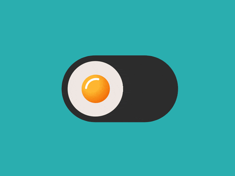
Input UI components enable users to input information directly into a design. These components are used when you need to let users enter or select data directly. Examples of input components include user input components such as onboarding or checkout. The elements typically included in this category are input fields, input dropdowns, input steppers, sliders, checkboxes, radio buttons, and toggles/switches.
What Makes A Great User Interface?

Clarity
The first quality is clarity. This means the interface avoids obscurity by ensuring everything in the UI is clear. This could include visual elements, flow, or metaphors.
Concision
The next quality a great UI should have is concision or the reduction of redundancy (programmers may think of this as DRY—Don’t Repeat Yourself). Sometimes, developers or designers can accidentally overcomplicate things for the user by overexplaining certain processes. It’s best to avoid this by simultaneously including the necessary content on the screen.
Familiarity
Familiarity is also important when it comes to UIs. If someone is using your interface for the first time, some of the elements may still be familiar to them. Using real-life metaphors is helpful in this scenario.
Responsiveness
Great UIs will be responsive, one of the most common words a front-end developer or web designer will ever hear in their lifetime. Have you ever used a website or app and you want to request some information and you are not sure if your request was processed or not? That is not a very responsive interface. Responsive interfaces will provide good feedback to the user when a request is made. You might see something like “please wait while we process your request”.
Consistency
Another quality that is super important in developing a user interface is consistency. Keeping your UI consistent allows users to recognize patterns throughout your application, which will help them navigate.
Aesthetic
Aesthetic, or artistic taste is another essential aspect of a UI. If your app is aesthetic, users will find more joy in using it.
Efficient
Efficiency is very important when developing a user interface. If your app is slow, users are going to find another solution very quickly.
Benefits Of Using UI Component Libraries

1. Accessibility
Using UI components offers quick access to developers and designers everywhere through a single repository. Accessibility improves collaboration and communication between developers and designers, helping them work more efficiently across teams.
2. Reduced code duplication
I believe a component library eliminates the need to copy code across varying designs and projects. Instead of converting every pixel to code, developers can leverage pre-coded components without any further development, saving time and resources.
3. Consistency
A component library facilitates consistency by promoting a single source of truth. This ensures a uniform UI and UX across entire projects, making it easier to achieve design consistency. Consistency makes work faster and more efficient.
4. Speed
Teams can save time by avoiding building from scratch using a component library. By utilizing ready-made components like calendars, teams can speed up their projects. Pre-set components help teams make faster decisions, reducing delays.
5. Compatibility
Frontend developers can struggle with ensuring cross-browser and cross-device compatibility. A component library aids in standardization, which helps avoid compatibility issues and provides a smooth user experience on different devices and browsers.
Potential Drawbacks of UI Component Libraries

While UI component libraries have some significant advantages, as with most things, there may also be some challenges. Some of these challenges are:
1. Library Size
some of the UI Component Libraries tend to be somewhat large. If you are building a small project or app, it may not be the best idea to use a library, instead, consider building your UI from scratch.
2. Look
Although UI component libraries make your design aesthetically pleasing, it can also be a drawback depending on the situation. Your application's look and feel will largely depend on the style defined in the UI library so this style must align with what you want your app to look like.
3. Changes
Suppose you decide you’re not necessarily a fan of some of the components offered and move to a more custom design but still decide to use some of the components provided by the library. In that case, knowing which components are custom and which are brought in by the library can be confusing. This is especially true when you add new team members.
Speaking of new team members, it can be a challenge to bring on new team members when it relates to the UI library you decide to use. If they are not familiar with the library, it may cause a bit of a delay when they need to implement or change the data housed in these components. While this is true for most things, it can be especially true here since there are so many different UI libraries.
Check Out Our React Component Library for Design Engineers
MagicUI is a free and open-source UI library that we designed specifically for design engineers. It offers a collection of over 20 animated components built with React, TypeScript, Tailwind CSS, and Framer Motion. We provide a range of visually appealing and interactive elements that can be easily integrated into web applications, allowing us to create stunning user interfaces with minimal effort. MagicUI components are highly customizable, enabling seamless adaptation to match our desired branding and design requirements.
With a focus on animation and a design-centric approach, MagicUI aims to bridge the gap between design and development, empowering us to craft captivating digital experiences. Along with our free component library, with MagicUI Pro, you can save thousands of hours and create a beautiful landing page, and convert your visitors into customers with our website templates.
Use our React component library for free today at https://magicui.design/docs.