
Color theory for web design is much more than just picking a few colors that look nice together. It's the art and science of using color to make a website easier to use, guide people where you want them to go, and make them feel something. This isn't just about aesthetics; it's a strategic choice that shapes brand perception, user trust, and conversion rates.
Why Color Is Your Most Powerful Design Tool
Let's be real—color is the very first thing someone notices when they land on your site. Before they've read a single headline or clicked a button, your color palette has already made a powerful first impression. That initial visual handshake sets the entire tone for their visit.
But color is so much more than decoration. It's a communication shortcut that works on a subconscious level. A thoughtful color palette can effortlessly guide the eye, spotlight key information, and define your brand's personality, whether that's buttoned-up and professional or high-energy and innovative.
The Real-World Impact of Color
Don't underestimate the tangible effects of color choices. Research shows that over 90% of snap judgments about products are based on color alone. That's a massive number, and it underscores just how critical color is in those first few seconds.
This influence translates directly to your bottom line. Something as simple as optimizing the color of a call-to-action button can boost conversion rates by up to 35%, depending on the audience and context.
Color is a silent ambassador for your brand. It speaks a universal language that can build instant connections, establish credibility, and differentiate you from the competition in a crowded digital space.
This is exactly why getting a handle on color theory for web design is a business necessity, not just an artistic one. When you understand these principles, you can stop making random guesses and start building interfaces that are both beautiful and effective. It's a cornerstone of modern web design best practices.
Making intentional color decisions allows you to craft experiences that guide users, drive action, and leave a lasting, positive impression.
Understanding the Building Blocks of Color
Before you can start whipping up incredible color palettes, you have to get familiar with the basic ingredients. Think of it like cooking—every color you see on a screen is just a mix of three core properties. Once you get the hang of these, you'll have total command over your design's visual flavor.
Mastering these components is what separates someone who just picks colors from someone who truly crafts them. While the ideas feel modern, they actually stretch back to Sir Isaac Newton's prism experiments in the 17th century. His work laid the groundwork for later systems that organized color by hue, value, and chroma—the direct ancestors of the digital tools we use every day.
Meet the Big Three: Hue, Saturation, and Value
These three elements—Hue, Saturation, and Value (HSV)—are the trio behind every single color imaginable. You might also hear this called HSL (Hue, Saturation, Lightness), which is a very similar concept.
-
Hue: The Pure Color Hue is what we all mean when we say "color"—it’s the raw red, the pure green, the essential blue. On a color wheel, the hue is simply its location on the circle, with no black or white added to muddy the waters.
-
Saturation: The Intensity Saturation is all about a color's intensity. Picture a dimmer switch for vibrancy. 100% saturation is the color at its absolute brightest and most brilliant. Drop it to 0% saturation, and you’re left with a shade of gray. Dialing back the saturation mutes a color, giving it a more subtle, understated feel.
-
Value: The Brightness Value, sometimes called lightness, is simply how light or dark a color is. Add white, and you increase the value to create a lighter "tint." Add black, and you decrease the value for a darker "shade." It's how you get from a bright sky blue to a deep navy without ever changing the core blue hue.
By playing with just these three sliders—Hue, Saturation, and Value—you can unlock a nearly infinite spectrum of colors. This isn't just abstract theory; it's the practical foundation of color theory for web design.
Getting these fundamentals down is the key to creating visuals that feel cohesive and intentional. And while we're focused on web design here, this knowledge is crucial for keeping a brand consistent everywhere it appears. For a deeper dive into how these principles translate to physical media, checking out resources on mastering color management in printing can be incredibly insightful.
How to Build Palettes That Actually Work
Alright, let's move beyond picking single colors. The real artistry in color theory for web design emerges when you start combining them into a cohesive palette. A great palette doesn't just look pretty; it creates a unified experience and tells a user's eyes exactly where to go. The color wheel is your best friend here—it's the blueprint that helps you build these combinations with confidence, taking all the guesswork out of the equation.
Instead of just grabbing colors that feel right, you can lean on proven relationships, often called color schemes or harmonies. These are essentially time-tested recipes for pairing colors in a way that just clicks with the human eye. Each one sets a totally different mood and serves a unique strategic purpose.
Choosing Your Core Color Scheme
Think of these schemes like starting points. They give you a structure, but you're still the chef—you control the final result by tweaking the brightness, saturation, and shades of the colors you pick. Let's break down the most reliable ones for web design.
-
Complementary Colors These are colors sitting directly across from each other on the color wheel, like a classic blue and orange. This combo creates the strongest possible contrast, which is perfect for grabbing attention. Need a call-to-action button or a critical link to pop? A complementary accent is your go-to.
-
Analogous Colors This scheme involves colors that are neighbors on the wheel—think blue, blue-green, and green. Since they're so closely related, they create a beautifully serene and comfortable vibe. Analogous palettes are fantastic for designs that need to feel trustworthy and calm, like a website for a healthcare provider or a financial advisor.
-
Triadic Colors If you're after something more vibrant but still balanced, a triadic scheme is a great choice. It uses three colors that are evenly spaced around the wheel, forming a triangle. This gives you strong visual contrast that feels less intense than a complementary pair, offering a wonderful variety of hues to assign to your primary, secondary, and accent elements.
Applying Harmony in Practice
The secret is to use these schemes with intention. A bold, high-energy startup might rock a triadic or complementary scheme to feel dynamic and exciting. On the other hand, a luxury brand would probably lean into a sophisticated analogous palette to create an atmosphere of elegance and calm.
A great color palette does more than decorate a page—it tells a story. The harmony you choose reinforces your brand’s personality and sets clear expectations for the user from the moment they arrive.
Understanding how different schemes work is at the heart of creating effective user interface themes. Once you get the hang of these basic harmonies, you can build palettes that not only look professional but actively push your website's goals forward. It’s a strategic approach that ensures every color choice has a purpose, leading to a better user experience and a much stronger brand identity.
Now that we've covered the core schemes, let's look at a few more and see how they stack up in a real-world context. The table below breaks down the most common harmonies, what they're best for, and the kind of feeling they tend to create.
Color Harmony Schemes for Web Design
| Harmony Type | Description | Best Used For | Psychological Effect |
|---|---|---|---|
| Monochromatic | Uses tints, tones, and shades of a single base color. | Minimalist designs, branding that needs a clean and simple feel. | Calming, elegant, sophisticated, and focused. |
| Analogous | Uses 2-4 colors that are next to each other on the color wheel. | Creating a sense of unity and calm. Great for nature or wellness brands. | Harmonious, comfortable, serene, and reassuring. |
| Complementary | Uses two colors that are directly opposite each other on the wheel. | Drawing attention to key elements like CTAs, logos, or headlines. | High-energy, dynamic, bold, and attention-grabbing. |
| Split-Complementary | A base color plus the two colors adjacent to its complement. | A less intense but still high-contrast look. Good for beginners. | Balanced, versatile, and engaging without being jarring. |
| Triadic | Uses three colors evenly spaced around the color wheel. | Vibrant and dynamic UIs, designs that need a balanced energy. | Playful, stimulating, and diverse. |
| Tetradic (Rectangle) | Uses two complementary color pairs. | Complex, multi-faceted designs that require a rich color palette. | Rich, energetic, and complex; requires careful balancing. |
Picking the right harmony is less about rules and more about matching the color's inherent "personality" to your brand's voice. A triadic scheme on a law firm's website might feel chaotic, just as a monochromatic one might make a toy store feel a bit dull. It's all about context.
Using Color Psychology to Influence Users
Color speaks a language all its own, and your users are listening from the moment they land on your page. Before they even read a single headline, the colors you've chosen are hard at work, setting an emotional tone, shaping their perception of your brand, and subtly guiding their next click. That's the real power of color psychology in web design: using color to spark a feeling and prompt a response.
This isn't some new fad. The story of color theory for web design began back in the early 1990s, when the web was mostly a monochrome world with those classic blue hyperlinks. By 1994, sites like ALIWEB were splashing bright yellow backgrounds on their pages to stand out, and the very first banner ad appeared. That was the beginning of using color as a deliberate marketing tool. You can dive into the full history of web design on VisualFizz to see just how far we've come.
Eliciting Specific Emotions with Color
Every color carries its own psychological baggage. A bright, saturated red screams urgency, making it perfect for "Buy Now" buttons or can't-miss sales. But tone it down to a deep, muted red, and it suddenly feels luxurious and sophisticated. It’s these subtle shifts that let you design with real emotion.
Think about some of the common associations we have:
- Blue: This is the color of trust, security, and professionalism. It’s no accident that so many banks, tech companies, and healthcare providers build their brands around blue.
- Green: Green immediately brings to mind nature, growth, and a sense of calm. It's a natural fit for brands in wellness, finance, or anything eco-friendly.
- Yellow: This one is all about optimism, warmth, and clarity. It’s a fantastic accent color to grab attention and create a friendly, approachable vibe.
Strategically Guiding User Behavior
Beyond just setting a mood, color is one of your best tools for directing traffic on your site. The goal is to make the actions you want users to take—like signing up for a newsletter or adding an item to their cart—feel like the most obvious and natural next step. This is where high-contrast colors for your primary call-to-action (CTA) buttons come in; they create a visual magnet that the user's eye can't help but be drawn to.
Color psychology empowers you to build credibility, reinforce your brand's personality, and prompt users to act, all without them consciously realizing it. It transforms your design from a static page into a persuasive experience.
This infographic gives you a great visual breakdown of how foundational color harmonies, which are all based on the color wheel, can be used to build these kinds of psychologically powerful palettes.
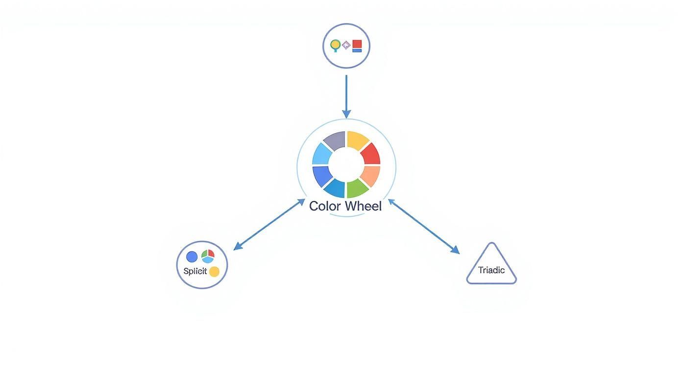
As you can see, the map shows how different color relationships—like the punchy, high-contrast complementary scheme or the smooth, harmonious analogous one—are just starting points. By understanding these principles, you can start building a palette that elicits the exact emotional response you're after and ensures every color choice is working towards your website’s goals.
Designing for Everyone with Accessible Color
Let’s get one thing straight: a beautiful design that isn't accessible to everyone is, in the end, a failed design. It's easy to get caught up in aesthetics, but the real heart of effective color theory for web design is creating an experience that works for all visitors. That includes the roughly 1 in 12 men and 1 in 200 women who have some form of color vision deficiency.
Accessible design isn't some extra feature you bolt on at the end—it's a core part of building a great user experience. When you make accessibility a priority, you’re not just checking a box to meet a standard. You're building a website that's more robust, more intuitive, and more welcoming for every single person who lands on it.
It’s about shifting your mindset from subjective beauty to purposeful clarity. The good news? You don't need to be an accessibility guru to make a massive difference.
Understanding WCAG Contrast Ratios
The Web Content Accessibility Guidelines (WCAG) give us a solid roadmap, and one of its most important signposts is the contrast ratio. It’s just a fancy term for the measurable difference in perceived lightness between a foreground element (like your text) and its background. Higher ratio, better readability. Simple as that.
WCAG breaks this down into two main levels of compliance:
- AA (Minimum Compliance): Think of this as the industry standard. It’s what most websites aim for, requiring a contrast ratio of at least 4.5:1 for normal-sized text.
- AAA (Enhanced Compliance): This is the gold standard. It’s a much stricter level, perfect for sites where readability is absolutely paramount, like those for older audiences. It demands a much higher ratio of at least 7:1.
You don't have to break out a calculator and guess. There are fantastic free tools like the WebAIM Contrast Checker or the built-in accessibility features in Adobe Color that do all the heavy lifting for you. In seconds, you can know exactly where your colors stand.
The table below breaks down the most common contrast requirements you'll encounter.
WCAG 2.1 Contrast Ratio Requirements
| Conformance Level | Normal Text (<18pt) | Large Text (≥18pt or 14pt bold) | UI Components & Graphics |
|---|---|---|---|
| AA (Minimum) | 4.5:1 | 3:1 | 3:1 |
| AAA (Enhanced) | 7:1 | 4.5:1 | 4.5:1 |
As you can see, the requirements are more lenient for larger text and essential graphics, but aiming for the higher AA standard for your body copy is a solid starting point for any project.
An accessible design benefits everyone, not just users with disabilities. Clear contrast and redundant cues (like icons and text) make an interface less ambiguous and easier to navigate for all users in various lighting conditions.
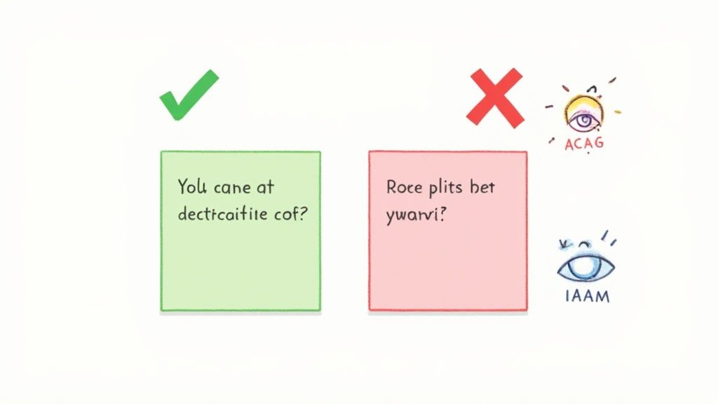
Never Rely on Color Alone
This is one of the golden rules of accessibility. Never, ever use color as the only method for communicating something important. Imagine a user filling out a form, and the only indicator of an error is the input field’s border turning red. For someone with red-green color blindness, that error might as well be invisible.
The better, more professional approach is to layer your visual cues.
- Add an icon: A small warning symbol or a checkmark provides an instant signal that doesn't depend on color.
- Use text labels: Spell it out. A simple message like "Error: Email is required" next to the field leaves no room for confusion.
- Change text weight: Making error text bold can also help it pop.
When you combine color with icons, text, and other visual indicators, you’re making sure your message gets through to the widest possible audience. This kind of thoughtful, multi-layered communication is the hallmark of truly user-centered design.
A Practical Workflow for Applying Color
Theory is great, but how do you actually put it into practice? Let's bridge the gap between knowing the rules and making them work for you. Bringing all these concepts together into a repeatable process is the key to applying color theory consistently and effectively.
A fantastic starting point for this is the 60-30-10 rule.
This simple framework, borrowed from interior design, gives you a clear and balanced structure for your palette. It's a tried-and-true method for making sure your design feels harmonious and professional, preventing any single color from completely overwhelming the user.
The 60-30-10 rule isn't a strict command but a powerful guideline. It provides a visual hierarchy that naturally guides the user's eye, making your interface more intuitive and easier to process at a glance.
Think of it like a recipe: 60% of your design will be your primary or dominant color, which is often a neutral. 30% is your secondary color, used to create contrast and visual interest. The final 10% is your accent color—a bold, high-contrast hue saved for your most important elements, like calls-to-action.
Building Your Palette Step-by-Step
Let's walk through a common workflow that uses this rule as its foundation. This process will take you from the big picture of your brand identity down to the fine details of your user interface.
-
Establish Your Primary (60%) Color: This is your foundation. It’s often dictated by your brand identity and should set the overall mood you're going for. Neutrals like light grays, off-whites, or even dark tones work beautifully here because they set the stage without stealing the show.
-
Select a Secondary (30%) Color: Using your chosen color harmony (like analogous or triadic), pick a color that complements your primary choice. This is the color you'll use for secondary elements like subheadings, active states, or informational panels.
-
Define Your Accent (10%) Color: This is your "action" color. A complementary or split-complementary choice is often perfect here. You want to reserve it for things like buttons, key links, and notifications to ensure they pop off the screen and grab attention.
As part of any professional workflow, it's crucial to make sure your monitor is calibrated for color accuracy. This ultimate guide to monitor calibration and display settings is a really helpful resource for getting that right. After all, you want to be sure the colors you so meticulously choose are what your users actually see.
Finally, modern software can seriously speed up this whole process. You can explore some of the best web design tools to find palette generators and accessibility checkers that fit right into your workflow.
Unpacking Common Color Theory Questions
Putting color theory into practice always sparks a few questions. I hear them all the time. Let's walk through some of the most common ones to clear things up and help you design with more confidence.
"How Many Colors Should I Actually Use?"
This is probably the number one question I get. While there's no single magic number, a great rule of thumb is to stick to three to five colors for a clean, professional feel. Any more than that, and things can get chaotic fast.
This usually breaks down into:
- A primary color (your main brand color)
- A secondary color (to support the primary)
- One or two accent colors (for things you want to pop)
"What's the Best Color for a CTA Button?"
Everyone wants to know the secret to the perfect call-to-action button. But the honest answer isn't a specific color like "red" or "green." The best color is simply the one that stands out the most.
It all comes down to contrast. Your CTA needs to be the most visually compelling thing on the page, so it should be an accent color that doesn't have to compete with anything else around it. You want it to be an unmissable target.
The most effective color palette isn't necessarily the most complex one. It's the one that creates a clear visual hierarchy, guides the user's attention, and serves the website's ultimate goals with clarity and purpose.
"Where Do I Even Start Choosing a Color?"
Staring at a blank color wheel can be intimidating. The best strategy is to forget the wheel for a second and start with your brand's core identity.
What's the personality? The emotion you want to evoke? Your primary color should flow directly from that. Once you nail that foundational color, you can use the harmony rules we've discussed to build out a supporting palette that feels intentional and truly cohesive.
Ready to build stunning web interfaces with a professional touch? Magic UI offers a library of over 50 customizable blocks and 150+ free animated components built with modern tech. Create beautiful landing pages in minutes.