A search input with an icon is way more than just a bit of visual flair; it's a powerful signpost that helps users find their way. When you add a simple magnifying glass, you turn a plain text box into a search tool that everyone instantly recognizes. This little touch lowers the mental effort required and makes your entire interface feel more intuitive.
Why an Icon Supercharges Your Search Input
Putting an icon inside a search bar is a classic design pattern for a very good reason. It immediately tells you what the element does, no label or placeholder text required. This small addition makes the search function pop, which is a huge deal for keeping users engaged and helping them navigate.
The magnifying glass is the universal symbol for "search." Everybody gets it. That instant recognition means people don't waste precious milliseconds trying to figure out what to do—they just know. It's a perfect example of how a small, thoughtful design choice can lead to a much smoother user journey.
The Impact of Icons on User Performance
The benefits here aren't just a gut feeling; there's data to back it up. A pivotal 2021 study found that interfaces combining icons with text labels gave user performance a serious boost. In fact, users found what they were looking for 23% faster and made 18% fewer errors compared to text-only options.
This data really drives home a core UX principle: visuals are incredibly effective at improving both speed and accuracy. For a search input, that translates directly into a better experience and more people successfully finding what they need.
A well-placed icon acts as a silent guide, telling users, "This is where you find what you need." It removes ambiguity and builds user confidence from the very first interaction.
The Broader Role of Effective Search
Just look at the search bar on Google's homepage—it's front and center, complete with its unmistakable icon.
This design choice highlights just how critical search is as a primary action, a lesson that applies to almost any website or app. Getting a handle on the vital role of search in user experience can really put the importance of optimizing your search input into perspective. A great search function can completely change how users find content, discover products, and move through your platform.
Building a Search Input with HTML and CSS
Before you can get fancy with frameworks, it’s crucial to understand how to build a polished search input with icon from the ground up. Nailing the core HTML and CSS gives you total control and ensures your component is accessible and easy to maintain. Think of it as building a strong foundation.
We'll start with semantic HTML. It’s tempting to just throw a <div> and an <input> on the page, but wrapping everything in a <form> tag is a non-negotiable. This gives you browser-native behaviors, like submitting on Enter, and provides essential context for screen readers.
Structuring the Component
The basic anatomy is simple: a container that holds the input field and its icon. This container is the key to positioning everything correctly.
Here’s the breakdown:
- A
divwrapper: This element will act as our positioning anchor. By setting it toposition: relative, we can place child elements precisely within it. - A
<label>: Every input needs a label for accessibility. We’ll hide it visually but keep it available for assistive tech. - An
<input>field: The star of the show where users will type. - An icon: This is usually an SVG that sits inside the wrapper alongside the input.
Getting this structure right from the start means your component will be functional and accessible before you’ve written a single line of CSS.
Proper semantic HTML isn't just a best practice; it's the bedrock of accessibility. A well-structured form with correctly associated labels ensures that users relying on screen readers can navigate your search functionality just as easily as visual users.
Styling with CSS Positioning
Now for the fun part. The real magic comes from the CSS relationship between the parent wrapper and the icon. We give the wrapper position: relative, which creates a bounding box for any children with position: absolute.
This lets us pin the icon exactly where we want it. We'll use top, left, and transform to get it perfectly centered vertically. Of course, this means the icon will sit on top of the input field, so we just need to add some left padding to the <input> to make sure the user's text doesn't slide underneath it.
Let's see how it all comes together in a complete example.
<div className="search-container">
<label htmlFor="main-search" className="sr-only"> Search </label>
<input
type="search"
id="main-search"
name="search"
placeholder="Search anything..."
/>
<svg
className="search-icon"
xmlns="http://www.w3.org/2000/svg"
width="16"
height="16"
viewBox="0 0 24 24"
fill="none"
stroke="currentColor"
strokeWidth="2"
strokeLinecap="round"
strokeLinejoin="round"
>
<circle cx="11" cy="11" r="8"></circle>
<line x1="21" y1="21" x2="16.65" y2="16.65"></line>
</svg>
</div>.search-container {
position: relative;
width: 300px;
}
.search-icon {
position: absolute;
left: 12px;
top: 50%;
transform: translateY(-50%);
color: #9ca3af; /_ A neutral gray color _/
}
input[type='search'] {
width: 100%;
padding: 10px 10px 10px 40px; /_ Left padding makes space for the icon _/
border: 1px solid #d1d5db;
border-radius: 8px;
font-size: 16px;
outline: none;
transition: border-color 0.2s;
}
input[type='search']:focus {
border-color: #3b82f6; /_ Blue focus ring _/
box-shadow: 0 0 0 3px rgba(59, 130, 246, 0.3);
}
/_ For screen readers _/
.sr-only {
position: absolute;
width: 1px;
height: 1px;
padding: 0;
margin: -1px;
overflow: hidden;
clip: rect(0, 0, 0, 0);
white-space: nowrap;
border-width: 0;
}This code gives you a clean, accessible search input with icon, complete with intuitive focus states and a properly handled label. It's a reliable pattern that you can use anywhere.
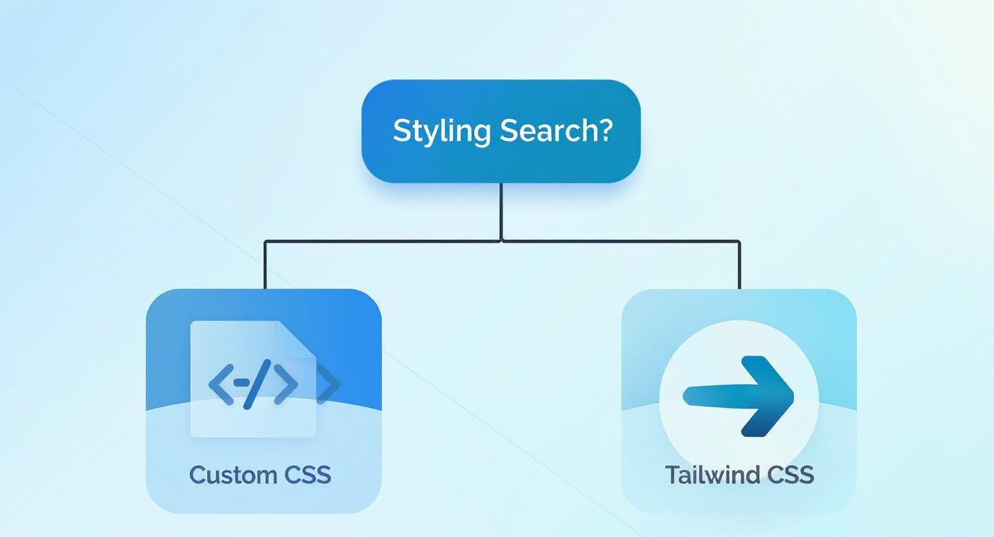
Modern Styling with Tailwind CSS
While plain CSS gives you total control, a utility-first framework like Tailwind CSS can seriously speed things up when building a search input with an icon. Instead of juggling custom stylesheets, you apply pre-built classes directly in your HTML. The result? Faster, more consistent styling.
This approach also keeps your markup and styles in the same place, making components much easier to decipher and maintain down the road. You won't have to go digging through separate CSS files just to figure out what styles are affecting an element.
This little decision tree visualizes the two main paths you can take.
As the flowchart suggests, while custom CSS is powerful for fine-grained control, Tailwind often provides a much smoother workflow, especially in modern, component-driven development.
Setting Up the Structure with Utility Classes
Let's refactor our previous HTML using Tailwind. The basic idea is identical—a relative parent containing an absolutely positioned icon. The difference is we achieve this with simple utility classes instead of writing custom CSS rules.
To get the alignment just right, we'll lean on flexbox utilities. By adding flex and items-center to the container, any child elements will be vertically centered automatically, which makes positioning the icon a breeze.
If you're new to the framework, our guide on how to install and set up Tailwind CSS will get you up and running in minutes.
With Tailwind, you're essentially composing a design directly in your HTML. This shift in mindset can feel strange at first, but it quickly becomes second nature and dramatically speeds up the process of building and iterating on UIs.
Implementing the React MDX Example
Translating this into a React component is a piece of cake. We just need to swap the class attribute for className and embed the SVG right into the JSX. This keeps the component totally self-contained and ready for any modern JavaScript project.
Here's how you can build a sleek search input with an icon using Tailwind CSS in a React environment.
function SearchInput() {
return (
<div className="relative w-full max-w-xs">
<label htmlFor="tailwind-search" className="sr-only">
Search
</label>
<div className="pointer-events-none absolute inset-y-0 left-0 flex items-center pl-3">
<svg
className="h-5 w-5 text-gray-400"
xmlns="http://www.w3.org/2000/svg"
viewBox="0 0 20 20"
fill="currentColor"
aria-hidden="true"
>
<path
fillRule="evenodd"
d="M9 3.5a5.5 5.5 0 100 11 5.5 5.5 0 000-11zM2 9a7 7 0 1112.452 4.391l3.328 3.329a.75.75 0 11-1.06 1.06l-3.329-3.328A7 7 0 012 9z"
clipRule="evenodd"
/>
</svg>
</div>
<input
id="tailwind-search"
name="search"
type="search"
placeholder="Search..."
className="block w-full rounded-md border-0 bg-gray-100 py-2 pr-3 pl-10 text-gray-900 ring-1 ring-gray-300 ring-inset placeholder:text-gray-400 focus:ring-2 focus:ring-blue-500 focus:ring-inset sm:text-sm"
/>
</div>
)
}This snippet is all you need. Notice how state variants like focus: are handled inline, making the styling logic immediately obvious. This kind of maintainability is a huge reason why so many developers gravitate toward utility-first frameworks for building robust component libraries.
When you move from static HTML and utility classes to a component-based framework like React, you unlock the ability to build a truly dynamic and reusable search input with an icon. Instead of copying and pasting the same markup over and over, we can build a single, intelligent component, configure it with props, and drop it anywhere in our app.
This whole approach is about building for scale. A good React component encapsulates its own logic, state, and styling, which makes it far easier to manage, test, and maintain down the road. For our search input, this means we can neatly handle its value, user interactions, and even its appearance through a clean, declarative API.
Here's a great video walkthrough of the process:
Managing State with the useState Hook
To make our search input truly interactive, the first thing we need to do is manage its state. In a functional React component, the useState hook is the perfect tool for the job. It lets us create a state variable to hold the current value of the input field.
As a user types into the input, we’ll capture that onChange event and use the state's setter function to update the value in real-time. This is the core of what makes React "reactive"—our component always knows what the user has entered, allowing us to immediately filter data or show search suggestions.
Defining Props with TypeScript
To make our component genuinely reusable and developer-friendly, we need to define a clear contract for how it's meant to be used. This is where TypeScript really shines. By creating an interface for our component's props, we get type safety and fantastic autocompletion in our code editor.
For our SearchInputProps interface, we might include:
initialValue: An optional string to set a default search query.placeholder: The text to display when the input is empty.onSearchChange: A callback function that fires whenever the input value changes.icon: AReact.ReactNodetype, which allows us to pass in any SVG or icon component.
This setup makes the component both flexible and predictable. Developers know exactly which props to pass and what types they should be, which drastically cuts down on bugs and guesswork. Following patterns like this is crucial, and you can dive deeper into them in our guide on React component best practices.
Using TypeScript to define your component's API isn't just about catching errors early. It's about creating a better developer experience. A well-typed component is self-documenting, making it much easier for your team to understand and use correctly.
Building the Reusable Component
Alright, let's put all the pieces together. We'll create a functional component called SearchInput that accepts the props we just defined. Inside, we’ll use the useState hook to manage the input's value and wire it up to the onChange event handler. The icon, passed in as a prop, will be rendered right alongside the input field using the same absolute positioning techniques we covered earlier.
Here’s a practical, production-ready example that combines React, TypeScript, and Tailwind CSS.
import React, { useState } from "react"
// Define the component's props with TypeScript
interface SearchInputProps {
icon: React.ReactNode
placeholder?: string
onSearchChange: (value: string) => void
}
const SearchInput: React.FC<SearchInputProps> = ({
icon,
placeholder = "Search...",
onSearchChange,
}) => {
const [query, setQuery] = useState("")
const handleChange = (event: React.ChangeEvent<HTMLInputElement>) => {
const newValue = event.target.value
setQuery(newValue)
onSearchChange(newValue)
}
return (
<div className="relative w-full max-w-sm">
<div className="pointer-events-none absolute inset-y-0 left-0 flex items-center pl-3">
{icon}
</div>
<input
type="search"
value={query}
onChange={handleChange}
placeholder={placeholder}
className="block w-full rounded-lg border border-gray-300 bg-gray-50 p-2.5 pl-10 text-sm text-gray-900 focus:border-blue-500 focus:ring-blue-500"
/>
</div>
)
}
export default SearchInputAnd just like that, we have a self-contained component ready to be dropped into any project. It provides a consistent and dynamic search input with an icon wherever it's needed, without any duplicated code.
Comparison of Search Input Implementation Methods
To wrap things up, let's compare the three approaches we've covered. Each method has its own trade-offs, and the best choice really depends on your project's specific needs, scale, and tech stack.
| Feature | HTML/CSS | Tailwind CSS | React Component |
|---|---|---|---|
| Setup Speed | Very fast, minimal setup required. | Fast, requires Tailwind setup but is quick. | Slower, requires React environment & setup. |
| Reusability | Low. Requires copy-pasting HTML and CSS. | Moderate. Utility classes are reusable. | High. Encapsulated and reusable via props. |
| Maintainability | Difficult. Changes must be made everywhere. | Better. Changes are managed in one place. | Excellent. Logic and styles are self-contained. |
| Interactivity | Low. Requires separate JavaScript. | Low. Still needs JS for state management. | High. Built-in state management with hooks. |
| Best For | Simple static sites, prototypes. | Projects already using Tailwind, rapid UI dev. | Complex applications, design systems, large teams. |
This table should give you a clear picture of when to reach for each tool. While plain HTML/CSS is great for a quick mockup and Tailwind excels at rapid styling, building a proper React component is the way to go for any application that needs to be scalable and easy to maintain over time.
Advanced Customizations and UI Patterns
Once you've got a solid, reusable component, the real fun begins. Now we can explore some more advanced UI patterns that make a search input with icon not just functional, but genuinely enjoyable to use. It's often the small enhancements that have the biggest impact on the user experience, turning a standard element into something that feels truly polished.
Moving beyond the basics is where you start to refine the interaction. Simple additions like a clear button or subtle animations can dramatically improve usability.
Shifting the Icon to the Right
While the left-aligned search icon is the convention, don't be afraid to break the mold. Moving the icon to the right can be a smart design choice, especially in layouts where it needs to feel more like a "submit" button, signaling the primary action after a user has finished typing.
The implementation is a simple tweak—just adjust the positioning classes. In Tailwind CSS, you'd swap left-0 pl-3 for right-0 pr-3. But this isn't just a code change; it's a UX decision. You need to consider user expectations and the icon's design. Research has actually shown that simple, horizontally structured icons can be located up to 28% faster than more complex, enclosed ones. The visual structure really does matter.
Implementing a Clear Button
Here’s one of my favorite user-friendly additions: a "clear" button. It's typically an "X" icon that only pops up inside the input when there's text. This little feature gives users a quick, one-click way to reset their search query without having to mash the backspace key.
Hooking this up in React is pretty straightforward. You'll want to conditionally render the clear button based on the input's state.
- Condition: Render it only if
query.length > 0. - Action: When clicked, the button should trigger a handler that resets the state (
setQuery('')). - Placement: Pop it on the right side of the input. Just make sure to add enough padding (like
pr-10) so the text doesn't awkwardly overlap both the search and clear icons.
This tiny feature is a perfect example of a thoughtful micro-interaction that saves user effort. If you're looking for more ideas on smart component design, check out our guide on common user interface design patterns.
Adding Subtle Focus Animations
Animations can add a layer of polish that makes an interface feel alive and responsive. For a search bar, a subtle expansion animation on focus is a fantastic way to draw attention to the active input without being distracting. You can pull this off with simple CSS transitions.
By applying a
transitionproperty to the input'swidthand ascaletransform to its focus state, you can create a smooth, satisfying effect. For example, usingfocus:w-fullon an input with a smaller initial width orfocus:scale-105can provide just enough visual feedback to feel great.
These advanced customizations are about much more than just looking cool; they're about creating an intuitive and efficient experience. When you start combining different patterns—like a right-aligned icon, a conditional clear button, and focus animations—you can build a search input with icon that is both powerful and a delight to use.
Looks great on the surface, but is it usable by everyone? A sharp-looking search input with an icon is only half the job. Making sure it’s accessible and intuitive is what separates a good component from a great one. This is where we nail down the accessibility (a11y) and user experience (UX)—the details that make or break your design.
It all starts with clean, semantic HTML. Every single input needs an associated <label>. You might be tempted to hide it for a cleaner look, and that's fine, but it must exist in the DOM. Screen readers rely on it to tell users what the input field is for.
Getting the Core Accessibility Right
When you do hide a label visually, ARIA attributes are your best friend. Slapping an aria-label="Search" directly onto the input element gives screen readers the context they need. It’s a tiny addition that makes a massive difference for anyone using assistive tech.
Next up: keyboard navigation. This is non-negotiable. Anyone should be able to navigate your site without a mouse. For our search input, that means a user must be able to:
- Tab directly to the search input.
- Type their query without any weird focus traps.
- Hit the Enter key to submit the form.
This simple flow ensures you aren't putting up a wall for users with motor disabilities. If you want to go deeper, referencing an ultimate website accessibility checklist is a great way to cover all your bases.
Accessibility isn't just a box to check off at the end of a project. It’s a core design principle that shows respect for every user and, frankly, leads to a better product for everyone.
Little Things That Elevate the User Experience
With accessibility handled, let's talk UX. A great user experience feels effortless. One of the easiest wins here is using an icon people already know. Why a magnifying glass? Because research shows that users recognize familiar icons like it 34% faster than abstract ones. Sticking to conventions just works. You can dive into the full study on icon recognition and search performance if you're curious.
Think about the user’s entire interaction. The search input has to be fully responsive, looking and working just as well on a tiny mobile screen as it does on a huge desktop monitor. And on mobile, make sure those touch targets are big enough to tap without frustration.
Finally, give people clear feedback. What happens after they hit Enter? A loading spinner, a subtle animation—anything that says, "I got your request and I'm working on it." This kind of feedback prevents confusion and makes the whole experience feel polished and professional.
Tired of building from scratch? You can skip the manual labor and drop production-ready, accessible components right into your projects. Magic UI offers a library of beautifully crafted and fully animated components built with React, TypeScript, and Tailwind CSS.