
A well-designed sidebar for a website is more than just a navigation panel—it's a strategic asset. Think of it as a dedicated column, usually on the left or right, that offers up helpful info like nav links, ads, or related content without cluttering up the main view. When done right, it can seriously improve the user experience.
Why a Modern Sidebar Is Crucial for Your Website
Let's move beyond thinking of sidebars as simple navigation. A modern sidebar is a powerful tool for guiding user behavior and boosting engagement. When you get the implementation right, it feels less like an afterthought and more like a helpful co-pilot, anticipating what your users need and giving them shortcuts to valuable content.
It’s the difference between a user feeling lost on your site and feeling completely in control. A huge part of this is how a sidebar can enhance user experience and guide visitors, which can ultimately help to improve website conversion rates. This isn't just about looks; it's about smart design.
Aligning with Natural User Attention
People don't scan webpages randomly; their eyes follow predictable patterns. Research has shown that a massive 80% of users spend most of their time looking at the left side of a webpage. This makes the left-side sidebar prime real estate for your most important navigation links and calls-to-action.
By placing key elements here, you can directly influence user flow, lower bounce rates, and create a much more intuitive experience. And since over 57% of users now browse on their smartphones, a responsive sidebar that collapses or slides out is non-negotiable. It's essential for keeping your site functional and friendly on smaller screens, which is a major factor for Google's mobile-first indexing.
Choosing the Right Sidebar for Your Goal
Not all sidebars are built the same. The type you choose should directly support what you want your website to achieve, whether that's keeping users hooked on your content or simplifying navigation through a complex site. The two most common approaches are static and sticky sidebars.
- A static sidebar stays put as the user scrolls down the page. This works best for sites where the main content is the star of the show.
- A sticky sidebar, on the other hand, stays visible on the screen no matter how far you scroll. This is perfect for keeping key actions like a "Subscribe" button or a shopping cart summary always within reach.
This decision tree breaks it down nicely:
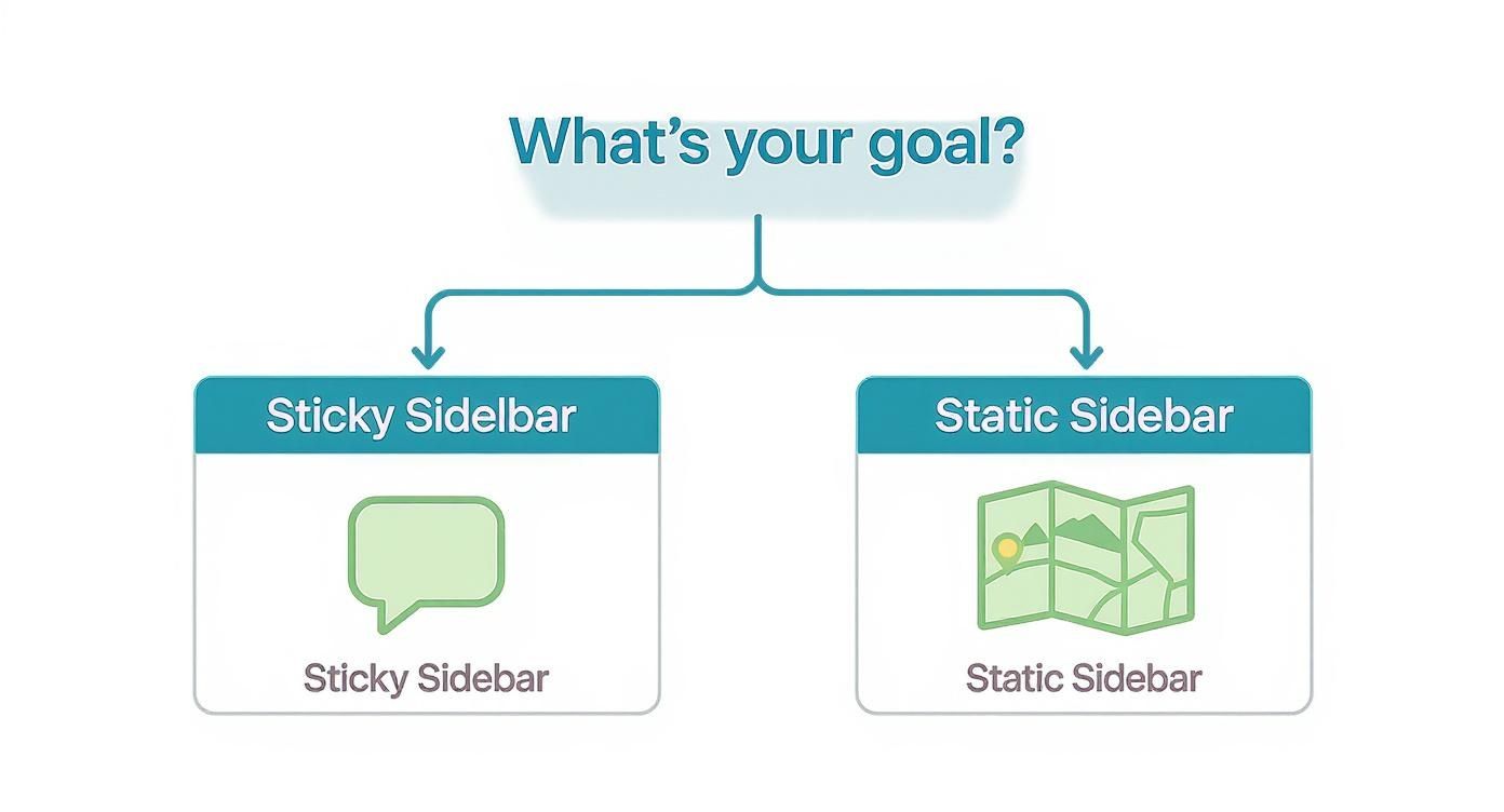
As you can see, if your goal is driving engagement, a sticky sidebar is your best bet. If you're focused on clear navigation, a static one is the way to go.
To help you decide, here’s a quick breakdown of the different sidebar types and where they shine.
Sidebar Types and Their Best Use Cases
| Sidebar Type | Primary Use Case | Desktop UX | Mobile UX | Best For |
|---|---|---|---|---|
| Static | Primary Navigation | Stays fixed at the top of the page content. Disappears on scroll. | Typically collapses into a hamburger menu or off-canvas drawer. | Blogs, documentation sites, corporate websites where content is the main focus. |
| Sticky | Persistent Actions | Remains visible on the screen as the user scrolls. | Often transforms into a sticky bottom bar or a floating action button. | E-commerce sites (cart summary), SaaS apps (key actions), lead-gen forms. |
| Off-Canvas/Drawer | Mobile Navigation | Can be used as a slide-out panel on wider screens for secondary info. | The standard for mobile. Slides in from the side when a menu icon is tapped. | Almost all responsive websites, especially those with extensive navigation menus. |
| Floating | Contextual Tools | Floats over the content, often movable by the user. | Can be adapted to a smaller, fixed position element. | Web applications, design tools, or sites with user-configurable interfaces. |
Ultimately, picking the right sidebar depends entirely on your site's purpose and how you want your users to interact with it.
A great sidebar minimizes friction. It makes key information available without interrupting the user's journey, which is why it often contains things like email sign-up forms, popular posts, or social media links. It’s all about providing value at just the right moment.
Think of your sidebar as an opportunity to declutter your UI while keeping essential tools accessible. By understanding user behavior and choosing the right implementation, you're setting the stage for a website that is not only functional but a genuine pleasure to use on any device.
Setting Up Your React and TypeScript Environment
To build a truly modern sidebar for a website, you need a solid foundation. That means starting with a clean, powerful, and scalable development environment. We'll be using a combination of React with TypeScript for type safety, Tailwind CSS for rapid styling, and Framer Motion for silky-smooth animations. I've found this stack to be the professional standard for building high-performance UIs.
The best place to start is by scaffolding a new React project. I almost always reach for a tool like Vite these days because its development server is incredibly fast, and it gives you an optimized build process right out of the box. TypeScript is non-negotiable for a project like this; it catches errors during development—not in production—and makes your components much easier to maintain as your project grows.
Installing Core Dependencies
With your project initialized, it's time to bring in the core styling and animation libraries. Tailwind CSS is essential for its utility-first approach, letting us design directly in our markup without ever leaving our component files. Framer Motion will handle all the complex animations, making our sidebar feel fluid and responsive to every interaction.
Fire up your terminal, navigate to your project's root directory, and run this to install Tailwind and its friends:
npm install -D tailwindcss postcss autoprefixer npx tailwindcss init -p
This sequence installs the necessary packages and then creates two crucial configuration files: tailwind.config.js and postcss.config.js. Getting these set up correctly is the key to letting Tailwind scan your component files and generate the right CSS. For a more detailed walkthrough, there's an excellent guide on how to install Tailwind CSS in your project that breaks down every step.
Configuring Tailwind and TypeScript
Now that the config files are in place, we need to tell Tailwind where to find our class names. You'll do this in tailwind.config.js by updating the content array. This is a critical step because it allows Tailwind to purge all unused styles during the production build, keeping your final CSS bundle as small as possible—a massive win for performance.
Pro Tip: When you set up your
contentpath intailwind.config.js, be as specific as possible. Pointing it directly tosrc/**/*.{js,jsx,ts,tsx}stops Tailwind from wasting time scanningnode_modules, which can really speed up your build process.
Next, let's give our tsconfig.json a quick look. While the defaults from Vite or Create React App are a decent start, enabling strict type-checking rules will save you countless headaches down the road. Make sure settings like "noImplicitAny": true and "strictNullChecks": true are enabled to enforce better code quality from day one.
Integrating Animation and UI Libraries
Alright, let's add the fun stuff: Framer Motion and a UI library to speed things up.
npm install framer-motion
Framer Motion gives you a set of simple yet incredibly powerful tools for animation. We'll lean on its motion components to create the slide-in and fade effects for our sidebar.
To really boost productivity, integrating a pre-built component library like Magic UI is a game-changer. It offers a collection of beautifully designed, pre-animated components built with the exact stack we're using—React, Tailwind CSS, and Framer Motion. This lets you focus on your sidebar's unique logic instead of reinventing the wheel on common UI patterns.
After running through these steps, you've got a professional-grade development environment ready to go. Your project is fully configured with:
- React and TypeScript for a robust, type-safe component structure.
- Tailwind CSS for efficient, utility-first styling.
- Framer Motion for smooth, declarative animations.
This powerful stack is the perfect launchpad for building a flexible, responsive, and visually impressive sidebar.
With our development environment ready to go, it’s time to build the heart of our application: a flexible and reusable sidebar for a website. The aim here isn't to create a one-off solution. Instead, we're building a modular piece of UI that you can drop into any project down the line. We'll get there by defining a solid structure, managing its state cleanly, and styling it with the power of Tailwind CSS.
The foundation of any great React component is a well-defined set of props. By using a TypeScript interface, we can enforce exactly what the <Sidebar> component needs to function. This simple step makes our code far more predictable and helps us sidestep common bugs. It turns our component into a reliable "black box"—you feed it the right data, and it just works.
Defining Component Props with TypeScript
First things first, let's outline the component's API. What information will our sidebar need from its parent to render correctly? We'll create a SidebarProps interface to establish this contract.
Our key properties will include:
isOpen: A boolean that controls whether the sidebar is visible. This gives the parent component total control over toggling it open or closed.onClose: A function that gets called when the user wants to close the sidebar, like clicking an overlay or hitting the escape key.children: This will be of typeReact.ReactNode, which is a fancy way of saying we can pass anything inside—from simple links to complex, nested components.
This structure gives us maximum flexibility. The sidebar itself doesn't need to know what content it holds; it just focuses on its one job: showing or hiding whatever it's given.
Structuring the Sidebar with JSX and Tailwind CSS
Now for the fun part: writing the JSX. We’ll lean on semantic HTML elements like <aside> for the main container and <nav> for navigation links. This isn't just a "nice-to-have"—it's crucial for accessibility and good practice.
Using Tailwind CSS lets us apply styles directly in our markup, keeping the component self-contained and easy to read at a glance. For instance, the main <aside> element might get classes like fixed inset-y-0 left-0 to pin it to the screen and bg-gray-800 text-white for a standard dark theme.
Here’s a simple structural outline to follow:
- Main Container (
<aside>): The root element holding everything. It’ll be positioned asfixedorabsolute, depending on your design. - Header Section: Usually holds a logo and a close button. This adds branding and gives users a clear way to dismiss the sidebar.
- Content Area (
children): This is the dynamic part where your navigation links, filters, or other components will live. - Footer Section: A great spot for secondary actions like "Settings" or "Log Out," keeping them neatly separated from the primary navigation.
By breaking the component into distinct sections—header, content, and footer—you create a logical and scalable structure. This makes it much easier to add or modify elements later without having to refactor the entire component.
Managing State with React Hooks
To bring the sidebar to life, we need to manage its state. While the isOpen prop will be handled by a parent component, we might need some internal state for other behaviors. The useState hook is perfect for this.
For example, a parent component would typically manage the open/closed state like this:
const [isSidebarOpen, setSidebarOpen] = useState(false)
return (
<div>
<button onClick={() => setSidebarOpen(true)}>Open Menu</button>
<Sidebar isOpen={isSidebarOpen} onClose={() => setSidebarOpen(false)}>
{/* Navigation links go here */}
</Sidebar>
</div>
)This pattern is called a controlled component. The parent has full authority over the sidebar's visibility, which makes state management crystal clear. Inside our sidebar, we can use the useEffect hook to handle side effects, like adding an event listener to close the sidebar when the "Escape" key is pressed. It's a small touch, but one that significantly improves keyboard accessibility.
If you want to dive deeper into building scalable UIs, exploring a guide on React component best practices can offer some incredibly valuable insights.
By combining a clean TypeScript interface, a logical JSX structure with Tailwind CSS, and smart state management via React hooks, we've built a seriously flexible and reusable sidebar. It’s not tied to any specific content, making it a perfect, adaptable solution for just about any web application. This foundational piece is now ready for us to build upon with responsive behaviors and smooth animations.
Implementing Responsive and Animated Behaviors
A static sidebar just doesn't cut it anymore. For a truly professional sidebar for a website, it needs to adapt fluidly to any device and respond to user interactions with grace. This is where we bring our component to life, making it smart enough to know when to be a full panel, a collapsed icon bar, or a slide-out drawer.
These dynamic behaviors aren't just for show; they're essential for usability. Someone on a tiny phone screen has completely different needs than a user on a widescreen desktop monitor. Our job is to anticipate those needs and build a seamless experience across the board.
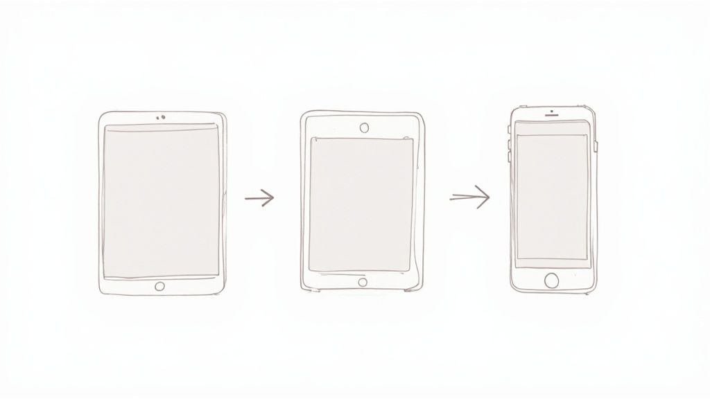
Making the Sidebar Responsive with Tailwind CSS
This is where a utility-first framework like Tailwind CSS absolutely shines. It makes responsive design feel intuitive. We can define different styles for specific screen sizes just by adding prefixes like md: (for medium screens) and lg: (for large screens) directly into our class names.
Let's game out the behavior we're aiming for:
- Mobile (default): The sidebar is hidden completely off-screen, ready to slide in as an overlay.
- Tablet (
md:): It collapses into a narrow bar showing only icons. - Desktop (
lg:): The sidebar fully expands to show both icons and text labels.
We can pull this off by conditionally applying width classes. For example, a div might get classes like w-16 md:w-20 lg:w-64. Just one line of code tells the browser exactly how to adjust the sidebar's width as the viewport changes. It’s an incredibly clean, declarative way to build UIs.
To handle the slide-out behavior on mobile, we can use something like transform -translate-x-full md:translate-x-0 on the main container. This tucks it away off-screen by default but snaps it into place on medium screens and larger.
Creating a Custom Hook for Screen Size Detection
While CSS handles the visual shifts, sometimes our component’s logic needs to know the screen size. Maybe we want a button to say "Menu" on mobile but shrink to just an icon on a tablet. For that, a custom React hook is the perfect tool.
We can build a useBreakpoint hook that listens to the window's resize event and tells us the current breakpoint (e.g., 'sm', 'md', 'lg'). This keeps all our responsive logic in one place, so our components stay clean and focused. With this hook, we can conditionally render entire elements or just change a few props, making our component as smart as it is stylish.
A custom
useBreakpointhook is a reusable asset that pays dividends across your entire application. By abstracting away the rawwindow.addEventListenerlogic, you create a simple, declarative API for any component that needs to adapt its behavior to screen size.
Adding Fluid Animations with Framer Motion
With our responsive structure locked in, it's time to add that layer of polish with animations. A sudden, jarring change can be disorienting. Smooth transitions give users crucial visual feedback, making the whole interface feel more intuitive and professional.
My go-to library for this is Framer Motion. It’s ridiculously powerful yet simple to use. We can just wrap our sidebar in a motion component and use the animate prop to control its state. For the mobile drawer, animating the x property creates that slick slide-in effect.
Think about the sidebar's toggle button, too. When clicked, we want the hamburger icon to morph into a close icon ('X'). Framer Motion's AnimatePresence and variants make complex animations like this surprisingly straightforward.
Here are a few key animations we should implement:
- Slide-In/Out: For the mobile view, animate the sidebar's position from off-screen to on-screen.
- Fade-In/Out: When the mobile drawer opens, a semi-transparent overlay should gently fade in over the main content to focus the user's attention.
- Icon Rotation: Animate the little chevron icons next to dropdown menus to rotate smoothly when they're opened and closed.
These small details guide the user's eye and confirm that their actions have registered. To dive deeper into creating these kinds of engaging user experiences, check out our guide on CSS animation on scroll. By combining smart responsive design with thoughtful animation, our sidebar for a website goes from being a simple box to a dynamic, delightful part of the user interface.
Getting Accessibility and Performance Right
Look, building a slick, responsive sidebar is a great start, but it's only half the job. A truly professional component needs to be accessible to everyone and load faster than they can blink. This is where we talk about two absolute must-haves in modern web dev: accessibility (or a11y) and performance.
If you drop the ball on either, you risk creating a frustrating experience, tanking your user engagement, and even hurting your SEO. The cool thing is, they often go hand-in-hand. A fast-loading site is inherently more accessible to folks on spotty connections, and a well-structured, accessible site is usually easier for browsers to render quickly.
Let’s dig into how to get both of these right for our sidebar.
Making Your Sidebar Genuinely Accessible
Web accessibility is all about making sure people with disabilities can use your site without barriers. For a dynamic component like a slide-out sidebar, this means we need to be thoughtful in our implementation, especially for users who rely on screen readers or navigate with a keyboard.
The first, and easiest, win is using semantic HTML. Wrap your sidebar in an <aside> element and the navigation links in a <nav> tag. This simple step gives assistive technologies immediate context about what they're dealing with. But we need to go further and use ARIA (Accessible Rich Internet Applications) attributes to communicate the sidebar's state.
Here are the key ARIA attributes you'll need:
aria-hidden: Set this totruewhen the sidebar is closed. When it's open, switch it tofalse. This tells screen readers to either ignore it or pay attention to it.aria-controls: This goes on your toggle button. Its value should be the ID of your sidebar container, creating a clear, programmatic link between the trigger and the panel it controls.aria-expanded: Also on the toggle button, this attribute should betruewhen the sidebar is open andfalsewhen it's closed, announcing the state change.
Getting these attributes right is the difference between a confusing mess and a smooth experience for screen reader users.
Don’t Forget Keyboard Focus Traps
For anyone navigating with a keyboard instead of a mouse, focus management is everything. When that sidebar slides open, you absolutely must programmatically shift the user's focus inside it. The target should be the first interactive element, like the "close" button or the first link.
More importantly, you have to create what’s called a "focus trap." This is non-negotiable. It means that as a user hits the Tab key, their focus should cycle only through the links and buttons inside the sidebar. It shouldn't be able to escape to the main page content hiding underneath. And when the sidebar closes? Focus must snap right back to the button that opened it.
A proper focus trap is a deal-breaker for accessible modals and off-canvas elements. Without it, keyboard users get stuck. They can't interact with the sidebar or get back to the main content, which essentially makes your site unusable for them.
Optimizing for Blazing-Fast Performance
A laggy sidebar will drag down your whole page, hurting your Core Web Vitals and testing your users' patience. We want it to feel instantaneous. Thankfully, our tech stack gives us some great tools for this.
One of the biggest wins comes from using Tailwind CSS's JIT (Just-In-Time) compiler. It’s on by default and works by scanning your files to generate only the CSS classes you’re actually using. The result is a tiny CSS bundle, which means much faster load times.
Another powerful technique is code-splitting. Let's say your sidebar has some heavy components, like high-res images or a complex chart, that aren't needed right away. You can lazy-load them. Using React.lazy() and Suspense, you can tell React not to bother loading that code until the sidebar is actually opened by the user. This can make a huge difference in your initial page load speed.
The whole concept of the sidebar for website design has shifted over the years, from static link lists to dynamic, interactive modules. You can see this evolution in platforms like WordPress, which powers over 43% of all websites and heavily relies on sidebars for widgets. This matters because websites with personalized sidebar content see better engagement and lower bounce rates—a big deal when the average user's attention span is just 8 seconds. With mobile browsing now accounting for over 63% of internet traffic, a responsive, fast-loading sidebar isn’t just nice to have; it’s essential for both UX and SEO.
Of course, performance goes beyond just one component. To make sure your entire site is up to snuff, it's worth following a comprehensive checklist for on-page SEO.
Sidebar FAQs: Getting the Details Right
Even with the best tutorials, you're bound to hit a few head-scratchers when building a sidebar for your website. Getting these core decisions right from the jump can save you a world of refactoring pain down the line. Let's tackle some of the most common questions developers and designers run into.
These aren't just minor stylistic choices, either. Deciding on placement, size, and mobile behavior directly shapes how people navigate your site, and it can make or break the user experience.
Left vs. Right: Where Does the Sidebar Go?
For any language read left-to-right (like English), the main navigation sidebar almost always belongs on the left. This isn't an arbitrary rule; it's baked into user psychology. We've been trained for years to look to the left side of a screen for primary navigation. It's prime real estate.
So, what about the right side? A right-hand sidebar is perfect for secondary, contextual information. It’s the ideal spot for things that supplement the main content, but aren't the primary way to get around.
Think of it as the place for:
- Related articles or product suggestions
- A shopping cart summary
- Context-specific filters or actions
- Advertisements
Stick your main navigation on the left to meet user expectations. It reduces their mental effort and helps them find what they need, fast.
What’s the Ideal Width for a Website Sidebar?
There's no magic number here, but a solid range for a desktop sidebar is between 240px and 320px. This gives you enough breathing room for navigation links that use both icons and text, without making things feel cramped.
The real key is balance. Your sidebar needs to be functional and spacious, but it should never fight for attention with your main content. If the sidebar is too wide, it makes the primary content area feel like an afterthought.
Always, always test your layout on different screen sizes. What looks perfect on your big monitor might completely overwhelm a smaller laptop screen. A smart, responsive design that adjusts the width based on the viewport is always the way to go.
How Do I Make My Sidebar Work on Mobile?
This one is non-negotiable. On a mobile device, screen space is everything, so a permanently visible sidebar is a huge no-go. The standard, most effective solution is to convert it into a collapsible "drawer" or "off-canvas" menu.
You’ve seen this pattern a million times: the sidebar is hidden by default, and a tap on a "hamburger" icon slides it into view, usually overlaying the main content. This approach just works.
- It Maximizes Content Space: The entire screen is dedicated to what the user came for, which is critical on a small display.
- It Keeps Navigation Handy: All your links and options are just one tap away, but they stay out of sight until needed.
- It’s an Established Pattern: Users instantly know how this works. There's no learning curve, making it completely intuitive.
Building this behavior is a cornerstone of modern responsive design. It ensures your site feels professional and is actually usable on any device.
Ready to build stunning, high-performance web interfaces without the hassle? Magic UI offers a massive library of over 150 free, open-source animated components built with React, TypeScript, and Tailwind CSS. Create beautiful landing pages in minutes, not weeks. Check out our components and templates at https://magicui.design.