
Pairing Tailwind CSS with React has become the go-to strategy for building modern, component-driven user interfaces. It’s a combination that just makes sense, letting you style components directly inside your JSX. This keeps your logic, markup, and styling all bundled together in one predictable, easy-to-manage file.
The Perfect Match for Modern Web Development
The real magic behind Tailwind and React is how well their core ideas complement each other. React is all about breaking down big, complex UIs into small, reusable components. Each component is a self-contained unit with its own state and logic, which makes your app far easier to scale and debug down the line.
This is exactly where Tailwind’s utility-first approach shines.
Instead of juggling separate CSS files and fighting with class name collisions or specificity issues, you apply simple, pre-defined utility classes right onto your elements. This means your styles live right alongside your component's markup. When you look at a React component, you see the full picture—its structure, its behavior, and its appearance—all at once.
Why So Many Developers Are on Board
The benefits aren't just theoretical; you feel them almost immediately. The biggest win is a massive productivity boost. You stop switching contexts between your component files and your stylesheets, which means you can prototype and build features much faster.
- Build Faster: You can create complex, bespoke designs without ever writing a single line of custom CSS.
- Maintain with Confidence: Because styles are scoped locally to each component, you can make changes without worrying about accidentally breaking something else in your app.
- Stay Consistent: Your
tailwind.config.jsfile acts as a single source of truth for your design system, ensuring a consistent look and feel across the entire project.
It's no surprise this combination has seen explosive growth. Tailwind now pulls in over 20 million weekly NPM downloads, and the State of CSS survey found that about 75% of developers who give it a try end up sticking with it for their projects. If you're curious about the bigger picture, it's worth reading up on some modern web design trends.
Choosing the right tools is a foundational decision for any project. Before you commit, thinking through how to choose the right tech stack is a critical step that will pay dividends in scalability and long-term maintainability.
Configuring Your React Development Environment
Getting Tailwind CSS hooked into your React project is a pretty smooth process these days, especially with modern tools like Vite and frameworks like Next.js streamlining the setup. The exact steps vary a bit depending on your environment, so let's walk through how to get up and running with these two popular choices.
Think of it like this: React gives you the component-based structure, and Tailwind provides the styling language to bring those components to life. They work together, not against each other.
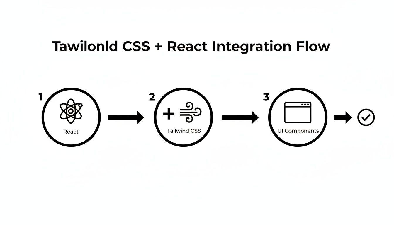
This flow shows that Tailwind isn't some separate entity; it's a powerful styling layer that integrates directly into your component ecosystem.
Setting Up Tailwind with Vite and React
Vite has quickly become a developer favorite, and for good reason—its near-instant server start and Hot Module Replacement (HMR) are game-changers. Luckily, integrating Tailwind is just as quick.
After spinning up a new Vite project with React, you'll need to pull in a few key dependencies. These are the workhorses that make the magic happen:
tailwindcss: The core framework itself.postcss: A tool that transforms your CSS with JavaScript plugins.autoprefixer: A PostCSS plugin that automatically adds vendor prefixes to your CSS, so you don't have to worry about browser compatibility.
You’ll run one command to install them, then another to generate your config files. This will create tailwind.config.js and postcss.config.js right in your project's root. These files are basically the command center for your entire styling setup. For a deeper dive into each step, our complete guide on how to install Tailwind CSS breaks down the fundamentals.
Next up, you have to tell Tailwind where to look for your classes. This is probably the most critical step for keeping your production build lean. Inside tailwind.config.js, you’ll update the content array to point to all your template files—your HTML, JSX, and TSX files.
/** @type {import('tailwindcss').Config} */
export default {
content: ["./index.html", "./src/**/*.{js,ts,jsx,tsx}"],
theme: {
extend: {},
},
plugins: [],
}This config tells Tailwind's Just-In-Time (JIT) engine to scan those specific files. It finds every utility class you've used and includes it in the final CSS bundle. Anything you haven't used gets purged. It's an incredibly efficient system that keeps your final stylesheet tiny.
Finally, you’ll pop open your main CSS file (usually index.css) and add three core Tailwind directives. These are responsible for injecting Tailwind’s base styles, component classes, and utility classes into your stylesheet during the build process.
These three lines—
@tailwind base;,@tailwind components;, and@tailwind utilities;—aren't just CSS. They're placeholders that PostCSS processes and replaces with all the generated styles. This is how your simple utility classes are transformed into highly optimized, browser-ready CSS.
Configuring Tailwind in a Next.js Project
With a production-focused framework like Next.js, the setup is even easier. When you fire up a new project with create-next-app, the installer will straight-up ask if you want to include Tailwind CSS from the get-go.
Just say "Yes." That's it.
The installer handles everything for you—it installs the right dependencies and creates perfectly configured tailwind.config.js and postcss.config.js files. The content array even comes pre-configured to scan the pages, components, and app directories, covering the standard Next.js project structure right out of the box.
If you're adding Tailwind to an existing Next.js project, the manual process is almost identical to the Vite setup. You'll install the same dependencies and generate the config files. The only real gotcha is making sure the content property in your tailwind.config.js correctly points to every file that contains your markup. A misconfigured path is the number one reason styles mysteriously don't show up.
React Framework Setup at a Glance
To quickly recap, here’s a high-level comparison of setting up Tailwind CSS with Vite versus Next.js. Both are excellent choices, but their approaches have subtle differences that might make one a better fit for your project's needs.
| Framework | Primary Dependencies | Key Configuration File | Best For |
|---|---|---|---|
| Vite | tailwindcss, postcss, autoprefixer | tailwind.config.js | Rapid prototyping, single-page applications, and projects where build speed is paramount. |
| Next.js | Included with create-next-app | tailwind.config.js (auto-generated) | Production-grade applications, server-side rendering (SSR), static site generation (SSG), and SEO-focused projects. |
Ultimately, both frameworks offer a fantastic developer experience. Next.js gives you a batteries-included setup with a single command, while Vite provides a lightning-fast, flexible environment that’s just as easy to configure manually. You can’t go wrong with either.
With your environment set up and ready to go, we can get into the real fun: building components. This is where Tailwind CSS in React truly shines. The utility-first approach fundamentally changes how you think about styling. You're no longer bouncing between CSS and JSX files; you're composing visual elements directly where they live.

Honestly, it feels less like writing CSS and more like snapping together LEGO bricks. You grab small, single-purpose utility classes—like flex for layout, p-4 for padding, or rounded-lg for border-radius—and combine them to build out complex, polished designs without ever leaving your component file.
Crafting a Responsive Card Component
Let's walk through a classic UI element: a responsive card. This is a perfect, real-world example of how quickly you can create something that looks great and adapts to different screen sizes. A solid grasp of responsive web design principles is helpful here, as Tailwind’s breakpoints are built right on top of these concepts.
We can kick things off with a simple container div. By applying classes for a shadow, rounded corners, and some padding, we can flesh out the basic card shape in seconds.
function ProductCard({ title, description, imageUrl }) {
return (
<div className="max-w-sm overflow-hidden rounded-lg bg-white shadow-lg">
<img className="w-full" src={imageUrl} alt={title} />
<div className="px-6 py-4">
<div className="mb-2 text-xl font-bold">{title}</div>
<p className="text-base text-gray-700">{description}</p>
</div>
</div>
)
}See how every style is declared right in the className prop? Classes like max-w-sm handle the width, shadow-lg adds that nice, subtle shadow, and font-bold takes care of the typography. This co-location makes the component completely self-contained and easy to understand at a glance.
Managing Readability and Conditional Styles
One of the first concerns developers have is that their JSX will get messy with long strings of utility classes. It’s a fair point, but the React ecosystem has some really elegant solutions.
For common, reusable elements like buttons or form inputs, the answer is abstraction. Instead of copy-pasting className="bg-blue-500 hover:bg-blue-700 text-white font-bold py-2 px-4 rounded" everywhere, you just create a dedicated <Button> component that encapsulates those styles. This keeps your application logic clean and your UI consistent.
When you need to apply styles based on state or props, libraries like clsx are absolute lifesavers. They let you merge class names conditionally in a super clean, readable way.
Pro Tip: Using a utility like
clsxortailwind-mergeis a game-changer for dynamic components. It elegantly handles conditional logic for things like anactivestate or adisabledstyle, keeping your JSX free of messy template literals.
Imagine a button that needs to change its appearance when it's disabled:
import clsx from "clsx"
function ActionButton({ children, isDisabled }) {
const buttonClasses = clsx("font-bold py-2 px-4 rounded", {
"bg-blue-500 hover:bg-blue-700 text-white": !isDisabled,
"bg-gray-300 text-gray-500 cursor-not-allowed": isDisabled,
})
return (
<button className={buttonClasses} disabled={isDisabled}>
{children}
</button>
)
}This approach keeps your styling logic declarative and right where you need it. It’s the perfect blend of JavaScript’s power and Tailwind’s simplicity. And if you're looking to speed up this process even more, exploring a pre-built Tailwind CSS component library can give you a massive head start with accessible, ready-to-use components.
Diving Deeper: Advanced Customization and Best Practices
Once you've got the hang of building UIs with utility classes, the real fun begins. This is where you start to bend Tailwind to your will, tailoring it to match your project's unique brand and feel. You'll move from simply using a design system to truly creating your own.
Your command center for all of this is the tailwind.config.js file. Think of it as the central hub for your project's entire aesthetic.
This is where you'll define your brand's specific design tokens—colors, spacing, fonts, and more—ensuring every component you build feels perfectly on-brand and cohesive.
Making the Design System Your Own
The theme.extend object in your config file is your personal playground. The golden rule here is to extend, not overwrite. Tailwind’s defaults are incredibly well-thought-out, so you'll want to build on top of them rather than replacing them entirely.
Let's say you need to add your brand's official color palette. It's as simple as this:
// tailwind.config.js
module.exports = {
theme: {
extend: {
colors: {
"brand-primary": "#1E40AF",
"brand-secondary": "#FBBF24",
},
spacing: {
128: "32rem",
},
},
},
plugins: [],
}With that small addition, you can now use classes like bg-brand-primary or p-128 anywhere in your React components. This is a game-changer for consistency. If the brand color ever needs an update, you change the hex code in one place, and it propagates across your entire application. Magic.
This tight integration between Tailwind CSS and React has genuinely changed how we approach frontend work, paving the way for fantastic tools like Shadcn UI. By marrying pre-built, accessible components with the power of Tailwind, developers can compose modern, responsive designs right inside their JSX, cutting down on the constant back-and-forth between different files. You can read more about these evolving front-end trends over at Netguru.
Mastering Responsive Design and Dark Mode
One of Tailwind's killer features is its ridiculously intuitive approach to responsive design. By using simple breakpoint prefixes like md: and lg:, you can tweak your UI for different screen sizes directly in the HTML. No more media query hell. It just works.
Getting a beautiful dark mode up and running is just as easy. Simply flip the darkMode: 'class' switch in your config. From then on, you can use the dark: variant to apply styles that only kick in when the <html> element has a dark class.
Here are a few pro tips to keep in mind as you work:
- Go Mobile-First: Always. Style for the smallest screen by default, then use prefixes like
md:andlg:to layer on adjustments for larger viewports. This leads to cleaner, more efficient CSS. - Order Your Classes Logically: A messy
classNameis hard to read. I like to group related utilities together: start with layout and flexbox, then spacing, then typography, and finally colors and backgrounds. - Use
@applywith Caution: While@applycan be tempting for extracting repeated utility patterns, it's often a sign that you should create a new React component instead. In a component-based world, encapsulation is king.
Following these practices will help you build scalable, bespoke UIs that are a joy to maintain. This level of customization is what separates a good Tailwind CSS React project from a truly great one.
Optimizing Your CSS for Production
A slick UI is a great start, but in today’s web, performance is everything. A snappy, responsive app has a direct line to user satisfaction and retention. This is where a Tailwind CSS React build really shines, helping you ship a product that’s as lightweight as it is beautiful.
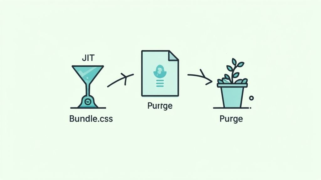
The secret to Tailwind’s incredible performance is its Just-In-Time (JIT) compiler. This engine works tirelessly behind the scenes, scanning your files and generating only the CSS classes you’re actually using. Think of it as an on-demand system that prevents your final bundle from getting bloated with styles you never touch.
The Critical Role of Content Paths
For the JIT engine to work its magic, you have to tell it where to look. This is all handled in the content array inside your tailwind.config.js file. Getting this right is the single most important step for production optimization.
Here's what a typical setup looks like:
// tailwind.config.js
/** @type {import('tailwindcss').Config} */
export default {
content: [
"./src/**/*.{js,ts,jsx,tsx}", // Scans all component files in the src directory
"./public/index.html", // Scans the main HTML file
],
theme: {
extend: {},
},
plugins: [],
}This configuration acts as a map, guiding Tailwind to every file that might contain a utility class. When you run a production build, any class that isn't found in these files gets completely purged from the final CSS output. This process, often called tree-shaking, is automatic and ridiculously effective.
The impact of proper purging is massive. An unpurged Tailwind CSS file can weigh several megabytes. But a properly configured production build often shrinks this down to just 10-15 KB. That drastic reduction translates directly to faster page loads and a much better user experience.
Ensuring a Lean Production Build
Getting your content paths right ensures your application stays quick and efficient. The goal is simple: ship only the necessary code to the user's browser. A well-configured Tailwind setup handles most of the heavy lifting for you.
Here are a few quick tips to keep in mind:
- Be Specific: Your content paths should be as specific as possible. This avoids scanning unnecessary files, like everything inside
node_modules. - Include All Sources: Double-check that every file type containing your markup (JSX, TSX, HTML) is included in the array. It's easy to miss one.
- Verify the Output: After running a production build (
npm run build), go inspect the generated CSS file in your build folder. You should see a remarkably small file size.
Mastering this optimization step is essential for any professional project. For more tips on boosting your site's speed, our guide on how to improve website performance offers additional valuable strategies.
Common Questions About Tailwind and React
Anytime you bring a new tool into your stack, you're going to have questions. It's just part of the process. When it comes to pairing Tailwind CSS with React, a few common hurdles pop up time and time again. Let's tackle them head-on so you can build with more confidence.
Can I Use Tailwind with Component Libraries Like Material-UI?
This is probably one of the first questions developers ask. The short answer is yes, you can, but it often feels like you're swimming upstream.
Established libraries like Material-UI or Ant Design come with their own strongly opinionated styling systems. When you try to sprinkle Tailwind classes on top, you often end up in a battle of CSS specificity, needing to use !important prefixes (!bg-blue-500) just to make your styles stick. It can get messy, fast.
A far more elegant solution is to reach for a headless UI library. Tools like Headless UI (from the makers of Tailwind) or Radix UI are game-changers here. They give you all the tricky functionality and accessibility for components like dropdowns or modals, but with zero pre-baked styles. It’s a blank canvas, ready for your Tailwind classes.
For any new project, I'd strongly recommend going the headless route. It just clicks with the entire Tailwind philosophy of giving you complete, granular control over your design from the very beginning.
How Do I Handle Conditional Classes in React?
Building dynamic UIs means your styles often need to change based on state or props. Is a button active? Is a dropdown open? You'll be toggling classes constantly.
While you could use simple template literals in your JSX, things can get unreadable pretty quickly once you add a bit of logic. A tiny utility library here makes a world of difference.
My go-to tools for this are clsx and tailwind-merge. They are purpose-built for cleanly and conditionally joining class names together.
For instance, look how clean styling an active navigation link becomes:
import clsx from "clsx"
function NavItem({ href, isActive, children }) {
const classes = clsx("px-3 py-2 rounded-md text-sm font-medium", {
"bg-slate-900 text-white": isActive,
"text-slate-300 hover:bg-slate-700 hover:text-white": !isActive,
})
return (
<a href={href} className={classes}>
{children}
</a>
)
}This keeps your component's render method tidy and makes the styling logic incredibly easy to reason about.
Is It Bad Practice to Have Long Class Names?
Seeing a dozen utility classes crammed into a className prop can feel wrong at first. It goes against everything we were taught about separating content and presentation. But in the world of Tailwind, this is often a sign you're on the right track.
The whole point is co-location—your styles live directly with the markup they affect. This makes components truly self-contained.
That said, if you find yourself copying and pasting the exact same long string of classes for every button on your site, that's a signal. It's time to abstract. The "React way" to solve this isn't to create a new CSS class like .btn, but to create a new component, <Button>. That component encapsulates the long className string, keeping your code DRY (Don't Repeat Yourself) and your application far easier to maintain.
Ready to build stunning, high-performance web interfaces with less effort? Magic UI offers over 150 free, open-source animated components built with React, TypeScript, and Tailwind CSS. Explore our components and templates today!