
Tailwind landing page templates are essentially pre-built websites crafted with the Tailwind CSS framework. Think of them as a collection of ready-to-use HTML and CSS components that let you build a beautiful, responsive landing page in a fraction of the usual time. They give you a massive head start, turning what could be weeks of work into just a few hours.
Why Tailwind Templates Are a Game-Changer for Developers
Before we get into the nitty-gritty, it’s worth taking a step back to see the bigger picture. The shift towards utility-first CSS frameworks like Tailwind isn't just a fleeting trend. It's a direct response to a real need in the development world: the demand for UIs that are faster to build, easier to maintain, and endlessly customizable. This is exactly where Tailwind landing page templates shine.
Instead of staring at a blank index.html file, you start with all the essential building blocks already in place—things like navigation bars, hero sections, feature grids, and footers. This lets you skip the tedious, repetitive work of coding common elements from the ground up. It’s like having the foundation and framing of a house pre-built, freeing you up to focus on the interior design and the unique details that will make it your own.
Speed Up Your MVP Launch
In the startup world, speed is everything. Launching a Minimum Viable Product (MVP) quickly can genuinely make or break a company. A good template gives you a production-ready design system right out of the box, so you can get a polished, professional landing page live in record time.
This isn't just a nice-to-have; it's a core reason why Tailwind has seen such massive adoption since its 2017 release. We're talking over 25,000 companies now using it for their projects. You can dig into more data on its industry adoption over at theirstack.com.
The real win here is reallocating your most precious resource—developer time. Instead of reinventing the wheel on basic UI, you're building the core features that actually deliver value to your users. It's all about working smarter, not harder.
Ensure Design Consistency and Quality
Keeping a consistent design language across a big project or multiple marketing pages can be a huge headache. A template solves this by providing a predefined set of components and styles. Every button, form, and card follows the same visual rules, creating a cohesive and professional experience for your users without you having to police every line of CSS.
Of course, before diving deeper, it helps to be clear on exactly what a landing page is and the strategic role it plays. Understanding this context makes it obvious why starting with a solid template is such a massive strategic advantage for any project.
Choosing The Right Tailwind Landing page Template
Let's be honest, picking a tailwind landing page template isn't just about finding a design you like. This decision sets the tone for your entire project. It's the foundation that dictates how quickly you can build, and more importantly, how easy the site will be to maintain down the road.
A great template is a massive shortcut, while a poorly coded one will have you tearing your hair out.
You have to look past the flashy demo and dig into what's under the hood. It’s a lot like buying a car—a slick paint job doesn't mean much if the engine is a mess. That means you need to check out the code quality, how clear the documentation is, and what kind of components you're actually getting.
If you're on the fence about whether to use a template or start from scratch, this decision tree can make things clearer.
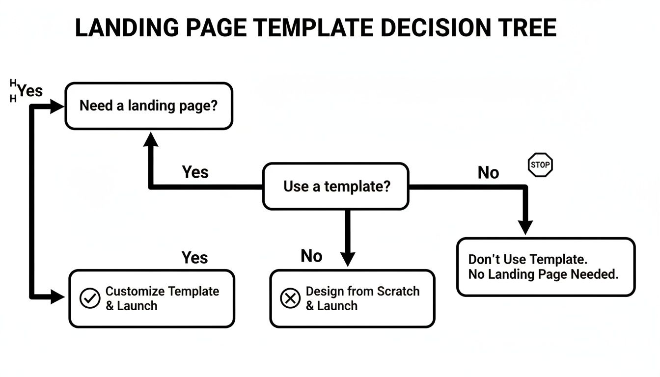
As you can see, for most new landing pages, a template is simply the smartest way to go. It saves a ton of time and gives you a solid, pre-tested structure to build on.
Where to Find Your Template
Templates are everywhere, from free open-source projects to premium marketplaces. Each source has its place, and the right choice really boils down to your project's needs—whether you're building a SaaS site, an e-commerce page, or a simple portfolio.
This growing ecosystem of high-quality templates has played a huge role in Tailwind's popularity. Developers can now get their hands on incredibly powerful tools without reinventing the wheel. Some premium providers, for example, offer massive bundles with over 53 fully coded landing pages, letting companies spin up professional marketing sites in record time. You can learn more about how premium templates are shaping web development and see some great examples in action here: https://magicui.design/blog/landing-page-design-templates.
To get a better sense of the landscape, here's a quick breakdown of what you can expect from different template sources.
Comparing Popular Tailwind Template Providers
| Feature | Free Templates (e.g., Tailblocks) | Mid-Range Templates (e.g., TailGrids) | Premium Suites (e.g., Flowbite Pro) |
|---|---|---|---|
| Cost | $0 | $29 - $99 (one-time) | $149 - $499+ (often includes lifetime updates) |
| Component Variety | Basic (buttons, cards, navbars) | Good (pricing, testimonials, forms) | Extensive (dashboards, marketing sections, e-commerce) |
| Design Quality | Functional but generic | Professional and modern | Polished, often with multiple style variants |
| Updates & Support | Community-driven, if any | Usually includes updates and basic support | Dedicated support and regular feature releases |
| Best For | Hobby projects, learning Tailwind | Startups, freelancers, smaller commercial sites | Agencies, large-scale projects, product teams |
Ultimately, free templates are perfect for getting your feet wet, but for any serious project, investing in a mid-range or premium option pays for itself in time saved and headaches avoided.
What to Look for When You’re Choosing
When you start comparing tailwind landing page templates, there are a few non-negotiables to keep in mind. The goal is to find something that not only looks sharp but is actually enjoyable to customize.
A template's true value is measured by how easily you can adapt it to your unique brand and functionality. Prioritize clean code, logical component structure, and mobile-first responsiveness over flashy, hard-to-modify animations.
Here's a quick checklist to run through before you commit:
- Code Quality: Is the HTML semantic? Is the CSS well-organized? Steer clear of templates with messy, overly complex code—it's a nightmare to customize later.
- Responsiveness: Pull up the demo on your phone, tablet, and desktop. A modern template has to be flawless on every screen size. No excuses.
- Component Variety: Does it have the building blocks you actually need? Things like pricing tables, testimonial sections, and contact forms are essential. The more useful components included, the more flexible the template.
- Documentation and Support: Clear documentation is an absolute must. Good support is a bonus that can be a lifesaver when you hit a wall with a tricky problem.
Thinking through these points is a critical step. If all this feels a bit overwhelming, you can always explore professional landing page design services to get expert help.
Your Modern React And Tailwind Setup
With your tailwind landing page template picked out, it's time to set up the digital workshop where you'll bring it to life. A clean, modern development environment isn't just nice to have; it's essential for a smooth workflow. We're going to build our project using React with Vite, a build tool famous for its blazing speed, and then weave in Tailwind CSS.
This isn't just about punching in commands. It's about understanding the foundation you're building on. We'll go from a blank terminal to a fully configured, scalable launchpad, ready for your template's components.
Initializing Your Vite and React Project
First things first, let's spin up the React application. Vite makes this incredibly quick. Pop open your terminal and run this command, but feel free to swap my-landing-page with your own project name.
npm create vite@latest my-landing-page --template react
That command scaffolds out a fresh React project. Once it wraps up, jump into the new directory and get the dependencies installed.
cd my-landing-page npm install
And that's it. Just two commands and you have a running React app. Give it a whirl by running npm run dev. This lightning-fast start is exactly why so many of us have switched to Vite for modern web projects.
Integrating Tailwind CSS
Now, let's get Tailwind in on the action. This part involves adding a few development dependencies and creating a couple of configuration files.
If your development server is running, shut it down with Ctrl + C. Then, install Tailwind CSS along with its peer dependencies.
npm install -D tailwindcss postcss autoprefixer
Next up, generate your tailwind.config.js and postcss.config.js files. These are the brains of your Tailwind setup.
npx tailwindcss init -p
This command adds two critical files. The postcss.config.js file is usually good to go out of the box, but tailwind.config.js needs a little guidance on where to find your template files.
Getting your
contentpaths right is key. It tells Tailwind's Just-In-Time (JIT) compiler where to look, so it only generates the CSS classes you’re actually using. The result is a tiny, super-optimized production build.
Open up tailwind.config.js and update the content array to point to all your component files.
/** @type {import('tailwindcss').Config} \*/
export default {
content: ["./index.html", "./src/**/\*.{js,ts,jsx,tsx}"],
theme: {
extend: {},
},
plugins: [],
}The final piece of the puzzle is telling your app to actually use Tailwind's styles. Find your main CSS file (usually src/index.css), clear out whatever is in there, and add these three Tailwind directives.
@tailwind base; @tailwind components; @tailwind utilities;
These directives act as placeholders that Tailwind’s build process will replace with all the styles it generates. For a more granular walkthrough, we have a great guide on how to install Tailwind CSS in our blog post here.
With everything in place, fire up your development server again with npm run dev. Your project is now fully armed with React, Vite, and Tailwind CSS—a powerful stack ready to handle any tailwind landing page template. You’ve just built a solid, optimized foundation ready for customization.
Making The Template Your Own With Custom Components
A great tailwind landing page template is just the canvas; now it's time to paint. This is where you move beyond the pre-built design and inject your brand's unique personality. Customization isn't about reinventing the wheel—it’s about making smart, targeted changes that align the template with your vision.
The first place I always start is with the core brand elements. This means diving right into the tailwind.config.js file to tweak the theme. Instead of chasing down color classes one by one, you can define your brand’s palette directly in the configuration. It’s a game-changer for consistency and makes future updates a breeze.

From Static Blocks To Reusable React Components
To truly own the template, you need to start thinking in components. A static HTML file is fine for a demo, but a modern web app is built from modular, reusable pieces. Look at the main sections of your landing page—the Hero, Features, Testimonials, and Call-to-Action (CTA)—and break each one down into its own React component.
For instance, your project structure might look something like this:
Hero.jsx: This holds your main headline, sub-headline, and primary CTA button.FeatureCard.jsx: A reusable card for showcasing individual product features. You can then just map over an array of feature data to populate a whole section.CTASection.jsx: The final prompt for users, which you can easily drop into different pages or even A/B test later.
This component-based workflow is the secret to building a landing page that’s both maintainable and easy to scale. If you need to change a button style, you do it in one file, and it updates everywhere. That alone will save you countless hours.
The real power here is unlocked when you separate presentation from data. By creating components that accept props, you can feed them dynamic information, transforming a static page into a living, breathing experience.
Breathing Life Into Your Page With Dynamic Data
Let's make this practical. Imagine your template has a static three-column feature grid. Instead of hardcoding the content directly in your JSX, you can pull it from an API or even just a local data file. This simple shift makes your content incredibly easy to update without ever touching the component's structure.
You could create a simple featuresData.js file:
Then, in your FeaturesSection.jsx component, you just import this data and render it dynamically. This small architectural change is what separates a simple website from a scalable web application.
It’s a key reason developers are flocking to more flexible frameworks. In fact, Tailwind CSS commanded around 7% of the CSS framework market share in 2023, pulling ahead of established players like Bootstrap, which held about 4%. This growth reflects a massive demand for more dynamic, component-driven development. You can discover more insights about landing page tech stacks to see just how quickly the industry is evolving.
Adding Polish With Animations And Interactions
A static landing page does its job, but a dynamic one creates an experience. This is where you add that final layer of polish—subtle animations and interactions that take your tailwind landing page template from good to genuinely memorable. We're not talking about flashy, distracting effects. The goal is thoughtful motion that guides the user and provides satisfying feedback.
A great place to start is with on-scroll reveal effects. As someone scrolls down your page, elements like feature cards or testimonials can gently fade or slide into view. This simple technique is incredibly effective at drawing attention to each section sequentially, making your page feel more engaging and less like a wall of text. Libraries like Framer Motion are fantastic for this; they integrate beautifully with React and give you powerful animation controls without a ton of boilerplate.

Implementing Smooth User Interactions
Beyond the big, section-level animations, the real magic happens in the micro-interactions. These are the small, functional animations that respond to a user's actions. Think about a button that subtly scales up when you hover over it or a form input that highlights with a soft glow when you click into it. These little details make your UI feel responsive and alive.
Here are a few high-impact micro-interactions you can build in minutes:
- Button Hover States: Just add a
transitionutility in Tailwind and change the background color or add a slighttransformon hover. It’s a classic for a reason. - Icon Animations: An icon that rotates or shifts slightly when its corresponding feature is hovered over adds a delightful touch.
- Form Feedback: Use color and motion to clearly indicate success or error states when a user submits a form. It's both helpful and reassuring.
These small touches really add up, giving your page a polished, professional feel. For a much deeper dive into the mechanics, you can find a helpful guide on achieving CSS animation on scroll in this blog post.
Ensuring Perfect Responsiveness
Okay, so your page is now beautifully animated. But does it look perfect on every device? Before you call it a day, you have to be rigorous with your responsive design checks. Open up your browser's developer tools and start emulating different screen sizes, from a tiny iPhone SE all the way up to a massive desktop monitor.
Don't just check the common breakpoints. My go-to trick is to slowly drag the browser window's width from its smallest to its largest size. This is how you spot those awkward layout shifts and content overlaps that happen between the standard device widths.
Pay special attention to typography, how your images are scaling, and the navigation menu. Your font sizes need to adjust for readability on small screens, and your mobile navigation has to be dead simple to use with a thumb.
Prioritizing Web Accessibility
Last but certainly not least: a great user experience has to be an accessible one. Accessibility (often shortened to a11y) is about making sure your site is usable by everyone, including people with disabilities who might rely on screen readers or keyboard-only navigation.
Start with these fundamental accessibility checks. They're non-negotiable.
- Keyboard Navigation: Can you get to every interactive element—links, buttons, form fields—using only the Tab key? Critically, is the focus indicator (
outline) always visible so you know where you are? - Semantic HTML: Use the right HTML tags for the job. That means
<nav>,<main>, and<button>instead of slapping a<div>on everything. This gives screen readers the context they need to make sense of your page. - Alt Text for Images: Every single meaningful image needs descriptive
alttext. This is what a screen reader will announce to a visually impaired user, so make it count.
Deploying Your Landing Page To The World
You've built an incredible site with a tailwind landing page template, polished it with slick animations, and made sure it's accessible to everyone. Now for the best part: getting it out into the world. Thankfully, deploying a modern React app is easier than it has ever been, all thanks to platforms built specifically for developers like us.
Services like Vercel and Netlify have totally changed the game. They offer seamless, Git-based workflows that take what used to be a complicated, multi-step process and turn it into just a few clicks. The whole idea is beautifully simple: connect your GitHub, GitLab, or Bitbucket repository, and the platform takes care of the rest. Every git push automatically triggers a new build and deploys the latest version of your site.
Connecting And Configuring Your Project
Let's quickly run through how this usually works. Once you've signed up for Vercel or Netlify, you'll authorize it to access your Git provider. From there, you just pick the repository where your landing page lives.
The platform is almost always smart enough to sniff out that you're using a Vite-based React project and will suggest the right build settings right out of the box.
Most of the time, the defaults are exactly what you need:
- Build Command:
npm run buildorvite build - Output Directory:
dist - Install Command:
npm install
You just confirm these settings, hit the deploy button, and in a minute or two, your site is live on a temporary URL. Seeing it work so effortlessly for the first time is a genuinely magical experience.
Final Touches For A Professional Launch
With your site officially live, there are a couple of last-minute things you'll want to handle. First up is adding a custom domain. Both Vercel and Netlify provide super clear, step-by-step instructions for pointing your domain's DNS records to their servers. This is what turns a generic URL into yourbrand.com.
Don't even think about skipping HTTPS. Modern deployment platforms automatically provide and renew free SSL/TLS certificates for your custom domains. This is completely non-negotiable for both security and SEO—it builds trust with your visitors and is a known ranking factor for search engines.
Finally, take a minute to check your production build's performance. The easiest way is to run a Lighthouse audit right from your browser's developer tools. This will give you a report card with actionable feedback on loading speed, accessibility, and SEO. You'd be surprised how often simple fixes like compressing images or lazy-loading offscreen content can give you a massive performance boost, ensuring your page loads lightning-fast for every visitor.
Ready to build your own stunning landing page in minutes? Magic UI offers a powerful library of over 50 customizable blocks and 150+ free animated components built with React, Typescript, and Tailwind CSS. Start building for free at magicui.design.