
UI card design is really all about creating those small, rectangular modules you see everywhere online. Think of them as digital playing cards, each holding a little packet of related information. They’re incredibly flexible containers for text, images, and buttons, making complex data easy to scan and digest at a glance.
Why UI Cards Are the Building Blocks of Modern Design
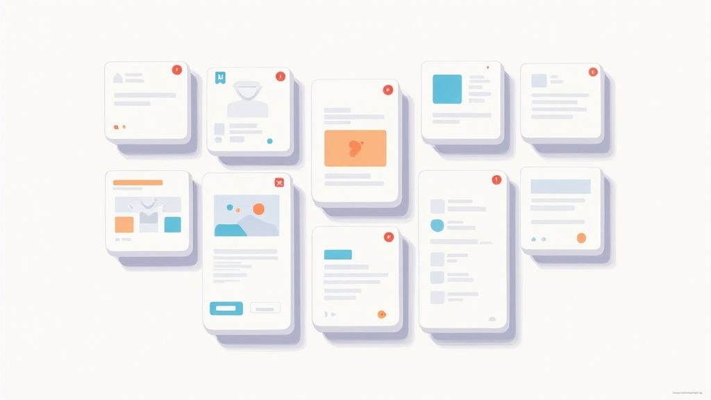
I like to think of UI cards as the LEGO bricks of a digital interface. Each card is its own self-contained unit—a bite-sized piece of information that users can quickly understand. From your social media feed to an e-commerce store, cards have become a true cornerstone of modern design.
This modular approach is fantastic for bringing order to potential chaos. Instead of hitting users with a wall of text or a jumble of images, cards group everything into neat, scannable chunks. This cuts down on cognitive load, letting people process what they're seeing much faster and with way less effort.
The Power of Modularity and Flexibility
The real magic of UI card design is in its modularity. Since every card works like an independent component, you can easily rearrange, filter, and stack them to create responsive layouts that just work. This adaptability is key to a consistent and intuitive experience on any device, from a huge desktop monitor to a tiny smartphone screen.
A well-designed card doesn't just present information; it tells a story at a glance. It guides the user's eye from the main image to the headline, and finally to the call-to-action, creating a clear and logical path.
This is why mastering card-based layouts isn't just a passing trend. It's a fundamental skill for anyone creating scalable, user-friendly digital products. In fact, using cards effectively is often a key part of broader strategies, as highlighted in these Top 7 Website Design Tips For Small Business Success.
By getting a handle on how to structure these essential pieces, you unlock the ability to build interfaces that are both beautiful and incredibly functional. To dig deeper into this foundational concept, check out our guide on what UI components are and see how they form the backbone of modern apps.
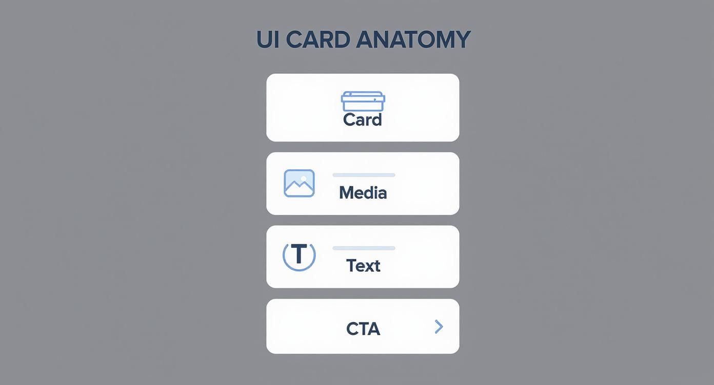
Deconstructing the Anatomy of a Perfect UI Card
If you want to get good at UI card design, you have to know what they're made of. Don't think of a card as just one thing. Think of it as a tiny, self-contained system where every single piece has a job to do. When all those pieces work together, you get a user experience that's clear, intuitive, and just plain works.
A great card is like a well-designed storefront window. Its job is to grab your attention and give you just enough information to make you want to step inside—or in this case, click. It's a careful balancing act between looking good and being useful. By breaking a card down into its core parts, we get a practical blueprint for building modules that are both beautiful and functional.
The Foundational Elements
At its heart, every UI card is built on a few non-negotiable elements. These are the pieces that give the card its structure and purpose.
- The Container: This is the card's skeleton—the box that holds everything together. It uses color, borders, or a subtle shadow to separate its contents from the rest of the page, creating a neat, digestible chunk of information.
- Media Element: This is often the star of the show. An image, video, or illustration can grab a user's attention far faster than text ever could. It sets the tone and provides immediate context. In fact, studies show that content with relevant images gets 94% more views than content without.
- Headline or Title: This is the most important piece of text on the card. It needs to be short, descriptive, and easy to scan, telling the user exactly what the card is about in a heartbeat. A clear headline anchors the card’s entire information hierarchy.
The secret to effective card design lies in establishing a clear visual hierarchy. Your design should effortlessly guide the user's eye from the most important element (often the image or headline) down to the secondary information and finally to the call-to-action.
Supporting and Actionable Components
Once you've laid the foundation, supporting elements add context and nudge the user toward an action. These components add depth, turning the card from a static display into something interactive.
Let's break down the most common components you'll be working with.
| Key Components of Effective UI Cards | | :----------------------------------- | :------------------------------------- | :------------------------------------------------------------------------------- | | Component | Primary Function | Design Best Practice | | Container | Groups and separates content. | Use subtle shadows or borders to lift it off the page without being distracting. | | Media | Grabs attention and provides context. | Ensure images are high-quality, relevant, and optimized for fast loading. | | Headline | Communicates the primary subject. | Keep it concise, scannable, and use a larger font size to establish hierarchy. | | Supporting Text | Offers a brief description or details. | Limit it to 1-2 short sentences. Brevity is key. | | Call-to-Action (CTA) | Prompts a specific user action. | Use a clear, action-oriented label (e.g., "View Project") on a prominent button. |
Each element plays a crucial role in the card's overall effectiveness.
For instance, supporting text offers a quick summary or extra detail that backs up the headline. It should be short and sweet, giving just enough context without creating a wall of text.
Finally, you have the Call-to-Action (CTA), which is the whole point of the card. Whether it’s a button that says "Learn More" or an icon for "Add to Cart," the CTA tells the user exactly what to do next. To see how these elements come together in a real-world component, check out how you can build a flexible and accessible MUI Card component that follows these very principles.
By deconstructing a card into these essential parts, you can approach the design process with a clear strategy. Every component has a purpose, and understanding how they all interact is the key to creating UI cards that not only look fantastic but also get users to take action.
Applying Fundamental Card Design Principles
Knowing the anatomy of a card is one thing, but applying core design principles is what turns a simple box into a genuinely effective user experience. These principles are the invisible hand guiding a user's eye, building trust, and making every click feel natural. Without them, even a perfectly built card can feel cluttered and confusing.
The real goal here is to create a visual language that users get instantly. It's a delicate dance between visual hierarchy, consistency, and accessibility. When you nail this trio, the card doesn’t just show information—it communicates it, making the user's journey feel completely seamless.
The explosion of card-based layouts wasn't an accident. They were the perfect answer to our need for modular, bite-sized content on screens of all shapes and sizes. This design pattern really hit the mainstream after Google's Material Design framework championed it back around 2013. By 2015, cards were absolutely everywhere, celebrated for their knack for structuring information in a way that just clicks with users. You can dig deeper into some of these foundational mobile app design trends on fuselabcreative.com.
Establishing a Clear Visual Hierarchy
Visual hierarchy is simply the art of arranging things to show what's most important. For a UI card, it’s about telling the user exactly what to look at first, second, and third, all in a split second. You can pull this off by playing with a few key visual cues.
- Size and Scale: Make the most important element—like a product shot or a big headline—the largest. It's an instant magnet for the user's attention.
- Color and Contrast: A vibrant call-to-action (CTA) button practically jumps off a muted background, screaming, "Click me!" This signals its role as the primary action.
- Whitespace: Don't fear the void! Using whitespace (or negative space) effectively keeps a card from feeling claustrophobic. It gives elements room to breathe and makes the whole thing much easier to scan.
By strategically using these visual cues, you create a clear focal point. This ensures users can scan the card in seconds and extract the most critical information without conscious effort, reducing cognitive load significantly.
Ensuring Consistency and Scannability
Consistency is the bedrock of a trustworthy interface. When all your cards speak the same design language—using the same fonts, button styles, and spacing—users quickly learn the rules of the road. This predictability builds confidence and makes the entire experience feel intuitive, not chaotic.
Scannability and consistency are two sides of the same coin. Let's be real: users rarely read every single word. They scan for keywords and things that catch their eye. Breaking up text into short snippets, using bullet points, and adding bold headings makes your cards infinitely easier to digest at a glance.
This infographic breaks down the typical hierarchy of a well-structured UI card.
You can see how the container neatly holds everything, leading the eye from the main image down to the text and finally to a clear, actionable button.
Designing for Accessibility
A truly great design is one that works for everyone. Accessibility isn't some optional add-on; it's a non-negotiable part of the process. It means making sure your cards are just as usable for people with visual impairments or other diverse abilities.
Here are a few key things to keep in mind:
- Sufficient Color Contrast: Text has to stand out from its background. If it doesn't, it's unreadable. Use tools like a WCAG contrast checker to get it right.
- Readable Text Size: Ditch the tiny fonts. Your body text needs to be large enough to be read comfortably on any device, from a massive monitor to a small phone screen.
- Clear Focus States: When someone navigates using a keyboard, interactive elements like buttons and links need a visible outline when they're selected. This is a lifeline for users who rely on screen readers or keyboard navigation.
When you weave these principles into your design process, you’re no longer just making a box with stuff in it. You’re crafting a powerful, inclusive, and highly effective tool for communication.
Exploring Common UI Card Patterns in Action
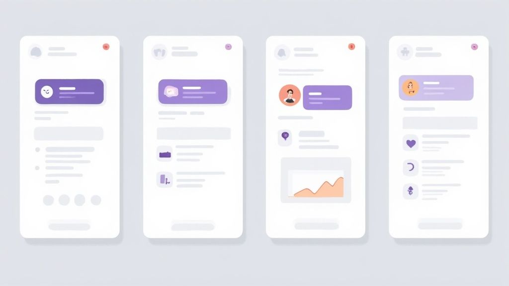
Theory is one thing, but seeing UI card design out in the wild is where it all clicks. Cards aren't a one-size-fits-all solution. They’re more like chameleons, adapting their shape and content to solve a specific problem for a specific user. By looking at a few common patterns, we can see how great design always follows function.
Each pattern is a little masterclass in information hierarchy. An e-commerce site needs to sell. A news app needs to inform. A social platform needs to connect. The card is the vehicle for these goals, and its design is the map that gets the user where they need to go. Let’s break down some of the most effective examples you see every day.
The E-commerce Product Card
The product card is the absolute workhorse of online retail. Its one and only job? Conversion. Every pixel is engineered to grab your attention and get you to click.
- Dominant Image: The product is the star of the show. A big, high-quality image takes up most of the space, letting you visually size up the item in a split second.
- Essential Information: Just below the image, you get the bare minimum needed to make a decision: the product name, maybe the brand, the price, and often a star rating for a bit of social proof.
- Clear Action: A big, bold "Add to Cart" button or a quick-view icon is the unmistakable call-to-action. There’s no ambiguity between seeing something you like and buying it.
This whole structure works because it mimics how we shop in a real store—you scan the shelf, see the product, check the price tag, and decide if it’s going in your cart.
The Content and Article Card
Hop over to any news site, blog, or content aggregator, and you'll find article cards. Here, the goal is pure engagement—getting you to click through and actually read the full piece.
A well-designed content card is the ultimate teaser. It gives you just enough to pique your curiosity without spoiling the story, making you feel like you have to know more.
These cards are all about text hierarchy. The headline is the main event—it needs to be bold and intriguing. It's usually followed by a short snippet that adds a little context. A smaller featured image often tags along to add some visual flair and keep the feed from becoming a wall of text. The publication and date are there, but they’re downplayed to keep your focus right where it belongs: on the content.
The Social Media Profile Card
On platforms like LinkedIn or X (formerly Twitter), profile cards are digital business cards. They condense a person's or a brand's entire identity into a tiny, easy-to-digest package. The main goal here is recognition and connection.
A profile picture or logo is almost always the anchor, creating an instant human connection. The name is displayed prominently, followed by a short bio or a key identifier like a job title. Most importantly, these cards are loaded with action buttons like "Follow," "Connect," or "Message," making the next step in building that relationship totally obvious.
Getting these designs right has a massive impact. For every dollar invested in UX design—which includes crafting intuitive card layouts—the return can be as high as $100. That’s a staggering ROI, and it comes from happier, more loyal users. In fact, well-executed UI card design has been shown to boost conversion rates by over 200%. You can dig into more of the business value of great UX in recent studies on maze.co.
The Future of Cards with AI and Micro-Interactions
As we look ahead, the humble, static card is on the verge of a massive upgrade. It's evolving into something far more intelligent and alive, thanks to two powerful forces: artificial intelligence and the subtle magic of micro-interactions.
These aren't just buzzwords. They're fundamentally changing cards from simple containers of information into dynamic, personalized experiences that feel like they're built just for you.
Imagine scrolling through an e-commerce app where the product cards don't just sit there. Instead, they cleverly rearrange themselves based on your browsing habits, bubbling the things you'll love right to the top. That's the power of AI-driven design in action, and it's closer than you think.
The Rise of Intelligent, Personalized Cards
Artificial intelligence is what will make our interfaces feel deeply personal. Instead of showing the same grid of content to everyone, AI algorithms can watch and learn from user behavior—every click, hover, and past purchase—to tailor what each card displays on the fly.
A news app could surface articles it knows you’ll find fascinating. A travel site might tempt you with destinations based on your recent daydreams and searches.
This kind of hyper-personalization makes for a much more relevant and efficient experience. We're seeing AI get baked right into design tools, helping us create data-driven components faster than ever. The results speak for themselves: companies that have leaned into AI-enhanced card UIs are reporting huge wins, like feature adoption jumping by over 20% and even doubled in-app sales after a redesign. You can see more of these emerging UI/UX design trends on uxpin.com.
AI-powered cards can anticipate what a user needs, turning a passive scroll session into an active, guided journey. The interface learns from you, becoming more helpful and intuitive with every single interaction.
Making Interfaces Feel Alive with Micro-Interactions
If AI provides the brains, micro-interactions provide the soul. These are the tiny, purposeful animations that breathe life into an interface when you interact with it. Think of a button that gently shifts when you hover over it, or an item that smoothly expands to show more details when you tap.
These small moments are doing some heavy lifting behind the scenes:
- Provide Immediate Feedback: They instantly confirm that the system got your command, like an item hopping into your cart.
- Guide the User: A subtle bounce or a soft pulse can draw your eye to the most important button on the screen.
- Create Delight: A well-crafted, buttery-smooth animation can make an interface feel polished, responsive, and genuinely fun to use.
When you weave these little animations into your design, the interface stops feeling like a static document and starts feeling like a responsive, living system. By combining the predictive power of AI with the satisfying feedback of micro-interactions, the future of UI card design is shaping up to be more intuitive, personal, and delightful than ever before.
To see how you can bring these ideas to life, check out our guide on creating stunning UI animations.
As you start building more and more interfaces, you’ll notice the same questions about UI card design keep popping up. Think of this section as a quick cheat sheet—a place to get straight answers that reinforce the core principles we’ve covered and help you navigate real-world design challenges.
It's the stuff that bridges the gap between knowing the theory and actually putting it into practice day-to-day.
What Makes a UI Card Design Truly Successful?
A great UI card is a three-way balancing act: it has to look good, be dead simple to use, and actually do its job. If a card is just pretty, it's failed. If it's functional but confusing, it's failed. Success happens when a card gets its core message across in a split second.
This all comes down to a crystal-clear visual hierarchy. Your user's eye should naturally flow from the most critical piece of info straight to the call-to-action, no friction involved. You get there by keeping the design clean and using whitespace to let every element breathe. A truly successful card just feels right—it delivers value at a glance and nudges the user to take that next step.
How Does Responsiveness Impact UI Card Design?
Responsiveness isn't a feature you tack on at the end; it's baked in from the very beginning. A card that looks amazing on a 27-inch monitor but falls apart on a phone is a broken design. The beauty of cards is their modular nature, which makes them perfect for responsive layouts, but you have to plan for it.
Here’s how to nail responsive cards:
- Flexible Grids: Use a fluid grid that lets your cards rearrange themselves gracefully. They might sit in a three-column layout on a desktop, but they should neatly stack into a single, scrollable column on mobile.
- Content Prioritization: You just don't have the same real estate on a small screen. Be ruthless. Hide or condense less critical information to keep things from feeling cramped. The main message and the primary CTA always get top billing.
- Optimized Media: Make sure any images or videos inside your cards are compressed for mobile. They need to load fast without looking like a pixelated mess.
What Are the Most Common Mistakes to Avoid?
Even pros fall into the same traps. The absolute biggest one is information overload. A card is supposed to be a summary, not a novel. When you cram in too much text, too many buttons, or a bunch of competing visuals, you completely overwhelm the user and kill the card’s main purpose: scannability.
The most effective UI cards are masters of restraint. They understand that what you choose to leave out is just as important as what you put in. Simplicity is the ultimate sign of a confident and user-focused design.
Another classic mistake is inconsistent styling. When cards in the same interface have different fonts, button styles, or spacing, it creates visual chaos. It feels unprofessional. Consistency builds trust and makes the entire experience feel cohesive. And finally, don't ever neglect accessibility. Using poor color contrast or tiny, unreadable fonts isn't just bad design—it's a critical failure that excludes people.
Ready to build interfaces that not only look incredible but are also a joy to use? Magic UI offers a library of 150+ free, open-source animated components and stunning templates to bring your vision to life in minutes. Start creating with Magic UI today.