Ever land on a website that just feels right? You instantly know where to click, where to read, and what to do next without a moment's hesitation. Now, picture the opposite: a site that’s chaotic, confusing, and makes you want to hit the "back" button immediately.
The difference between these two experiences almost always comes down to one thing: visual hierarchy.
Think of a well-designed webpage like a perfectly organized storefront. Your eyes are naturally drawn to the big, bold window display (the headline), then to the featured products on mannequins (subheadings and images), and finally to the smaller price tags and descriptions (the body text). This entire journey is carefully orchestrated, not accidental.
Visual hierarchy is this strategic art of arranging elements to signal their importance. It's about creating a seamless path for the user's eye, guiding their attention from one point to the next in a logical, intuitive sequence. It transforms a simple collection of text and images into a clear, scannable, and effective communication tool. A well-executed hierarchy is a cornerstone of modern web design best practices.
The Goal of a Strong Hierarchy
At its core, the goal is to eliminate friction and reduce the user's cognitive load. When a page has a clear visual order, people don’t have to waste mental energy just figuring out where to look. This makes their experience smoother, more enjoyable, and far more efficient.
A strong visual hierarchy helps you nail several key outcomes:
- Improves Scannability: Let's be real—people scan, they don't read. A good hierarchy lets them quickly grasp the page structure and find what they need.
- Directs Attention: It’s your tool for pointing a giant, invisible arrow at the most important stuff, like your call-to-action (CTA) buttons or key value propositions.
- Enhances User Experience: It makes navigating your site feel effortless and intuitive, which is crucial for reducing frustration and keeping people from bouncing.
- Boosts Comprehension: By presenting information in a structured, logical way, you help users process and remember it more effectively.
Ultimately, visual hierarchy is about answering one question for the user: "What's the most important thing here?" In our mobile-first world, where screen real estate is precious, making this prioritization crystal clear isn't just a nice-to-have—it's essential for creating an experience that works.
The Building Blocks of Visual Hierarchy
To get a real handle on visual hierarchy, you first need to understand the pieces that make it up. These aren't just abstract theories; they're the practical tools designers use every single day to guide a user’s eye and bring a sense of order to the screen. Think of them as the grammar of design. Each principle works with the others to form clear, coherent visual "sentences" that people can understand in an instant.
When you combine these building blocks the right way, you create a clear path for the user. It tells them what to read first, what to click next, and what’s just supporting information. This deliberate arrangement is what separates a page that feels intuitive from one that feels like a total mess.
Size and Scale Command Attention
The most straightforward way to signal importance is with size and scale. Our brains are just wired to notice bigger things first, and that instinct translates directly to web design. Simply put, bigger elements feel more important and grab our attention immediately.
For example, a hero section's headline is almost always the largest piece of text on the page, locking it in as the primary message. Call-to-action buttons are often beefed up in size compared to other links to pull the user's focus right where you want it. This isn't just about making things big for the sake of it; it's about creating a deliberate contrast in scale between your primary, secondary, and tertiary elements.
Color and Contrast Create Focal Points
Color and contrast are your power tools for creating an emotional connection and, more importantly, for drawing the eye. Bright, bold colors naturally pop against more muted backgrounds, creating instant focal points. This is exactly why you'll see crucial buttons like "Buy Now" or "Sign Up" decked out in a brand's most vibrant accent color.
Contrast—the difference between elements—is just as vital. High contrast, like classic black text on a white background, makes things easy to read. Low contrast, on the other hand, can make text a real chore to get through and cause eye strain. Using contrast strategically helps your key information stand out, making sure your most important messages aren't just seen, but easily absorbed.
Key Takeaway: The human eye is a sucker for contrast. A single, brightly colored button on an otherwise neutral page is one of the most effective ways to tell a user, "Click here!"
This classic pyramid model shows how content is typically layered on a webpage, starting with the most prominent headline and moving down to the finer details.
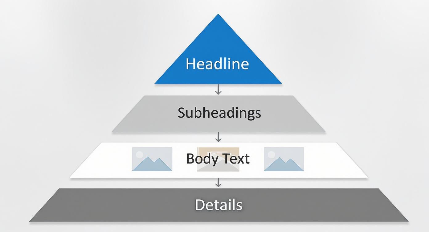
The shape itself is a great reminder: you should have fewer high-importance elements (like a single main headline) and progressively more elements of lower importance as you go down the page.
Typography Guides the Reader
Typography is so much more than just picking a pretty font. It’s about structuring text to be scannable and digestible. A well-defined typographic hierarchy uses different font sizes, weights (like bold or regular), and styles to create obvious levels of information.
Just think about a standard blog post:
- H1 (Title): The biggest and boldest text, designed to grab you immediately.
- H2/H3 (Subheadings): Smaller than the title but bigger than the body, breaking the content into bite-sized, scannable sections.
- Body Text: The smallest, standard-weight text, optimized for comfortable, long-form reading.
This simple structure lets users scan the subheadings to get the gist of an article without having to read every single word.
Whitespace and Repetition Build Rhythm
Sometimes, what you don't see is just as important as what you do. Whitespace, often called negative space, is the empty area around elements on a page. It’s a surprisingly powerful tool for cutting down on clutter and creating logical groups.
Elements that are close together are seen as related—a principle called proximity. By leaving generous whitespace between different sections, like a feature list and a testimonial block, you create a clean visual separation that makes the layout much easier to process. This "breathing room" is essential for preventing users from feeling overwhelmed.
Finally, repetition creates a sense of consistency and predictability. When you use the same styles for similar elements—like making all clickable links the same color or all section headings the same font—you teach users the rules of your site. This consistency creates a comfortable rhythm, letting them navigate your interface confidently and without confusion.
Below is a quick-reference table summarizing these core principles. It breaks down how each one is used in practice and the psychological effect it has on the user's journey through your site.
Core Principles of Visual Hierarchy
| Principle | How It Is Used | Impact on User |
|---|---|---|
| Size and Scale | Making key elements like headlines and CTAs larger than less important ones. | Immediately draws attention to what's most important, establishing a clear starting point. |
| Color and Contrast | Using bright or contrasting colors for buttons and links to make them stand out. | Creates focal points, guides the eye to interactive elements, and improves readability. |
| Typography | Using different font sizes, weights (bold), and styles for headings and body text. | Organizes text into a scannable structure, allowing users to quickly grasp the main ideas. |
| Whitespace | Adding empty space around elements and sections to reduce clutter and group content. | Improves comprehension by separating distinct ideas and prevents the user from feeling overwhelmed. |
| Repetition | Applying consistent styles (e.g., color, font) to similar elements across the site. | Creates a sense of predictability and order, making the interface feel intuitive and easy to learn. |
By mastering these five principles, you move from just placing elements on a page to intentionally designing a user experience. You're no longer just decorating; you're communicating.
Why Visual Hierarchy Drives Business Success
A strong visual hierarchy isn't just about making a website look good; it's a powerful tool that directly impacts your bottom line. When a user lands on your page and can instantly figure out where to look and what to do, they're far more likely to stick around. This isn't an accident—it's the result of a deliberate, well-planned hierarchy guiding their eyes.
Fumble this, and you leave them stranded in a sea of visual noise. Confusion quickly turns into frustration, and before you know it, they’ve bounced off your site and landed on a competitor’s. A weak hierarchy isn’t just a design problem; it’s a direct line to lost opportunities.
Boosting Engagement and Reducing Friction
Think of an effective visual hierarchy as a tour guide for your visitors. It points out the most important landmarks (your value proposition), shows them the best path to take (the user flow), and makes sure the final destination (your CTA) is impossible to miss. This clarity is a game-changer for user engagement.
When information is structured logically, people can scan and absorb it without much effort. The reality is, users only read about 20% to 30% of the text on a webpage, so scannability is everything. A solid hierarchy ensures that your key messages get noticed even during a quick glance. This cuts down on user friction and keeps them on your site longer. If you want to see the hard data, check out VWO's comprehensive analysis on how design influences behavior.
From Clicks to Conversions
At the end of the day, your website has a goal: make a sale, get a lead, or earn a subscriber. A clear visual hierarchy is directly tied to improving the user experience and steering people toward these critical actions. This is the core of what is Conversion Rate Optimization Explained. By applying principles like size, color, and contrast, you can make your calls-to-action pop off the screen.
This is where design turns directly into revenue. A big, bold "Add to Cart" button or a well-defined "Sign Up Now" form isn't just about aesthetics; it's about performance. The design actively funnels attention toward conversion points, making the desired action feel like the most natural next step. To explore this further, our guide on how to improve website conversion rates offers more practical strategies.
An intuitive site structure doesn't just guide users; it builds trust. When a website feels professional and easy to use, it signals credibility and reliability, turning skeptical visitors into loyal customers.
Investing in a solid visual hierarchy in web design is really an investment in your business. It elevates your website from a simple digital brochure to a strategic tool that actively guides behavior, improves key metrics, and drives real results. It’s no surprise that over 61% of website redesigns are kicked off by a bad user experience—proving just how vital a well-structured interface is for keeping customers and growing your business.
Building Interfaces with React and Tailwind CSS
Theory is great, but turning design principles into working, breathing code is where the real fun begins. For developers, tools like React and Tailwind CSS are the perfect sandbox for building interfaces that aren't just beautiful, but also make perfect sense to the user.
What we're aiming for here is a collection of reusable, accessible components that guide people through a page without them even realizing it.
Tailwind’s utility-first approach is an absolute game-changer for this. Instead of getting bogged down writing custom CSS, you apply tiny, pre-built classes right in your JSX. This gives you direct control over every piece of the hierarchy puzzle—typography, spacing, color, you name it. It's incredibly fast for prototyping and building out designs with a clear sense of order.
Crafting Hierarchy with Tailwind Utilities
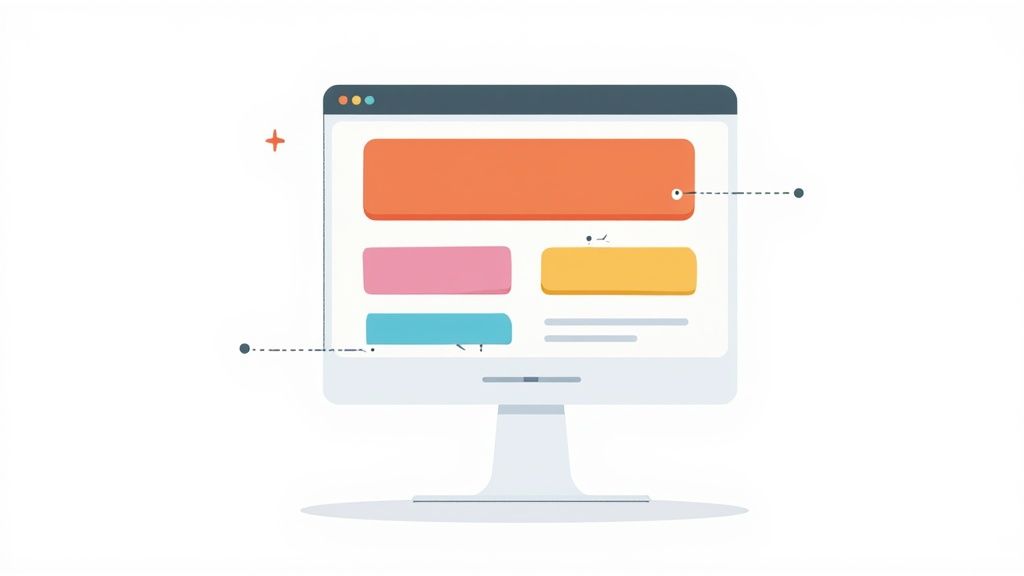
Let's start with the basics: a headline and a call-to-action button. These are the bread and butter of almost any webpage. A strong visual hierarchy screams that the main message (your headline) and the most important action (that button) are the stars of the show.
Here’s how you can pull this off in a simple React component using Tailwind CSS. Notice how we're using utility classes for font size, weight, and color contrast to make things pop.
function HeroCTA() {
return (
<div className="p-8 text-center">
<h1 className="mb-4 text-5xl font-extrabold text-gray-900">
Build Amazing Websites Faster
</h1>
<p className="mb-8 text-lg text-gray-600">
The ultimate UI library for modern web development.
</p>
<button className="rounded-lg bg-blue-600 px-8 py-3 text-lg font-bold text-white transition-colors hover:bg-blue-700">
Get Started Now
</button>
</div>
)
}See what’s happening here? The <h1> instantly demands attention with text-5xl and font-extrabold, making it the undeniable king of the component. Meanwhile, the button uses a bold bg-blue-600 and generous padding (py-3 px-8) to create an unmissable target for the user's cursor. This is a perfect, textbook example of a strong visual hierarchy in web design.
Accelerating Development with Magic UI
Of course, building every component from the ground up is one way to do it. But component libraries like Magic UI can put your development on hyperdrive. These are pre-built, production-grade blocks that come with visual hierarchy principles already baked right in. You can stitch together stunning, effective landing pages in minutes, not days.
Magic UI components are built with React and Tailwind CSS, so they’re a breeze to integrate and customize. If you're new to the framework, getting it set up is simple. We have a full guide on how to install Tailwind CSS to get you running quickly.
When you use pre-built blocks, you’re not just saving time. You're standing on the shoulders of professional designers who have already figured out the tough hierarchy challenges for you. This frees you up to focus on what makes your content unique.
Deconstructing a Magic UI Block
Let's pull back the curtain on a typical hero section from Magic UI to see how it puts these ideas into practice. A hero block has one job: make an immediate impact. Its hierarchy is absolutely critical for convincing a visitor to stick around.
Here’s a simplified breakdown of how a Magic UI hero component is structured right out of the box:
- Primary Element (Headline): It grabs you with the largest font size and the heaviest weight (
text-6xl,font-bold). This is the core value prop, and it’s the very first thing your eyes are drawn to. - Secondary Element (Description): The text underneath is smaller and has less visual weight (
text-xl,text-muted-foreground). It adds important context but doesn't fight the headline for the spotlight. - Tertiary Elements (CTAs): The main call-to-action button pops with a high-contrast background. Any secondary link, like "Learn More," will have a subtler, outlined style. This gently nudges users toward the most important action.
This built-in structure means you can drop a component into your project and instantly have a well-organized, high-impact section. It's visual hierarchy made practical, saving you countless hours of design and development and ensuring your interfaces are effective from the very first line of code.
How to Test and Refine Your Visual Hierarchy
Great design isn't a "set it and forget it" kind of deal. It’s a living process that breathes and evolves with real user feedback. Building a strong visual hierarchy is your starting point, but the real magic happens when you test, analyze, and tweak it based on what your audience actually does.
Without that crucial feedback loop, you're just guessing.
This is where a data-driven approach shifts your process from subjective hunches to objective facts. Instead of relying on gut feelings, you can use powerful tools to see exactly how people interact with your interface. These insights are pure gold for making smart improvements.
Uncovering User Behavior with Heatmaps
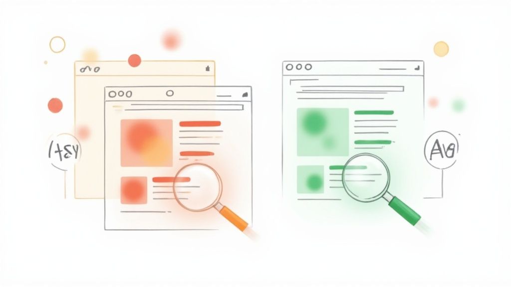
One of the best ways to put your visual hierarchy in web design to the test is with heat mapping. Tools like Hotjar or Microsoft Clarity create visual overlays on your site, showing you exactly where people click, move their cursors, and how far they scroll down the page.
Think of it like putting on a pair of glasses that lets you see your site through your users' eyes. The "hot" spots (usually red or yellow) show where all the action is, while the "cold" spots (blue or no color) reveal which elements are getting completely ignored.
This can be a powerful—and sometimes humbling—reality check. You might discover that users are clicking on a non-interactive image over and over again while totally missing your main call-to-action button. That’s an instant signal that your intended focal point isn't hitting the mark and needs to be more prominent.
The image below from Microsoft Clarity shows how a heatmap visualizes clicks, giving you a crystal-clear picture of what's grabbing attention.
This kind of visual data is invaluable for pinpointing where your hierarchy is working and where it's falling flat. By combining this with analytics, you can start to quantify user patterns and refine your hierarchy to perfectly align with how people naturally behave. It's an iterative process that turns a static design into a user-centered experience that drives up engagement and conversions. You can find more practical tips on this in these visual hierarchy principles.
Validating Your Choices with A/B Testing
While heatmaps show you what's happening, A/B testing helps you understand why and figure out what works better. The method is simple: you create two versions of a page (Version A and Version B) with one key difference, then show each version to a different segment of your audience.
From there, you just measure which one performs better for a specific goal. For example, you could test things like:
- A bright green CTA button vs. a subtle blue one.
- A huge, centered headline vs. a smaller, left-aligned one.
- A clean single-column layout vs. a two-column grid.
By tracking metrics like click-through rates, time on page, or conversions, you get undeniable proof of which design choice is more effective. This cuts out the guesswork and lets you make informed, incremental improvements to your visual hierarchy over time.
A/B testing isn't just about picking a "winner." It's about learning what makes your audience tick—what colors they respond to, which layouts they find intuitive, and what words compel them to act.
Establishing a Continuous Improvement Loop
Testing your visual hierarchy shouldn't be a one-time thing. User expectations change, and so should your design. The most successful websites operate on a continuous loop of feedback and refinement.
It breaks down into four simple steps:
- Design: Build your interface using established visual hierarchy principles.
- Test: Use tools like heatmaps and A/B tests to gather real-world user data.
- Analyze: Dig into the data to figure out what’s working and what isn’t.
- Refine: Make targeted adjustments based on what you learned, then start the cycle again.
When you adopt this iterative mindset, you ensure your site’s hierarchy stays sharp, effective, and perfectly aligned with both your users' needs and your business goals. It transforms your design from a static project into a constantly improving asset that delivers better results for the long haul.
Common Visual Hierarchy Mistakes to Avoid
Knowing the principles of visual hierarchy is one thing, but spotting where you’ve broken them in your own work? That’s a whole different skill. Even the most well-intentioned designs can fall flat if they stumble into common traps that leave users confused, frustrated, and ready to bounce.
These mistakes quietly sabotage your entire user experience, turning a great concept into a cluttered, ineffective mess. Learning what not to do is just as important as learning the principles themselves. It gives you a sharper eye for critiquing your own work and ensures the final product is clear, focused, and actually works.

Creating Visual Clutter
This is probably the most common mistake out there: trying to make everything important. When every single element on the page is screaming for attention—big fonts, bold text, bright colors everywhere—the result is pure visual chaos.
This "everything is a priority" approach always backfires. If everything is loud, nothing is. The user is left feeling overwhelmed, with no idea where to look first. The fix is to be ruthless with your prioritization. Pick the one thing you want the user to do or see, and give it the most visual weight. Everything else should be scaled back to support that main goal, not compete with it.
Lacking Sufficient Contrast
Poor contrast is a silent killer of good design. When your text color is too close to its background, it’s a struggle to read. This isn't just a minor annoyance; it causes real eye strain and frustration.
Beyond being a poor user experience, it’s also a massive accessibility fail, effectively locking out anyone with a visual impairment. Always, always check your contrast ratios. Use an online tool to make sure your color pairings meet at least WCAG AA standards. Readability should never be sacrificed for a trendy, low-contrast aesthetic.
Key Insight: A design with weak contrast forces users to work harder just to understand the content. This friction adds up, often leading them to abandon the page entirely in search of an easier experience elsewhere.
Using Inconsistent Styling
Inconsistency is a surefire way to confuse your users. If buttons, links, or headings look different from one page to the next, you shatter their mental model of how your site works. Suddenly, they have to re-learn your interface with every click, which completely disrupts their flow.
The solution is simple: create a consistent design system and stick to it.
- Links: All clickable text should look and behave the same way, every time.
- Buttons: Your primary, secondary, and tertiary buttons need consistent, distinct styles that are used for their intended purpose across the entire site.
- Headings: The styles for your H1, H2, and H3 tags should be uniform to maintain a clear typographic scale.
When you apply styles consistently, you build a predictable and intuitive experience. Users feel more confident and navigation becomes second nature. This is a fundamental part of creating a strong visual hierarchy in web design that people can actually trust.
Got Questions About Visual Hierarchy? Let's Clear Them Up.
We've walked through the what, why, and how of building a solid visual hierarchy. But theory is one thing, and practice is another. To help you connect the dots, here are some straight answers to the questions that pop up most often when people start applying these ideas.
How Does Visual Hierarchy Affect SEO?
This is a great question. While visual hierarchy isn't something Google's algorithm "sees" directly, its impact on SEO is huge—just indirect.
Think about it: a strong visual guide improves the user experience. When people land on your page and can instantly figure out what to do and where to go, they stick around longer. They interact more. This lowers your bounce rate and bumps up session duration, two signals that tell search engines your page is high-quality and relevant.
Plus, a well-structured page uses proper heading tags (H1, H2, H3) to create that hierarchy. This not only helps human readers scan your content but gives search engine crawlers a perfect map of your information, which can definitely help with indexing and visibility.
What's the First Thing to Consider When Planning a Layout?
Before you even touch a color palette or pick a font, you have to start with the page's primary goal. The absolute first question to ask is: "What is the number one action I want a user to take here?"
Is it to buy a product? Sign up for a newsletter? Book a demo? Whatever that core action is, it becomes the north star for every design decision you make. Your main call-to-action (CTA) should be the king of the hill—the most visually dominant element on the page. Everything else is there to support it and guide the user's eye right to it.
A layout without a clear goal is like a map without a destination. It might look interesting, but it won't lead your users anywhere meaningful.
Is It Possible to Have Too Much Visual Hierarchy?
Oh, absolutely. It's a classic rookie mistake, and it has a name: visual noise or design clutter.
This happens when you try to make everything important. Every button is bright red, every headline is bold and huge, every icon is animated. When everything is screaming for attention, nothing actually gets it. The result? Your user is overwhelmed and has no idea where to look first. They get confused, frustrated, and they bounce.
Effective hierarchy is about making deliberate choices. It’s about contrast. You have to be selective, giving serious visual weight only to the elements that truly matter and letting the rest play a supporting role.
Ready to skip the guesswork and build interfaces with a powerful hierarchy baked right in? Magic UI gives you a library of 50+ professional, open-source React and Tailwind CSS components. They're designed to help you build stunning, effective landing pages in a fraction of the time.