Humans love circles. According to BBC Science, soft corners give off a feeling of safety, whereas sharp corners suggest threat and injury. It's no wonder that this phenomenon has surfaced in modern web design, where users highly prefer rounded elements over sharp ones.
Do you ever look at a site from pre-2010 and gasp at the sharp buttons all over the place? Yep, me too. If you can master the border-radius, you can up-level your designs in minutes. Tailwind makes this even easier.
In this blog post, I'll guide you through setting border-radius in Tailwind using React. Whether you're a seasoned developer or just starting out, this guide will help you effortlessly create visually appealing and consistent designs.
What is Border Radius in Tailwind CSS?
Tailwind provides utility classes out of the box to apply CSS' border-radius property. Typically, you can apply any pixel amount of rounding, but Tailwind provides a common set that really helps with consistency across your designs.
These include:
rounded- Applies a small border radius.rounded-lg- Applies a larger border radius.rounded-full- Makes the element a perfect circle if its height and width are equal.rounded-none- Removes all rounded styling from the element. Best used when you want to override base roundedness on hover or responsive screen width change.
Setting Up Tailwind CSS in a React Project
First, make sure that your React project has Tailwind CSS properly configured. Need help? We've written a full step-by-step guide on how to install all the necessary packages for React here.
Create a React Button component
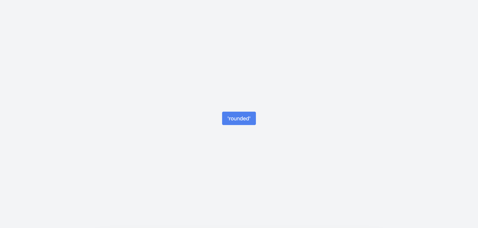
Let's add a button to the App.tsx. We will apply just the base level of roundedness with rounded.
import "./App.css"
import "./index.css"
function App() {
return (
<div className="flex-rows flex h-screen w-full items-center justify-center gap-4 bg-gray-100">
<button className="rounded bg-blue-500 px-4 py-2 text-white">
'rounded'
</button>
</div>
)
}
export default AppWhen rendered, this is what the button looks like - very aesthetically pleasing, right?
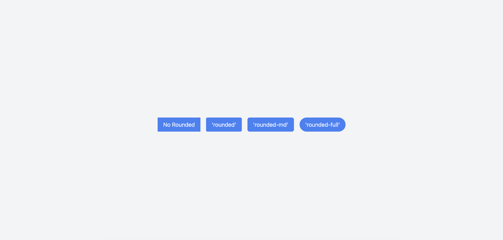
Let's add more rounded variations and see side-by-side how they compare.
import "./App.css"
import "./index.css"
function App() {
return (
<div className="flex-rows flex h-screen w-full items-center justify-center gap-4 bg-gray-100">
<button className="bg-blue-500 px-4 py-2 text-white">
No Round Corners
</button>
<button className="rounded bg-blue-500 px-4 py-2 text-white">
'rounded' Corners
</button>
<button className="rounded-md bg-blue-500 px-4 py-2 text-white">
'rounded-md' Corners
</button>
<button className="rounded-full bg-blue-500 px-4 py-2 text-white">
'rounded-full' Corners
</button>
</div>
)
}
export default AppNotice the different rounded utility classes added to each button element.
Modify Border Radius on hover
When creating complex layouts, you can add more interactivity to your elements by modifying the border radius on hover.
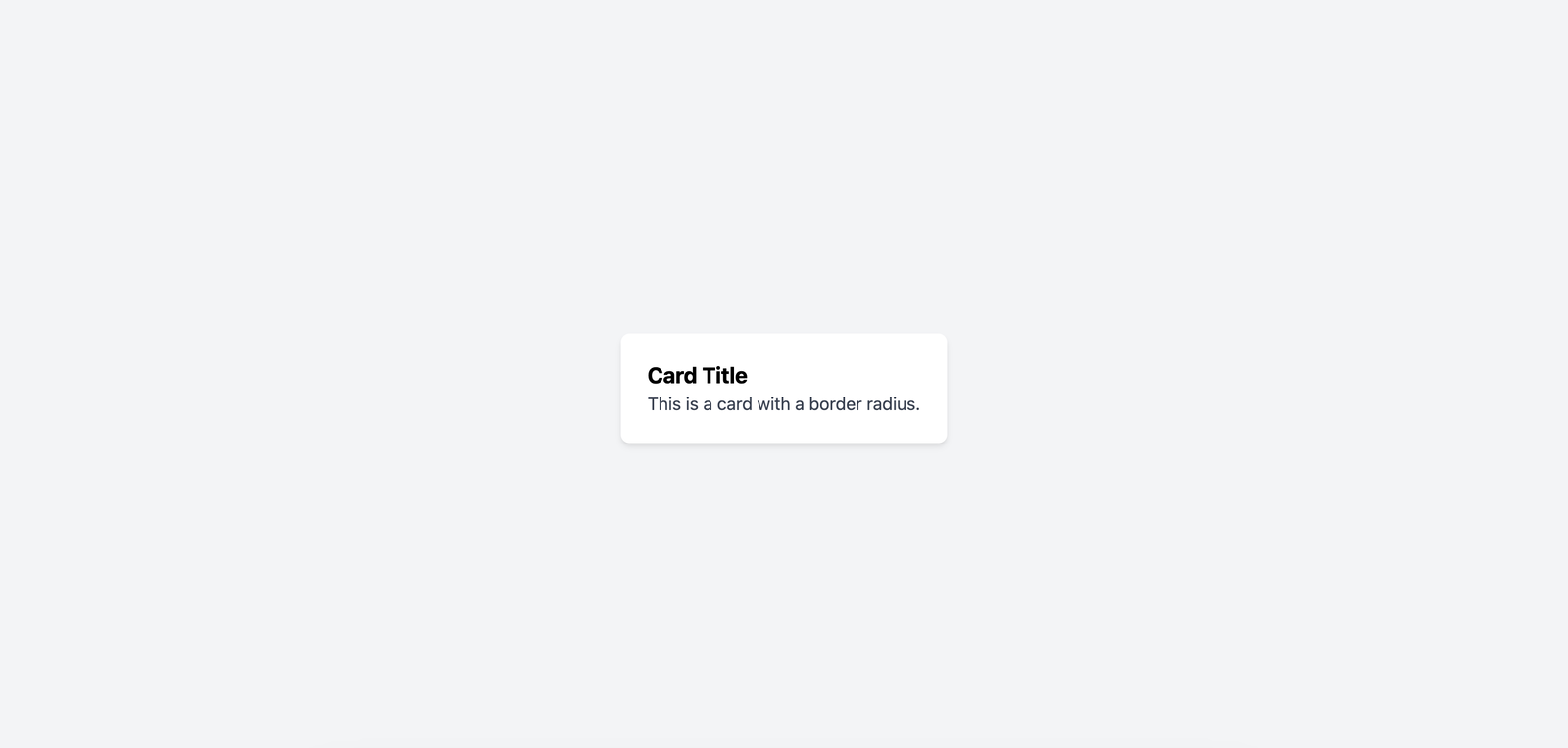
Here's a sample React card that has rounded-lg applied at the start but when the user hovers over it, it changes to rounded-none giving the element sharp edges.
import "./App.css"
import "./index.css"
function App() {
return (
<div className="flex-rows flex h-screen w-full items-center justify-center gap-4 bg-gray-100">
<div className="rounded-lg bg-white p-6 shadow-md hover:rounded-none">
<h2 className="text-xl font-bold">Card Title</h2>
<p className="text-gray-700">This is a card with a border radius.</p>
</div>
</div>
)
}
export default AppThis is what it looks like when rendered:
Creating Responsive Design
As with all the classes in Tailwind, you can apply different rounded classes based on what width screen the user is on.
For smaller screens, the card below will have medium roundedness applied. It will switch to Large at the Medium breakpoint and then stay Extra Large for all of the bigger screens.
import "./App.css"
import "./index.css"
function App() {
return (
<div className="flex-rows flex h-screen w-full items-center justify-center gap-4 bg-gray-100">
<div className="rounded-md bg-white p-6 shadow-md md:rounded-lg lg:rounded-xl">
<h2 className="text-xl font-bold">Responsive Card Title</h2>
<p className="text-gray-700">
This card adjusts its border radius based on the screen size.
</p>
</div>
</div>
)
}
export default AppNext Steps
Now that you've learned how to set border radius in Tailwind using React, it's time to put that knowledge to use. Here are a few ideas to help you continue building your skills:
-
Experiment with Different Border Radii: Try out different values for the border-radius classes like
rounded-lg,rounded-full, orrounded-md. See how they change the look of your components. -
Combine with Other Tailwind Classes: Mix and match border radius with other Tailwind classes such as padding, margin, and colors. This will give you a better sense of how different utilities work together.
-
Create Custom Components: Use your new skills to create reusable React components with different border radii. We have written guides on using Grid and Font Sizes in React that you can explore.
-
Practice by Building a Project: Start a small project, like a personal portfolio or a simple web app. Apply what you've learned about border radius in a real-world scenario.
-
Share Your Work: Post your creations on platforms like GitHub, CodePen, or your personal blog. Getting feedback from others can help you improve and learn new tricks.
Keep experimenting and building, and you'll become more comfortable using Tailwind with React in no time. Happy coding!