
Are you looking for inspiration and ideas for designing a captivating landing page? Crafting an engaging and effective page can be challenging amid countless landing page examples. In this blog, we will study creative landing page design, which is crucial for capturing attention, encouraging action, and converting visitors into customers. Join us as we brainstorm innovative ways to elevate your design and boost conversions.
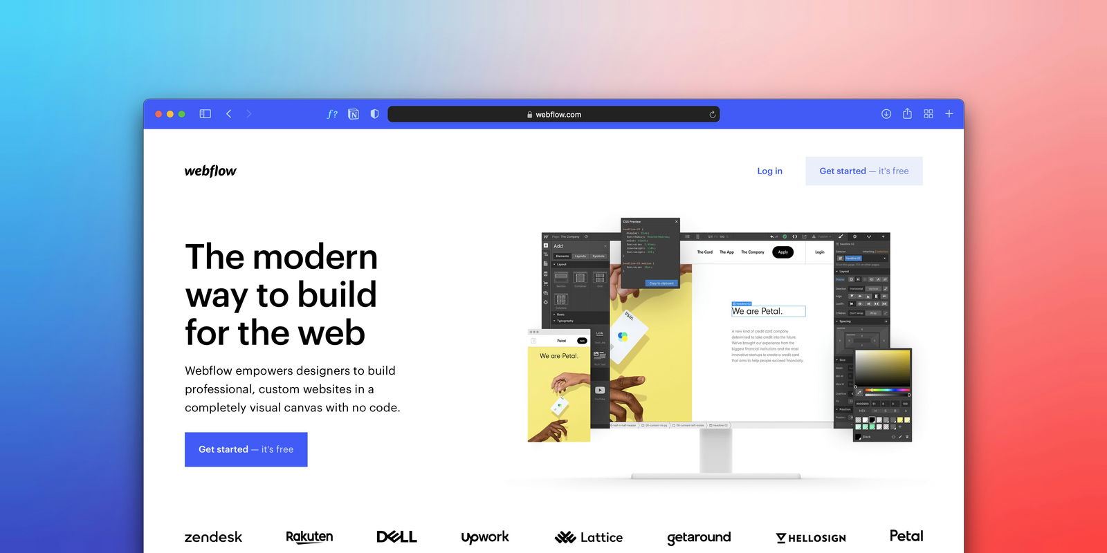
Entrepreneurs and marketers exploring innovative solutions for compelling landing pages will find Magic UI's startup landing page template indispensable. Tailored to enhance visitor conversion, this template provides the inspiration and ideas to create a standout landing page.
Ready to elevate your design? Let's get started.
What Is a Landing Page?
A landing page is designed to turn site visitors into leads or customers. Most landing pages usually feature personalized content and a clear call-to-action (CTA) to encourage users to take the desired action, such as:
- Filling out a contact form
- Downloading content
- Purchasing
Its primary function is to direct visitors towards the call-to-action (CTA).
Landing Pages for Maximum Impact
A website can have multiple landing pages. For example, you may create different landing pages to test out different messaging or layouts and see which version your visitors respond to the most. You can also create different landing pages to send visitors through a series of choices to land on a tailored CTA (this is known as a click funnel.)
Landing Pages That Sell
Landing pages educate your visitors and use compelling content to transform them into clients. They also serve as a representation of your website and your business. For example, in most cases, a landing page is the first thing a visitor will see after clicking on an ad. While it may be your audience's first page, a landing page differs from a web page's focus on conversion and lead generation.
Landing Pages Designed to Convert
A landing page stands alone, often at the forefront of a homepage, and serves a single purpose: getting your visitors to give you their contact information. Landing pages have limited navigation and direct visitors to a call to action. They give your offer or promotion a place to live and act as a gate to your coveted materials.
Related Reading
- FAQ Template
- How To Create A Landing Page
- Website Footer
- Website Header Examples
- How To Design A Landing Page
- Pricing Page Examples
- Tailwind Landing Page
- Landing Page UI
- Landing Page Copywriting
- App Landing Page
Why You Need the Element of Creativity in Your Landing Pages
Creativity is a fundamental factor in high-converting landing pages. It inspires users to take action and ensures their needs and preferences are met. While usability is the main element of a good landing page, the user experience truly matters. Two factors that must coexist to bring the best results:
- Creativity
- User experience
Why Landing Pages Need Creativity
Take a look at the data to better understand the importance of creativity in crafting landing pages. Studies show that 50% of users won’t recommend a poorly designed landing page, and 38% will stop engaging with a page they consider unattractive.
Brand Identity & User Experience
Your landing page’s design can affect higher conversion rates. If your brand visual identity complements well-suited landing page colors and typography, includes visuals that represent high quality and has visible but not flashy CTAs, you are on the right track.
Beauty & Usability for Modern Landing Pages
Today's internet users don't just appreciate well-designed pages; they expect them. They crave pages that are not only visually appealing but also designed with user experience in mind. Web designers must meet this demand to stay competitive in the digital realm.
Captivate Users with MagicUI
MagicUI is a free and open-source UI library that we designed specifically for design engineers. It offers a collection of over 20 animated components built with:
- React
- TypeScript
- Tailwind CSS
- Framer Motion
We provide a range of visually appealing and interactive elements that can be easily integrated into web applications, allowing us to create stunning user interfaces with minimal effort.
MagicUI components are highly customizable, enabling seamless adaptation to match our desired branding and design requirements. With our focus on animation and a design-centric approach, MagicUI aims to bridge the gap between design and development, empowering us to craft captivating digital experiences. Along with our free component library, with MagicUI Pro, you can save thousands of hours creating a beautiful landing page and converting your visitors into customers with our website templates.
Use our startup landing page template today and leverage the power of MagicUI to create stunning, conversion-driven digital experiences.
6 Elements of a Creative Landing Page Design
1. Catchy Headlines That Grab Attention
When it comes to creative landing page design, one of the most crucial elements is crafting a catchy headline that grabs the visitor's attention instantaneously. Your headline should be around ten words short and convey the purpose of your page to the visitor.
Crafting Effective HeadlinesUse numbers for impact
- Be specific and clear
- Choose solid and resonant words
- Set the tone for the landing page
2. Eyeflow Design for a Neat and User-Friendly Landing Page
Maintaining an organized and visually appealing layout on your landing page is essential for keeping visitors engaged. Categorize your content logically and complement it with high-quality images or videos that align with your brand aesthetic.
Design for Conversions, Not Clutter
Avoid overcrowding the page with too many colors and elements, as this can make it look cluttered and distract visitors from the key message. Instead, focus on using neutral colors, contrast, white space, and directional cues to guide visitors' attention to your call-to-action (CTA) button.
3. Short and Sweet Writing to Keep Visitors Engaged
When writing the content for your landing page, less is more. Keep your text concise, aiming for 250-300 words unless you're dealing with a complex product or service. Shorter text is easier to read and understand, ensuring visitors quickly grasp the value proposition.
Why This Matters to You
Focus on explaining why your offer matters to them and how it can benefit their lives or businesses. Being direct and to the point in your writing will help keep visitors engaged and increase the likelihood of conversion.
4. Craft a Compelling Call to Action (CTA) to Prompt Action
A landing page's success hinges on its ability to encourage visitors to take action, and a compelling call-to-action (CTA) is the key to achieving this. Make sure to include one or more clear CTA buttons that tell visitors precisely what you want them to do next. Place these buttons strategically on the page, significantly above the fold, so they're immediately visible.
Action-Oriented Words to Boost Engagement
- Sign up
- Get Started
- Download
- Register Now
5. Unique Value Proposition (UVP) to Differentiate Your Offering
Your landing page should communicate your Unique Value Proposition (UVP), which sets your product or service apart from the competition. Craft a concise and clear statement that explains how your offering solves customers' needs and why they should choose you over other options in the market. Your UVP should resonate with your target audience and convince them that your product or service is the best solution to their pain points or challenges.
6. Ease of Navigation for a Seamless User Experience
Incorporating intuitive navigation on your landing page is essential for providing visitors with a smooth user experience. A clean, straightforward layout with minimal distractions helps visitors focus on the key message and navigate the page effortlessly.
Guiding Visitors to Action
Ensure that the design elements are laid out logically, directing visitors' attention toward the CTA button and guiding them through the conversion process smoothly. A well-structured landing page enhances user engagement and increases the likelihood of conversion.
45 Examples Of Creative Landing Page Design To Inspire Your Creation
1. Langfuse Landing Page Design Example: Navigating the Animation Realm
Langfuse's landing page uses animated components to bring it to life. It is built with Magic UI, which allows easy access to animated components. The page is clean, with a minimalistic design and a clear call to action, making it easy for visitors to navigate and take their desired action.
2. DoorDash
Food delivery is big business; companies like DoorDash use landing pages to get more drivers to sign up for their service. This page helps you visualize what delivering food for a living will be like and highlights how much money you could make with your new full-time gig or side hustle.
Freedom You Crave, Delivered
What’s the most significant advantage of being a food delivery person? It’s not that you’ll learn every traffic shortcut in your city, nor is it the delicious smell of food that permeates your vehicle (10 years later, my car still smells like pepperoni pizza). The most significant advantage is the freedom you get. You can work your hours and be your own boss. And this landing page nails that feeling right in the headline.
3. Muzzle
Muzzle, a Mac app that silences on-screen notifications, fully embraces this show-and-tell mentality on their otherwise minimal landing page. Landing pages help users decide whether or not your product or service is worth their precious time and energy.
What better way to communicate your value proposition clearly and straightforwardly than by confronting visitors with the problem your app solves?
4. AirBnB
This AirBnB landing page is a one-stop shop for visitors curious about where to book a holiday rental. It features several options, such as:
- Beachfront
- Cabins
- Views
Once a user clicks, they can:
- Easily view the potential home
- Read testimonials
- View the pricing
What’s even better is that a user can select a date to book on the same page and convert on the spot if the information is convincing.
5. Netflix
The streaming giant’s landing page is short, sweet, and straightforward, including only the necessary details. It makes it extremely easy for users to complete the page's goal of entering their email address to get started with a Netflix membership.
A single-field form above the page fold makes starting with Netflix seem effortless. The copy is succinct, states the brand’s value proposition, and clarifies that you can cancel anytime. It also includes details on introductory pricing upfront so users don’t have to search for them.
6. Philosophy
Philosophy features skincare products and fragrances. Its landing page is arranged so scanning gives two opportunities to shop for skincare products or fragrances. If you are just browsing, you see two more shopping links every time you scroll down.
7. Slack
Slack landing page example. It is always on top of its game when creating some of the best landing pages. They are constantly optimizing for conversions, which is the best way to find your winning landing page.
Beyond Messaging
What makes Slack’s landing page stand out is its messaging. The company doesn’t want you to consider Slack a messaging tool. Today, it’s so much more than that — and that’s what this landing page is trying to convey.
A key takeaway from Slack’s landing page is to keep your navigation bar bare. On this landing page, Slack only includes the most important elements in the navigation bar: letting current users log in and prospective users talk to sales.
8. ExpressVPN
Virtual private networks (VPNs) add a layer of security to WiFi browsing, and ExpressVPN has created a landing page that communicates safety and simplicity. The main headline promises visitors a seamless online experience, and the graphic of someone accessing a variety of digital experiences reinforces that message.
Engaging Content & Building Trust
As visitors scroll down, the text describes the service's chief benefits, accompanied by simple graphics that help make abstract concepts like “global access” more concrete. Given that ExpressVPN is a security tool, establishing credibility is essential.
This landing page achieves this without alienating visitors with muted graphics and simple language. Prominent TrustPilot and app store reviews further signal that the company is reputable.
9. Blue Apron
Blue Apron aims to win new customers with a landing page emphasizing the variety of menu options available for Meal planning and ingredient delivery service. High-quality food photography entices visitors to keep scrolling, with content down the page emphasizing the service’s:
- Value
- Flexibility
- Convenience
Driving Conversions
The CTA remains consistent throughout, encouraging visitors to view plans and begin designing a subscription to suit their dietary preferences and schedule. Blue Apron could have cluttered this landing page with testimonials, menu examples, and recipe links, but it focused on its core messaging:
- Value
- Convenience
The landing page is relatively short (it only has four sections), but it intends to offer many features using cute graphics.
10. LinkedIn Ads
This landing page outlines the benefits of advertising on LinkedIn to potential business customers. A fixed header menu with the CTA button “create an ad” stays anchored as visitors scroll through the content, and the button appears twice. In the middle of this landing page, visitors can click through a carousel presentation of the critical benefits of LinkedIn Ads.
The design allows each concept to shine without devouring too much screen real estate. The page concisely outlines the three-step ad launch process, signaling visitors won’t waste time with a cumbersome backend system.
11. Hootsuite
Hootsuite is a social media management tool that helps marketers create, schedule, and track all their social content in a single dashboard. The landing page aligns with social media as a fun but legitimate marketing tool, with Hootsuite’s trademark cartoon owl sharing center stage with a photo of a youthful-looking customer.
Tiered CTA
The CTA, which is repeated throughout, invites visitors to start a 30-day free trial. Details about product benefits are shared in a space with a testimonial and a section displaying customer brand logos, which signal that the company has a track record of success. Hootsuite’s page starts with minimal text and an immediate CTA button for those who already know they want to get started.
As visitors scroll, each section of the page includes more detail, prioritizing describing tools for:
- TikTok, followed by
Granular information on pricing and product benefits is displayed down the page, followed by a button for scheduling a demo for visitors who seek a deeper dive.
12. Wondrium
The landing page for this streaming service uses a tiled background of movie title graphics to showcase the breadth of its offerings. A prominent CTA highlights a 14-day free trial offer. Testimonials from well-known Internet creators prove the service is worth exploring, while an FAQ proactively explains more details.
In keeping with Wondrium’s educational focus, a prominent FAQ details the service and reveals additional benefits, such as a quarterly magazine and audio-only streaming capabilities.
13. Uber for Business
The popular ride-sharing business has expanded to offer a feature set specifically for businesses, such as:
- Ride services for company customers
- Helping employees track travel expenses
This squeeze landing page, reached from a Google search, gives companies a fast track to setting up an Uber account with the headline “Let’s get started.”
Brand Consistency with a Twist
Three succinctly-stated benefits on the right persuade visitors to take action, while the logo at the top links to a purpose-built microsite for further information if needed. While the page looks different from the typical Uber app experience, the typeface and black-and-white color scheme make it recognizable as part of the Uber brand.
Understanding User Behavior
Web design research shows that most users skim what’s on screen in a predictable pattern. Their eyes move across the page and down in a zigzag and “Z pattern,” or else straight down and then across to the right in an “F pattern.”
F-Pattern for Conversions
Uber’s page uses an F-pattern by placing “Uber for Business” in the top left corner. After that, your eye is drawn straight down to the CTA form, with the three horizontal bands to the right providing supplemental material to skim.
14. Skillshare
This landing page design for online course provider SkillShare includes a navy blue background with text in high-contrast white and lime green. Tiled photos showcase the various course types available via the service, from cooking to computer skills. Using an F-pattern layout, the page uses the right-hand side to detail three key differentiators.
Multiple Login Options
The signup form requires just a name and email address to get started, and visitors can use existing social media logins integrated with the site.
By keeping the required fields to a minimum, Skillshare’s page encourages visitors to sign up for the service. Integrating with other login services makes the process even easier, allowing new customers to avoid remembering another username and password.
15. Snowflake
This event page for a data service provider demonstrates a commitment to mingling informative content with networking and fun. Detailed descriptions, an agenda, and an interactive event finder give potential attendees all the information they need to find the right event. This straightforward page looks information-heavy, with minimal graphics and plenty of text.
A Different Approach for Data Analysts
While that’s the opposite of most landing pages, the wonky approach may be just right for a data analytics audience. By stating that events are sold out and inviting viewers to fill out the form to be placed on a waitlist, Snowflake signals that their events are worthwhile and exclusive. This positioning helps ensure that visitors who sign up will rush to register when another event invitation comes their way.
16. Spatium
Different shades of purple and captivating images of outer space make it difficult not to install this Google Chrome extension on your computer. An abundance of blank space accentuates the limited text, creating an attractive and straightforward design.
A Winning CTA Combination
The CTA includes a reminder that the extension is free; for those who need more information, the page goes on to illustrate functionality with lush photos and to list widgets and options included with the download.
Frictionless Conversions
If the CTA can be accomplished quickly with little risk or cost to the visitor, there’s no need to over-elaborate. While you should spell out essential details (such as shipping costs for a product or which devices are compatible for a download), make the action as easy to take as possible, and be sure any checkout or download processes are similarly streamlined to keep visitors on track to completion.
17. Beats by Dre
Landing pages allow retailers to elaborate on:
- Style elements
- Technical features
- Craftsmanship
- Other product details
Educating and Converting Buyers
To that end, this page dedicated to wireless headphones includes extensive information on sound quality, charging capabilities, and built-in functions. Large visuals and concise text spell out the benefits, while the “buy” button links directly to the shopping cart, shortening the path to purchase.
Keeping the CTA in Sight
Visitors can lose track of the initial CTA if a landing page is long. Repeating the button at several points throughout the page is one solution, but it’s more elegant to use a floating header that always anchors the button at the top of the screen, keeping it within reach.
18. Inbound by Hubspot
This conference landing page makes it easy to secure tickets with a focused CTA and persuasive content that convinces visitors that the event is worth their time.
Showcasing Event Highlights
- Video presentations
- Event photos
- Speaker bios featuring expert talent
At the same time, delineated descriptions of the two available ticket types make it easy for visitors to select the right price point for them.
Avoiding Decision Fatigue for Conversions
While it can be tempting to show various price points and products to appeal to multiple tastes, having too many options can confuse and overwhelm viewers. By sticking to the two ticket types available to attendees who aren’t also exhibiting as vendors, HubSpot avoids complicating the selection and gives page visitors a binary choice.
19. Masterclass
Online course provider Masterclass has set the standard for marquee instructors, and its offering for screenwriting is no exception. Oscar-winner Aaron Sorkin teaches the ins and outs of the trade.
Content and Conversion
For those who search for the class using Sorkin’s name, Masterclass has devised a landing page with his photo front and center and a simple red CTA that makes it straightforward to claim a class spot. Video preview clips and a course outline help visitors decide whether the content will meet their needs.
Attracting Celebrity Instructors
If you’re working with an influencer or have a celebrity connection, highlight their endorsement or credentials. Masterclass appeals to its target audience with this approach, attracting visitors who want to name-drop their instructors at cocktail parties.
Showcasing Expertise
The clean and straightforward design of the rest of the page concentrates attention on the celebrity, while the preview clip demonstrates why they’re worth paying for.
20. Calm
Most of us could use more tranquility in our lives, and Calm aims to bring us exactly that. It’s a meditation and sleep app with features designed to invite relaxation into our otherwise chaotic lives. This landing page website example is the first thing people see once they visit the app’s site—right away, it encourages visitors to get started and engage more deeply with Calm.
Matching Design to Message
Calm practices what they preach through the look of their landing page. The copy is clean and straightforward to avoid overwhelming visitors with too much information. The headline, “Meet Calm,” lends a feeling of harmony and peace to the content.
Clear Value Proposition
Calm’s main goal is spelled out. (Better sleep, lower stress, and less anxiety? Sign me up!) The landing page gets straight to the point by inviting the reader to join millions of others around the globe on their path to wellness.
21. Zola
Zola is the latest startup that’s breaking the mold regarding wedding planning. Their philosophy is simple: Make it easy for couples to plan their big day, from the invitations through the honeymoon.
From an online wedding registry to a directory of wedding venues and vendors, Zola is a one-stop shop for brides and grooms-to-be. The first word we read on the landing page is free, immediately having a powerful effect on future brides and grooms who want to save on wedding costs but still get a polished-looking product.
22. CD Baby
CD Baby is a music distributor that gets your tracks to the ears of the masses. The platform aims to help independent musicians get on all the top platforms to get the widest distribution. Not only that, CD Baby wants to make sure that musicians are receiving the royalties they deserve.
The landing page explains why musicians benefit from CDBaby's service (beyond getting their music out there as much as possible). CDBaby does it all for one price, so musicians know exactly what they get.
23. Goby
Brushing perfected. That’s what this landing page from Goby promises right at the top, giving visitors the confidence and curiosity to click through. Not only does their award-winning electric toothbrush come with impressive accolades, but it’s also affordable and backed up by a money-back guarantee.
Now that’s worth a smile! Check out the section of the page that breaks down every element of the toothbrush. Rather than just talk about these features in the copy, visitors can see the:
- Soft, Premium Bristles
- Oscillating Brush Head
24. Salt & Straw
Salt & Straw Curiously Delicious Ice Cream Delivered Right to Your Door rewards lead capture with a subscription to their monthly newsletter with information about:
- New flavor launches
- Special offers
- Coupons for partner shops
- 10% off the customer's first order
The visual on their landing page is:
- Simple
- Memorable
- Yummy
It's scoops of ice cream flanked by rows of ripe summer berries.
25. SEM Rush
If you’re a digital marketer, you’re probably already familiar with SEM Rush. Their platform offers an all-in-one toolkit for:
- SEO
- Content marketing
- PPC
- Social media
- Market research
But rather than try to sell you all of these things simultaneously, this landing page narrows its focus on just one thing: how to use its platform to learn more about your competitors.
The CTA on this page taps into every marketer’s innate desire to spy on the competition. The one-field form asks you to enter any domain name before prompting you to click the big button and “Get Insights.”
26. Coco Village
The marketers at J7 Media, a Facebook Ads agency, did a phenomenal job creating a landing page showcasing a collection of different products while still keeping it focused on a single click-through goal.
Bold Discounts Drive Conversions
When offering a big sale or discount, you want everyone to know about it. And visitors on this landing page can’t miss that they’re offering “50% Off Beds and Bedding Sets.” Not only is that the main headline, but it’s also repeated under each product on every CTA. They even strikethrough the original prices to illustrate how much money you’ll be saving. Nice!
27. Grass Roots
There’s a growing demand for grass-fed meat, which is where this landing page from the Grass Roots Farmers’ Cooperative and the agency MuteSix comes into the mix. As you scroll through the page, you’re taken on the full customer journey—from problem awareness (understanding why grass-fed meat is better), through consideration (seeing why you should choose Grass Roots as your protein provider), to making a purchase (“Claim Your $30 Off”).
Building Trust & Urgency for Premium Meat
At the top of the page is a one-minute video featuring Dave Asprey, the founder and CEO of Bulletproof. The video explains how challenging it can be to source high-quality grass-fed meat and why Dave uses Grass Roots for the meat he can’t find in the grocery store. This sets the tone nicely for the rest of the page and gives you the right mindset to purchase.
28. Amazon
Here’s a landing page that, on paper, doesn’t seem to work at all. The colors are incredibly disjointed, and there are multiple different art styles. The content seems to be all over the place. The page even has multiple links to other pages and exit points.
When Benefits Trump Design Rules
Amazon somehow manages to get away with breaking all of these rules because they know their offer is too good to pass up. Ask people why they signed up for Amazon Prime, and they’ll answer you in the same order these sections appear on the landing page. Free shipping is the main benefit, followed by Prime Video.
Click-Through CTAs
The rest are bonuses, shown as add-ons as you get farther down the page. (With the average scroll depth only about 50%, it’s smart to put the most important stuff in the top half of the page.) Whether you consider this a SaaS page or an ecommerce page, the marketers at Amazon made the right call to use a click-through CTA instead of embedding a form on the page. According to the Unbounce Conversion Benchmark Report, click-through CTAs perform better in both industries.
29. Branch Furniture
As someone who had to furnish a home office recently, I know exactly how difficult it can be to find desks, chairs, and tables you like online. Branch Furniture understands this can be a problem for office managers, so their landing page instantly reassures you that you’re in the right place.
"Easy" Office Furniture
Their service makes it easy to get your office furniture designed, shipped, and installed. “Office Furniture Made Easy.” In just four words, you understand who this landing page is trying to target and what their unique selling proposition (USP) is. You don’t want to be building 100 desks for your new office Ikea-style, with nothing but a socket wrench and a dream. It seems like a much better idea to let Branch Furniture handle all those details for you.
30. Western Rise
Sometimes when prepping a piece like this one, you end up buying the product. I’m very, very close to pulling the trigger on a pair of Western Rise’s AT Slim Rivet Pants. And why not? This sharp landing page quickly establishes the appeal of the product through visuals and copy that stresses the benefits of these “elevated” pants. It may be time to give up on my ratty jeans altogether.
Evoking a Lifestyle
These pants may be handmade in Los Angeles, but many of the photos here (including the hero shot) scream Brooklyn. It’s easy to imagine wearing the AT Slim Rivet Pants as you peddle your fixie through traffic, balancing a latte on your handlebars on the way to a chic rooftop cocktail party.
31. Athabasca University
Athabasca University pioneered distance education in Canada in the 1970s. Today, it uses landing pages to boost its online enrolment initiatives, including this example representing its 14 certificate programs. It’s a smart choice since landing pages allow AU to focus a visitor’s attention on a particular slice of its many online program offerings.
Hitting the Right Audience
It might be worth testing out a more direct headline, but the copy here matches the school’s other branding initiatives elsewhere. It’s also very sharp. The target is clear: people who might further their education but don’t feel they have time to pursue it. This landing page says otherwise (in words and in its hero image).
32. Bariatric Eating
Here’s a page for Bariatric Eating that shows why personality and style are so important to your landing page. You can easily imagine a version of this campaign that looks much more clinical and scientific. Still, the marketers at Sevah Creative have infused it with a colorful and friendly design to make the subject matter much more approachable. The approach is working, too.
A Conversion Magnet
This page has an impressive conversion rate of over 39%. The playful design extends to every element of the page. The font choices, the illustrations, the colors—everything comes together in a way that perfectly matches their brand personality.
33. blow LTD.
If you look past the buzzy “Uber for beauty” thing, UK brand blow LTD. solves a genuine problem in a genius way. They offer affordable, professional beauty services that come to you, and—more importantly—you can book an appointment with one of their pros straight from their app. Smartly, landing pages are a big part of their campaign strategy. The example, for instance, promotes in-home eyelash extensions in clever ways.
Headline Clarity Wins Conversions
This landing page doesn’t mess around with cute copy (e.g., “Eyes That Amaze”). Instead, it clearly states the offer and relies on value (and maybe a little bit of novelty) to win over prospective customers. A promise doesn’t get more unambiguous than “Eyelash Extensions At Home,” and that’s precisely why this headline is so effective.
34. Blue Forest Farms
Hemp farmers sometimes have trouble disassociating themselves from cannabis culture. (Tie-dye colors, bong water, and that funky smell coming from your older brother’s van.) But this stellar B2B landing page takes modernized and, dare we say, adult approach to wholesale hemp oil extracts. From its clean design to persuasive copy, it makes a strong case that this is an industry that demands to be taken seriously.
Targeting Professionals Who Already Know
Unlike B2C landing pages, this page speaks to a professional crowd. By which I mean, people who know what it means when plant extract contains “natural terpenes” and has been “decarboxylated.” We might suggest going with a more impactful headline, but wholesalers are likely very aware of the benefits. Cutting to the chase can’t be a bad thing.
35. Border Buddy
The headline starts with the pain and insecurity (“Importing and Exporting Is Hard”) that any visitor who hits this landing page from a PPC campaign is likely to be feeling. Crucially, though, the promise of a solution appears with equal clarity above the fold: “We do the hard part for you,” says Border Buddy. Perfect.
Cut Through Customs Complexity
Bringing your purchases across the border can get very messy, so keeping this landing page clean is essential. There’s no more information here than what you need to know. No legalese either. You’ll have a customs broker worrying about all those small details for you.
36. REI Co Op
Engaging Call-to-Actions on REI Coop's Landing Page
- Carousel of messages
- Repeated "shop now" prompts
- Encouragement to "save 40%"
They can shop now or get a $25 gift card for shopping now. The site has a link to the nearest brick-and-mortar store and links to 10 kinds of merchandise. Still, all of the featured links on the page lead to immediate shopping.
37. Wix
Wix has turned its landing page into a creative playground with a captivating digital illustration that follows you down the page. It‘s not overwhelming or distracting — it’s carefully balanced with white space and clear text.
Guiding Users with Design
Wix uses design to emphasize certain touchpoints on the page. For instance, the mountain's peak in the illustration points to the main CTA, encouraging visitors to get started.
38. Row House
Besides its sleek design, this landing page gets bonus points for the header, which gives prospects a free first class. The copy speaks to both new and experienced fitness pros. What’s better is that it includes access to a fitness community that can help keep customers accountable for their fitness goals.
Streamline Design for Faster Conversions
Row House focused its website design on minimalism and getting people to sign up immediately. When you design your landing page, ditch a fussy design and focus on how to turn prospects into customers more quickly.
39. Codeacademy
The page's form is simple and only requires an email address and password.
Alternative Login Options
- GitHub
- Google Plus
The landing page also offers real-life success stories, testimonials, and other social proof for visitors needing more information before creating an account. This helps make the potentially intimidating world of coding more approachable for beginners.
40. Sunbasket
Sunbasket’s landing page ticks all the boxes by communicating its audience’s challenge in simple terms. People like me want an easy and convenient process for making meals. I want the best quality organic food. And I want my meals on autopilot. Sunbasket nails all these, and that means my chance of becoming a customer is high.
41. Curology
Effective Top Fold Features of Curology
- Clean
- Visually appealing
- To the point
Clarity & Connection in Your Landing Page
Users immediately understand the offer and how it can benefit them. Even if the brand is new to you, its message is loud and clear: Curology has a custom solution for you regardless of your skin issues. Make your landing page reflect how your customers will feel when they use your product. An open and transparent visual of a room with plants and clean tile gives a pleasant impression that your audience may be looking for.
42. Breather
When you visit Breather.com, there’s an instant call to action: indicate where you want to find a space. Plus, it uses location services to determine where you are, providing instant options nearby. Breather uses simple, to-the-point copy to let the visitor know what the company does, followed immediately by the CTA to select a city.
The negative space and soothing color scheme also align with the product — essentially, room to breathe.
43. Paramount Plus
This landing page design has it all. It's visually:
- Appealing
- Interactive
- Offers scannable yet descriptive headers
The background makes each fold look slightly different, creating a captivating scrolling experience. The landing page also features a repeatable CTA (“Sign In…”) and several strategically placed content offers, culminating in multiple touchpoints for visitors to convert.
44. Herb & Wood
The landing page for Herb & Wood Private Events uses advertising and off-page SEO to funnel traffic with one goal in mind: TIt seeks people who want to host a private event near its venue, which is in San Diego. A banner on the landing page announces, "Herb & Wood is a stylish and versatile event space in San Diego." The page offers visitors only one possible action: to click on the Private Events link.
45. St. Jude's Children's Research Hospital
St. Jude's Children's Research Hospital inspires monthly giving with the stories of the children it helps. Their landing page links to emotive stories of successful childhood cancer treatment.
Related Reading
- Portfolio Landing Page
- React Portfolio Template
- NextJS Portfolio Template
- React Landing Page
- Startup Landing Page
- Tailwind Portfolio Template
- Best Saas Landing Pages
- React Header
- CTA Design
- App Landing Page
- Social Proof On Website
- Hero Section Design
- Waitlist Landing Page
- Best Web Developer Portfolios
- Nextjs Landing Page
How To Arrive At A Creative Landing Page Design In 8 Steps
1. Set your campaign goal
Setting a campaign goal is pivotal to the success of your landing page. Your goal could be to:
- Increase sales
- Generate leads
- Boost conversions
It's crucial to set a realistic and measurable goal that aligns with your business objectives.
2: Select a Landing Page Template
Choosing a pre-made landing page template can save you time and effort. MagicUI Pro offers a range of templates to choose from, allowing you to customize the design and content to meet your specific goals. These templates provide a solid foundation for your landing page, making it easier to focus on customization.
3: Write your copy
Crafting compelling copy is essential for engaging visitors and driving conversions. Your headline should be attention-grabbing and clear, highlighting the key benefits of your offering. Focus on how your product or service can solve the visitor's problems and keep your copy concise and easy to read.
4: Craft your CTA
Your Call to Action (CTA) is the key element that prompts visitors to take action. Ensure your CTA is clear, specific, and compelling. Avoid generic CTAs like "Learn More" and opt for descriptive options like "Start Your Free Trial" or "Book A Demo" for better results.
5: Select your images
Visual elements play a crucial role in capturing visitors' attention. Choose high-quality images that resonate with your target audience. Start with a hero image that showcases your offer and include visuals that highlight the benefits of your product or service.
6: Connect your landing page
Integrating your landing page with your business domain and analytics tools is essential for tracking performance. Customize your URL, add tracking scripts like Google Analytics, and ensure seamless integration with your marketing stack for a complete setup.
7: Preview and publish
Before launching your landing page, review the copy, SEO settings, and form functionality. Ensure there are no typos, optimize for search engines, and test all forms to confirm they work as intended before publishing your page.
8: Optimize Your Landing Page
Once your landing page is live, continue to optimize its performance through A/B testing. Test different elements such as headlines, visuals, and CTAs to maximize conversions. Regular testing and optimization will help you achieve the best results from your landing page.
Best Practices For Creating A Landing Page
The first thing you need to remember when creating a landing page is that it needs to be very specific. This is essential for a number of reasons, but the primary one is that it helps significantly increase your conversion rates. Why? because those who visit your landing page are looking for something specific.
They have clicked on an ad or followed a link because they want something. It might be a special offer, some information about a product or service, or a free report or webinar. If your landing page doesn't offer them what they are looking for, they'll just hit the back button. Having a single, fixed goal allows you to get better conversion rates. So don’t send out multiple, mixed messages. Instead, stick to a single CTA—both in your ad and your landing page form.
Choose a Relevant Hero Image
When choosing a hero image, you need to think of your target audience and identify the kind of image appeals to them. For example:
- Are they young and looking for the latest tech gadgets?
- Are they business professionals looking for the most efficient way to get things done?
- Are they stay-at-home moms looking to have more fun with their families?
Then, pick a photo that not only appeals to visitors but also reinforces your message or value proposition. Now, place it in a spot that leads to your CTA, which is where you want your visitors to look next.
Here are some images that will make for a successful landing page:
- Simple images that evoke emotion
- Images that feature people
- A straightforward color palette that matches your landing page
Treat your CTA with Utmost Care
The CTA is, without a doubt, the most important part of your landing page. If your CTA isn’t convincing enough, your visitors won’t convert. Studying effective CTAs is the best way to know which ones could work for your specific purpose.
Some characteristics of effective landing page CTAs are:
- Focused on the benefit
- Straight to the point (five words at most)
- Action verbs (get, download, click, register, etc.)
Apart from great button copy, you also have to highlight your CTA. Here are a few more ways to make your CTA stand out on your landing page:
- Surround your CTA button with negative space, so it won’t compete for attention
- Look at your page the way your visitor will, follow where their eyes go, and place the CTA there
- Test everything–your button shape, size, color, font, and copy
Do A/B testing
An A/B test, also called split testing, is creating two slightly different variations of a single page to see which one works better. The key thing to note here is the slight variation as you conduct the test by changing one small element at a time.
Examples of A/B testing include testing between a red and green CTA button, two different headlines, or two hero images. You can’t just do A/B Testing at random, so to decide which variable to test, follow the ICE (Impact, Confidence, Ease) framework.
Common Mistakes To Avoid While Designing A Creative Landing Page

No Images or Low-Quality Graphics
Using high-quality images and videos on your landing page is crucial since people process visual content much faster than text. Using generic, pixelated, or outdated images can harm the credibility of your page. Stock photography can make your page look less authentic and reduce trustworthiness.
Page Layouts with Too Much Content and Complexity
While creativity is essential, avoid overwhelming your visitors with complex page layouts and too much content. Unclear messaging and elements like auto-playing videos with sound can discourage visitors. Make sure your page is mobile responsive and loads quickly for a better user experience.
Unscannable Copy
Good copy is key to creating clear and intuitive landing page experiences. It should be:
- Well-written
- Suggestive
- Exciting
Avoid using too much text, grammatical errors, long blocks of text, or a dull tone. Visitors will trust you more if they feel the copy is tailored to them and tells a compelling story.
Check Out Our React Component Library for Design Engineers
MagicUI is a free and open-source UI library specifically designed for design engineers. It provides a collection of over 20 animated components built with React, TypeScript, Tailwind CSS, and Framer Motion. This library offers a range of visually appealing and interactive elements that can be seamlessly integrated into web applications, allowing users to create stunning user interfaces with minimal effort.
Highly Customizable Components
MagicUI components are highly customizable, allowing for seamless adaptation to match desired branding and design requirements. This level of customization empowers users to craft captivating digital experiences that resonate with their target audience and elevate their brand identity.
Bridge Between Design and Development
With a focus on animation and a design-centric approach, MagicUI aims to bridge the gap between design and development. This fusion enables users to create dynamic and engaging landing pages that not only capture attention but also drive conversions effectively.
Save Time and Effort with MagicUI Pro
MagicUI Pro takes the capabilities of the free component library to the next level by offering users the ability to save thousands of hours creating beautiful landing pages. The Pro version includes website templates that are optimized for conversions, enabling users to convert visitors into customers efficiently.
Launch Your Startup Landing Page with MagicUI's Template
Ready to elevate your landing page game with MagicUI? Use our startup landing page template today and experience firsthand how MagicUI can transform your digital presence.