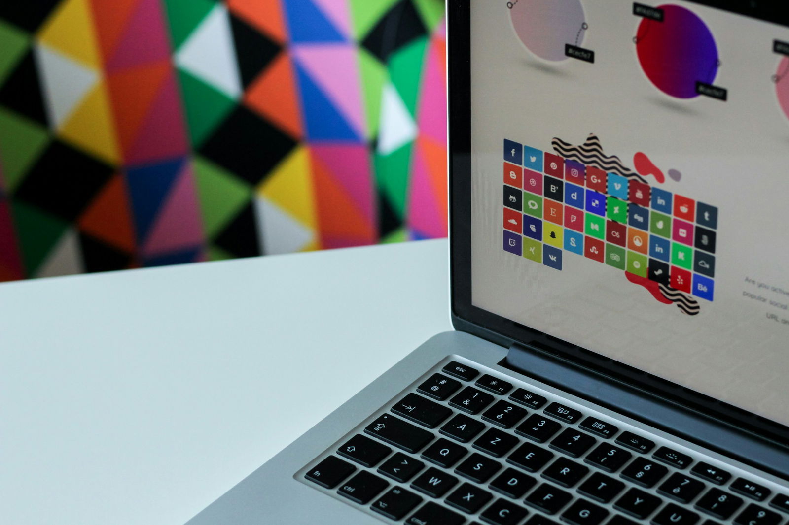
Your website is like a book. What’s the first thing people notice when they open your book? The cover. Just like a book cover, your website's logo creates an immediate impression, telling visitors what to expect. In this case, it helps them identify your brand and understand whether or not they’ll find what they’re looking for. A website logo can make or break your landing page such as these landing page examples. This blog will help you avoid the pitfalls of logo design by showcasing 50 fresh website logo examples to inspire your own logo.
Before we jump into the examples, take a look at MagicUI’s startup landing page template solution to help you design a logo that fits your brand and looks great on your website. It features a demo with a logo that you can easily customize to fit your business.
Understanding the Role of a Logo in Website Branding

A logo is a visual representation of your brand. It’s often the first point of contact between a business and its potential customers. A logo plays a critical role in making a positive first impression.
A visually appealing and professionally designed logo can capture attention and pique interest, encouraging consumers to engage further with the brand. This initial positive impression can set the stage for a favorable relationship between the brand and its audience.
Why Your Business Needs a Logo
A logo is a graphic symbol or emblem representing a company, organization, or brand. It is often composed of text, images, or a combination of both and serves as the primary visual identifier for the brand. The logo is a critical component of a brand's identity and is designed to convey the essence, values, and personality of the organization it represents.
It is typically displayed prominently on:
- Websites
- Business cards
- Marketing materials
- Products
Brand Identity Core
The importance of a logo lies in its ability to create a strong visual identity for a brand. It acts as a symbol that encapsulates the brand’s message and values, making it easier for consumers to recognize and remember the brand.
A well-designed logo helps establish a brand’s presence and creates a cohesive image across various platforms. It serves as the cornerstone of the brand’s visual identity, influencing how the brand is perceived by its audience.
Related Reading
- FAQ Template
- How To Create A Landing Page
- Website Footer
- Website Header Examples
- How To Design A Landing Page
- Creative Landing Page Design
- Pricing Page Examples
- Tailwind Landing Page
- Landing Page UI
- Landing Page Copywriting
- App Landing Page
What Makes a Great Website Logo?
Simplicity: Less is More When it Comes to Logos
Effective logos are simple and easily recognizable. They avoid complex designs and focus on conveying the brand’s message clearly and straightforwardly. This ensures the logo is versatile and can be effectively used across various mediums and sizes.
Memorability: Make it Stick
An effective logo is memorable and leaves a lasting impression. It should be unique and stand out from competitors, making it easy for consumers to recall and associate with the brand. Memorable logos often incorporate distinctive elements that make them easily identifiable.
Relevance: Stay in Your Lane
The logo should be relevant to the brand’s industry, values, and target audience. It must reflect the brand’s personality and purpose, ensuring that it resonates with the intended audience and accurately represents its identity.
Versatility: All-Around Goodness
A versatile logo can be used across various applications and formats, including:
- Digital
- Print media
It should look equally effective in color and black-and-white and at different sizes. Versatility ensures that the logo maintains its impact and readability regardless of where it is displayed.
Timelessness: Avoid Trends Like the Plague
A great logo has a timeless quality and avoids trends that may quickly become outdated. Its classic design should remain relevant and effective over the long term. Timeless logos avoid excessive changes and maintain their effectiveness as the brand evolves.
Scalability: Adapt to Any Situation
A logo's scalability is essential for its clarity and impact at different sizes. A well-designed logo should be legible and visually appealing, whether displayed on a large billboard or a small mobile screen. Scalability ensures that the logo adapts well to various contexts.
Color Considerations: Choose Wisely
The choice of colors in a logo can influence brand perception and recognition. Compelling logos use colors that align with the brand’s identity and evoke the desired emotional response. Color choices should be deliberate and support the overall design and messaging of the logo.
Typography: Mind Your Fonts
If the logo includes text, the typography should be carefully selected to complement the design and reinforce the brand’s identity. The font choice should be legible and align with the brand’s personality, ensuring the text enhances the overall logo design.
Originality: Don’t Be Cliché
Originality is key to creating a logo that stands out from competitors. A great logo should avoid clichés and overused design elements, offering a fresh and innovative brand representation. Originality helps differentiate the brand and create a unique visual identity.
Alignment with Brand Values: Get on the Same Page
The logo should align with the brand’s core values and mission. It should communicate the brand’s essence and resonate with the target audience, reflecting its commitment to its values and purpose.
Visual Balance: Don’t Let your Logo be Ugly
Visual balance ensures that the logo is aesthetically pleasing and well-proportioned. The elements of the logo should be harmoniously arranged, creating a balanced and cohesive design that:
- Draws attention
- Maintains visual appeal
Meaningful Symbolism: Make it Count
Effective logos often use meaningful symbolism to convey the brand’s message or story. Symbolic elements can enhance the logo’s significance and create a deeper connection with the audience.
Adaptability: Make it Work Everywhere
An adaptable logo can be easily modified to fit various contexts and applications. This includes adjusting the logo for different backgrounds, formats, and promotional materials while maintaining its core identity.
Clear Messaging: Make Sure People Get It
The logo should convey a clear and coherent message about the brand. It should communicate the brand’s purpose and values effectively, providing a visual representation that aligns with its overall messaging strategy.
Professional Design: Don’t Skimp on Quality
A professional design is crucial for creating a high-quality logo. The logo should be crafted with attention to detail and precision, reflecting the brand’s commitment to excellence and quality.
Related Reading
- Portfolio Landing Page
- React Portfolio Template
- NextJS Portfolio Template
- React Landing Page
- Startup Landing Page
- Tailwind Portfolio Template
- Best Saas Landing Pages
- React Header
- CTA Design
- App Landing Page
- Social Proof On Website
- Hero Section Design
- Waitlist Landing Page
- Best Web Developer Portfolios
- Nextjs Landing Page
50 Website Logo Examples for 2024
1. Minimalist Design: Uncomplicated Logos for the Modern World
Minimalist logos use clean lines and simple shapes to create an uncluttered design. This approach to logo design eliminates the distractions and complexities of more ornate logos, allowing the audience to grasp the brand’s identity quickly.
Tech startups like Xpand use minimalist logos to convey modernity and sophistication. For instance, Xpand’s logo features a simple geometric shape with no embellishments, immediately communicating the brand’s focus on digital growth and expansion.
2. Abstract Symbols: Unique Logos that Spark Curiosity
Abstract logos use unique, unexpected symbols to create unique, stand-out designs. Creative agencies like Tactile use these logos to grab attention and spark curiosity about their brands.
Tactile’s logo features an abstract shape that resembles a letter and a digital icon, reflecting the company’s expertise in design and technology. This logo invites onlookers to learn more about the business and its services, making it an effective branding tool.
3. Negative Space: Creating Clever and Engaging Logos
Negative space logos use the white space in and around a logo’s design to create hidden visuals that add depth and intrigue to the logo. The clever use of negative space can make logos:
- More engaging
- Thought-provoking
Financial services company BNB utilizes this technique in its logo to convey a sense of stability and trust. The logo features a traditional-looking bank icon created using negative space within the letters B and N. This subtle yet creative approach to logo design makes the logo more memorable and relevant to the industry it represents.
4. Hand-Drawn Logos: Authenticity and Artistic Flair
Hand-drawn logos incorporate sketched elements or custom illustrations to create a personalized and artistic brand mark. Fashion brands like Free People use hand-drawn logos to convey a sense of:
- Authenticity
- Creativity
Free People’s logo features a typography-focused design with delicate floral illustrations that reinforce the brand’s commitment to:
- Bohemian style
- Aesthetic
5. Geometric Shapes: Structured and Professional Logos
Geometric logos use structured, bold shapes to create organized and visually balanced designs. Software company Kittl uses a geometric logo to convey:
- Stability
- Professionalism
Their logo features a structured design with a grid-like appearance that suggests the brand’s expertise in organized digital solutions.
6. Vintage Style: Nostalgic Logos that Evoke Timelessness
Vintage logos evoke nostalgia by incorporating design elements from the past. These logos appeal to consumers because they suggest a sense of history and reliability. Café Bicerin uses a vintage-inspired logo to connect with its audience on an emotional level.
The logo's antique design suggests that the café has been around for generations, even though it has only recently opened.
7. Monogram Logos: Elegant and Sophisticated Lettermarks
Monogram logos use the letters of a business’s name to create an elegant and sophisticated brand mark. Luxury brands like Louis Vuitton use monogram logos to convey a sense of:
- Exclusivity
- High-end appeal
The brand’s iconic logo features an interlocking design of the letters L and V that can be found on nearly all of the company’s products. Monogram logos are simple yet distinctive, making them ideal for sophisticated businesses.
8. Wordmark Logos: Memorable Logos Driven By Typography
Wordmark logos create distinctive brand marks solely by using business names. Media company Netflix boasts one of the most recognizable wordmark logos in the world.
The logo’s custom font features unique details that make the design stand out and help create a memorable brand identity.
9. Combination Logos: Flexible Logos for Various Branding Contexts
Combination logos merge text and symbols to create comprehensive brand marks. E-commerce platform Etsy features a combination logo with a business name and an icon representing the brand’s focus on handmade goods.
These types of logos are flexible and can be used in various branding contexts. As a business grows, combination logos can be easily adapted for different applications, including:
- Website design
- Social media
- Merchandise
10. Gradient Logos: Dynamic Logos with Depth and Dimension
Gradient logos use color transitions to add depth and dimension to brand marks. Tech company Instagram features a vibrant gradient logo incorporating multiple colors to create a visually dynamic design.
This logo is more eye-catching than a traditional solid-color logo, suggesting that the brand is:
- Modern
- Innovative.
11. 3D Logos: Realistic Logos with Visual Engagement
3D logos use shading and perspective to create designs with depth and a sense of realism. Gaming company, Zeldal, features a 3D logo that instantly engages fans of the franchise.
The logo’s design includes intricate details and shading that make it appear as if it could exist in real life. 3D logos are visually striking and suggest a cutting-edge, modern brand.
12. Flat Design Logos: Simple Logos That are Easy to Scale
Flat logos eliminate three-dimensional effects for a simple and clean appearance. Startups like Ghost use flat logos because they are versatile. These logos are easy to scale and work in various applications, including:
- Digital
Flat design logos' simplicity makes them easy to recognize and remember.
13. Typography-Focused Logos: Creative Typography as the Logo
Typography-focused logos emphasize custom or creative typography to create unique brand marks. Publishing house Jaded Books uses a typography-driven logo with a custom font designed specifically for the company. The logo’s eerie, horror-like details reflect the imprint’s focus on publishing dark fiction.
14. Icon-Based Logos: Logos that Quickly Convey Brand Identity
Icon-based logos use simple icons as the central element in logo design. Health and wellness brand, WellNest, features an icon-based logo that uses a bird’s nest as the focal point of the design.
The logo design quickly conveys the brand’s focus on nesting and creating a serene home environment for expectant mothers.
15. Colorful Logos: Attention-Grabbing Logos that Evoke Emotions
Colorful logos use bold, vibrant colors to create eye-catching designs that grab attention. Children’s brand Melissa and Doug uses a colorful logo to appeal to its target audience of young kids. Bright colors evoke joy and happiness that align with the brand’s focus on imaginative play.
16. Black and White Logos: Timeless Logos that Emphasize Design
Black and white logos are classic and never go out of style. The legal firm, Houlon, Berman, uses a monochromatic logo to convey a sense of professionalism and trust.
The simple color scheme allows the firm’s design elements to take center stage. As a result, this logo emphasizes the firm’s experience and reliability over flashy design.
17. Circular Logos: Balanced Logos that Evoke Unity
Circular logos use round shapes to create balanced and harmonious designs. The United Way, a non-profit organization, features a circular logo that symbolizes unity and inclusivity.
The logo design includes a variety of colors that represent different communities coming together to create a better life for everyone.
18. Organic and Natural Logos: Designs that Evoke Sustainability
Organic logos incorporate earthy colors and shapes that mimic nature to create designs that convey a sense of sustainability. Eco-friendly brand, Naturally, dog uses a natural logo design that reflects its commitment to creating safe products for pets and their owners.
The logo’s earthy color palette and organic shapes suggest a:
- Connection to the environment
- Appeal to eco-conscious consumers
19. Dynamic Logos: Adaptable Logos for Modern Businesses
Dynamic logos are designs that can change form while maintaining the brand’s identity. The tech company Google, features a dynamic logo that adapts to different contexts.
When users search for a specific topic, the logo changes to reflect their search results. This flexibility signals to consumers that the brand is:
- Modern
- Adaptable
20. Playful and Whimsical Logos: Fun Logos that Appeal to Children
Playful logos incorporate whimsical elements to create a fun and approachable brand image. Toy company Melissa and Doug features a whimsical logo that appeals to its target audience of young children.
The logo’s colorful design and playful font evoke feelings of joy and happiness that align with the brand’s focus on imaginative play.
21. Transparent Logos: Logos That Use Transparency for Modern Appeal
Transparent logos use transparency effects to create engaging designs that add layers of meaning to the logo. Digital marketing agency WebFX features a transparent logo that uses the effect to create a modern and sleek design.
The logo’s clean appearance reflects the firm’s expertise in helping businesses grow their online presence.
22. Gradient and Metallic Effects: Luxurious Logos that Evoke Premium Appeal
Metallic gradients use shiny effects to create a luxurious and high-end feel. Automotive brand Aston Martin features a metallic logo that evokes an elite appeal. The logo’s rich details signal to consumers that the brand’s products are premium and exclusive, attracting wealthier clientele.
23. Cultural and Ethnic Logos: Logos that Represent Heritage and Identity
Cultural logos incorporate traditional motifs and symbols to create designs that represent specific communities. The African American History Museum uses an ethnic logo that honors the culture’s heritage.
The logo’s design features a traditional African symbol that connects the museum to its roots and reinforces its mission to educate the public about:
- African American history
- Culture
24. Futuristic Logos: Designs that Signal Innovation and Forward-Thinking
Futuristic logos use modern design elements to signal innovation and forward-thinking. Artificial intelligence company OpenAI features a futuristic logo that suggests the brand is a leader in technology.
The logo’s geometric design, coupled with its gradient color scheme, evokes a cutting-edge appeal that will attract consumers and businesses interested in the latest advancements in AI.
25. Symbolic Logos: Logos with Deep Meaning
Symbolic logos use imagery that carries deeper associations to communicate brand values and missions. Wellness brand SoulSpa uses a symbolic logo that features a lotus flower.
This imagery is commonly associated with tranquility and relaxation, perfectly representing the brand’s spa products.
26. Dual-Tone Logos: Striking Logos with High Contrast
Dual-tone logos use two-color schemes to create visually striking designs. The fintech company Stash features a dual-tone logo that uses a:
- Bright green
- Dark navy color scheme
The high contrast of the colors makes the logo easily recognizable and memorable.
27. Handwriting-Style Logos: Custom Fonts for a Personal Touch
Handwriting-style logos use cursive or handwritten typography to create a personal and inviting brand mark. Sweet Lady Jane, an artisanal bakery, features a handwriting-style logo that evokes a sense of warmth and homemade quality. This charm appeals to consumers looking for authentic and delicious baked goods.
28. Layered Logos: Complex Designs with Depth
Layered logos use overlapping elements to create complex designs with depth. Creative studio, Dside features a layered logo design representing the brand’s multifaceted identity.
The logo incorporates a variety of shapes and colors that suggest the studio’s expertise in creative and digital projects.
29. Textured Logos: Engaging Designs with Tactile Appeal
Textured logos incorporate patterns into their designs to create rich and engaging visuals. Fashion brand Coach uses a textured logo that mimics the look of leather to evoke the quality of its products.
The logo’s intricate details suggest the brand’s commitment to craftsmanship and create an engaging design that draws in curious consumers.
30. Hand-Crafted Logos: Logos that Evoke Artisanal Quality
Hand-crafted logos showcase the quality and craftsmanship of artisanal products. Boutique brand Lark features a hand-crafted logo with a custom font and delicate illustrations to convey the brand’s personalized and high-quality goods.
The logo’s design evokes a sense of warmth and charm that explains the products’ unique nature, appealing to the target audience of discerning consumers.
31. symmetrical Logos: Unconventional Designs for Modern Brands
Asymmetrical logos use an imbalanced structure to create dynamic and unconventional designs. Tech startup Droneseed features an asymmetrical logo that conveys a modern and edgy appeal.
The logo’s off-center design reflects the innovative nature of the company’s operations, which utilize drones to replant trees in deforested areas.
32. Interactive Logos: Engaging Logos for Digital Platforms
Interactive logos incorporate moving or changing elements to engage users on digital platforms. The Secret Door website features an interactive logo that changes when users click on it. This engagement:
- Draws visitors into the site’s mysterious theme
- Enhances user experience
33. Gradient Mesh Logos: Smooth Transitions for Artistic Appeal
Gradient mesh logos use a digital art technique to create smooth color transitions and fluid forms. Digital Arts, a media company, features a gradient mesh logo that evokes a contemporary and artistic feel.
Its colorful design is eye-catching and unique, helping the brand stand out and attract the right audience.
34. Dual-Meaning Logos: Clever Logos that Tell a Story
Dual-meaning logos contain hidden or double images that reveal a brand’s more profound story. The Northumberland Theatre Company’s logo cleverly incorporates a bird and a theatrical mask to represent the organization’s commitment to:
- Performing arts
- The local community
Logos like this engage viewers through discovery and interpretation, making them more memorable.
35. Hybrid Logos: Unique Logos that Combine Styles
Hybrid logos blend different logo styles to create unique designs that stand out. The New Orleans Pelicans’ logo mixes geometric and organic elements to create a hybrid design that represents the team’s identity and the culture of New Orleans.
The logo’s sharp, structured details evoke a sense of professionalism and sports, while the ornate, shell-like exterior pays homage to the local culture and environment.
36. Tech-Inspired Logos: Logos with Digital Motifs
Tech-inspired logos incorporate design elements referencing technology, such as circuits or digital grids. Norton, a cybersecurity firm, features a tech-inspired logo that evokes a sense of security and protection, reassuring customers that their data will be safe.
The logo’s design includes imagery that resembles a digital shield, creating a clear connection to the brand’s focus.
37. Retro-Futuristic Logos: Nostalgic Yet Modern Designs
Retro-futuristic logos blend vintage and futuristic design elements to create a nostalgic yet modern logo. Media brand Futurology features a retro-futuristic logo that appeals to both forward-looking audiences and those who appreciate the past.
The logo combines a classic sci-fi aesthetic with modern color gradients, creating a unique logo that tells a story.
38. Environmental Logos: Eco-Conscious Designs That Appeal to Green Consumers
Environmental logos use natural motifs and eco-friendly colors to represent sustainability. The World Wildlife Fund’s logo features a simple black-and-white design of a giant panda that connects to the organization’s mission to protect wildlife and their habitats.
This recognizable and straightforward logo evokes an emotional connection that resonates with eco-aware consumers and movements.
39. Dynamic Typography Logos: Kinetic Typography Evokes Energy and Movement
Dynamic typography logos feature text with moving or kinetic elements. The logo for the digital agency Motioncue features typography that appears to be in motion. The design conveys the brand’s specialty in creating engaging and energetic video content.
40. Digital Art Logos: Intricate Logos with a Modern Appeal
Digital art logos utilize digital art techniques to create modern and intricate logos. Gaming company Braid features a digitally illustrated logo that evokes a sense of:
- Creativity
- Artistic flair
The detailed logo design reflects the company’s focus on unique storytelling and imaginative gameplay.
41. Line Art Logos: Elegant Minimalist Logos
Line art logos use simple line art to create minimalist and elegant logos. Wellness brand Kin, features a line art logo that incorporates a smooth illustration of a mother and child to convey the brand’s focus on gentle products for families.
The logo’s clean design and use of white space create a calming aesthetic that reflects the brand’s values.
42. Custom Illustration Logos: Unique Logos that Tell a Brand’s Story
Custom illustration logos utilize unique graphics or illustrations to create distinct brand marks. The Dapper Dog, a dog grooming boutique, features a custom-illustrated logo that tells a story about the business.
The design incorporates a bowtie and top hat to convey the upscale nature of the grooming services, appealing to the target audience of affluent pet owners.
43. Artistic Logos: Logos that Incorporate Creative Elements
Artistic logos incorporate elements like brush strokes or abstract art to create visually appealing designs. G Creative, a creative agency, features an artistically inspired logo that evokes a sense of:
- Creativity
- Out-of-the-box thinking
The logo’s colorful design and unique shapes reflect the agency’s focus on helping clients stand out.
44. Collage Logos: Diverse Logos that Represent Varied Brand Values
Collage-style logos combine different elements to create a cohesive logo design. Lifestyle brand Kinfolk features a collage logo that incorporates a variety of images to represent the brand’s diverse values.
The logo’s intricate design conveys a sense of community and tells a story about the lifestyle the brand promotes.
45. Iconic Shape Logos: Simple Shapes with Universal Appeal
Iconic shape logos use instantly recognizable shapes, such as hearts or stars, to create brand marks.
Charity: Water uses a droplet logo to represent the organization’s mission to bring clean drinking water to developing nations. The logo’s simple design is universally understood and conveys the charity’s focus quickly and efficiently.
46. Futuristic Typography Logos: Modern Fonts for Innovative Brands
Futuristic typography logos use modern fonts to convey innovation and forward-thinking. Tech brand Kera features a logo with futuristic typography that suggests the company is a leader in innovation. The unique font of the logo stands out and creates a modern aesthetic that will attract the brand’s target audience.
47. Brushstroke Logos: Logos that Evoke a Handcrafted Feel
Brushstroke logos incorporate artistic brushstroke elements for a handcrafted and artistic feel. The art gallery, Brush Creek, features a logo with a brushstroke font that conveys the artistic nature of the business. The logo’s unique design adds texture and personality to the brand’s visual identity.
48. Neon Effect Logos: Bright, Colorful Logos with Retro Appeal
Neon effect logos use bright colors and glowing effects to create eye-catching designs. Entertainment brand Stranger Things features a neon logo that captures the retro aesthetic of the popular Netflix series.
The logo’s design evokes the show's theme, which centers around the 1980s and appeals to both:
- Nostalgic audiences
- Modern viewers
49. Responsive Logos: Adaptable Designs for a Digital World
Responsive logos are designs that adapt to different screen sizes and devices. Tech company Fuze, features a responsive logo that reduces in size and complexity when viewed on smaller screens. This adaptability is crucial for modern logo design as more website traffic comes from mobile devices.
50. Geometric Pattern Logos: Complex Logos for Structured Brands
Geometric pattern logos use repeating shapes in logo design to create visually complex and structured brand marks. Architectural firm ODA features a geometric pattern logo that reflects the firm’s innovative approach to design. The logo’s intricate pattern evokes a sense of organized structure and stability that aligns with the firm’s values.
How to Choose the Right Logo Style for Your Website
Brand Identity: Reflecting Your Unique Brand Values
Your logo is often the first thing people notice about your business. Therefore, choosing a logo style that aligns with your brand identity is essential. Consider how the logo style reflects your brand’s:
- Identity
- Values
The logo should align with your brand’s mission, personality, and target audience, accurately representing your brand’s essence.
Industry Trends: Find a Balance Between Unique and Familiar
Every industry has specific visual languages and logo design trends. While you want your logo to be unique, you also want to make sure it fits within the current design trends of your particular industry.
Research industry trends to understand your target market's visual language and preferences. Choosing a logo style that fits these trends can help your brand stay relevant and appealing to your audience.
Audience Preferences: Selecting a Logo Style Your Audience Will Appreciate
Your logo shouldn’t be designed just for you. It should also appeal to your target audience. To achieve this, you must understand your audience's preferences and select a logo style that resonates with them.
Consider demographics, interests, and cultural influences to ensure the logo appeals to your audience.
Design Versatility: Selecting a Flexible Logo Style
Your logo will appear online and offline in various places and formats. Therefore, it’s crucial to choose a logo style that is versatile and adaptable to different applications.
The logo should work well across different digital and print mediums and remain effective at different sizes.
Brand Differentiation: Avoiding the Trap of a Generic Logo Style
One of the main purposes of your logo is to represent your brand visually and set it apart from the competition. Choosing a logo style that sets your brand apart from competitors is crucial.
A unique and distinctive logo can help your brand stand out in a crowded marketplace and avoid confusion with similar brands.
Simplicity vs. Complexity: How Detailed Should Your Logo Be?
One of the first decisions you should make when selecting a logo style is whether you want a simple or complex design. Simple logos are often more memorable and versatile, while complex logos can convey more detailed messages but may need to be more adaptable.
Consider your brand’s personality and the message you want your logo to communicate to determine whether a simple or complex logo style is best for you.
Color Palette: Understanding What Different Colors Mean
Every logo has a color palette, and your logo’s colors should align with your brand’s visual identity. Colors play a significant role in brand perception and can evoke:
- Specific emotions
- Associations
For this reason, it’s crucial to research different color meanings to determine which palettes are appropriate for your logo based on your brand and target audience.
Typography: Choosing Fonts That Reflect Your Brand’s Voice
Many logos include text; if your logo has any wording, it’s essential to consider the typography that will be utilized carefully.
The typography style should complement the overall logo design and reinforce your brand’s identity. The font should be legible and align with the brand’s personality.
Symbolism: Adding Meaning to Your Logo Design
Another important consideration when selecting a logo style is whether your logo should incorporate symbols or icons representing your brand’s values or industry.
Not all logos need to have symbols, but including some imagery can add depth and meaning to your logo, enhancing its overall impact.
Brand Longevity: Choosing a Timeless Logo Style
Your logo is not something you want to change frequently. Instead, you want your logo to remain relevant and effective over time. For this reason, avoid trends that may quickly become outdated and opt for a design that can evolve with your brand’s growth.
Competitive Analysis: Ensuring Your Logo Is Original
Part of the logo design process involves analyzing your competitors' logos to ensure that your logo is distinctive and differentiates your brand.
This process helps you avoid mimicking competitors’ designs and instead focus on creating a unique visual identity.
Cultural Considerations: Being Mindful of Diversity and Inclusivity
When selecting a logo style, be aware of cultural implications. Ensure the design is appropriate, respectful of different cultural contexts, and does not inadvertently offend or misrepresent.
Feedback and Testing: Getting Outside Opinions on Your Logo Design
Before settling on a final logo design, gather feedback from stakeholders and test the logo with your target audience.
This process can provide valuable insights into how the logo is perceived and whether it effectively communicates your brand’s message.
Professional Design: Working With an Experienced Logo Designer
Once you’ve selected a logo style that fits your business, it’s time to create your logo. Consider working with a professional designer to ensure your logo is well-crafted and aligns with your brand’s identity. An experienced design can enhance the quality and effectiveness of the logo.
Adaptability: Ensuring Your Logo Design Is Flexible
In addition to being versatile, your logo design should also be adaptable. This means that the design can be easily adapted to:
- Different contexts
- Applications
Your logo should remain effective and recognizable in various formats and sizes.
Additional Elements
Consistency: The Key to a Cohesive Brand Identity
Consistency in logo design ensures that the logo aligns with the brand’s overall visual identity. This includes using consistent colors, typography, and design elements across various platforms and materials.
Scalability: Is the Logo Design Versatile?
Scalability ensures that the logo maintains its quality and impact at different sizes. The design should be clear and legible, whether displayed on a small mobile screen or a large billboard.
Visual Impact: Does the Logo Make a Strong First Impression?
The logo should have a strong visual impact that captures attention and makes a memorable impression. Effective use of design elements such as color, shape, and typography contributes to the logo’s visual impact.
Emotional Appeal: What Feelings Does the Logo Evoke?
A great logo should evoke the desired emotional response from the audience. Consider how the design elements and colors contribute to the logo’s emotional appeal and align with the brand’s message.
Market Positioning: Does the Logo Suit the Brand’s Target Audience?
The logo should reflect the brand’s market positioning and differentiate it from competitors. Consider how the design aligns with the brand’s positioning and conveys its unique value proposition.
Brand Message: Does the Logo Communicate the Right Values?
The logo should effectively communicate the brand’s message and values. Ensure the design elements reinforce the brand’s core message and resonate with the target audience.
Adaptability: Can the Logo Function in Different Contexts?
The logo should be adaptable to different contexts and applications. This includes being effective in various formats, such as digital and print, and maintaining its integrity across:
- Different backgrounds
- Sizes
Feedback Incorporation: Has the Logo Been Refined?
Gather feedback from stakeholders and incorporate their input into the logo design. This can help refine the design and ensure it aligns with the brand’s goals and audience expectations.
Professionalism: Does the Logo Look High Quality?
Ensure that the logo design reflects a high level of professionalism and quality. A well-crafted logo enhances its credibility and reinforces its commitment to excellence.
Future Growth: Will the Logo Be Relevant Over Time?
Consider how the logo design will accommodate future growth and changes. The design should be flexible enough to evolve with the brand and remain relevant.
Check Out Our React Component Library for Design Engineers
MagicUI is an open-source UI library built with:
- React
- TypeScript
- Tailwind CSS
- Framer Motion
Developer's Arsenal
This library was designed specifically for engineers and developers. It includes over 20 animated components that can be integrated into web applications to create stunning user interfaces with minimal effort.
MagicUI bridges the gap between design and development, allowing us to create beautiful digital experiences.
Why Use MagicUI?
MagicUI’s collection of customizable, animated components allows developers to build interactive web applications that impress users. With a focus on design, MagicUI can help your project stand out, and the library’s free and open-source nature empowers you to use it however you want.