A great SaaS product deserves a landing page that does it justice. Yet, countless companies struggle to turn visitors into users because their page misses the mark. It's not about flashy animations or complex jargon; it's about clarity, trust, and a seamless user journey. The gap between a visitor and a sign-up is often filled with small, strategic optimizations that make all the difference.
This guide cuts through the noise to provide actionable SaaS landing page best practices, showcasing specific platforms, templates, and frameworks that help you build pages that don't just look good, they convert. We will dive into seven essential resources, from leveraging modern UI kits and high-converting templates to mastering the psychology of conversion with expert insights. Each item includes screenshots, direct links, and practical advice to help you implement these strategies effectively.
The goal is to equip you with a clear blueprint for creating landing pages that communicate value instantly and guide users effortlessly toward conversion. To help you quickly refine your page and ensure it adheres to modern best practices, consider incorporating AI-powered tips for fixing your landing page into your workflow. Let's explore the tools and techniques that will transform your landing page into a powerful growth engine.
1. Nail the First Impression with a Modern UI & UX
Your landing page's success is often decided in the first five seconds. A clunky, outdated, or slow-loading design creates immediate friction and distrust, causing high bounce rates. One of the most effective SaaS landing page best practices is to leverage a modern, developer-first UI library that combines aesthetic polish with high performance. This approach allows you to build a beautiful, responsive page from pre-built, customizable components without sacrificing speed or developer experience.
Why It Works: Combining Speed and 'Wow' Factor
Instead of building complex animations and layouts from scratch, a component library provides production-ready blocks for heroes, feature sections, and social proof. This strategy not only saves hundreds of development hours but also ensures your page adheres to the latest design standards, building instant credibility with a discerning audience of developers, founders, and tech enthusiasts. It’s about delivering a 'wow' factor that feels both professional and effortless.
Actionable Insight: Use Magic UI for Stunning Animations
A standout choice for this is Magic UI, an open-source component library built with React, TypeScript, and Tailwind CSS. It excels at providing sophisticated, copy-paste components that add a premium feel to any landing page.
- Unique Offerings: Magic UI specializes in dynamic elements like animated grids, bento grids, retro grids, and attention-grabbing hero sections that are notoriously difficult and time-consuming to build manually.
- Developer Experience: The components are designed for easy integration. You can install them via
npmor simply copy the source code into your project, giving you full control over customization. - Pricing & Access: Magic UI is completely free and open-source, making it accessible to everyone from solo founders to established companies. You can browse and use all components without any cost.
Pro Tip: Combine Magic UI’s animated components with a strong value proposition in your hero section. For example, use their
AnimatedGridPatternas a background for your H1 and CTA to create a visually arresting first impression that hooks visitors immediately.
By using a tool like Magic UI, you bypass the trade-off between a bespoke, animated design and a fast-loading, template-based site. You get the best of both worlds, ensuring your landing page is memorable, trustworthy, and conversion-focused from the very first glance.
Website: ui.aceternity.com
2. Accelerate Launch with Production-Ready Webflow Templates
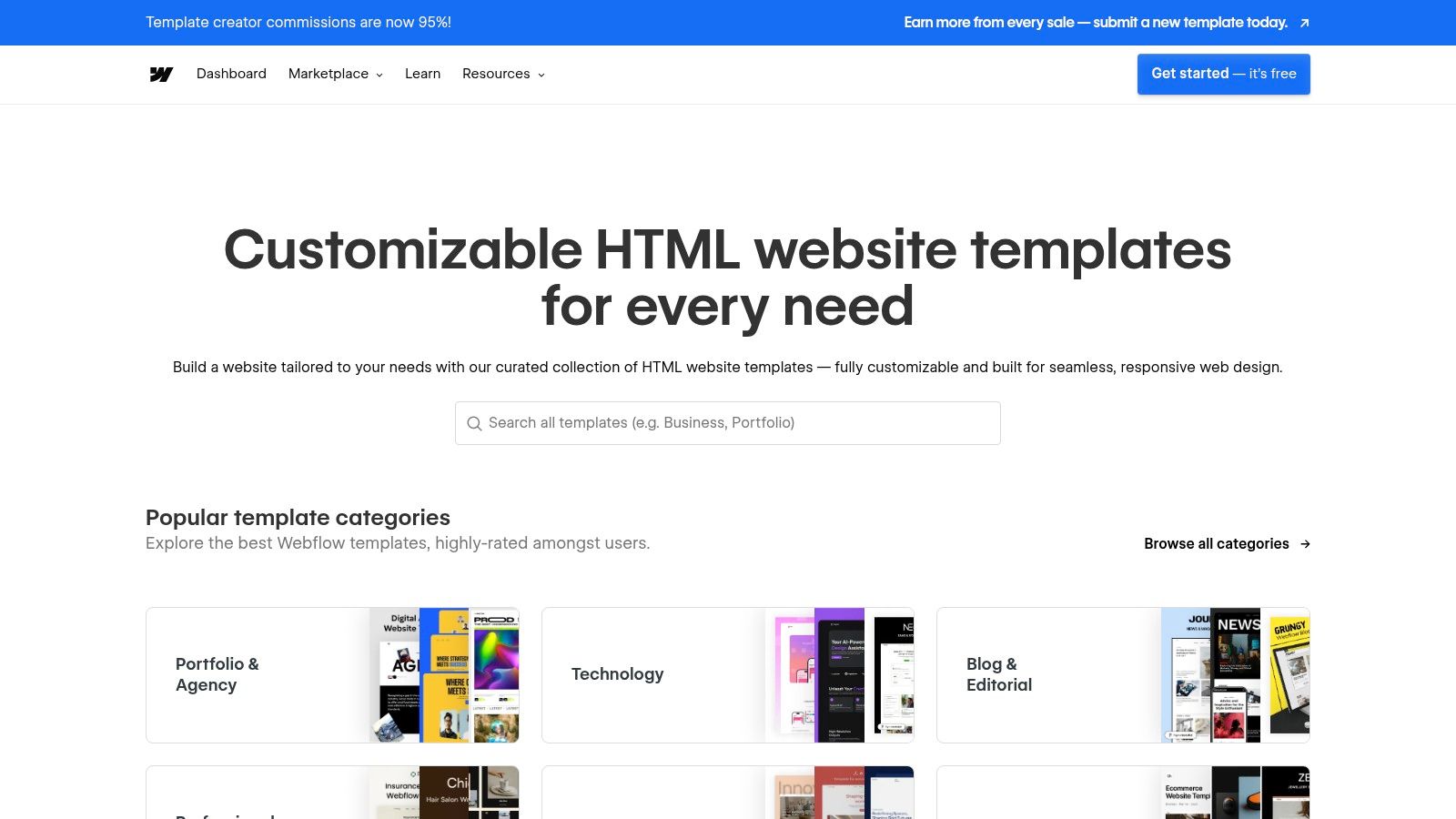
Building a high-quality landing page from scratch is a significant time and resource investment. For teams that need to move fast without compromising on design quality, leveraging a pre-built template is one of the most effective SaaS landing page best practices. The Webflow Templates Marketplace provides a curated library of professionally designed, conversion-focused templates that can be customized and launched in days, not weeks.
Why It Works: Marrying Best Practices with No-Code Speed
Webflow templates are more than just static designs; they are fully functional websites built with best practices baked in. SaaS-focused templates come with pre-built sections for clear value propositions, social proof logos, in-depth feature showcases, and pricing tables. This structure allows you to bypass the wireframing and initial development phases, letting you focus entirely on adapting the content and branding to fit your product. The no-code visual editor means you can make changes in real-time without writing a single line of code.
Actionable Insight: Choose a Template Built for SaaS Conversions
The Webflow Templates Marketplace is the ideal platform for this approach, offering a vast selection of templates specifically designed for technology and software companies. It provides the tools to get a professional, high-performing landing page live with minimal friction.
- Unique Offerings: The marketplace features hundreds of SaaS-specific templates with built-in conversion-oriented sections like hero components, testimonials, feature grids, and FAQ accordions. Live previews allow you to test the user experience before purchasing.
- Developer Experience: While it's a no-code platform, Webflow offers powerful customization and the ability to export clean, semantic code if you prefer to host the site yourself. This flexibility appeals to both marketing teams and developers.
- Pricing & Access: Templates are a one-time purchase, typically ranging from $49 to $149. You can then customize the template within Webflow's visual editor and host it there (requires a subscription) or export the code.
Pro Tip: When selecting a template, filter for those recently updated and with high ratings. Before customizing, review the template's "Style Guide" page to understand its core design system (colors, fonts, buttons). This will help you maintain design consistency as you add your own branding and content.
By starting with a Webflow template, you leverage a proven layout and design foundation, freeing up your team to focus on what matters most: compelling copy and a clear call to action. You can learn more about how to choose from the many high-quality landing page design templates available in the ecosystem.
Website: webflow.com/templates
3. Accelerate Conversion Testing with a Dedicated Platform
Building a landing page is just the first step; the real work lies in optimizing it for conversions. Instead of relying on slow, developer-dependent A/B testing cycles, one of the most impactful SaaS landing page best practices is to use a dedicated conversion rate optimization (CRO) platform. These tools empower marketing and growth teams to rapidly launch, test, and iterate on landing page variants without touching a single line of code, turning optimization into a core, agile workflow.
Why It Works: Speed, Data, and AI-Driven Insights
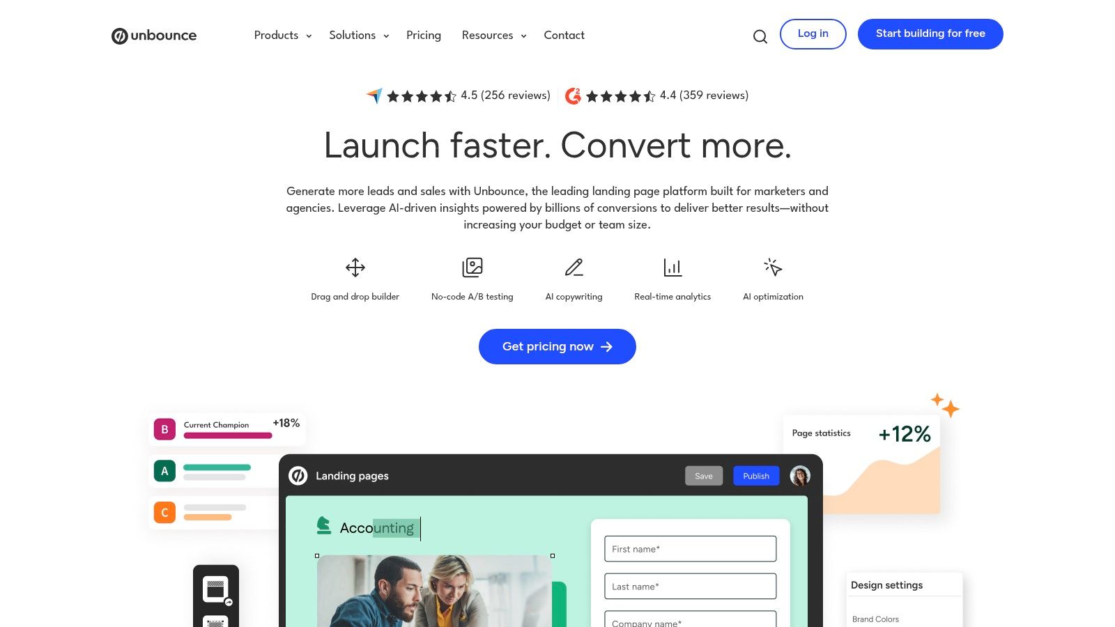
A dedicated platform like Unbounce moves landing page management from the engineering backlog to the marketing team’s control. This allows for immediate implementation of data-driven hypotheses. You can test different headlines, hero images, or call-to-action designs in parallel, gathering real-world data on what resonates with your audience. The addition of AI-powered features further accelerates this process by automatically directing visitors to the variant most likely to convert them.
Actionable Insight: Use Unbounce for Rapid Testing and AI Optimization
Unbounce is a mature, industry-leading platform designed specifically for building and optimizing high-converting landing pages. It's an ideal solution for paid acquisition teams and marketers who need to move quickly and validate ideas with rigorous testing.
- Unique Offerings: Unbounce’s standout feature is Smart Traffic, an AI algorithm that analyzes visitor attributes and dynamically routes them to the landing page variant where they are most likely to convert. It also offers a rich library of SaaS-specific templates, popups, and sticky bars.
- CRO-Focused Toolset: The platform provides built-in A/B testing, a user-friendly drag-and-drop builder, and seamless integrations with over 1,000 marketing tools. This creates a powerful, all-in-one environment for conversion optimization.
- Pricing & Access: Unbounce is a subscription service with plans that vary by traffic volume and features. It offers a 14-day free trial, allowing you to test its full capabilities before committing.
Pro Tip: Start by using a pre-built SaaS template from Unbounce’s gallery to get a head start on best-practice layouts. Then, create 2-3 variants of your hero section and activate Smart Traffic. This allows the AI to optimize for conversions from day one, even before you have enough data for a traditional A/B test conclusion.
By leveraging Unbounce, you shift from a "build and hope" mentality to a continuous cycle of "test, learn, and improve." This data-first approach ensures your landing pages evolve based on actual user behavior, maximizing your return on ad spend and driving sustainable growth.
Website: https://unbounce.com
4. Seamlessly Connect Your Landing Page to Your CRM
A high-converting landing page is only half the battle; the real value comes from what you do with the leads it generates. One of the most impactful SaaS landing page best practices is to ensure a seamless connection between your page and your CRM. This integration eliminates manual data entry, prevents leads from falling through the cracks, and enables immediate, personalized follow-up, which is critical for nurturing prospects effectively.
Why It Works: Unifying Marketing and Sales Data
When your landing page builder is natively integrated with your CRM, every form submission, content download, or demo request automatically updates a contact record. This creates a unified view of the customer journey, allowing you to trigger automated email workflows, score leads based on their activity, and provide your sales team with rich context for their outreach. This closed-loop system turns your landing page from a simple lead capture form into a powerful engine for your entire revenue pipeline.
Actionable Insight: Use HubSpot’s Free Landing Page Builder
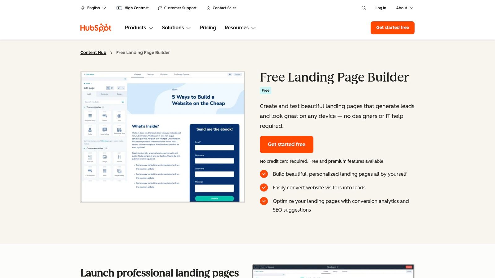
HubSpot offers a powerful landing page builder that is deeply integrated into its world-class CRM platform. It’s designed for marketers who want to move fast and prove ROI without needing extensive technical skills, making it an ideal all-in-one solution.
- Unique Offerings: The tool’s biggest strength is its native connection to the HubSpot ecosystem. Leads captured on a landing page are automatically added to the CRM, where you can enroll them in email sequences, track their lifecycle stage, and analyze conversion analytics all in one place.
- User Experience: HubSpot provides a library of mobile-responsive templates and a drag-and-drop editor, along with built-in SEO suggestions and performance analytics. This makes it easy to launch optimized pages quickly.
- Pricing & Access: You can start building landing pages for free. The free tier includes HubSpot branding, but it provides core functionality tightly integrated with the free HubSpot CRM. Paid plans (Starter, Professional) unlock advanced features like A/B testing and dynamic content.
Pro Tip: Use HubSpot’s free landing pages to capture leads for a specific high-value asset, like an ebook or webinar. Then, create an automated email workflow in the free CRM to nurture those new contacts with related content, effectively guiding them through the sales funnel without any manual intervention.
By leveraging a tool like HubSpot, you connect the dots between traffic and revenue. It ensures that every conversion on your landing page is the start of a managed, measurable, and optimized customer relationship.
Website: hubspot.com/products/landing-pages
5. Deconstruct and Rebuild with Proven Components
Why reinvent the wheel when you can learn from the best? A common pitfall is designing in a vacuum, leading to layouts and copy that miss the mark. One of the most effective SaaS landing page best practices is to deconstruct what’s already working for top-tier companies and use those proven patterns as a foundation. This approach allows you to benchmark your design against successful examples and rapidly assemble high-converting pages.
Why It Works: Benchmarking Meets Rapid Implementation
Instead of guessing which hero section or pricing table layout converts, you can study thousands of real-world examples from successful SaaS businesses. This strategy removes the guesswork from design and copywriting, providing a clear roadmap for what an effective page looks like. By using a library of pre-built components based on these examples, you can accelerate your workflow from inspiration to a fully functional page.
Actionable Insight: Use Landingfolio for Inspiration and Assets
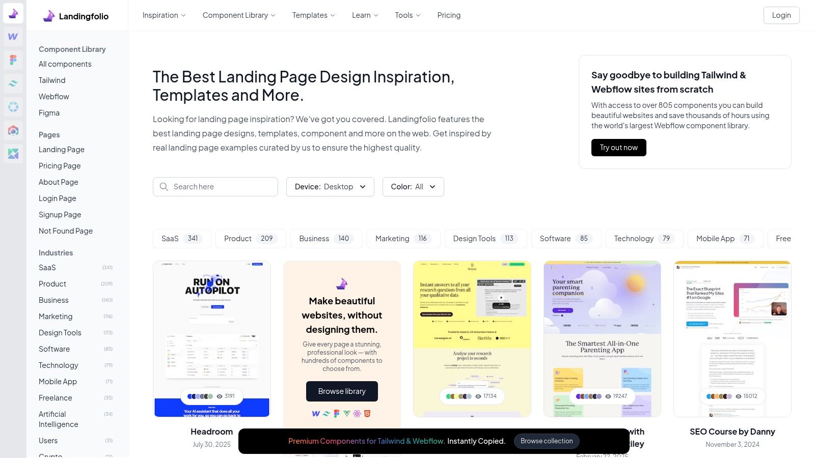
A premier resource for this is Landingfolio, a curated gallery of top-tier landing pages that also offers hundreds of pre-built components and templates. It bridges the gap between seeing a great design and being able to implement it quickly in your own projects.
- Unique Offerings: Landingfolio provides thousands of real component examples categorized by section (hero, features, pricing, etc.). It also sells production-ready assets and templates for Figma, Webflow, Tailwind, and Vue/React, supporting diverse tech stacks.
- Developer & Designer Experience: The platform is a goldmine for both inspiration and practical application. You can analyze copy, structure, and design choices, then download a corresponding component to drop directly into your project, drastically reducing build time.
- Pricing & Access: While the inspiration gallery is free, the high-quality components and templates are available via flexible pricing plans, including quarterly, annual, and lifetime access options.
Pro Tip: Use Landingfolio’s gallery to identify 3-4 hero sections you admire. Analyze their value propositions and calls-to-action. Then, find a similar pre-built component from their library to use as a starting point for your own page, ensuring your design is grounded in a proven format from day one.
Landingfolio is not a hosted builder; it’s an asset and inspiration library. You still need the technical skills to implement the components, but it gives you an unparalleled head start, ensuring your landing page is built on a foundation of proven success.
Website: https://www.landingfolio.com
6. Test Multiple Concepts Rapidly with a Template Marketplace
Iterating on your landing page design is crucial for finding what resonates with your audience, but building multiple high-fidelity versions from scratch is often impractical. A key SaaS landing page best practice is to leverage a vast template marketplace to quickly prototype and deploy different concepts. This allows you to test various layouts, value propositions, and visual styles without a massive upfront investment in custom design and development.

Why It Works: Quantity and Quality on Demand
Using a subscription-based asset library gives your team an unlimited playground for creative exploration. You can download and customize dozens of production-ready SaaS templates, from complete HTML/CSS builds to sophisticated Figma and Webflow kits. This approach dramatically accelerates the A/B testing cycle, enabling you to gather real-world data on what converts best before committing to a final, polished design. It's about making data-driven decisions faster.
Actionable Insight: Use Envato Elements for Unlimited Assets
For teams looking to implement this strategy at scale, Envato Elements is an unparalleled resource. It’s a subscription service offering unlimited downloads from a massive library of over 26 million creative assets, including thousands of high-quality SaaS landing page templates.
- Unique Offerings: The platform provides a huge selection of assets tailored for SaaS, including HTML templates, Webflow components, and comprehensive Figma/XD UI kits. It also includes icons, illustrations, and mockups to fully flesh out your designs.
- Developer Experience: Templates come with live previews and user ratings, helping you vet quality before downloading. While you need your own build and hosting workflow, the source files are well-organized and ready for customization.
- Pricing & Access: Envato Elements operates on a simple subscription model (starting at $16.50/month) that includes a commercial license for all assets. This makes it incredibly cost-effective for teams that need a steady stream of creative resources.
Pro Tip: Use Envato Elements to create multiple landing page variants for different audience segments. Download a few top-rated Figma kits, customize the messaging and visuals for each target persona, and deploy them simultaneously to see which one performs best. This rapid, low-cost testing can yield powerful conversion insights.
By using a service like Envato Elements, you can de-risk your design process and empower your team to experiment freely. It provides the assets needed to implement best practices across multiple campaigns, ensuring your final landing page is not just beautiful but also validated by user behavior.
Website: https://elements.envato.com
7. Go Beyond Design with Conversion Rate Optimization (CRO) Expertise
A beautiful landing page is a great start, but it’s useless if it doesn’t convert visitors into customers. Truly effective SaaS landing page best practices involve a deep understanding of user psychology, data analysis, and continuous testing. Instead of guessing what works, you can learn the proven frameworks for persuasion and optimization from the industry’s leading practitioners.
Why It Works: Data-Driven Decisions Over Gut Feelings
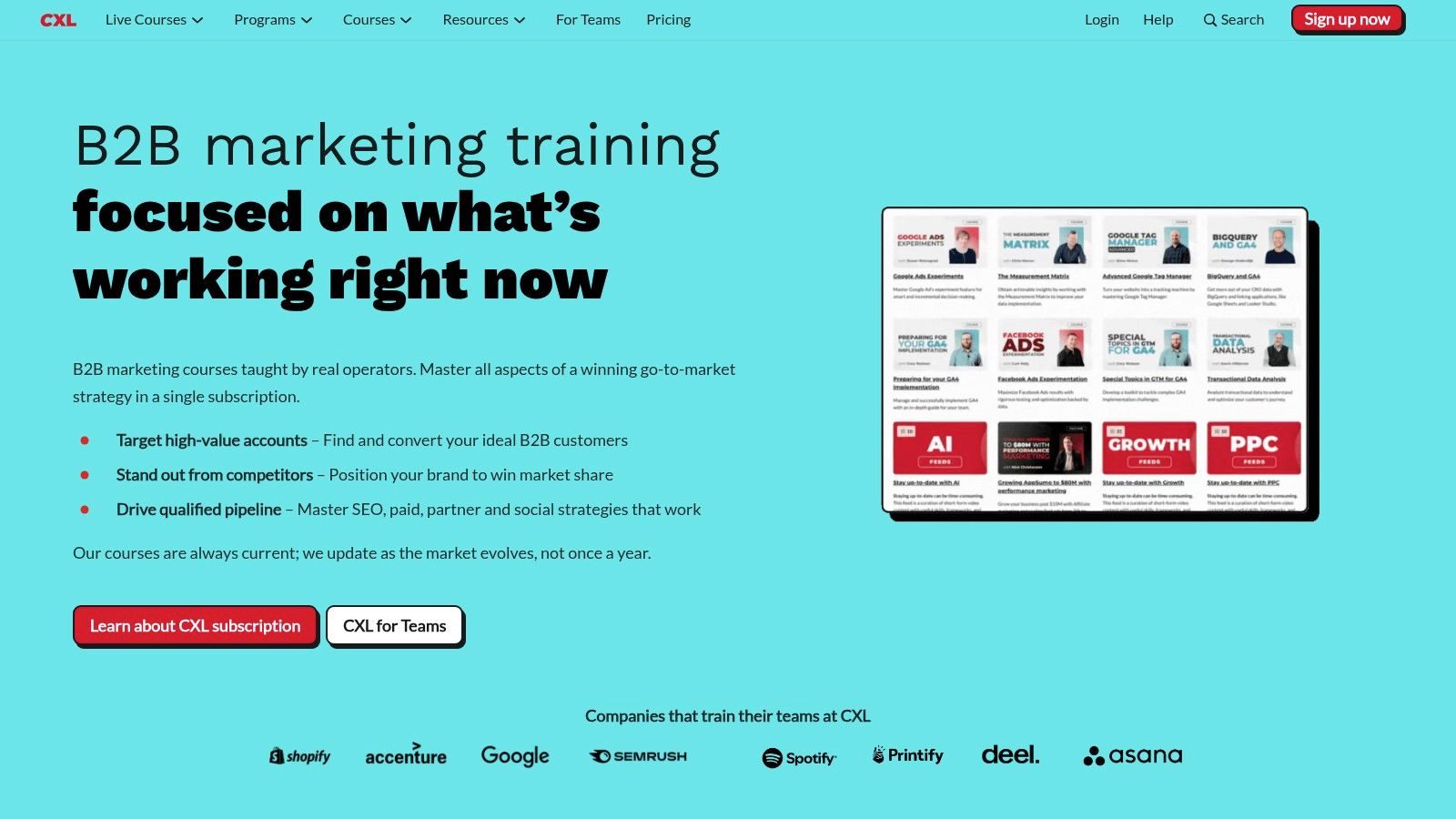
Top-performing SaaS companies don't just launch a landing page and hope for the best; they instrument, test, and iterate based on data. CXL provides the exact knowledge required to implement this process. By learning foundational CRO principles, you can systematically improve your messaging, layout, and calls-to-action to drive measurable growth, turning your landing page into a predictable revenue engine rather than a static digital brochure. For a deeper dive into these tactics, you can learn more about how to improve website conversion rates.
Actionable Insight: Upskill Your Team with CXL Courses
CXL (ConversionXL) is a premier education platform that offers practitioner-led courses on every aspect of conversion rate optimization. It’s the ideal resource for moving beyond surface-level tips and mastering the science behind high-converting landing pages.
- Unique Offerings: CXL offers over 100 on-demand courses, including a dedicated "Landing Page Optimization" course that covers everything from persuasive design to A/B testing frameworks. Minidegrees and certifications provide structured learning paths.
- Expert Instructors: The courses are taught by vetted, in-the-trenches experts who have driven results for major brands, ensuring the content is practical and up-to-date.
- Pricing & Access: Full access to the library is subscription-based, with plans for individuals and teams. They also offer a 7-day money-back guarantee, allowing you to explore the platform risk-free.
Pro Tip: Don't just watch the videos. Use the CXL frameworks to conduct a heuristic analysis of your current landing page. Identify areas of friction, unclear value propositions, and weak calls-to-action, then create a hypothesis-driven testing roadmap to systematically improve performance.
By investing in education from a platform like CXL, you equip yourself and your team with the skills to make smarter, data-backed decisions that directly impact your bottom line. It’s about building a culture of optimization, not just a one-off design.
Website: https://cxl.com
SaaS Landing Page Best Practices — 7-Tool Comparison
| Item | Implementation complexity | Resource requirements | Expected outcomes | Ideal use cases | Key advantages |
|---|---|---|---|---|---|
| Magic UI | Moderate — developer-focused (React/TypeScript/Tailwind) | Dev environment, familiarity with modern JS stack; Pro templates are paid | Production-ready, highly animated UIs assembled quickly | Dev teams, startups, freelancers building modern landing pages | Large open-source animated component library, ready blocks, strong community |
| Webflow Templates Marketplace | Low — visual no-code editing in Webflow | Webflow account (hosting optional), basic Webflow skills | Fast visual launches; polished templates, exportable clean code | Non-technical founders, marketers, designers who want visual editing | Curated templates, live previews, visual builder + hosting or export |
| Unbounce | Low–Medium — platform-driven builder and testing tools | Subscription, marketing resources, sufficient traffic for AI features | Rapid A/B testing and CRO-focused page improvements | Paid-acquisition teams and conversion-focused marketers | Smart Traffic AI, built-in A/B testing, wide integrations |
| HubSpot Landing Page Builder | Low — WYSIWYG builder integrated with CRM | HubSpot account (free start, paid tiers for more features) | Lead capture with attribution and workflow automation | Teams already using HubSpot or needing CRM-connected pages | Native CRM integration, end-to-end marketing stack, easy lead workflows |
| Landingfolio | Low (resource library) — requires implementation in chosen tool | Purchase/access to assets, designers or devs to implement Figma/Webflow/Tailwind assets | Rapid benchmarking and component-based page assembly | Designers and teams looking for examples and reusable sections | Massive collection of real landing sections, cross-tool assets for multiple stacks |
| Envato Elements | Low–Medium — download assets then build/host yourself | Subscription, time to vet assets, dev/design for integration | Access to many template concepts for large-scale iteration | Agencies and teams testing many concepts or producing multiple sites | Unlimited downloads, broad asset variety, commercial licensing included |
| CXL (ConversionXL) | Low — learning platform (no builder) | Subscription or course purchase, time investment for training | Deeper CRO knowledge, better test design and optimization outcomes | Teams wanting to upskill in CRO and persuasive design | Practitioner-led courses, certifications, in-depth CRO frameworks |
From Best Practices to Better Performance
Building a SaaS landing page that consistently converts is not a one-time project; it's a dynamic, ongoing process of strategic iteration. Throughout this guide, we've explored a comprehensive toolkit designed to elevate your landing pages from mere digital storefronts to powerful conversion engines. We've seen how establishing a powerful first impression with sophisticated animations from Magic UI can immediately capture user attention. We've also delved into the efficiency of using platforms like the Webflow Templates Marketplace and Envato Elements to accelerate development without sacrificing quality.
The journey from a good landing page to a great one is paved with data and user-centric design. This is where mastering SaaS landing page best practices becomes crucial. Tools like Unbounce and the HubSpot Landing Page Builder empower you to move beyond guesswork, enabling rapid A/B testing and personalization at scale. By leveraging these platforms, you can systematically test headlines, calls to action, and value propositions to discover what truly resonates with your audience.
Furthermore, continuous learning and inspiration are non-negotiable. Drawing inspiration from curated collections like Landingfolio keeps your designs fresh and aligned with current trends, while diving deep into the data-driven methodologies taught by CXL provides the strategic framework to understand the "why" behind every conversion.
Your Actionable Next Steps
The difference between reading about best practices and achieving better performance lies in implementation. Don't let this wealth of information lead to paralysis. Instead, focus on taking small, deliberate steps forward.
- Audit Your Current Page: Use the principles discussed as a checklist. Where are the most significant gaps? Is your value proposition unclear? Is your social proof weak or non-existent? Identify one or two high-impact areas to tackle first.
- Select the Right Tool for the Job: Your choice of tool should align with your immediate goals and technical resources.
- For visual distinction and modern UI, consider integrating components from Magic UI.
- If you need to launch and test new page variants quickly, Unbounce is an industry-leading choice.
- For inspiration and design direction, spend an hour browsing Landingfolio.
- If you're part of a larger marketing ecosystem and need an all-in-one solution, HubSpot is a powerful contender.
- Commit to a Testing Cadence: The core principle behind all SaaS landing page best practices is experimentation. Commit to running at least one new test every two weeks. Whether it's a simple headline change or a complete redesign of a section, the key is to build a rhythm of continuous improvement. This iterative process, fueled by data and guided by the strategies we've covered, is the ultimate path to building a landing page that not only looks great but also drives meaningful business growth.
Ready to instantly elevate your landing page's first impression? The best practices start with a design that captivates and communicates quality. Explore the open-source, professionally designed components at Magic UI to add stunning, modern animations to your site in minutes.
